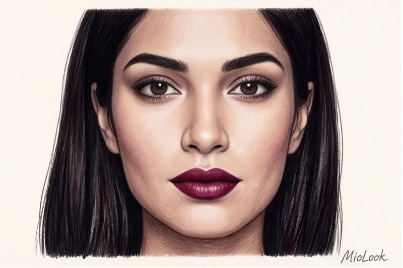
The Right Color Combinations in Clothing: Why the Old Rules No Longer Work
Did you know that you have exactly 90 seconds to impress a stranger? But the most interesting thing is in the details: according to extensive research into the psychology of perception (in particular, reports from the Institute for Color Research), 62% to 90% of this initial subconscious assessment is based solely on color. Hello, my dears! I am Isabella Garcia, your personal stylist, and for me, the right color combinations in clothes It's more than just a morning routine in front of an open closet. It's a true passion, a direct reflection of your inner energy, and the most powerful tool of nonverbal influence you have at your disposal.
When I was just starting out in styling, academic fashion dictated strict guidelines. We were taught strict "color math": don't mix more than three shades in one look, always match your bag to your shoes, and wear warm tones only with warm ones. Forget it! In the realities of 2024–2025, these ironclad rules are hopelessly outdated. Today, they make looks flat, artificial, and downright contrived. Dry mathematical formulas have been replaced by "emotional architecture" image. We no longer calculate proportions with a ruler—we create a mood, control the focus of the interlocutor's attention, and convey confidence through complex, deep palettes.
Color no longer exists separately from the texture of the fabric. The same shade on matte cashmere and glossy silk conveys completely different emotional weight. And it's understanding these subtleties that distinguishes a modern, stylish look from one that's outdated.
"Perfect precision takes the life out of a look. Your outfit shouldn't scream that you spent two hours in front of the mirror matching buttons to your lipstick shade." This is a rule I repeat to every client when we begin working on their wardrobe.
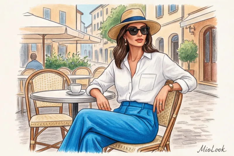
This is the main secret of my favorite Mediterranean style. True Southern chic is a light, barely perceptible carelessness in the palette, that famous Italian sprezzatura Imagine: flowing trousers the color of a burnt olive grove, a loose linen shirt the color of sea foam, and a silk scarf in a complex terracotta hue, casually tied to the handle of a bag. The colors seem to flow into one another, creating the feeling that you simply threw on the first thing that came to hand on your way to a morning espresso in Madrid or Rome, yet you still look like a million bucks. To achieve this effect, you need a sense of harmony, not blindly following color charts.
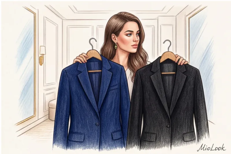
The Myth of Black: Why It Ages You
If you ask ten women what color makes you look slimmer and helps you out of any awkward situation, nine of them will answer without hesitation: "Black." Over the years, I've learned that this is the most dangerous and widespread fashion misconception. Black is absolutely not universal, and for the vast majority of European body types, it's not the ideal base.
Let's break down the physics of this process. Black acts as a harsh, negative "reflector" on the face. It actively absorbs light, instantly highlighting even the slightest shadows on the skin: nasolabial folds, dark circles under the eyes, pigmentation, and signs of fatigue after a long flight. If you're over thirty, a heavy black sweater or jacket with a high collar can visually add another five years to your age. It creates a sharp facial contour and a sickly, sallow complexion.
The myth that black is unconditionally slimming is only half the truth. Black creates a very distinct, uncompromising silhouette. If you're wearing a $50, form-fitting black dress made of fine knitwear, it will highlight every imperfect curve of your body much more than a complex sapphire-hued dress made of a dense, shapely fabric.
What if you're used to a dark base? Replace total black with rich, deep alternatives. My absolute favorites, which work like expensive photo filters: Navy blue (deep navy blue), rich burgundy (the hue of aged wine), and dark chocolate. These colors have the same slimming properties, but their warmth and softness illuminate the face, making the look more prestigious and fresh.
Before radically changing your wardrobe and getting rid of your favorite dark clothes, I always recommend doing a safe test. You can upload a photo of yourself to MioLook and virtually try on jackets in navy or dark chocolate. You'll immediately see how your skin tone changes without a black collar. And if you want to learn more about how light shades work for your look, I recommend checking out our article about beige color in a business wardrobe — it's a fantastic tool for soft power. Also, don't be afraid to experiment with rich tones, which we discuss in detail in the article about bright colors in office wear.
Color Architecture: The 70/20/10 Rule for Perfect Balance
Have you ever noticed why some outfits look cohesive, like works of art, while others create visual chaos, even if the pieces in them cost €500 each? The mistake often lies not in the choice of shades themselves, but in their dosage. When creating stylish color combinations in clothing, the mathematics of space plays no less a role than the palette itself.
In my practice, I constantly use the golden formula of 70/20/10—a stunningly effective principle that the fashion industry borrowed directly from interior design. Architects know very well that for a space to "breathe" and not overwhelm the mind, a precise balance of dominant and secondary elements is needed. This same rule works flawlessly with the human silhouette.
Let's break this structure down into its atomic parts so you can use it today:
- 70% is your foundation (base color). This is the foundation of the look, taking up the largest area of the silhouette. Typically, this role is played by a two-piece suit, an elegant midi dress, a long coat, or a monochrome set of trousers and a sweater. It's the canvas that sets the overall mood of your outfit.
- 20% - complementary color. It supports the base, creating visual depth and rhythm. This includes a contrasting blouse under a jacket, a textured sweater casually draped over the shoulders, or a statement pair of shoes paired with a medium-sized bag.
- 10% - accent. A flash, a spark that makes an outfit truly unique. It could be a bright lipstick, a silk scarf tied around a bag, or a statement horn-rimmed pair of glasses. It's that ten percent that catches the eye and makes people turn their heads.
Theory is dead without practice, so I'll give you a real-life example. One of my clients, a top manager named Sofia, adored strict, classic pieces. Before we met, her typical work outfit consisted of a loose white shirt and straight-leg black trousers. A classic 50/50 ratio. What was really happening? The sharp horizontal line between the two contrasting colors mercilessly cut her figure in half. This technique visually shortened her legs, added volume to her waist, and made her look static.
We restructured her wardrobe based on the architecture of color. As an experiment, we assembled a new ensemble: 70% of the look was a luxurious dark chocolate pantsuit, 20% a flowing caramel blouse, and the final 10% was accented by a silk scarf with touches of sky blue. The silhouette instantly elongated thanks to the single vertical color base, adding dynamism, and the look's status quo soared to a new level without a single flashy logo.
Stylist's secret: If you're unsure about your outfit, take a photo of yourself in the mirror and squint. You'll immediately see color spots. If they divide you into two equal halves (50/50), immediately change the proportions by adding a dominant layer, for example, by throwing on a long jacket in a basic color.
Try MioLook for free
A smart AI stylist will select the perfect look based on the 70/20/10 rule and harmonize your wardrobe in a couple of clicks.
Start for freeItten's Color Wheel: 5 Working Schemes for Combining Colors in Clothing
Swiss artist Johannes Itten created his famous color wheel in 1961 for students at the Bauhaus design school. Ironically, decades later, this purely academic tool has become the ultimate closet nightmare for many women. "How can I connect these quadrants without looking like a crazy woman?" is a question I hear at every other consultation.
Let's agree right away: the right color combinations in clothing shouldn't turn into strict mathematics. The color wheel is a compass, not a prison guard. We use it to understand the logic of harmony, and then add that Mediterranean casualness that brings the look to life. Here are 5 schemes that actually work in real life, not just on the pages of color textbooks.
1. Monochrome: a play of textures, not shades
Many people think monochrome means wearing a red pantsuit with a red shirt and red shoes. That's not a style, it's a uniform. A true, "expensive" monochrome is built on a variety of textures. Light reflects off different surfaces differently, creating natural depth even in a completely black or beige look.
My favorite formula: silk slip skirt + chunky knit sweater + sleek leather boots in the same shade (like dark chocolate) = instant status.
In this combination, even a basic satin skirt from a mass-market store for $50 will look like a runway item, because the matte wool of the sweater nobly highlights its delicate sheen.
2. Analog circuit: the aesthetics of an expensive gradient
This is a combination of two or three colors that are adjacent on Itten's color wheel. For example: yellow-orange, orange, and red-orange. In wardrobe terms, this translates to mustard, camel, and terracotta. An analogous scheme creates a visually continuous line that elongates the silhouette. It's the perfect choice for days when you want to look elegant but monochrome seems too boring. The secret to success here is to choose one color as the lead (for example, a camel coat), and use the adjacent colors as supporting layers.
3. Complementary scheme: The Taming of the Shrew
The most dangerous and at the same time most effective scheme is the use of opposite colors (red and green, blue and orange, yellow and purple). If used in their purest, most intense saturation, you'll achieve an eye-catching effect, appropriate only for sportswear.
How can you reduce contrast so your look doesn't overwhelm you? Move one or both colors toward the dark or light spectrum. Instead of neon green and scarlet, try deep olive and rich burgundy. Instead of bold blue and orange, try navy blue and muted peach.
Working formula: A total look of dark blue denim and a burnt orange suede bag. The contrast is maintained, but it's subtle rather than overt. If you're unsure whether this contrast will work with items in your closet, I always recommend loading them into the "smart wardrobe" feature in MioLook You'll be able to visually combine complex emerald and wine shades on your smartphone screen before you even start changing.
Triad and tetrad: for advanced fashionistas
If you've already mastered the basic schemes, welcome to the advanced level. Triads (three colors forming an equilateral triangle on a circle) and tetrads (four colors forming a rectangle) are the ultimate in color, beloved by Prada designers and creative directors at advertising agencies.
The main mistake when working with a triad is trying to use all three colors in equal proportions and with the same brightness. This is a direct path to a clown costume. This is where the ironclad rule comes into play. one dominant rule.
In a complex color combination, only one shade is allowed to be bold and occupy a large area. The other two should be either heavily muted or used in microdoses. For example, the classic triad: blue, red, yellow. What does this look like in the life of a stylish woman? A deep navy pantsuit (dominant, 85%), a silk scarf with a soft mustard print (10%), and burgundy lipstick or watch strap (5%). You're using a highly complex color scheme, yet still appear impeccably elegant and understated.
Digitize your palette with MioLook
Tired of wondering if a terracotta top will go with olive pants? Upload your items to the app, and the AI stylist will help you create dozens of harmonious combinations based on Itten's circle using what you already own.
Create a smart wardrobeTemperature and Saturation: The Secret to "Expensive" Combinations
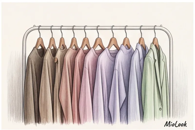
Take a stroll through The Row or Loro Piana's flagship stores. Have you noticed how they rarely carry bold, garish colors? The secret to the "quiet luxury" aesthetic lies not only in premium cashmere (though a $2,000 sweater plays a role), but also in masterful color palettes. To ensure your color combinations in clothing look truly prestigious, it's essential to distinguish two fundamental concepts: temperature And saturation.
Temperature is the undertone of your shade. Does it have a hint of icy blue (cool) or warming yellow (warm)? Saturation, on the other hand, determines purity. How vibrant is the color, a spectral effect, or, conversely, a calm, powdery gray?
It is precisely in saturation that lies the answer to the question of why muted, complex colors—for example, dusty rose, sage, or gray-blue—are always perceived by our brains as more “expensive” and aristocratic.
It's all about visual complexity. The pure colors of a child's crayon box are straightforward and quickly tire the eye. But a color blended with multiple pigments makes the gaze linger. Historically, creating such multifaceted tones required the most complex dyeing techniques, and our subconscious still associates complex, muted hues with high status.
For a long time, glossy magazines had a strict rule: never mix warm and cool tones in the same outfit. Forget it! Is it possible to mix warm and cool shades in the same look? Spoiler: yes, absolutely. But under one critical condition— they should be of the same saturation.
Imagine a classic red sweater and green pants. In pure, spectral colors, this combination will make you look like an elf from Santa's retinue. But if we tone down the saturation and shift the temperature in different directions while maintaining a consistent level of mutedness, we have a gorgeous duo: cool, deep wine and warm, soft olive. You can easily pair icy blue and peach, as long as both are equally pastel. This will create a stunning, vibrant harmony.
What if you're looking for something more exciting and dynamic? According to WGSN's analytical reports (2024), the modern trend toward energy contrasts is taking center stage: pastel + neon This is a brilliant trick for those who want to add a touch of daring to their look without overloading it.
We're pairing a calm, soothing base with an aggressive, electric accent. Imagine a relaxed oatmeal pantsuit (a neutral pastel) paired with neon lime pumps or a fuchsia micro bag. The key here is proportion—neon shouldn't take up more than 5-10% of the overall outfit. It looks fresh, witty, and demonstrates your mastery of fashion codes.
Learning to accurately determine whether items match in saturation requires a keen eye. If you're unsure whether two complex shades in your closet will work together, it's best to test them out beforehand.
Try MioLook for free
Start creating perfect images with the help of artificial intelligence
Start for freeMediterranean Chic: My Favorite Color Formulas
Let's leave dry theory aside. As a stylist whose heart is forever devoted to the southern aesthetic, I believe: the perfect color combination in clothing should evoke emotion, not look like a solved equation. Think of the sun-drenched streets of coastal towns—no one there calculates contrasts with a calculator. The main secret of Mediterranean chic lies not only in the shades themselves, but also in the way the light plays on the fabric. Remember my personal rule: color does not exist without texture.
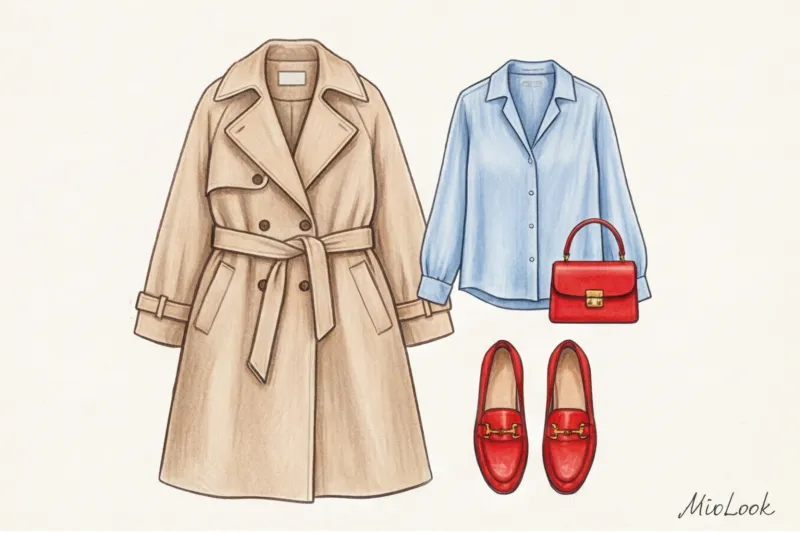
Formula 1: Camel + Azure - City Break
This combination is my personal antidepressant for dull days. Imagine warm, sun-warmed sand and cool, vibrant seawater. The warm, enveloping camel grounds the look, while the piercing azure adds dynamism and freshness.
How to wear: Try pairing a chunky camel cashmere sweater with a flowing azure silk midi skirt. The contrast in temperature (warm/cool) and texture (fluffy/smooth) creates that effortless chic effect. An alternative option for hot summer: a heavy azure washed linen shirt and wide-legged sand-colored cotton trousers.
Formula 2: Olive + Terracotta – Natural Elegance
This duo is inspired by the Tuscan landscape: the muted green of ancient olive groves and the scorching clay roofs of villas. This complex, earthy combination looks incredibly noble and luxurious, especially on women with warm skin tones.
How to wear: A matte finish is crucial here. Glossy terracotta can be a bit forgiving, so stick to natural fabrics with a pronounced weave. My favorite early fall outfit: a loose olive blazer in heavy linen and a ribbed terracotta top. Add chocolate-colored suede loafers, and you've got the perfect "quiet luxury" look.
Formula 3: Navy + Emerald – Status and Depth
While the first two formulas evoke midday sun, this one embodies evening coolness, deep waters, and dense pine needles. The combination of Navy and Emerald is a stunning alternative to traditional black for prestigious events. The two dark, rich colors blend into each other, creating an atmosphere of mystery and aristocracy.
How to wear: A sharp double-breasted navy wool coat, casually draped over an emerald slip dress. To prevent the outfit from blending into a single dark blob, be sure to break up the colors with subtle shimmer—for example, by adding vintage gold earrings or choosing a bag with accent metal hardware.
How to adapt these Southern combinations for a strict office dress code
Clients often ask me, "Isabella, it's perfect for strolling along the Riviera, but how can I wear azure silk to a board meeting?" The secret to adapting is simple: we reduce the active color and relegate it to an accessory group or the first layer, while maintaining the color pairing itself.
- Camel + Azure: Keep the classic camel-colored pantsuit as a firm base, and introduce azure through a thin silk scarf or a formal shirt, but in a heavily bleached, pastel version of azure.
- Olive + Terracotta: Swap exposed terracotta for a more subdued burnt brick hue in a leather belt or structured tote, pairing it with a simple olive sheath dress.
- Navy + Emerald: This combination is already quite conservative. A dark blue suit with an emerald matte silk blouse (with a closed collar) is perfectly acceptable, even in the banking sector with its strict dress code.
If you're unsure whether the chosen contrast will violate your company's corporate ethics, I strongly recommend putting together a virtual look first. Upload your items to MioLook The app allows you to visually evaluate color proportions and the overall tone of an outfit before you even take it out of the closet. This saves a ton of time in the morning and is guaranteed to prevent fashion mistakes before important work meetings.
The Psychology of Color: How to Manage Impressions with Your Wardrobe
Research by the Pantone Institute confirms a startling fact: up to 85% of information about us is read nonverbally by others in the first few seconds of a meeting. When you step into someone's office, their subconscious instantly analyzes your color combinations. This is a basic evolutionary mechanism—the brain decides in a split second whether you convey stability, creativity, or a hidden threat.
Color is the fastest language of communication. Before you can even say "Hello," your outfit has already made a brilliant self-presentation.
Let's break down the key color codes for situations where the stakes are truly high.
- Interview in the corporate sector: Deep navy paired with crisp white. Why is blue so reliably trustworthy? Psychologically, it's associated with logic, reliability, and structure. It's the color of a problem solver, not a problem creator.
- Tough negotiations: Graphite gray as a base, plus emerald or sophisticated burgundy accents (like a silk top or a structured bag). Gray creates the necessary emotional distance, while a refined accent conveys your high status without being overly aggressive.
- Public speaking: Here the rules change completely, as you need to manage the focus of attention of tens or hundreds of people.
Last year, a client, a fintech expert, approached me. She was scheduled to present at a fintech conference and wanted to wear her "lucky" black pantsuit. I categorically forbade it: against the dark backdrop of the stage, she would simply disappear, turning into a floating head. We chose a monochrome look in a rich burgundy. This color gave her the necessary visual weight and authority, but was also much more dynamic than black. After her presentation, she admitted that the audience's eyes were glued to her—the color literally captivated them.
I'd like to make a special mention of the color red. Many people mistakenly consider it a universal tool of influence. Red is a visual megaphone. It conveys dominance and powerful energy, but that's precisely why red demands an absolutely perfect cut. If you're wearing a scarlet jacket, the slightest imperfection in the fit, a cheap plastic button, or uneven stitching will be highlighted like a spotlight. A $300 red suit should be tailored to the exact fit as if it were a $3,000 custom-made suit.
Your ideal image
it begins Here
Join thousands of users who look flawless every day with MioLook.
Start for freeTop 5 color combination mistakes that cheapen your look
"Fashion forgives many things, but color is ruthless." In 2023, analysts at the WGSN agency published a fascinating report on the psychology of perceived luxury. It turned out that an unsuccessful color palette reduces the visual value of an outfit in the eyes of others by 60%, even if you're wearing heavy luxury pieces. As a personal stylist, I regularly review wardrobes and see the same annoying mistakes. Let's go through a strict but essential checklist of these tricky pitfalls.
1. Combination of black with bright pure colors (the "bee" effect)
Black is the heaviest and most dense color in the spectrum. When you contrast it head-on with a vibrant yellow, scarlet, or forest green, it creates an aggressive, harsh contrast. In professional circles, we call this the "uniform effect" or "the bee." Our subconscious reads this combination as a danger signal or a marker for workwear.
What to do: Swap black for graphite, dark chocolate, or deep navy. If you really want to wear black pants with a bright top, be sure to add a "buffer zone"—for example, throw a neutral beige blazer over it.
2. Ignoring your natural contrast
I once had a client come to see me with a stunning yet very soft Scandinavian appearance: ash-blond hair, clear gray eyes, and fair skin. Her closet was filled with graphic black-and-white dresses that literally "devoured" her face. A well-chosen color combination in clothing should always be based on your natural complexion. If there are no sharp transitions between the shades of your hair, eyes, and skin, avoid loud color blocking near your face. Otherwise, your dress will appear first in the room, and only then will you.
3. Equal color proportions (50/50), cutting the figure in half
A white waist-length jumper and black trousers are a classic that mercilessly cuts the silhouette into two equal squares. This optical illusion takes at least 5 centimeters off your height and makes your figure appear squat. The human eye loves asymmetry.
What to do: Use the golden ratio. Tuck your top in so the top-to-bottom ratio is 1/3 to 2/3, or wear a long cardigan that matches your trousers to create elongated vertical lines.
4. Too many accents without a unifying base
By wearing red shoes, a green bag, a blue skirt, and a yellow scarf, you risk becoming a walking palette. The other person's brain doesn't know what to focus on and perceives the image as visual noise. If you use more than three shades, one of them should be a "canvas"—a voluminous, neutral base (beige, gray melange, ecru) that will calm the chaos. To check if you've overdone it with accents, assemble the planned look in MioLook — on a smartphone screen, congestion can be detected in a split second.
5. Mismatch of color and texture of fabric
This is my personal pet peeve when shopping with someone. Remember this ironclad rule: the brighter and more complex the color, the more expensive the texture of the material should be. Neon fuchsia or emerald on thin, shiny polyester for €30 looks like a disaster. But the same shades on thick silk, cashmere, or textured wool instantly acquire a prestigious air.
With pastel tones, the opposite logic applies: powdery, marshmallow shades require smooth, flowing materials (silk, satin, thin cotton). On loose, cheap knitwear with pilling, they simply look washed out and untidy.
How to Incorporate New Colors into Your Wardrobe: A Step-by-Step Guide
According to Lyst's 2023 global report, 68% of women buy clothes exclusively in neutral, black-and-gray tones simply out of fear of choosing the wrong shade. Stop hiding behind the safe achromat! Now that you understand the laws of color and how to manage impressions, it's time to put them into practice. I've prepared a clear algorithm, tested on dozens of my clients, that will help you add life to your closet without stress and wasted money.
Step 1: Audit your current palette (find your base)
Color integration doesn't start at the mall, but at your bedside. Pull out all the current season's items from your closet. Divide them into two piles: a neutral base (black, white, beige, gray, denim) and colorful pieces. Take a close look at the second pile. What's the dominant hue? Perhaps you're unconsciously buying muted blues, or perhaps you've discovered a hidden passion for wine tones?
Consider the temperature of your current wardrobe. If 80% of your sweaters and pants are cool graphite, icy beige, and crisp white, a warm mustard blouse will look out of place. Before buying a bright item, make sure you have a calm "canvas" of the right temperature where the color will shine.
Step 2: The "Safe Investment" Method
Don't buy a €400 neon pink coat in a fit of inspiration that you'll only wear once. Introduce color in homeopathic doses. My favorite method for beginners is to start with an accessory group and statement shoes.
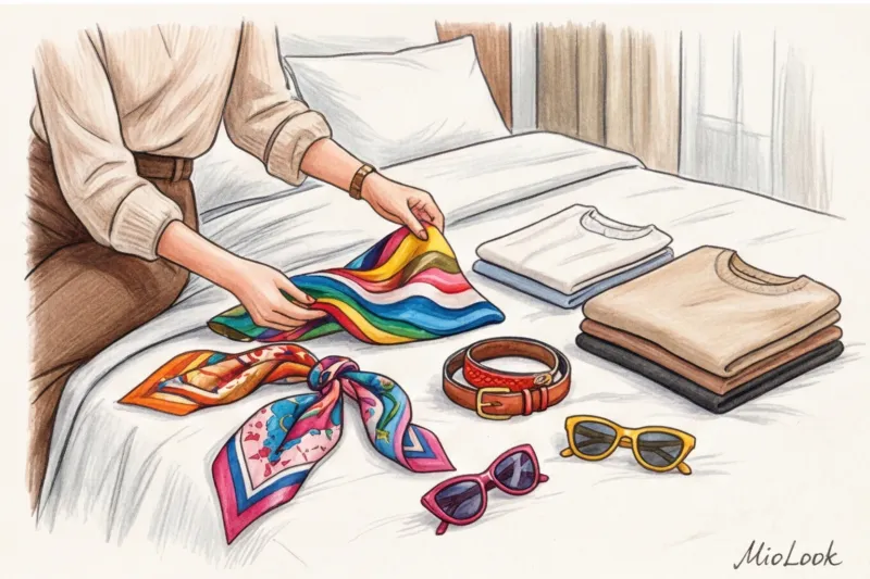
Buy a vintage silk scarf with an emerald print (real treasures can be found at European flea markets for €30-50), a statement belt in the color of ripe cherry blossoms, or burnt caramel loafers. If the bright element is placed far from your face (like colorful shoes), it won't clash with your natural coloring, but it will instantly add complexity to your look. The perfect starting formula: a monochrome base with one bold stroke. You only spend €50 on a quality belt, but it will completely change the shape and mood of your typical office attire.
Step 3: Virtual try-on before purchase
The most common fear I hear is, "What if this terracotta bag doesn't go with anything?" To avoid having a proliferation of odd items with uncut tags in your closet, test ideas digitally. Take photos of your base and upload them to the "smart wardrobe" feature in MioLook.
Saw a stunning pair of pistachio-colored trousers online? Save the image, add it to the app, and try creating at least three different looks with them using your real-life clothes. If the digital puzzle comes together and the app shows harmonious combinations, go ahead and place your order. If not, you've just saved money and rack space.
Step 4: Give yourself permission to play
Style isn't a rigorous math exam where the slightest mistake in proportions results in a failing grade. It's a living, breathing process, a direct reflection of your inner energy. Remember that Mediterranean casualness we mentioned at the beginning: Southern women don't look stunning because they obsessively calculate tonality using Itten's circle. They look that way because they wear color with pleasure, dignity, and a touch of self-irony.
Don't be afraid to experiment. Make mistakes, try bold, unconventional combinations, mix textures, and break the rules when you feel confident. Ultimately, the best color combination in clothing is the one that straightens your back, changes your gait, and makes you feel incredibly beautiful today. Open your closet door and get creative!
Guide Chapters
Colors for an Office Wardrobe: The Psychology of Influence
Forget the boring black suit. Discover how the right business attire can help you win tough negotiations.
Warm and cool colors in clothing: how to mix them?
The ban on mixing shades of different temperatures is an outdated myth that makes a wardrobe boring. Learn how to mix colors correctly and break the rules without compromising your style.
How to Combine Prints and Colors: Stylist Secrets
Forget the outdated rule of matching clothes tone-on-tone to the background of a pattern. Discover the signature method of European buyers for creating dynamic and stylish looks.
How to choose the color of tights: black, nude, colored
Tights aren't just warmth, they're an essential style element. We'll explore how to use tights color to create a flawless look.
Pink in clothing: what to wear without the Barbie look
Pink is a powerful element of a status-conscious wardrobe, not just the color of childishness. We'll explore how to wear fuchsia shades with style and confidence.
Purple in clothing: combinations for a stylish look
A personal stylist debunks the myths about purple. Learn how to stylishly incorporate lilac and eggplant into your everyday wardrobe.
Yellow in clothing: combinations and style rules
Many women avoid sunny shades, fearing they'll look pale or out of place. Learn stylist secrets for how to skillfully incorporate yellow and orange into your wardrobe.
Bright Accents in Clothing: How to Stylishly Add Color
Worried about blending in with the crowd in basic pieces? Learn how to add color to your look with accessories and command attention.
Bag and Shoe Color Combinations: New Style Rules
Should shoes and bags match? We explore modern etiquette rules and learn how to stylishly combine different shades of accessories.
What to wear with blue to look expensive
Blue is the most popular, yet often underrated, color in the wardrobe. Learn from a practicing colorist how to properly combine textures for a classy look.
Brown in clothing: combinations and trends
Black is no longer a must-have. Learn how to wear brown and beige to create luxurious and stylish everyday looks.
What to wear with red: stylist tips
Afraid of wearing bright colors? Discover the stylists' secrets and learn how to seamlessly incorporate a bold red hue into your everyday wardrobe.
What to wear with green: stylist tips
There's no such thing as "just green" in the fashion industry. Learn how to choose the right shade temperature and texture to create a sophisticated yet fresh look.
Pastel colors in clothing: a combination for a status look
Pastel shades aren't just about childish naivety, they're also about status. Learn how to wear pastel colors to look luxurious and authoritative.
The Three-Color Rule: How to Avoid Becoming a Traffic Light
Learn how to use the three-color rule correctly to look classy, not like a "traffic light." We'll break down common mistakes and color secrets from a stylist.
Stylish Monochrome Clothing: Dos and Don'ts
The biggest mistake when creating a monochromatic look is choosing exactly the same shades. Find out how playing with textures can make your outfit truly stylish.
Color blocking in clothing: how to combine bright colors
Afraid of bright colors? Learn how to use color blocking correctly to create luxurious looks and visually contour your figure.
Basic Colors in the Wardrobe: Combinations and Main Myths
Why are 70% of my closet basics, yet I still have nothing to wear? We debunk the biggest myths about black, white, and gray.
Which colors make you look slimmer: visual illusions in clothing
Black isn't the only solution for figure-shaping. Learn how to use shades and optical illusions to create a slimmer look.
Itten's Circle in Clothing: How to Combine Colors Without Mistakes
Why do classic color schemes often fail in real life? We explore how to adapt Itten's theory to create an elegant and stylish wardrobe.