You know what phrase I hear most often during wardrobe reviews? "Katarzyna, green makes my face look sallow and sickly." My client Anna, a finance director from Warsaw, was absolutely convinced of this. Until we swapped her favorite, but utterly unflattering, warm olive blouse for a cool, pine-colored, thick cashmere sweater. The effect was as if she'd just returned from a two-week vacation.
Trying to figure out what goes with green in clothing is pointless if we treat it as a single, unified whole. In the fashion industry, there's no such thing as "just green." There's the architecture of a look, where the color temperature and texture of the fabric are everything. In this article, we'll move away from flat and outdated color type charts and explore the anatomy of a green wardrobe, as professional stylists do.
Emerald, khaki, pistachio: why "simple green" doesn't exist
According to Pantone's 2024 Color Analysis Report, shades like Olive Oil and rich Bottega Green have dominated collections for several seasons in a row. But why does it look luxurious on the runway but dull in the dressing room?
The secret lies in Johannes Itten's classic theory: everything depends on whether the fabric contains more blue (cool) or yellow (warm) pigment. The old rule of "match your eye color" no longer applies. Modern street style dictates a different approach: color should complement the skin tone, not blend with the iris.
"To accurately determine the temperature of an item in the store, use my favorite trick. Place a plain, basic white T-shirt next to a green fabric. Against the white, a cool emerald will immediately reveal its blue undertone, while a warm khaki will clearly gravitate toward a yellow undertone."
That's why the basic lines of brands like COS or H&M Premium always rely on complex, mixed shades—they look more expensive than pure spectral colors.
Texture Decides: How Fabric Changes Color
From my shopping experience: a shiny khaki skirt from a mass-market store often looks cheap, while matte cotton trousers of the same shade from Mango look classy. Why is this?
The rule of thumb is: glossy textures (silk, satin, and shimmery viscose) make a color 2-3 shades brighter in daylight. For deep emerald, this is a plus—it becomes luxurious, like a precious stone. But for earthy shades like khaki or olive, gloss is detrimental. Complex, dusty colors require matte, light-absorbing textures: wool, heavy cotton (from 180 g/m²), and suede. Remember: the more complex the color, the more refined the fabric should be.
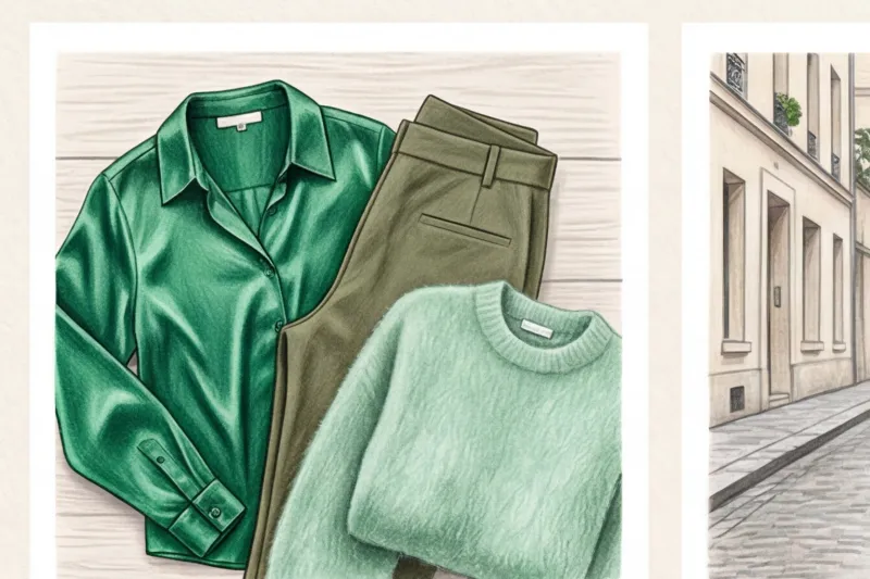
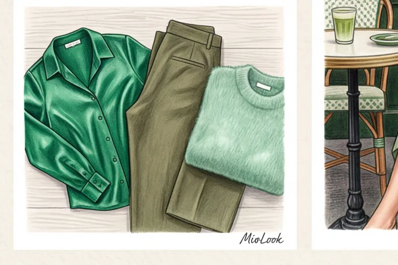
What goes with green in clothing: basic combinations
If you're just starting to introduce this color into your wardrobe, start with fail-safe neutral combinations. But even here, there are some pitfalls.
- Green + shades of white: Pure white is the enemy of complex green. It creates too harsh a contrast and kills the richness of the hue. Replace it with ecru, milky, or oatmeal.
- Green + gray: The perfect pairing for smart casual. A tailored gray wool suit instantly warms up and becomes less formal when layered with a muted pistachio-colored top underneath.
- Green + beige/camel: This is the signature formula for the "dear woman" in the Massimo Dutti style. The warm camel undertone perfectly complements olive and khaki.
- Green + black: A dangerous combination that can make you look gloomier. Stylist's secret: to make black and green look harmonious, add exposed skin (rolled sleeves, a V-neck) or brighten up the look with light-colored shoes.
Try MioLook for free
A smart AI stylist will select the perfect look and help you integrate complex colors into your wardrobe without making mistakes.
Start for freeExpensive Contrasts: What Bright Colors to Wear with Green
Many are afraid of bright combinations, recalling the outdated rule of "no more than three colors in an outfit." I discussed in more detail why this postulate has long been outdated in our a complete guide to the perfect color combinations in clothing Today, emotional color blocking is king.
Take a look at the street style from Copenhagen Fashion Week: Scandinavian women masterfully mix green and fuchsia. It's a play on maximum contrast that requires confidence. If fuchsia is too much for you, try purple or lilac. The combination of an emerald sweater and lavender pants is often chosen by my clients in the creative industries.

Debunking the myth: Green and red aren't just for New Year's
"You can't wear green with red—you'll look like a Christmas tree" or "you'll look like an elf." You've probably heard it. The truth is, this rule only works for pure spectral colors of equal saturation.
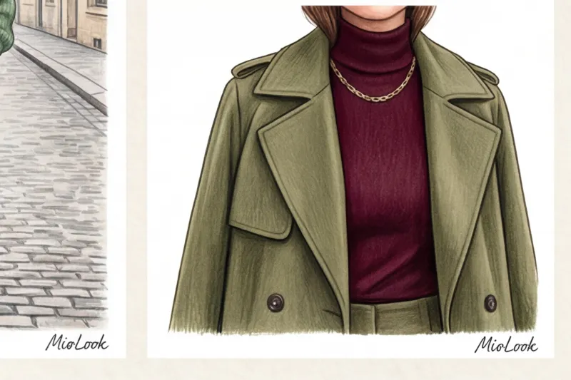
The secret to luxurious contrast is a shift in lightness and saturation. Deep burgundy paired with muted sage is the most prestigious color combination in the "quiet luxury" aesthetic. Terracotta and khaki, or dusty rose and dark emerald, look incredibly sophisticated and sophisticated. The key is to remember texture: pair smooth burgundy leather with fluffy green mohair.
Related colors: green with blue and yellow
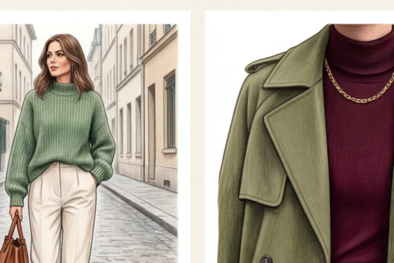
According to the rules of the color wheel, this is an analogous scheme (adjacent colors). Navy blue paired with dark green is the new black and white dress code. This combination looks formal, but not trivial.
Be careful with yellow, though. To avoid looking like a walking Sprite logo, avoid neon lemon tones. Opt for mustard, lemon cream, or go for texture—gold perfectly complements any warm green.
Khaki is the new black: how to incorporate the military hue into your wardrobe
According to a 2024 WGSN study, basic khaki items sell three times better than their bright emerald counterparts. The human brain perceives khaki as a natural, extremely neutral, and safe shade. It conveys stability and practicality.
For offices with a relaxed dress code, I often suggest that top managers replace their boring dark blue suits with khaki two-piece suits. However, there's a catch the main danger Khaki is absolutely not suitable for people with pronounced rosacea (redness) or a dull, tired undertone. The green pigment will bring out any dark circles under the eyes.
What if a color doesn't suit you, but you still want to wear it? Move it away from the "portrait zone." Wear khaki pants and skirts, and layer refreshing ecru shades near your face, or wear a khaki jacket over a white shirt with a crisp collar, creating a buffer zone.

Your perfect look starts here
Join thousands of users who look flawless every day with the help of the smart MioLook algorithm.
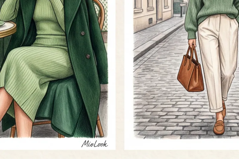
Start for freeTotal Green: How to Create a Monochrome Look
Monochrome visually elongates the appearance of height—it's an optical illusion stylists use to add a few inches to a client's height. But wearing all one color and one fabric means turning into a green blob.
The architecture of monochrome is built on two pillars: texture differences and color expansion. Mix leather pants, a silk blouse, and a cashmere coat within the same tone. Or use expansion: a mint top blending into emerald bottoms.
Shoes and bags in such an outfit are best kept in a neutral palette (beige, dark chocolate) or made into accents—for example, by adding leopard-print pumps, which are adored by Parisian street style heroines.
Stylist Katarzyna Nowak's checklist: 5 rules for buying green
My approach to shopping is pragmatic: every item should be 100% worth its price. Before you take that green blouse to the checkout, run it through this checklist:
- Checking the "portrait zone": Remove your makeup (or simply hold the item to your face without heavy foundation) and look in the mirror in natural light. Have the shadows under your eyes become deeper? The item is still in the store.
- Test for “expensiveness”: Be mindful of texture. If khaki or olive fabric has a sheen like a candy wrapper, it will cheapen any look.
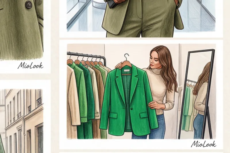
- The rule of three sets: Can you mentally create three different looks for this green item right now, using everything you already have in your closet? If the answer is "no," you're buying a problem, not clothes.
- Safe start: If you're afraid of color, don't buy a green coat right away. Start with the basics: a structured green bag, a suede belt, or crisp olive pants will fit into your closet much more seamlessly.
- Care question: Green pigment, especially on cotton, is prone to fading. Make sure you're prepared to wash the item inside out at 30 degrees Celsius and hang it to dry out of direct sunlight.
Green isn't about a random choice, but rather a conscious effort with your wardrobe. Your next step? Open your closet today, pull out a white T-shirt, and test the temperature of all your green items. You'll be surprised how many answers this simple five-minute test will give you.


