One day, a stunningly beautiful woman came to see me for a consultation, looking like... a decorated Christmas tree. "I did everything by the book!" she said, almost crying. "I chose contrasting colors. A red sweater and green pants. But somehow I feel like a clown, not a style icon."
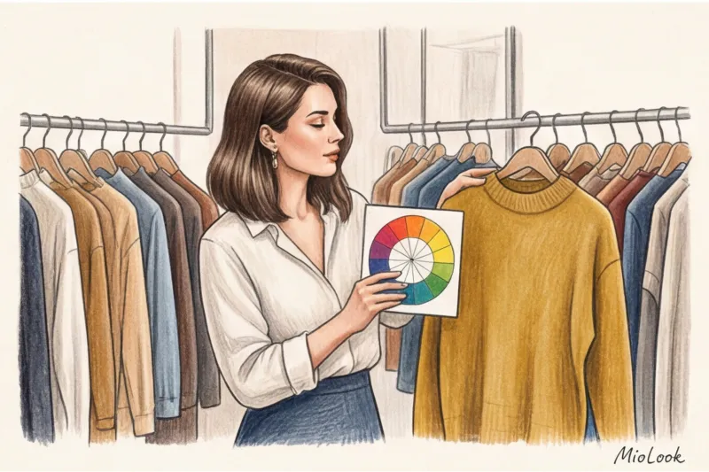
At that moment I was convinced for the hundredth time: Itten's circle in clothing It's a brilliant tool that's completely ineffective when applied head-on. We've been taught basic color schemes for years, but one critical detail has been forgotten: Johannes Itten developed his theory in the 1920s for Bauhaus artists mixing paints on a palette. He didn't expect modern women to try to transfer these pure, pigmented colors to a cashmere coat or a silk blouse.
We talked about the basic principles of coloristics in more detail in our the complete guide to the perfect color combination , but today I want to talk about something else. About how to adapt the rigorous mathematics of color to a realistic, expensive, and prestigious wardrobe for 2024–2025.
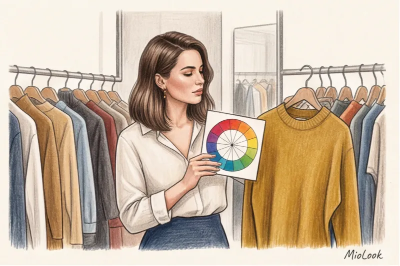
What is Itten's Circle in Clothing (and Why Classical Theory Often Fails)
Let's take a moment to recap the basics. The classic color wheel consists of 12 sectors: three primary colors (red, yellow, blue), three secondary colors (created by mixing them), and six tertiary colors. It seems simple: just grab a chart, apply it to your wardrobe, and get the perfect look.
The biggest mistake beginners make is trying to wear pure colors from the typographic circle. In paint, pure blue looks vibrant. On fabric (especially inexpensive polyester), pure blue instantly dulls the appearance and cheapens the look. The human eye can distinguish up to 10 million shades, and limiting yourself to the 12 basic sectors is voluntarily depriving your wardrobe of depth.
In my practice, I use the concept of "emotional architecture" of an image. Color is not a mathematical formula; it is a tool of influence. According to the latest reports from the WGSN trend bureau (2024), global fashion has finally shifted toward complex, "dirty," and muted shades. These shades convey calm, confidence, and status.
The Three Pillars of Coloristics: A Secret That's Not on the Basic Wheel
If you look at the standard Itten circle, you will see only one characteristic of color out of the three existing ones - its hue But the magic of the style lies in the other two.
Lightness (Value) — is the amount of white or black pigment. It's the difference between navy and sky blue.
Saturation (Chroma) — it's a hint of gray. It's what distinguishes a flashy fuchsia from a noble dusty rose.
According to statistics from the PANTONE Color Institute and the experience of practicing stylists, 80% of the success of color combinations depends not on which sectors you choose on the wheel, but on the matching of their saturation levels. My main professional insight: colors from any , even the most incompatible parts of the circle, will look harmonious together if you “make friends” with them through the same gray undertone.
Try MioLook for free
A smart AI stylist will select the perfect look based on your individual parameters and coloring.
Start for freeBasic color combination schemes (adapted for a modern wardrobe)
It's time to bust one of the most persistent fashion myths: "You can't wear more than three colors in one outfit." This rule is hopelessly outdated! You can wear five or even six colors at once, as long as they share a consistent temperature and muted tone (for example, by creating an outfit entirely of pastels or deep autumnal shades).
Monochrome and Analog Triad (Dear Silence)
Monochrome, in its modern interpretation, isn't about wearing the same beige from head to toe. It's about using a single sector of the color wheel, but with extreme variations in lightness: from ecru (unbleached silk) to rich dark chocolate. This is the foundation of the "quiet luxury" aesthetic, so beloved by brands like The Row and Loro Piana.
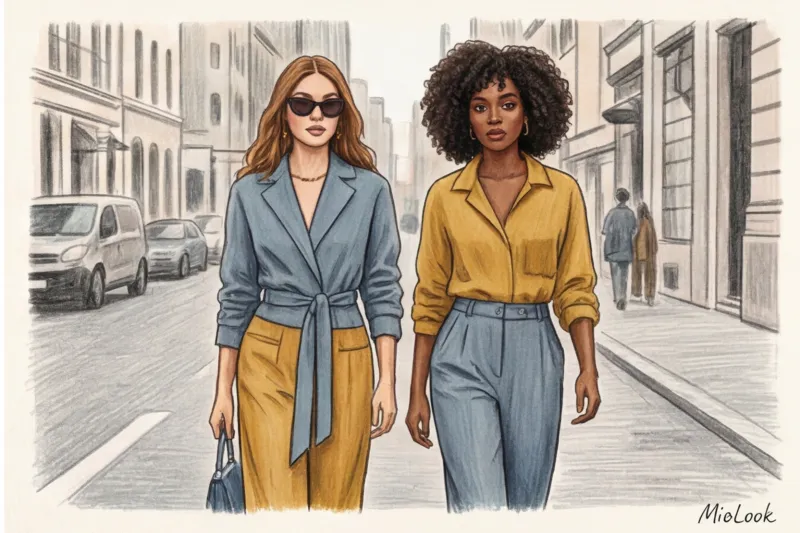
An analogous scheme uses two or three adjacent sectors (for example, blue, teal, and green). For a business wardrobe, this is the most prestigious and safe scheme after monochrome. It creates a sense of thoughtfulness without being jarring with contrast.
Complementary Combination (The Art of Contrast Without the Traffic Light Effect)
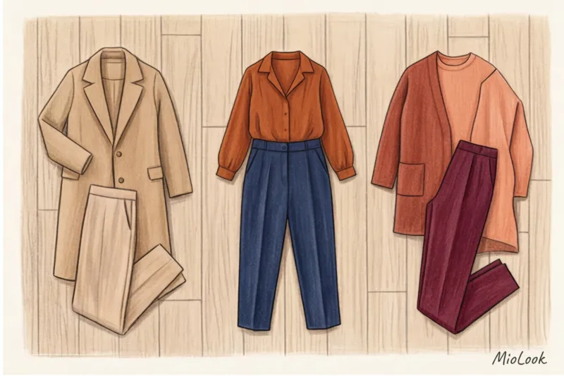
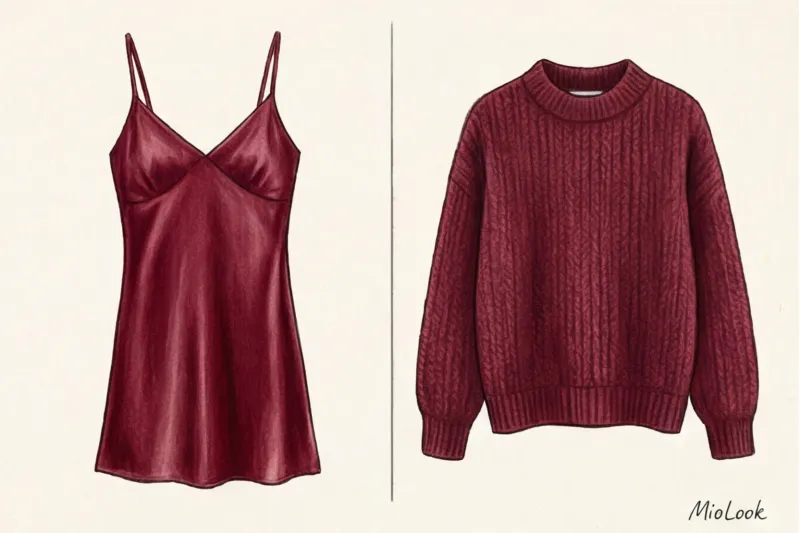
Let's return to my client with the "Christmas tree." A complementary scheme uses colors that are opposite each other (red and green, yellow and purple). The client's mistake was to use them in their maximum saturation and in a 50/50 ratio.
How did we fix this? We reduced the lightness and saturation: we replaced the pure red with a deep wine (Bordeaux), and the herbaceous green with a muted olive (sage). Then we applied the stylist's golden rule: 80/20 ratio The wine-colored pantsuit made up 80% of the look, while the olive silk blouse provided the remaining 20%. From the "clown," we achieved impeccable Italian chic.
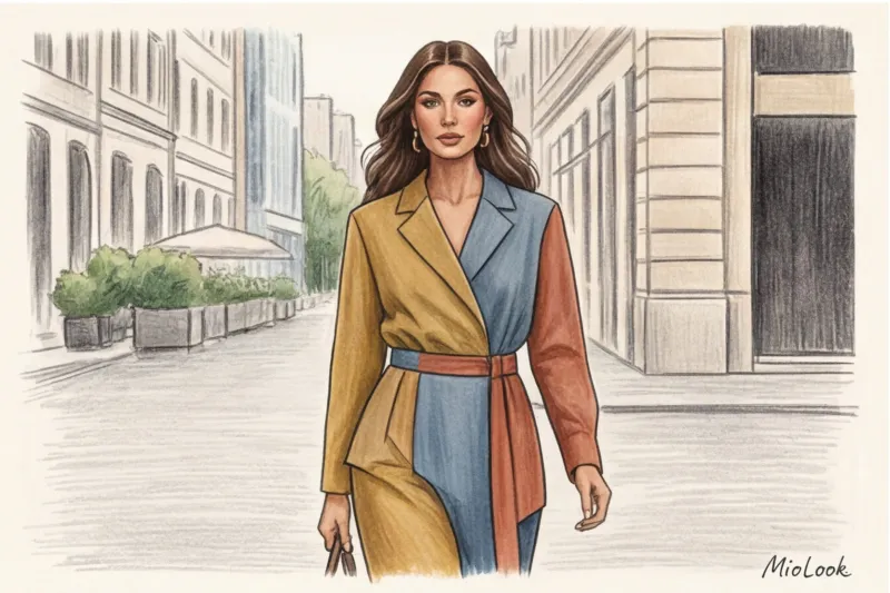
Complex Patterns: Triad and Tetrad (For Advanced)
Triad (an equilateral triangle on a circle) and tetrad (a rectangle) are color blocking schemes. The classic triad is blue, yellow, and red. Sounds like a courier's uniform, right?
A prerequisite for using these schemes in 2024 is a radical reduction in saturation. Instead of bold colors, choose complex versions: mustard instead of yellow, dusty blue instead of blue, and terracotta instead of red. This stretching will prevent the look from breaking up into garish pieces.
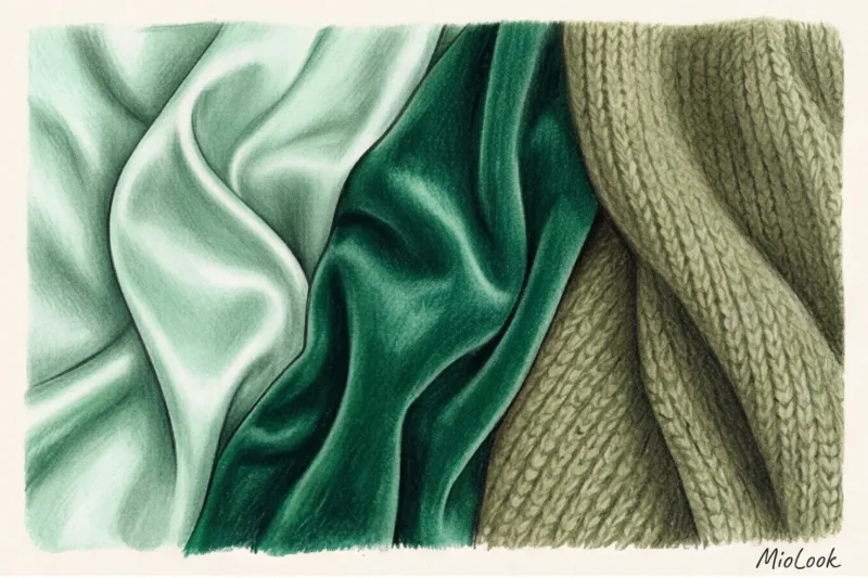
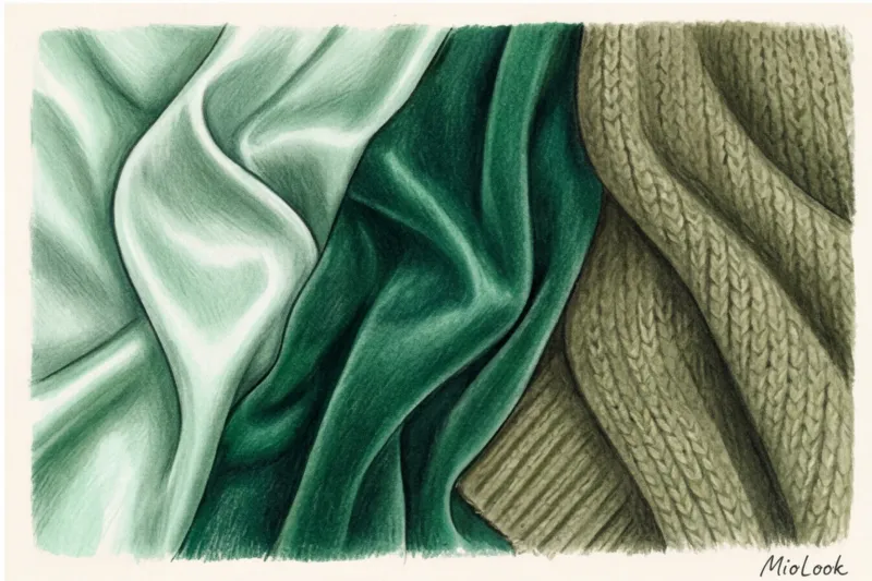
Fabric texture: hidden filter for the Itten circle
The mathematics of color are useless without considering the physics of fabric. The same shade from the Itten circle on glossy silk and on loose, matte wool are, in fact, two different colors.
Glossy textures (satin, leather, sequins) reflect light. They make colors appear brighter, more vibrant, and closer to the viewer. Matte textures (suede, cashmere, corduroy, heavy cotton) absorb light, making the shade appear deeper, darker, and more distant.
My personal pro tip: If you're going for a monochromatic look (like all black or all beige), Necessarily Mix textures. Pair a smooth silk skirt with a chunky knit sweater. The contrast in texture will create a 3D effect, preventing the look from looking flat.
Your perfect look starts here
Join thousands of users who look flawless every day with MioLook, experimenting with textures and shades.
Start for freeHow to Use Itten's Color Wheel in Practice: A Stylist's Algorithm
Enough theory. Here's a step-by-step checklist I use during real-life wardrobe reviews with clients:
- Step 1: Select a dominant color (base). Determine the color that will take up the most space in your outfit (coat, suit, dress). Choose a complex, muted shade.
- Step 2: Defining the emotional task. What do you want? For an IT interview (where you need to appear calm but not bored), use an analog scheme. For a creative presentation (where you need to be memorable), use a complementary scheme with an 80/20 ratio.
- Step 3: Adjusting Saturation. This is a critical point. If you've chosen a yellow accent, avoid neon lemon. Go for a buttery shade or ochre.
- Step 4: Checking the quality of the material. Color lives in the fabric. If it's cotton, it needs to be dense (at least 180 g/m²) to hold its shape and color. Thin, squeaky knitwear will ruin even the most ingenious Itten scheme.
- Step 5: Integration of achromats. Black, white, and gray aren't part of the color wheel. Stylists use them as "air" to break up overly vibrant color blocks and give the eye a break.
Itten's Circle and Your Color Type: When to Break the Rules
Here, I must make an important confession as a colorist: Itten's ideal, mathematically precise scheme can easily make your face look dull, tired, and add five years to your age. This happens when the scheme clashes with your natural coloring (color type).
For example, the circle suggests a gorgeous combination: peach and sky blue. But if you're a "Deep Winter" with a high-contrast complexion, these pastel tones will simply obliterate you. Your face will be lost in the background.
What to do if the color scheme is perfect, but it doesn’t suit you?
Never place a "foreign" color in the portrait area (near the face). Move it downwards: into pants, skirts, shoes, or a bag. Always keep shades near the face that highlight your skin and brighten the whites of your eyes. The mathematics of the circle are secondary to your natural features.
Ready to get started?
Try the MioLook plan for free—no commitments required. A virtual fitting room will help you see how colors complement your appearance.
Start for freeSummary: From Theory to Your Ideal Wardrobe
Itten's circle isn't a strict map with a predetermined route from which you can't deviate. It's a compass. It merely guides your thoughts.
The main secret of the current wardrobe of 2024-2025 is that complexity The shade and noble texture of a fabric are always more important than its mathematical arrangement on the circle. Don't be afraid to experiment with lightness and saturation, moving away from open, felt-tip colors toward natural, slightly dusty tones.
And if you're unsure whether your plan will work in reality, don't buy the items right away. Use the smart wardrobe feature in MioLook app Artificial intelligence will help you visualize combinations before you buy and will suggest how well your chosen palette matches your goals and natural color palette. Color is a game, so play it by your own rules!