"Darina, not pink. I'm a lawyer, not a runaway Barbie," a new client told me right off the bat. It's the most common objection I hear during an initial consultation. And the most unfair. Over 12 years of working as a colorist and image consultant, I've learned that pink isn't the color of childishness. It's a powerful tool. power dressing (status wardrobe). But only if you know how to use it.
If you are looking for an answer to the question, What to wear with pink in clothes To convey expertise and confidence, forget the old rules. We discussed the basic principles of color in more detail in our a complete guide to the perfect color combinations in clothing , and today we will analyze the anatomy of the most controversial shade.
Why We're Afraid of Pink: Debunking the "Barbie Effect" Myth
For decades, cultural stereotypes dictated that pink was the color of little girls, frivolity, and romances with happy endings. Career women instinctively hid behind navy and gray jackets to be taken seriously. But the paradigm has changed.
According to Pantone Color Institute reports (remember the triumph of bold Viva Magenta in 2023 and enveloping Peach Fuzz in 2024), the global perception of this palette has been transformed. Pink has become a symbol of emancipation and a new sincerity. Research in color psychology proves that pastel pink (a shade of dusty rose) reduces aggression in interlocutors and evokes empathy, while rich magenta or fuchsia are subconsciously perceived as markers of leadership and courage.
"In the first 90 seconds of meeting someone, the color of your clothes speaks louder than your resume. The right pink says: I'm confident enough not to hide behind a black sheath."
Pink in clothing: what to wear it with to look expensive
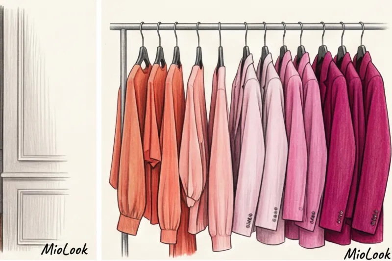
The key to a classy look isn't the color itself, but the texture it complements. Retail analytics and research from platforms like Lyst show that over 70% of harmonious looks with vibrant shades rely on the right contrast of materials.
Pink silk and pink knitwear are two different universes. Smooth, lustrous silk (for example, 19-mommie) requires a matte, rough companion—a dense suiting wool or suede. Wearing a pink silk blouse with glossy leather pants will create a busy look. Give the color a refined backdrop.
Forget Black: Why Chocolate and Graphite Work Better
Here we come to the biggest mistake 8 out of 10 girls make. Counterintuitive, but crucial advice: Never try to "calm down" bright pink with black..
The combination of fuchsia and black creates a harsh, theatrical contrast. It's jarring and almost always looks cheap, reminiscent of promoter uniforms. What's a substitute for black?
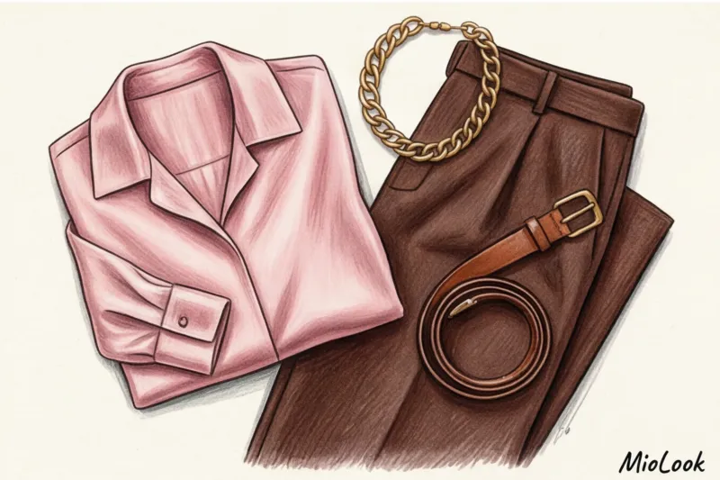
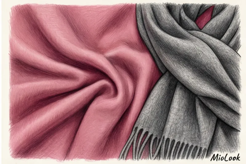
- Dark chocolate. The deep brown shade perfectly grounds the soft pink and magenta. This combination feels like a dessert at an upscale restaurant—complex and sophisticated.
- Graphite grey. Unlike black, dark gray has less contrast. It becomes a wonderful canvas for any pink experimentation, from powder to neon.
- Ripe cherry (burgundy). An analogous combination (colors are next to each other on the color wheel) that conveys luxury.
Monochrome Magic: A Play of Textures Instead of a Play of Shades
How to create a total-pink look without looking like a giant lollipop? Use color stretching and texture blending.
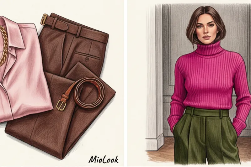
Wear a chunky knit sweater in ash pink, strawberry marshmallow trousers with pleats, and a rich berry coat draped over your shoulders. The contrast in the weight of the materials (loose wool + smooth suiting + shaggy cashmere) will create the necessary depth. A uniform texture from head to toe in pink is only acceptable with an impeccably tailored pantsuit.
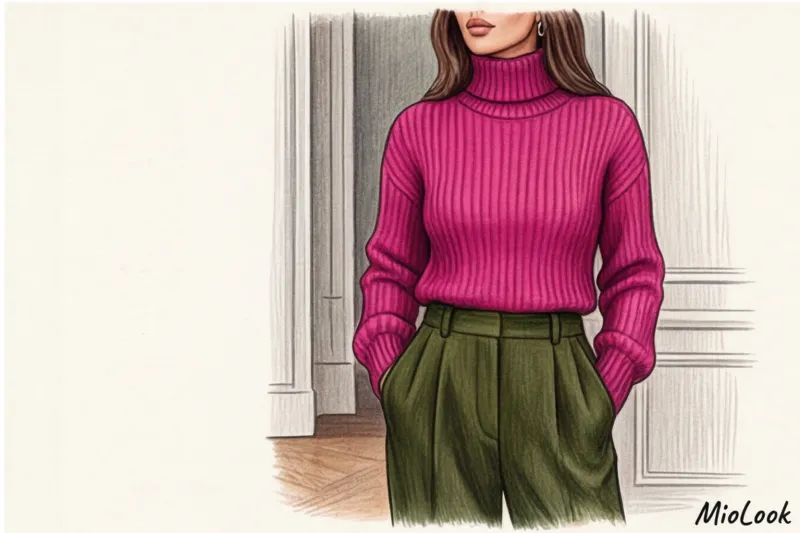
Fuchsia as a Statement: Rules for Taming the Bold Color
Technically, fuchsia differs from classic pink in its blue undertone and extreme saturation. It's a statement color. It physiologically causes the pupil to dilate, capturing 100% of everyone's attention.
A year ago, a client, a top manager at an IT company, approached me about presenting at a specialized conference. Female speakers there typically blend into a gray mass of beige and navy blue jackets. I suggested she wear a tailored graphite suit with a masculine cut, and underneath it, an electric fuchsia turtleneck made of fine merino wool. The result? She was the center of attention in the event photos, and, according to her, the audience never once looked at their smartphones. The fuchsia in the portrait area was like a magnet.
The color wheel in action: fuchsia + emerald and fuchsia + mustard
If you're ready for street style-level experiments, try complex color schemes:
- Complementary contrast: Fuchsia + Emerald (or pine green). These colors lie on opposite sides of the color wheel. Green's natural coolness balances the aggressiveness of fuchsia. Example: a green coat from COS over a magenta dress.
- Warm-cold dynamics: Fuchsia + Mustard (ocher). A bold combination for creative industries. The cool blue undertone of fuchsia contrasts luxuriously with the warm, earthy mustard. Perfect for fall capsule collections.
Limitation: This rule does NOT apply if both items have a glossy sheen. If you're pairing such vibrant colors, the fabrics should be strictly matte.
How to choose the perfect pink color for your skin tone
There's no woman who doesn't suit pink. There are women who haven't found their perfect temperature and contrast.
Warm skin types (Spring, Autumn) with golden or peachy undertones should avoid icy Barbie fuchsia—it will make your face look sallow and highlight under-eye circles. Your ideal shades are salmon, peach, and coral pink. Cool skin types (Summer, Winter) with olive or porcelain undertones should choose colors with added blue pigment: ash rose, icy pink, fuchsia, and magenta.
Professional stylist life hack: 10-second test.
Take a plain sheet of white office paper and place it on your bare face in daylight, then place a pink item on the other side. If the pink makes your face appear fresh and your contours are lifted, this is the shade for you. If redness or pigmentation becomes prominent, or your face appears tired, remove this color immediately. Read more about how these mechanisms work in our article about business wardrobe according to color type.
Pink in a Business Wardrobe: An Expert's Guide
Is pink acceptable in a formal office? McKinsey's 2024–2025 fashion market report confirms the trend toward "emotional tailoring." Sales of colored pantsuits among female executives have increased by 45%.
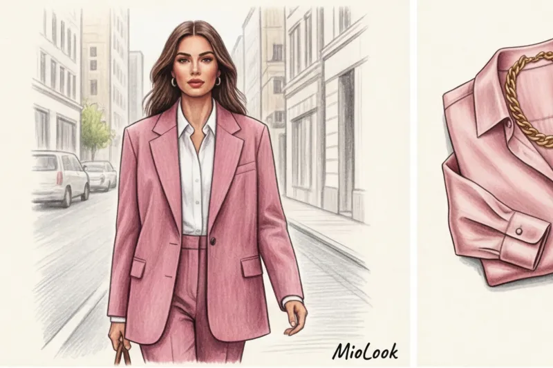
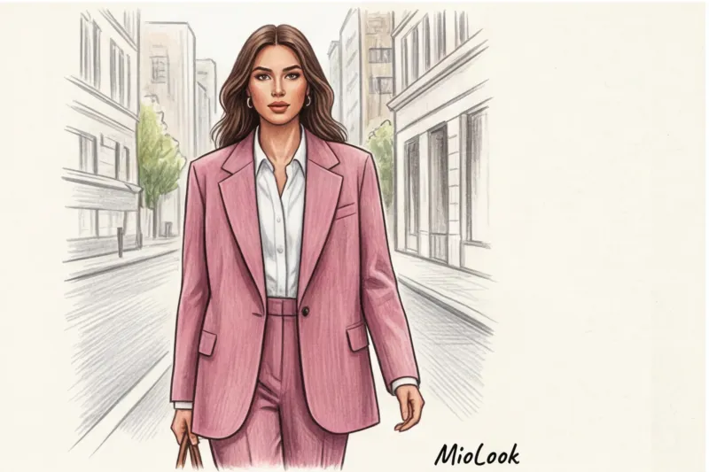
That same lawyer client from the beginning of our article ultimately trusted me and bought the perfect three-piece suit (jacket, vest, and straight trousers) in a dusty rose shade from Massimo Dutti. Three months later, she wrote to me that she closed two of her most difficult deals of the year in this very suit. The muted pink color relieved the unnecessary psychological tension at the negotiating table, put her opponents at ease, and, thanks to its impeccable, rigorous, architectural cut, never diminished her authority.
If your dress code (for example, in the banking industry) absolutely does not accept colored suits, introduce fuchsia in microdoses: a silk square scarf on the handle of a bag, the lining of a formal black or gray jacket, magenta pumps with a gray tweed suit.

Your perfect look starts here
Join thousands of users who look flawless every day with MioLook.
Start for freeChecklist: 5 Mistakes That Cheapen Your Pink Look
During regular shopping trips, I constantly find myself correcting the same flaws. Here are 5 things that instantly ruin the status of a pink look:
- Thin, shiny polyester. Pink looks cheap 90% of the time on translucent, static-prone fabrics. Choose heavyweight cotton (180 g/m² and above), viscose with elastane, thick wool, or natural silk.
- An abundance of infantile details. Forget ruffles, flounces, bows, rhinestones. Pink is a powerful embellishment and accent in its own right. The more complex the color, the more laconic and formal the cut should be.
- Incorrect fittings. Cheap yellow, samovar gold looks disastrous against a cool pink hue. Cool fuchsia and ash rose prefer silver, platinum, or aged bronze hardware.
- "Dirty" temperature mixing. Never wear warm peachy pink and cool magenta in the same outfit. They will overpower each other, creating visual noise.
- Too tight. This is my favorite rule: pink loves air. A fuchsia sheath dress harks back to the 2000s. The same color, worn with an oversized jacket or a loose blouse, conveys modern luxury.
Pink is an uncompromising test of your taste. It doesn't forgive careless fabric choices or lazy pairings with black, but generously rewards those who aren't afraid to put some thought into their wardrobe. Tomorrow morning, when getting ready for the office or a meeting, try swapping out your usual white shirt for a structured blouse in dusty rose or graphite gray. You'll be surprised how much it changes not only the reactions of others but also your own posture.


