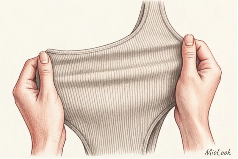
Over my 12 years as a stylist, I've seen this gesture hundreds of times: a client picks up a stunning scarlet blouse from a hanger, holds it up in front of the mirror, and then hands it back with a heavy sigh. "It's too bright," "It's too much of me," "I look like a fire engine"—the same excuses are heard over and over again. The fear of the most vibrant shade in the palette is completely understandable. We're accustomed to perceiving color as a flat image from Itten's basic circle, where we're taught the strict mathematics of contrasts.
We discussed this outdated approach in more detail in our a complete guide to the perfect color combinations in clothing Spoiler: the old rules no longer apply. Up to 90% of first impressions are indeed based on color, but today the perfect pairing for a bold accent isn't just the opposite sector of the color wheel. In this article, we'll explore... What color goes with red in clothing? through the prism of textile chemistry, fabric texture and the psychology of perception.
The Anatomy of Red: Why One Shade Looks Expensive and Another Cheap
Red is the only color in the optical spectrum that elicits a measurable physiological response. A 2010 study by Professor Andrew Elliott of the University of Rochester demonstrated that this hue is subconsciously associated with high status, dominance, and financial well-being. However, this psychological trick only works under one condition: if the color looks expensive.
The main problem with modern mass-market fashion is its physical inability to produce "expensive" red. According to recent reports on sustainable fashion (specifically, the Changing Markets Foundation's 2023 data), fast-fashion manufacturers use harsh synthetic azo dyes to dye cheap synthetics. These are highly toxic to the environment and, importantly for us as consumers, are unstable on man-made fibers.
Red pigment can't penetrate deep into the fiber structure of polyester or acrylic. It remains on the surface, creating a flat, jarring neon effect. Furthermore, this dye washes out and loses its original appearance 30–40% faster than pigment on natural wool or organic cotton. This is why a $20 red acrylic jumper will take on a dull, faded appearance after just three washes.
Pigment Secrets: How to Recognize High-Quality Coloring
To determine whether a garment is high-quality, examine it at an angle under store lighting. The fine pigment on natural fibers (cashmere, thick silk, linen) always has visual depth. The color seems to glow from within because the natural hair scales or plant fibers absorb the dye multidimensionally.
If an item has a cheap, plasticky sheen (especially around the seams), it's a bad synthetic. Leave it on the hanger. Invest in one quality piece made of a blended or natural fabric—it will last for years, retaining that same status energy Professor Elliott spoke of.
Your perfect look starts here
Join thousands of users who look flawless every day with MioLook. Its smart algorithm will help you integrate complex colors into your wardrobe.
Start for freeWhat to wear with red: new color rules
Modern styling has long since moved away from the mechanical selection of tones to the creation of an "emotional architecture" of an image. In this architecture, red is always the star. Your task is not to try to drown it out with other bright colors, but to create the right, noble scene for it. The background you choose to complement your accent piece is what controls your interlocutor's attention.
Noble duets: chocolate, camel and deep khaki
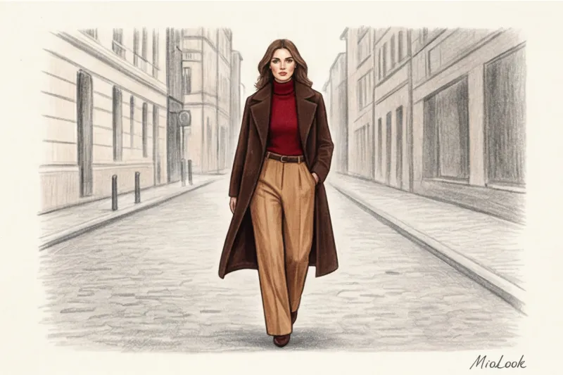
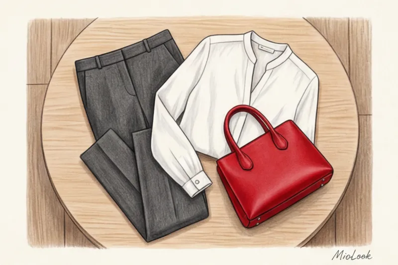
Natural, earthy tones are the perfect companions for vibrant pigment. They literally "ground" it, toning down the aggressiveness while maintaining warmth. Swap your usual blue jeans for camel-colored trousers paired with a red sweater, and you'll instantly achieve a look of "quiet luxury."
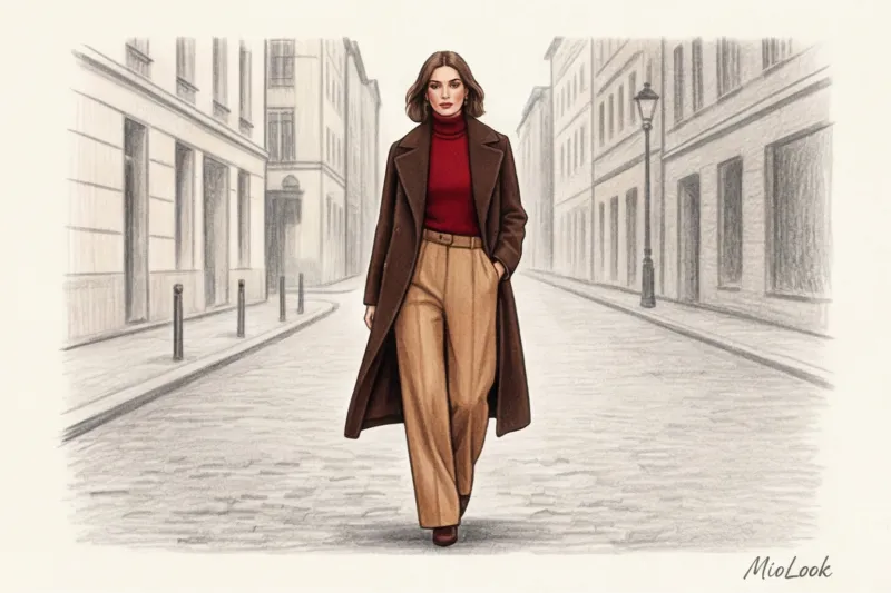
Dark chocolate is a major stylistic trend of recent seasons. It possesses the same visual heaviness as black, but without its harshness. The pairing of a dark brown leather trench coat and a burgundy turtleneck looks incredibly sophisticated.
Unobvious mixes: pastels and complex cool tones
Want to look like a fashion editor? Play with radical temperature contrasts. Pair a hot, pulsating scarlet with an icy baby blue or dusty pink. A ruby silk top peeking out from under a voluminous graphite-gray jacket is the perfect balance between understatement and understated sensuality.
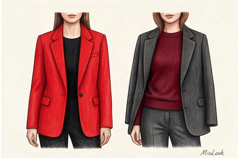
The Myth of the "Fatal Combination": Why Red and Black No Longer Works
Forget Stendhal's novel. In the modern wardrobe, the classic "red and black" combination is hopelessly outdated. It's the ultimate styling cliché from the 2000s, and it sets your look back twenty years.
What's the problem with this duet? Firstly, the excessive contrast mercilessly cuts the silhouette in half. Secondly, it creates unnecessary visual strain—the other person's eye doesn't know where to focus. But the worst thing is the persistent association with the uniforms of staff: promoters, casino croupiers, or flight attendants of certain airlines.
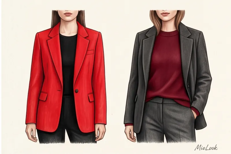
One of my clients, a top manager at an IT corporation, complained that she was perceived as too aggressive during negotiations. Her wardrobe was dominated by black suits and red blouses. We conducted a simple experiment: we replaced the jet-black trousers with a pair in the color of wet asphalt (dark anthracite). Reducing the contrast by just half a tone instantly made the look more luxurious, deeper, and more inviting. Black absorbs light, while the gray melange diffuses it, softening the harshness of the red accent.
Fair limitation: The only situation where black and red still have a right to exist is a strict evening dress code (Black Tie). There, the textures of heavy velvet, lace, or glossy satin justify the high drama of this combination.
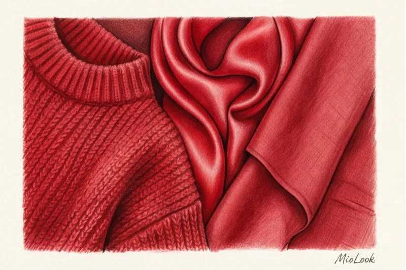
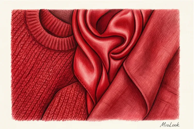
Texture is everything: how fabric changes the perception of red
The main secret of textile experts is this: the texture of the fabric changes color more than adding white or black pigment. The physics of the process are simple—it all depends on how the weave of the threads reflects light.
Glossy surfaces (satin, smooth leather, sequins, silk) act like mirrors. They reflect maximum light, enhancing the brightness and drama of red. You'll be the center of attention in such a piece, but it requires a perfect cut and the right occasion. Matte textures (heavy cotton, cashmere, suede, linen) act like sponges, absorbing light. Red on a suede jacket will always appear more muted, calm, and cozy than the same shade on a leather coat.
A client once confided in me that she was terrified of red because of its "garish" nature. We addressed her fear by choosing a matte red linen jacket. The loose, natural texture of the linen absorbed the excess color, transforming the aggressive hue into a soft, almost terracotta blush. The golden rule of balance: If you choose a piercingly bright color, let the texture of the item be as calm and matte as possible.
Try MioLook for free
Unsure about which texture to choose? Our smart AI stylist will find the perfect look for you, taking into account your specific hair type.
Start for freeRed in a Business Wardrobe: The 15 Percent Rule
Is scarlet appropriate for a boardroom or investor meeting? Of course, yes. But here, the rule used by top officials' stylists comes into play: dosage.
Unless you're Anna Wintour, wearing an all-red suit in the office can be perceived as insubordination or an attempt to exert undue pressure on colleagues. To harness the leadership power of this color without risking your reputation, apply the 15 percent rule.
Keep red to no more than 15% of your outfit. This could be a structured ruby-colored leather bag against a monochrome beige suit. It could be suede pumps, a silk scarf around your neck, or even just red piping on the inside lapel of your jacket. You've seemingly adhered to the strict dress code, but you've also clearly marked your territory.
A practical checklist: how to test red clothing before buying
Buying a brightly colored item always poses a risk to the rest of your wardrobe when you wash it. Over the years, I've developed a strict checklist that I run right in the fitting room. Follow these steps to avoid regretting your purchase:
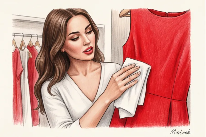
- White handkerchief test. My favorite insider trick: Take a regular white cotton handkerchief (or a dry paper napkin). Rub the fabric of a red garment firmly from the inside in an inconspicuous area. If a pink or red stain remains on the handkerchief, return the garment to the shelf immediately. The dye is unstable and will ruin your light-colored garments and cause them to fade in the first wash.
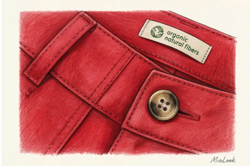
- Checking the seams. Red is a color that doesn't forgive carelessness. If you see threads on the seams that are even a half-tone lighter or darker than the main fabric, or if they have a cheap nylon sheen, this is a clear sign of production cutbacks. High-quality brands always order threads that match the same tone.
- Change of lighting. Never make a decision under yellow fitting room lights. Go out into the showroom, move to a window, or a source of natural light. Cheap reds take on a dirty orange or plasticky crimson undertone in the light.
- Exploring the shortcut. Look for at least 70% natural or high-quality synthetic fibers (wool, cotton, silk, viscose, lyocell). These are the ones that ensure the pigment ages gracefully.
Remember: the perfect pairing for red isn't a mathematically calculated shade from a colorist's chart. It's the quality of the fabric itself, the deep, natural background, and your own confidence. Leave rigid black boundaries behind and indulge in complex, intelligent combinations.