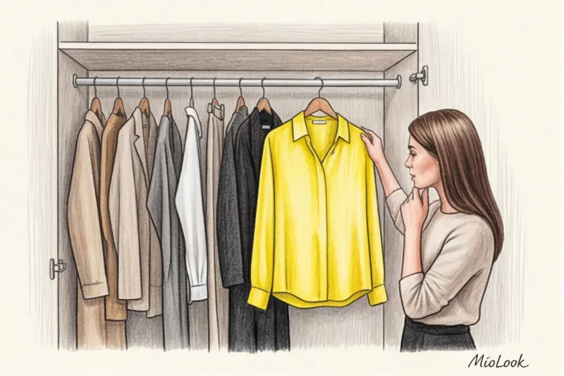
How many times have you pulled a stunning lemon-colored jumper off the hanger, held it up to your face in the fitting room mirror, and hung it back up with a sigh, muttering, "No, it makes me green"? If this sounds familiar, you're in the majority. Over 14 years of working as a personal stylist, I've compiled my own dismal statistics: about 80% of women instinctively avoid yellow and orange.
We happily buy our tenth beige sweater or yet another pair of black pants, but we're terrified of sun-kissed shades. We think yellow will mercilessly highlight fatigue, while orange will instantly cheapen our look or make it inappropriately garish.
But the truth is, the popular myth about yellow being contraindicated for pale skin and cool undertones is simply a consequence of poor understanding of fabric texture and the "distance from the face" rule. Any woman can wear these complex colors, turning them into a tool for managing her status and energy. Let's figure out exactly how.
The Psychology of the Sun: Why We're Afraid of Yellow and Orange (and in Vain)
Rejecting bright colors is often linked to our internal resources. In moments of chronic fatigue or stress, we subconsciously retreat into a "safe" cocoon of gray, black, and dark blue. Yellow and orange are energy-giving colors; they require energy to wear, but they also return that energy.
According to the Institute for Color Research, others make subconscious judgments about us within the first 90 seconds of meeting us, and 62% to 90% of these judgments are based solely on the color of our clothing. We've covered the mechanisms behind this influence in more detail in our a complete guide to the perfect color combinations in clothing When you wear muted mustard or noble saffron, you convey confidence, openness, and intellectual courage to others.
In recent seasons, these shades have ceased to be the exclusive preserve of beachwear or sportswear. The right yellow has become a new hallmark of the "quiet luxury" aesthetic. The secret lies not in the color itself, but in the fabric it's applied to.
Yellow in clothing: combinations that look "expensive"
The style math of the 2000s, when we painstakingly matched shoes to our yellow bags, is hopelessly outdated. Today, such deliberate premeditation betrays a lack of confidence. True chic is a touch of casualness and the ability to incorporate a complex color into an everyday look.
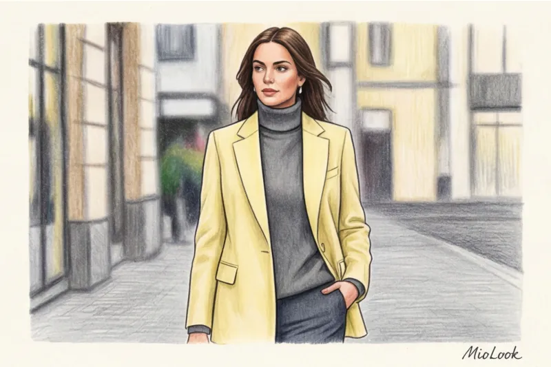
The main rule that distinguishes a professional stylist from an amateur: the texture of the fabric changes temperature and color status Cheap, glossy satin or thin polyester will turn yellow into a canary-yellow animator's suit. The same shade on matte Mongolian cashmere, thick linen, or heavy mulberry silk will look like butter or expensive saffron.
"Quiet Luxury": Yellow + Complex Primary Shades
If you want to look classy, avoid pairing stark yellow with crisp white or jet black. Such stark contrasts will overpower the look. Instead, try complex pairings:
- Pale lemon + graphite grey. It's the perfect, softer alternative to the classic black-and-white office dress code. The gray grounds the lightheartedness of the lemon, while the yellow keeps the gray from looking dull.
- Mustard + camel shades or beige. A luxurious monochrome stretch for the warm season. Imagine sand-colored wide-leg linen pants and a dark mustard top.
- Creamy yellow + deep navy. A status contrast adored by members of the British royal family and adherents of old money style.
Bold Contrasts: How to Avoid Looking Like a Traffic Light
The desire to add more color is commendable, but it's easy to slip into a "children's matinee" effect. If you're pairing yellow with emerald, wine, or sapphire, always use rule of dominance.
The ratio should be 80/20 or 70/30. One color acts as the canvas, the other as the accent. For example: a deep burgundy pantsuit (80%) and a yellow silk top peeking out from under the jacket (20%). If you split the colors 50/50, the other person's eye won't be able to focus, and the look will appear overloaded.
Your perfect look starts here
Join thousands of users who look flawless every day. MioLook, the smart AI stylist, will help you find the perfect color combinations for your clothes.
Start for freeOrange is the new black: how to wear the most energetic color
Orange has a unique property: it visually reduces the distance between people. If yellow is about intellect and distance, then orange is about empathy, warmth, and communication.
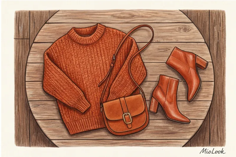
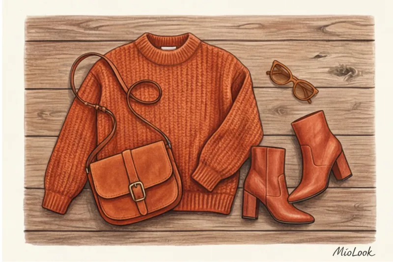
The gradation of this color is enormous. You don't have to wear the color of a traffic cone. Consider complex derivatives: terracotta, burnt caramel, rust, persimmon, muted tangerine.
Italian fashionistas have a foolproof secret for working with the orange-red spectrum: pairing it with light blue denim. The rough texture of vintage light blue jeans perfectly balances the aggressiveness of the orange. Add suede shoes or a bag, and you've got a look straight out of a Vogue cover.
A client, a financial director, once approached me. Her wardrobe consisted exclusively of gray and dark blue suits. She complained that her subordinates were intimidated by her, and that she appeared too stern at informal meetings. We didn't change the basics. We simply added a single, oversized burnt terracotta tote bag and a silk scarf. This single "energy center" in an otherwise minimalist look instantly changed the way people read her mood. She began to appear more approachable without losing any of her authority.
The Myth of Color Types: How to Wear Yellow and Orange If They Don't Suit You
Now let's break the cardinal rule of old-school styling: "If you have a cool skin tone, you absolutely can't wear warm orange." This lie has deprived thousands of women of beautiful looks.
Your skin doesn't "see" the color of your skirt, pants, or shoes. Color reflections, which can highlight paleness or dark circles under the eyes, only work in the so-called portrait zone (from the chest line to the crown of the head).
If you're in love with color but worried about its impact on your face, use two proven techniques:
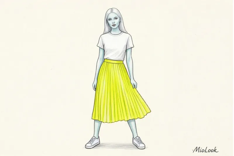
- Safe zone technique. Keep the tricky color down. A neon yellow pleated skirt, terracotta palazzo shoes, or mustard pumps won't cast any shadows on your face. Wear your perfect, tried-and-true base color up top.
- Using the "buffer zone". You bought an orange sweater, and it really makes your face look tired. Create a buffer! Wear a white shirt underneath the sweater, using the stiff collar to separate your face from the colored fabric. The white will illuminate your face, act as a lightbox for a photographer, and completely neutralize the impact of the orange. A deep V-neckline also works as a great buffer—the more skin exposed between the color of the shirt and your face, the safer it is.
An important clarification and the only fair limitation: If you haven't slept for two days and have pronounced dark circles under your eyes, a lemon-yellow turtleneck will actually make things worse. It's the physics of light. On days like these, we simply remove any bright pigments from our faces.
Ready to get started?
Try a free plan—no commitments required. Create your perfect capsule wardrobe and plan your looks for the week ahead with the smart MioLook app.
Start for freeYellow and Orange in a Business Wardrobe: A Guide to Use
Integrating bright colors into a business environment is always a tricky proposition. Research into the psychology of color shows that too much orange in the corporate sector can be perceived as frivolous. But when used sparingly, the results are impressive.
Data from the Pantone Color Institute (2024 report) indicates that shades of yellow are perceived in professional environments as markers of innovative thinking. It's the color of people who aren't afraid to propose new solutions.
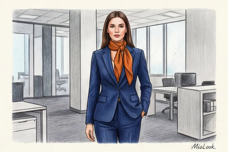
I had a revealing case with a lawyer client. Anna worked in mergers and acquisitions, where strict business formality (dark suits, white shirts) reigns supreme. During difficult negotiations, she needed to tone down her aggression slightly to win over her opponents. We swapped her usual white shirt for a crisp silk blouse in a dark mustard shade, worn under a navy blue jacket. This small detail (the warm texture and the soft yet sophisticated color) visually reduced the distance. As Anna later admitted, the negotiations proceeded much more constructively.
How to adapt these colors for the office if you choose a business wardrobe according to your color type:
- Business Formal (strict dress code): Color is allowed only in micro-accessories. A silk bob with an orange print, the dial of a watch on a terracotta strap peeking out from under the cuff, or even the mustard silk lining of your formal gray jacket (which only you and those you allow to notice it will see).
- Smart Casual (Free Friday): Here, you can confidently introduce 30-40% color. A terracotta cashmere jumper over a light blue shirt or mustard pleated trousers paired with a white oversized sweater.
Orange (even in the form of a phone case or a diary) is a magnet at networking events and business conferences. Statistics based on color psychology show that warm shades in the portrait area increase the likelihood that a stranger will speak to you first by 40%.
A stylist's checklist: how to safely incorporate sunny colors into your base
If you've only worn gray and black your whole life, don't buy a yellow pantsuit tomorrow. Take it gradually, expanding your comfort zone. Here's my step-by-step formula for incorporating complex colors.
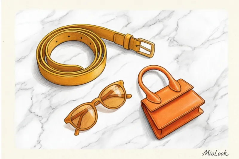
- Level 1 (Beginner): 10% color. Build your look in familiar neutral tones, but add one bright detail. It could be a saffron crossbody bag, a terracotta belt, or yellow pumps. You'll get used to seeing the color on yourself, but it won't overwhelm you.
- Level 2 (Advanced): 30% color. Color becomes a full-fledged part of the ensemble. A yellow blouse under a tailored blazer, an orange chunky knit cardigan with basic jeans, or an ochre midi skirt paired with a black turtleneck.
- Level 3 (For the Brave): 60-100% color. You're ready to be the center of attention. A monochrome egg-yolk midi dress, a terracotta pantsuit, or a mustard straight-cut coat. The key at this level is a flawless fit and an expensive, high-quality matte fabric (no shine!).
The main advice I give to all my clients is to stop listening to the rigid color rules of decades ago. If a lemon sweater makes you smile at your reflection, buy it, even if an online test says you're "deep autumn." A smart approach to textures, the use of buffer zones, and balanced proportions will allow you to incorporate absolutely any shade into your wardrobe. Fashion is, first and foremost, a tool for joy, and what could be more joyful than carrying your own personal sun?


