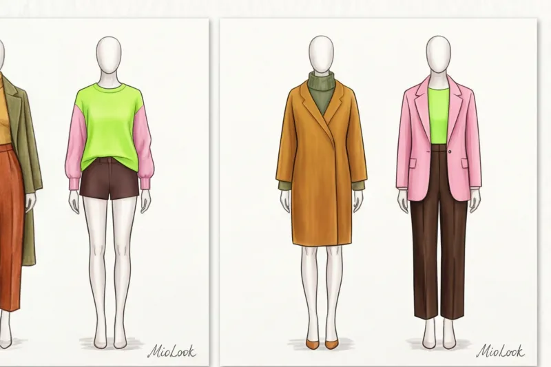
In my 14 years as a personal stylist, I've seen hundreds of wardrobes, but one instance has stuck in my memory forever. A new client came to me with the request, "I want to look striking, but classy." She immediately declared that she strictly adhered to the rule of three colors in clothing , but for some reason, colleagues call her style "traffic light." I looked at her look: neon fuchsia (pants), bright mustard (sweater), and rich mint (coat). Technically, exactly three colors. In reality, it's a visual disaster.
Many people think this rule is a rigid mathematical law that guarantees impeccable taste. In reality, it's just training wheels for those just beginning to work with a palette. We've already discussed the basic principles of coloristics in more detail in our a complete guide to the perfect color combinations in clothing And today I want to show you the flip side of this rule: why neutral shades are "air," how fabric texture replaces color, and when this formula can (and should) be broken with impunity.
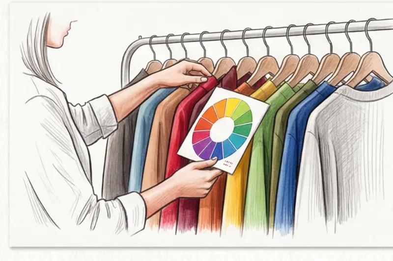
What is the "three-color rule" in clothing and why does it still work?
Did you know that we evaluate a person in 90 seconds? According to reports Institute for Color Research , 62% to 90% of that first impression is based solely on color. Our brains need clear visual anchors to process information without being overwhelmed.
Historically, the three-color rule came into fashion from architecture and interior design (the famous Bauhaus proportion). The essence lies in the neuropsychology of perception: the human eye comfortably reads an image when it contains background, figure and detail If there are more colors and they are used in equal proportions, the eye begins to dart around, not knowing where to focus. Visual noise occurs.
The 60-30-10 Formula: The Mathematics of the Ideal Image
For this rule to work, colors must not be mixed in equal proportions. The gold standard for visual balance is the 60/30/10 formula:
- 60% - main color (anchor). This is your base. Typically, it's outerwear, a suit, a long dress, or trousers and a sweater in the same color. This color sets the overall mood.
- 30% - additional color. It supports the base, creating contrast or nuance. This could be a shirt under a jacket, a turtleneck, shoes and a bag (if they're chunky), or a skirt.
- 10% - accent. That icing on the cake. A scarf, bright lipstick, a statement micro-bag, socks, or glasses frames.
Base, Accent, and Nuance: How to Distribute Roles in a Palette
Johannes Itten's color theory is the bible of any stylist. But how do you apply the color wheel to your closet? In my experience, the best way is to start assembling an outfit with the largest element (60%), choosing it based on your contrast level and natural coloring.
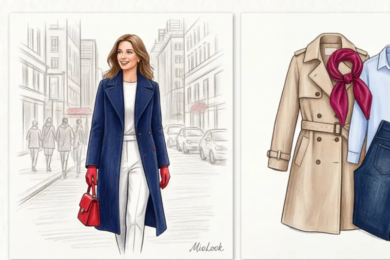
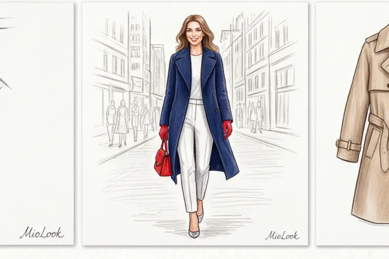
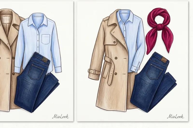
One of my clients is a top manager at an IT company with a smart casual dress code. She wanted to break away from the boring black-and-white office norm while maintaining an air of authority. We put together a business capsule collection following the 60-30-10 rule. I chose a deep navy blue (Navy) for 60%—a perfectly tailored wool-blend pantsuit. For 30%, we added a crisp white shirt made of heavy cotton. And for the remaining 10%, we dedicated it to accents—loafers and a belt in a ripe cherry (burgundy) hue.
See how it works: swap out burgundy loafers for white sneakers (eliminating the accent color altogether) and the look becomes relaxed and sporty. Add leopard-print pumps and it becomes bolder. Just 10% of the area can make a 100% impact.
The biggest mistake beginners make: why 3 colors sometimes look like 10
Let's return to my "traffic light" client. Why did her image fall apart, even though she was mathematically correct? Because she didn't take into account the characteristics of color. Color isn't just "red" or "green." It has three dimensions: temperature (warm/cool), value (dark/light), and saturation (pure/muted).
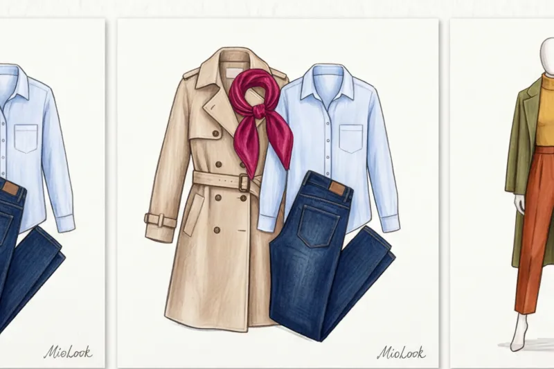
The biggest mistake is mixing pure, bold shades (neon) with complex, muted pastels in the same look. For example, a neon pink top and dusty sagebrush pants would clash because they're in different weight classes. To calm that client's look, we simply balanced the saturation: swapped fuchsia for dusty rose, neon mint for deep pine, and mustard for soft camel. This left us with three colors, but the look began to look expensive.
Temperature and Saturation: The Invisible Enemies of Style
Basic rule for beginners: combine warm shades with warm ones, and cool ones with cool ones A warm tomato red will scream against a cool icy blue.
When does this rule NOT work? In advanced styling, if you already have a sense of color, deliberate temperature contrast is a powerful tool. For example, a combination of cool graphite gray and warm terracotta looks incredibly stylish, but only if they match in depth (both are dark and rich).
Your perfect look starts here
Join thousands of users who look flawless every day with MioLook.
Start for freeAre neutrals "colors" or not?
This is the biggest myth that keeps many people from experimenting. Black, white, and various shades of gray are achromatic. In professional styling, we often we don't count them in the general limit of three colors.
Achromatic shades and basic beige act like "air" or canvas. Have you ever noticed how street style stars wear complex, multi-colored looks without it being too jarring? Their secret is a neutral buffer.
"A white T-shirt or a gray coat doesn't steal the show, it creates a break for the eye between the active color blocks."
Can you wear red pants, a green jacket, a blue bag (now three colors), and a white shirt? Yes! The white color will simply separate the contrasting blocks without ruining the harmony. That's why MioLook When digitizing your wardrobe, we always recommend having a sufficient number of basic achromatic pieces—they tie together any, even the wildest, accents.
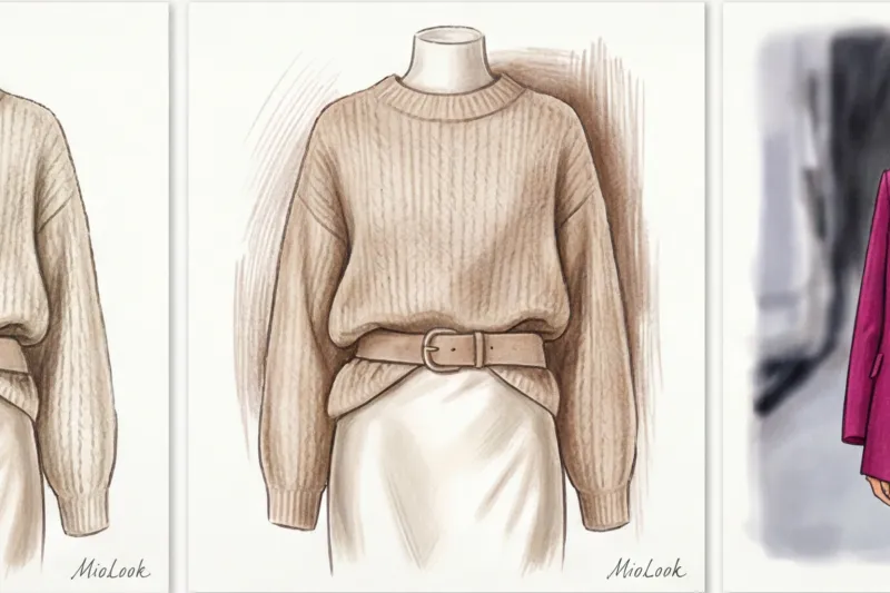
Fabric texture as a fourth color: the secret to luxurious looks
This is my favorite counterintuitive insight that changes everything. If you're afraid of bright colors and prefer to wear only beige or black, your look can look flat. How can you fix this? Use texture as color.
The same shade on different materials is perceived by the eye as three different colors. Why? Because of the physics of light:
- Matte fabrics (wool, cashmere, heavy cotton, suede) absorb light. Colors appear deeper, darker, and more subdued.
- Glossy fabrics (silk, satin, smooth leather, viscose) reflect light. The color becomes bright, shimmering, and dynamic.
- Embossed fabrics (velvet, boucle, chunky knit) create micro-shadows, giving the color a complex, uneven undertone.
If you wear sleek black polyester pants and a sleek black turtleneck, you'll look like a flat blob. But pair them with matte black wool pants, a flowing black silk top (19 momme count or higher), and layer a textured black bouclé jacket with a leather belt. You've used exactly one color, but using four different textures, you've created an "emotional architecture" for the look. It's a million-dollar piece.
When to break the three-color rule in clothing
As I mentioned before, the three-color rule is just a basic guide. Once you've mastered the 60-30-10 proportions, it's time to break out the training wheels.
1. Total look and monochrome (Old Money effect).
Instead of three different colors, you take one color and stretch it into 5-7 shades of varying lightness. For example, from baked milk to rich chocolate. This visually elongates the silhouette (creates a vertical line) and always looks classy.
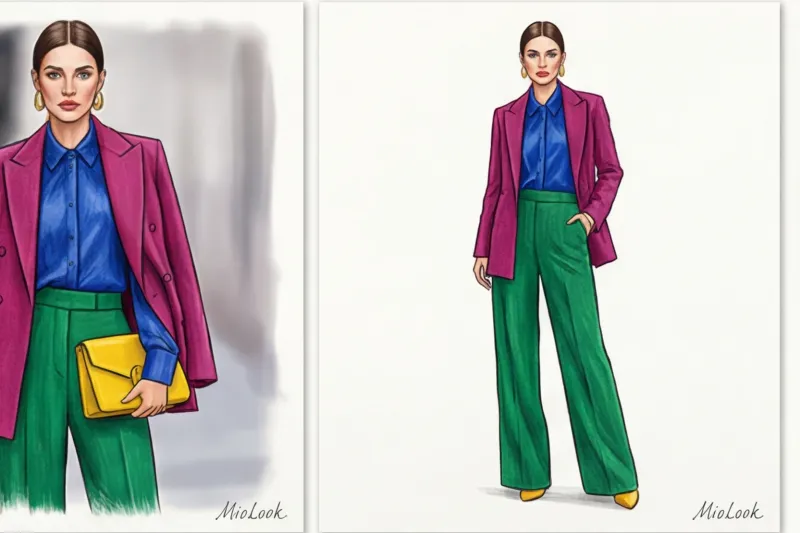
2. Color blocking.
A style in which you boldly combine four or more local colors. The secret to success here is to use shades that are adjacent on the Itten color wheel (analogous combinations) or equidistant from each other. And the main rule of color blocking: the cut of clothes should be as simple and architectural as possible, without ruffles or complex embellishments. Color itself is a design.
3. Prints and patterns.
How do you count colors if you're wearing a dress with a small floral pattern, which already has five shades? It's simple. Squint. The color that blends into the main color (usually the background of the dress) counts as 60%. The brightest flower in the print counts as 30%. And match your shoes and bag to the most subtle, small element of the pattern—that's your 10%.
Stylist Checklist: Create a Coherent Look in 5 Minutes
To make sure this theory doesn't just remain text, here's a step-by-step algorithm I give my clients after a wardrobe review. Stand in front of a mirror and follow these steps:
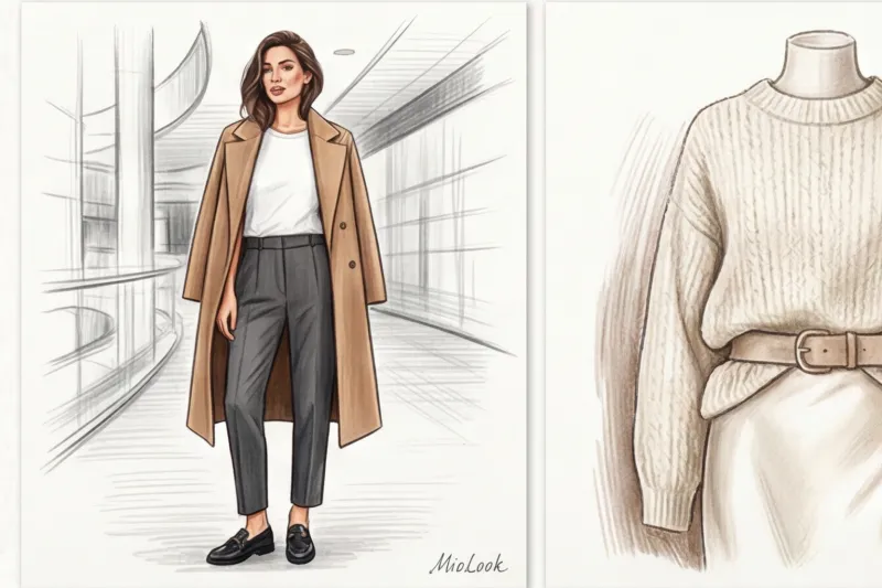
- Step 1: Selecting an “anchor” (60%). Start with the largest item. What's your mood today? Dressy (let's take a gray suit) or relaxed (let's take blue jeans and a voluminous cardigan)?
- Step 2: Selecting the base (30%). Calm or enhance the anchor. Pair a dusty pink blouse with a gray suit (adds softness).
- Step 3: Choosing shoes. Shoes can either continue the basics (gray ankle boots will lengthen your legs) or become an accent.
- Step 4: Accent Integration (10%). Add a touch of contrast. A burgundy structured bag or emerald earrings.
- Step 5: Check for temperature and saturation. Squint in front of the mirror. Is anything standing out from the rest of your outfit? If the pink blouse is too neon against the calm gray suit, try a muted shade instead.
The three-color rule isn't about restrictions. It's about managing attention. Once you understand that colors are simply tools for creating focus, you'll stop being afraid of brightly colored items in the store. Start small: add just 10% of a vibrant accent to your usual black-and-white base, and you'll be amazed at how your reflection in the mirror and the reactions of others change.


