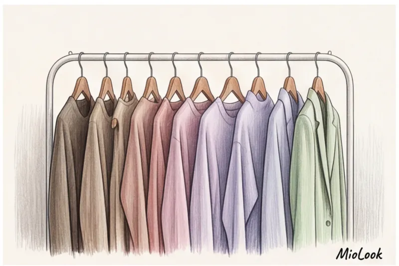
I tracked my look statistics for exactly six months and came to a paradoxical conclusion: 80% of the time, I wore things that could be described as "safe." Deep black, graphite, classic navy. And when I began analyzing my clients' wardrobes, the pattern repeated itself with alarming accuracy. We all hide behind a dark base because we're afraid of color. We're especially afraid of looking "like a childish marshmallow."
Today I propose a complete change of perspective. We will analyze pastel colors in clothing Not as a seasonal whim for a spring stroll, but as a highly effective tool for creating expensive, functional, and prestigious looks. We've already discussed the basic principles of color in more detail in our a complete guide to shade combinations in the capsule , but it is the bleached colors that require special, almost mathematical precision.
Why pastels are the new neutrals in clothing
If you open your closet and feel a slight sense of melancholy, know this: you're not alone. A 2024 global study by trending agency WGSN revealed an interesting pattern: the abundance of black, dark gray, and brown in everyday wardrobes causes so-called "visual stress" in city dwellers. Consumers are intuitively drawn to calming shades like digital lavender (digital lavender) or sage green (sage) to reduce anxiety, but they have no idea how to integrate them into their lives.
The Pantone Color Institute has gone further, officially establishing the concept of "New Neutrals." The idea is to use rich pastel tones instead of the usual gray or white. A dusty blue shirt works just as well in a business look as a classic white one, but it looks much more sophisticated. And a pistachio trench coat or jacket easily replaces the tired khaki.
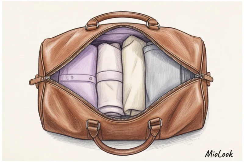
In a well-designed capsule collection, pastel acts as a "glue." It visually brightens dark winter pieces without creating the harsh, eye-catching contrast that snow-white does.
Your perfect look starts here
Join thousands of users who look flawless every day with MioLook. A smart algorithm will help you integrate new colors into your database.
Start for freeThe Anatomy of "Expensive" Pastels: How to Avoid the Childish Effect
The biggest mistake I see 9 out of 10 women making when buying light-colored clothes for the first time is choosing the wrong cut. They want to add a touch of delicacy and buy a pale pink dress made of flowing chiffon, with ruffles or flounces. The result? A "bridesmaid" look, completely inappropriate for everyday wear.
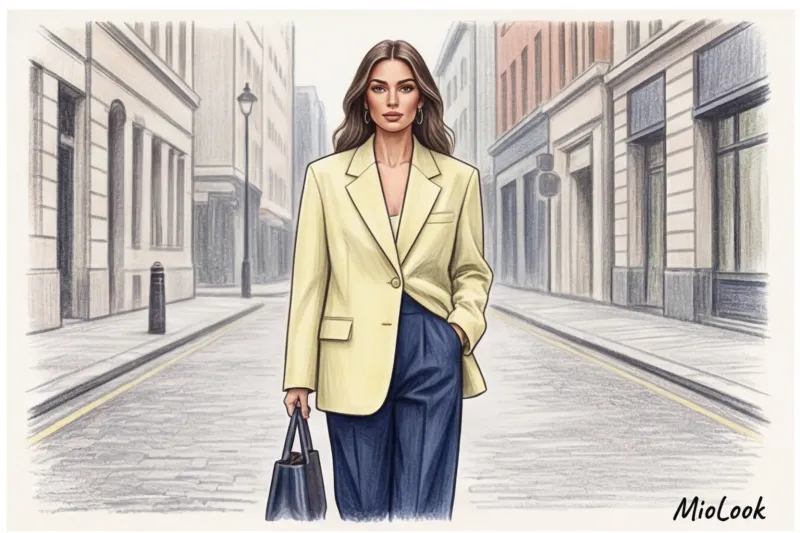
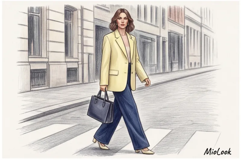
One of my clients, a top manager at an IT company, categorically refused to wear light colors for fear of being taken less seriously. The situation changed dramatically when we selected a pale pink pantsuit for her. But there was a catch: the suit had a rigid, masculine cut, exaggerated shoulders, and peak lapels. The severity of the shape completely offset the softness of the color, creating the image of a high-status expert rather than a sweet girl.
The stylist's golden rule: the more delicate and light the color, the more rigid, masculine, or architectural the shape of the product should be.
The Rule of Texture: Why Fabric Decides Everything
My personal shopping statistics are relentless: over 60% of pastel items in the mass-market segment look downright cheap. The reason lies not in the pigment itself, but in the physics of the fabric. Light shades lack shadows that could hide the material's imperfections.
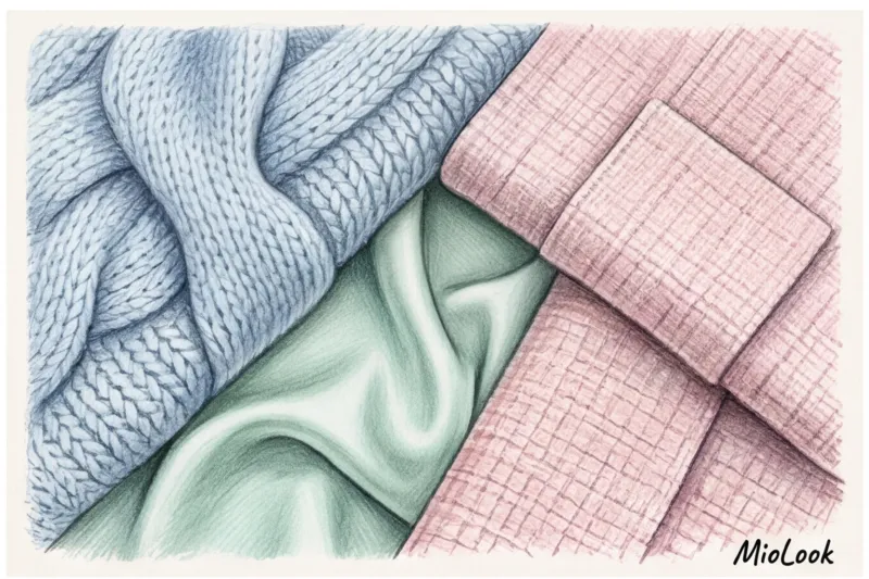
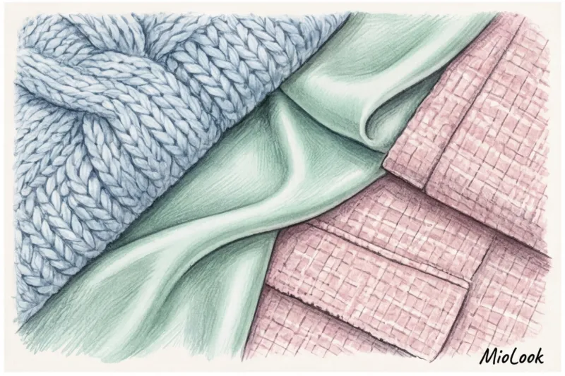
Thin, sheer knits or flimsy powder-colored viscose will instantly highlight the slightest imperfections and suggest a frugal lifestyle. Items that make pastel shades appear "grown-up" and expensive include heavyweight cotton (180 g/m² and above), textured leather, thick cashmere, tweed, and high-quality suiting wool.
Shade temperature and your color type
There's no such thing as someone who "can't wear pastels." There are people who haven't chosen their skin tone. If you have a warm undertone, your ideal allies are peaches, creams, and warm greens. If you have a cool undertone, look for icy blues, lavenders, and dusty pinks with gray undertones.
There is an important limitation here. When it does NOT work: If you're prone to redness (rosacea, rosacea), a cool pink or lilac shade in the portrait area will instantly highlight it. In such cases, it's best to keep pastels to the lower half of your figure—for example, by choosing pistachio-colored pants. We wrote more about this in the article about business wardrobe by color type.
4 Pastel Shade Combinations for a Smart Wardrobe
Over the years, I've developed formulas that cover 90% of my clients' color integration needs. It's simple math that eliminates the need for long mornings spent pondering in front of the mirror.
Formula 1: Pastel + Deep Dark Base (Status Contrast)
Forget the common myth that pastel colors should only be worn in spring and summer, paired exclusively with white or beige. This is an outdated stereotype.
Try "winter pastels"—integrating light accents into a dense, dark wardrobe. A dusty pink cashmere sweater looks incredibly elegant paired with marsala (deep burgundy) trousers. And a mint-colored shirt worn under a dark chocolate-colored jacket creates a complex, visually arresting depth. This kind of status contrast is far more effective than a simple pairing with white jeans.
Formula 2: Winter Pastel + Grey Melange
This is the perfect combo for everyday city wear. Cool pastel tones (ice blue, lavender, menthol) serve as a natural "freshener" for stark gray pieces.
Wear a lavender cashmere turtleneck with graphite wool palazzo pants. The gray will offset the lavender's overly romantic appeal, while the lavender will neutralize the graphite's somberness. It's a surefire office look.
Formula 3: Pastel Monochrome (Total Look)
The most striking, but also the most difficult technique. The main danger of pastel monochrome is the risk of looking like someone who stepped out in expensive pajamas.
A stylist's secret: for monochrome to work, you must juxtapose dramatically different textures of the same color in one look. For example: a smooth silk blouse + matte wool pleated trousers + a crisp leather belt. All elements are in the same icy menthol shade, but the different reflectivity of the materials creates a three-dimensional and architectural look.
Ready to get started?
Try the MioLook free plan—no commitments required. Create your first pastel looks with AI.
Start for freeIntegrating Pastels into Business Style: A Dress Code Without Boredom
For many corporate employees, stepping away from a black-and-white palette seems like a breach of discipline. But the line between smart casual and inappropriate frivolity runs not through color, but through cut.
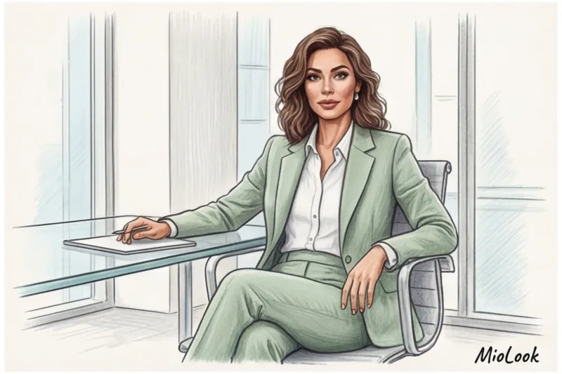
Pastel colors in business attire are a legitimate way to stand out while remaining within protocol. For female executives and lawyers whose colors are strictly regulated , I recommend starting with microdoses:
- Inner layer: Swap out your usual white blouse under a navy suit for an eggshell or pale pistachio shade.
- Scarves and accessories: A thin silk scarf with a dusty pink print can soften even the stiffest black jacket.
- Summer business season: A pastel suit made of a wool blend or heavy linen with viscose is the best investment for work in the warm season.
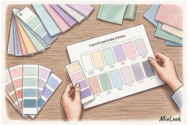
Checklist: 5 steps to the perfect pastel capsule with MioLook
My personal experiment: last fall, I decided to integrate mint and dusty pink into my formal wardrobe. To avoid impulse purchases, I used an app MioLook to digitize the database. The algorithm generated over 30 new combinations for me with existing dark items! Here's how you can replicate this experiment:
- Digitize the current database. Take photos of your essential bottoms (pants, skirts, jeans) and basic jackets. Upload them to your virtual closet.
- Conduct a color spot analysis. The app's algorithms will clearly show you a diagram of your palette. If it's 80% dark, you have the perfect canvas for integrating "winter pastels."
- Apply the Rule of 3 combinations. Never buy a pastel item unless you can create at least three looks with it from your existing collection right in the fitting room. The app's smart stylist can do this in seconds.
- Have a virtual fitting. Torn between a lavender and dusty blue jumper? Create collages with your gray trousers and see which contrast works best.
- Create a precise shopping list. Go to the store not for "some pretty blouse," but for a specific structured pale yellow jacket.
Summary: Taming Color Without Wasting Time
Working with complex shades isn't as daunting as it seems. If you start treating pastel colors not as cute decor but as a fully-fledged architectural element of your wardrobe, the results will amaze you. Sharp lines, dense textures, and bold combinations with a deep, dark base will instantly elevate your style to the realm of premium minimalism.
Take the first step today: open your closet, find your most understated navy or gray piece, and consider which grounded pastel shade could give it a new lease of life. Technology will take care of the tedious process of choosing options.


