"Isabella, I manage a department of forty men. If I show up to a board meeting in soft pink, no one will take me seriously," Anna, the CFO of a large IT company, told me during our first consultation. She was used to hiding behind dark blue suits, considering lighter shades a sign of weakness.
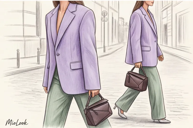
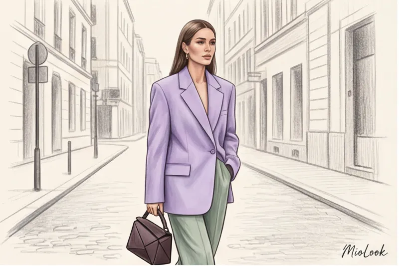
This is the most common misconception I've encountered in my 12 years as a personal stylist. We tend to associate washed-out colors with children's parties, spring dresses, and naive romanticism. But I suggested an experiment to Anna: we swapped her usual black jacket for a structured, oversized blazer in a cool lavender shade made of thick wool. The result? A month later, she admitted that her partners in difficult negotiations had become less aggressive, and her authority hadn't suffered at all—in fact, her look had become more prestigious and "expensive."
Literate pastel colors in clothing combination — is the art of impression management. We've already discussed the fundamental rules of coloristics in more detail in our a complete guide to the perfect color combinations in clothing Today, we'll go further and explore how to use "power pastels." We'll break away from outdated rules and learn how to create architectural, confident images that are appropriate even in a tough corporate environment.
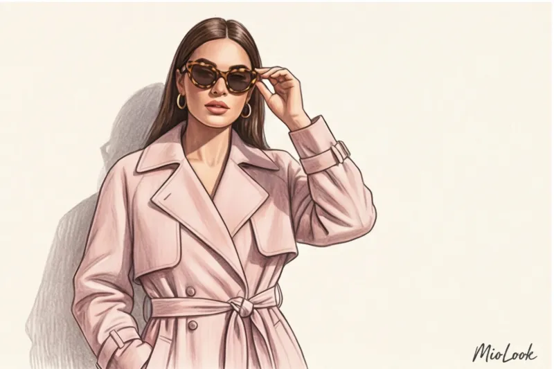
Pastel colors in clothing: a combination that looks expensive, not childish
Forget the old glossy rule of "combine no more than two delicate colors in a single look." The mathematics of color has given way to psychology. Today, the concept of Emotional Architecture is taking center stage. The idea is that color sets the mood, while cut and texture set the boundaries.
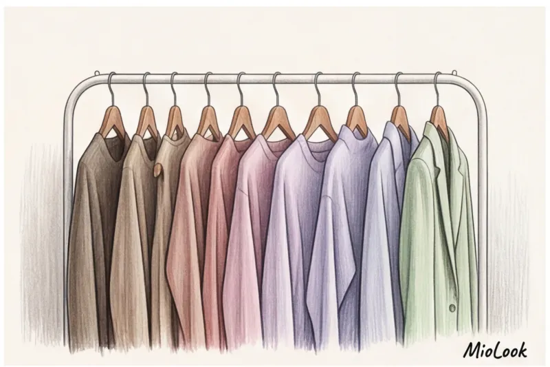
In its 2024–2025 report, the Pantone Color Institute officially documented a global trend toward a shift from "sweet," candy-colored shades to so-called grounded pastels. These are colors with a touch of gray pigment: dusty rose instead of fuchsia, sage instead of open lime, gray-blue instead of sky blue. It is this gray undertone that gives the color a refined and mature feel.
Pastel isn't a whisper. It's a confident voice that doesn't need to shout to be heard. Its power lies in the contrast between the delicacy of hue and the rigidity of form.
Transitioning from a "marshmallow girl" look to a power dressing aesthetic requires attention to the garment's structure. Pastel doesn't tolerate slack silhouettes. If you choose a light shade, the garment should have an impeccable fit, a defined shoulder line, and hold its shape.
The Biggest Mistake: The "Bridesmaid" Effect and How to Avoid It
The quickest way to cheapen a look is to pair a pastel shade with too many ruffles, flounces, guipure, or sheer chiffon. This instantly evokes the aesthetic of a provincial wedding.
My golden rule of balance is: Soft color = hard shape Want to wear soft pink? Go for a tailored, mannish jacket or wide, pleated trousers in a crisp suiting fabric. Opting for mint? Opt for a straight-cut shirt in crisp poplin over a flowy blouse with a bow.
When this rule does not work: If a jacket lacks overlap (it hangs like a rag) or the material is see-through, even the most precise cut won't save the situation—it will look like pajamas.
Try MioLook for free
A smart AI stylist will select the perfect look and help you seamlessly incorporate pastels into your wardrobe.
Start for freeFormulas for ideal pastel color combinations for different occasions
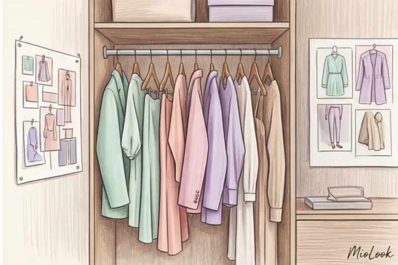
As a practicing stylist, I love giving my clients ready-made formulas—like a chef giving recipes. You don't have to reinvent the wheel; just take these tried-and-true combinations and adapt them to your wardrobe. In the app MioLook You can easily upload your items and see how these formulas work on your real clothes.
Formula 1: Pastel + Deep Base (30/70 Rule)
Many people habitually pair pastels with black, creating a harsh, eye-catching contrast. Replace black with deep, complex base tones. Try pairing a mint sweater with dark chocolate-colored trousers, or a dusty rose blouse with a graphite suit. The dark base acts as a grounding agent (70% of the look), while the pastel (30%) brightens the complexion.
Formula 2: Color Block in pastels
Who said color blocking is only about acidic colors? A combination of three pastel shades looks incredibly fresh when combined with a single temperature. For example: cool lavender + lemon cream + pistachio. The key here is the simplicity of the cut. No unnecessary details, just clean lines and smooth textures (for example, viscose with 5% elastane or thick cotton).
Formula 3: Pastel + Metallic
This is my favorite Mediterranean trick. We're used to wearing pastels with beige or white shoes. Try adding a touch of drama: a soft blue pantsuit paired with aged silver shoes. Or a warm peach top with chunky gold jewelry. Metallics take the edge off the romanticism and add an urban edge to the look.
Monochrome elegance: a play of textures
Pulling together a look in one pastel shade (a total look) without looking like a big splash of color is a challenge. The secret lies solely in the difference in textures.
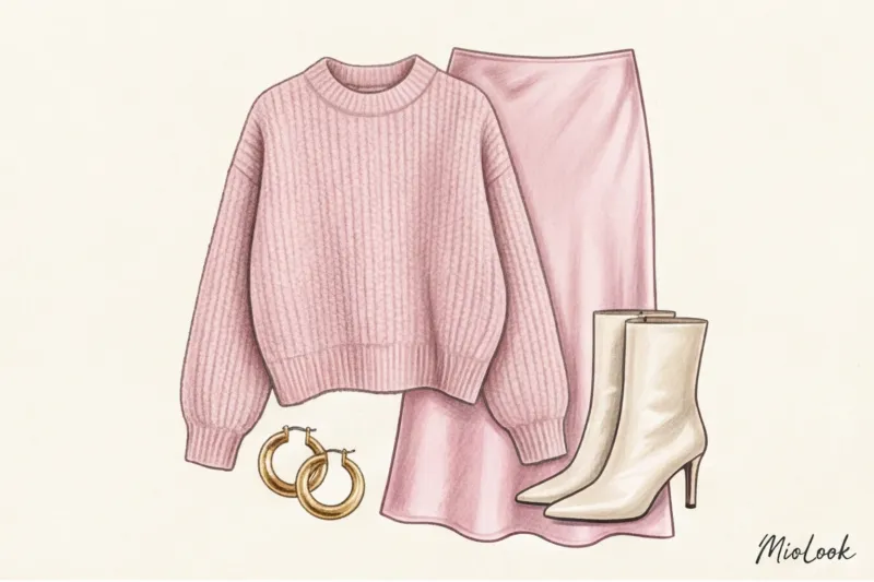
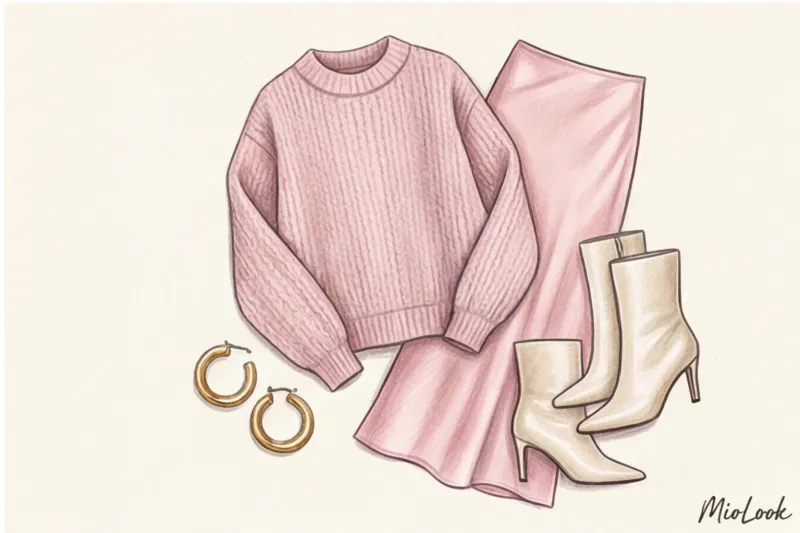
If you're wearing a powder-pink cashmere sweater, pair it with a smooth silk skirt in the same shade and matte leather boots. Light reflects off the silk, is absorbed by the cashmere, and shimmers softly on the skin. The eye registers this difference, creating a look of depth, dimension, and truly luxuriousness.
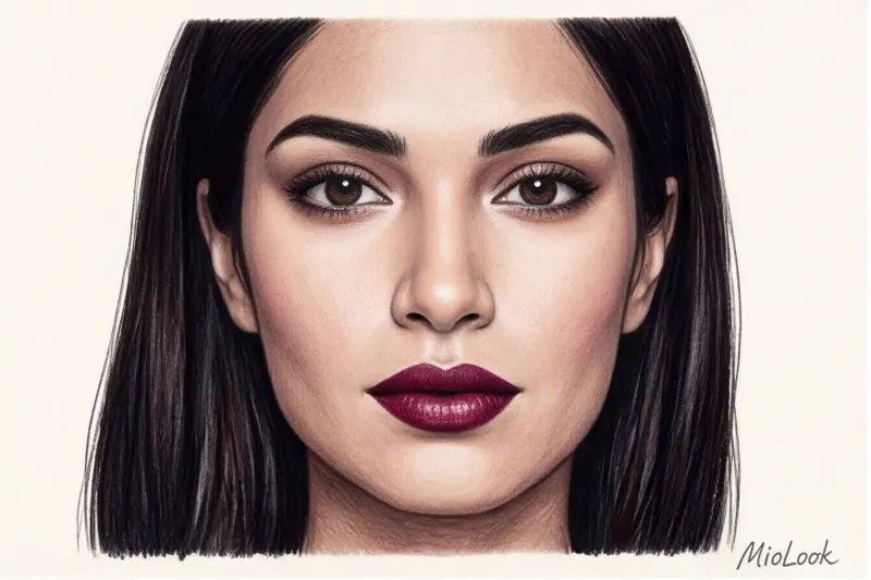
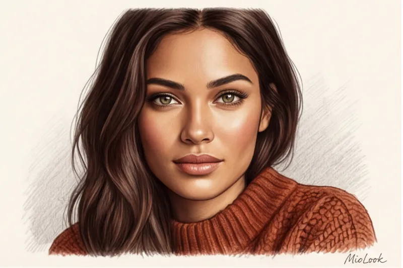
How to choose pastel shades according to your color type
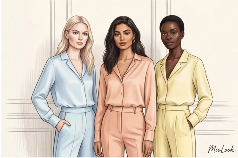
I'm not a fan of strict rules and restrictions, but understanding your complexion's temperature is fundamental. The wrong pastel can make your skin look sickly gray, while the right one will work as a good concealer, erasing signs of fatigue.
- For a contrasting appearance (Winter): Your story is about "icy" pastels. Icy blue, cool purple, bleached lemon. They should be clean, vibrant, without a hint of gray.
- For a soft look (Summer and Fall): Those grounded and dusty shades are perfect for you: sage, ash rose, muted gray-blue. They complement the soft contrasts of your appearance.
- For a warm look (Spring): Choose glowing, warm pastels. Peach, warm beige, cream, and crème brûlée.
If you really like a color, but it objectively makes you look "pale," don't rush to give it up. Simply move it away from your face. Use pants, a skirt, or a bag, and leave your complimentary shade near your face. We wrote more about how to work with your natural features in the article about business wardrobe according to color type.
Your perfect look starts here
Join thousands of users who look flawless every day with MioLook. AI will determine your best colors in seconds.
Start for freeDebunking the Myth: Why Pastels Are the Perfect Color for a Fall/Winter Wardrobe
Historically, with the arrival of October, city streets are painted 50 shades of black, gray, and dirty brown. Pastel is traditionally considered a summer color. And that's a huge omission!
A 2024 study by global trend bureau WGSN revealed a sharp increase in searches for "winter pastels" in the premium fashion segment. Why? Because light, delicate tones in winter are an absolute hallmark of old-money aesthetics and high status.
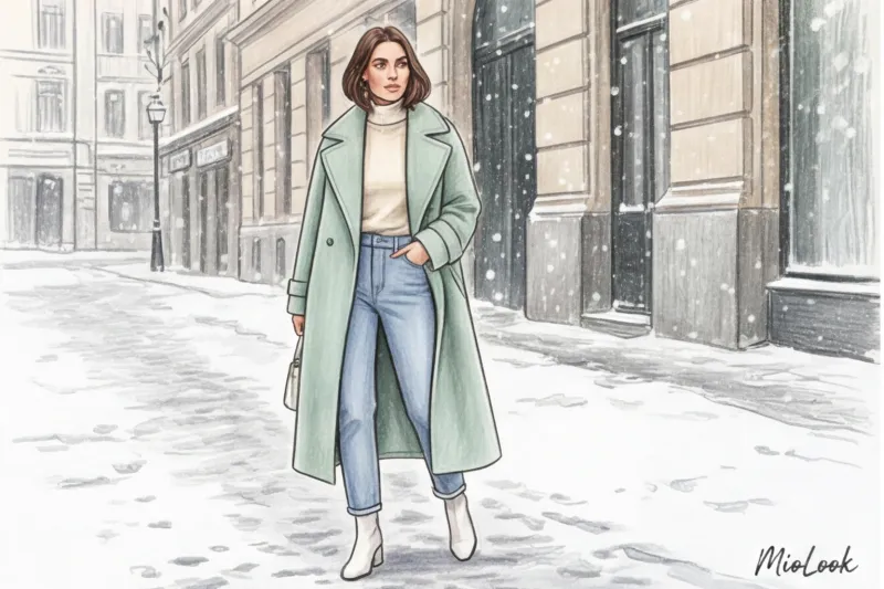
By wearing a powder-pink cashmere coat or pistachio-colored wool trousers in winter, you convey a nonverbal message: “I travel by car or taxi, I’m not afraid of getting dirty on public transport, and my standard of living allows me to wear light-colored clothes in slush.”
The most luxurious winter looks are achieved when we integrate delicate colors into heavy, dense textures: voluminous chunky knit sweaters (alpaca or merino wool), heavy wool coats (400 g/m² and up), and tanned leather. Playing with the contrast of "delicate color and rugged winter texture" creates a stunning visual effect. More ideas for the colder weather can be found in our article about winter office clothes.
Integrating Pastels into Your Business Wardrobe: From Smart Casual to Formal Meetings

Let's return to my client Anna from the beginning of the article. Why did the lavender suit perform better than the black one? According to a 2023 survey of HR specialists, adding one pastel element to a formal dark suit increases the visual empathy of the image by 40%.
In a business environment, especially during difficult negotiations, too much black or dark blue can be perceived as a dead end, aggression, or an unwillingness to compromise. Pastel, on the other hand, reduces tension, evoking subconscious trust, but with a clean cut, it doesn't detract from your professionalism.
How do you put this into practice if you have a strict dress code?
- Replacing a white shirt: Crisp white often looks too harsh and highlights even the slightest redness on the face. Swap out your classic white shirt for an ecru, dusty ice, or pale lemon shade.
- Pastel suit: If you're choosing a light-colored suit for the office, pay attention to the fabric. It should be a dense wool suit or a viscose blend that won't wrinkle the first time you sit down on a chair. A wrinkled pastel suit instantly turns into pajamas.
- Dosed emphasis: For a smart-casual Friday when everyone's wearing jeans, wear classic blue jeans, a white T-shirt, and a dusty rose jacket over the top. You'll look put-together yet relaxed.
Stylist Checklist: 5 Steps to a Confident Pastel Look
If you've been wearing dark colors your whole life and are afraid to try light shades, don't go for a total pink look right away. Be strategic. Here's my step-by-step plan:
Step 1: Start with accessories.
Afraid of the color against your complexion? Invest in a structured, rigid bag in a matcha shade or soft blue loafers. Incorporate them into your usual taupe looks.
Step 2: Check the fabric for transparency and density.
This is critically important. Pastel doesn't tolerate cheap, thin fabrics. If it's cotton, it should be at least 180 g/m² (it shouldn't be see-through). If it's jersey, it should be a tight knit that doesn't cling to every fold of the body.
Step 3: Add a grounding conductor.
Always include at least one dark or rugged element in your look. This could be a chunky chocolate-colored leather belt, chunky boots, or dark horn-rimmed glasses.
Step 4: Keep an eye on your makeup.
Subtle complexions require a flawless skin tone. Pastels have a tricky tendency to highlight under-eye circles and redness. Spend a little extra time on concealer and a subtle blush.
Step 5: Assess the silhouette.
It should be modern. Avoid the skimpy, form-fitting jackets of the 2010s. Leave some space between you and the pastel piece. A slight oversize is the best friend of soft shades.
Ready to get started?
Try MioLook's free plan—no commitments required. Upload your items and let the AI create dozens of new combinations for you.
Start for freeResults: Your personal palette of tenderness and strength
Pastel colors are a powerful styling tool when used correctly. They don't make you weaker; they enhance your complexion, richness, and elegance. By pairing delicate shades with clean silhouettes, deep primary colors, and bold textures, you create a wardrobe for a woman so confident she doesn't need to hide behind stark black.
This week, I challenge you to pull out that light-colored piece you've been saving "for spring" or "for a special occasion." Wear it with a chunky wool, add a touch of metallic, and see how it changes how you feel and how others react. And to avoid racking your brain over combinations in the morning, entrust your routine to the app MioLook — your personal pocket stylist will always suggest the perfect formula.