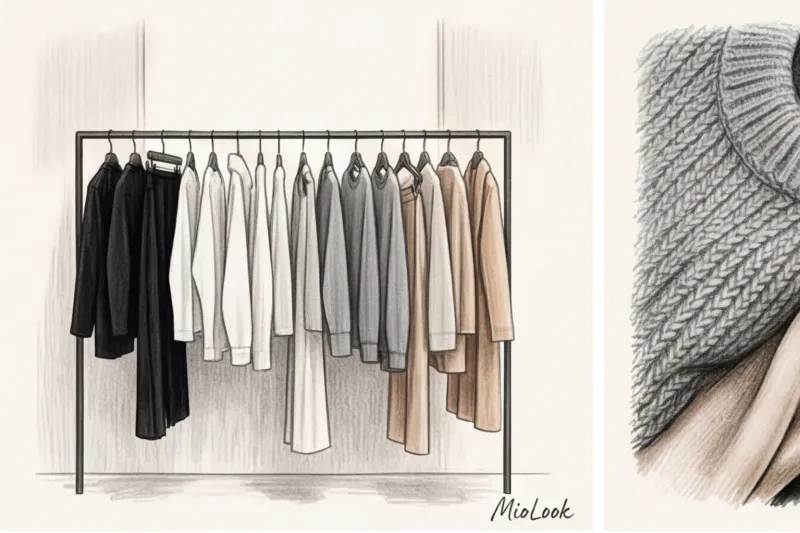
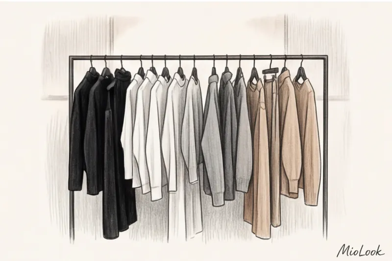
Did you know that, according to statistics, 70% of the average woman's wardrobe consists of just four colors: black, white, gray, and beige? Yet, 80% of them open their closet every morning and utter the sacramental phrase: "I have absolutely nothing to wear." Over more than 10 years of working in the fashion industry, I've realized one paradoxical thing. When we choose Basic colors in the wardrobe, combination These shades seem to us the most logical and safest path. We're used to thinking: black is guaranteed to make you look slimmer, white is always refreshing, and gray is appropriate in any situation.
This is the greatest stylistic myth that destroys the potential of thousands of female images every day.
In fact, pure black and snow-white are the most complex and demanding colors in the palette. Without perfect tailoring, architectural texture, and expert makeup, they mercilessly highlight the slightest skin imperfections, signs of sleep deprivation, and age-related changes. We've already discussed the mechanics of how shades work in more detail in our a complete guide to the perfect color combinations in clothing Today, I want to explore the anatomy of "quiet luxury." I'll prove to you that a neutral palette works exclusively through texture clashes and temperature contrasts, and the notorious combination of gray and beige isn't a rookie mistake, but rather a masterstroke in styling.
The Anatomy of a Neutral Palette: How Basic Wardrobe Colors and Their Pairings Create "Quiet Luxury"
Rejecting bright, flashy colors isn't an attempt to hide in the crowd. It's a conscious statement. Think back to the minimalist aesthetic of the '90s: Calvin Klein and Jil Sander made monochrome a symbol of unattainable status and high intellect. Working backstage at the Jil Sander shows in Milan, I spent hours watching stylists layer five different shades of gray with manic precision. Up close, it looked like contemporary art.
The psychology of color perception is relentless. Report Institute for Color Research (2023) revealed astonishing figures: people wearing complex, monochromatic basic colors are perceived by others as more competent, and their social status is perceived as 40% higher than that of those wearing vibrant prints. By choosing a muted palette, you're effectively saying, "I don't have to shout to be heard."
Black, white, gray, and beige are an architectural canvas. They draw attention not to your clothes, but to your face, posture, and silhouette.
The Biggest Beginner Mistake: Why Your "Safe" Colors Look Flat
You've probably encountered the "uniform" phenomenon. You put on classic black suit pants and a plain white cotton shirt. It seems classic. But in the mirror, you see not a style icon, but a tired waiter or bank clerk from 2005.
One of my clients, a top manager at an IT company with a casual dress code, complained about exactly this: her gray and black wardrobe seemed unbearably boring. The problem wasn't the colors, but the materials. All her clothes were uniformly matte and smooth: basic cotton, fine viscose, and thick knits. We radically changed the situation without adding a single new color. We simply replaced the smooth fabrics with textured ones.
A stylist's golden rule: if there's no color difference in your look, there should be a dramatic difference in the materials. Without a textural clash, the base color becomes flat.
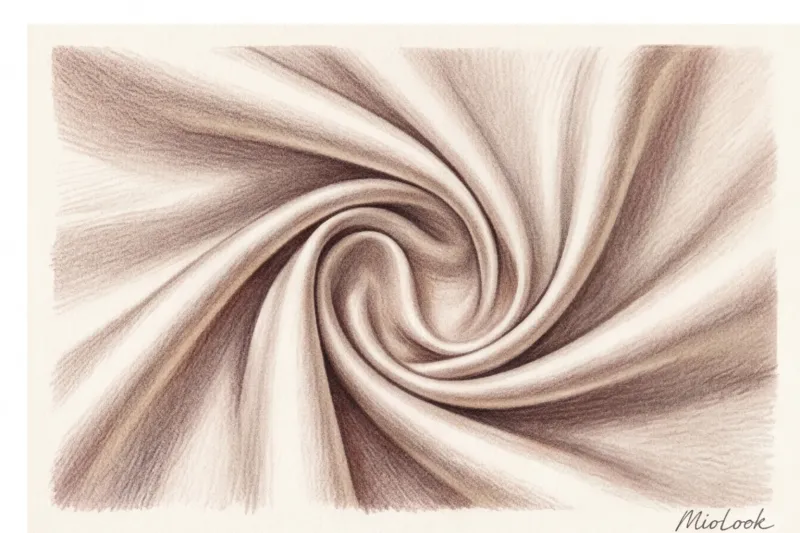
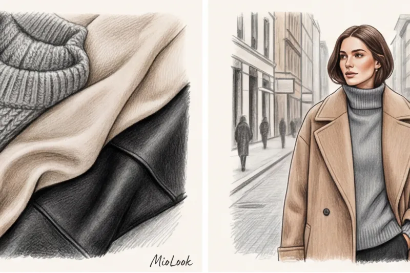
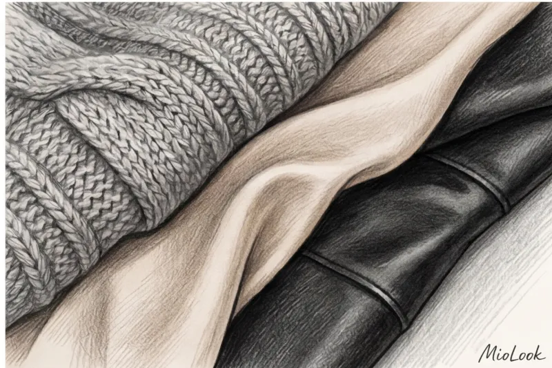
The magic of textures: silk, cashmere, suede and leather
To manage your base, you need to understand the physics of light. Fabrics are divided into those that reflect light (heavy silk, satin, smooth leather, organza) and those that absorb light (textured suede, cashmere, bouclé, velvet, coarse wool). The same black color on glossy leather will appear harsh and aggressive, while on loose cashmere it will be deep, soft, and enveloping.
Practical advice you can apply right now: Never wear more than two items of the same texture in the same base color. If you're wearing matte black wool trousers, don't pair them with a matte black cotton long-sleeve. Opt for a black silk top (19 momme count or higher) or a chunky, chunky knit sweater with mohair.
Your perfect look starts here
Join thousands of users who look flawless every day with MioLook. Our intelligent AI stylist will select textures and colors based on your appearance.
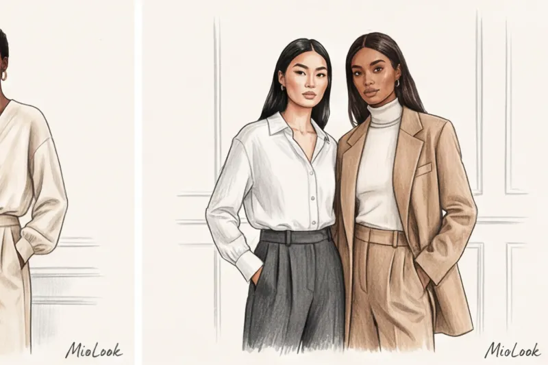
Start for freeTemperature Dissonance: How to Make Gray and Beige Work Together
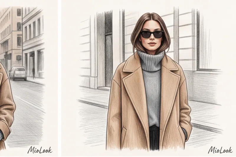
If you've ever read outdated style blogs, you'll likely remember the ironclad rule: never mix warm and cool shades. Forget it. Breaking this rule is precisely what creates the most expensive visual effect of modern times.
In the 1980s, Giorgio Armani revolutionized business fashion by inventing the shade Greige (a fusion of gray and beige). He proved that a cool steel undertone can brilliantly coexist with a warm sandy tone. Today, Phoebe Philo has elevated this technique to the extreme, first at Celine and now at her own brand.
How can you replicate this in real life? The key to pairing cool gray and warm camel is to create a transitional, bridging element. For example, wear gray, full-length wide-leg trousers with a beige cashmere coat, and layer a neutral white in between (a basic shirt or T-shirt made of heavy cotton weighing at least 180 g/m²). The white will act as a frame, separating the conflicting colors and making them work for your status.
Ready-made formulas for combining basic colors for status looks
Theory is great, but let's move on to the specific formulas that I regularly use to build my clients' capsules (if you're interested in the mechanics, check out our article On choosing a business wardrobe based on your color type ).
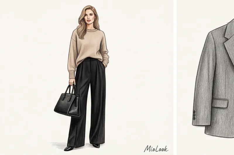
- Black + Beige (Contrast of drama and softness). The perfect formula for an interview at a creative agency or a business dinner. Black bottoms (like a leather midi skirt) provide a rigid, structural foundation, while a beige, oversized sweater near your face softens the portrait area, making you appear more approachable.
- Gray + White (Intellectual minimalism). The perfect alternative to the tired black-and-white office dress code, a gray three-piece suit paired with a crisp white shirt looks less aggressive than black, yet still conveys maximum poise and expertise.
- Beige + White (Old money aesthetics). This combination creates a resort-chic effect in an urban setting. Pair white heavy denim jeans (yes, even in fall!) with a beige trench coat or cashmere polo, and you'll look like you just returned from a weekend on Como.
Monochrome and Total Looks: How to Avoid Getting Lost in One Color
Monochrome is often mistakenly considered the easiest solution. "I'll just throw on all black and go." But there's a tricky trap here. Total black absolutely doesn't tolerate sloppiness. If you're going for an all-black look, you need perfect makeup with an even skin tone and a hint of blush. Otherwise, black will highlight any shadows and under-eye circles, making your face look unhealthy.
Total beige looks work differently: here, using a gradient is crucial. Don't try to match pieces tone-on-tone—it looks flat and artificial. Move along the spectrum: from light ecru around the face to rich, dark caramel or cappuccino on the shoes and pants.
Try MioLook for free
Not sure if your color formula is working? Upload items to the MioLook smart wardrobe, and the algorithm will automatically suggest the perfect proportions.
Start for freeProportions in color: the 60-30-10 rule for neutral shades
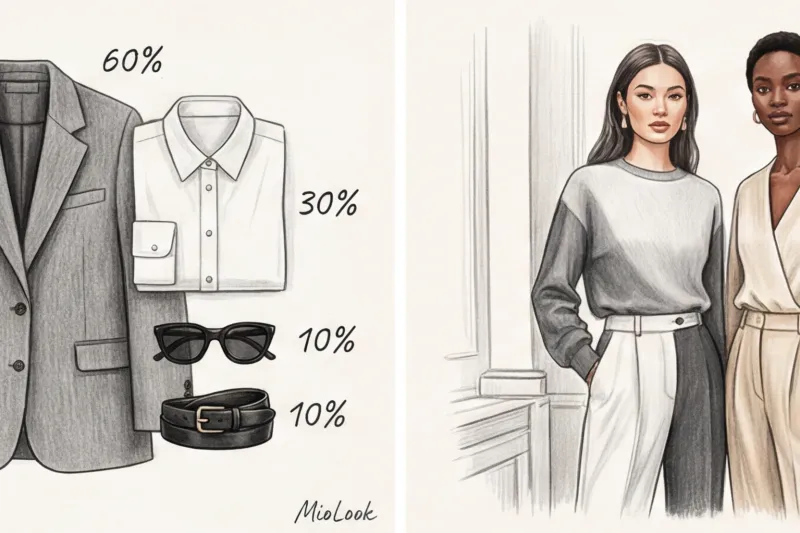
Forget the outdated rule that "no more than three colors should be used in a look." It's not the number of shades that matters, but their percentages. Interior designers have long used the golden ratio of color—the 60-30-10 rule—which is also ideal for wardrobe design.
How does this work in practice? Imagine the mathematical structure of the image:
- 60% - base color. This is your foundation. Typically, it's a suit, dress, or a pants-and-outerwear combo. For example, a voluminous graphite gray suit.
- 30% - complementary color. It supports the base and creates depth. In our case, it's a white basic shirt and a white silk scarf.
- 10% - accent color. Even if it's basic, it dots the i's and crosses the t's. It's black structured loafers, a crisp black belt with a minimalist buckle, and a black geometric leather bag.
If you try to split the colors 50/50, the look will visually fall apart into two equal parts, cutting your figure in half.
Integration with your appearance: basic colors and color types
I promised to be honest about when primary colors don't work. Well, pure jet black and cool white only suit people with high-contrast complexions (the classic "Winter" color type—dark hair, fair skin, bright eyes). If you have light brown hair, soft features, and a warm undertone (the "Summer" or "Autumn" color types), deep black against your face will visually add five years to your age and make you look unhealthy.
Does this mean you have to throw out your favorite dark clothes? Absolutely not. There are two ways to get around this limitation.
The first is to replace radical shades with softer versions. Instead of jet black, choose graphite gray, wet asphalt, or dark chocolate. Instead of pure white, choose milky, ecru, ivory, or pearl.
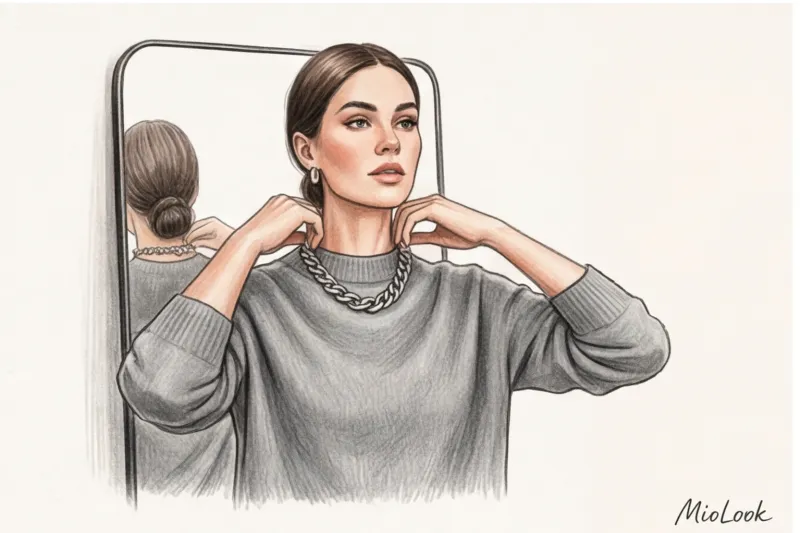
The second method is the portrait zone rule. If you're tempted to wear a black jacket that doesn't suit you, pull it away from your face. Layer a blouse in your ideal shade with a stand-up collar underneath, add a chunky necklace in a light metal, or tie a scarf in the right colors around your neck. Your face will be illuminated in the right shade, and the jacket will simply serve as a frame.
Stylist checklist: check your look before you go out
Putting together a classy look from basic pieces isn't that difficult if you have a clear strategy. Before you leave the house, simply look in the mirror and ask yourself three questions:
- Are there at least two different textures in the image? If you're wearing matte jeans and a matte cotton top, add a touch of shine with a smooth leather belt, a silk scarf, or patent-toe shoes.
- Is the darkest/dangerous color separated from the face? If you're going makeup-free today, make sure you have a light, refreshing shade (white, cream, light gray) just under your chin.
- Do the accessories create the right contrast? In a monochrome gray look, a black rigid bag acts as an anchor, enhancing the soft texture of the garment. Without it, the look might become too washed-out.
Basic colors—black, white, gray, and beige—are not a limitation on your imagination or a boring office compromise. On the contrary, they represent the highest form of stylistic freedom. By mastering textures, temperature contrasts, and proportions, you can create dozens of luxurious, sophisticated looks from a minimal set of items.
Ready to get started?
Try a free plan—no commitments. Organize your wardrobe and find your perfect combinations with MioLook.
Start for free