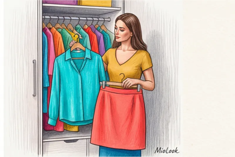
Hello, my dears! In my 14 years as a stylist, I've seen hundreds of wardrobes where color was strictly forbidden. One of my clients, Marina, wore exclusively beige and gray for 10 years for fear of looking "like a traffic light" or "too young." Sound familiar? We started introducing color blocking into her life with a tiny detail—an emerald lining on a basic sand-colored coat. Six months later, she confidently paired fuchsia with red and garnered compliments at every business meeting.
We talked about color architecture and basic rules in more detail in our a complete guide to the perfect color combinations in clothing , but today I want to go further. We'll talk about how to use large pops of color so that it looks expensive, classy, and, most importantly, flatters your figure rather than ruins it.
What is color blocking in clothing (and why are we afraid of it)
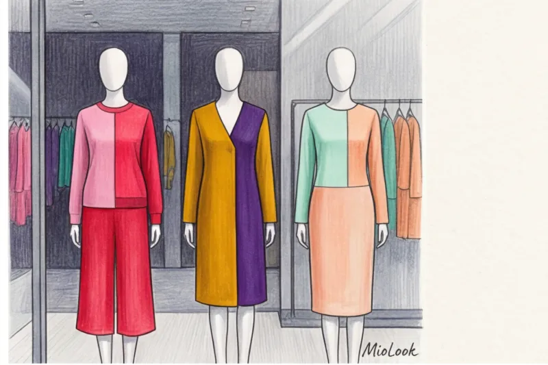
Let's agree right away: color blocking in clothing "This isn't an attempt to throw on every bright item you've found in your closet. It's a thoughtful, architectural construction of an image with large, localized pops of color. No tiny flowers, ripples, or complex prints—only clean lines and geometry."
Why do so many women turn to "safe beige" or all-black after 30? According to a 2024 study by the WGSN trend bureau, 68% of women avoid bright colors due to so-called "wardrobe fatigue" and the fear of making a mistake. For decades, we've been hammered with outdated rules like "your bag should strictly match your shoes" or "no more than three colors in an outfit." These rigid guidelines are killing modern color blocking, making it seem forced and artificial.
"True style begins where fear ends. Color blocking is a tool for attention management. You decide where others will look."
The biggest mistake beginners make: why the "50/50" rule ruins your figure
The most common and most fatal mistake I see on the street is the 1:1 ratio. Imagine a bright yellow, thigh-length sweater and contrasting blue jeans. What happens to your figure? The classic law of optical illusions kicks in (in styling, we often rely on variations of the Müller-Lyer illusion): the horizontal line between two contrasting colors mercilessly cuts your height in half and visually widens your waist or hips.
The golden rule of stylists that works without fail is 70/20/10 formula:
- 70% (Base) - the main color block (for example, a pantsuit or a long dress).
- 20% (Accent) - an additional large block (a top under a jacket, a cardigan, a large bag).
- 10% (Micro-accent) — the finishing touch (shoes, scarf, glasses frames).
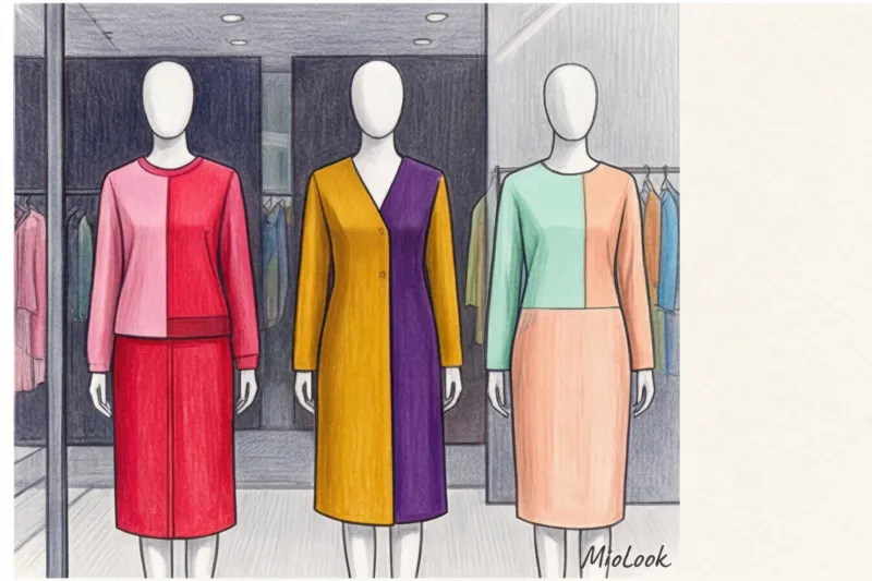
Practical advice from my experience: When I work with short clients (up to 160 cm), we never Don't create a junction of contrasting colors at the waistline. This won't work if you want to appear taller. We shift the ratio to 80/20 by using a monochrome vertical (pants and top in the same color) and layering a contrasting, elongated jacket over it, leaving it unbuttoned.
Try MioLook for free
A smart AI stylist will select the perfect look and help you create a 70/20/10 balance of your items.
Start for free4 working color blocking schemes that look classy
Everyone's read about Itten's color wheel. But let's be honest: color theory divorced from modern cuts and textures is dead. I've adapted classic patterns to the realities of a modern, premium wardrobe.
Analogous harmony (adjacent colors)
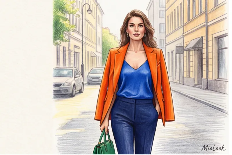
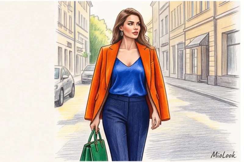
This is a combination of two or three colors adjacent to each other on the color wheel. My favorite combinations, which always look like street style from Paris Fashion Week, are fuchsia + rich red, or cobalt blue + emerald. This is the safest and most expensive way to start wearing bright colors, because the eye perceives this transition as a natural gradient, without any sharp jumps.
Complementary contrast (opposites)
Here we tame the shrews: purple and yellow, blue and orange. Attention, important limitation: This doesn't work if both colors are at their peak spectral brightness—you'll look like a child's party entertainer. A stylist's secret: one color should be rich, and the other should be either washed out or very dark. For example, a soft lavender sweater and dark mustard pants.
Muted Color Blocking (The Secret of "Quiet Luxury")
Here's the biggest myth: color blocking is always about flashy neon. The truth is, the most prestigious and sophisticated image is created using complex, muted shades. Try combining burgundy, dusty cedar, and dark pine in one look. It looks incredibly elegant, unobtrusive, and perfectly fits the Old Money aesthetic.
Your perfect look starts here
Join thousands of users who look flawless every day with MioLook. AI will help you find the perfect combination.
Start for freeTexture is everything: how fabrics change the appearance of color
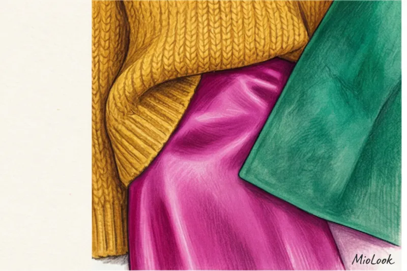
Remember the rule I repeat in every masterclass: color doesn't exist separately from texture. As experts at the Pantone Color Institute note, the texture of a material can alter the perception of a hue by 30%.
Why does the same red look vulgar on cheap, thin polyester, but luxurious on thick, matte silk? Cheap synthetics reflect light unevenly, creating a cheap sheen. Fine fabrics (wool, cashmere, and heavy viscose over 200 g/m²) absorb light, creating a deep, velvety color.
In color blocking contrast of textures is a must When you wear two smooth, bright fabrics, the look becomes flat. Mix and match: smooth and fluffy, matte and shiny. My favorite combination for fall: a matte ochre cashmere sweater and a glossy magenta silk skirt. The density of the fabric also affects the clarity of the "block." A thin, flimsy knit will distort the geometric color, while a dense suiting fabric will maintain a crisp border.
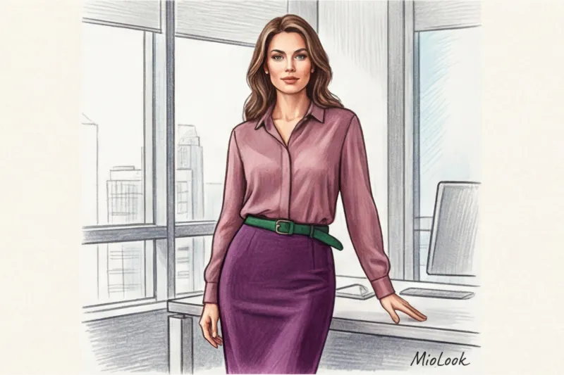
Color blocking in business wardrobe: myth or reality?
Many people think color blocking ends where the office door begins. This is a misconception. You can easily integrate color blocking into business casual and smart casual dress codes.
One of my clients, a top manager at a large IT company, wanted to stand out from her male colleagues (who exclusively wore gray hoodies and blue blazers) while still maintaining authority. We didn't buy her neon suits. We built her work color blocking on deep, "commercial" shades: Navy blue + Burgundy + Camel.
If you have a strict dress code, use color blocking through accessories. A dark gray suit instantly comes to life with cherry-red shoes and a structured bottle-green bag. You're following the rules, but still showing off your personality.
Ready to get started?
Try the MioLook free plan—no commitments required. Digitize your wardrobe and create stylish business looks.
Start for freeA practical checklist: putting together your first color-blocking look
To turn theory into practice today, let's create your first look step by step:
- Step 1: Start with the base. Choose one neutral or deep-colored piece to ground your look. Consider a pair of wide-leg, navy blue trousers in a crisp fabric.
- Step 2: Add the main accent. Choose a color that complements your appearance (the color that will be on your face). For example, a terracotta or emerald sweater.
- Step 3: We introduce support (the same 20%). Add shoes or a bag in a third color - for example, mustard.
- Step 4: Check the silhouette. Look in the mirror. Where does the line between the colors lie? Is it cutting you off at the widest part of your hips? If so, tuck your sweater in asymmetrically, creating a diagonal line that will visually slim you.
I know it's scary to buy new, bright items without knowing what to wear them with. And technology makes life so much easier here. I always recommend that my clients first digitize what's already on the hangers. Use the "smart wardrobe" feature in MioLook Artificial intelligence will analyze your items and suggest color combinations from already existing clothes you never even knew you needed. It's the perfect way to practice your eye for something without breaking the bank.
The art of color combination is a muscle that can and should be trained. Don't try to become a street style icon right away. Start small: add one block of color in a different texture to your usual look. And remember: the most valuable look is the one that makes you feel physically and mentally comfortable.


