Have you ever stood in front of the mirror in your favorite patterned skirt, paired it with a turtleneck that matches the background color, and suddenly realized you look boring, flat, and a bit like a uniform? It's a classic mistake. In 12 years of working as a personal shopper in Europe, I've seen this scenario hundreds of times. Girls Google How to combine prints and colors , they find outdated mathematical advice on the internet to select a tone-on-tone base - and they kill the entire dynamic of the image.
We talked in more detail about the architecture of color and the basic rules of coloristics in our The Complete Guide to Perfect Color Combinations in Clothing: Stylist Tips But today we're getting down to some serious practical stuff. I'm Katarzyna Nowak, and I'll show you a unique method used by buyers at premium boutiques to create "tasty" outfits on mannequins.
How to combine prints and colors: Forget the old rules and look for the "invisible thread"
The most popular styling rule is: look at the background color of your print and buy a matching sweater. Forget it. If you have a black skirt with large white polka dots and you wear a black sweater with it, you'll achieve a "countryside glamour" effect. The look will become flat, and the print will look like a cardboard cutout.
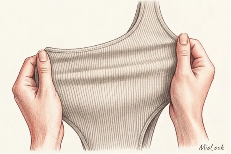
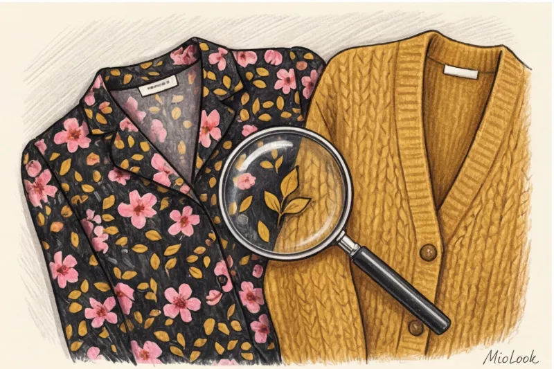
Instead, I suggest my clients use The 5% Rule Or the "invisible thread" method. The secret to a luxurious look is to find the rarest, barely noticeable accent color in a print (it usually takes up no more than 5-10% of the pattern's area) and duplicate it in a large-scale, solid-color garment.
Imagine a midi dress. The main background is dark blue, with large blue flowers, green leaves, and tiny, almost invisible mustard-yellow stamens. Nine out of 10 women would buy a blue jacket to match. But if you wear a voluminous cardigan in a rich mustard color over this dress, the look instantly moves from "just clothes" to "conscious styling." By bringing the minor color to the forefront, you give the print a completely new feel.
Your perfect look starts here
Join thousands of users who look flawless every day with MioLook.
Start for freeTemperature is more important than shade: why your clothes visually "compete"
Sometimes colors appear to be perfectly matched according to the Itten color wheel, but in reality, the ensemble looks muddy and untidy. The reason is temperature dissonance. As the Pantone Color Institute notes in its annual report (2024), the human eye detects the temperature difference between adjacent shades in 0.2 seconds, even if the person is completely ignorant of fashion.
A warm print and a cool base always create a stylistic clash. If you're wearing a chiffon blouse in warm autumnal shades (terracotta, olive, baked apple), a crisp white or icy gray jacket will literally "kill" it. White will make a warm print appear washed out and yellowed with age.
"During fittings, I always make clients leave the fitting room and go to the sales floor or to a window. The artificial fluorescent lighting in Zara or H&M booths mercilessly distorts the yellow and red spectrum. What seems like a perfect match under the lamp can be a disaster outside."
Black is not a universal savior
Wearing any complex print with a black top or bottom is simply stylistic laziness. Yes, black is slimming. Yes, it's in every closet. But deep black has the ability to absorb light. If your print has medium or low contrast (for example, a muted pastel geometric pattern), a black background will make it look dull.
What to replace it with? Try deep navy, dark chocolate, graphite, or rich burgundy. Chocolate works much more subtly with prints, creating a refined, rather than harsh, frame.
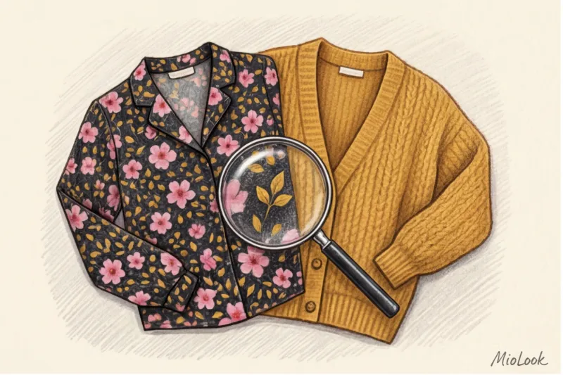
Texture changes color: a secret bloggers are keeping quiet about
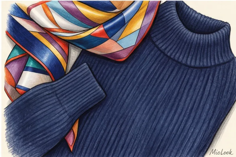
According to WGSN's 2023 consumer perception study, 70% of a garment's perceived value is determined by the texture of the fabric, not its color. This brings us to the most important rule for combining prints: Mix textures to control color.
Shiny printed fabrics (silk, viscose, satin, and sateen) reflect light. Pairing them with a similarly smooth, solid-colored garment will create a cheap and slippery look. Shiny fabrics require a matte, light-absorbing base—cashmere, thick merino wool, suede, or textured cotton.
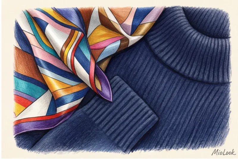
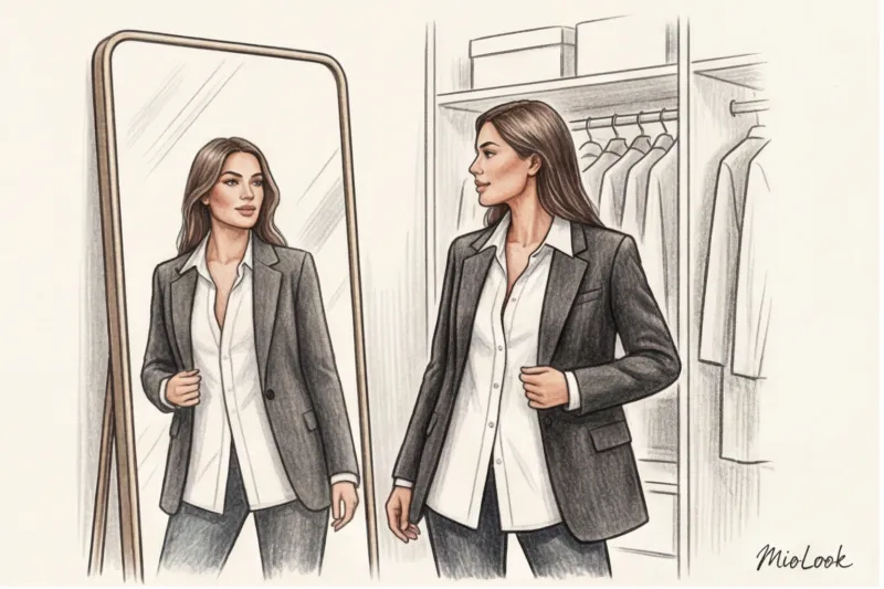
This is where the European principle of high-low dressing (mixing price segments) works perfectly. A cheap polyester or viscose top with a bold floral pattern from a mass-market store will look 10 times more expensive when paired with a high-quality, heavy wool cardigan from COS, & Other Stories, or Massimo Dutti. The matte, expensive texture of the base coat "calms" the shine of the budget print.
Try MioLook for free
A smart AI stylist will select the perfect combination of textures and shades from your real wardrobe.
Start for freeA breakdown of popular patterns: which solid-color items to wear them with
There's no one-size-fits-all formula for all patterns. What works with nautical stripes will turn leopard print into a disaster. Let's look at the most common requests from my experience.
Animalistics (leopard, zebra, python)
Animal prints themselves carry a powerful charge of aggressive sexuality. Our goal is to tone it down with a calm, refined base.
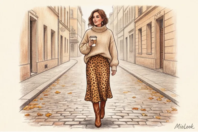
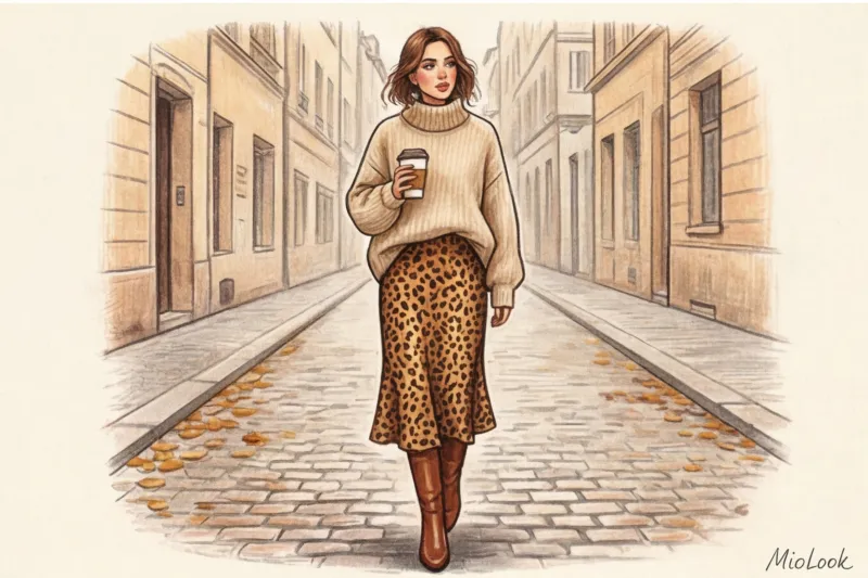
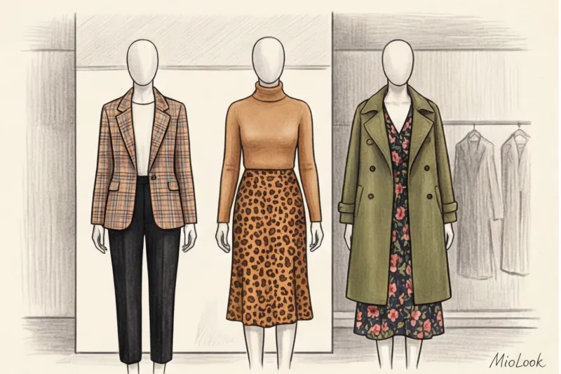
- Leopard: We strictly avoid red and black—they're a direct nod to 2000s style. I once had a client who tried to tone down a leopard-print midi skirt with a black turtleneck, but it only heightened the drama. We swapped the black top for a chunky, textured camel sweater, added suede ankle boots, and the skirt instantly became a statement piece. Denim blue and deep emerald also work well.
- Zebra: Instead of the usual crisp white (which will create that same temperature conflict), choose ecru, butter, or eggshell shades for the base.
Floral and plant ornaments
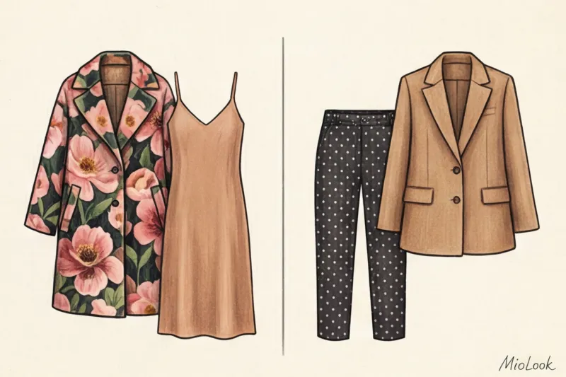
Here, everything depends on scale. Huge buds (macro prints) require air. For them, we use the same "invisible thread" rule, drawing out the smallest shade.
However, the small cotton print (millefleur), often found in summer dresses, is fraught with danger. If styled incorrectly, it instantly turns a woman into a "peasant woman in a hayfield." To avoid this, choose a single, clean, urban color for the base—for example, an architectural jacket in a rich cobalt or grassy green. The strict cut and purity of the solid color offset the simplicity of the small floral print.
Geometry (checkered, striped, houndstooth)
Unlike florals, rigid geometric patterns can withstand color blocking. Breton stripes look great with bright, contrasting colors like red, yellow, and fuchsia. Geometry sets the rhythm, and vibrant monochrome maintains it.
If you're wearing a complex check pattern (such as tartan or Prince of Wales check), use a light-drawing technique. Find the lightest shade in the weave (usually a thin white, cream, or light gray stripe) and choose a blouse or sweater in that color. This will instantly brighten your complexion.
Visual weight and scale: balance of proportions in an image
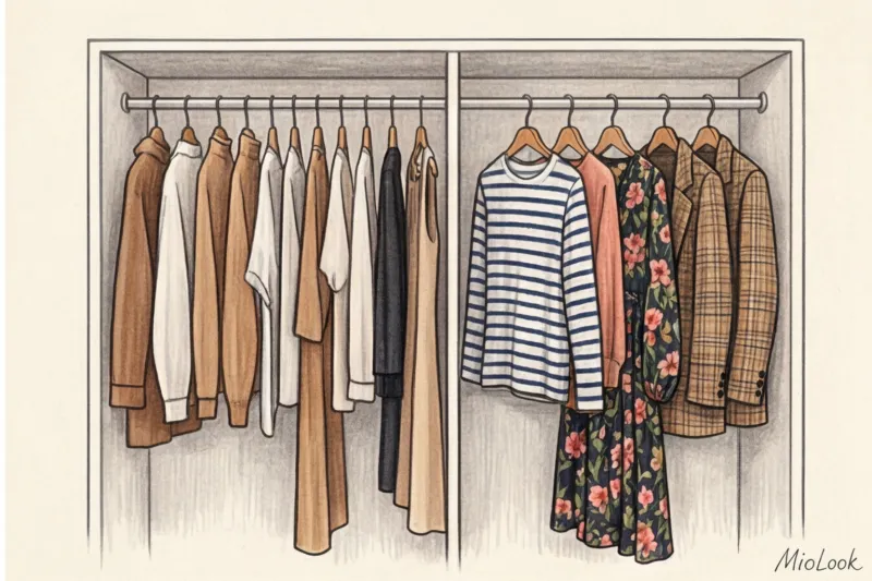
Even if you've chosen the perfect colors, a look can fall apart due to improper proportions. There's a golden rule in color theory: 60-30-10, which I adapt for my wardrobe like this: 60% is the main color (a matte solid base), 30% is the print, and 10% is a bright accent (shoes, bag, lipstick). Why is this? Because 70% of your outfit budget should go toward a high-quality base; it "carries" the entire structure.
Visual perception studies show that high-contrast geometric prints can tire the eyes of others after just 15 minutes unless they're balanced with a calm background. How can you test this? Use a professional styling trick: Squint test.
- Get dressed and move two meters away from the mirror.
- Squint your eyes hard so your eyelashes blur the focus. The image should turn into splashes of color.
- If one of the spots (for example, a printed skirt) literally “screams” and draws all the attention to itself, leaving the upper part of the body unnoticeable, the balance is off.
- Add visual weight to the top by layering a chunky jacket or swapping a thin blouse for a textured sweater.
Fair Limit: This advice doesn't work for everyone. If you have a high-contrast appearance type (for example, a deep Winter with snow-white skin and black hair), you may want to pull off a 50/50 ratio or even print clash (a combination of two different patterns). But for girls with medium and low contrast, the squint test is a must.
Katarzyna's Checklist: 4 Questions Before Leaving the House
Let's systematize everything we've discussed. Before you walk out the door in your new outfit, ask yourself these four questions:
- Does the temperature undertone match? (Doesn't the icy white jacket clash with the warm mustard flower on the dress?)
- Is the color chosen non-obvious? (Is that 5% "invisible thread" pulled out, or did you take the easy way out and blend in with the background of the print?)
- Is there a difference in texture? (Is the smooth silk of the skirt offset by the fluffy mohair or the thick wool of the sweater?)
- Did the squint test pass? (Squint - are your eyes blurry from too much active pattern?)
Prints aren't scary. They don't make your wardrobe complicated if you have a solid foundation. The key is to stop treating the pattern as the star of the show, something you should indulge in. Make a high-quality, textured solid a full partner in this duo, and your looks will always look like they were created by a professional stylist.
Ready to get started?
Upload your items to MioLook, and the algorithm will suggest which textures and prints from your closet will create an expensive look.
Start for free