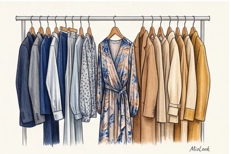
Two years ago, a client came to me with four huge shopping bags filled to the brim with stunning clothes. She was barely holding back tears. It turned out that the day before, another stylist had given her a strict "diagnosis"—a "Warm Autumn" color type—and categorically forbade her from wearing any cool shades. She obediently packed away her favorite silver skirts, cobalt sweaters, and emerald dresses. I stopped her at the last second.
Many people still believe that warm and cold colors in clothing It's like oil and water: they can't be mixed in the same look. For decades, we've been taught to assemble capsules strictly at the same temperature. But as a practicing colorist with an artistic background, I'll tell you straight: this prohibition is the main contributor to boring, flat, and "age-defying" wardrobes.
In this article, we won't just break old rules. We'll explore the physics of color and optical illusions so you can learn to manipulate temperature contrast as a true stylistic weapon.
The Myth of the "Pure Palette": Why the Old Rules of Coloristics No Longer Work
The fear of mixing temperatures dates back to the early 1980s. It was then that the "four seasons" system (winter, spring, summer, fall), popularized by Carole Jackson in her book "Color Me Beautiful," became the style bible. It was a breakthrough at the time, but today, this system has become a fashion prison.
In 2024-2025, a strict "temperature diet" makes looks predictable. When you put on a warm beige trench coat, a warm caramel sweater, and warm brown trousers, there's simply nothing to catch the eye. The silhouette blurs into a single blur. Modern styling is based on the concept of "emotional architecture" of the wardrobe. We discussed this in more detail in our a complete guide to the right color combinations in clothing , but the main point is this: an image needs conflict to become interesting.
Temperature Contrast: Stylists' Secret Weapon
Now let's turn to science. Renowned art theorist Johannes Itten, in his book "The Art of Color," identified temperature contrast as one of the most powerful tools for influencing the viewer. Why does it work so well in clothing?
It's all about optics. Warm colors (red, orange, yellow) have longer wavelengths. Our brain perceives them as visually "protruding" forward, bringing an object closer. Cool colors (blue, violet, icy) have shorter wavelengths and visually "recede." When you juxtapose them in a single image, you create the physical illusion of depth and 3D volume.
According to research by the neuromarketing agency WGSN (2024), a person's gaze lingers on images with temperature contrast 38% longer than on stark monochrome. Contrast forces the brain to "decipher" your outfit.
The Pantone Color Institute knows this trick well. Just think back to 2021, when they chose two colors of the year: cool Ultimate Gray and absolutely warm Illuminating Yellow. It's a perfect example of how a cool base balances warm expression.
Ready to get started?
Try the MioLook free plan—no commitments required. Your personal AI stylist is waiting.
Start for freeHow to Combine Warm and Cool Colors in Clothing: 4 Rules of Balance
Creating a temperature contrast isn't a haphazard process of throwing together random items from your closet. It's a strict mathematics of proportions and color characteristics. Over 12 years of working with clients, I've developed four infallible rules that work for any body type.
The Rule of Proportions (Forget 50/50)
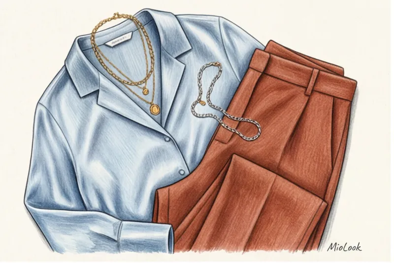
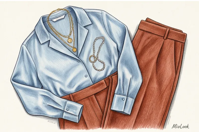
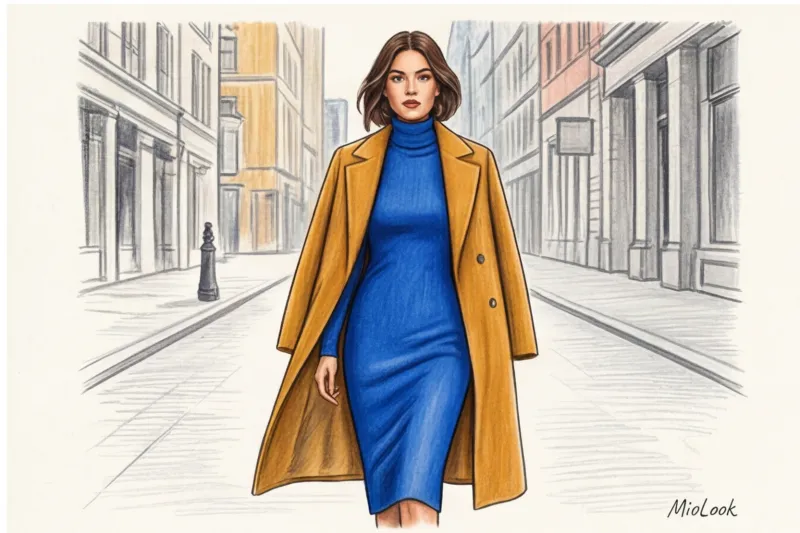
The most common mistake beginners make is dividing the silhouette in half. A cool blue shirt and warm ochre trousers in a 1:1 ratio will visually "cut" you in two, breaking your height. The ideal formula is 80/20 or 70/30, where one color is the dominant background and the other a dynamic accent.
Imagine a relaxed, cool gray suit made of flowing viscose (that's your 80%). Add a warm, crisp terracotta bag and matching loafers (the remaining 20%). The look instantly transcends boring office staples.
The principle of equal saturation
Here's a secret you rarely find in amateur style articles: temperatures can be dramatically different if the colors have the same lightness or saturation levels.
- Pastel to pastel: Cool, icy mint works amazingly with warm peach or soft coral. They have the same degree of whiteness.
- Deep to deep: A cool sapphire or emerald color will reveal itself many times richer next to a warm chocolate or aged cognac shade.
Using "bridge color" (prints)
If you're wary of abrupt transitions, use a "bridge." This could be a silk scarf, a geometric-print blouse, or a textured tweed jacket a la Chanel, whose threads entwine both warm and cool elements. This element legitimizes the presence of both temperatures in your outfit, literally explaining to the viewer why you're wearing cool denim with a warm mustard sweater.
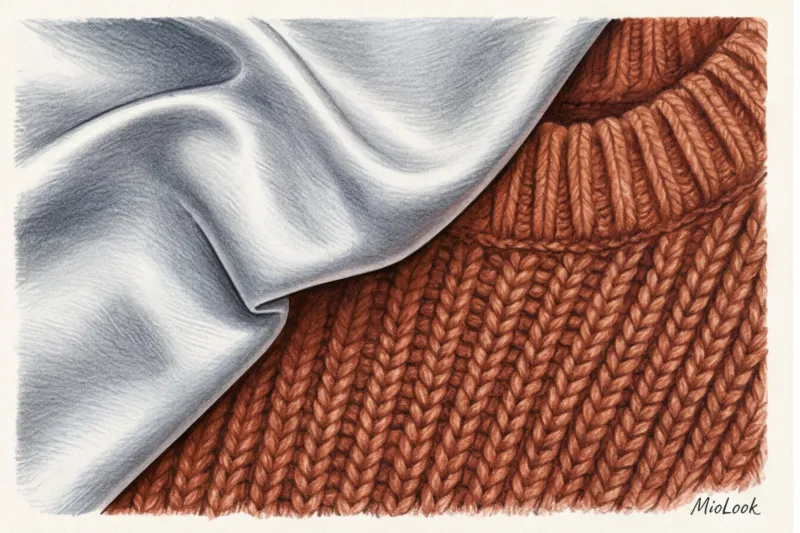
Fabric Texture as a Temperature Filter: A Life Hack for Advanced Users
We tend to evaluate color in isolation, forgetting that we're actually wearing the material. Fabric texture acts as a physical light filter, capable of visually altering the pigment's temperature.
Shiny fabrics (silk with a density of 19 mm, satin, patent leather, sequins) reflect light. This sheen always adds a cool, almost icy note. Even the warmest orange will appear slightly cooler on smooth satin.
Conversely, matte and fleecy fabrics (corduroy, suede, mohair, cashmere) absorb light. They create a visual softness that "warms" the color. A cool, icy gray shade on a fluffy mohair sweater feels much cozier and warmer than the same color on a cotton shirt.
Secret stylist trick: My favorite way to integrate a complex color is to blend temperatures through contrasting textures. Try pairing a flowing skirt in cool silver silk with a chunky, chunky knit sweater in a warm rust shade. The contrasting light reflections make this pairing mesmerizing.
Your perfect look starts here
Join thousands of users who look flawless every day with MioLook. A smart assistant for your wardrobe.
Start for freeThe main mistake that ruins an image: a conflict of undertones
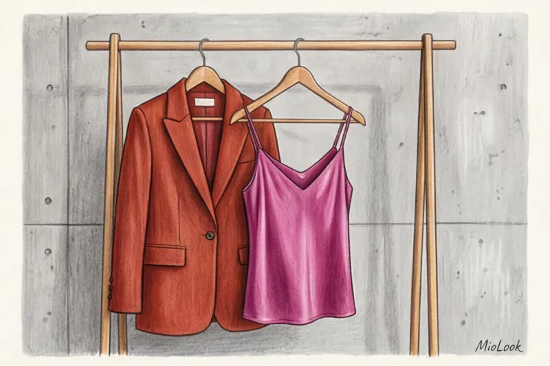
It's important to make a serious disclaimer here. Mixing different colors of opposite temperatures (for example, cool blue and warm yellow) is a masterstroke. But mixing warm and cool shades THE SAME COLOR - this is a disaster.
The vast majority of sloppy street looks stem from a clash of undertones. If you wear a warm tomato-red jacket with a cool raspberry-red blouse, the pieces will visually "kill" each other. The tomato-red will appear washed out and dirty against its cool counterpart.
The most insidious duo is warm yellow-beige (camel) and cool gray-beige (greige). When combined in the same outfit, the cool-toned item looks long overdue for the dry cleaners. Another strict rule concerns makeup: never wear a warm brick-colored sweater with cool cherry lipstick with a blue undertone. This will instantly make your teeth take on an unhealthy yellowish tint.
Color Type: How to Wear Someone Else's Temperature
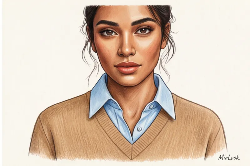
What if your natural coloring is strictly cool (you're a vibrant "Winter" or a contrasting "Summer"), but you're crazy about a warm autumn palette? There's no need to give up your favorite pieces. The life-saving "portrait zone rule" comes to the rescue here.
The portrait zone is the area approximately 30-40 centimeters from your face (shirt collar, scarf, top of jacket). This area critically affects skin tone, highlighting dark circles under the eyes or, conversely, creating the effect of an expensive vacation. In this zone obliged your complementary, “native” colors are located.
But everything below the bust (pants, skirts, shoes, bags) can be absolutely any temperature. One of my regular clients, a 100% contrasting Winter, adores the warm color camel. We found an elegant solution: she wears wide-leg camel wool pants with a pristine white (cool) menswear shirt. Her face is illuminated with the perfect color, and her desire to wear a trendy warm shade is completely satisfied.
Don't forget about makeup, either. The right foundation and blush can be a powerful buffer that will "pull" your clothes from their natural temperature. If you're having trouble deciding which items to move from your closet to the portrait area and which to keep downstairs, try the "smart wardrobe" feature in MioLook — the app analyzes your clothing palette and suggests safe combinations.
Try MioLook for free
A smart AI stylist will analyze your appearance and select the perfect look, taking into account temperature contrasts.
Start for freeChecklist: How to Integrate Temperature Contrast into Your Wardrobe Tomorrow
If you're used to safe, monochrome looks, the idea of mixing icy blue with warm caramel can be daunting. Don't try to change your entire wardrobe in one day. Stick to a tried-and-true formula.
- Step 1: Base plus micro-accent. Wear your usual outfit in one temperature (for example, a completely cool all-black or gray suit). Add just one detail in a contrasting temperature: a warm chocolate-colored belt, gold earrings (instead of the usual silver), or an ochre-colored bag.
- Step 2: Equal Saturation. Create your first contrasting capsule collection with muted tones. Choose a cool dusty pink jacket and complement it with a warm pistachio silk tank top. They won't disagree, as both colors have a calming hint of gray.
- Step 3: Factual conflict. Once you feel confident, combine not only different temperatures but also different textures in your look. Smooth, cool metal and loose, warm wool, shiny satin and matte suede.
Mixing warm and cool shades is a sign of a mature, conscious style. By breaking free from the rigid color rules of the last century, you don't risk looking awkward. On the contrary, you gain access to a wardrobe that's inviting, one with character and dynamism. Stop categorizing clothes as "yours" and "theirs"—start managing proportions, and you'll be surprised at how limitless your personal style can be.


