What is appearance contrast and why is it more important than the basic color type?
Have you ever noticed this: you buy a seemingly perfect shade from your "fall" or "summer" palette, but somehow your face gets lost in it? You look in the mirror and see a bright jumper first, and only then yourself. In 12 years of working as a stylist and textile expert, I've regularly seen the same picture: a closet full of clothes in the "right" colors, hanging like dead weight. The problem isn't the shade itself. The problem is that we ignore a crucial physical characteristic— contrast in appearance.
From the point of view of color physics and textile materials science, contrast is the difference in lightness ( value ) between your skin, hair, and eyes. If we discard color pigments (red, yellow, blue) and look at the face only through the prism of light and shadow, we get an achromatic axis. Imagine a scale of lightness, where 0 is absolute black, absorbing the maximum amount of light, and 10 is absolute white, reflecting it as much as possible. If your hair is at 2 and your skin is at 8, your natural contrast is high. The difference is enormous.
This is precisely why the popular "12 color types" system or the classic "4 seasons" are hopelessly outdated if applied without regard to contrast. Take, for example, two women with the "deep autumn" color type. One has dark brown hair and fair, almost porcelain skin. The other has equally brown hair but dark, well-tanned skin. According to classic theory, both of them would be suited, say, with a brick-red or rich mustard shade. But in practice, the first woman in a monochrome mustard suit will look painfully pale (she won't have enough contrast in her clothes to support the sharp contrast of her face), while the second woman will literally blossom.
As a proponent of sustainable fashion, I always emphasize: knowing your contrast level directly impacts the sustainability of your wardrobe. Items with "your" contrast level are worn for years. You objectively look good in them, receive compliments, and feel confident. Meanwhile, clothes with someone else's contrast level end up on the shelves. According to a 2023 report by the British environmental organization WRAP, about 30% of the clothes in the average European woman's closet haven't been worn in the past year. These are often the very same impulsive print purchases that clash with the face. We explored a deeper understanding of color in the guide. Color Combinations in Clothing: Itten's Rules and Circle , but you always need to start with the base lightness.
How to measure your level: the black-and-white photo test
How can we determine this difference in lightness in practice? The most objective method I give to clients is a black-and-white photo test. Our brains are often fooled by color temperature: we see a warm skin tone or a golden sheen in hair and mistake it for lightness. We need to remove the color pigment and leave only pure light.
Here's a step-by-step guide on how to do it right:
- Prepare the lighting: Take a selfie in daylight with diffused light. Ideally, stand facing a window on a cloudy day. Direct sunlight will create harsh shadows that will distort the result. The photo should be makeup-free.
- Remove color: Convert the photo to monochrome. In the settings of any smartphone, select the basic Grayscale filter. Critical: Don't use artistic black-and-white filters (like Noir or Silvertone), as they artificially exaggerate the contrast. We want a realistic image.
- Find the extreme points: Evaluate the lightest areas (usually the skin on the forehead and cheeks, the whites of the eyes) and the darkest areas (hair roots, eyebrows, irises). Ignore the teeth—their whiteness can be disconcerting.
Now analyze the result. If in a black and white photo your hair looks almost black and your skin looks white, you have high contrast. If all the elements blend into a single soft light gray or medium gray, your contrast is low. If the difference is noticeable but not dramatic (for example, dark gray hair and light gray skin), your contrast is average.
To simplify the process, you can use MioLook By uploading your portrait and outfit photos to the app, you can objectively evaluate how your natural features interact with contrasting items without relying solely on your eye.
The Black and White Fallacy: Why Pure Contrast Doesn't Suit Everyone
There's a pernicious myth in the style industry: if you're a striking brunette, you're automatically destined for a black-and-white wardrobe. One of my clients, a top manager at a European IT company, spent several years exclusively buying crisp white shirts and jet-black suits (price ranges from €150 to €400 per jacket), complaining that she looked tired and older than her age at important meetings.
The point is that pure black and white contrast is the extreme point of the scale (0 and 10). If your natural contrast doesn't reach this absolute (for example, your skin has a warm olive undertone, and your hair is more dark chocolate than raven), you risk being "overshadowed." Your clothes begin to take precedence. Your conversation partner notices your sharp collar, graphic print, and only then your face. I wrote about how to properly incorporate such sharp transitions in the article How to Wear Contrasting Colors in Clothing: Styling Tips.
This is where my beloved textile expertise comes into play. The optical impact of color depends enormously on the texture of the fabric. When it comes to high-contrast combinations, cheap synthetic fabrics become the true enemies of the silhouette. Why does inexpensive black-and-white striped polyester look so disappointing? Smooth synthetic fibers absorb light poorly and unevenly, creating a glare. This unnatural sheen disrupts the geometric pattern along the curves of the body, creating visual noise.
At the same time, dense natural fabrics—matte organic cotton, linen, or high-quality viscose—absorb light evenly. They make the same contrasting pattern appear elegant, stable, and luxurious.
The secret to elegance isn't wearing the brightest combination. It's choosing a fabric contrast that's exactly half a tone below your natural contrast. This way, your face always remains the main focus of your look.
Understanding this physics is the first step to creating a smart wardrobe, where every item works for your appearance, not against it.
Three Levels of Contrast: A Detailed Guide with Combination Examples
In professional coloristics and textile design there is a strict rule: color is secondary, primary Value Contrast (lightness contrast). Before we begin selecting complex shades for a new capsule, we must assess the range between the darkest and lightest areas of your complexion. This range determines whether your face can handle a harsh color block or requires a soft, watercolor-like blend.
When you upload your selfie to MioLook The app's algorithms perform the same work as a professional stylist, but with mathematical precision. The neural network converts the portrait area into 256 shades of gray (from absolute black to pure white) and calculates the difference index between the pixels of the skin, iris, and hair. Based on this delta, the system accurately categorizes appearance into three main levels: high, medium, or low.
Interestingly, these levels are closely but very nonlinearly related to global natural data:
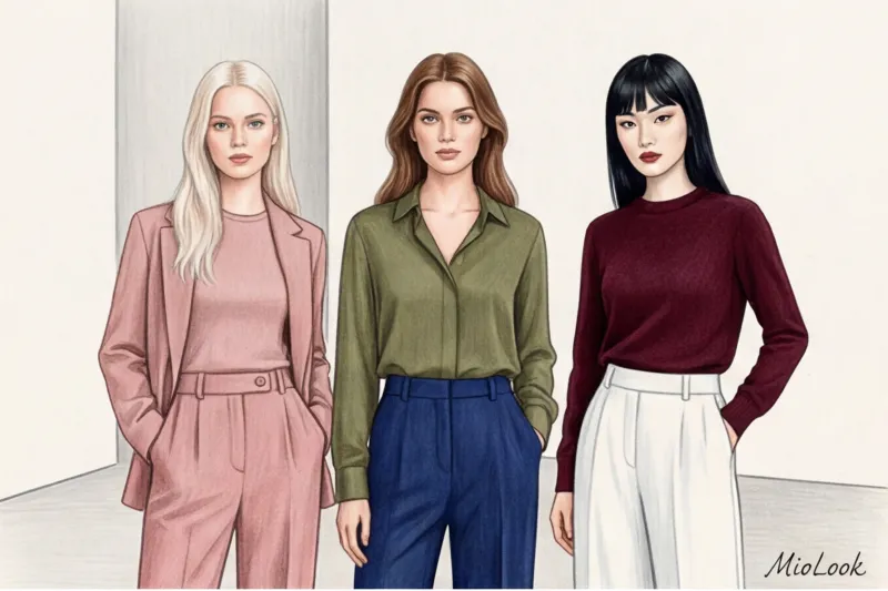
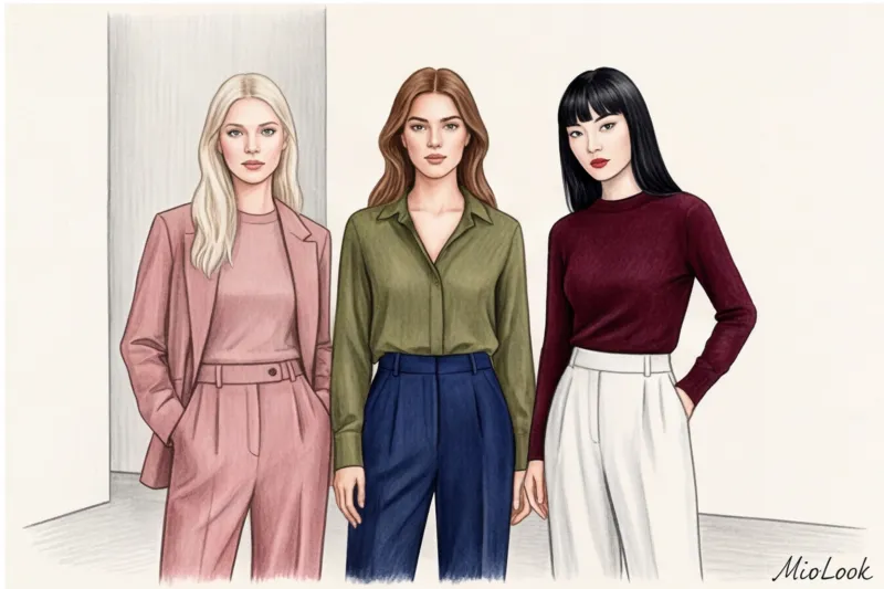
- Asian appearance type (in its classic East Asian version) most often exhibits a confident, high contrast: blue-black hair and dark eyes stand out sharply against a background of porcelain or fair skin.
- African type of appearance Contrary to stereotypes, this type often technically creates a low or medium contrast. Deep, rich skin tones and dark hair are at the same value. However, the snow-white teeth and whites of the eyes create localized highlights, allowing this type to handle pure, neon colors phenomenally well, working on the contrast of color spots rather than lightness.
- Caucasoid type has the widest and most unpredictable spectrum: it covers everything from extremely low contrast (Scandinavian ash blonde and transparent skin) to piercingly high (the so-called "Celtic" type with black hair and icy blue eyes).
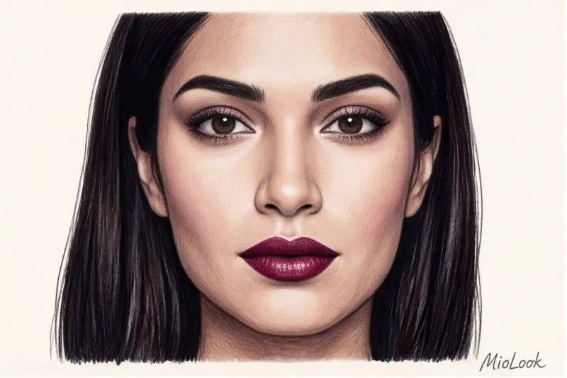
High contrast: dramatic brightness
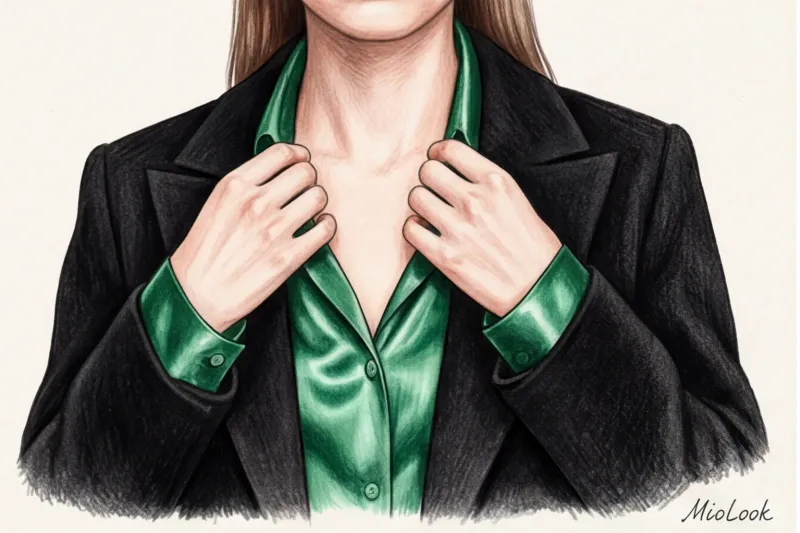
You fall into this level if the difference between your skin tone and hair/eye color is extreme. Key features: dark (almost black or deep brown) hair paired with very fair skin, or dark hair and piercingly bright, icy eyes (blue or emerald green) that glow against dark eyelashes and eyebrows. Think of the classic Snow White look.
Best solutions: Your appearance is made for technology Color blocking (a juxtaposition of large blocks of open color) and complementary combinations. Deep, rich jewel tones look luxurious on you: royal sapphire, dark emerald, ruby. Pair them with clean, cool light tones (pristine white, icy blue). In my experience, such contrasting looks are best created with dense fabrics with a smooth texture—for example, mercerized cotton or organic poplin. In the mid-price range (€100–€150), excellent basic shirts for color blocking can be found at COS.
What to avoid: Dusty, "dirty," and complex mixed shades (earthy mustard, faded khaki, gray-brown) are a strict no-no. Against your natural sharpness, such colors look washed out, and your skin instantly takes on a sickly, sallow undertone.
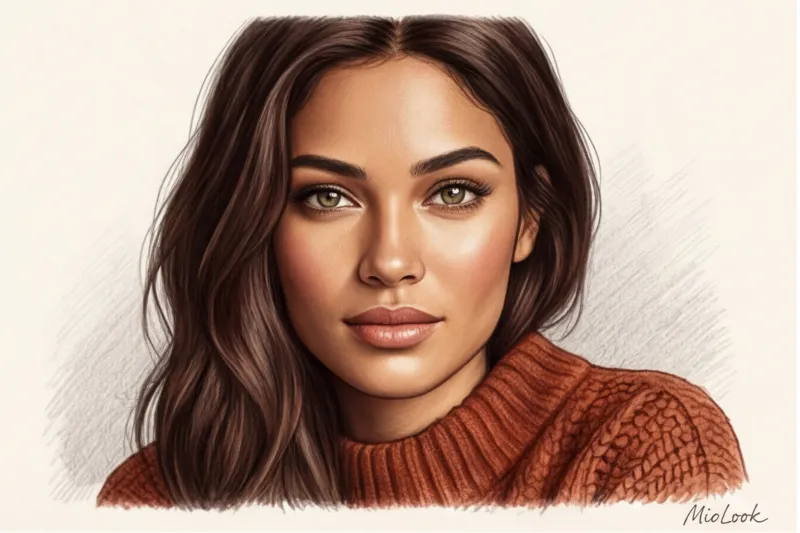
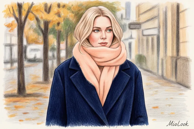
Medium contrast: the golden mean and variability
This is the most common and incredibly flexible appearance type. Characteristics: light brown hair, chestnut locks paired with tanned or olive skin, and soft hazel or gray-green eyes. The shades of your appearance are balanced and seem to flow into one another without any sharp contrasts.
Best solutions: Your main tools are analogous combinations (colors adjacent on the Itten circle), smooth gradients, and total looks with just one accent color. For example, a complex terracotta suit with a camel-colored base top and a dark chocolate-colored bag. According to WGSN's 2024 analysis, complex, "medium-contrast" colors dominate the sustainable collections of premium eco-brands, as they require fewer harsh chemicals for dyeing.
Medium contrast allows you to be a stylistic chameleon. This is the only type that can artificially adjust its contrast.
Medium Contrast Flexibility: If you want to wear a bright, high-contrast outfit (like a black and white geometric pattern), all you need to do is complement your face with makeup: add graphic black eyeliner and a rich, wine-colored lipstick. And if you're in the mood for a cozy pastel, simply remove the bright makeup, and your natural softness will perfectly complement the muted fabrics.
Not sure about your contrast level?
Try MioLook for free: A smart AI stylist will analyze your photo, determine contrast with pixel-perfect accuracy, and select the perfect color combinations.
Start for freeLow contrast: noble pastels and monochrome
Low contrast is all about subtle nuances. Key features: light hair and fair skin (Scandinavian type) or, conversely, very dark skin and dark hair without sharply defined whites of the eyes. There's almost no difference in tone between your natural skin tones—they're all in the same tonality.
Best solutions: The "quiet luxury" aesthetic is created just for you. Monochromatic looks and techniques form the basis of your wardrobe. tonal dressing (When the entire look is pulled together in one color, but with subtle differences in shades and textures). Choose sophisticated powdery colors: pearl gray, ecru, taupe, dusty rose, sage. On you, such colors don't look pale, but incredibly aristocratic and expensive.
What to avoid: Sharp geometric prints (checkerboard, contrasting zebra, large polka dots) and especially the combination of “neon + black”.
During a recent wardrobe review in Milan, I had a client with a classic low-contrast complexion (translucent skin, wheat-blond hair). We analyzed her favorite black sweatshirt with a large, acid-orange logo, purchased for €350. The paradox was that the garment physically "overshadowed" her: the sweatshirt walked into the room first, and only then did the client herself. Her face appeared tired and flat. As soon as we replaced this garment with an oatmeal-colored, chunky cashmere sweater, her natural colors instantly came alive and were illuminated from within. Aggressive geometric patterns and excessive contrast can literally obliterate a delicate appearance.
How contrasting appearance dictates print choices
In visual design theory, there's a fundamental concept of rhythm—the regular alternation of elements. In the context of stylistics, any pattern on fabric isn't just a decorative image, but a strictly defined frequency of light and dark spots. A print acts as a ready-made contrast solution. When the amplitude of this pattern clashes with the natural light and shadow of your face, a powerful optical conflict arises.
It's precisely because of this disruption of visual rhythm that the same classic tartan pattern on someone with a striking, polarizing appearance appears like a luxurious statement, while on a woman with soft, muted features, it instantly cancels out, creating a "clown costume" effect. In the latter case, the viewer first notices the vibrant geometry of the fabric, and only then the person themselves.
As a textile specialist, I'm obliged to highlight the subtle connection between the quality of the fabric itself and how a print is interpreted. We often blame our appearance ("patterns don't suit me"), when the real problem lies in the garment's composition. Cheap synthetics, such as 100% polyester, are physically unable to deeply absorb pigment. The dye lays flat on the surface in a harsh, unnatural sheen, often acquiring an unnatural, cheap sheen that ruins the geometric design. Eco-friendly cellulose fibers behave quite differently. Natural organic cotton, EcoVero viscose, or premium Tencel absorb color at a structural level.
On a high-quality Tencel dress (in the mid-price range, this will cost €120–180), even the boldest, contrasting motif will look elegant. The fiber itself has a matte, velvety finish and softly diffuses light, subtly softening the aggressiveness of the pattern. By choosing such materials, you're not only investing in sustainable fashion but also guaranteeing a premium print that won't fade in patches after the tenth wash.
Scale and Rhythm of Drawing: Rules of Geometry
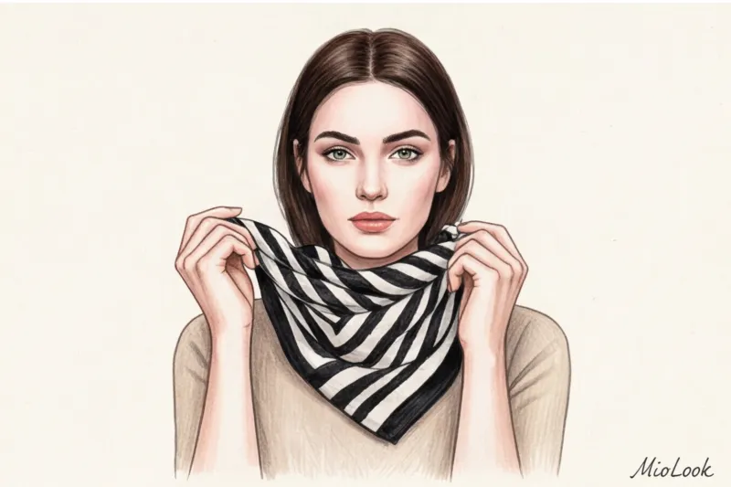
The scale and frequency of repetition of a print's elements directly dictate its "volume." If you possess high contrast (for example, porcelain skin paired with jet-black hair or piercing, icy eyes), your appearance demands a bold, confident rhythm. Your ideal tools are wide nautical stripes, exaggerated contrasting pied-de-poule, and radical color blocking. Uncompromising juxtapositions of dark and light shades on the fabric will harmoniously echo the sharp contrast of your natural colors.
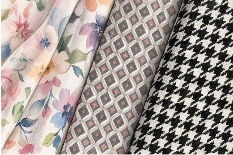
For low-contrast settings, this scheme is detrimental. Large geometric patterns will simply erase the face, leaving only active tissue in the foreground. A fine, discrete rhythm is essential. Consider classic French millefleur (a scattering of tiny wildflowers), subtle ripples, speckles, or small polka dots. The mechanics of this technique are simple: from a distance of one and a half to two meters, the fine pattern merges into a single, complex, textured tone for the human eye. Rather than screaming with individual colors, it creates a vibrant background that gently illuminates the delicate appearance.
Watercolor vs. Graphic: Choosing the Right Technique
When it comes to prints, it's crucial to evaluate the execution technique. I had a particularly revealing case: a client with a classic low-contrast complexion (ash-blond hair, translucent olive skin with no blush, gray-green eyes) desperately wanted to incorporate a trendy animal print into her wardrobe. However, every time she tried on a classic yellow and black leopard coat, her complexion looked sallow and tired. The problem wasn't the leopard print itself, but the harshness of its execution.
We found the perfect solution by simply switching techniques. We chose a "watercolor" leopard print in muted taupe and cream tones, printed on flowing cupro. The edges of the spots weren't outlined with a sharp black outline, but softly blurred, like paint on wet paper. The lack of hard edges allowed the print to perfectly sync with her smooth, soft appearance.
The application technique is your main filter. Sharp, graphic edges (hard geometry, pop art, sharp abstraction) are created exclusively for high and medium-high contrast. If your natural colors blend delicately, look for similarly blurred edges in your clothing.
Gradients, watercolor florals, soft tie-dye, and melange weaves are a surefire base for medium and low contrast. To avoid relying solely on your imagination when shopping, I recommend checking out prints digitally. Upload a photo of the patterned item you like to the "smart wardrobe" feature in MioLook By placing a print in a collage next to your face, you instantly assess the optics: if the eye is drawn to the pattern first, not your eyes, then feel free to leave the item on the store's display rack.
Optical illusion of textures: a stylist's secret tool
In its 2023 report, the Pantone Color Institute highlighted a curious fact: the same pigment is perceived by the human eye as 30% lighter or darker solely depending on the weave of the threads. The physics of light reflection is the hidden mechanism that directly influences how we perceive the color of clothing and how it interacts with our face.
Let's look at this from a textile engineer's perspective. Smooth silk satin acts like a mirror: its long overlapping threads (satin weave) reflect light rays, creating intense highlights. The color on the fabric's curves appears almost white, vibrant and iridescent. In contrast, dense, matte wool (such as classic broadcloth) absorbs light. Its microscopic fibers capture the rays, creating miniature shadows, making the hue appear deeper and more muted.
It's this difference in light reflection that explains a common mistake in styling. I once reviewed the closet of a top manager who complained that her expensive beige suits made her face look sallow and aged. The problem was that a completely matte monochrome look (a cotton shirt and matte suit crepe) acted like a black hole of light. The matte surface didn't cast a protective glow on the skin of the neck and chin, mercilessly emphasizing the nasolabial folds and shadows under the eyes, making the face appear completely flat. To restore natural volume, we simply swapped the matte blouse for a flowing cupro top—the subtle sheen worked like a professional photographer's softbox.
Texture contrasts offer the most eco-friendly alternative to fast fashion and impulsive buying of multiple colorful items. Instead of buying synthetic tops in trendy shades every season, a sustainable wardrobe is built on a variety of surfaces. With a basic set of high-quality textures, you can create dozens of fresh outfits. Investing in an organic silk or dense Tencel skirt for around €120–€150 will pay for itself much faster than mountains of cheap knitwear that will pill after the third wash.
Gloss, matte, and pile: eco-friendly fabrics in action
Understanding how fabrics manipulate light allows you to fine-tune your contrast in appearance for any stylistic purpose. Japanese deconstruction masters like Yohji Yamamoto have long proven that color is secondary if you know how to work with the material.
If your natural contrast is high, you don't have to wear red and emerald to look striking. Try creating a Total Black look by combining radically different surfaces. A classic, timeless technique: heavy, matte wool coat and glossy vegan silk. This combination creates a powerful visual impact due to the dramatic difference in light absorption and reflection. The resulting look is dynamic, perfectly complementing your naturally vibrant features while remaining within the bounds of elegant minimalism.
If your goal is to maintain low contrast (for example, with soft light brown hair and fair skin), shaggy fabrics come to the rescue. High-quality alpaca, kid mohair, or undyed cashmere literally "melt down" the harshness of any shade, even the most aggressive. Light, hitting the fluffy pile, is scattered in thousands of directions, preventing harsh glare.
Try MioLook for free
Start creating perfect looks with artificial intelligence and find harmonious texture combinations.
Start for freeAs a result, the color loses its tension and becomes enveloping. That's why a rich sapphire sweater made of fluffy mohair will fit seamlessly into the wardrobe of a woman with a delicate color palette, while the same blue shade in crisp, smooth cotton will completely overwhelm her face. The texture acts as a built-in filter, reducing the brightness.
To incorporate the optical illusion of texture into your everyday looks today, use the rule of three elements:
- Add a drop of "liquid light": If you're wearing a matte cotton trench coat and denim, be sure to add a silk scarf or Ecovero viscose top to the portrait area. This will instantly highlight your skin.
- Take the gloss off: Shiny pieces (such as a satin skirt or faux leather pants) often look too formal for daytime dress codes. Tone them down with a chunky merino wool sweater or a matte suede jacket.
- Create a 3D effect in monochrome: When putting together a set in a single color, make sure it includes at least three different weights. For example: translucent chiffon, thick smooth cotton, and a loose textured knit.
Wardrobe Management: How to Wear "Other People's" Prints and Shades
According to a 2023 analytical report by the Ellen MacArthur Foundation, the average city dweller wears a purchased item only seven to ten times before giving it up. One of the main reasons for this dismal statistic is the notorious feeling of "this dress makes me look pale" or "this pattern is eating me up." Sustainable fashion doesn't require throwing away items that don't seem to suit you. Getting rid of a perfectly tailored €150 jacket just because its print is too graphic for your soft complexion is a direct violation of the principles of responsible consumption.
Instead of a radical closet cleanout, I suggest using intelligent styling This is a method of adapting a trendy or simply beloved item that contrasts with someone else's to suit your unique appearance using visual barriers and clever layering. We're not changing the item, we're changing its visual environment. To stress-freely test how your "problem" purchase will work, I recommend digitizing your closet using smart wardrobe feature in MioLook The algorithm will help you find the perfect balancing element among your basic pieces that will either calm or, conversely, enhance a controversial print.
Portrait Focus: Scarves, Collars, and Makeup
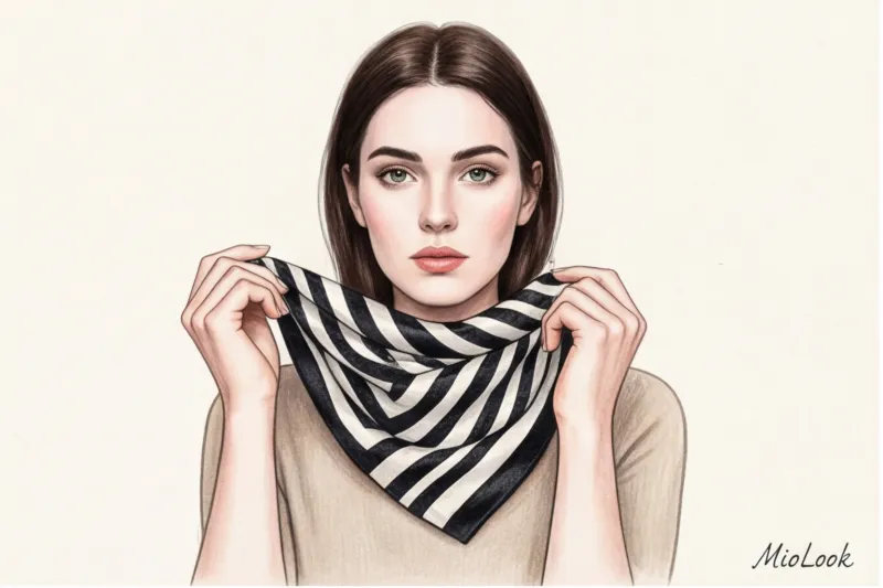
The key to working with inappropriate contrast lies in the "30 centimeters from the face" rule. The anatomy of our perception is such that all colors and rhythms below this invisible boundary (from the bust line down) have virtually no effect on how your skin tone, the brightness of your eyes, or the depth of your cheekbones are perceived. If you've purchased an item with an aggressive contrast, simply create a buffer layer of your "own" shade.
In my experience, this architectural technique has saved dozens of looks. Recently, we adapted a bold black and white wide-striped sweater for a client with a very soft, low-contrast look. The solution? A voluminous ecru cashmere turtleneck worn underneath and a light silk scarf. This layering of skin-matching base tones took the brunt of the look, allowing her to confidently wear any contrast underneath. The same principle works perfectly with the prominent collars of basic shirts.
If you want to wear a bold piece solo, without any additional layers, you'll have to optically "pull" your face up to the level of your clothes. Enhancing your contrast with makeup is a surefire way to achieve this. A thick matte berry lipstick or bold, graphic eyeliner artificially enhance your natural contrast. Your face won't be lost against a color-blocked backdrop or neon print. Another favorite trick of mine is statement glasses with chunky, dark frames. They act as a rigid frame, drawing your features together and preventing your clothes from overpowering your appearance.
Stylistic honesty: makeup tricks aren't for everyone. Heavy, contrasting makeup takes time and can clash with a relaxed daytime dress code. If you feel uncomfortable with bright lipstick at 10 a.m., always return to the fabric barriers in the portrait area—it's the most reliable and comfortable option.
Contrast and Age: Why Your Palette Changes
Let's start with physiology, which is rarely covered in glossy magazines. From a biological perspective, our maturation is directly linked to changes in melanin synthesis. After 40–45 years, this process gradually undergoes a restructuring: the iris gradually "fades" and loses its former icy brightness, the skin thins, acquiring a different light transmittance and changing its base tone, and a noble gray appears in the hair. This is a completely natural evolution of your beauty, which requires an equally natural revision of your wardrobe.
Due to the natural loss of pigment density, the contrast of appearance almost always decreases with age. A fiery winter brunette with porcelain skin, who at twenty-five easily withstood the highest light contrast, gradually transitions to the medium or even low contrast category by fifty. Facial features become softer, their geometry taking on a watercolor-like quality.
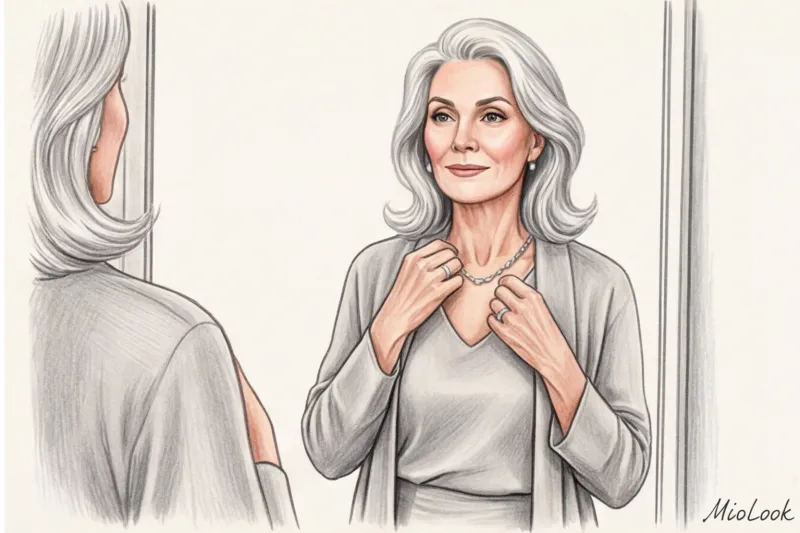
Herein lies the main stylistic mistake of middle age—the desperate attempt to cling to the familiar palette of youth. The decision to continue dyeing your hair a radical jet-black and wearing similarly contrasting clothes backfires. The physics of light are merciless: a deep black tone near the face creates a harsh visual frame, acting like a magnifying glass. Against this extreme darkness, the slightest wrinkles, age spots, under-eye shadows, and sagging skin instantly become accentuated. Instead of the desired rejuvenating effect, we get an exhausted look.
The modern philosophy of pro-aging (a conscious, respectful attitude toward age) suggests not fighting nature, but rather wisely embracing it. An elegant transition to low-contrast, refined combinations can visually erase signs of fatigue better than any highlighter. Replace aggressive color blocks with complex, enveloping shades: dusty rose, pearl gray, warm taupe, sage, or sage. For example, a formal black jacket with a crisp white shirt should be replaced with a soft graphite cardigan paired with an ivory silk blouse.
Your ideal image
it begins Here
Join thousands of users who look flawless every day with MioLook.
Start for freeUpdating your wardrobe to a new level of contrast doesn't require a complete overhaul in a single day. A basic merino wool jumper in the right taupe shade will cost around €100-€150, but it will be the perfect softening "transition" to your older, brighter pieces. To visualize how new muted tones will fit into your current wardrobe without breaking the bank, it's handy to use the "smart wardrobe" feature in MioLook It will clearly show you which soft combinations will support your updated natural palette, and which items should be kept away from the portrait area.
Checklist: Wardrobe Contrast Analysis with Algorithms
Professor Kate Fletcher's research on sustainable fashion reveals depressing statistics: up to 60% of our closets become "orphans." These are the clothes that hang on hangers for years with their tags intact because we simply don't know what to wear them with. Analyzing hundreds of wardrobes, I've uncovered a clear pattern: in 9 out of 10 cases, the problem isn't a color wheel clash, but a radical mismatch of contrast levels. Your appearance demands one rhythm, but the item you buy conveys a completely different one.
To stop storing dead weight and make things work, we need a systematic audit. A practical guide to sorting through your closet using the contrast assessment method starts not with pants and shoes, but with the portrait zone—it dictates the rules for your entire silhouette and is responsible for how your face looks.
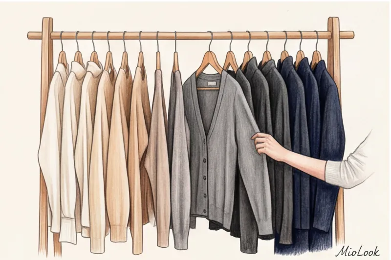
Top Sorting: The Three-Pile Rule
Set aside a free hour in good daylight. Take out absolutely all your blouses, shirts, tops, sweatshirts, and jackets. Our goal is to strictly sort the tops into three contrast groups, completely ignoring their seasonality, price, or style. We evaluate only the differences in the lightness and saturation of patterns within a single item. To ensure a clean experiment, I often advise my clients to take a photo of a bunch of clothes with their phone and convert the image to a black-and-white filter—this prevents the brain from being distracted by their favorite colors.
- Group A (High Contrast): Graphic black-and-white patterns, color blocking, pure, deep colors (emerald, sapphire, fuchsia), wide stripes, and crisp geometrics—these are pieces that make a statement the second you walk into the room.
- Group B (Medium Contrast): Analog prints without sharp changes, classic blue denim in basic washes, terracotta, olive, and a calm Vichy check. Versatile staples for a basic wardrobe.
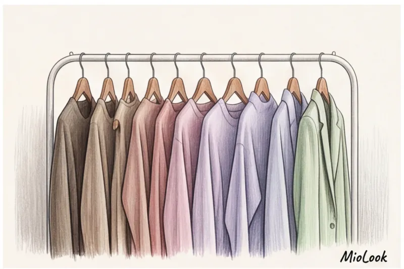
- Group C (Low Contrast): Powdery and dusty tones, mélange, textured solid-color fabrics (for example, oatmeal-colored cashmere), complex gradients, watercolor transitions, where colors softly merge into each other.
Blind Spot Diagnostics
Once you sort your items into these three categories, you'll quickly discover your stylistic blind spots. Let's say you impulsively bought a stunning zebra-print maxi skirt on sale for €120. It's amazingly high-quality and fits perfectly. But why is it that you absolutely have nothing to wear it with?
The answer lies in the stacks in front of you. If 80% of your tops and jackets are in Group C (low-contrast, soft sweaters, and pastel blouses), a high-contrast skirt will optically "cut" your figure in half. It will pull all the visual weight down, making your upper body (and your face, if it's also low-contrast) look washed out, tired, and expressionless. The garment isn't to blame—it's simply stylistically isolated from your basic matrix.
Delegating Routine Tasks: How Smart Algorithms Work
Conducting such microanalysis of each new purchase manually is a task that requires professional insight. This is where technology comes in. As an expert, I'm a proponent of offloading complex analytical routines to artificial intelligence.
By digitizing your things, you can use MioLook's smart algorithms How does this work in practice? The system doesn't just recognize the category of an item. It mathematically calculates Value Contrast (light contrast) of the uploaded clothing items and compares them with each other. The algorithm identifies those "orphans" (like our zebra skirt) and automatically assembles outfits with the perfect contrast for you.
For example, the app might suggest toning down an aggressive print on the bottom by adding a thick black jacket (creating artificially high contrast in the portrait area) or using a scarf in the right rhythm as a transitional bridge. You get ready-made look formulas from what's already hanging in your closet.
Conscious style isn't a closet overflowing with hundreds of seasonal new items. It's a high compatibility factor for each individual item. Understanding your natural contrasts in appearance acts as an uncompromising filter against marketing ploys. Your face is a painting, and your clothes are just the frame. Choose a frame that will make the canvas shine, not one that desperately competes for attention.
Guide Chapters
How to choose jewelry based on contrasting appearance
The "gold is warm, silver is cool" rule no longer applies. We reveal the secret to choosing the perfect jewelry based on your natural contrasts.
How Hair Color Affects Contrast and Wardrobe
Changing your hair color isn't just a beauty treatment; it's a major shift that changes the way you choose clothes. Find out why your favorite clothes may no longer suit you after dyeing your hair.
Who suits total black: wearing monochrome for contrast
Black isn't always a "safe base." Learn how to wear monochrome looks and who black suits effortlessly.
Color blocking in clothing: rules for combining bright colors
Afraid of wearing bright colors? Learn the secrets of color blocking from a personal stylist and learn how to harmoniously combine vibrant shades.
Color contrast of appearance: lightness and color
The traditional division into seasons is outdated. We explore how the Munsell system and color physics can help you choose the perfect wardrobe.
Makeup for Contrast: A Stylist's Guide
Bought a cult red lipstick, but it makes your face look tired? It's not the color, but the pigment density. Learn how to match your makeup to your natural contrast.
How to choose a print to suit your face: scale, rhythm, and geometry
Tired of patterns that don't flatter you? We'll tell you how to choose the right prints based on your natural contrast.
How to determine the contrast of appearance using an online neural network
Why doesn't the black-and-white filter method work anymore? We explain how AI can accurately determine contrast and select the perfect clothing colors.
Medium Contrast Appearance: Wardrobe Rules
About 60% of women have medium contrast, but often hide behind black and white uniforms or bland beige. We'll explore how to cleverly highlight your natural coloring.
Low Contrast Appearance: How to Choose Clothes
Are bright colors detracting from your beauty? Learn how to turn soft colors into the foundation for a flawless, luxurious style.
How to determine the contrast of appearance: a photo test
Forget complicated color palettes. Find out your contrast level with this objective black-and-white photo test from a stylist with 12 years of experience.
High contrast appearance: the best colors and combinations
Tired of the same old advice for the Winter color type? We'll explore how to harness your natural vibrancy with the right shades, prints, and textures.