The Secret Code of Appearance: Why a Basic Color Type Isn't Enough
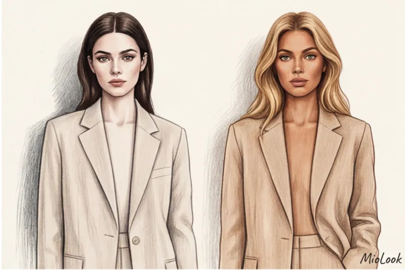
Imagine this: you buy a luxurious cashmere pantsuit for €800. It's a perfect cut, a refined sandy shade, and a dense fabric. You put it on, anticipating a look of "quiet luxury," but when you look in the mirror... you realize your face has vanished. You look tired, unwell, and the suit steals all the attention.
Over my 14 years as a stylist, I've seen this scene hundreds of times. One of my clients, a striking brunette with porcelain skin, genuinely couldn't understand why expensive, minimalist clothes in basic colors made her look "mousey." The answer wasn't a bad cut, but a complete disregard for the physics of color.
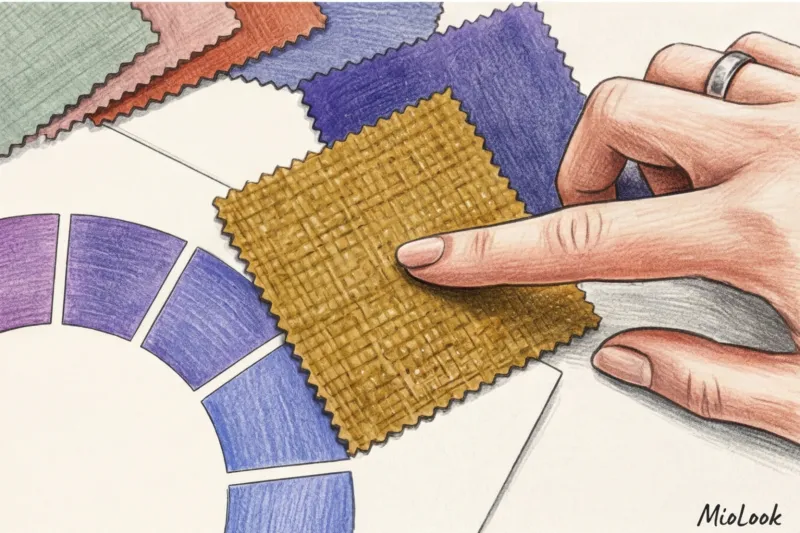
The traditional division into seasons ("winter," "spring") is hopelessly outdated. Today, professional styling relies on an engineering approach—Albert Munsell's color system. Back in the early 20th century, he decomposed color into three measurable vectors: hue, value, and saturation. It's these last two parameters that form your personal code.
We have already discussed the basic principles in more detail in our The complete guide to contrasting appearances and choosing the perfect colors But today we'll dig deeper. We'll explore how exactly your natural contrast controls the focus of others' attention, and why smart algorithms—like those in MioLook app — First of all, they analyze the geometry of light and shadow on your face, and don’t just look for the right shade of red.
Light Contrast: The Physics of Light and Shadow in Your Image
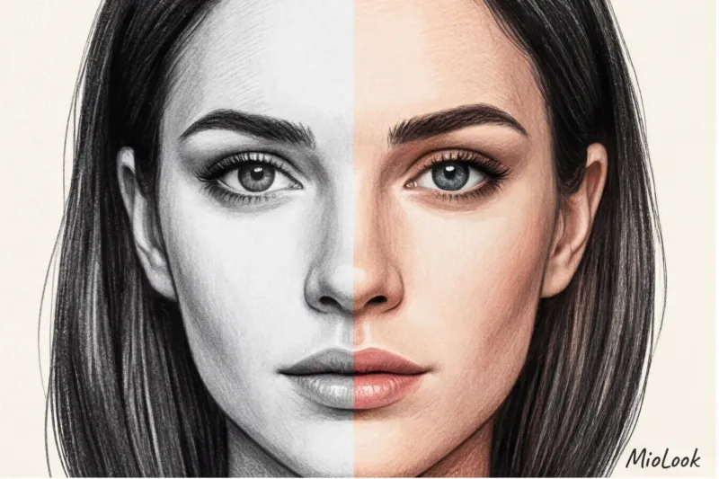
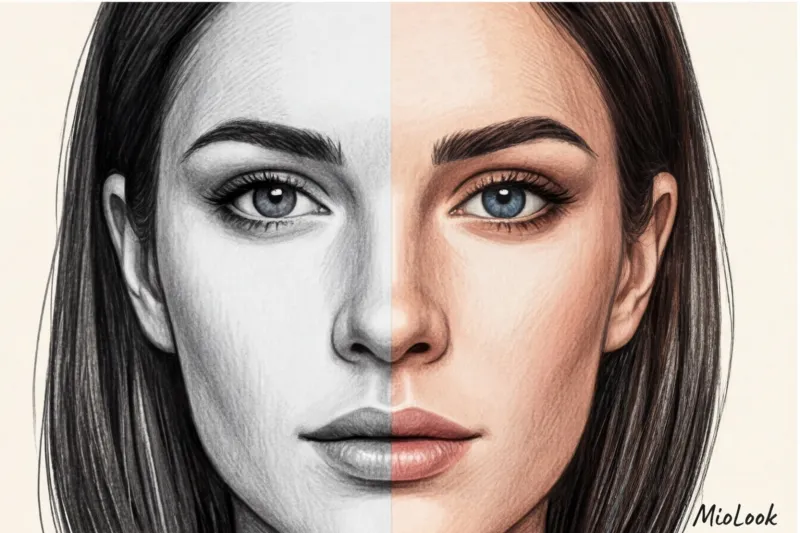
Value contrast is the mathematical difference between the lightest and darkest areas of your subject. We typically compare hair color and skin tone (sometimes adding eye and eyebrow color).
In design and photography, there is a lightness scale from 0 to 10, where 0 is absolute black (maximum light absorption) and 10 is absolute white (maximum reflection).
- High contrast (difference of 5-7 steps or more): Snow-white skin (8-9) and jet-black hair (1-2). An example is the classic Dita von Teese or Snow White type.
- Medium contrast (3-5 steps difference): Light brown hair (5) and fair skin (8). This is the most common European type.
- Low contrast (1-2 steps difference): Light hair and fair skin, or dark skin and dark hair. The shades flow smoothly into each other.
"The right clothes work like a frame for a painting. If the frame's contrast matches the canvas's, we see a masterpiece. If the frame is too aggressive, the painting is lost." I explain this principle of optical illusion to every client during their first consultation.
How to measure your light contrast at home
To take the guesswork out of it, do the simple thing I ask everyone to do before going through their wardrobe: take a makeup-free selfie.
- Sit facing a window in natural daylight (no direct sunlight).
- Take a photo with your phone.
- Convert the photo to a monochrome (black and white) filter in a standard editor.
Now look at the photo. How clearly do your hair, eyebrows, and eyes stand out against your skin? If you see sharp, graphic lines, you have high contrast. If your entire face appears bathed in a soft gray gradient, you have low contrast.
Important limitation: This test does NOT work if you're standing in direct sunlight or under a harsh overhead light—harsh shadows from your nose and browbones will create a false high contrast that you don't naturally have.
And remember about your hair. If you're naturally light brown (medium contrast) but go platinum blonde, you've artificially reduced your light contrast. Things that suited you before won't work.
Color contrast in appearance: the play of shades and temperatures
If lightness is about black and white cinema, then color contrast of appearance — it's about painterly quality. It's how bright, pure, or, conversely, muted the tones are in your natural colors.
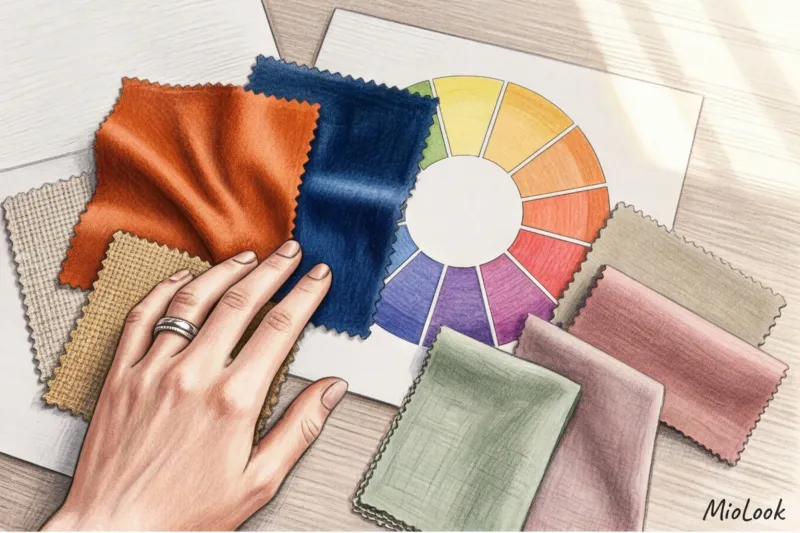
Let's return to Itten's color wheel. Color contrast depends on two factors: the temperature difference (cool/warm) and the chromaticity level (the brightness of the pigment). You and your friend may have exactly the same lightness, but completely different color contrast.
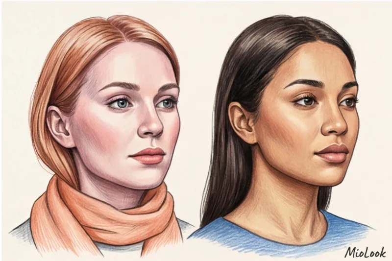
I had a telling case in my practice. Two sisters, born close in age, came to see me, both blondes with fair skin (low contrast). But Anna had transparent, icy blue eyes, a cool platinum blonde, and a frosty blush. Marina, on the other hand, had a soft, wheat-colored blonde, an olive undertone, and gray-green eyes with golden flecks.
Anna is high-contrast (clear, vibrant pigments). Marina is low-contrast (muted, complex, dusty hues with a hint of gray). When Anna wore Marina's dusty pink sweater, she looked like she hadn't slept in a week. Her vibrant appearance called for pure hues—like a rich, icy blue.
The main difference between light contrast and color contrast
Many people confuse these two concepts, but the difference is fundamental:
- Light contrast dictates to us how dark or light The items in the set must be in accordance with each other (black trousers + white shirt = high light contrast).
- Color contrast dictates what colors exactly from Itten's circle we can pit heads (emerald + fuchsia = high color contrast).
As Leatrice Eiseman, executive director of the PANTONE Color Institute, notes, true harmony in style is born only when clothing becomes a physical extension of a person's natural coloring, rather than competing with it.
The "Safe Monochrome" Myth: Why Universal Rules Don't Work
Perhaps the most harmful stereotype of our time is the belief that a total beige or grey look suits absolutely everyone and automatically makes the image “expensive”.
Let's use logic. If you have snow-white skin and black hair (high contrast), your face is a bright, graphic picture. When you put on an all-beige suit (low contrast), an optical illusion occurs. The brain of the person looking at you can't match the sharpness of your face with the blurriness of your body. The "head floating" effect occurs.
A 2024 study by the analytical agency WGSN showed that the trend toward faceless minimalism is rapidly declining. Consumers are tired of looking the same. Clothing should highlight your unique personality.
Safe monochrome is ideal only for those with low contrast. For everyone else, it works solely as a base to be broken up with accents.
Tired of guessing with flowers?
The smart MioLook algorithm will analyze your appearance and create a capsule that perfectly matches your natural complexion. Upload your photos and get ready-made looks.
Find the perfect colorsThe Rule of Similarity: How to Combine Clothes Knowing Your Contrast
The secret to an expensive wardrobe lies in the mathematical rule of similarity: the contrast of your clothes should be equal to the contrast of your face Here's how it works in practice.
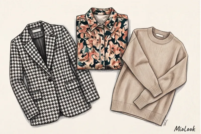
For a high-contrast appearance
Sharp edges and color blocking are essential for you. You're that rare breed of woman who looks stunning in a classic Breton top made of heavy cotton (180 g/m² or higher) or a combination of scarlet silk and black leather.
- Combinations: Black + white, dark blue + lemon.
- Prints: Large geometric patterns, sharp-edged houndstooth, and crisp stripes. You can confidently buy jackets with bold patterns at Zara or Massimo Dutti—they won't overwhelm you.
For a low-contrast appearance
Your superpower is the magic of watercolor transitions and complex textures. If you wear black and white stripes, people will see the stripes first, and then you.
- Combinations: Monochrome gradients, pastel tones. Beige + camel, dusty pink + light gray.
- Prints: Blurred edges, small florals, and tie-dye with subtle tonal differences. Your ideal reference point is the aesthetics of brands like COS or Loro Piana (in the mass-market segment, such pieces typically cost between €80 and €150).
For medium contrast
You're the lucky owner of a happy medium. Your goal is to avoid extremes. Avoid both overly dull, all-over looks and aggressive neon and black.
- Combinations: Burgundy + powdery, emerald + baked milk color.
- Prints: Moderate size, medium sharpness.
Impression Management: How to Artificially Change Your Contrast
What if you absolutely love a shirt, but it's completely unflattering because of the contrast? Or if a strict dress code requires a white blouse with a black suit, but you're a girl with a soft, low-contrast appearance?
This is where professional styling tricks come into play. In my experience preparing speakers for major business conferences, a problem regularly arises: the company's corporate colors simply "kill" the expert's face. So we use the buffer (portrait zone) technique.
Contrast control tools:
- Accessories-dividers. If a piece blends with your skin tone, create a border. Tie a geometric silk scarf (say, €40-€50) around your neck that matches both your skin tone and the color of your blouse. It will act as a transition.
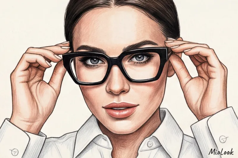
- Glasses frames. This is a powerful tool. A girl with low contrast can wear chunky black frames, and her light contrast will be artificially boosted! Now she can confidently wear black and white.
- Makeup. A bright, graphically defined red lipstick or bold eyeliner instantly enhances the color contrast of your appearance.
- Depth of cut. The further the "wrong" color is from the face, the less impact it has. Swap out your turtleneck for a V-neck, and the impact of the unflattering contrast will be reduced by 70%.
Checklist: Auditing Your Wardrobe for Contrasts
Don't rush to throw out things that don't suit you. Let's conduct a smart audit right now.
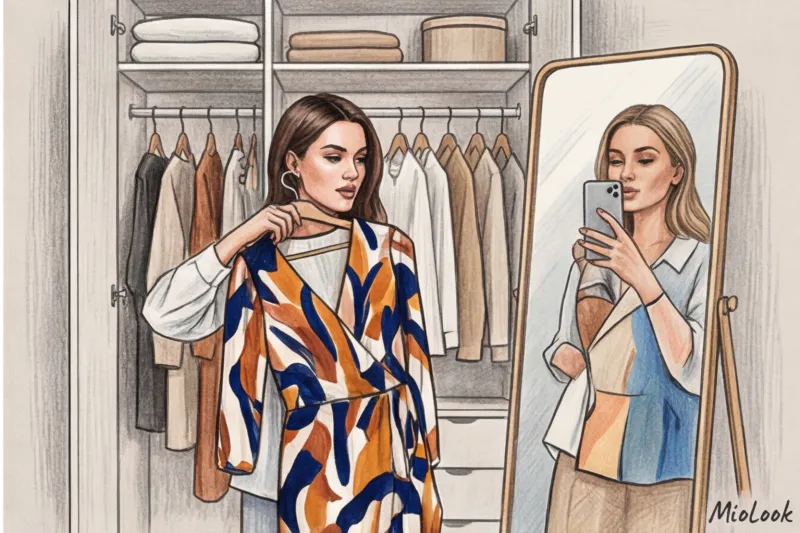
Step 1: Sorting. Take out all the items you love on the hanger but rarely wear. The problem is likely a contrast issue.
Step 2: Print Test. Take a black and white photo of your printed items. If the pattern blends into a gray mass, it's low contrast. If it's too bright, it's high contrast. Compare it to your black and white selfie from the beginning of the article.
Step 3: Rescue operation. Put aside items that don't align with your natural coloring. Consider whether you can "pull" them away from your face (by relegating them to the bottom of your wardrobe, such as trousers or skirts) or compensate with accessories.
Step 4: Digitization. To avoid having to keep all these formulas in your head, add things to MioLook smart wardrobe The app will help you create capsules with the right balance of light and dark, based on the items you've uploaded.
Your perfect look starts here
Join thousands of users who look flawless every day with MioLook. The AI stylist will select combinations based on your contrast levels.
Start for freeUnderstanding your natural contrast is the key to breaking free from the matrix of spontaneous shopping. You stop buying pretty things that take on a life of their own. You start buying clothes that work for you, making your face the main, most striking, and harmonious accent of any look.