A few years ago, Alina, a classic Scandinavian blonde with fair skin and crystal-blue eyes, came to me for a consultation. She was desperate: she'd spent about €150 on a stunning fuchsia dress for a friend's wedding. "I wanted to stand out, not look like a pale moth in the photos," she explained. But when Alina showed me the pictures, the effect was the opposite. The photos revealed a gorgeous pink blotch, and the girl's face seemed to vanish above it. The dress had completely devoured her appearance.
This is the most common mistake I encounter in my practice. Girls whose superpower is low contrast in appearance , have been trying to "color" themselves with bright clothes for years, killing their natural aristocracy. We've covered the basics of color typing in more detail in our complete guide to choosing the perfect colors and prints And in this article, I'll show you how to stop fighting nature and turn soft colors into the foundation for a flawless, luxurious style.
What is low contrast in appearance really?
Forget the complicated "four seasons" theory for a moment. In professional coloristics, based on the theory of Johannes Itten, we work with a value scale from 0 (absolute black) to 10 (pristine white). Contrast is simply the mathematical difference between the color of your skin, hair, and eyes on this scale.
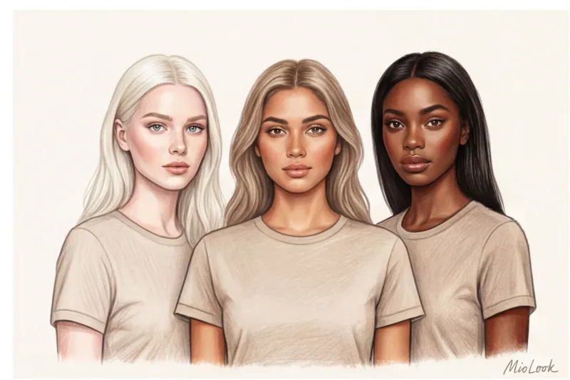
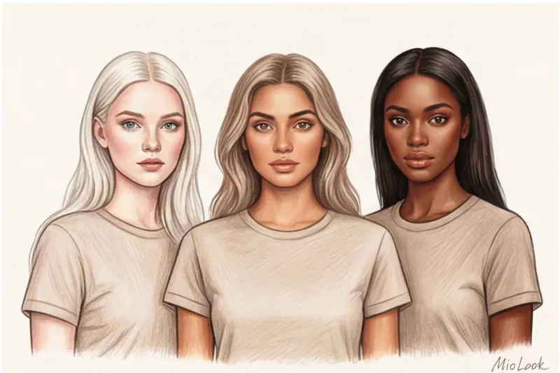
If this difference is only 1-3 steps, we're dealing with low-contrast appearance. And here's the first surprise: there are three types:
- Light: platinum blondes with porcelain skin (the difference between hair and skin is minimal at the light end of the scale).
- Average: Soft blond hair, beige skin, gray-green eyes. That very Slavic type often unfairly called the "gray mouse."
- Dark: dark or swarthy skin, dark hair, brown eyes (monochrome on the dark end of the scale).
Knowing your contrast level is your financial shield. You'll stop buying garishly colored items on sale that then hang with the tags on for years. If you have trouble determining your parameters yourself, I always recommend using technological solutions. For example, MioLook analyzes your data and helps you weed out unsuitable items before you even go to the fitting room.
Your perfect wardrobe awaits
Try MioLook for free: A smart AI stylist will select the perfect look based on your contrast and coloring.
Start for freeThe Main Myth: "The Gray Mouse" or Why Bright Colors Kill You
The most harmful and persistent piece of advice from the glossy magazines of the 2000s: "Pale girls should wear bright colors to blend in." As a colorist, I can tell you: this simply doesn't work. Bright and contrasting clothes don't "highlight" a low-contrast complexion; they wash it out.
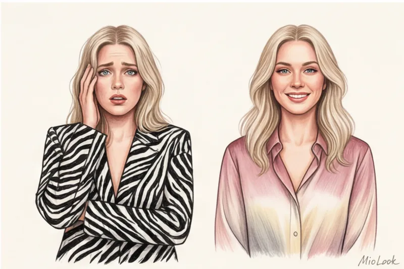
The human brain and vision are designed in such a way that attention is always immediately focused on the most contrasting point in the visual field. If a girl with a soft, pastel complexion wears a bold black-and-white striped blouse, others will stare at the blouse. This creates the optical illusion of a "levitating head" or "the dress is moving away from the person."
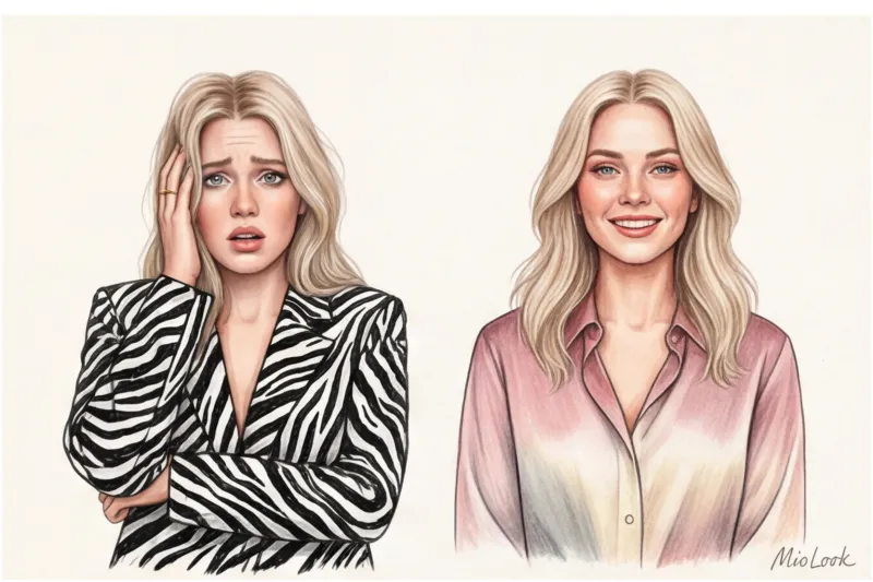
"When a client wears something at her level of contrast, people compliment her: 'You look so beautiful!' When the contrast is too high, they say: 'What a beautiful dress you have.' Our job is to sell the face, not the fabric." This is a rule I emphasize at every wardrobe review.
Expressiveness Formula: How to Dress in Low Contrast
The secret is simple, but it requires discipline: the level of contrast in your clothes should exactly match the level of natural contrast on your face. This is the so-called similarity rule Let's look at how to apply it in practice.
Monochrome and analog combinations
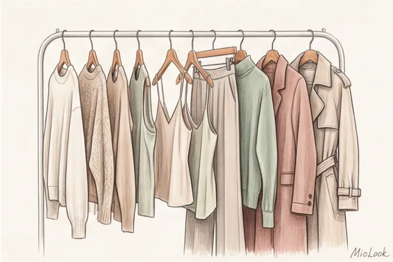
Total monochrome is the basis for a low-contrast appearance. By choosing one color and stretching it from head to toe in different shades (from light to dark, but within 2-3 tones), you create a vertical line.
If monochrome seems boring, try analogous schemes. In Itten's color wheel, these are colors that sit next to each other. For example, instead of a sharp blue + yellow color block, choose a gradient: dusty pink + soft wine + warm beige. According to the analytical agency WGSN (2024), it is precisely these smooth, flowing color schemes that form the basis of the trend toward intelligent minimalism.
The Power of Texture: How to Play Without Color
If we're going to eliminate color differences, we absolutely need texture differences. This is my favorite stylistic technique.
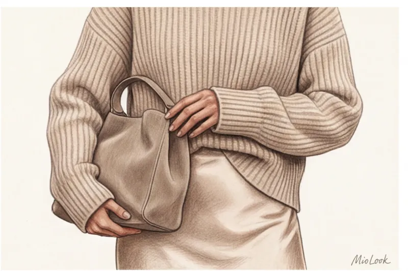
Natural silk with a density of 19 momme or more reflects light, creating highlights. Matte wool or loose cashmere absorb light. By wearing a smooth silk midi skirt (you can find excellent viscose options in high-street stores for €40–€60) with a voluminous matte sweater in the same ecru shade, you create a micro-contrast. It gives the eye something to catch the eye, making the look incredibly expensive, while still making your face the focal point.
Tired of collecting images bit by bit?
Your perfect look starts here: Join thousands of users who look flawless every day with an AI assistant.
Start for freePrints and patterns: what to avoid and what to add to your wardrobe
According to statistics, about 70% of global mass-market assortments (Zara, H&M, and others) use high-contrast patterns. This is a huge problem for women with low-contrast needs—finding the right print at the mall can be difficult. Therefore, it's important to know exactly what to look for.
Stop list (what erases you):
- Chessboard;
- Zebra and leopard in classic natural colors (with black spots);
- Sharp geometry with right angles;
- Pop art and large inscriptions in contrasting letters on the chest.
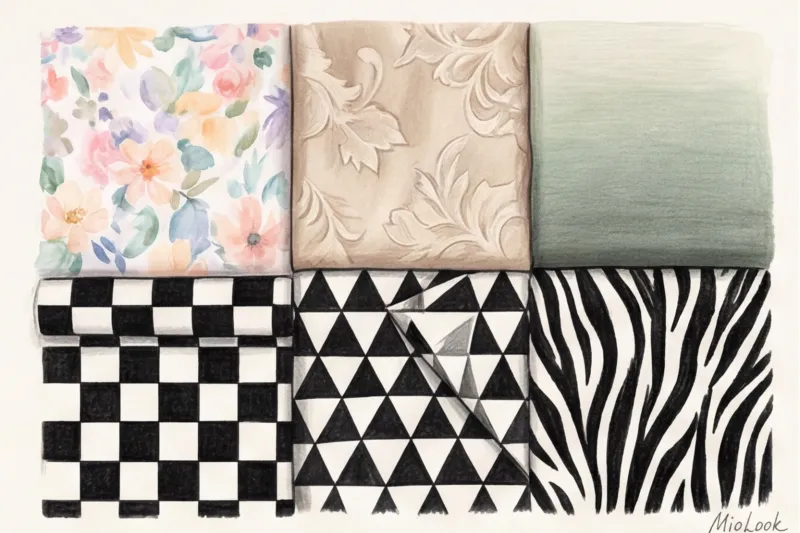
Green-list (what makes you beautiful):
- Watercolor stains (tie-dye in pastel colors);
- A small floral print (millefleur), where the background and pattern are close in lightness;
- Pied-de-poule print (houndstooth), but not in the classic black and white version, but in a combination of beige and caramel;
- Jacquard. This is an absolute favorite! The tone-on-tone textured pattern (when the design is woven onto the fabric with the same color thread) looks elegant and complements your facial features.
Makeup and Accessories: How to Manage Attention
And now the question I get asked at every other consultation: "Am I, a fair-haired girl with pale skin, forever forbidden from wearing red lipstick?" My answer: no, it's not. But there's a catch.
If you're accentuating your lips with a contrasting color (like a classic red), you need physical "support" for the color near your face. Otherwise, your lips will look "floating." A smooth, textured fabric near your lips (like a satin silk top) can provide support, visually weighting the bottom of your look and counterbalancing the bold color on your face.
For everyday makeup, use the "matte + shimmer" rule (similar to the sweater and silk skirt). And when choosing jewelry, avoid chunky black stones or dazzling diamond necklaces. Your aesthetic is matte (brushed) gold, irregular baroque pearls, and translucent stones like moonstone or morganite.
Checklist: A Wardrobe Audit for Low Contrast
Knowledge is useless without practice. Take 30 minutes this evening and do a quick closet audit using this process:
- Step 1: Separate items into soft and sharp. Honestly put aside anything with aggressive prints (black and white stripes, acid colors).
- Step 2: Create a "buffer zone." I have a rule of thumb: sometimes we're forced to wear something that doesn't suit us. For example, a strict black jacket due to a corporate dress code. In this case, use a buffer: wear a top in your ideal dusty rose or beige shade under the jacket. Or tie a silk scarf around your neck to separate your face from the black fabric.
- Step 3: Move the prints down. Not ready to ditch your favorite brightly colored skirt? Don't. The main rule is to keep high contrast away from the portrait area. Wear such pieces exclusively on the lower half of the body.
- Step 4: Collect 3 monochrome capsules. Try creating outfits from the remaining items, combining them solely based on similar shades. Upload them to MioLook so that the app can help you pair them with matching shoes and bags.
Digitize your wardrobe in 15 minutes
Ready to get started? Try MioLook's free plan—upload your items and get ready-made monochrome looks.
Start for freeConclusion: Your contrast is your superpower
Stop trying to drown out your natural beauty with fuchsia, neon green, or graphic black. Low contrast isn't a lack of color, it's a subtle adjustment of the midtones.
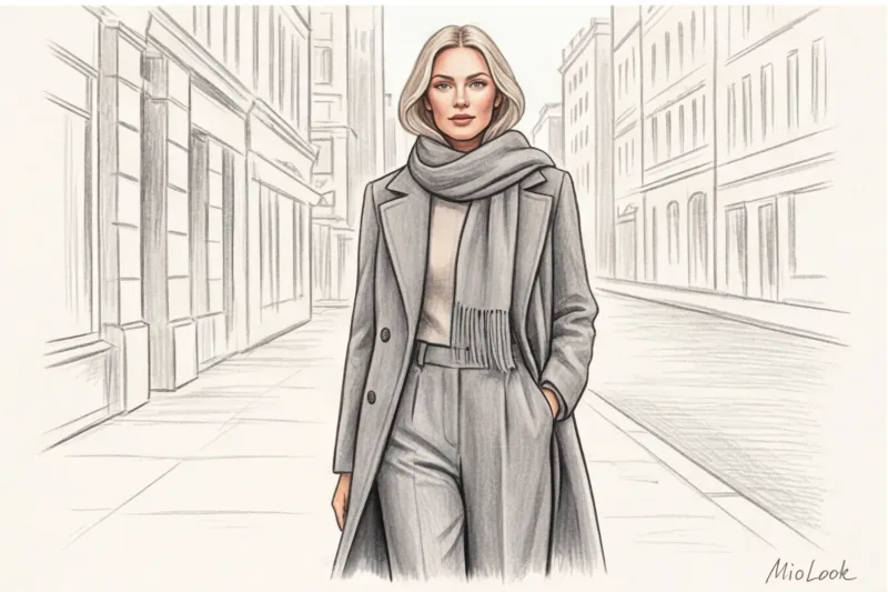
This particular look resonates perfectly with the most sought-after and refined contemporary styles: minimalism, Old Money, and Quiet Luxury. A low-contrast woman in a beige cashmere coat and flowing ivory trousers will always look like she owns a contemporary art gallery, not just someone who happened to be in a boutique. Embrace complex textures, embrace your soft tones, and you'll never feel lost in your clothes again.