Sound familiar? You buy a cult red lipstick (say, that €30 MAC Ruby Woo), apply it in front of the mirror, and realize your lips are wearing way too much. Your face looks tired, your skin pale, and your makeup looks like you borrowed it from your older sister. You wash it off, get frustrated, and decide that "red just isn't your color."
As a stylist with 14 years of experience, I hear this phrase regularly during wardrobe reviews. But the truth is, it's not about color. It's about pigment density. Today, we'll talk about makeup based on contrasting appearance — a tool that connects your natural face with your clothes. We discussed the basics of color in more detail in our complete guide: Contrast in appearance: how to choose the perfect colors , but in this article we will go further and analyze makeup as the physics of light.
Why contrast makeup works better than classic color types
The classic theory of color types (winter, spring, summer, fall) works well with the temperature of a shade—warm or cool. But it completely overlooks a crucial parameter: depth and brightness. Imagine two pieces of fabric in your ideal cool pink. One is a translucent, flowing chiffon, the other a dense, heavy drape. Do they look the same? Absolutely not. Eyeshadow and lipstick behave the same way on our skin.
A 2024 study by global beauty trend bureau WGSN shows that consumers are massively abandoning "universal" palettes in favor of customized textures, as texture (coverage) determines how seamlessly makeup blends into the face. If your natural complexion is soft and watercolor-like, a dense matte pigment will always look out of place, even if it perfectly matches your complexion.
"Makeup isn't just about painting your face; it's about controlling light and shadow (Chiaroscuro). The density of your makeup should mathematically match the density of your natural colors." This principle came to makeup from classical painting, and it's what distinguishes expensive makeup from amateurish.
Your perfect look starts here
Join thousands of users who look flawless every day with MioLook. A smart AI stylist will help you create a wardrobe that matches your contrasting personality.
Start for freeHow to Measure Your Facial Contrast: A Stylist's Method
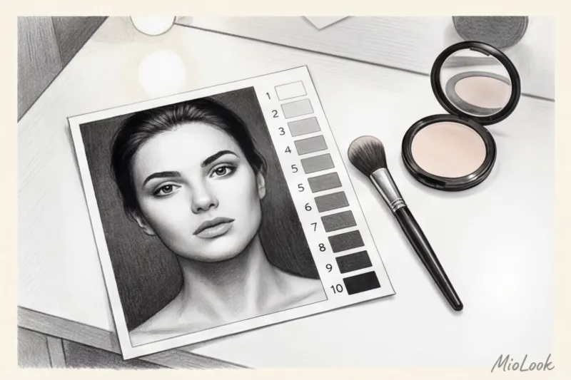
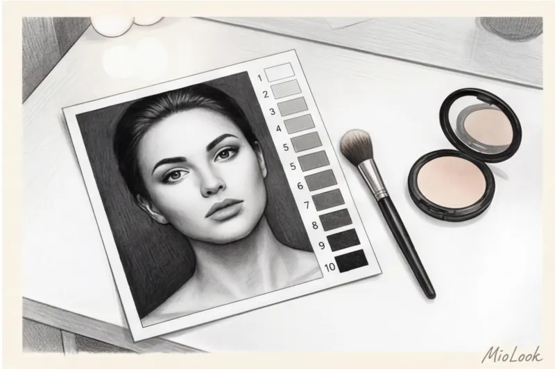
Forget subjective mirror assessments like "I think I'm bright enough." We'll use the objective physics of light, specifically Albert Munsell's Value Scale, where 1 is pitch black and 10 is pitch white.
At the first consultation, I always ask clients to come in with their everyday makeup, and the first thing I do is take a portrait of them in black and white. This instantly removes any illusions.
Here's how to make it at home in 5 minutes:
- Take a makeup-free selfie in daylight, facing the window.
- Convert your photo to black and white (monochrome) in your phone's editor.
- Find the lightest point in the photo (usually the whites of the eyes or a highlight on the skin) and the darkest point (pupils, eyebrows, hair roots).
- Rate the difference between them on a scale of 1 to 10.
Three levels of contrast and their main markers
The resulting difference will determine your strategy for both makeup and clothing choices:
- Low contrast (1-3 steps difference): The colors flow smoothly into each other. Light hair, light eyes, light skin. Or, conversely, dark skin and brown eyes without any sharp contrast.
- Average contrast (4-6 steps difference): The most common European type. Light brown or chestnut hair, balanced facial features.
- High contrast (7-9 steps difference): The most drastic change. Porcelain skin and jet-black hair, dark, expressive eyebrows and bright whites of the eyes.
Rules for choosing the brightness of shadows: from watercolors to graphics
In professional makeup, there's a term called "opacity." It's the percentage of coverage a makeup product provides to bare skin. The higher the contrast in your appearance, the higher the opacity required to create a harmonious look.
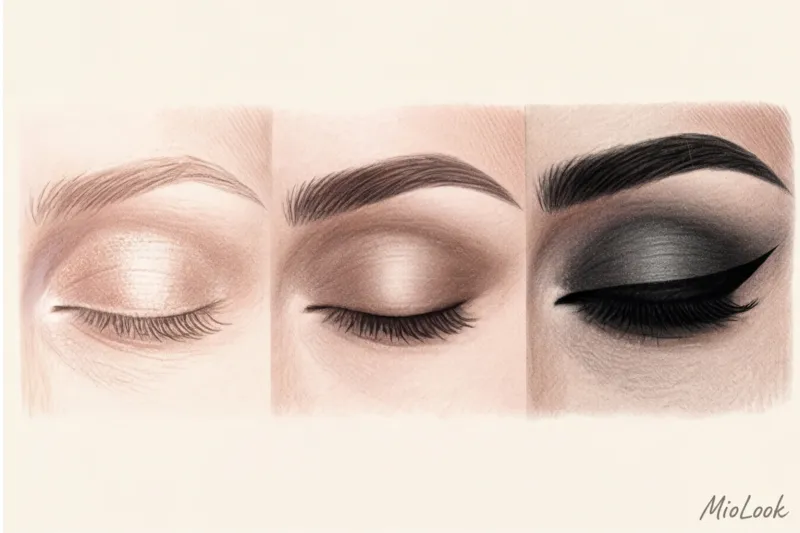
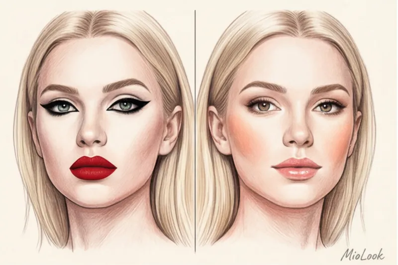
Low contrast (10-40% coverage): Dense, graphic lines are contraindicated. If a woman with a fair, soft complexion draws thick black eyeliner or a dense matte smoky eye, the result will be a panda effect—the makeup will seem separate from the face. Satin textures, creamy shadows, delicate shimmer, and soft blending are your best bet. Light should reflect off the eyelid, not be absorbed.
Average contrast (50-70% coverage): You can go for a thicker finish, but the one-focus rule applies here. Choose matte, medium-weight textures (like silky eyeshadow) and brown, graphite, or plum pencils instead of jet-black eyeliners. If you're going to an evening event, check out our guide: How to Create Long-Lasting Makeup: Secrets for the Evening.
High contrast (80-100% coverage): This is the moment when translucent watercolor eyeshadow will look dirty or sleep-deprived. Your look demands clarity. Graphic black eyeliner, deep matte shades, and high pigmentation are your everyday essentials without looking overdone.
How to Choose the Right Lipstick Brightness: Texture is More Important than Color
Let's use red lipstick as an example. Red truly suits everyone, but the devil is in the texture. The cosmetics market offers options from €15 to premium sticks for €70, but the price is irrelevant if you choose the wrong density.
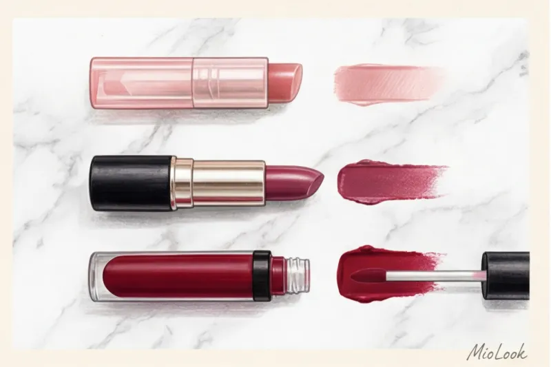
- For girls with low contrast You need a translucent berry tint or tinted balm. The pigment should be translucent and blend seamlessly with the skin (10-30% coverage). Heavy lipstick will make the lower third of the face look heavy.
- Medium contrast Classic creamy satin lipsticks (50-70% coverage) are ideal. They provide color while maintaining the vibrant glow of moist lips.
- High contrast Requires uncompromising style. Liquid matte lipsticks, lip lacquers, thick velvet sticks (80-100% density)—deep winter in a matte red shade looks regal, while a translucent gloss would simply be lost.
Important limitation: This rule doesn't apply to creative, theatrical, or runway makeup, where disharmony and exaggeration are intentionally used as artistic devices. But for real life, in the office or on a date, it's an ironclad law.
The "Universal Nude" Mistake: Why Light Lipstick Washes Out Your Face
It's commonly believed that nude makeup is the safest choice for everyone. "If you don't know what to wear, go with beige." This is a disastrous misconception that I often see in strict business dress codes, where women want to look professional.
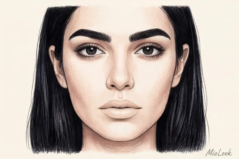
Bobbi Brown has repeatedly emphasized in her makeup tutorials (2018): true nude isn't the color of your foundation. It's the color of your mucous membranes plus one shade of depth. For high-contrast brunettes with porcelain skin, a classic beige nude (especially with a gray or lilac undertone) is a visual disaster. It literally erases the mouth from the face, disrupting the natural balance of light and shadow, and creates a sickly, haggard look.
If you have naturally bold eyebrows and dark hair, your "safe nude" is a dusty rose, terracotta, or even a soft brick shade. It should be dark enough to maintain the contrast of the upper third of the face.
Try MioLook for free
A smart AI stylist will create the perfect look for you. Analysis of your appearance, a virtual fitting room, and capsule collections for every day.
Start for freeMakeup as a Tool: How to "Pull Up" Your Face for Complex Outfits
And so we come to the main secret of stylists. Makeup isn't a thing in itself. It's a bridge between your natural appearance and your wardrobe. The contrast of your face directly influences what you can wear near your natural features.
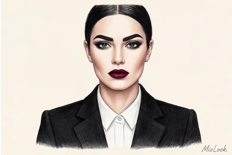
Let me tell you a story from my experience. I had a client named Anna, a typical "Light Summer"—a low-contrast, soft blonde. Anna had gotten a management position and wanted to wear strict, structured black suits in the spirit of Saint Laurent. But during the fitting, something terrible happened: the suit took center stage, and Anna's face disappeared, appearing pale and tired.
Black has the highest contrast level (10 on the Munsell scale). To wear it with a low-contrast face, we needed to artificially boost the contrast of her appearance. We didn't change her wardrobe. We adjusted the intensity of her everyday makeup: we darkened her eyebrows a bit more, added a subtle, graphic winged line, and swapped the translucent peach gloss for a creamy berry lipstick. Her face "reached" the suit, and the balance was restored.
The same principle works in reverse. If you're wearing a dress with a very bold, colorful print, your makeup should act as a counterbalance so the dress doesn't overpower you. You can read more about this in the article: Makeup for a Red Dress: How to Avoid Overdoing the Look.
Stylist Checklist: An Audit of Your Makeup Bag
Knowledge is useless without practice. This evening, I invite you to audit your makeup bag and get rid of products that live a life separate from your face.
Algorithm of actions:
- Apply all your favorite lipsticks and eyeshadows to the back of your hand in one layer.
- Evaluate their density (coverage). Which ones allow the texture and color of the skin to show through, and which ones lie like a dense enamel?
- Compare the result with your contrast ratio in a black-and-white photo. If your contrast is low and your makeup bag is full of thick matte textures, you've found the reason why your makeup looks heavy.
- Save the products that match your contrast level for your everyday base. Save the rest for special occasions when you'll be wearing contrasting clothing (that black jacket).
The secret to a luxurious look isn't the amount of euros spent on cosmetics, but absolute harmony. When the density of the fabric, the richness of the color of your clothes, and the coverage of your lipstick all harmonize, you look flawless.


