Contrast and print: why we see the dress and not you
Last Tuesday, I stood in front of my new client's open closet in Warsaw. The hangers were crammed with about twenty dresses from Zara and H&M—leopard print, large tropical leaves, bright geometric patterns. "I buy them when I want to lift my spirits," she sighed. "But I only wear them once. I feel like I've been dressed up as a stranger." This situation is familiar to almost every woman who has tried to spice up her basic wardrobe with a little "cheerful color."
According to a 2024 report by the analytical agency WGSN, approximately 80% of printed clothing returns from online purchases occur precisely because the scale and brightness of the pattern in person clash with the buyer's appearance. When choosing an item on a screen, we look at the fabric, not how it will interact with our face.
To understand, How to choose a print to suit your face , we need to forget the outdated theory of seasonal color types ("spring," "winter") and turn to the physics of color. We discussed the basic mathematics of color theory in more detail in our the complete guide to appearance contrast , but in short: your tolerance for prints is determined by the Value scale—that is, the difference between the shade of your skin, eyes, and hair.
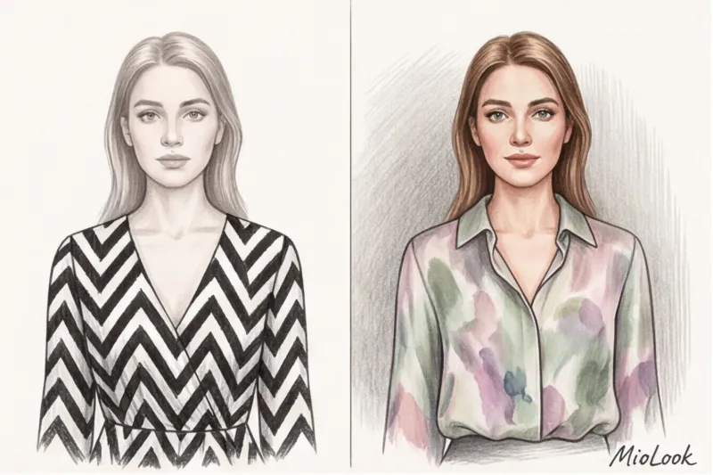
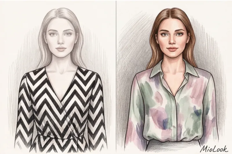
The main law of stylistics states: The contrast of the pattern (the difference between the lightest and darkest color on the fabric) should never exceed your natural contrast. If you have light brown hair, light eyes, and a soft skin tone (low contrast), and you wear a black and white zebra print (maximum contrast), the physics of optical illusion are merciless. The bold pattern takes center stage, and your facial features are visually washed out, making you look tired and pale. People will compliment your dress, but not you.
Try MioLook for free
A smart AI stylist will select the perfect look based on your contrast levels and facial features.
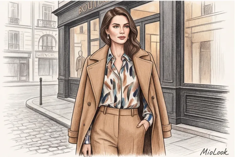
Start for freeThe Anatomy of Print: Scale, Rhythm, and Geometry (A Practical Analysis)
As a personal shopper, I often explain to my clients: a print isn't just a picture printed on fabric. It's a complex architecture. When you buy a garment, you're stepping into a geometric mesh that can either elongate or deconstruct your silhouette.
Mass-market manufacturers know this better than we do. Do you know why &OtherStories or H&M stock so many items with chaotic, tightly packed, small patterns? The answer lies in cost-cutting. Fabric printing has its own "rapport"—the pitch at which the pattern repeats. Using a dense, seamless print allows factories to save up to 15% of fabric when cutting. Unfortunately, what's good for the brand rarely flatters your figure.
Scale: size of facial features versus size of pattern
There's a secret formula for proportionality used by stylists: the size of the dominant element of a print should be comparable to the size of your eyes or lips. This rule is based on optical illusions—in particular, the Ebbinghaus illusion, where an object appears smaller when surrounded by larger details, and vice versa.
What happens in practice? If a woman with large, expressive features wears a micro-polka-dot blouse, her face will appear larger and more coarse in contrast to the fine polka-dot pattern. Conversely, petite features will be lost against the backdrop of giant peonies. Look for your reflection in the scale of the fabric.
Rhythm (Density): How the Distance Between Elements Changes Perception
The rhythm of a print is the amount of "air" (background) between its elements. It can be sparse, medium, or dense.
- Thick rhythm (no background): Elements are layered on top of each other. This trick is a favorite among budget brands, as the visual noise perfectly conceals the cheap texture of the polyester, crooked seams, and poorly made darts.
- Sparse rhythm: Lots of empty space between patterns. This is an absolute marker of luxury. Take a look at classic Hermès silk squares or Massimo Dutti's summer collections—they always leave a lot of air. Producing such garments requires impeccable tailoring, because the empty space reveals every tailoring flaw.
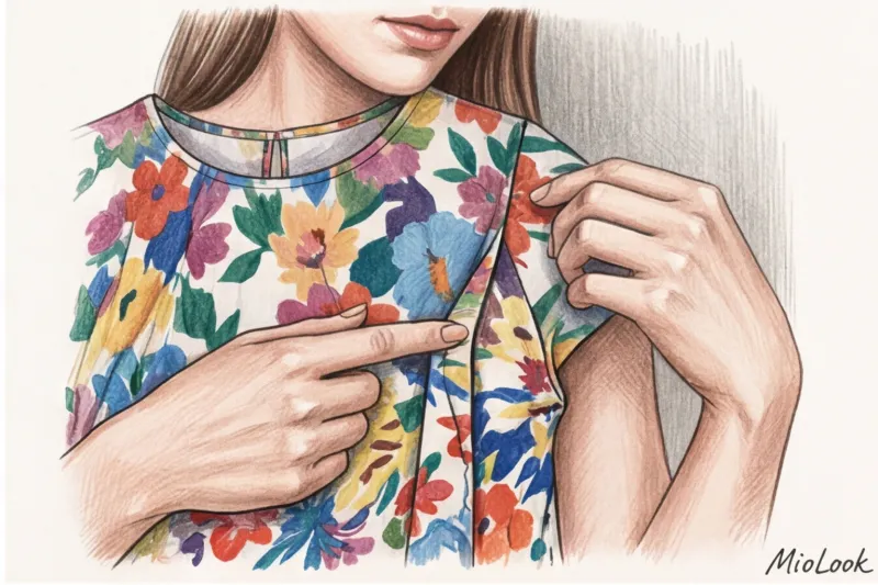
The "small flower" myth: why popular mass-market prints ruin your figure
Over the course of 12 years of working, I've come to loathe one particular fabric—the so-called ditsy floral. For decades, fashion magazines have been insisting that this pattern is universal, creates a romantic look, and is ideal for slender women. It's the most damaging romantic cliché in styling.
In fact, too-dense, small mass-market prints turn the figure into a mottled blob. There's nothing to catch the eye, the silhouette blurs, and the look looks cheap. This is especially critical for midi and maxi dresses—they feature a huge expanse of chaotic pattern with no pauses or accents.
"A solid-color, thick viscose dress for €40 will always look three times more expensive than a polyester dress for the same €40 with a small, colorful floral print. A solid color requires a decent pattern, while a print forgives the manufacturer any sloppy cut."
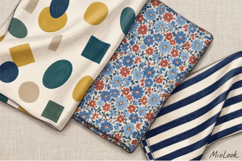
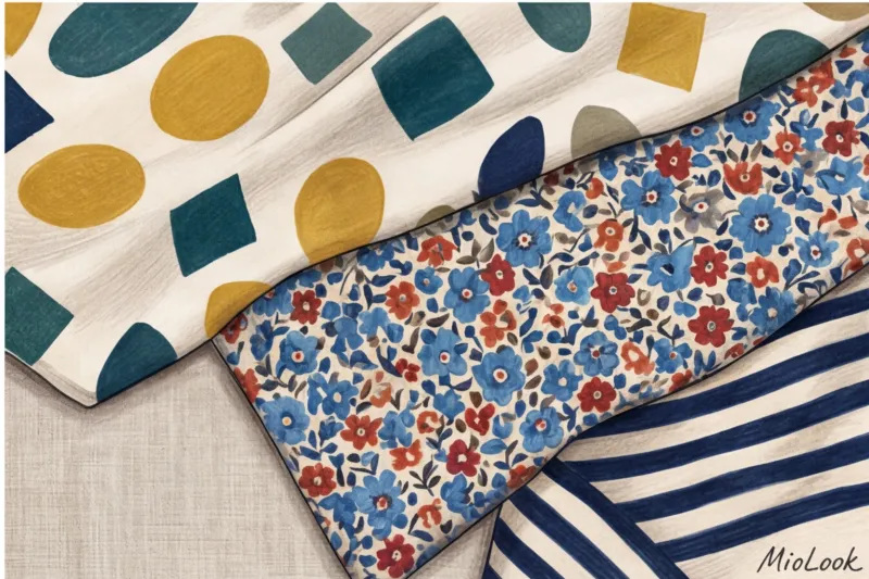
Another pain point is misalignment of the pattern at the seams. When you wear a dress with a pronounced pattern, and at the side seam half of the flower roughly meets a piece of stem from a different pattern, it instantly cheapens the look and visually disrupts the proportions of your waist. If you're wary of large prints but want to break away from the basics, choose abstract watercolors with blurred color boundaries rather than small chintz, or classic geometric patterns (stripes, ribbed patterns) that create a clear vector for your figure.
Your perfect look starts here
Upload your items to the MioLook digital wardrobe, and the neural network will show you which prints really flatter your figure.
Start for freeInstructions: How to choose a print to suit your face based on your contrast level
Theory is useless if you don't know what to do with it in the fitting room. I've developed a clear algorithm for choosing patterns based on how much your hair color contrasts with your skin tone. But there's a fair limitation: This rule does NOT work strictly if you use the print only on the lower part of the body (skirts, trousers) The recommendations below apply to everything in the portrait area: blouses, scarves, jackets, and dresses.
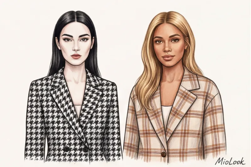
For high contrast (bright difference between skin and hair)
Whether you're a striking brunette with porcelain skin or a platinum blonde with dark eyes, your appearance alone makes a strong statement. You need a graphic look.
- Your choice: Color blocking, clear geometry (black and white houndstooth, large vichy, zebra), sharp color transition boundaries.
- Danger: Blurred watercolors, complex tie-dye, and dirty melange prints. Against your backdrop, they'll look washed and faded.
For medium and low contrast (soft transition of shades)
If you have light brown hair, a soft skin tone, and no harsh shadows on your face (typical Slavic or Scandinavian appearance), you want nuances, not harsh lines.
- Your choice: Gradients, watercolor florals, Prince of Wales check, fine ribbing, leopard in muted (not orange!) beige tones.
- The "softener" rule: If you're absolutely in love with a dress with a high-contrast pattern, pull it away from your face. Wear a solid turtleneck in your base color underneath, or drape a sleek sweater over your shoulders. plain cardigan This buffer will save the situation.
Integrating Prints into Business and Capsule Wardrobes: The 15% Rule
Let's talk about money. As a shopper, I always calculate my clients' CPW (cost per wear). Items with bold prints have a horrendous CPW. They're too memorable. If you wear a stunning skirt with large poppies to the office twice a month, the third time your colleagues will think you have nothing to wear. But you can wear perfectly cut navy blue trousers three times a week, changing tops, and no one will notice.
That's why when creation of a smart capsule I am implementing 15% rule In an ideal basic wardrobe, printed items shouldn't take up more than 10–15% of the space. If you have 20 items for the season, a maximum of three should be printed.
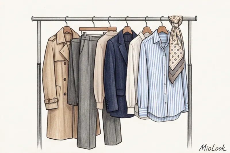
How do you make those 15% work? Use the print not as a base, but as a "bridge." For example, you have terracotta pants and a dark green jacket. On their own, they might clash. But if you add a silk scarf or a blouse with delicate terracotta and green lines intertwined against a creamy background, the look instantly comes together into a sophisticated, sophisticated composition.
For a strict business dress code, only conservative patterns are acceptable: pinstripes (no wider than 2 mm), small checks, and delicate polka dots exclusively on accessories. Save everything else for casual Fridays or weekends.
Ready to get started?
Try MioLook's free plan—upload items and see how AI combines complex prints with your base.
Start for freeKatarzyna's Checklist: 5 Fitting Room Tests Before Buying
To avoid bringing home items that will hang with the tags on for months, perform this quick inspection in the fitting room. It takes exactly one and a half minutes.
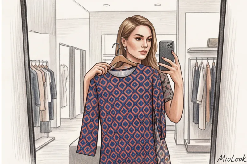
- Selfie test: Take a photo in the mirror without flash. Look at the photo after 5 seconds. Where does your gaze fall first—your eyes or the pattern of the dress? If it's the pattern, leave the item in the store.
- The Squint Test (Stylists' Ultimate Trick): Squint at the fabric to blur your vision slightly. Does the print dissolve into a dirty gray-brown stain? Does it retain its graphic quality? If the fabric looks "dirty," it will also dull your complexion.
- Seam test: Look at the side seams, the bust darts, and the junction of the sleeve and shoulder. If a large geometric or floral pattern is cut off there, it's a cut-off. Exception: items under €30, where this might be expected, but in the €80+ range, it's unforgivable.
- Distance test: Step back two meters from the mirror. Are the design elements proportionate to your facial features? Do they make you appear larger than you actually are?
- Combinatorics test: Name three solid-color items from your current closet that you could pair with this skirt or blouse tomorrow. Can't? The item will become a "loner" requiring additional purchases.
Bottom line: Print should work for you, not the other way around.
A print in clothing isn't a distraction or a way to lift your spirits. It's a powerful architectural correction tool. It can elongate your height, highlight your eye color, enhance the visual appeal of your look, or it can turn you into a distracting blip in the background.
It's better to have one perfect silk blouse in your closet with a precise cut that garners a million compliments than five cheap, crooked floral dresses. If you're unsure of your abilities, delegate this task to technology. Digitize your closet with Smart wardrobe features in MioLook The neural network will instantly analyze the ratio of your basics to your accent pieces and suggest how to pair that intricate printed skirt so it finally earns its keep.


