Fashionable Colors in Clothing: How Marketing Dictates Trends (and How to Avoid Them)
Have you ever noticed how suddenly the windows of absolutely every store—from premium boutiques to local brands—are painted the same shade? Just yesterday, we didn't think about creamy yellow, and today it literally haunts us on every mannequin and in targeted advertising. This isn't a collective epiphany of designers. When choosing fashionable colors in clothing We often think we are being individualistic, but in reality we are following a carefully planned and generously paid marketing script.
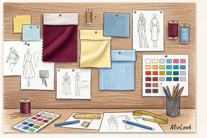
The process of trend emergence begins long before a garment even makes it into your closet. Reputable trend agencies like WGSN and the Pantone Color Institute identify key shades approximately two years before their mass retail release. Their analysis is based not on creative fantasies, but on rigorous global data: the economy, political sentiment, box office performance, and even technological innovations. For example, according to WGSN reports, color choice always responds to a collective psychological need in society—the need for stability or, conversely, a thirst for radical escapism.
This industrial standardization explains why mass-market giants (Zara, H&M, and others) release capsule collections in the same colors simultaneously. Corporations purchase identical trend books costing tens of thousands of euros and order fabrics from Asian factories in colossal quantities, using approved Pantones. This is pure economies of scale and minimizes commercial risks.
But as a practicing stylist, I see that the most interesting things happen at the adaptation stage. Over 12 years of working with European wardrobes, I've clearly identified one pattern among mid-market brands. What looks like garish avant-garde on the runway should sell in real life. While high fashion features neon fuchsia, European brands like COS or & Other Stories masterfully tone it down. They adapt these "garish" runway colors into more sophisticated, muted, and wearable shades for the European market, ones that will seamlessly fit into the lives of real women, not models under the spotlight.
To avoid falling victim to impulse buying, it's crucial to understand the difference between macro and micro trends:
- Macro trends They last a long time (3 to 5 years). A great example is the global trend for "quiet luxury" aesthetics and deep natural shades (chocolate, graphite, camel). This is a safe haven for investing in cashmere and leather.
- Micro trends — these are aggressive, one-season flashes, like last summer's acid green hue. Buying an expensive €300 coat in such a color is a downright waste of money.
My main principle of smart shopping is this: evaluate a trending color not by its popularity on social media, but solely by its integration into your current wardrobe.
Before you take that trendy shade to the checkout, do a mental test. How to incorporate trends into your wardrobe with a strict foundation — the question isn't abstract, but mathematical. Can you wear this creamy yellow top with three different bottoms that are already hanging in your closet? Will you be able to put together an elegant outfit? color blocking in clothing , or will the new item require new shoes and a bag? If the item doesn't pass this test, leave it in the store, no matter how tempting the trend may seem.
The Top 5 Fashionable Shades of the Season (and Their Wearable Alternatives)
According to the analytics platform Tagwalk, designers reduced their use of pure black by 18% at recent shows. How did they fill the void? With complex, deep tones that look more prestigious and work just as well in a wardrobe as basic achromatic shades. When choosing fashionable colors for clothing, it's important to understand: the hue alone doesn't guarantee a stylish look. The texture of the material is what makes the difference.
Let's take a look at the top five favorites of the season and the strict rules for incorporating them into your real-life, not runway, wardrobe.
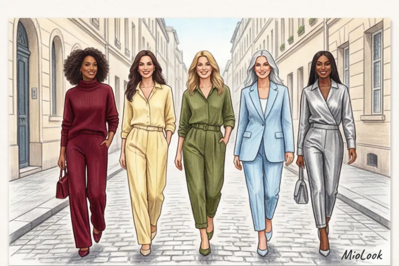
Deep Burgundy: A Status Replacement for Black
Burgundy, marsala, ripe cherry—this color returns every fall, but now it's officially supplanted black in the "quiet luxury" category. It's the perfect choice for those who want a sophisticated look without being overly gloomy.
A stylist's secret: wine is incredibly demanding when it comes to fabric reflectivity. It looks truly luxurious and expensive in smooth leather, patent leather, thick glossy silk, and cashmere. But buy a thin acrylic cardigan or cheap burgundy polyester, and the garment will instantly transform you into a tired librarian. Thin matte knits will dull the depth of this color.
How to wear: Start with shoes or a bag. A leather wine-colored tote bag (priced between €150 and €300) will visually elevate even the simplest outfit of straight-leg blue jeans and a white T-shirt.
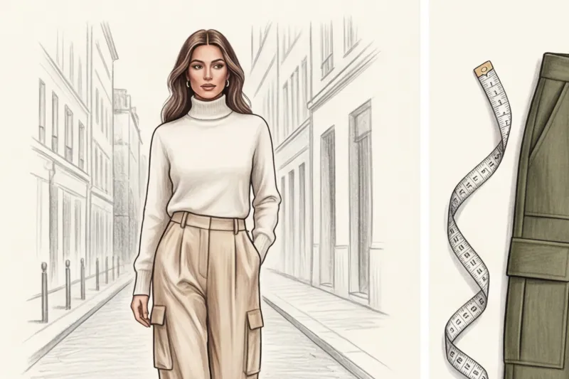
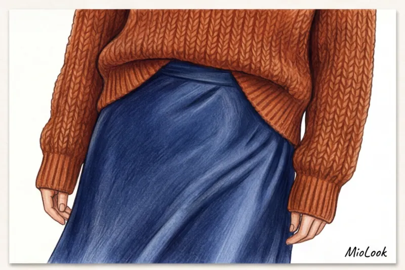
Butter Yellow: The New Beige
Many of my clients complain that classic camel or sand colors clash with their complexion, making them look sallow. Creamy yellow has become an elegant solution to this problem. It's no longer just a pastel, but a full-fledged neutral base color with just the right amount of warmth.
- Ideal in fabrics: Thick cotton (trench coats), flowing viscose, voluminous wool.
- Dangerous in tissues: A thin, translucent ribbed knit—in a creamy color, it often looks like washed-out underwear.
How to wear: Try swapping out your usual beige sweater for a buttery-colored jumper. It adds a fresh touch to the portrait area and pairs beautifully with gray, brown, and dark denim.
Ice Blue: A Refreshing Office Dress Code
If you're putting together a capsule collection for a business with a strict dress code (business casual), icy blue is your best bet. It's clean, crisp, and, unlike stark white, doesn't create a "waiter's uniform" effect.
This cool undertone shines best on structured fabrics. A crisp poplin shirt that holds its shape or a two-piece wool-blend suit are ideal investment pieces. Avoid this color in soft plush or fleece, unless you want to look like a cartoon character.
Olive Green: A versatile base for casual looks
Olive has replaced the tired khaki. It's less military-inspired and more natural, grounding. It's a color that can withstand any casual experimentation.
It pairs beautifully with textures that have a nap or a pronounced weave. Olive suede is an absolute hit. Corduroy trousers, thick waxed cotton jackets, and heavy denim—all of these look incredibly organic and luxurious in an olive shade.
Metallic (Silver): From an evening band to a daytime routine
We're used to thinking of silver as a New Year's party accessory. But the key to modern styling is to tone down the pretentiousness of formal pieces. To bring silver into everyday life, use the principle of maximum texture contrast.
Wear a silver foil skirt with a chunky, slightly chunky knit sweater and suede Cossack boots. Or incorporate silver in microdoses: silver sneakers or Mary Janes will elevate even the most boring casual look. Strict taboo: Cheap lurex and sequins on a thin mesh. Daytime metallics should be smooth, imitating liquid metal or foil.
Liven up your wardrobe with MioLook
A smart AI stylist will analyze your items and suggest how to incorporate trending colors into your everyday looks without breaking the bank.
Start for freeWhere to Find the Right Shades: Navigating Brands
Knowing what fashionable clothing colors are currently in fashion is only half the battle. It's important to know where to buy them so you don't overpay and get the quality you need. Over the years of shopping with people, I've identified a clear specialization of popular European brands:
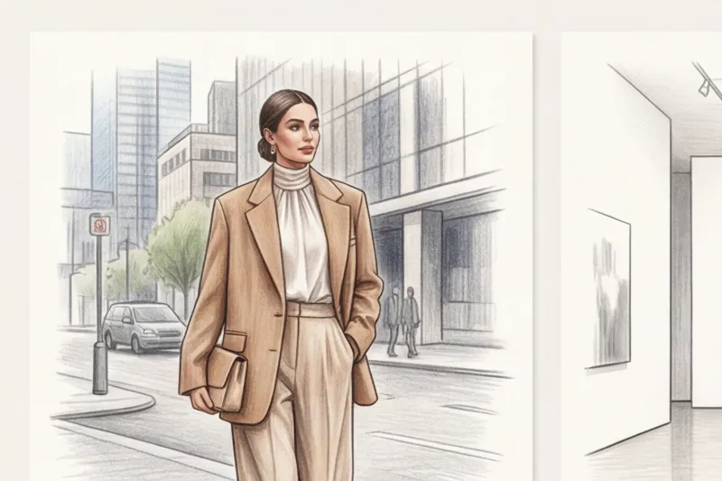
- Massimo Dutti (100€ – 350€): We come here for deep, refined shades—wine and olive. The brand specializes in old-money aesthetics. They have perfectly tuned dyes for natural leather and thick wool. A wine-colored leather jacket or olive coat from this store will last for years, retaining its original depth of color.
- Zara (30€ – 80€): The best testing ground for fast-moving micro-trends. Want to try on silver trousers or buy a butter-colored statement bag for a season? This is the place to go. Zara instantly copies runway colors, but the quality of the fabrics is often subpar, so choose items that don't require frequent washing (jackets, shoes, bags).
- COS (70€ – 150€): Undisputed masters of complex pastel shades. They nail icy blue and creamy yellow. The secret lies in the architectural cut: COS's clean, minimalist silhouettes prevent pastel colors from becoming childish. Their blue organic cotton shirts and yellow cashmere sweaters are a ready-to-wear uniform for the modern office.
The 10-30-60 Rule: How to Incorporate Trendy Colors into Your Clothing Without the "Parrot" Effect
Architects and interior designers have been using this proportion for decades, and it works flawlessly in styling, too. Our brains perceive color harmony only when it has a clear hierarchy. If you want to integrate trendy colors into your everyday wardrobe but are wary of looking too colorful, consider creating outfits using the 60-30-10 formula.
- 60% - base color. This is the foundation of your look, taking up the largest area. It's usually a large garment: a coat, a pantsuit, a long dress, or classic jeans.
- 30% - additional shade. It creates depth and contrast. This includes shirts worn under a jacket, a cardigan draped over the shoulders, or basic shoes.
- 10% - trendy accent. That edgy detail that was the whole point. It's a pop of color that refreshes the familiar base.
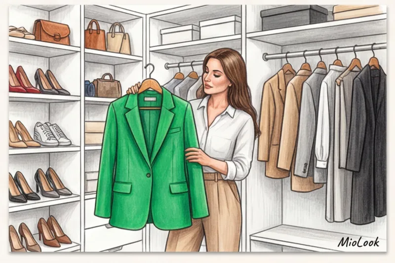
The most common mistake I correct during wardrobe reviews is trying to make a seasonal micro-trend the foundation, giving it that same 60%. Buying outerwear (coats, oversized down jackets, shearling coats) in trendy but difficult-to-combine shades is almost always a stylistic trap. A chunky fuchsia down jacket or neon green coat quickly tires the eye. Moreover, they trigger a domino effect: you have to buy a neutral hat, special shoes, and a scarf to somehow "calm down" the look.
Let's turn to wardrobe math and calculate the CPW (Cost Per Wear) index. I had a telling case: a client impulsively bought a hot pink coat for €150. She wore it exactly three times that season because so few items in her closet complemented it. The result: €50 per outfit. By comparison, we bought a hot pink silk scarf for €30. It complemented her gray and beige sweaters perfectly and was worn 20 times. The cost per outfit was only €1.50. The difference in cost-effectiveness is obvious.
Tracking these statistics and planning purchases is much easier if you digitize your things - for example, by uploading them to MioLook , where smart wardrobe algorithms will clearly show how many outfits can be created with just one new color detail.
That's why accessories—structured bags, shoes, belts, textured tights, or scarves—remain the safest way to tame the ultra-fashionable color. They fit perfectly into the 10% quota. You can wear your favorite gray two-piece suit for years, but add a bag in a trendy shade of icy blue or creamy yellow shoes, and the whole outfit instantly becomes modern.
To prevent those 10% accent colors from looking like a random, out-of-place blot, I always use the concept of "color echo." The idea is simple: support the bright color in your accessories with a micro-stroke in another area, preferably closer to your face. Bought a deep wine-colored bag? Get a matching manicure or apply a translucent lip tint in a similar shade. Opted for metallic shoes? Add a silver eyeliner or a cool highlighter. The echo ties the look together, demonstrating to others that your bright accent isn't a fluke, but a brilliantly crafted stylistic formula.
Trendy Colors and Your Color Type: How to Wear What "Doesn't Suit You"
The theory of 12 color types (winter, spring, summer, autumn, and their subtypes) has confined women to rigid boundaries for decades. If you were once told you were a "soft summer," buying a vibrant neon sweater might seem like a stylistic crime. However, modern coloristics protocols prove the opposite: the classic color type system is not a life sentence, but rather a convenient tool for customizing your wardrobe, not a reason to deny yourself fashion experiments.
The physics of color perception are incredibly simple: fabric acts as a reflector. Light hits your clothing and casts a colorful reflection on your chin and cheeks. That's why the key life hack of professional stylists sounds so indecently simple: if trendy colors in clothing are clearly unflattering, simply move them away from the portrait area (face, neck, and collarbones).
IN MioLook We always emphasize one ironclad rule: before purchasing a product, always test the color on your face in natural daylight. Artificial lighting in mass-market fitting rooms often distorts the true picture. If, upon stepping out into the daylight, you notice that a trendy shade accentuates signs of fatigue, accentuates nasolabial folds, or literally "eats" your appearance by taking center stage, don't try to tame it on your face. Instead, use the color on a skirt or bag.
But what if you've fallen in love with a top, jacket, or jumper in a complex, unsuitable shade? This is where technology comes to the rescue. "buffer" colors I recently worked with a client with a contrasting, cool complexion who bought a stunning yet perfectly warm olive cardigan. Worn barefoot, it made her complexion look sallow. A simple white collar saved the day.
A basic cotton shirt in a crisp white or cool blue, worn as the first layer, creates that visual barrier. This light strip of fabric counteracts the "bad" reflection on the face, restoring freshness to the skin. Basic silk scarves, thick turtlenecks in neutral shades (graphite, navy), or even a chunky necklace in a suitable metal work flawlessly as such a buffer.
If you don't want to complicate your look with layers, use the safest strategy: shifting color to your lower parts (trousers, skirts, shoes). What you wear below the waist won't affect the reflections on your face. You can confidently invest in wide wool palazzos in a sophisticated buttery shade (excellent tailored styles are currently available at COS for €115) or opt for bright suede loafers. Your face will be framed by your perfect, tried-and-true basic shades, and your look will remain sharp and fashionable.
Try MioLook for free
Start creating perfect looks with AI and find the colors that work for you.
Start for freeExpensive Combinations: Color Formulas That Always Work
Researchers at the Pantone Color Institute (2024) note an interesting paradox: the human eye perceives an image as "expensive" and prestigious not because of the price tag, but because of the correct mathematical proportions of shades. By integrating new fashionable colors in clothing There's no need to reinvent the wheel. Simply rely on four ironclad color formulas that stylists have been using for years when creating runway looks and commercial shoots.
Tonal monochrome: a play on contrasting textures
Putting together an outfit of pieces in a single, on-trend shade sounds like the simplest of tasks. But in practice, a total burgundy or olive look made from the same dense cotton fabric looks flat, reminiscent more of a waitress's uniform than a well-thought-out outfit. The secret to luxurious monochrome lies in the physics of light and the clash of textures: matte and shiny, smooth and loose.
Try combining fluffy wool (or mohair), flowing silk, and crisp, textured leather in a single look. The way light reflects off these materials creates the illusion of multiple complex undertones, even if the pieces are technically dyed with the same pigment. For example, an inexpensive flowing viscose silk skirt paired with a voluminous sweater in a similar, fashionable color will visually increase the cost of the entire outfit several times over.
Analogue circuit: the aesthetics of "quiet luxury"
Analogous color combinations involve using two or three colors adjacent to each other on the classic Itten color wheel. This creates a very soft, sophisticated, and fluid look, often found in the collections of premium brands like Lemaire or The Row.
If you've purchased a trendy creamy yellow cardigan, don't immediately pair it with a crisp, contrasting black bottom. Pair it with caramel pants and a warm ecru top. The eye glides seamlessly over this gradient, which subconsciously conveys absolute elegance and sophistication.
Complementary scheme with a trick
The classic complementary formula (opposite colors on the wheel, such as blue and orange) often looks too theatrical in its pure form. My favorite technique, inspired by the colorists of Italian fashion houses, is a combination of contrasting colors, where only one shade remains saturated (on-trend), while the other is subdued to the maximum, becoming the base.
Take a trendy icy blue sweater and pair it not with a bright terracotta skirt, but with deep, dusty chestnut-brown trousers. The temperature contrast is maintained, the look is dynamic, but the comic-book or children's party effect is completely eliminated.
Achromats plus one color: genius in simplicity
Achromatic colors (white, all shades of gray, and black) lack hue, making them the perfect canvas for any fashion experiment. This is the most effortless, yet absolutely foolproof, formula for a stylish look when you want to incorporate a bold micro-trend with minimal risk.
My personal "lazy formula," which I turn to on days when I'm absolutely pressed for time: a classic, oversized gray melange pantsuit paired with a basic white T-shirt, accessorized with trendy shoes or a cherry-red bag. It takes exactly two minutes to get dressed, but everyone around you will be convinced that your outfit was painstakingly crafted by a personal stylist.
To avoid wasting mornings in front of your open closet trying to remember what to pair your new colorful bag with, I recommend digitizing your achromatic base. In the app MioLook You can create outfits from basic gray and black items in just a few clicks, virtually "shopping" them with trendy accessories. This allows you to see which combinations work perfectly in advance and plan your looks right on your phone on the way to work.
Budgeting for Trends: What to Invest in and What to Save on
According to the report Ellen MacArthur Foundation (2023), over the past 15 years, the average number of wears per new item has decreased by 36%. The main reason is the race for seasonal shades. When trend-watching agencies announce the next favorite color, a veritable color fever ensues. One of the most wallet-damaging mistakes I regularly see in new clients is impulsively buying up the entire Zara collection simply because the items are in the coveted icy blue or wine color.
To implement fashionable colors in clothing Without compromising the budget and the environment, I insist on a strict division of the wardrobe into “investment base” and “fast-fashion accents”.
Let's start with the main anti-rule: Never buy cheap knitwear in trendy colors. Fast fashion skimps not only on patterns but also on the quality of dyes. Mass-market brands often use cheap surface pigments on blended fabrics (predominantly acrylic or recycled polyester). Smooth synthetic fibers have a hard time holding low-quality dyes. As a result, after just three washes, your stunning creamy yellow jumper will lose its vibrancy and become covered in unsightly pilling. Nothing cheapens a look more than a pilled, faded garment, even the most fashionable cut.
If you want to test a trend but aren't sure it'll last longer than a season, use a micro-investment strategy. Here's a list of items you can (and should) spend a minimum on:
- Cotton T-shirts (between €15 and €25) are the perfect base layer under a jacket in your base color. They'll add that extra 10% pop of color.
- Accent socks — a cheap but incredibly stylish way to keep up the trend. Colored socks look great in the space between cropped suit trousers and chunky loafers.
- Scarves and bandanas — are located near the face, instantly refresh the portrait area and require minimal costs.
- Bijouterie — items made of colored enamel, resin, or jewelry glass in seasonal shades easily integrate into everyday outfits.
But even before buying a €15 T-shirt, it's worth taking a break. A great way to avoid storing unnecessary items is to upload a photo of the potential new item to MioLook And visually try it on with your current jeans and jackets. If the new item doesn't create at least three complete outfits with what's already hanging in your closet, it stays in the store.
Your ideal image
it begins Here
Join thousands of users who look flawless every day with MioLook.
Start for freeNow, let's talk about when it's time to open your wallet wider. Items that require serious financial investments are purchased only if the fashionable color matches your personal base one hundred percent For example, if deep burgundy is trending this fall, and you realize it's the perfect, more elegant alternative to black for your high-contrast look, feel free to up the ante.
In such a situation, buying a structured leather bag for €250–400 or a luxurious cashmere coat will be absolutely worth it. These items will become your long-term assets: high-quality leather and expensive natural wool perfectly retain complex pigment for years, without fading in the sun or losing the depth of their undertone. At this point, you stop playing fast fashion and make the trendy color your personal, recognizable uniform.
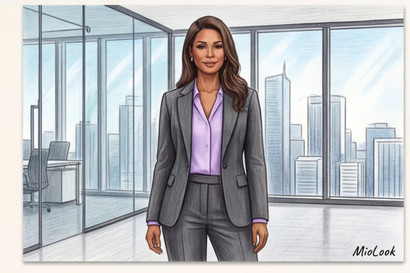
Business style and fashionable clothing colors: rules of integration
Research in corporate psychology convincingly proves that the color of your suit shapes your credibility even before you utter your first word in a meeting. This is why fashionable colors so often clash with strict dress codes. Overly bright, revealing, or neon shades in the office are subconsciously interpreted as a marker of frivolity, impulsiveness, and unpredictability. To maintain professional status, any runway trends should be "calmed down" by choosing only deep or pastel variations.
Let's start with the basics of the business casual dress code. The safest and most elegant way to modernize a business wardrobe is to replace the usual black and blue base with trendy, yet understated alternatives. Instead of a stark black blazer, choose a structured style in dark chocolate or rich burgundy. Swap your standard white shirt for a crisp cotton shirt in Ice Blue or Butter Yellow. You'll retain a touch of conservativeness, but your look will no longer feel like a bland uniform. One of my clients, a financial auditor, completely transitioned her work wardrobe from pure black to deep olive and cool graphite. We found gorgeous wool trousers in these tones at Massimo Dutti (around €100), which dramatically refreshed her look without sacrificing any authority.
If your company's policies allow for a smart casual format, you can be a little more bold with trendy colors, but texture is paramount here. A trendy, rich hue is forgiving when applied to a matte, luxurious fabric like cashmere, tweed, suit wool, or heavy crepe. However, a glossy sheen (such as smooth, bright satin) will instantly cheapen the look and violate business etiquette.
For employees with strict work schedules (banks, law firms), I always use the elegant "invisible" zone technique. It's an intelligent fashion game: imagine a bright emerald lining on a formal gray blazer, glimpsed only when you move, or a sophisticated lavender silk top worn under a tightly buttoned suit. You're incorporating a trendy color, feeling modern, but formally not breaking any corporate protocol.
In a business setting, it's important to remember basic psychology: deep dark tones convey expertise and distance (an excellent choice for difficult negotiations), while pastel shades evoke empathy and encourage dialogue. Before buying a colorful accent piece for the office, I strongly recommend digitizing your basic business attire in an app. MioLook Its virtual fitting room algorithms will help you visually assess whether a new blouse will ruin your well-curated work capsule, and allow you to create at least three flawless outfits before you even reach the checkout.
Checklist: A Wardrobe Audit Before Buying New Colored Items
Have you ever brought home a stunning, luxurious piece of clothing, only to discover it refuses to fit in with the rest of your closet? Statistically, this is how so-called "orphaned items"—pieces worn only once—are created. To ensure that new fashionable colors truly complement your style, rather than leaving them hanging like dead weight with a label, I've developed a pragmatic testing algorithm. Go through this short checklist before you reach the checkout.
Step 1: Assess the prevailing temperature of your wardrobe (warm/cold)
The most common cause of color clashes is a temperature clash. You can buy a luxurious sweater in an icy blue shade, but if 80% of your wardrobe consists of warm camel, mustard, and chocolate tones, it will look completely out of place. Open your closet and glance at the hangers: which undertones dominate? If your wardrobe is decidedly warm, look for analogs of trendy colors with a hint of yellow (for example, olive instead of pure emerald). If your wardrobe is cool, opt for burgundy, silver, and dove-green tones.
Step 2: The Rule of Three
This is the foundation of smart consumption. Ask yourself: what exactly will I wear with this new colorful item tomorrow morning? You should be able to immediately, without thinking, come up with at least three complete outfits with the items you already hanging in your closet.
My personal ultimatum for clients: "If you need to buy new shoes and a new top to integrate that trendy green skirt, you leave the skirt in the store."
A piece should serve your wardrobe, not require you to create a new one around it. If a trendy shade leads to a chain of forced purchases, it's a financial trap, not a style update.
Step 3: Choose a category of item to trend test (Accessory -> Bottoms -> Tops)
If you're trying a complex, unfamiliar shade (like creamy yellow) for the first time, don't start with a €300 coat. Maintain a safe gradation of trend integration: accessory -> bottom -> top.
- Level 1 (Accessories): Buy a textured bag, scarf, or belt at Zara for €20-€30. You'll get used to the color, and the financial risk is minimal.
- Level 2 (Bottom): Pants or a skirt. The color is far from the portrait zone, doesn't highlight signs of fatigue on the face, and is easily neutralized by a familiar white or gray sweater.
- Level 3 (Top): Jackets, blouses, coats. Proceed to this step only if you are 100% sure the shade refreshes your appearance and fits into your overall palette.
Step 4: Digital Try-On and Reality Check
Lighting in shopping malls is deliberately adjusted to make colors appear brighter and fabrics more expensive. This is a marketing illusion. Always photograph your outfit in the fitting room in natural light (if there's a window) or at least take an honest selfie.
Then technology comes into play. AI styling tools are radically changing the shopping experience. Upload a photo of your potential purchase to MioLook smart wardrobe and virtually connect it with your digital belongings. Artificial intelligence will help you visually assess how this color truly fits into your current capsule wardrobe, eliminating guesswork and impulsive spending.
Introducing fresh color schemes is the fastest way to update your look without a drastic change in style. But remember: no Pantone trend report is worth feeling uncomfortable in your own clothes. Choose shades that make you sit up straight, and any color will become your personal trend.
Guide Chapters
Metallic in clothing: what to wear with shiny items every day
Sparkly pieces aren't just for the holidays. Learn how to stylishly incorporate the metallic trend into everyday looks and wear them year-round.
What to wear with burgundy: stylist tips
Burgundy and wine are the new fashion staples. Discover stylist secrets on how to incorporate the season's most luxurious color into your everyday wardrobe.
Color Blocking in Clothing: Rules for Vibrant Looks
Afraid of bright colors in your wardrobe? Learn how to use color blocking correctly to visually correct your figure and look luxurious.
Pastel colors in clothing: what to wear with them: stylist tips
Tired of gray and black? Learn how to style pastel shades in any season to look confident and luxurious.
Bright Accents in Clothing: How to Add Color to a Basic Look
Tired of your boring base coat but afraid of looking clunky? Our stylist's tips will help you elegantly incorporate trendy colors into your everyday looks.
Basic Wardrobe Colors: Replacing Black and White
Black and white are no longer universal classics. Find out what shades have replaced them and how to create a modern base without looking cheap.
What colors make you look younger after 40: shades that refresh
Forget the myth that only pastels suit mature women. We'll explore the physics of color to see which shades truly refresh the face and conceal signs of aging.
How to Wear Colors That Don't Match Your Color Type: Stylist Tips
Forget the strict rules of color typing! Discover the secrets of stylists that will help you adapt any complex shade to your appearance.
How to create a monochrome look and look expensive
Monochrome isn't just about matching pieces of the same color; it's the art of manipulating textures and light. Learn how to create a stylish look with a single color palette that will truly look luxurious.
Fashionable colors for fall/winter: clothes in deep shades
How to wear dark shades in cold weather without looking tired? We explore the physics of color and fabric texture with a personal stylist.
Spring/Summer Fashion Colors: Clothes for a Stylish Wardrobe
Why do trendy mass-market items quickly become outdated? A stylist and textile expert explains how to choose the right shades and fabrics for the warm season.
Pantone's Color of the Year in Clothing: How to Update Your Basic Wardrobe
An engineered approach to trends: we explain how to update your wardrobe with new shades while maintaining your style, budget, and peace of mind.
A smart app for choosing clothing colors with AI
Neural networks are changing the rules of fashion. Find out how algorithms help you fearlessly incorporate vibrant shades and find the perfect color scheme for your wardrobe.