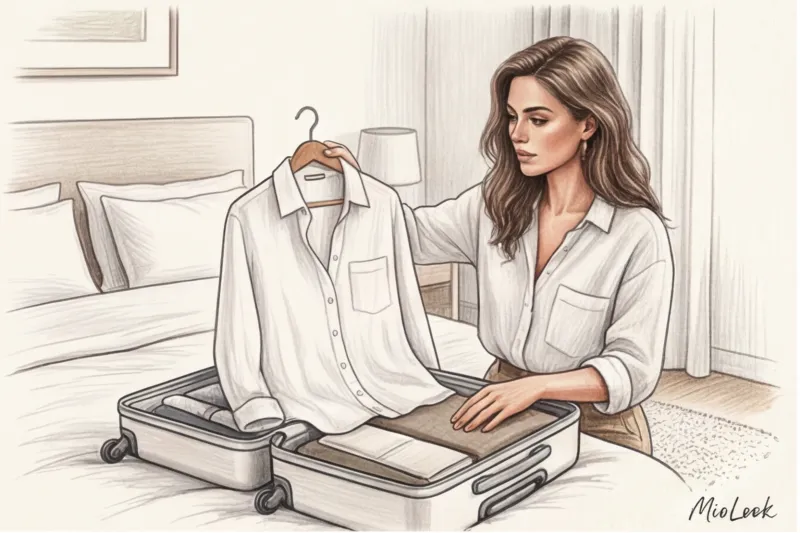
Let's be honest: every time I suggest a new client try on a baby blue sweater or lavender pants, I hear the same thing. "Isabella, I'll look like a marshmallow," "But those are for little girls," or "It's November, what spring colors are there?" We're used to hiding behind beige, gray, and black, considering them the only synonyms for status and elegance.
But after 12 years of working as a personal stylist, I've come to the conclusion that there's another axiom. True, luxurious Mediterranean chic begins when you stop being afraid of color. It's just a matter of styling it correctly. We've already discussed how global macro color trends are formed in our a complete guide to fashionable colors in clothing Today we'll look at a specific, and perhaps most daunting, problem: What to wear with pastel colors in clothing to look confident, expensive and appropriate in any season.
The Psychology of Color: Why Pastels Are the New Essentials (and How WGSN Predicted the Trend)
Society is mortally tired of the visual noise, neon, and aggressive color blocking of the early 2020s. According to the WGSN global trend bureau's 2024 report, our brains subconsciously seek visual "safety anchors." Pastel shades aren't just a nod to romance; they're a psychological antidepressant.
The Pantone Color Institute confirms this theory: while previously whitened shades dominated exclusively in spring/summer collections, in the latest fall/winter seasons, butter yellow, dusty rose, and sage account for up to 30% of the palettes at brands like Jil Sander, COS, and Massimo Dutti. This is a signal: pastels have officially become a year-round staple, an excellent alternative to the tired camel.
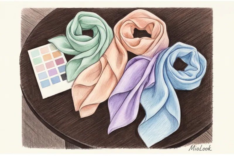
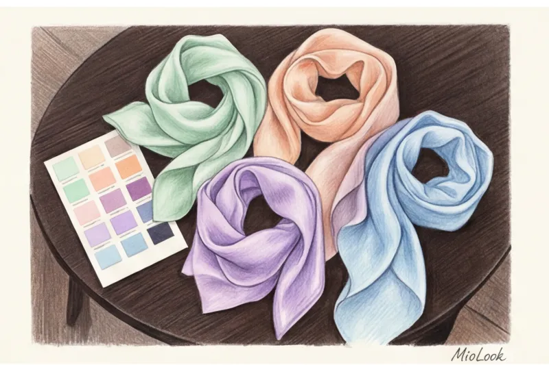
But there's one caveat. When choosing a light shade, pay attention to the texture. Pastels don't tolerate cheap fabrics. If you're choosing cotton, it should be at least 180 g/m², and if knitwear, look for dense viscose (at least 70%) with elastane or merino wool. Thin, flimsy fabric in a delicate color will instantly cheapen the look and highlight even the slightest unevenness in the silhouette.
Try MioLook for free
A smart AI stylist will select the perfect look and suggest which colors will flatter your appearance.
Start for freeWho suits delicate shades: adapting to your color type without rigid boundaries
"Pastels make me look pale" is the most common myth I combat at every other consultation. The truth is, it's not the light color itself that makes you look pale, but the incorrect temperature and contrast level.
If you're naturally soft-toned (light brown hair, light eyes), pastels are your natural element. But if you're a bright, contrasting brunette, a completely pale pink look can really wash out your complexion. Does this mean pastels are off-limits? Absolutely not.
Stylist's trick: If a shade absolutely doesn't suit you, but you really want to integrate it into your wardrobe, simply move it away from the portrait area. Wear soft pistachio pants with a dark top or use a light bag. If in doubt, I recommend reading our article about How to check if a garment's color matches online.
"The main rule when working with pastels for a high-contrast look is to always add a strong visual frame. Dark glasses frames, bright lipstick, or chunky jewelry will save the day."
Don't forget about metals. Gold or silver can radically change the perception of clothing. Silver enhances the iciness of cool blue and lavender tones, creating a strict and detached look. Gold warms up peach, cream, and pistachio, adding a Mediterranean relaxedness.
Pastel colors in clothing: what to wear them with to look expensive and prestigious
We've come to the most important point. The most fatal mistake beginners make is the so-called "bridesmaid effect." This is when you take a pastel dress, add pastel shoes, a light-colored bag, and, heaven forbid, lace. In 90% of cases, this looks childish and outdated.
The Contrarian Insight That Changes Everything: stop wearing pastels only with white or other pastels Yes, it's safe, but it's incredibly boring. True chic is born of contrast. Here are my favorite working formulas.
Formula #1: Pastel + Deep Jewels
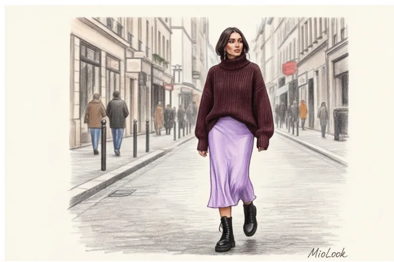
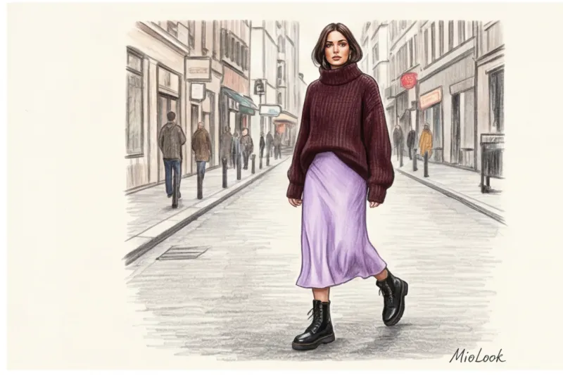
Instead of pairing baby pink with white, try wearing pink color in clothes with deep burgundy or marsala. Delicate lavender looks fantastic next to plum or dark emerald. And a mint sweater paired with dark chocolate-colored trousers is a combo that always garners compliments.
Formula #2: Aggressive play of textures
To tone down the vanilla factor, contrast the softness of the color with the roughness of the material. My favorite combination: an icy-blue silk slip skirt + a heavy, chunky, chunky graphite-colored sweater + chunky leather Chelsea boots with a chunky sole. The softness of the silk is accentuated by the ruggedness of the leather.
Your perfect look starts here
Join thousands of users who look flawless every day by creating capsules with MioLook.
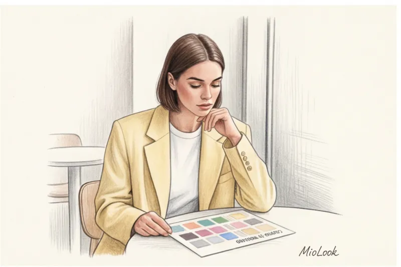
Start for freeColor schemes for advanced users
If you are ready to experiment, let's turn to the theory of Johannes Itten. Mix warm and cool colors In the pastel segment it is much simpler than in the bright one.
- Monochrome with color stretch: Choose one color, but in varying tones. For example, from a pale blue sweater to sapphire wide-leg pants and navy blue shoes.
- Complementary contrast: Yellow and purple in their purest form are carnival. But creamy yellow and washed-out lavender are sophisticated. The secret is that reducing saturation makes any opposing colors complement each other.
Breaking the Stereotypes: How to Wear Pastels in Fall and Winter
Perhaps my favorite styling trick. A few years ago, I was putting together a winter capsule collection for a client in Milan. She insisted on a black down jacket ("for practicality"). I talked her into a voluminous double-breasted coat in thick wool in a luxurious pistachio shade. The result? Against the gray-black winter crowd, she looked like an art gallery owner.
Sales statistics confirm: demand for light-colored premium outerwear has grown by 40% over the past two years. Winter pastel colors are a status symbol. They convey the message: "I drive and I'm not afraid to get dirty."
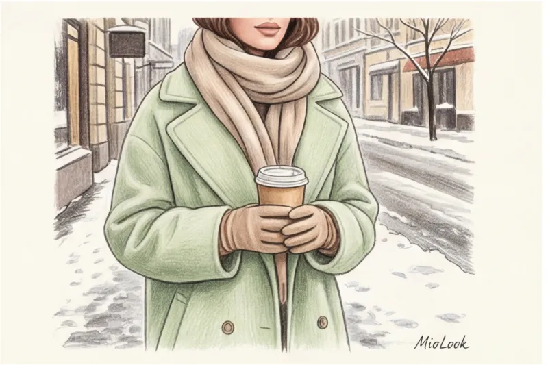
Invest in light-colored cashmere. In winter, our skin often looks dull due to lack of sun. A sweater in ecru, soft peach, or pale pink acts as a reflector, literally illuminating the face from below and erasing signs of fatigue.
But there is an important limitation (when it DOESN'T work): If you're wearing a light-colored winter coat, never pair it with translucent black 20-denier nylon tights. This creates a dirty contrast. Opt for thick, opaque tights (80-100 denier) in mocha, graphite, or navy blue.
Business Dress Code: Integrating Soft Shades into the Office
Is it okay to wear pink to a board meeting? One of my clients, a top manager at an IT company, was terrified of light colors in the office. We found her a dusty rose-colored three-piece suit with impeccable cut: sharp shoulders, peak lapels, and a thick wool suit that holds its shape.
Research into the psychology of color perception (specifically, data from the University of British Columbia) shows that cool, pale blue increases a speaker's credibility by 15% during difficult negotiations. It calms the other party while maintaining a distance.
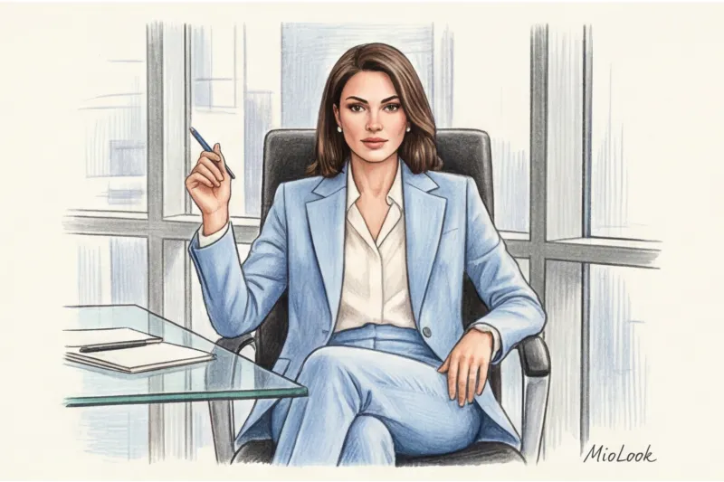
If you have a strict dress code at work, introduce pastels in moderation. For example, What to wear with blue To avoid looking like a flight attendant's uniform? Pair the navy blue jacket with a blouse in a soft mint or powder shade. This will soften the look without detracting from its authority.
Ready to update your wardrobe?
Upload photos of your items to MioLook, and the algorithm will suggest dozens of new combinations for every day.
Start for freeChecklist: 5 Rules for Styling Pastels by Isabella Garcia
To summarize, I want to give you a concrete summary of my experience. Save this checklist the next time you reach for that familiar black sweater:
- Watch the density. I can't stop repeating this. Pastels on thin, translucent jersey look cheap. Opt for dense fabrics: suiting wool, structured cotton, denim, leather.
- The "grounding" rule. Always add at least one dark or rugged detail to a light look. A brown belt, a burgundy bag, chunky loafers—they'll keep you from looking too much.
- No more than two light shades. Unless you're going for a deliberate monochrome look, mix a maximum of two pastel colors in one outfit (for example, mint + lemon), otherwise the look will fall apart.
- Cool or warm with fittings. Metal buttons, buckles, and embellishments set the tone. Gold adds a luxurious and warm feel to pastels, while silver adds a futuristic and understated feel.
- Analyze before release. I always advise my clients to use the image evaluation function in MioLook Take a photo of your outfit in natural light—the AI stylist will tell you if your look lacks contrast or needs an accent.
Remember the most important thing: color is your tool for impression management, not a box confined by stereotypes. By stopping perceiving delicate shades as exclusively for summer wardrobes or children's parties, you'll discover a whole new level of style. Start small—buy a creamy cashmere scarf to go with your dark coat, and you'll see how your reflection in the mirror changes.