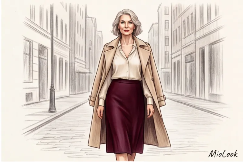
In 12 years of working as a stylist at fashion weeks from Paris to New York, I've heard the same cliché hundreds of times: "After forty, you should only wear pastels and forget about black forever." If you ask a typical store consultant, What colors make you look younger after 40? , you'll likely be offered a boring powder-pink cardigan or a bland beige blouse. But the industry has long since moved on.
We discussed the mechanics of how the entire palette works in more detail in our a complete guide to fashionable colors in clothing , and today I want to talk about physics. Yes, physics. Color isn't magic or intuition. It's an optical illusion based on how fabric reflects or absorbs light. And when we understand these laws, age-related changes become less of a problem and more of a new wardrobe guide.
The Physics of Color: Why Our Palette Should Change After 40
Let's be honest: as we age, our skin changes. Collagen loss leads to changes in microrelief, and micro-shadows appear (in the nasolabial folds and under the eyes). At the same time, cosmetology research shows that the natural contrast in appearance—the difference between skin tone, the whites of the eyes, lips, and hair—decreases by an average of 15-20%.
What does this mean in practice? Bright neon shades or muted dark colors that looked gorgeous on you in your 20s now take center stage. People see the fuchsia dress first, and only then the tired woman in it. Clothing near your face acts like a photographer's lightbox. It can become your personal reflector, directing soft light upward and erasing shadows, or it can absorb the remaining light, highlighting every wrinkle.
This is where the law of simultaneous contrast, discovered back in 1839 by the French chemist Michel-Eugène Chevreul, comes into play. He demonstrated that two colors placed next to each other influence each other. Your skin tone inevitably blends with the shade of your blouse. Our task is to choose a "neighboring" color that will neutralize unwanted undertones on your face.
Try MioLook for free
A smart AI stylist will select the perfect look based on your color type and appearance.
Start for freeWhat colors make you look younger after 40: the main reflective shades
The search for the perfect anti-aging shade begins in the portrait zone—from the chest line to the chin. This is where color has the greatest impact on the face's perception. Below is an overview of a basic palette that works as a high-quality concealer for most skin types.
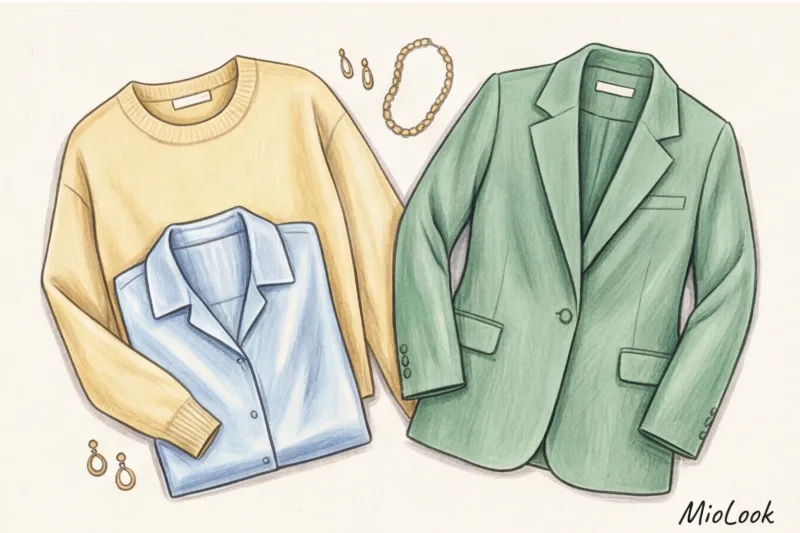
Creamy yellow and ecru instead of pure white
In 2019, before a fashion show in Paris, my client, a top manager at a large company, complained about her gray, haggard complexion. She was wearing a crisp, crisp white poplin shirt. The mistake was precisely that. With age, the enamel of our teeth and the whites of our eyes naturally lose their crystalline whiteness. Against the backdrop of a snow-white fabric with a blue undertone, these changes become obvious.
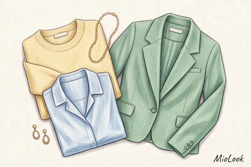
We swapped out the shirt for an ecru blouse (unbleached silk). The effect was immediate—she looked like she'd slept for eight hours in the Maldives. Pantone has made butter yellow one of the top trends of recent seasons for good reason. These warm, delicate shades soften facial features and always look significantly more expensive than stark white.
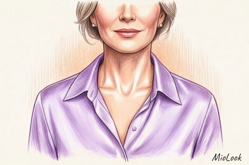
Icy Blue and Lavender Photoshop Effect
Have you noticed how makeup bases often have a lilac or blue pigment? In color, cool, light tones neutralize the yellowness and sallow undertones of tired skin. Ice Blue works phenomenally for the portrait zone.
There is, however, an important limitation here. This does NOT work if If you have a pronounced olive undertone and don't wear makeup, cool blue can give your skin a sickly green tint. But for most women, icy blue is a safe and fresher alternative to classic navy, which often makes a look too conservative.
Gemstone shades: emerald, sapphire, amethyst
What if you absolutely hate pastels? Opt for jewel tones. Emerald, sapphire, and deep amethyst provide the necessary contrast without the heaviness of black or brown.
One of my favorite tricks is to match these colors to my eye color. Green eyes will pop against an emerald silk top, while brown eyes will deepen against a sapphire one. This creates a focal point for the eyes, drawing attention away from the contours of the lower third of the face.
Trendsetting or anti-aging: how to wear the season's fashionable colors from WGSN reports
Every year, trend bureaus like WGSN dictate new commercial palettes. Recent reports highlight burgundy, dark chocolate, and deep khaki. The problem is that these marketing trends are often incredibly "heavy" and visually age people.
Does this mean we should abandon the fashion agenda after 40? Absolutely not. Look at street style icon Grace Ghanem—she wears the most complex colors, but she does so according to the "distance rule."
Distance rule The rule is: any complex, dark, or controversial trendy color should be relegated to the waist. Want to wear an ultra-fashionable espresso shade? Invest in a pair of gorgeous wide-leg pleated trousers or a leather midi skirt. And keep your personal highlighter shade near your face—for example, a soft blue cashmere sweater.
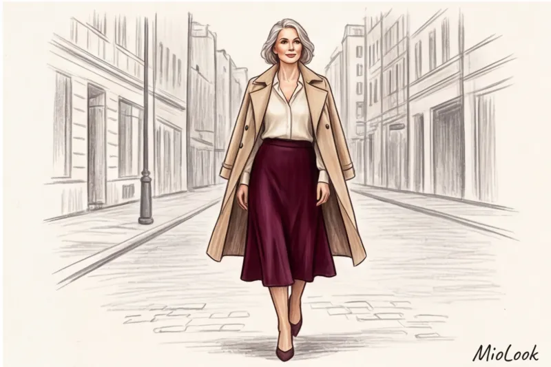
This color blocking technique allows you to stay on the cutting edge of fashion without sacrificing a fresh complexion. Wine-colored trousers paired with an ecru blouse will create a modern yet portrait-safe look.
Your perfect look starts here
Join thousands of users who look flawless every day with MioLook. Digitize your wardrobe and try on trends virtually.
Start for freeThe main myth of style: "Black makes you look older, but pink makes you look fresh."
It's time to debunk perhaps the most damaging myth in the industry. The common wisdom is: throw away black and wear pink. In practice, blindly following this rule leads to fashion disasters.
I once had a client who bought a dusty rose dress because she'd read in a glossy magazine that it made her look younger. In reality, this "pig-colored" hue brought out even the slightest rosacea and redness on her cheeks, visually adding at least five years to her age. Pink is a tricky color: magenta or fuchsia can create harsh reflections that highlight uneven skin tones.
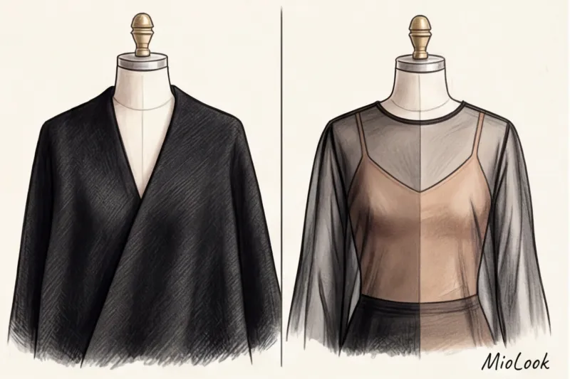
What about black? Black only makes you look older if it's a tight, matte turtleneck that goes all the way up to the neck, acting like a black picture frame, highlighting every wrinkle. If you love black, wear it right:
- Open your collarbones: A V-neck or deep bob pulls the black away from the chin, letting light into the face.
- Use translucency: Black chiffon, lace or organza over a beige top looks airy and graphic.
- Separate with decorations: A strand of pearls or a chunky gold necklace will create a barrier between the black fabric and your facial skin.
Incidentally, the fashion advice to "swap black for graphite or dark chocolate" doesn't always work. Matte dark gray can make a look incredibly dull and drab, robbing it of the Parisian edge that black provides.
Texture of fabric is more important than color: a secret that is not being told
No copywriter without experience working on shoots will tell you the most important thing: the texture of the fabric changes the temperature and weight of the color. The same shade of beige in matte cotton and in shimmering silk are two completely different instruments.
According to research into the optical properties of fabrics, glossy textures reflect up to 30% more light onto the face than matte fabrics of the same shade.
- Matte fabrics (Thick cotton, linen, suede, heavy wool) absorb light. They make the color appear denser and heavier. A dark green matte sweater will accentuate the shadows under the eyes.
- Glossy and satin textures (silk, high-quality viscose, satin) work as a highlighter. A flowing silk blouse, even in a complex mustard shade, will illuminate the face with its reflective highlights.
- Translucent fabrics (Chiffon, organza) lighten the color, blending it with your skin tone. This is the best way to wear dark colors in summer.
When in doubt, choose items with a slight satin sheen (but not cheap synthetic lurex!). A viscose blouse with 5% elastane will always beat out a stiff 180 g/m² cotton when it comes to keeping your complexion looking fresh.
A stylist's checklist: how to incorporate refreshing shades into your wardrobe
Theory is great, but style requires practice. Here's how you can apply this knowledge today, even if your office dress code is casual on Fridays and you prefer jeans on the weekends.
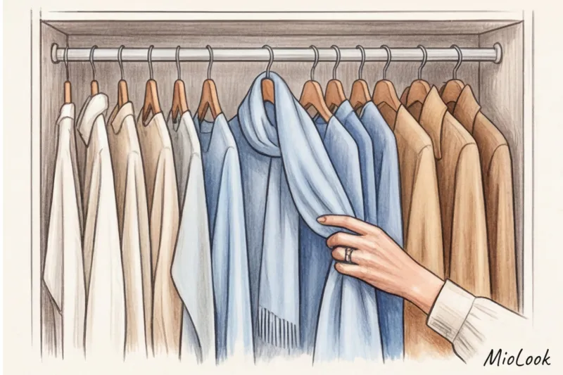
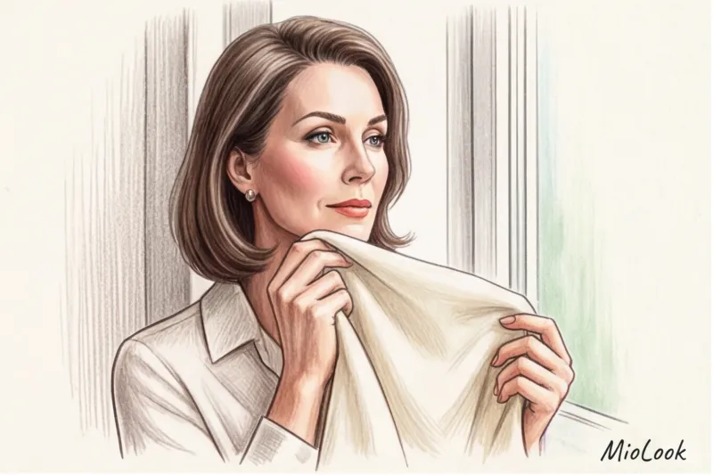
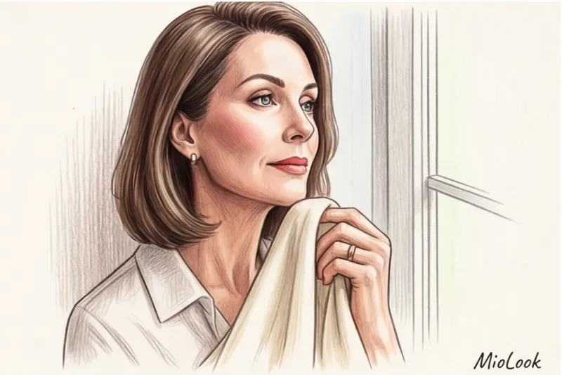
- Do the "scarf test." Stand near a window in natural light (no makeup). Apply fabrics of different shades and textures from your closet to your chin. Focus only on the nasolabial folds and under-eye area. You'll immediately see which fabrics work like an eraser and which work like a marker.
- Digitize your database. Upload your items to the app MioLook AI analytics will clearly show you any color imbalances in your closet. If the system displays 80% black and gray near your face, it's time to add reflectors.
- Use the 80/20 rule. You don't have to throw out your entire wardrobe. It's enough to have just 20% of your items (tops, blouses, scarves) in refreshing shades in the portrait area. They'll "lift" the remaining 80% of your favorite dark jackets and cardigans.
Instead of chasing illusory youth through childish styles and unflattering pink tones, embrace the noble physics of light. A well-chosen creamy silk and exposed collarbone in a black jacket will do far more for your confidence than any amount of persuasion to wear something you don't like.


