"Throw away your white shirt and little black dress." Sounds like fashion heresy, right? But after 12 years as a styling consultant and fashion journalist, I've realized one harsh truth: what we've been sold for decades as a "universal basic" actually works against most of us. Perfect black isn't salvation, it's an optical trap.
We talked in more detail about global color shifts and how modern palettes are formed in our a complete guide to fashionable colors in clothing In this article, we'll go further and examine the physics of color. You'll learn why traditional monochrome solutions cheapen an image, and how basic colors in the wardrobe evolved under the influence of the trend towards “quiet luxury”.
The Illusion of Versatility: Why Black and White Are No Longer the Best Basic Wardrobe Colors
Let's look at the laws of optics. Black absorbs light. When you wear a solid black turtleneck or jacket close to your face, the fabric literally "pulls" the light from your skin. The result? Micro-relief becomes more visible, the shadows under your eyes deepen, and the nasolabial folds appear sharper. Black doesn't make you look slimmer—it creates a harsh, graphic contour that mercilessly accentuates any signs of fatigue.
One of my clients, a 38-year-old top manager at an IT company, came to me with a question: "I constantly look tired, even though I sleep eight hours." Her closet was a monopoly of black suits and crisp white shirts. As soon as we replaced the sterile white with an almond shade and the black with a soft graphite, her face literally "came alive." The reduced contrast worked like a good cosmetic treatment.
According to colorists, radical black suits only 15-20% of women with European complexions (primarily those with the contrasting cool "Winter" coloring). For everyone else over 30, black is the least versatile color.
"Why do brands continue to make everything black?" you might ask. The answer lies in economics. Black dye is the cheapest, and dark pigments are excellent at disguising the low quality of fabric and crooked seams of mass-market products. For decades, we've simply been sold what's profitable to produce.
Dark base colors in your wardrobe: a noble alternative to dull black
At the last Paris Fashion Week, standing backstage before the show, I noticed one detail: Vogue editors and top buyers no longer wore all-black. Their "uniform" had transformed into complex, rich mixes.
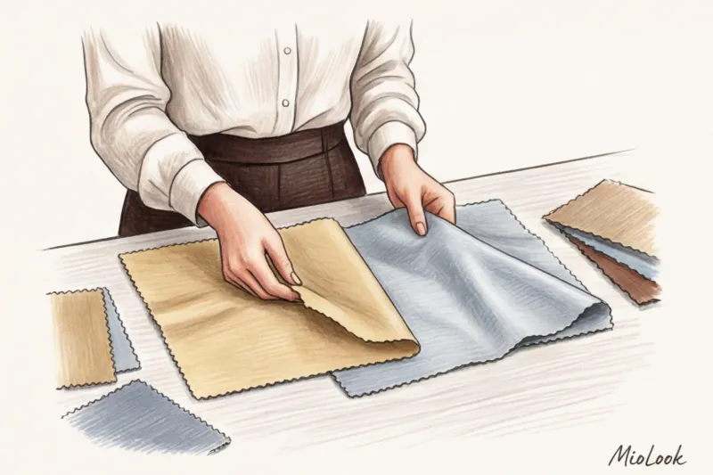
The paradigm shift is clear: darker alternatives look significantly more expensive. But there's one strict rule: complex color requires texture. Deep hues only emerge on materials that reflect or softly absorb light: thick wool, natural silk, or smooth leather. Cheap polyester will ruin the color's magic, leaving it flat.
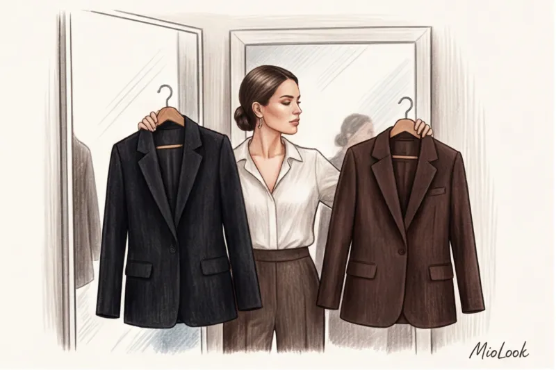
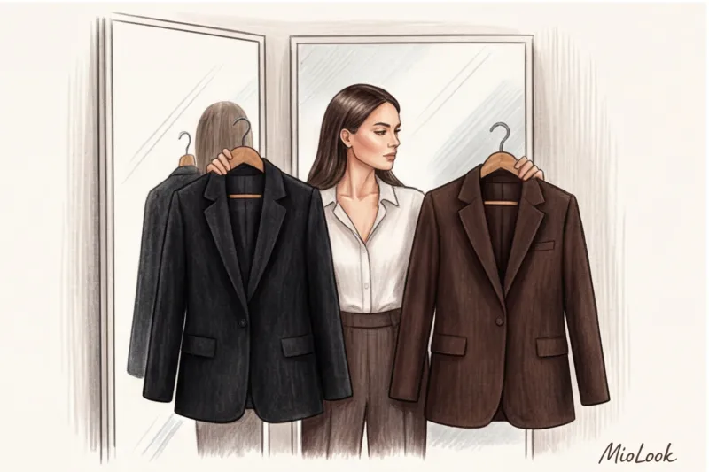
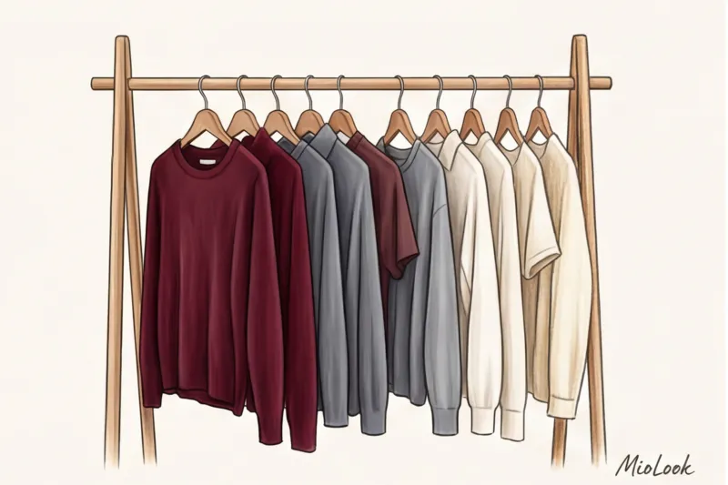
Dark chocolate and espresso: the new uniform of aesthetes
Thanks to Mary-Kate and Ashley Olsen and their brand The Row, and to Mathieu Blasi of Bottega Veneta, for bringing brown back. According to analytics from global platform Lyst, searches for "brown tailored trousers" increased by a staggering 45% over the past year compared to their black counterparts.
Espresso is phenomenally flexible. Try pairing black trousers with a light blue shirt—you'll get a bank clerk's uniform. Swap the black trousers for chocolate brown—and you'll have the look of an intellectual. Chocolate is the perfect complement to cream, cherry, and sky blue.
Deep Wine (Gucci Rosso): When the Base Makes a Statement
When Sabato De Sarno presented his debut collection for Gucci, he didn't simply unveil a new color, Rosso Ancora. He legitimized deep burgundy as a new neutral. It's the perfect choice for those who are afraid of color but tired of gray.
A wine-colored jacket or leather midi skirt in this shade make the perfect backdrop. At the office, burgundy is a great substitute for black when paired with off-white blouses, and on weekends, it pairs luxuriously with classic blue denim in 12-ounce weights or higher.
Graphite and Midnight Blue: A Safe Transition
If brown isn't your thing, consider gray. WGSN named Sustained Gray one of the most enduring trends of the decade.
Dark graphite or midnight blue (navy) are ideal for reducing portrait contrast. They maintain the formality required for a strict dress code without creating a "mourning frame" effect around the face.
Try MioLook for free
A smart AI stylist will select the perfect look based on new base colors and your personal coloring.
Start for freeLight Basic Colors in Your Wardrobe: How to Replace Sterile White
Pure white is a tricky color. Firstly, it inevitably evokes associations with medical uniforms or school assembly. Secondly, its absolute coldness highlights even the slightest yellowness of teeth and the whites of the eyes. If you haven't had enough sleep, white will treacherously highlight it.
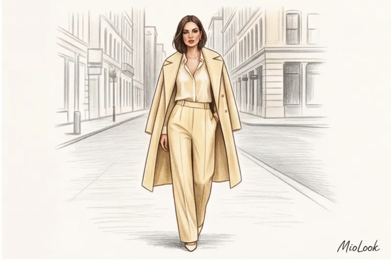
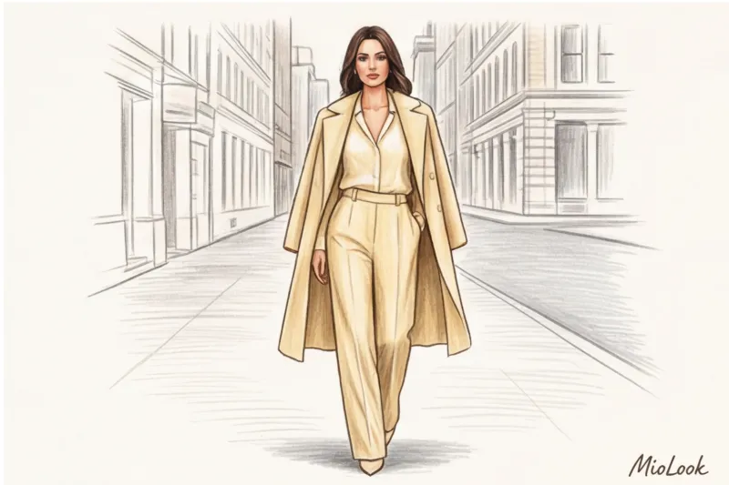
It's being replaced by warm, enveloping tones. The most commercially successful light shade of this year was Butter Yellow (buttery color). It gives the skin that "expensive" glow that highlighters can't achieve.
How do you choose your light base based on the 12 color types? My professional advice: always test your light color in daylight without makeup.
- If you have warm skin undertone (Spring/Fall) - Your choice is oat milk and almonds.
- If cold (Summer/Winter) - pay attention to the color of undyed linen or frosty milky.
- Secret ingredient: Dusty Sage. This muted gray-green shade is a phenomenally adaptable light base that instantly calms any bright accents in your look.
3D Wardrobe Formula: How to Combine New Basic Colors
Giving up black and white is often daunting: it seems like nothing will go with anything else. This is a myth. To make your wardrobe work for you, use the stylists' formula: Dark + Light + Connecting.
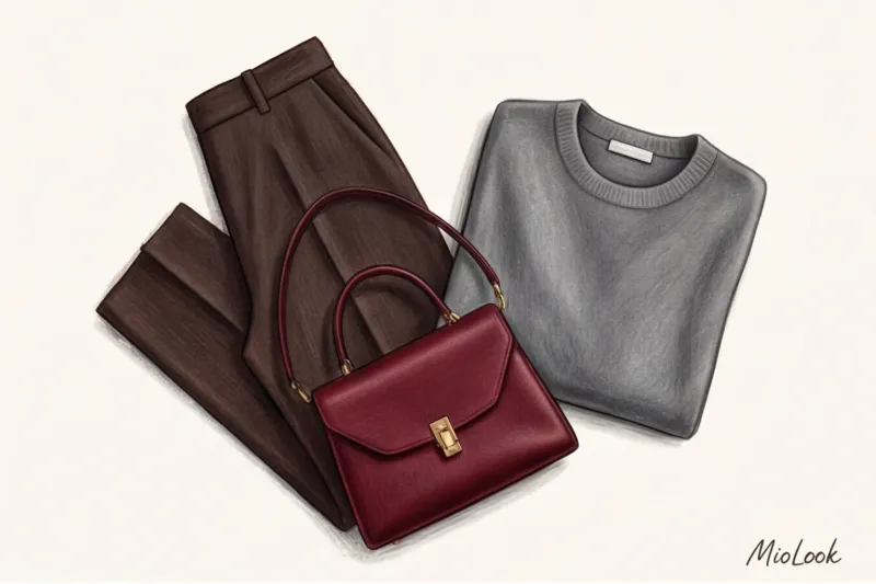
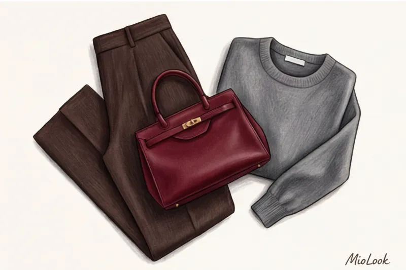
Instead of flat monochrome, we create depth. For example, you take espresso-colored trousers (dark), a butter-colored blouse (light), and drape an almond-colored jacket (linking). The result is a luxurious gradient stylization that begs to be explored.
Another professional technique is to play on the clash of temperatures. Pair a cool graphite cashmere sweater with warm, cream-colored silk trousers. This subtle dissonance adds a sophisticated and intellectual touch to the look. Incidentally, it's the shift to related, yet complex, shades that dramatically enhances the look. cost-per-wear indicator: things start to be combined in dozens of new ways, and you wear them much more often.
Common mistakes: how to avoid ruining new basic colors in your wardrobe
I'll be honest with you: switching to a new palette has its pitfalls. There are some things that just don't work.
Mistake 1: Clashing earth tones without a neutralizer. If you wear warm terracotta pants with a cool taupe sweater, the look will be "dirty." You need a neutralizer—like a peek of the collar on a cream-colored shirt—to separate the colors.
Mistake 2: Ignoring the invoice. I see this a lot in mass-market clothing. Cheap brown acrylic knitwear looks like it's been worn for five years. Brands like Zara or H&M often lack depth of pigment in their budget lines, and after the first wash, beautiful dark chocolate turns into a dull red. Invest in mid-range brands (COS, Massimo Dutti) or look for at least 50% natural fiber content.
Mistake 3: Leaving black shoes. You've created a stunning look in graphite and almond, and you've paired your feet with black ankle boots. This visually cuts off your legs and adds heft to your bottom. Swap the black base for deep burgundy or dark brown shoes—they go with absolutely everything.
Stylist Checklist: A Step-by-Step Plan for Implementing a New Palette
To prevent your wardrobe update from turning into a chaotic buying spree, follow a strategy.
- Step 1: Inventory. There's no need to burn all your black clothes. Keep the "survivors"—well-cut pants and skirts. Anything away from your face (the lower part of your silhouette) won't damage your skin tone.
- Step 2: Purchase a "transitional" element. Buy a quality jacket or coat in graphite or dark chocolate. Try pairing it with your regular pieces—you'll be surprised how much softer it softens your look.
- Step 3: White cleaning. Replace old white T-shirts with off-white or cream-colored ones. Look for heavyweight cotton (at least 180 g/m²)—thin fabric in light shades always looks cheap.
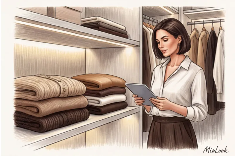
- Step 4: Smart cataloging. To help you remember what to wear with your new items, digitize them. Add your new espresso and sage shades to MioLook wardrobe — the algorithm will instantly create capsules for you and show you combinations you never even thought of.
Your perfect look starts here
Join the thousands of users who look flawless every day by combining new base shades with MioLook.
Start for freeRemember the key: basic colors in your wardrobe aren't a stiff prison uniform of boring shades. They're a sophisticated canvas that should accentuate your face, not steal the show. Opt for softness, texture, and depth, and you'll notice how not only your reflection in the mirror changes, but also how others perceive you.


