Do you know what I hear from 9 out of 10 new clients during my first consultation? "Olena, I want to add some bright colors, but I'm afraid I'll look like a clown." We've lived in an era of total beige minimalism for so long that we've forgotten how to manage color. In 14 years as a stylist, I've realized one thing: women aren't afraid of color because it doesn't suit them. They simply don't understand how the architectural proportions of shades work.
Today we will analyze color blocking in clothing, rules which most people misunderstand. It's not just a principle of "wearing your brightest colors at once." It's a mathematically precise tool that can visually shed a few pounds, lengthen your legs, and make your look three times more expensive.
Interesting fact: according to the WGSN trend analysis bureau (2024), color blocking always comes back into fashion during periods of global economic instability. The brain uses saturated hues as a form of psychological escapism—we physiologically need the endorphins that color provides. I've already discussed how such trend palettes are formed in more detail in our a complete guide to fashionable colors in clothing.
What is color blocking in clothing: rules we've forgotten
The term "color blocking" literally translates as "color blocks." The main difference between this technique and traditional colorful clothing lies in the geometry: we juxtapose large, localized patches of pure color. No flowers, ripples, checkered patterns, or complex gradients.
Historically, this technique originated in painting. Remember Yves Saint Laurent's famous 1965 trapeze dresses, inspired by Piet Mondrian's paintings. The localized blocks of blue, red, and yellow, separated by clean lines, revolutionized the look. Today, street style chronicles of Milan and Copenhagen reveal a modern interpretation: softer, yet just as confident.
"Color blocking is the architecture of color. You're not just painting yourself, you're rebuilding your silhouette with contrasting planes."
The Biggest Mistake: How Contrasts Ruin Proportions (and How to Avoid It)
Visual perception studies reveal a brutal fact: a horizontal color border visually expands the area it touches by at least 15%. Wherever the contrasting border falls, the viewer's gaze is drawn.
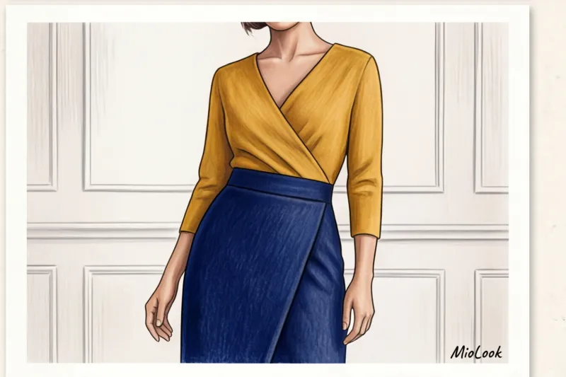
Last month, a client came to me with the request, "I want to wear bright colors, but I feel fat." At 160 cm tall, she was wearing a thick mimosa-colored cotton jumper and classic indigo jeans. The color ratio was exactly 50/50. A sharp horizontal line across her stomach literally cut her height in half and added extra bulk to her waist.
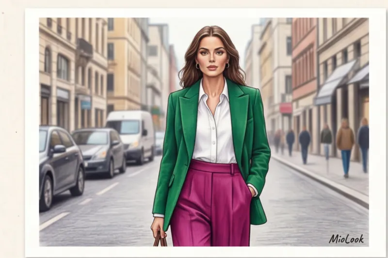
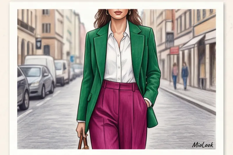
How did we fix this? We used vertical and asymmetrical color blocking in the clothing—the rules work flawlessly here. We swapped the jumper for an emerald wrap top with a diagonal edge and layered an unbuttoned fuchsia jacket over it. The diagonal line elongated the silhouette, and the two vertical lines from the unbuttoned jacket visually cut off the sides.
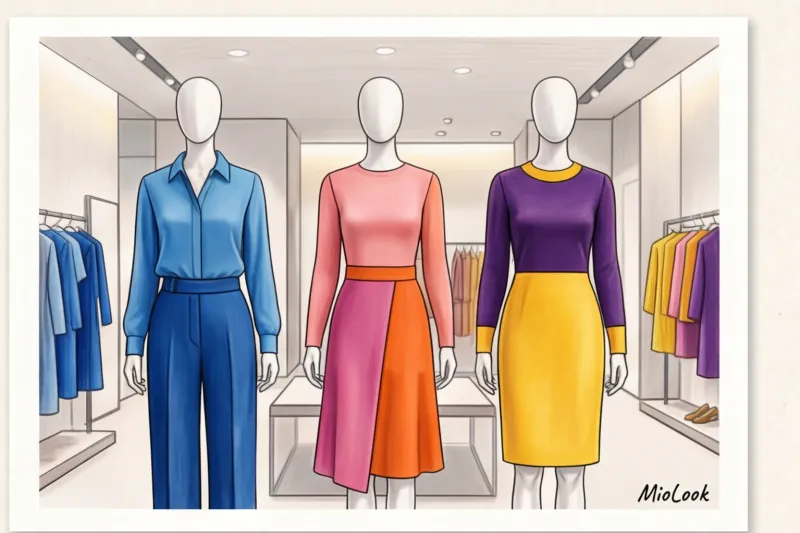
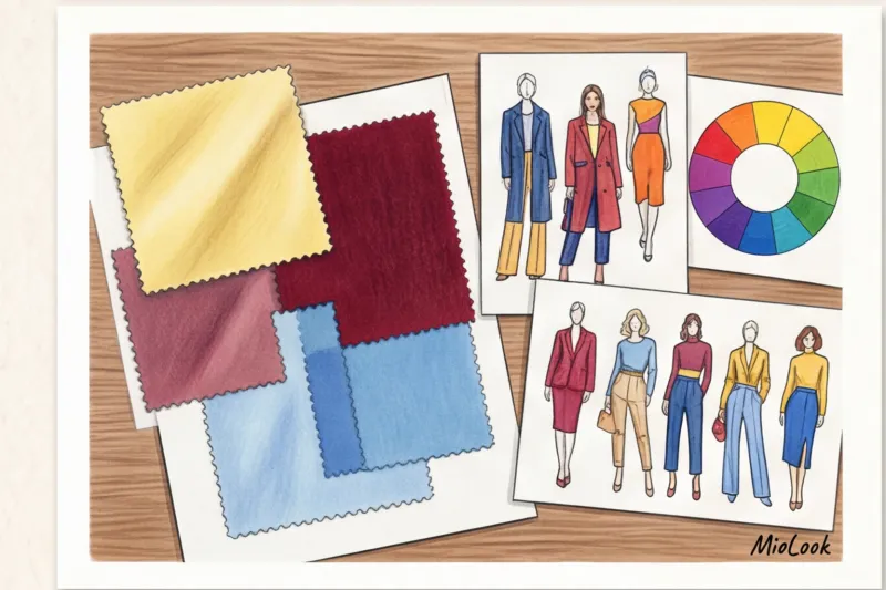
The Golden Ratio of Color Blocking: The 60-30-10 Rule
To avoid chaos, I always use the 60/30/10 formula, which we stylists shamelessly stole from interior designers. It's the perfect balance that doesn't overwhelm the nervous system:
- 60% - leading color: Your canvas. Pantsuit, long dress, or coat.
- 30% - complementary color: A top under a jacket, statement shoes or a chunky bag.
- 10% - micro-accent: A belt, glasses frames, a scarf, or even bright lipstick.
It’s these 10% that show that you put together your look consciously, and didn’t just throw on the first thing that came out of the closet.
Try MioLook for free
A smart AI stylist will create the perfect look using the 60/30/10 rule right on your phone from the items you already own.
Start for freeThree foolproof color blocking patterns for real-life clothing
I won't bore you with the dry theory of Johannes Itten and his color wheel. Let's move on to practical applications—diagrams you can put together as early as tomorrow morning.
Scheme 1: Analogous (adjacent colors)
The safest method for beginners. We choose shades that are adjacent on the color wheel. They are related, so they never clash. Try pairing rich fuchsia with classic red (a favorite of Princess Diana) or deep blue with cool emerald.
Scheme 2: Complementary contrast
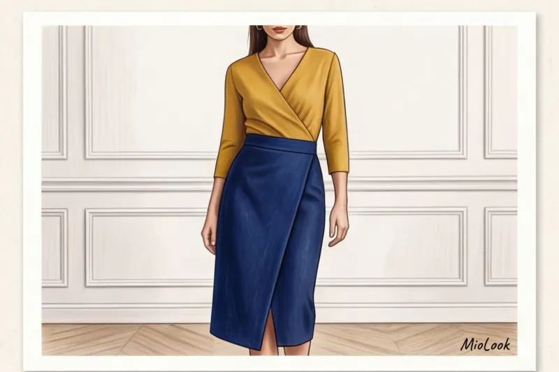
Here we're juxtaposing colors from opposite ends of the color wheel: yellow and purple, orange and blue. To avoid looking like a child's party entertainer, remember the golden rule: one color should be as saturated as possible, and the second should be muted or pastel For example, a juicy mustard sweater and soft lavender trousers.
Pattern 3: Monochrome Block
My favorite trick for smart casual at the office: take one color but juxtapose shades of varying lightness and temperature. An icy blue silk top, deep sapphire trousers, and a navy jacket. It looks incredibly expensive and classy.
How to incorporate the season's trending colors into a color-block capsule
Every season, the Pantone Color Institute and mass-market marketers bombard us with new "must-have" shades. This year, it's buttery yellow and deep burgundy. Does this mean we need a complete wardrobe overhaul? Absolutely not.
Integrate trendy colors into the 30% or 10% roles. If your natural coloring is cool and warm yellow is trending, simply move it away from your face. Use pants or a bag for this, and keep your tried-and-true base shade close to your face.
By the way, to avoid wasting money on things you can't wear with, I recommend my clients visualize their purchases in advance. You can take a photo of the desired item in the fitting room, upload it to MioLook and immediately see how it will work in color blocking with your current wardrobe.
Texture is everything: the hidden secret of stylists
Now I'm going to share some insider knowledge that often leads to failure when experimenting with color on your own. You've bought the perfect shades, put them on, but the look still looks flat and cheap. Why?
It's all about the texture of the fabric. If you juxtapose two smooth, identical materials (for example, two thin cottons or two matte viscose), the magic disappears. In commercial shoots, we always salvage a dull look with a play of textures. The rule is simple: matte + shiny, fluffy + smooth, loose + dense.
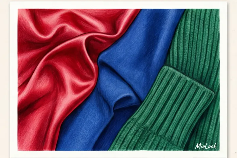
An example of a perfect mix: a flowing emerald silk skirt (shine, smoothness) and a voluminous, fluffy fuchsia mohair sweater (matte, volume). The texture gives the color a depth that's impossible to achieve with flat fabric.
Myth: Why you shouldn't use black to 'calm' a color block
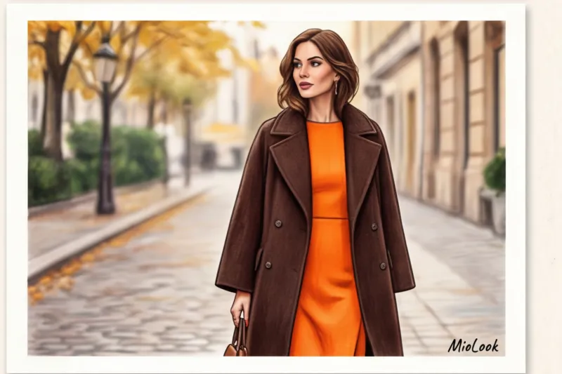
One of the most pernicious fashion misconceptions is: "I'll wear a really bright blouse, but to avoid going overboard, keep the pants basic black." If you want to create truly luxurious looks, forget about black as a "comforter."
Black doesn't calm down bright colors—it makes them even more aggressive and harsh. It creates the effect of cheap neon against the night sky. Pure black is extremely rare in nature, and next to it, any rich shade begins to scream.
What to replace it with? Try using dark chocolate, deep graphite, rich burgundy, or classic navy as a dark base. Dark chocolate paired with tangerine orange looks far more refined and sophisticated than orange and black.
Checklist: Creating Your First Color-Block Look Without Stress
If you're standing in front of your open closet and don't know where to start, follow this algorithm. It works flawlessly for any body type.

- Step 1: Select the base (60%). Choose something in a calm, deep shade (for example, a dark blue suit).
- Step 2: Add companion color (30%). Use an analogous or complementary scheme. Add a mustard top under the jacket.
- Step 3: Check the joint. Stand in front of a mirror. Does the line of contrast cut into your figure at the widest point? If so, unbutton your jacket or tuck in your top asymmetrically.
- Step 4: Micro-accent (10%). Take a wine-colored bag or wear glasses with bright frames.
- Step 5: Check for purity. Fair Limit: Color Blocking it absolutely doesn't work Next to bold prints. If you're wearing florals, leopard print, or gingham, that's a whole other stylistic story. Stick to clean lines.
Ready to get started?
Try MioLook's free plan—no commitments required. Artificial intelligence helps you create harmonious color blocks in just a few clicks.
Start for freeColor is your visual volume. The right color blocking allows you to make a statement with just the right tone for the day. Don't be afraid to experiment: start with deep shades, play with textures, and remember the golden ratio. Your wardrobe can do more than just keep you warm.


