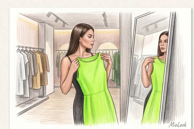
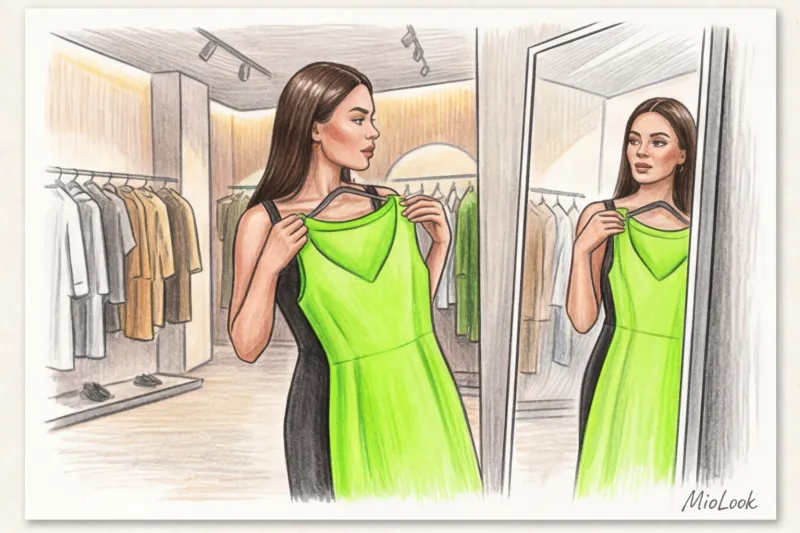
Remember that frustrating moment in the fitting room: you're holding a luxurious creamy yellow sweater, pressing it to your face, sighing, and returning it to the hanger. The reason? Someone once told you that you're a "cold summer" and that yellow will make your face look sallow. In my 14 years as a stylist, I've seen hundreds of women voluntarily confine themselves to four or twelve color types, foregoing stunning, trendy shades.
But here's the secret: color isn't magic or a death sentence. It's simple physics (light and reflection). If you're wondering, How to wear colors that don't match your color type The answer lies not in completely abandoning trends, but in managing fabric texture, contrast, and color coverage. We've covered more about how these trends are formed and why we even want to wear them in our A complete guide to fashionable colors in clothing: trends and combination rules.
Let's debunk the myth of strict color standards once and for all and learn how to adapt any complex Pantone to your unique appearance. Spoiler: you'll never have to give up your favorite shades again.
Why Strict Color Types Are Outdated (and How Marketing Affects Our Palettes)
The color classification system, devised back in the 1980s, was an excellent basic tool for its time. But today, it's hopelessly outdated. Analytical agencies like WGSN and the Pantone Color Institute adapt runway trends for the commercial sector every season, releasing dozens of complex, mixed shades onto the market: from digital lavender to dusty khaki. By strictly limiting yourself to a single "season," you're cutting off 75% of the current assortment in stores.
One of my clients avoided any shade of yellow for five years because she was labeled a "summer color type." She was convinced the color was "killing" her. When we picked out a blouse for her in a shimmering, smooth silk instead of a dull, matte cotton, her complexion literally lit up. The problem wasn't the color itself, but its characteristics and interaction with her skin.
In the appendix MioLook We use algorithms that take into account not only the warmth of a color's appearance but also the level of contrast, offering a more flexible and modern approach to palette creation.
How to wear colors that don't match your color type: the portrait zone rule
The most important rule of coloristics is based on optics. Light hits the fabric of your clothing, reflects off it, and illuminates your face from below, like a ring light. This is why the "portrait zone" (from the chest to the crown of the head) is critically important. An inappropriate shade right at the chin can really highlight dark circles under the eyes, accentuate nasolabial folds, or give your skin a sallow undertone.
But that's no reason to give up on the purchase. There are two elegant stylistic options.
Shifting Focus: Pants, Skirts, and Shoes
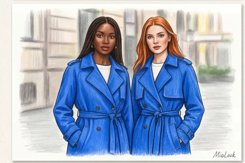
The easiest and safest way to implement How to wear colors that don't match your color type — move them down, away from your face. A trendy shade won't affect your skin tone if it's worn on your legs. Consider bright palazzo pants, statement shoes, or thick, colored tights. For example, if you don't know, What color goes with red in clothing? , start with wine leather pants paired with your perfect neutral-toned basic sweater.
Creation of a "buffer zone"
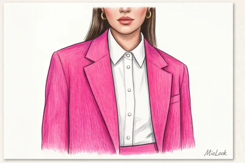
If a difficult color does end up in the portrait zone (for example, you bought a stunning, trendy jacket), create a barrier. A "buffer zone" is a layer of your ideal, 100% matching shade between your face and the problematic item.
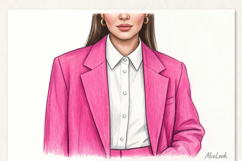
In practice, this works flawlessly: throw a sophisticated olive cardigan over a crisp white poplin shirt or a light blue turtleneck. Just 5-7 centimeters of the right color at the collar completely intercept the reflected light and save your complexion. Fair Limit: This trick won't work with deep V-necks on bare skin—your skin will be the buffer there.
Try MioLook for free
A smart AI stylist will select the perfect look and help you incorporate new colors into your wardrobe without making mistakes.
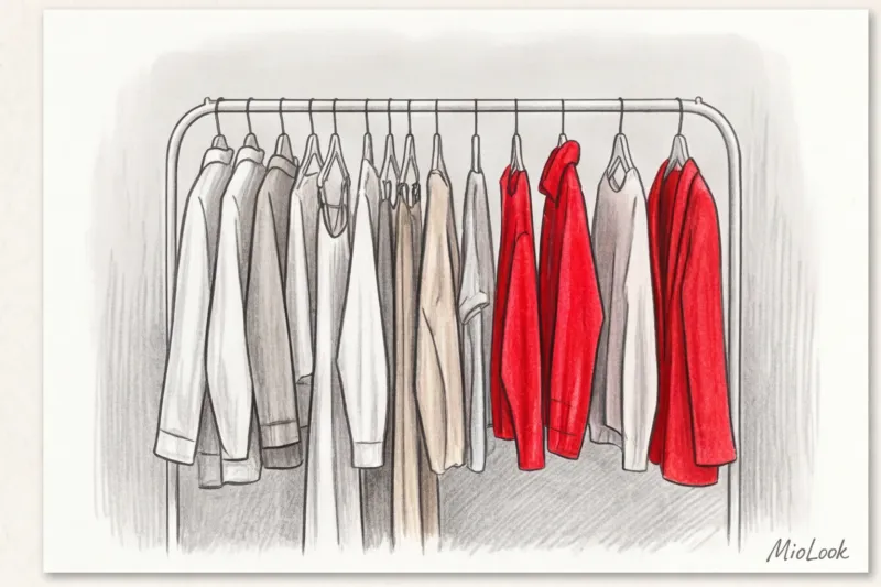
Start for freePlaying with Texture: A Hidden Trick of Stylists
The same Pantone color number will look completely different on linen, cashmere, leather, and sequins. The physics of fabrics is such that matte surfaces (cotton with a weight of 180 g/m², linen, suede, and mohair) absorb up to 40% of light. They make any color, even the most garish, more muted, loose, and safe.
Glossy fabrics (satin, silk, patent leather), on the other hand, act like mirrors. They sparkle, reflect light, and maximize the vibrancy of a color.
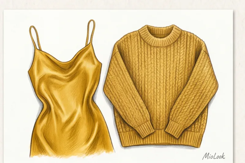
We once adapted an ultra-fashionable neon green for a client with a very soft, low-contrast Slavic appearance. In smooth knitwear, the color looked alien on her, like a marker. But when we found the same shade in the texture of fluffy, long-haired mohair, magic happened. The pile broke up the solid color, added shadows, and the neon became soft and sophisticated.
Temperature vs. Contrast: What Really Ruins an Image
We're used to blaming color temperature: "This peach is too warm, and I need a cool pink." But Swiss artist and researcher Johannes Itten proved one important thing in his color theory: the human eye perceives contrast (lightness/darkness) in a split second, long before it recognizes the warmth or coolness of a hue.
According to stylist statistics, 80% of the harmony of an image depends on the matching level of contrast between appearance and clothing, and not on the notorious “warm” or “cold” undertone.
If you have fair skin, light brown hair, and flat features (low contrast), it's not the "wrong" color that will kill you, but rather a shade that's too toxic, pure, or extremely dark. If you want to wear a complex purple, simply choose a washed-out, pastel version (lavender) or a sophisticated gray version (dusty blackberry). Understanding that How to mix warm and cool colors , it begins with managing their saturation.
Makeup as a tool for color correction
If you're determined to wear an inappropriate shade next to your face (for example, a chic evening dress), makeup should act as a bridge between the clothing and your skin. I often prepare speakers for corporate presentations, where the color of the outfit is dictated by the company's strict brand book (for example, an aggressive orange or a cool blue), rather than the person's appearance.
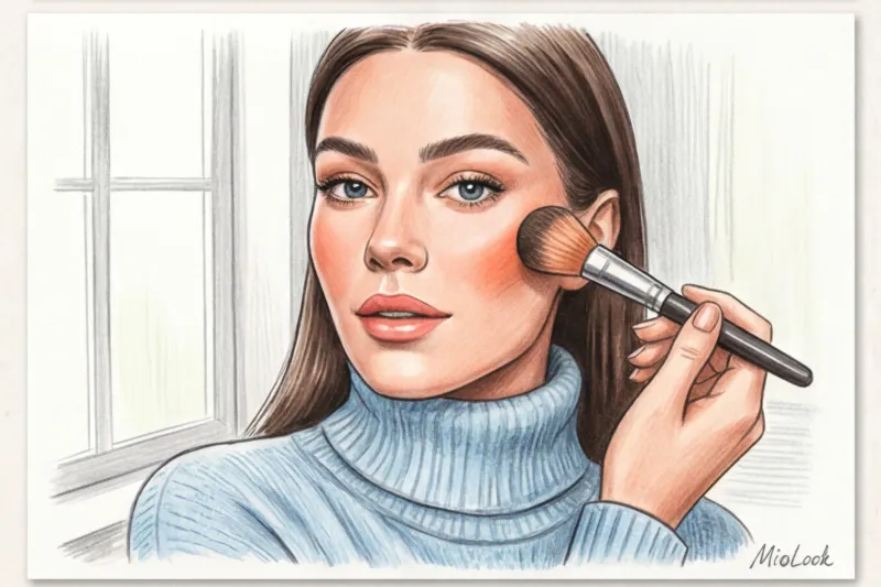
The rule of balance is: if your clothes "drain" your complexion, your makeup should be a little brighter and heavier than usual. Foundation with the right undertone will even out the look. If you're wearing a cool, icy sweater, add a cool, pink blush. If you're wearing a warm, mustard-colored blouse, use peach tones on the apples of your cheeks.
But there is an important exception here: This advice is completely useless if you don't wear foundation on principle. A bright emerald top coat will inevitably highlight even the slightest redness on bare skin.
Your perfect look starts here
Join thousands of users who look flawless every day with the MioLook smart wardrobe algorithms.
Start for freeTrend Dosage: From Micro-Accents to Accessories
Integrating trendy shades into your basics should follow the 80/20 rule. Let 80% of your look consist of tried-and-true, perfectly fitting neutrals, and dedicate the other 20% to experimenting with trendy pieces. This is the foundation of any well-designed capsule wardrobe.
From a smart shopping perspective, this is also cost-effective. Buying an expensive coat in the ultra-fashionable "Peach Fuzz" color (Pantone 2024) is a huge risk. You might not like it in a month or it might go out of style. But add emphasis Whether it's a structured bag, a belt, glasses frames, or a silk scarf on a tote handle, it's ingeniously simple. Accessories allow you to look sharp without having to redo your entire closet.
Checklist: How to safely buy something in the wrong color
To help you decide whether to take an item to the checkout next time you're in the store, I've put together a step-by-step checklist.
- Estimate the distance from the face. Is it pants or a skirt? Go for it. Is it a turtleneck? Move on to step 2.
- Check the invoice. Is the fabric shiny or matte? If color is a concern, choose loose, matte textures (cotton, wool, linen) as they tone down the harshness of the hue.
- Find a buffer item at home. Do you have a basic white or light blue shirt or top in your perfect shade that you can wear with your new piece? If so, you're in luck.
- Do the test in natural light. Fitting room lights often emit a harsh yellow light. Leave the stall and go to a room with windows, or photograph the item without a flash.
If in doubt, take a photo of the item in the store and upload it MioLook virtual wardrobe The app will suggest which of your current items will pair well with this new item.
Color is your tool, not a strict overseer. Allow yourself to wear what makes you smile and lifts your spirits. Just do it skillfully: play with texture, move complex shades away from your face, and balance them with the right contrast. After all, the worst color is the one you're afraid to try on.


