How many times have you bought a neon green top or a lemon dress in a fit of passion, only to have them hang in your closet for years with the tags still intact? Sounds familiar? My name is Isabella Garcia, and over 12 years as a personal stylist, I've sorted through hundreds of wardrobes where the perfect but boring taupe base sat alongside chaotic, flashy purchases. These women genuinely wanted to add some life to their everyday looks, but they weren't sure how to do it elegantly.
Incorporating bright accents into clothing is an art that doesn't tolerate fuss. We discussed the origins of these trends in more detail in our a complete guide to fashionable colors in clothing , and today we're going to do some seriously practical magic. I'll show you how to use the concept of "color integration" instead of outdated pops of color to give your style an expensive, thoughtful, and Mediterranean-inspired feel.
The "Red Bag" Illusion: Why the Old Rules of Bright Accents in Clothing No Longer Work
Perhaps the most persistent and harmful fashion myth is this: "If you're wearing all black, just grab a red bag and your look will pop." I strongly disagree. In my experience, this technique almost always cheapens the look and mercilessly distorts the figure's proportions.
One of my clients, top manager Elena, bought a trendy fuchsia bag for a hefty sum. She paired it with a classic, formal gray coat but admitted she felt uncomfortable—as if the bag "wasn't her own bag." And she was right! The sharp, unsupported pop of color against a contrasting background acts as a visual anchor. The other person's eye is drawn to the bright spot at the hips, visually cutting your silhouette in half, and making you look like you grabbed the first thing you saw before heading out.
True style lies not in point-by-point contrasts, but in color flow. Color should flow, be supported by texture or layers, and become an organic part of your DNA, not an alien flash.
Why do we make such purchases at all? According to WGSN (2024), during periods of global instability, consumers experience a strong need for "dopamine dressing." Marketers embrace palettes from the Pantone Color Institute, mass-market stores flood their shelves with vibrant shades, and we succumb to impulse buys. But without knowledge of the integration formulas, these items become dead weight.
Stylist's Formulas: How to Seamlessly Incorporate Trendy Colors into Your Basic Wardrobe
To make color work for you, you need to replace random purchases with mathematically proven formulas. Over the years, I've discovered a rule: cheap fabric ruins any complex shade. Bold color requires depth, which only the right texture can provide.
Smooth cotton with a weight of less than 150 g/m² or thin polyester will make emerald or burgundy colors appear flat. However, silk, cashmere, thick viscose, suede, or textured leather will make the pigment sparkle in the light, creating luxurious highlights.
Your perfect look starts here
Join thousands of users who look flawless every day with MioLook.
Start for freeThe Sandwich Method: Balancing the Top and Bottom
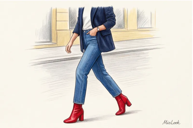
One of the most reliable techniques I use is the "sandwich" method. It involves placing a bright color at opposite ends of the figure, sandwiching a basic neutral shade in the middle. This creates a frame for the eye and elongates the silhouette.
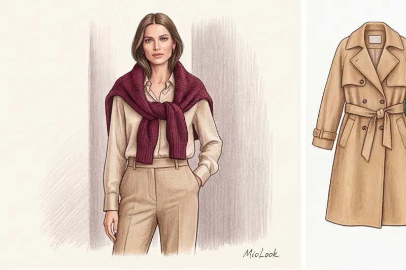
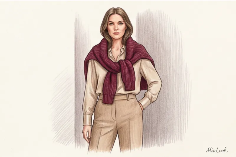
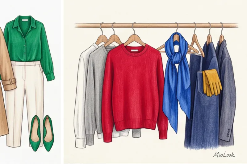
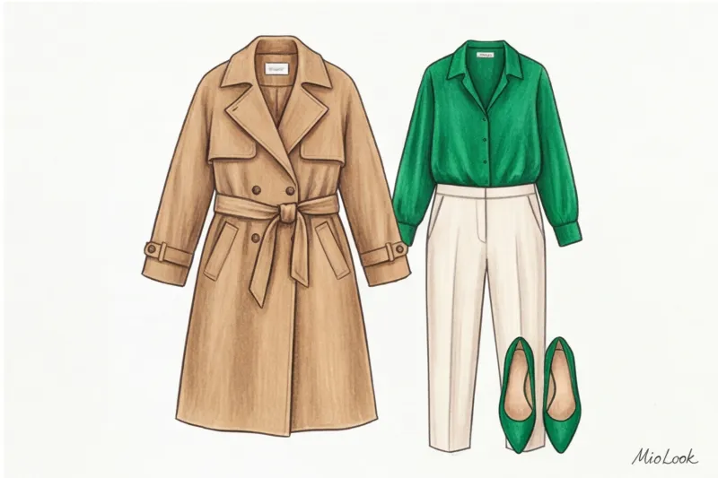
What does this look like in practice? Imagine the basics: classic camel trousers and a beige trench coat. To add color, we add an emerald silk blouse (the top "bun" of the sandwich) and hold it up with emerald suede loafers or ankle boots (the bottom "bun"). Neutral trousers act as the "filling." The look instantly becomes cohesive and complete.
Colored lining layer and exposed details
If the sandwich method seems too bold, start with the "peeking color" technique. This is my favorite Mediterranean trick, adored by Italian and Spanish women. The idea is to make the color not overpowering, but merely hint at its presence.
- Cuffs and collars: Wear a sheer, rich sapphire turtleneck under a relaxed blue shirt or gray jacket. Let the color show only at the neckline and loose cuffs.
- Sweater as an accessory: A basic beige coat + a bright terracotta jumper, casually thrown over the shoulders (and tied in a knot at the chest) + shoes in the same tone as the base = elegance with a twist.
Safe Investments: What's Worth Investing in for Color?
I always encourage my clients to evaluate items using the Cost Per Wear formula. Investing in a trendy acid pink coat from a mass-market store is a bad idea. You'll wear it three times, tire of the attention, and the cost per wear will be astronomical. But an expensive cherry-red cashmere jumper can be worn 50 times per season, paired with different bottoms. Its cost per wear will be close to zero.
Ideal candidates for color investments:
- High quality knitwear: Thick knit sweaters, cardigans, turtlenecks made of merino wool.
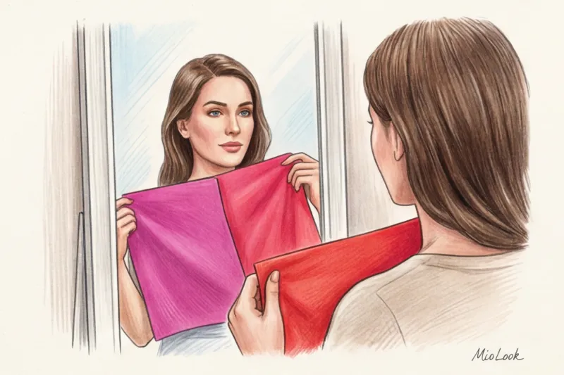
- Silk scarves: A bob is the safest way to integrate 3-4 bright shades into a portrait area.
- Textured shoes: Burgundy embossed leather loafers or dark green suede ankle boots work as an accent without stealing the show.
- Leather gloves: Long gloves in mustard or burgundy colors, combined with the short sleeves of a basic coat, look incredibly aristocratic.
I strongly advise against buying brightly colored classic trousers if you're just starting out with color. Trousers are a huge area of fabric that requires a flawless fit. Colored trousers visually widen the hips and require complex styling of the top.
The 90/10 Rule: The Perfect Proportion to Avoid Turning Your Look into a Circus
If you're wary of going overboard, rely on the 90/10 architectural rule. Let 90% of your look be a flawless base (graphite, navy, off-white, camel), and 10% be a clean, vibrant accent. This ratio works flawlessly.
But there's an important psychological nuance here: where exactly should you place that 10%? Research in the psychology of perception shows that a bright detail in the portrait area (near the face) increases the person's memorability by 30%. If you have an important presentation or an interview at a creative agency coming up, add a statement silk scarf or wear a bright top under a formal suit. People will remember your face, not your shoes.
A scale error occurs when we break the proportions and make the ratio 50/50. For example, wearing a red jacket and bright blue pants. This isn't just accents; it's color blocking—an entirely different, much more complex stylistic technique that requires perfect looks and contrast.
Temperature Compass: How to Match a Bright Trend with Your Color Type
One of the main secrets to luxurious looks, based on Johannes Itten's color theory, is matching temperatures. You can mix any colors as long as they have the same undertone. Cool gravitates toward cool (emerald + icy blue), warm toward warm (terracotta + milky).
But what if the Pantone Institute has declared warm "Butter Yellow" as the color of the year, but you have a cool, contrasting color type, and yellow on your face makes you look sickly pale? Should you ditch the trend?
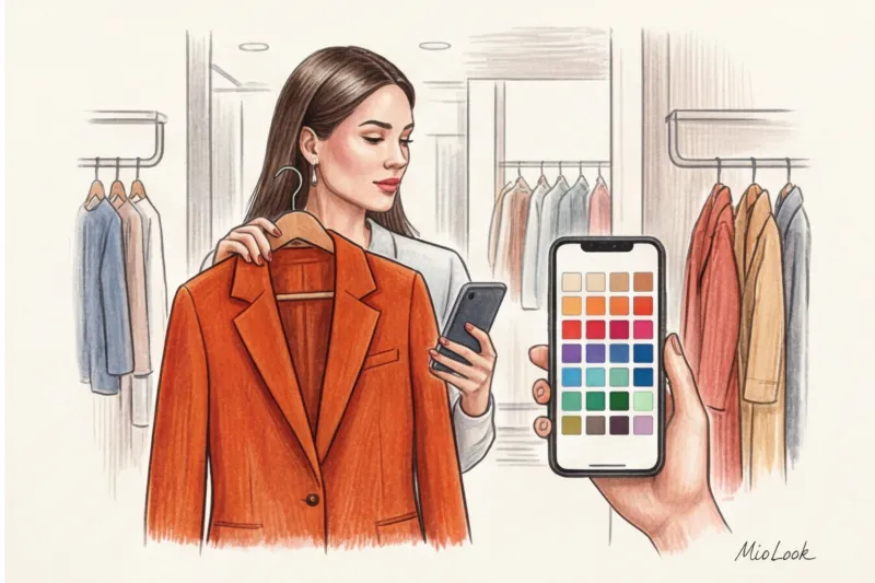
Absolutely not! The main rule for stylists: if a color isn't your thing, simply move it away from the portrait area. Creamy yellow pants, a midi skirt, or shoes won't affect your complexion at all if you wear a blouse in your ideal, contrasting shade over it. To avoid guesswork in the fitting room, I recommend my clients use the "smart wardrobe" feature and the virtual fitting room in the app. MioLook You can take a photo of an item in the store and see how its temperature compares to the palette of your existing base.
Ready to get started?
Try the MioLook free plan—no commitments required. Artificial intelligence will help you assemble the capsule.
Start for freePre-purchase checklist: 4 questions from a stylist
During my shopping sessions, I teach clients to filter emotional purchases. Before taking a flashy item to the checkout, ask yourself four tough questions:
- Can I create at least 3 looks with this item right now? If you need to buy new trousers, a top, and shoes to wear this raspberry jacket, put it back on the hanger. It should fit into the basics.
- Is the temperature the same? Does the undertone of this item (cool/warm) match 80% of your current wardrobe?
- Is the texture suitable for this pigment? Does the color appear deep and refined? Is there a cheap, glassy sheen typical of low-quality polyester?
- Does this color match my contrast level? If you have a soft, muted appearance, neon will overwhelm you—people will see the dress, not you.
Conclusion: Color as a tool for your confidence
Bright accents in clothing aren't a way to hide behind a passing fad. They're your personal impression management tool. Color can communicate your energy, professionalism, or creativity to your interlocutor before you even utter a word.
Don't try to incorporate the entire rainbow into your wardrobe at once. Start small: choose one deep, elegant shade for this season, like rich wine or sapphire. Invest in a quality cashmere scarf or a pair of impeccable loafers in this color. And don't forget to digitize your new pieces with MioLook Let our AI stylist help you create dozens of new, unexpected, yet harmonious combinations. Remember: elegance isn't the absence of color, it's its ingenious taming.