Last May, a client came to me almost in tears. She'd bought a stunning dress in a trendy buttery shade at a popular high-street store. On the hanger, it looked fresh and spring-light. But after the first gentle wash, the color had turned a dirty yellow, as if the garment had been sitting in a dusty attic for a decade. The problem wasn't the laundry detergent, but the cheap dyes used on the 100% polyester.
By entering the query “ Fashionable colors for spring and summer clothing "," we usually get glossy magazine selections in the "buy this now" style. Glossy magazines often propagate a dangerous myth: Trendy bright colors should be bought in the cheaper segment so that you don't feel sorry to throw them away after a season As a textile expert and stylist, I categorically disagree with this.
The truth is, accent, complex colors require high-quality fabric. Bright or pastel synthetics quickly fade and look flat. In this article, we'll look at the seasonal palette not through the prism of fleeting fashion, but through an understanding of textures, conscious consumption, and the laws of color. We've already covered the basic psychology of shades in more detail in our a complete guide to fashionable colors in clothing , and now let's figure out how to choose an item that won't lose its appearance after the third wash.
The main fashionable colors of spring-summer: clothes that won't go out of style in a month
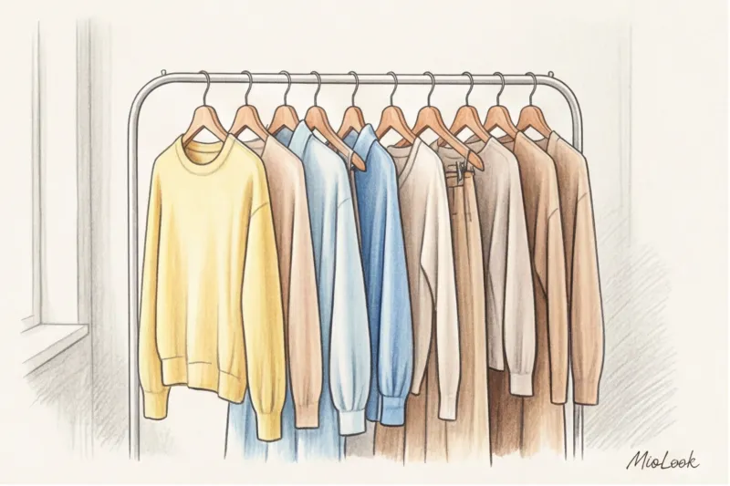
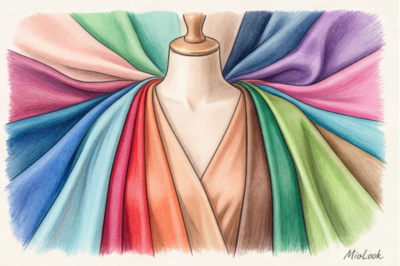
According to the analytical agency WGSN (2024), current color trends are driven by a global demand for calm, grounding, and connection with nature. Unlike the neon flashes of past years, the current palette is more durable and easily transitions into a "new base."
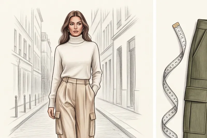
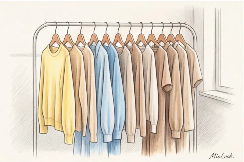
- Butter Yellow — a soft, enveloping alternative to white and beige. It works great as a base color for shirts and lightweight cardigans.
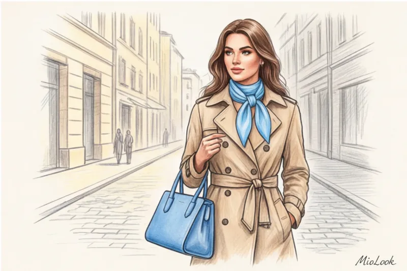
- Chambray Blue — the color of a clear spring sky. It has the highest potential to become a wardrobe staple for the next five years.
- Muted Wine (Cherry Red / Oxblood) — an unexpected guest in the spring-summer season. A deep shade that looks chic in leather accessories and shoes, creating a contrast with light, flowing fabrics.
- Pistachio - a refreshing, but not flashy green that perfectly highlights a light tan.
Remember: fashionable spring/summer clothing colors aren't a strict set of rules, but a palette for inspiration. Choose only the 1-2 shades that make your face glow, not the ones that just pop up on social media feeds.
The Anatomy of Color: Why Does the Same Shade Look Expensive or Cheap?
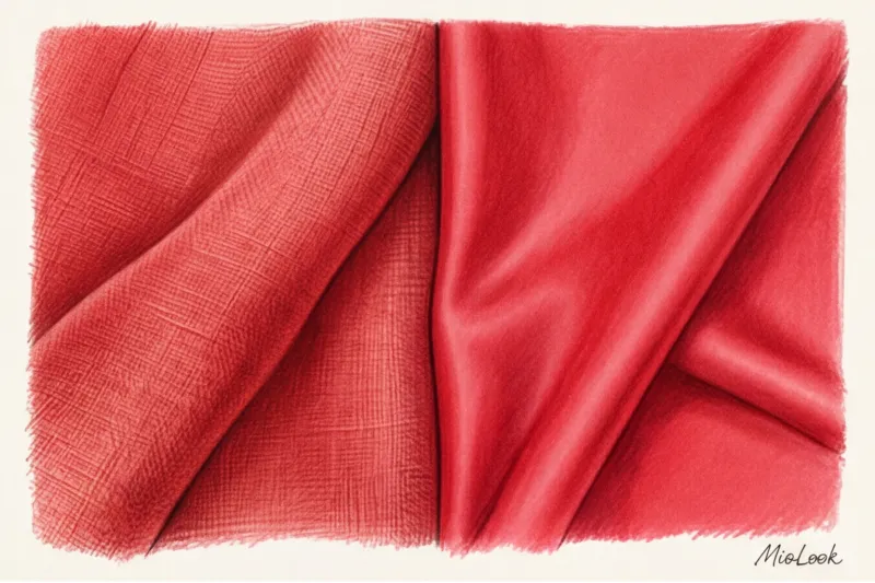
Have you ever noticed how the same wine shade looks elegant on a silk blouse but cheap on a polyester top? It's all about the physics of light and the fiber structure.
Up to 80% of the visual "cheapening" of an item depends not on the shade itself, but on the incompatibility of a complex color and the synthetic texture of the fabric. The more complex and delicate the color, the more natural the fabric should be.
Smooth synthetic fibers reflect light harshly, creating a distinctive glassy sheen. Because of this, complex pastel colors (such as peach or cream) lose their depth and appear flat. Natural fibers—linen, cotton, and silk—have a porous structure. Dye penetrates deeper, and the uneven surface of the thread softly diffuses light, giving the color volume and refinement.
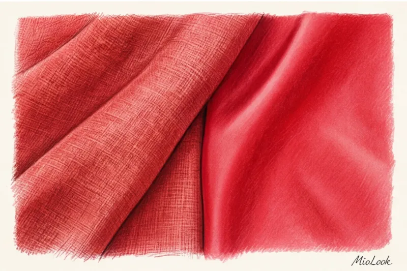
Natural vs. Synthetic Fabrics: A Color Durability Test
Textile Exchange reports (2023) confirm that synthetic dyes used for cheap polyester not only pollute waterways with microplastics with every wash, but are also extremely unstable under UV light. The summer sun fades them within a couple of weeks of heavy wear.
However, 100% natural fabric isn't always a guarantee of color fastness. In my experience, clothing made from high-quality blended fabrics (for example, 80% linen and 20% viscose) retains color saturation 40% longer than pure cotton, which is prone to pigment leaching.
My personal fitting room life hack: I always carry a pack of regular wet wipes (alcohol-free). If I'm unsure about the dyeing of a brightly colored item (especially mass-market trousers or skirts), I gently dab the wipe along the inside hem. If the wipe leaves even the slightest trace of color on the white fabric, I leave the item at the store. Otherwise, it will stain your light-colored bag or underwear and will lose its appearance after washing.
Try MioLook for free
A smart AI stylist will select the perfect look based on your color preferences and existing wardrobe.
Start for freeIntegrating trendy colors into your base: the 80/20 rule and smart styling
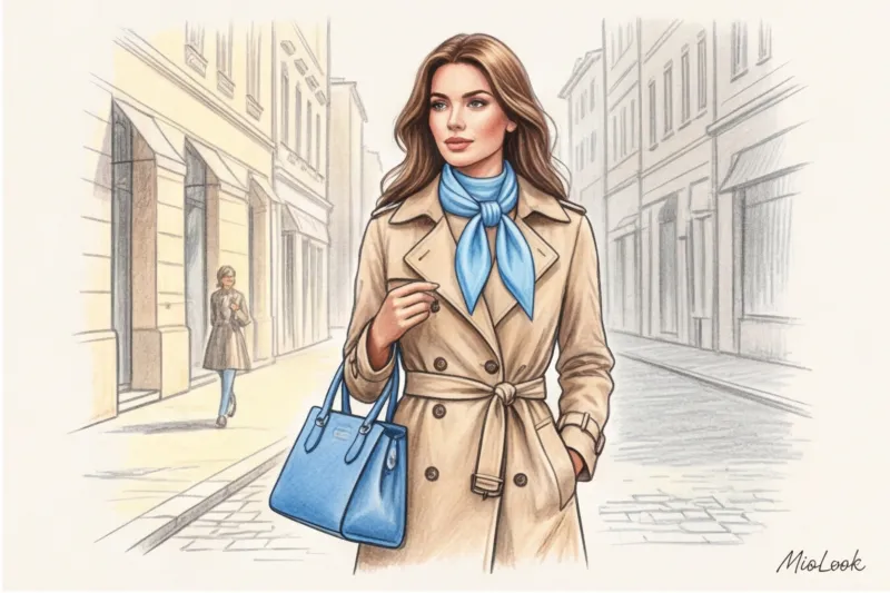
To incorporate new trendy shades, you don't need to buy a capsule from scratch. For my clients, I use the golden rule of color: 80% neutral base and 20% trendy color.
Last season, one of my clients complained about her incredibly boring spring wardrobe, consisting entirely of gray, beige, and graphite pieces. Instead of buying colorful dresses, we purchased just one high-quality, rigid bag in a trendy sky blue and a matching silk scarf. This pair of accessories literally "lifted" 10 basic looks, making them ultra-modern.
A bright, trendy color is perfectly "calmed down" by achromatic shades. If you've bought pistachio-colored trousers, pair them with a graphite or mouse-gray jumper. The gray tone counteracts the excess brightness, creating an elegant look.
Before purchasing an accent piece, I always recommend trying it on with what's already hanging in your closet. If you're using the digitization function in the MioLook app With just a couple of clicks, you can see which of your basic shirts or trousers will pair with a new wine or yellow shade. If an item doesn't create at least three or four outfits, it's a waste of money.
Dangerous Liaisons: How to Combine New Shades with Your Color Type
For a long time, the fashion industry was governed by a strict color-type dictate: "You can't wear yellow, you're winter!" Today, the approach has become much more flexible.
The main secret: if a trendy color objectively makes your face look tired (emphasizes under-eye circles or gives your skin a sallow tone), simply move it away from your portrait area. Transfer the trendy shade to your waistline (skirts, trousers, shorts) or shoes. Frame your face with colors that are guaranteed to flatter you.
But here I must make an honest disclaimer: This advice doesn't always work. If your natural coloring is very soft and muted, and you wear loud, bright fuchsia pants (even if they're placed away from your face), they'll visually "cut" your figure and steal the show, leaving your appearance in the shadows. Always consider the level of contrast.
Also, pay attention to the color temperature within a given trend. Creamy yellow has a warm undertone and looks good on skin with a golden hue. Lemon, on the other hand, is a cool yellow that will beautifully complement porcelain skin with a pink undertone.
Your perfect look starts here
Join thousands of users who look flawless every day with MioLook. Find out which shades are perfect for you.
Start for freeSmart Shopping and the Environment: A Mindful Shopping Checklist
As a sustainability advocate, I urge people to avoid impulse buying "on the wave of trends." When we see a beautiful color in a store window, our brain releases dopamine, and we often ignore the quality of the item. Here's my checklist for checking colored clothes before going to the checkout:
- Inspect the back and seams. If cheap, shiny synthetic threads of a slightly different shade are sticking out from the inside of an expensive-looking wine-colored dress, it means the manufacturer cut corners. These seams will quickly come apart, and when the fabric is stretched, they will gape unsightly.
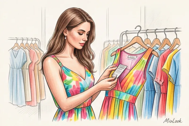
- Look for certificates. The Oeko-Tex Standard 100 label on the tag means the dyes are free of toxic heavy metals. This is an investment in your health, especially when it comes to summer clothing that comes into contact with sweaty skin.
- Consider Cost Per Wear. A $30 trend for the sake of being trendy, worn twice ($15 per outing) will cost you more than a quality silk blouse in a fashionable shade for $150, which you will wear 30 times ($5 per outing).
Don't forget the cyclical nature of fashion. Gorgeous shades of blue, wine, and pistachio can be found in vintage shops and resale platforms. Items from the '90s and '00s often feature much higher-quality fabrics (heavy silk, pure linen) than modern mass-market items in the same price range.
Preparing for the warm season: a closet overhaul instead of a shopping mall
Before rushing out to buy new clothes in the season's trendy color, do an honest inventory. Over 12 years of practice, I've noticed a paradox: 9 out of 10 women already have trendy shades in their closets that they've simply forgotten about because they're hanging in the back corner.
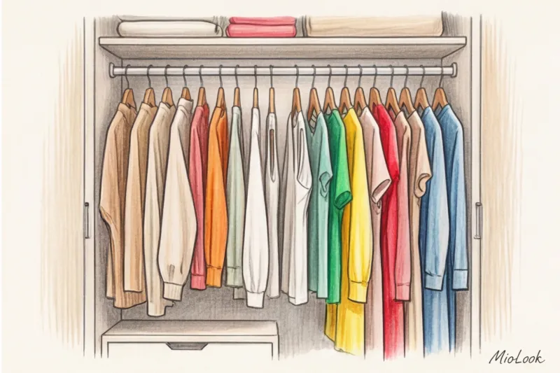
Take out all your spring/summer clothes. Sort them by color. Load the items into MioLook virtual wardrobe so the program can randomly generate new combinations for you from old items. You'll be surprised how last year's white skirt will sparkle with a forgotten pistachio top.
Color is a powerful tool for impression management, but it should never control you. A personal style built on an understanding of your body type, quality textures, and appropriateness will always outperform any seasonal palette imposed from above. Choose the shades that make you feel like yourself, and let them only be paired with worthy fabrics.