The Psychology of Color in Clothing: The Hidden Language of Business Negotiations
Have you ever noticed how conversation flows easily in some conference rooms, while in others the atmosphere tenses even before coffee is served? The reason often lies not in the dry numbers of reports or the tone of voice. According to a study by the Institute for Color Research, it takes the human brain just 90 seconds to form a subconscious judgment about a new person. And the most interesting thing: 62% to 90% of this initial assessment is based solely on the visual perception of color.
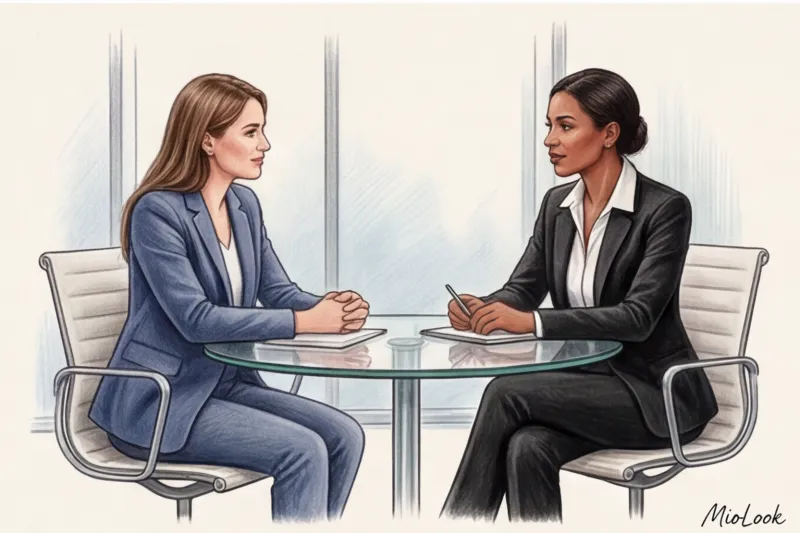
That's why psychology of color in clothing This isn't esotericism or a glossy magazine figment, but a powerful, scientifically proven impression management tool. Your image begins to "speak" for you long before you utter your first word.
How does this work on a subconscious level? Physiologically, color is a light wave of a certain length. When the eye detects this wavelength, it sends a signal to the hypothalamus—the part of the brain that controls our endocrine system and emotions. So, the reaction to your dark blue jacket or emerald blouse occurs purely physiologically. Before the other person has even shaken your hand, their brain has already made a decision: trust you, keep their distance, or prepare for defense.
"Color doesn't just decorate—it physically changes the atmosphere in a room. The right shade can lower your opponent's heart rate, while the wrong one can trigger an unconscious release of cortisol."
In my 14 years as a personal stylist, I've regularly encountered the same dangerous myth. Clients come to me before an important board meeting and say: "Olena, I need a red suit to show strength and dominance." Stop. If you want successful negotiations, forget the "power red" concept straight out of the 80s.
Yes, red does raise your heart rate and instantly attract attention. But in modern business, where partnership, sustainable communication, and flexibility are valued, aggressive scarlet triggers an unconscious defensive reaction in your opponent. You convey not expert authority, but a direct threat and pressure, causing your partners to instinctively withdraw.
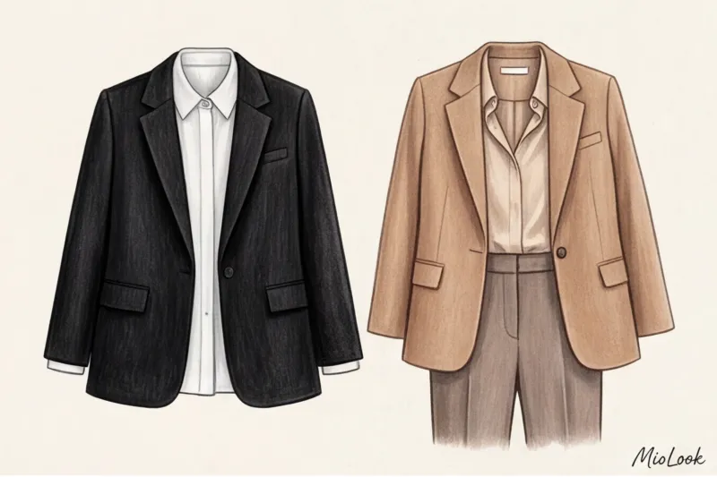
I had a particularly revealing case. One of my clients, a senior manager in the IT sector, had been struggling to close a complex merger deal for months. She wore crisp black suits with that signature "leadership" red silk top to every meeting. Opponents were constantly on the defensive, nitpicking details. We completely changed tactics: we removed the aggressive contrast and dressed her in an "empathetic" palette—deep navy combined with soft shades of camel and warm caramel. The result? The tension eased during the very next negotiations, the dialogue shifted to a constructive direction, and three weeks later, the contract was finally signed.
Of course, for the desired shade to work 100% and not make your face look tired, it must match your natural features. If you're still unsure about your base, I recommend checking out our A guide to the 12 color types of appearance.
Color is your hidden negotiator. In the following sections, we'll explore in detail how different shades and textures can help you achieve your desired results at the negotiating table.
Temperature and Contrast: Advanced Impression Management Tools
Many people mistakenly believe that finding their "perfect shade" will do the job. But optical physics and neurobiology work differently: the human brain reacts to the boundaries between color patches faster than to the pigment itself. This is why the psychology of color in clothing is inextricably linked to how shades interact with each other. A navy blue double-breasted jacket over a crisp white shirt and the same jacket paired with a muted blue shirt send two completely different messages to your opponent.
Before talking about contrast, it is worth mentioning the temperature of the image. Cool tones (steel, icy blue, classic navy) optically distance the subject. They create an aura of absolute objectivity, an analytical mind, and cool reason. Warm tones (Caramel, olive, warm beige), on the other hand, have a drawing-in effect. They reduce psychological distance, making you seem more human and empathetic to your interlocutor.
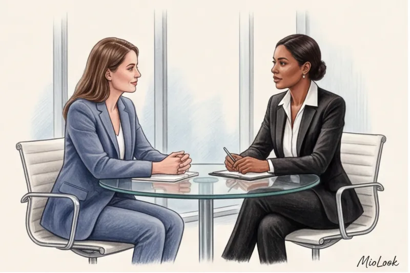
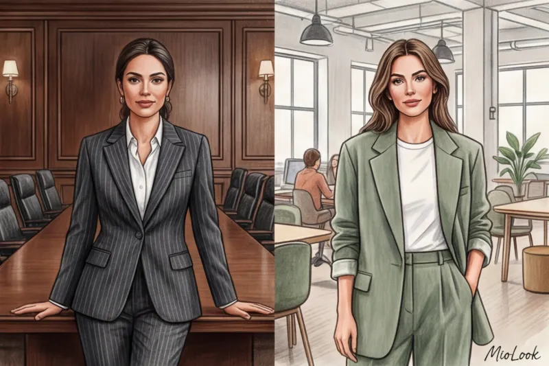
But the real tool of influence is the level of contrast. Let's start with high contrast A classic example: a black or charcoal gray suit with a crisp white shirt. In color, this technique creates maximum visual fragmentation. The sharp boundary between light and dark acts as a stop sign, creating an invisible but very strong wall between you and your interlocutor. This image conveys uncompromisingness, authoritarianism, and rigidity.
In my practice of preparing CEOs for difficult rounds of negotiations, we use contrast to artificially manage the tension at the table. If the client is facing crisis management, defending a cut budget, or announcing unpopular decisions (for example, a company restructuring), I deliberately create an image with maximum contrast between light and dark. A crisp, graphic silhouette is subconsciously perceived as armor. It's harder to argue with someone in such a suit, and it's practically impossible to be overly familiar with them.
It gives the exact opposite effect low contrast Tonal combinations, monochrome, or soft gradient transitions. Imagine an outfit composed of related shades of camel, sand, and ecru, or a delicate transition from graphite to mid-gray. The lack of sharp boundaries allows the other person's gaze to glide smoothly, without tripping over color blocks, which reduces anxiety on a neurophysiological level.
Low contrast conveys openness, flexibility, and a willingness to engage in dialogue. It's the aesthetic of "quiet luxury" in the spirit of Loro Piana or The Row collections, which, in business terms, says, "We're on the same page, I'm ready to listen." It's the absolute best choice for networking, initial introductory meetings with potential investors, and long-term contract negotiations, where partnership is more important than immediate profit.
An important rule from a stylist: to prevent a low-contrast tonal look from appearing too relaxed and shapeless, be sure to offset the softness of the color with a firm shape. Choose dense fabrics (such as heavy silk or shape-resistant wool) and a structured cut with a defined shoulder line.
Try MioLook for free
A smart AI stylist will analyze your wardrobe and select the perfect look with the right contrast for any meeting.
Start for freeAn analysis of basic business colors and their impact on the opponent
A basic wardrobe isn't just a collection of versatile pieces that go together. In the context of business communications, a basic wardrobe is the architectural foundation of your personal brand. The shades you rely on every day create lasting associations with your colleagues, partners, and clients. If you constantly wear strict black, you'll be remembered as a person of distance. If you prefer soft caramel, you'll be remembered as an empathetic negotiator.
Interestingly, Johannes Itten's classic color theory, taught in all style schools, now requires significant adaptation to the realities of modern dress codes. According to a large-scale corporate culture study by WGSN (2023), post-pandemic businesses have become less formal but more demanding of visual authenticity. We no longer need to hide behind tight-fitting covers to appear professional, but we need to know precisely what emotion each specific pigment evokes.
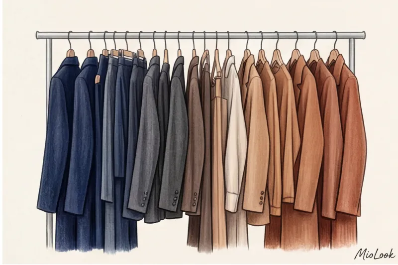
Let's explore the four key color pillars of a business wardrobe and see how the psychology of color in clothing works in practice when the stakes at the negotiating table are truly high.
Blue and Light Blue: The Architecture of Absolute Trust
In today's corporate environment, navy (a deep, dark blue) has officially earned the status of "the new black." Unlike the dramatic and sometimes aggressive black, navy conveys absolute reliability, logic, and order without creating a barrier between you and your conversation partner.
This effect has a physiological basis. The blue spectrum has a short wavelength. Research by the Pantone Color Institute confirms that visual contact with deep shades of blue stimulates the parasympathetic nervous system: the viewer's heart rate literally slows, blood pressure drops, and anxiety subsides. This is why pilots, bank employees, and rescue workers often wear blue uniforms—this color tells the brain, "Everything is under control, you can trust me."
However, it is important to distinguish between saturation levels:
- Deep blue (Navy, Midnight Blue) — This is the color of expertise, analytical mind, and unwavering reliability. Ideal for signing contracts, audits, and meetings with investors.
- Light blue (Cerulean, Ice Blue) — works completely differently. It symbolizes openness, ease of communication, and a willingness to engage in dialogue.
"One of my recent cases involved preparing a top manager at an IT company for a series of meetings with disgruntled clients following a technical glitch. We deliberately eschewed formal dark jackets in favor of soft cashmere jumpers in a muted blue. The visual softness and "calming" color helped ease tension within the first few minutes of the conversation—they subconsciously sensed a lack of threat and a willingness to cooperate."
Gray: The Perfect Background for Intelligence
Gray is often underestimated, considered boring or bland. In fact, when used correctly, it's the most intelligent color in the business palette. Its main superpower is its absolute neutrality: gray doesn't evoke strong emotional reactions and doesn't distract from the essence of your words. When you wear gray, your interlocutor listens. What you speak, but do not look in what you have come.
But herein lies the main danger—the notorious "gray mouse" effect. Since the color itself has no energy of its own, it requires impeccable form. If you choose a gray suit made of a cheap blend with a loose fit, you risk looking tired and unnoticeable.
To make gray work for your status, follow two rules:
- Architectural cut. A sharp shoulder line, crisp lapels, and a perfectly tailored trouser fit. Gray calls for geometry.
- Premium texture. Choose fabrics with character: matte Super 120s wool, flannel, fine cashmere or heavy silk.
The choice of shade also depends on the time and purpose of the meeting. Light gray (pearl, dove) works flawlessly for daytime meetings, brainstorming sessions, and presentations—it refreshes the face and looks dynamic. Charcoal, however, is a heavyweight for high-profile, high-level negotiations. It has the authority of black, but without its excessive harshness.
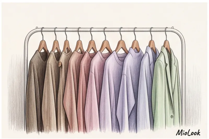
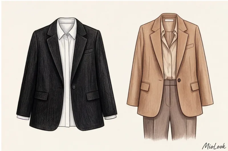
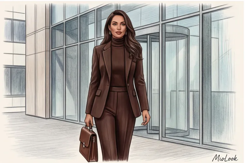
Brown and beige: stability, empathy and "quiet luxury"
Just ten years ago, a brown suit would have raised eyebrows in a boardroom setting—the color was considered too "provincial" for big business. Today, shades of camel, dark chocolate, caramel, and taupe have become synonymous with the aesthetics of "quiet luxury" and a sign of high emotional intelligence.
Psychologically, brown is strongly associated with earth, wood, and natural stability. Unlike blue, which appeals to logic, brown evokes empathy. A person in caramel or chocolate shades is perceived as grounded, stable, and, most importantly, humane.
That's why brown inspires much more trust than black in fields where personal contact and psychological comfort are essential. If you work in consulting, HR, psychology, medicine, or the service industry, a warm beige-brown palette should form the basis of your wardrobe. It literally says to the client, "I understand you, you are safe."
Stylist's advice: Creating a monochrome look in beige tones requires mastery of combining temperatures and textures. To avoid making mistakes and buying items that clash with each other, I recommend digitizing your database. Upload your existing items to MioLook — a smart algorithm will help you create harmonious capsules and show you exactly which shade (cool taupe or warm caramel) is missing to complete the perfect look.
Black and White: Maximum Distance and Status
Achromatic colors—black and white—are the poles of a business wardrobe. They lack color pigment, yet they possess a powerful psychological impact.
Pure black Black conveys power, strength, uncompromisingness, and mystery. However, in modern negotiations, its excess can pose a serious danger. An all-black look, if not complemented by the right accessories or exposed skin, is often perceived by the other party as closed-off, unwilling to engage, or even mournful. Furthermore, black near the face mercilessly highlights fatigue, shadows, and wrinkles unless you have a high-contrast natural complexion (for example, porcelain skin and dark hair).
If you want to use black to convey status, be sure to break it up. Add a silk scarf, choose a jacket with a subtle satin sheen on the lapels, or layer a sophisticated burgundy or emerald top underneath.
Snow-white color , on the contrary, works as a symbol of impeccability, the highest standards and perfectionism. A person in a perfectly white suit or shirt conveys the message: "I'm so in control of the situation that I can wear the dirtiest color." It's the color of triumph.
But white has a downside: too much of it can appear sterile, cold, and aloof, evoking associations with a hospital ward. To avoid this effect, replace optical white with softer, more sophisticated shades: ivory, ecru, milky, or pearl. These retain the prestigious appeal of white while adding warmth and aristocracy to the look.
Remember: there are no good or bad colors. There are colors that suit and don't suit your current negotiating task. Knowing how to juggle this basic knowledge is the first step to managing impressions even before you utter a single word.
A Stylist's Secret: How Fabric Texture Changes the Psychology of Color
The physics of optics is inexorable: any hue is merely reflected light. This is why the same pigment on different surfaces is interpreted by our brains completely differently. In the context of a business wardrobe, color never exists in a vacuum—the fabric radically alters its perception, enhancing or completely destroying the intended impression.
Let me give you a clear example from my styling practice. A dark blue suit is traditionally considered the epitome of business reliability. But if it's a matte suiting wool (for example, a highly twisted merino yarn), your interlocutor subconsciously perceives you as a person of integrity and absolute trustworthiness. Now imagine the same cut and the same deep blue, but in a fabric with a distinctly glossy sheen—a common culprit in cheap blended materials. Instead of inspiring authority, such a shiny suit arouses a persistent suspicion of insincerity in your partners and a desire to double-check every word in the contract.
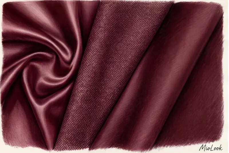
Matte fabrics Matte textures, such as high-quality wool, cashmere, and dense cotton, act as light absorbers. They make any color appear deeper, more dense, and more refined. In a strict business environment, matte textures are your best bet. They convey a sense of solidity, calm, and luxury. Research in neuroaesthetics shows that visually rough, light-absorbing surfaces literally calm the observer's nervous system, making them more attentive to your arguments.
The opposite effect is given glossy and shiny fabrics Natural silk, satin, viscose, and smooth synthetics are among the most popular materials. Their basic physical characteristic is their ability to actively reflect light. While they certainly attract immediate attention, too much shimmer can be a detriment. In conservative settings, too much shine often looks cheap or too frivolous. If you want to use an emerald silk blouse to showcase your creativity, make it the only shimmering element of your look, carefully framed by a matte jacket.
A separate category that is very useful for a negotiator is tweeds and bouclés Their complex, loose surface breaks up the color into multiple shades, stripping it of its aggressiveness. If you need to tone down formality and transition tough negotiations into a warmer, more collaborative atmosphere, a tweed jacket is a perfect choice. Think of classic Chanel suits: the bouclé texture adds complexity and coziness to the color, allowing you to look distinguished yet empathetic and open.
To avoid getting confused in the complex combinations of smooth and rough, I always recommend digitizing your images. MioLook app It's very convenient to create these capsules on your smartphone screen: you can immediately see whether the textures clash with each other and how they complement the basic colors of your wardrobe before an important meeting.
Try MioLook for free
Start creating perfect business images with the help of artificial intelligence
Start for freeChoosing a color depending on the business sector and the purpose of the meeting
Even an impeccably tailored suit in the right shade will lose its impact if it clashes with the industry's unspoken dress code. What's perceived as creativity in the office of an IT giant will raise eyebrows in the boardroom of an investment fund. In this context, psychology of color in clothing works as a strict social filter "friend or foe".
In conservative fields—banking, law, and the public sector—color serves as a guarantor of stability. Here, the three-color rule: No more than three shades should be present in a single look, two of which must be basic achromats or darkened tones. The dominance of deep navy, charcoal gray, and muted accents (for example, dusty burgundy instead of open scarlet) conveys respect for subordination and regulations. If you are pursuing a career in the legal field, I highly recommend studying our detailed analysis of style for lawyers — there we show how to maintain individuality without breaking protocol.
A completely different picture emerges in marketing, IT, and the creative industries. Here, excessive color formality (for example, a completely gray three-piece suit) is perceived as a lack of flexibility and conservatism. Allowing bright accents—terracotta, deep emerald, complex mustard—becomes your professional tool. According to the Pantone Color Institute's 2023 reports, warm, earthy, and spicy shades stimulate engagement and encourage collaborative idea generation, demonstrating your out-of-the-box thinking. When choosing a wardrobe for such tasks, it's helpful to rely on the principles described in articles on style for IT specialists And creative professions.
The most interesting and challenging task is adapting your palette when you're moving from one industry to another or meeting with clients from radically different niches in a single day. One of my regular clients, a CFO who moved from a traditional bank to a fintech startup, faced exactly this: her stark black and navy blue suits created an unnecessary distance from her new, more approachable team. We solved the problem using the "color bridge" technique. While maintaining the familiar, composed cuts (structured jackets, palazzo pants), we completely replaced the austere palette with shades of dark chocolate, pine, and warm camel.
When your schedule demands flexibility, embrace color layering. Wear a terracotta or mustard silk top under a classic gray suit, and you can button up the jacket for a meeting with conservative investors (leaving just a subtle pop of color near your face) and unbutton it for a brainstorming session with the creative agency. Regularly creating such multi-tasking capsule collections for clients across various industries, I've discovered a golden rule: you don't need a huge closet, you need a smart coordinate system. To quickly assemble these transformable looks, try loading your pieces into MioLook — algorithms will tell you how to adapt the same emerald jumper to both formal and relaxed dress codes.
Checklist: How to Choose the Perfect Palette for Important Negotiations
Preparing for a challenging meeting begins not with a presentation rehearsal, but with opening your closet. As a well-known study from Northwestern University (USA) on the phenomenon of "enclothed cognition" proves, what we wear directly programs our cognitive processes and the unconscious reactions of others. psychology of color in clothing To make sure it works for you, not against you, I've put together a rigorous five-step algorithm. Go through it this morning before you put on your usual jacket.
- Step 1: Define the goal. Ask yourself: What is my role today? If your goal is to dominate and firmly defend terms, choose deep, rich tones. If you need to negotiate and listen to your partner, soften the look with warm shades (for example, camel or sand). And if you need to sell a creative idea to investors, add dynamism with one unusual color accent.
- Step 2: Select the contrast level. Optical physics works flawlessly here. For a strong stance, pair a high-contrast look (a dark charcoal suit with a crisp white shirt)—it creates a visual boundary. For a compromise, choose a low-contrast look: tonal transitions within a single color or shades adjacent to each other on the color wheel convey flexibility.
- Step 3: Choose a base color that matches your natural coloring. Even the most prestigious shade will fail in negotiations if it makes your face look sallow. Your base must complement your skin tone. If a stark, cool gray accentuates signs of fatigue, switch to a warm taupe. Your face should look fresh—this will subconsciously convey to your opponent a sense of resourcefulness and confidence.
- Step 4: Add the right texture. Fabric acts as a color enhancer. Deep matte wool (for example, high-quality worsted yarn from Italian mills) instantly adds authority. Meanwhile, soft cashmere knits or silk-blend fabrics enhance empathy and reduce distance.
- Step 5: Take a test photo in daylight. This is my favorite rule of the "window test." Artificial light in a dressing room always distorts colors. Go to the window and take a quick, unfiltered selfie. You'll instantly notice whether the blouse clashes with your skin tone or whether your look is too gloomy.
By the way, to avoid wasting morning hours sorting through things before an important day, I strongly recommend digitizing your work capsules. By uploading the database to MioLook , you can pre-compile kits for different tasks and save them with labels such as "for tough meetings," "for pitching," or "for networking."
Your ideal image
it begins Here
Join thousands of users who look flawless every day with MioLook.
Start for freeConclusion: Your Personal Color Code for Success
To conclude our extensive analysis, I would like to highlight the most important point. The psychology of color in clothing is a controlled, mathematically precise tool, not magic or esotericism. This is applied neuroscience, which allows you to fine-tune your opponent's perception. Just as you prepare graphs for a presentation or hone your arguments, you can consciously direct your visual message by varying the temperature, contrast, and texture of fabric.
But let's be honest: no palette, even the most impeccably crafted, can replace real expertise. As the great Giorgio Armani, who revolutionized the business suit, said: "Elegance is not about standing out, it's about being remembered." Your clothes are merely the high-quality, expensive packaging for your brilliant expertise. If you show up to a board meeting without a clear plan, no amount of charcoal-gray cashmere will save you. However, when you're on an equal footing with your competitors, your visual code will be the nonverbal trigger that tips the scales toward trust and long-term partnership.
We've covered the rules of both conservative and creative industries in detail, but over the years of styling, I've learned one law that trumps any academic prescription. The most “correct” color for negotiations is the one in which you physically feel confident. Your image should never come before you or overshadow your personality, turning into a carnival costume of a successful person.
I had a client, a financial auditor, who absolutely couldn't stand classic navy blue—she found it stifling and unnatural. We broke protocol and created a capsule for her complex audits in shades of dark chocolate and deep wine. According to the strict canons of banking, this was a risk, but in these colors she felt so monumental and calm that her inner confidence was instantly detectable by her opponents. Remember: your physical tension from an uncomfortable or "foreign" color will scream far louder than any true hue could whisper.
How can you put all this theory into practice today? I encourage you to start with a smart wardrobe audit rather than rushing to the mall. Before your next important meeting, take 15 minutes to review your work clothes through the lens of this new knowledge. Ask yourself: Is this contrast too aggressive for tomorrow's compromise dialogue? Does this sleek fabric make my look too frivolous?
To avoid having to keep all these combinations in your head and wasting your morning hours on nervous fittings, I highly recommend digitizing this process. Upload your business items to MioLook app Its algorithms will help you analyze your current wardrobe, assemble the right capsule wardrobe for specific needs (whether it's tough bargaining or empathetic networking), and instantly see how shades and textures combine on your smartphone screen. This saves a tremendous amount of time and relieves morning anxiety.
Manage your impressions consciously. And let your ideal business image be one that you completely forget about the moment you step into the meeting room—so you can focus 100% on your professional victory.
Guide Chapters
What color clothes should I wear to a job interview?
A black suit no longer guarantees interview success. Find out how choosing the right outfit can help you land that coveted offer.
Why blue in business attire inspires confidence
Forget the boring black suit. Discover how the right color, blue, can help build trust and manage business negotiations.
Color combinations in business attire: a status image
Tired of the boring black and white dress code? Learn how to use the right shades to create a sophisticated look and boost your authority at work.
Red in a Business Wardrobe: Leadership Without Aggression
Red can be your powerful ally or your biggest saboteur during important negotiations. We'll explore how to wear shades of red to project confidence, not aggression.
Business wardrobe by color type: your best colors
Tired of the boring black-and-white dress code? Learn how to choose office attire that suits your appearance and lighting so you always look confident.
Dressing for a Video Call: How to Look Your Best on Zoom
The webcam lens dictates its own style rules. Find out which shades will help you look professional in online meetings, and which ones should be avoided.
Clothing Color for Public Speaking: How to Choose
The right shade of a suit is a powerful tool for commanding attention. Learn how to avoid looking like a "floating head" on stage and outsmart smartphones.
Beige in a Business Wardrobe: The Secret to Soft Power
Replace stark black with shades of camel and gray to ease tension during negotiations. Learn how "soft power" colors can help you achieve success.
What colors shouldn't you wear to the office? The main taboos
The wrong blouse shade could cost you a major contract. We explore the key color taboos for business attire from a psychological and style perspective.
Black and White Dress Code: Psychology and Status
A black and white wardrobe isn't a safe classic, but a powerful tool for visual impact. Learn how to master contrast to highlight your high status.
Bright Accents in a Business Look: Strict Dress Code
How to add color to a strict business formal and look professional? Learn the secrets of "quiet luxury" and the right choice of shades for work.
Bright Colors in Office Style: A Dress Code Without Boredom
Forget boring black and gray suits. Learn how to incorporate vibrant colors into your business wardrobe to highlight your professionalism and style.