Forget the advice from the glossy magazines of the 2000s: “To freshen up your look, just tie a bright scarf with a gray suit.” Today bright colors in office style — this isn't a timid attempt to "revive" a boring baseline, but a powerful tool of aesthetic intelligence. This is especially true if you work in PR, IT, design, or media, where your appearance is a direct extension of your professional vision.
As a colorist and image consultant, I constantly encounter the same problem: women want to look bold and authoritative, but are afraid of appearing clownish. So, they opt for a safe, yet completely bland black. I've already covered the hidden meanings of shades and their impact on careers in our guide. The Psychology of Color in Clothing: How to Manage Impressions And here we will analyze pure practice.
According to the Institute for Color Research, 62% to 90% of initial assessments of a person are based solely on color, and this happens within the first 90 seconds of meeting them. Before you've even opened your laptop for a presentation, your emerald jacket or cobalt blouse has already "sold" your creativity.
Why Bright Colors Are the New Black in Creative Industries Office Style
Dress codes in creative agencies differ dramatically from those in the banking sector. If you show up to a pitch for an advertising project in a dark gray sheath suit, you'll be subconsciously perceived as someone who thinks in a box. In an industry where ideas are sold, strict formality often works against you.
One of my clients, the art director of a large agency, had long struggled to express her creative spirit through chaotic prints: floral blouses, abstract skirts, and colorful scarves. Clients perceived her as a "creative girl," but not as a leader they could trust with a million-dollar budget. We removed all the visual noise and replaced it with a monochrome, architecturally cut pantsuit in a rich fuchsia. The result? She seized the initiative in the very next negotiation and won the tender. The color conveyed boldness, and the strict cut conveyed consistency and reliability.
A study from Loyola University confirms this mechanism: color increases brand recognition—including personal brand recognition—by 80%. The only question is where the line is drawn between "looking creative" and "looking ridiculous."
Try MioLook for free
A smart AI stylist will select the perfect look for a creative office based on your color type.
Start for freeThe Anatomy of Color: How to Manage Brightness to Look Expert
To make color work for you, you need to understand its physics. Based on Johannes Itten's color theory, we can control the temperature and saturation of a hue. If you have a contrasting complexion (dark hair, fair skin), you'll thrive in pure, icy shades like electric blue or lemon. If your natural coloring is soft, these same colors will "wash out" your face, and your conversation partner will be talking to your dress, not you.
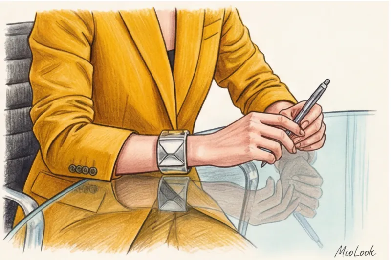
But the main rule that I never tire of repeating during consultations is: the bright color works like a magnifying glass It greatly enhances the perception of fabric quality.
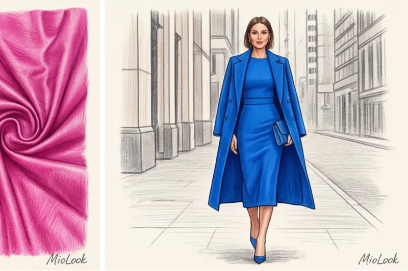
Thin fuchsia polyester looks like a cheap promoter's uniform. Thick wool, structured cotton (180 g/m² and above), or heavy silk in the same fuchsia shade look like a high-status piece from Bottega Veneta or COS. If you choose a vibrant hue, the texture must be impeccable. No cheap sheen, flimsy knits, or see-through materials.
The Biggest Myth: Why You Can't Combine Bright Colors with Black
Now let's debunk the most common misconception. What do most women do when they buy a bright neon or deep red top? That's right, they pair it with black pants or a black jacket to tone it down. This is a fatal mistake.
Black doesn't calm the brightness. On the contrary, it creates a highly aggressive, sharp contrast that harks back to the cheap discos of the early 2000s. Black absorbs light, and against it, any bright color begins to shimmer and scream, visually cheapening the entire outfit and cutting the silhouette in half.
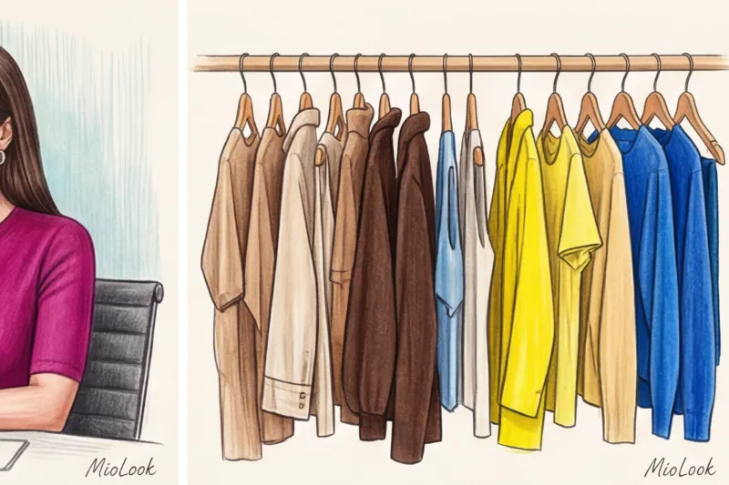
What can I use instead of black? My favorites for neutralizing bright colors are deep, rich shades that already have a rich color palette:
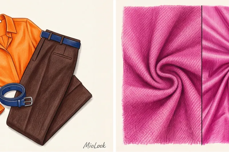
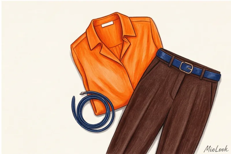
- Dark chocolate Instead of black, it works perfectly with tangerine, yellow and sky blue.
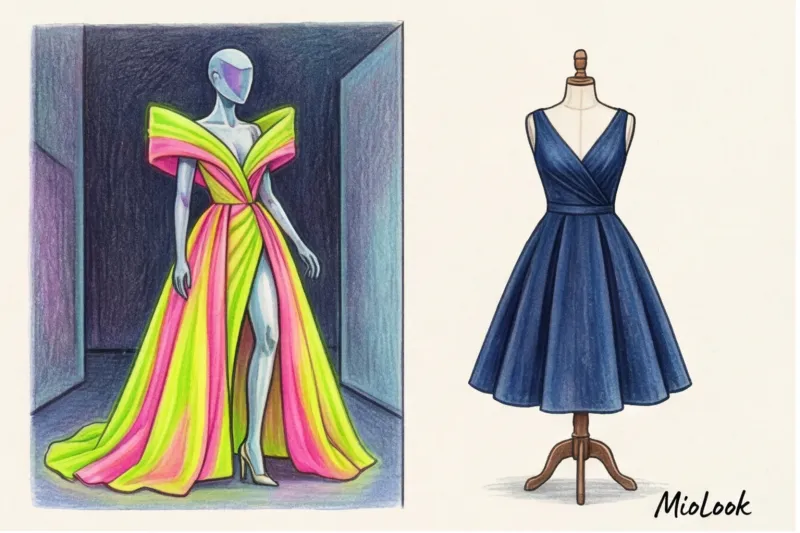
- Navy (deep dark blue) luxuriously soothing fuchsia, emerald and scarlet.
- Graphite gray creates an intelligent contrast with neon and lemon.
- Camel makes any bright color warmer and more expensive.
Implementation Strategies: 3 Formulas for a Creative Office
If you're just starting to introduce bright colors into your office decor, don't buy half the store's inventory at random. Use one of three proven formulas.
Formula 1: Architectural Monochrome
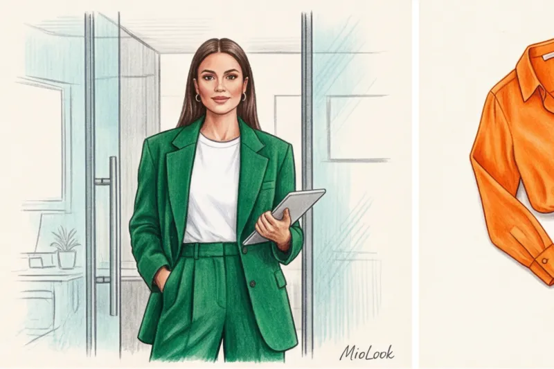
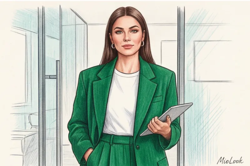
This is the choice for executives and those looking to make a statement. You wear one complex, vibrant color from head to toe. The secret to success here is the cut. The silhouette should be as clean, geometric, and masculine as possible.
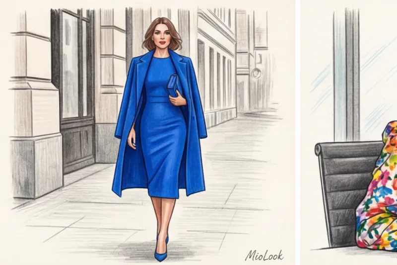
A client of mine, a commercial interior designer, has made an oversized emerald three-piece pantsuit her signature look. No ruffles, flounces, or tailored waists. Just straight lines and pure color. It looks incredibly powerful and creative at the same time.
Formula 2: Intelligent Color Blocking
A combination of two complementary (opposite on the color wheel) colors, but in slightly muted tones. For example, terracotta wide-leg trousers and a deep blue jumper. Or a mustard midi skirt and a plum blouse. This demonstrates your ability to handle complex visual tasks.
Formula 3: A bright accent on a deep base
Perfect for those days when you have a meeting with conservative investors but don't want to lose your creative edge, you can wear a chic navy or graphite suit with an electric-blue silk top underneath. Or you can add fuchsia pumps to a monochrome beige look.
Your perfect look starts here
Join thousands of users who look flawless every day with intelligent wardrobe selection.
Start for freeTaboos and Mistakes: When Creativity Turns into Chaos
As much as we love freedom of expression, there are limits in business. Over 12 years of working as a stylist, I've developed an ironclad rule of balance: If we crank up the color to the max, we are obliged to bring the cut into strict minimalism What absolutely doesn't work even in the most creative industries?
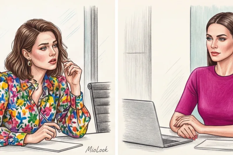
- An abundance of small, colorful prints. It's better to choose one clean, rich monochromatic color than a cheerful floral blouse or neon leopard print. A small print creates visual noise, which can be physically tiring for the person you're talking to.
- Inappropriate sexualization. Bright color + tight fit + mini length = crossing business boundaries. A red knee-length sheath dress exudes confidence. A red bandage minidress at the office is a reputational disaster.
- Ignoring context. Always assess the situation. For a brainstorming session with the development team, a lemon-colored oversized sweatshirt with wide-leg pants is appropriate. But to defend the annual budget in front of the board of directors, a graphite suit with bright, statement shoes is better.
Checklist: Putting together a vibrant wardrobe for a creative office
To make your wardrobe work for you, rather than spending hours on morning fittings, start with basic investments:
- Invest in one bright, perfectly-fitting pantsuit. You can wear it together for a wow effect, or break it up: a bright jacket with jeans, or bright trousers with a basic sweater.
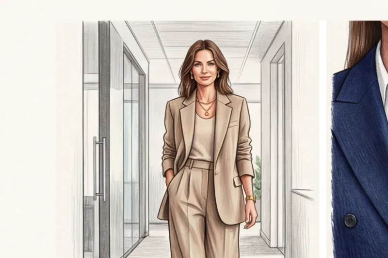
- Gather a "precious" neutral base: turtlenecks, T-shirts and shirts in shades of camel, ecru, chocolate and navy.
- Add a pair of statement shoes. Cobalt suede pumps can elevate even the simplest white shirt and jeans look.
By the way, in order not to rack your brains over combinations of complex shades, I recommend my clients to use the "smart wardrobe" feature in the MioLook app You simply upload photos of your items, and artificial intelligence, trained on color principles, puts together safe yet unique outfits for you. This eliminates morning stress and the fear of looking like a traffic light.
Summary: Your color is your calling card
Incorporating vibrant colors into your office decor isn't just a fashion statement; it's a strategic decision. In a world where most people hide behind safe grays and blacks, someone in a complex, rich hue is instantly seen as a leader unafraid to take charge.
"Color is the keyboard, the eyes are the hammers, and the soul is a many-stringed piano," wrote Wassily Kandinsky. In business, this piano plays the melody of your expertise.
Start small. Swap your usual black jacket for a deep emerald or burgundy one. Notice how your posture changes and how your colleagues listen to you differently at meetings. Don't be afraid of color—beware of boring silhouettes and cheap fabrics.