
Do you know why one of the biggest contracts in my client Anna's career fell through? It wasn't because of a weak presentation, or an inflated estimate, or even a late delivery. It was the neon-green silk blouse she wore under a formal graphite jacket. Her negotiating partner simply couldn't look her in the face—his brain subconsciously interpreted the optical shock as an irritant. That's why the question of... What colors should you not wear to the office? , is not the snobbery of stylists, but the basic neurobiology of business communications.

I, Katarzyna Nowak, have learned one ironclad rule after 12 years of working as a personal stylist and reviewing hundreds of top executives' wardrobes: color speaks for itself long before you utter a single word. You can buy the perfect suit at Massimo Dutti or the perfect basic shirt at COS, but if you choose the wrong shade, the whole look will fall apart.
Why the question of what colors to wear to the office is more important than the cut and brand
Color isn't just dye on fabric. Physically, it's an electromagnetic wave of a specific wavelength that directly affects the hypothalamus of the person you're talking to. According to the Institute for Color Research, 62% to 90% of a person's initial assessment is based solely on the visual perception of shades. And this happens within the first 90 seconds of a meeting.
We discussed the mechanisms of this influence in more detail in our The complete guide to the psychology of color in business attire , but it's important to note the main point here: the opponent's brain is lazy. They use colors as labels to quickly assess the situation: "friend or foe," "safe or dangerous," "professional or amateur."
The biggest mistake I see clients make every season is confusing the concepts of "fashionable color" and "appropriate color." What the Pantone Institute declares the year's key shade (as with acidic yellow-green or vibrant magenta) looks great in street style photos or at a rave, but in the boardroom it turns into a ticking time bomb.
The Biggest Taboos: 4 Colors That Ruin Your Business Reputation
When my team of stylists and I MioLook When putting together business capsule collections for clients, we first apply a strict color filter. There are shades that we ruthlessly exclude from the work palette, even if the item fits perfectly. Here's a list of absolute corporate no-nos.
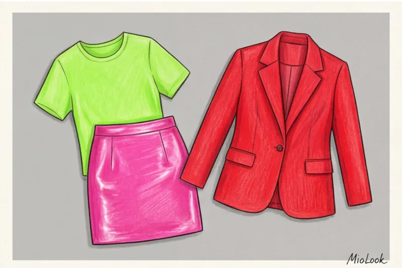
Neon and acid shades (Optical shock)
Acidic lemon, highlighter pink, and poisonous green—these colors physiologically irritate the retina. If you sit across from a colleague in a neon top for more than ten minutes, you'll literally get a headache. The other person will subconsciously try to end the conversation quickly to avoid the visual discomfort.
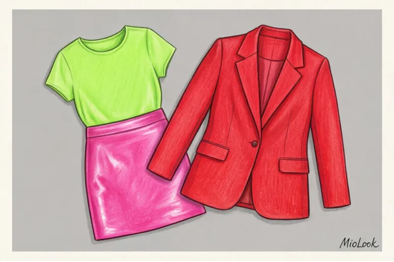
Moreover, neon is inextricably linked to the aesthetics of the cheap mass market. You can buy an acid-colored blouse for 500 euros from a conceptual designer, but in a corporate environment, it will still be perceived as something from a youth department sale. Expertise and neon lie at opposite poles of perception.
Deaf Total Black (Illusion of Safety)
And here we come to the biggest and most dangerous myth. Many people believe that wearing all black is a safe, classic look. "I'll wear a black suit, a black turtleneck, and black pumps—it's so elegant!" I hear regularly.
In modern business, all-black isn't elegance, it's a communication barrier. It's a wall you erect between yourself and your interlocutor.
Research conducted by HR portals in 2024 reveals an interesting trend: candidates who come to interviews in all-black attire (without light accents near the face) are perceived as more reserved, inflexible, and lacking empathy. In some corporate cultures, all-black attire is even associated with mourning or a desire to "hide." Save this technique for stagehands or art directors. If you work in a team, you need color.
Frank Red (Aggression instead of leadership)
The "power red" concept, which came to us from the aggressive corporate style of the 1980s, is hopelessly outdated today. Modern leadership is built on soft skills, partnership, and flexibility, not on domination.
Pure, spectral red (scarlet, the color of a fire engine) triggers the release of cortisol, the stress hormone. Statistics show that too much aggressive red in a business environment reduces trust by 40%. Wearing a red suit to difficult negotiations literally screams, "I'm going to push, I'm not prepared to compromise." This can derail a deal even before the numbers are discussed.
Infantile Pink (The Authority Killer)
The Barbie-core trend has generated a lot of buzz, but in business, it's incompatible with authority. Shades of fuchsia, bubblegum, or cotton candy lower your perceived IQ in the eyes of conservative peers. It's a harsh stereotype, but it works.
One of my clients, a financial analyst, had been struggling to get a promotion for a long time. During a wardrobe review, we discovered that 30% of her office shirts and sweaters were baby pink. Once we replaced them with dusty blue and elegant beige, her management's attitude changed—she was no longer perceived as a "junior assistant."
Try MioLook for free
A smart AI stylist will select the perfect business look based on your palette and dress code, eliminating dangerous shades.
Start for freeThe Reflex Effect: The Hidden Danger of Forbidden Shades
Beyond psychological perception, color has a purely physical property that 90% of women forget about—color reflex. Any fabric placed close to the face acts as a light reflector, casting a shadow of its own hue onto your skin.
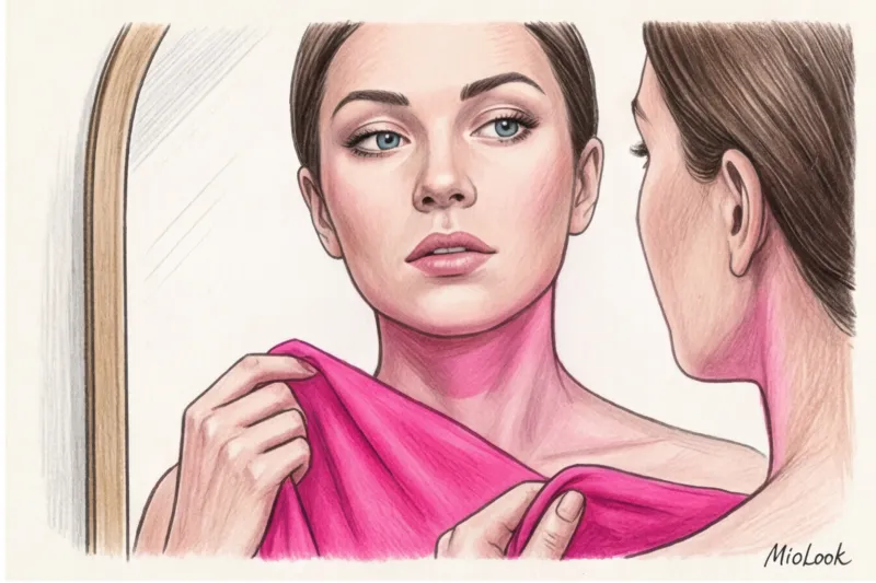
Think back to the pandemic and the endless Zoom calls. I was sorting through the wardrobe of a marketing director who complained that she always looked sick and exhausted on video calls. It turned out that her favorite "cozy" mustard-yellow sweater and acid-green blouse cast a sallow cast on her chin and neck. They literally created dark circles under her eyes and a jaundiced complexion.
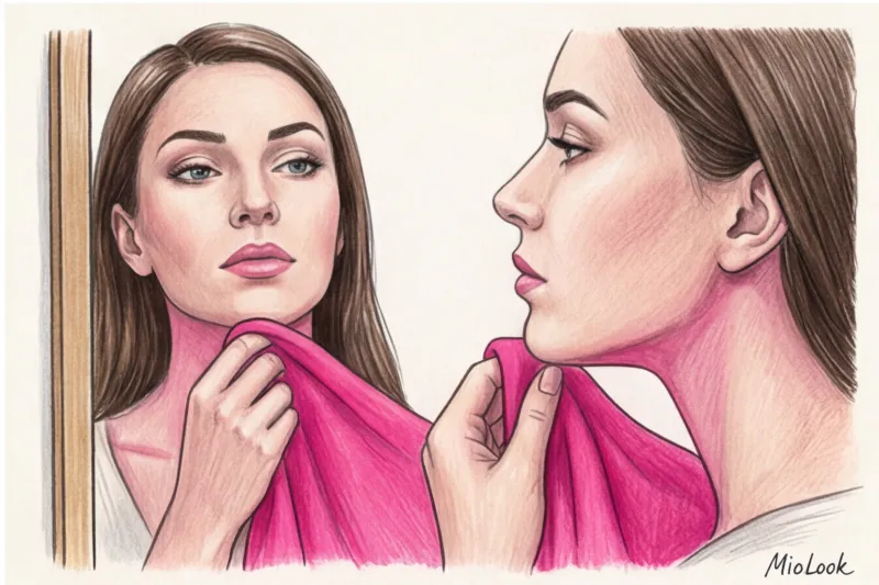
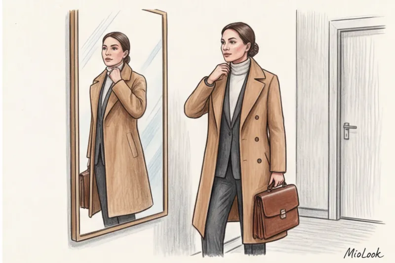
Stylist's secret: the "safe zone" rule. Keep all complex, controversial, or overly dark colors away from the portrait area (face and neck). Save them for pants, skirts, or shoes. Always keep your best base tones near the face—milky, pearlescent, soft blue, or powder. They act like a ring light, illuminating the skin and erasing signs of fatigue.
Context Decides: How the Level of Austerity Dictates the Palette
I'll be honest: my advice doesn't always work for everyone. It's important to understand the context. The strictness of a dress code directly determines which colors you specifically shouldn't wear to the office.
If we take the European banking sector, law firms, or the public sector (Business Formal dress code), then one step to the right, one step to the left means execution. Only dark blue, gray, brown, beige, white, and muted burgundy are allowed. No prints, no bright spots.
But if you work at an IT startup or creative agency where smart casual reigns supreme or there's no dress code at all, the rules are relaxed. However, even there, there's a limit. Showing up to a pitch to investors in an acid-orange hoodie is a risk that rarely pays off. The only exception is for creative professionals (designers, stylists, artists), for whom breaking the rules is a way to demonstrate unconventional thinking.
Also consider the season. A summer business wardrobe tolerates light pastel colors (mint, peach, light yellow), but still doesn't tolerate loud tropical prints a la "Hawaii vacation."
Your perfect look starts here
Join thousands of users who look flawless every day with MioLook. Digitize your wardrobe in minutes.
Start for freeA stylist's cheat sheet: how to replace office taboos
It's easy to criticize, but what can you do in practice? If you love color and don't want to blend in with the drab masses, use the "deep substitution" rule. Replace bold, garish spectral colors with their complex, muted counterparts. They look ten times more expensive (even if bought at H&M) and convey status.
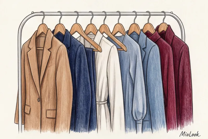
- Instead of total black: Deep blue (Navy), graphite gray (Charcoal), dark chocolate. A dark blue suit made of high-quality wool blend inspires maximum confidence.
- Instead of aggressive red: Noble burgundy, wine, and terracotta. These colors retain a leadership message without being too aggressive.
- Instead of infantile pink: Dusty rose, powdery, beige-pink. Perfect for silk blouses under a tailored jacket.
- Instead of neon: Rich, jewel-toned hues like emerald, sapphire, and amethyst add dynamism to the look while remaining within the bounds of business etiquette.
By the way, it is for such cases that I recommend using the "smart wardrobe" feature in MioLook — the app will show you what items in elegant shades you already own and how to combine them correctly so as not to violate the dress code.
Checklist: Test your look before heading to the office
To avoid doubting yourself in the mirror in the morning, use this short three-step process. Fifteen minutes before heading out, ask yourself three questions:
- Does the three color rule work? A classic business look shouldn't contain more than three main colors. If you're wearing blue pants, a white shirt, a burgundy jacket, and green shoes, you've overloaded the look. Remove one colorful item and replace it with a basic one.
- Does the contrast suit my face? If you have a soft, low-contrast complexion (light eyes, light-brown hair), the stark combination of a crisp white shirt and a jet-black jacket will overwhelm you. Opt for softer transitions: milky and graphite.
- What emotion does my outfit convey? Look in the mirror and answer this question honestly: does this image say, "I'm a reliable professional" or "I want to attract attention at any cost"? If the latter, change your outfit.
Your wardrobe is your silent negotiator. Don't let random shades ruin the impression you've worked on for years. Choose colors that work for your reputation, not against it.


