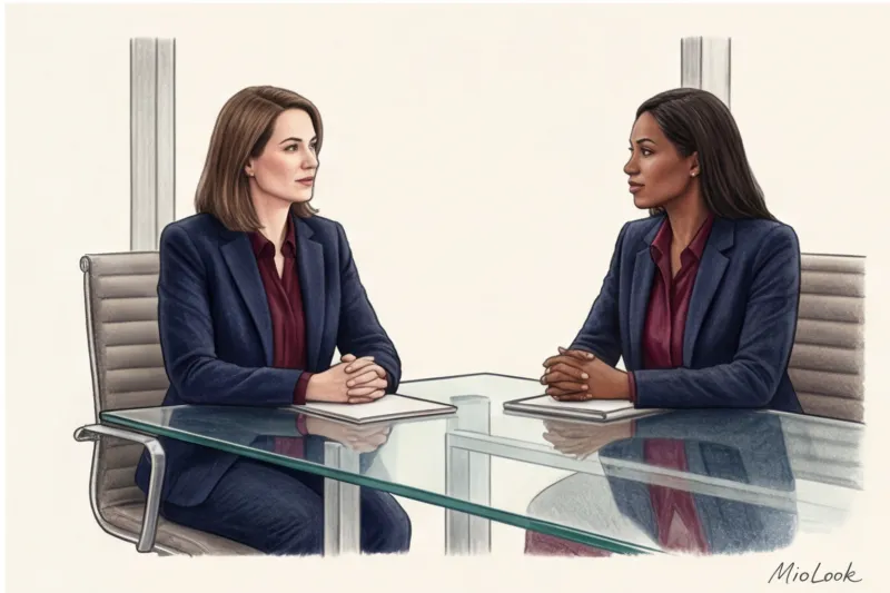
Three years ago, Anna, a senior manager at a large fintech startup, came to see me. She complained that her ideas were constantly met with hostility at board meetings, and budget discussions devolved into aggressive arguments. We began sorting through her wardrobe, and I immediately saw the reason: to the most challenging meetings, Anna wore an impeccably tailored but piercingly scarlet Zara jacket. She thought it was a show of strength. In reality, she was visually "shouting" at her investors before she even opened her mouth.
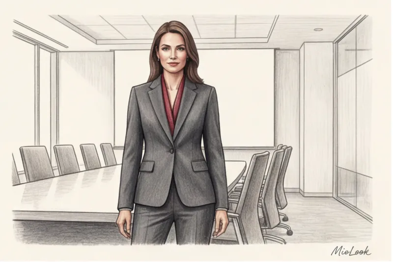
We swapped the scarlet jacket for a formal dark blue suit, but kept the ruby silk lining and added a sturdy burgundy briefcase. The result? Meetings became less tense, and budgets were approved more quickly. This case perfectly illustrates how red color in business wardrobe can be either your most powerful ally or your main saboteur.
We discussed basic physiological reactions to shades in more detail in our guide. The Psychology of Color in Clothing: How to Manage Impressions Today, I, Giulia Rossi, want to talk to you about the ultimate in style: how to wear red in the office to project status and leadership, not desperation and aggression.
The Power Suit Myth: Why Total Red No Longer Works
Let's be honest: the "winner's red suit" stereotype is hopelessly stuck in the 1980s. During the Dynasty era, women had to literally fight for their place in the male-dominated corporate world, using their wardrobe as both armor and signal flare.
Over 12 years of working with premium wardrobes, I've learned one ironclad rule: true luxury and real status always whisper The all-encompassing color red in business today conveys insecurity. It seems to say, "Please pay attention to me, I'm in charge here!" But a leader doesn't need to prove their voice with a neon marker.
Take a look at the collections of Italian business fashion giants like Loro Piana, Brunello Cucinelli, and Giorgio Armani. You'll almost never find a bold, garish scarlet in their business collections. Their philosophy is built on sophisticated, muted tones that compel others to take a closer look at you rather than squinting at the visual noise.
The Physiology of Color: How Red in Business Attire Affects Opponents
Choosing a color for negotiations isn't a matter of aesthetics. It's pure biology. Red light has the longest wavelength in the visible spectrum, and our brain processes it in a special way.
According to data Institute for Color Research (2023) , contemplating the active color red physiologically increases the viewer's heart rate by 10-15% and can stimulate a mild release of cortisol (the stress hormone).
"By wearing bright red during a tough negotiation, you literally trigger your opponent's ancient fight-or-flight reflex. You put them on the defensive even before you've made your offer."
That's why red in a business wardrobe requires pinpoint precision. You need to embrace its energy but neutralize its threat.
Try MioLook for free
A smart AI stylist will select the perfect look for your negotiations, taking into account the psychology of color.
Start for freeThe 15% Rule: How to Use Red to Demonstrate Leadership
I always suggest my clients treat the color red like an expensive, high-end perfume. It should be just enough to leave a luxurious trail, but not overpower everyone in the meeting room.
In practice I use The 15% Rule This is the exact area of your overall look that the active red color should occupy.
What does this look like mathematically? If your image is 100%, then:
- A three-piece suit is 80%
- Coat or trench coat - 70%
- Blouse under a buttoned jacket - 15-20%
- Bag, shoes or scarf - 5-10%
Fair limitation: This rule doesn't apply if you're speaking on stage in front of a 1,000-person audience. The rules change there—you need a completely bright color (red, fuchsia, electric blue) to stand out from the background and capture the attention of the audience. But in a room with 5-10 people, 15% is your maximum.
By the way, to avoid calculating these percentages in your head in the morning, I recommend using the "smart wardrobe" feature in MioLook The AI assistant automatically analyzes the color proportions in your finished look and suggests whether you've overdone it with accents.
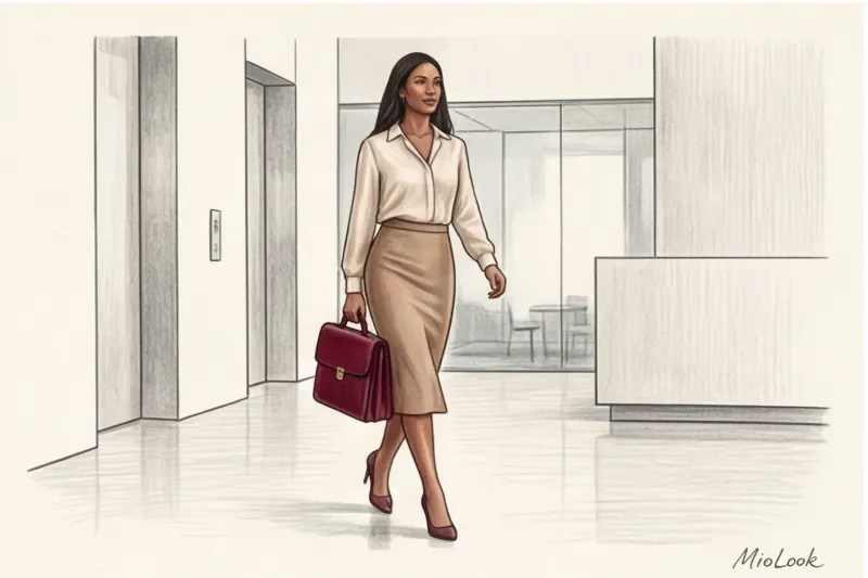
Accessories as an investment in status
The safest and most aristocratic way to introduce red is to place it in an accessory group.
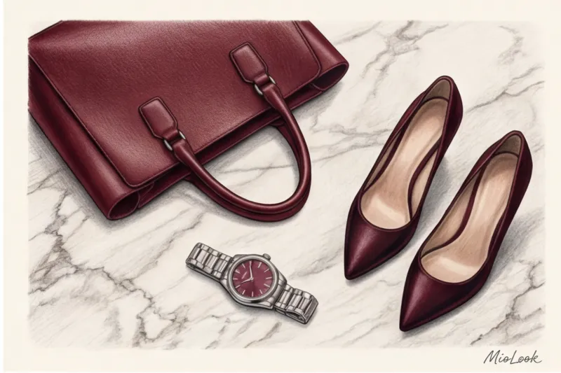
Consider why the iconic shade of the house of Hermès is not a fire-red, but a complex, deep Rouge H (the color of aged burgundy)? Because it's a marker of "old money."
A structured bag in oxblood pays for itself faster than a basic black one. cost-per-wear (prices per outing), the burgundy bag is the perfect bridge between seasons: it looks luxurious with summery beige linen and flawlessly complements wintery gray cloth. Add a watch with a steel bracelet and a subtle ruby dial, and you have the image of a woman who is in control of every detail of her life.
Blouses and tops under a jacket: managing contrast
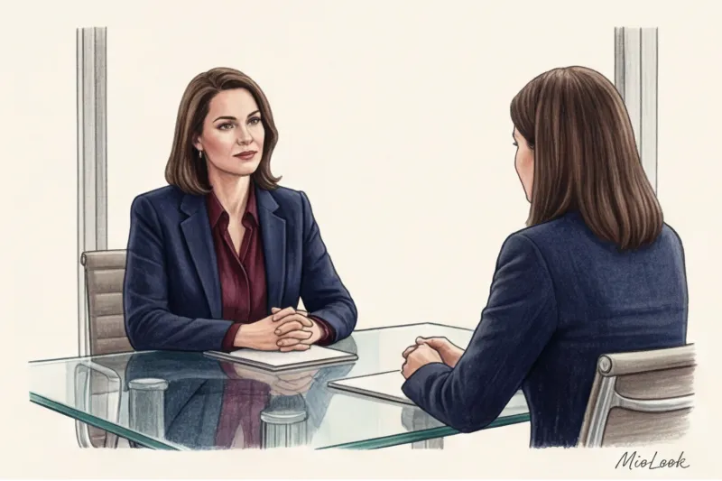
If you choose a red silk blouse, be sure to tone it down with a strict architectural jacket in navy (deep blue) or wet asphalt.
The V-neckline rule applies here: leave only a narrow strip of color around the face. This will highlight the skin, add dynamism to the portrait area, but create the necessary distance between you and your conversation partner.
Temperature and Depth: Choosing a "Precious" Shade of Red
Not all reds are created equal. Pure, primary red without any impurities often cheapens an outfit, especially if it's made from a mass-market fabric.
According to a large-scale study Pantone Color Institute (2024) In a study on color perception in corporate environments, complex wine and berry shades were perceived by respondents as 40% more “trustworthy” and “intellectual” than open scarlet.
The secret to a "precious" color lies in the addition of black or brown pigment. The darker and more complex the red, the more prestigious it appears.
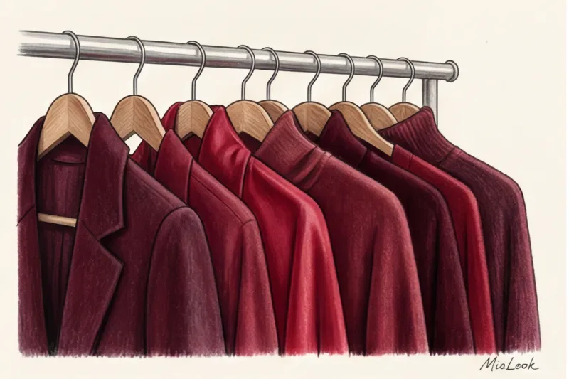
From Burgundy to Ruby: A Palette of the Highest Echelon
- Burgundy and Marsala: An absolute must-have for conservative businesses (banking, law). These cool, deep shades convey stability and expertise.
- Oxblood: A masterpiece for leather goods (shoes, belts, briefcases). It looks incredibly expensive when paired with dark green and camel.
- Brick and terracotta: Warm, muted shades. Ideal for smart-casual dress codes, the IT sector, or creative agencies.
Texture Decides Everything: How Fabric Transforms Aggression into Nobility
Even the most perfect shade of burgundy can be ruined by the wrong fabric. There's an immutable law in style: texture rules color.
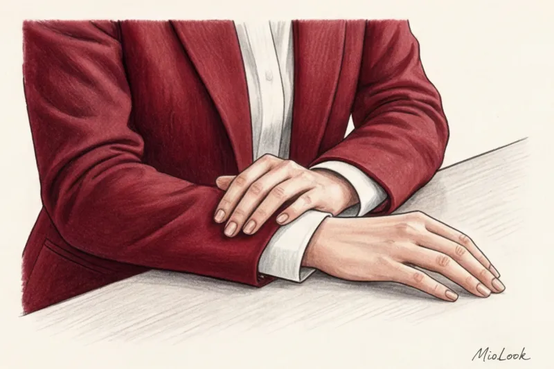
Gloss = aggression, drama and evening. Red satin, shiny silk, patent leather, or, worse, cheap polyester with its distinctive sheen—they're a no-no for daytime business attire. The smooth surface reflects light, making the color even more piercing and garish. In the office, it looks out of place and provocative.
Matteness = status, depth and tranquility. When I select red pieces for my clients, we always look for dense, matte textures. Italian cashmere, thick suiting wool (virgin wool), suede, heavy crepe. These materials absorb light. In them, the red seems to sink deeper, becoming velvety and enveloping.
Compare a red patent leather pump with a similar pump in wine-colored suede. The first screams, "Look at me!" while the second calmly declares, "I know my worth."
Your perfect look starts here
Join thousands of users who look flawless every day with MioLook. AI will help you find the perfect texture.
Start for freeChecklist: Is Red Appropriate for Your Next Meeting?
Before you wear anything with a red accent, run your plan through this quick filter:
- Who is your audience? If you're pitching to conservative Swiss investors, skip the red, leaving a burgundy watch strap at most. If you're pitching to a young creative agency, a terracotta jumper over a white shirt will show your energy.
- What is the purpose of the meeting? Need to smooth things over, apologize for a missed deadline, or find a compromise? No red. Choose beige, blue, or gray. Need to push through a decision, inspire a team, or protect a budget? Add 15% ruby or burgundy.
- Is this online or offline? Laptop cameras (especially in Zoom or Teams) mercilessly distort colors. They automatically crank up the saturation in an attempt to "improve" the image. As a result, a rich wine color on your interlocutor's screen can turn into a toxic crimson. For online meetings, I recommend pushing reds as dark as possible—almost brown.
I always advise my clients to try out their looks in a virtual fitting room. MioLook Before important events, you can take a photo of your outfit, and the app will show you how it looks in terms of color harmony.
Summary: Leadership that doesn't need to be proven by shouting
Red in a business wardrobe is a piquant spice. A Michelin-starred chef would never dump half a jar of chili pepper into a dish. He'll add just a pinch to bring out the flavor of the main ingredients.
True authority isn't built on who's dressed the brightest. It's built on your professionalism, confident speech, and body language, all visually enhanced by refined colors, impeccable tailoring, and high-quality materials.
Your step for today: Open your closet. Find that bold red piece you bought "for courage" but only wear once a year with a slight sense of awkwardness. Put it away. And the next time you want to add some energy to your look, invest in one flawless piece in a mellow burgundy. Trust us, your career will thank you.


