The Architecture of Ornaments: Why Some Patterns Look Expensive and Others Cheap
Have you ever noticed how one checked jacket looks like a wardrobe investment and an inheritance for the grandchildren, while another, with a similar pattern, betrays mass-market appeal from ten meters away? It's not always about the brand or the designer's big name on the tag. Understanding How to combine prints in clothing , begins not with choosing the right palette, but with the inside of the garment itself. The secret lies in the physical architecture of the fabric.
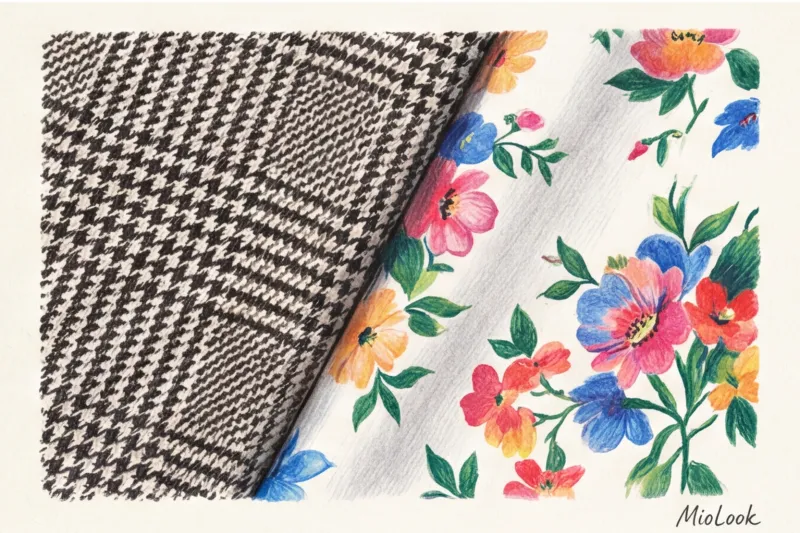
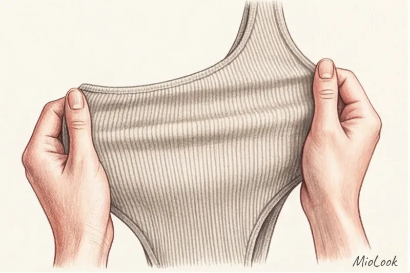
All the magic (or greatest disappointment) is created at the fabric creation stage. There's a huge difference between a woven pattern and a printed design. A woven design—for example, a classic pied-de-poule, a complex jacquard, or a fine Scottish tartan—is created by interweaving pre-dyed threads. The design in this case is part of the fabric's DNA; it's structured, deep, and three-dimensional. The opposite is true of surface application, where paint is simply stamped onto a ready-made, inexpensive canvas.
Over 12 years of working as a stylist and textile expert, I've developed a "blind touch" rule. In my practice, eight out of ten clients who come to me with the problem of "nothing to wear" have a closet full of printed items that are unbearably hot and look washed out. The reason is simple: pigment printing on cheap polyester. The pigment adheres to the fabric like a rubbery film, tightly clogging the fibers. The result is a harsh greenhouse effect—your skin can't breathe, and you feel like you're in a plastic bag.
I always teach my clients a simple test right in the store: vigorously rub the printed area of the garment between your fingers. If the print feels hard, rubbery, slightly sticky, or you see micro-cracks in the paint when you stretch it, don't hesitate to return the item to the hanger. It won't survive even five washes.
If you're choosing a printed design, look for reactive or digital printing on natural fabrics (silk, cotton, linen, or high-quality viscose). These technologies chemically react with the dye and penetrate deep into the fibers. The fabric remains soft, supple, flows beautifully, and is breathable, while the pattern itself will not fade for years.
Beyond tactile properties, the psychology of perception plays a huge role. How others perceive your status directly depends on the contrast and rhythm of the pattern. Our brain scans a silhouette in a split second. A chaotic, jagged rhythm with maximum contrast (for example, acid-pink tropical leaves on a black background) creates visual noise. This overloads the perception and often "forgives" the image. At the same time, an orderly, proportional rhythm conveys confidence and stability. Incidentally, the size and contrast of the pattern you can afford is closely related to your bone structure—I discussed this mechanism in more detail in the article about Straight Man Drama by Larson.
Trends vs. Timeless Classics: What to Invest in
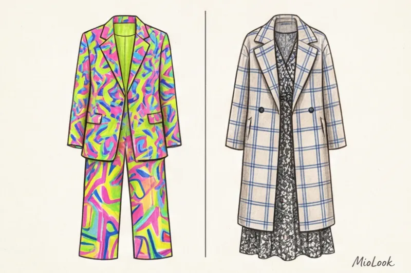
The fast fashion industry loves bold, wild prints. They're the perfect marketing tool for stimulating impulse purchases. However, every pattern has its own strict life cycle. Recall the tie-dye craze or loud pop art a couple of years ago. Today, such items seem anachronistic. Their place is in the textile waste heap, which fundamentally contradicts any conscious consumption philosophy.
If your goal is an eco-friendly and functional wardrobe, invest in timeless classics. Prince of Wales check, elegant Breton stripes, understated argyle, or classic polka dots will be just as relevant in five or fifteen years. From a sustainable fashion and simple math perspective, it's far more cost-effective to spend €180 on a quality wool-blend jacket with a woven pattern that will become the foundation of dozens of looks. It's incomparably better than dropping €35 on a trendy polyester blouse with a distorted leopard print that will pill by the end of the month.
By purchasing printed items for years to come, you're saving both the environment and your budget. And to make sure your new check or stripe will fit in with your current wardrobe before you head to the store, I highly recommend digitizing your items. MioLook Trying on combinations virtually will save you from spontaneous purchases that end up as dead weight on the shelves.
Basic rules: how to combine prints in clothes without risk
According to statistics from the WGSN global report (2024), approximately 68% of women refuse to buy printed items simply because they fear looking like urban lunatics. The main request I regularly hear during personal consultations is: How to combine prints in clothing and not look ridiculous. The fear of making a mistake makes us buy the tenth beige turtleneck, even though our souls crave rhythm and color.
The good news is that pattern styling isn't an innate gift, but pure mathematics and geometry. You don't need to be a Central Saint Martins graduate to create a complex look. Simply rely on three fundamental laws of visual harmony, which work flawlessly.
Law #1: The Rule of Contrast Scale
The most common mistake that causes an outfit to visually "fall apart" is using two patterns of the same size. The human eye requires hierarchy. If you wear a medium-sized floral blouse and a medium-sized checkered skirt, they begin to compete for attention, creating optical ripples and visual noise. The rule of scale dictates that a large pattern should always be paired with a small one. For example, a massive, architectural check pairs perfectly with a microscopic, barely noticeable polka dot.
In my styling practice, I had a telling example with a client who was a gallery owner. She had invested around €1,200 in a luxurious Dries Van Noten coat with giant tropical leaves, but it was sitting in her closet like dead weight. She tried pairing it with dresses in medium-sized floral patterns, but the result was chaos. We applied the rule of scale: we replaced the dress with a micro-houndstooth silk blouse (from a distance, it looked like just a textured gray fabric) and tailored trousers. This tiny pattern created a calm backdrop, allowing the coat to shine. One simple rule literally saved this complex and expensive look.
Law No. 2: Proportion 60/30/10
This rule came into fashion from interior design and architecture. The 60/30/10 rule for distributing active patterns in an image helps the brain structure information without overload. If you decide to go all-in and use multiple patterns, distribute them like this:
- 60% - Dominant print. This is the largest item in the outfit (for example, a midi dress or a long coat). It sets the overall mood.
- 30% - Supporting pattern. A smaller item (jacket, shirt, or cardigan). The print here should be half the size of the dominant one.
- 10% - Accent. Shoes, a bag, a scarf or even socks with a third, completely unexpected pattern.
This mathematical proportion creates the effect of deliberate casualness characteristic of street style influencers.
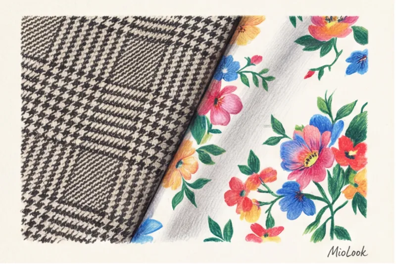
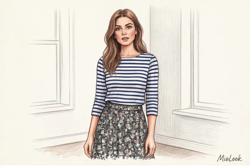
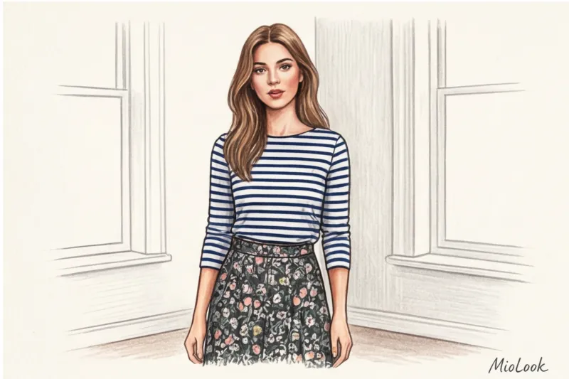
Law #3: Conflict of Textures (Geometry + Botany)
If you're just starting to experiment, remember this formula. Geometry and botany are the safest and most stylish combination possible. Why does it work? It all comes down to the psychology of line perception.
Floral and botanical patterns (botany) feature smooth, flowing, romantic lines. Too many of them can make the look appear childish or overly rustic. Strict stripes, checks, or diamonds (geometric) are composed of hard angles and straight lines. They act as a structural framework. A sharp men's pinstriped shirt instantly calms the naive and relaxed romanticism of a flower on a flowing skirt, making the outfit look modern and composed.
To avoid blind buying and disappointment at home, I recommend testing out these combinations virtually. Upload a photo of your striped shirt and new floral skirt to the "smart wardrobe" feature in MioLook — Artificial intelligence will immediately show whether these prints match each other in terms of shade and geometry.
Try MioLook for free
A smart AI stylist will select the perfect look from your items and suggest how to skillfully mix complex prints every day.
Start for freeLeopard and animalistics as a new base
Many people still view animal prints with caution, associating them with the aesthetics of the 2000s. However, the modern styling paradigm has shifted. Today, stylists agree: leopard, zebra, and python can work as neutral base shades. Just look at the color palette of classic leopard: it's a mix of black, caramel, beige, and dark brown. It's literally the palette of a classic trench coat!
Since animal print is made up of achromatic and natural tones, it pairs phenomenally with both bright, pure colors (leopard + scarlet, zebra + emerald) and other basic prints, such as Breton stripes.
But here lies the main catch: The critical importance of fabric quality for animal prints Nothing cheapens a look like a synthetic sheen. The cheap, glossy sheen of low-quality polyester instantly ruins the leopard print's status, turning it into a costume for a themed party. If you're buying an animal print, choose only matte textures: thick cotton, matte viscose, cupro, sand-finished silk, or wool. A leopard-print skirt made of matte, flowing cupro for €80-€120 will look like heavy luxury, while a shiny, mass-market equivalent for €20 will ruin the entire look.
Advanced level: mix of three or more patterns
When looking at the runway collections of Dries Van Noten or Marni, you can't help but wonder: how do designers manage to mix several vibrant patterns without the look looking like a random collection? The secret lies in their rejection of perfectionism. Let's debunk the biggest styling myth of past decades right away: the perfect color match (the infamous matchy-matchy) is no longer in fashion. If you stubbornly try to match the red polka dots on your skirt to the red stripe on your blouse, the outfit will end up flat, strained, and downright boring.
Modern, intelligent fashion demands a light, deliberate casualness. A shade difference of a few shades looks much more designer-like. It creates the impression that you put together this complex outfit in a couple of minutes, trusting your own taste, rather than checking everything against a Pantone color chart with a magnifying glass.
My experience working with the archives of European silk factories in Como confirms an interesting pattern: the most prestigious and harmonious combinations are achieved when we stop focusing on the geometry of the design and begin to look beyond it.
This is where "negative space"—the background of a pattern—comes into play. In textile design, this concept is crucial. To make three completely different patterns work together, analyze their base. Let's say you take a blouse with a small floral print, a skirt with a large argyle print, and layer a houndstooth jacket over it. If all three pieces have the same deep shade of dark chocolate or dusty ecru as the background, they will inevitably "stick" together into a single capsule. Our brains read the shared light and temperature base much faster than they analyze the interweaving of the motif's lines.
The second powerful tool is the "color bridge" method. This is the secret sauce that once and for all solves the problem of how to combine prints in advanced clothing. The essence of this method lies in finding a single unifying shade for three completely different patterns. Imagine you have a graphic green-and-blue striped shirt, an orange-and-blue paisley scarf, and an accent tweed skirt with cobalt thread (high-quality tweed can be found in the €150-€300 range today). The blue acts as a bridge. The shades can also vary slightly: the ultramarine on the scarf easily harmonizes with the dark blue stripes, creating a dynamic yet mathematically precise balance.
But what if the colors don't intersect at all? As a materials scientist, I can confidently say: fabric texture can be the perfect unifying factor. Let's say you've decided to combine abstraction, animal print, and psychedelic geometry. If all three pieces are made of heavy, matte silk, dense cupro, or tencel with a velvety surface, they will equally absorb and softly diffuse light. This identical play of light and shadow will visually unite the elements into a harmonious set. However, if you try to mix cheap, shiny polyester, loose, fluffy wool, and glossy satin with different patterns, the look will inevitably fall apart due to the clashing textures.
Assembling such multi-layered designs mentally or standing in front of an open closet can be tedious. To avoid wasting morning hours trying on and changing clothes, I digitize complex pieces and test out bold combinations virtually. By uploading your database to the app MioLook , you can overlay patterns directly on the screen, checking whether they share a color bridge or a common textural story. This allows you to practice your visual skills without wasting time or effort.
Integrating prints into business and capsule wardrobes
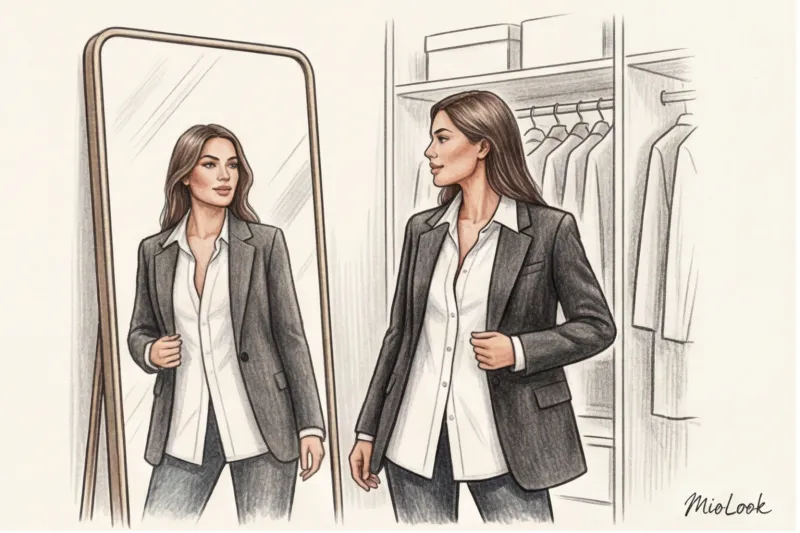
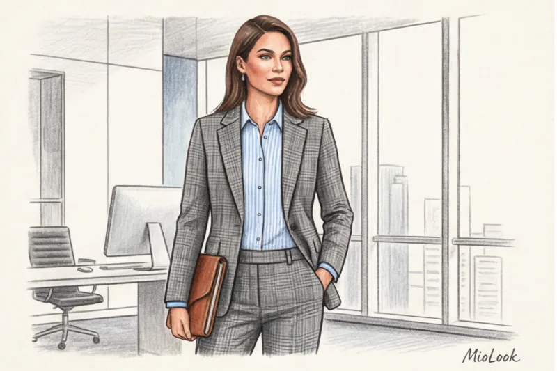
There's a long-standing stereotype: the stricter the company's dress code, the bland the suit should be. Many professionals have spent years hiding behind dull dark blue and gray fabrics, fearing their appearance would undermine their authority. However, the history of traditional tailoring proves the opposite: status is best emphasized by delicate, intricate textures and patterns.
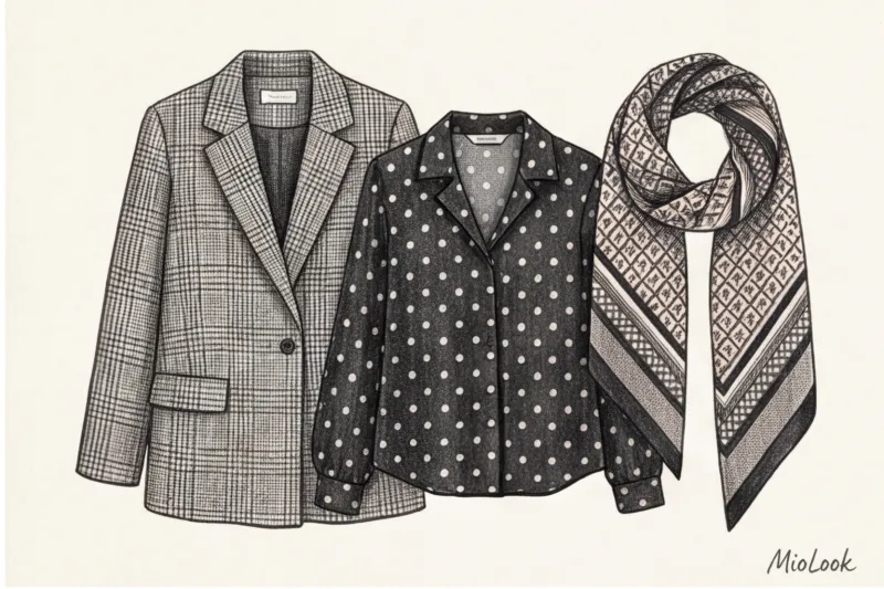
If you've already mastered how to combine prints in everyday outfits, it's time to transfer this skill to the workplace. In classic business attire (even in conservative legal or banking environments), three patterns are completely legal: pinstripes, glen checks, and salt-and-pepper.
The main rule of office print is optical fusion. The pattern should be clearly visible only from a close-up distance (up to half a meter). If you take two steps back, the fabric should appear as a deep, complex solid color.
A top manager at an audit firm once came to me for a consultation. Her wardrobe consisted of impeccable, yet completely identical, black and graphite suits. She felt like a "person in uniform." We didn't break the dress code, but simply swapped the flat black jacket for a salt-and-pepper wool one, and the white shirt for a cream one with the finest burgundy stripes. The formality remained 100%, but the look gained a dynamic quality that tacitly conveyed confidence and authority.
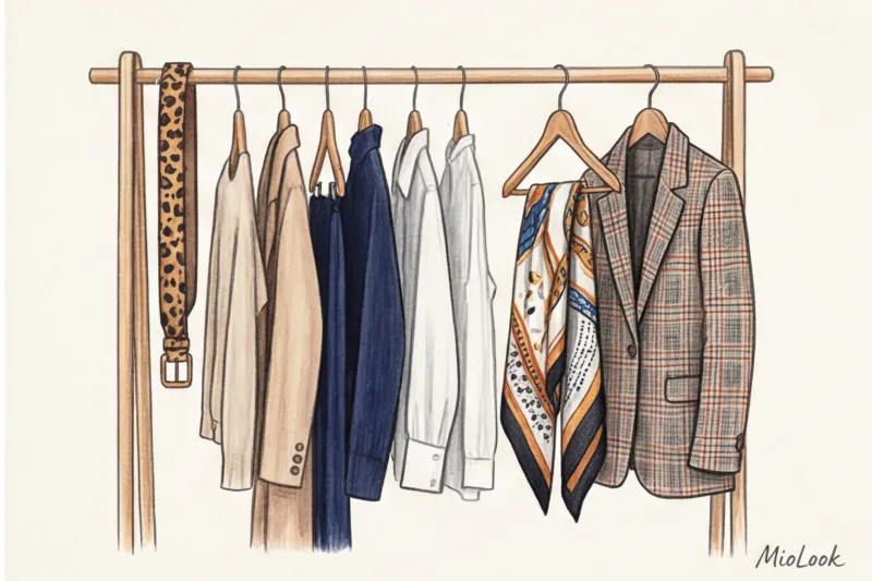
Capsule Mathematics: Maximum looks with minimal pieces
A common problem with minimalist capsule wardrobes is that they quickly become boring. When you have the perfect beige trousers, navy blazer, and white shirt, you end up with safe but predictable outfits. To update a boring basic capsule wardrobe without adding endless pieces, you need a "print tie-in."
Imagine investing in a high-quality silk scarf or blouse (in the €100-€150 range) with a complex geometric pattern that combines beige, navy blue, and, say, emerald green. This single piece will instantly tie together your disparate basics into complex, layered outfits. No longer will you need to buy a dozen new blouses of dubious quality for a single season. One well-chosen pattern, incorporating the colors of your basics, makes your wardrobe three times more effective.
Try MioLook for free
Start creating perfect looks with AI and test print combinations online.
Start for freeSilhouette Geometry: How Directional Print Changes Proportions
Patterns are not only a means of self-expression but also a powerful tool for optical correction. The principles of clothing design and visual perception dictate that the direction of the lines on the fabric determines the direction of the viewer's gaze.
Directional printing works like a sculptor if you know the laws of physics and optics:
- The vertical stretches. A thin vertical stripe up to 5 millimeters wide on a contrasting background can visually slim the silhouette and add 3-4 centimeters of height. This is a classic technique used in palazzo pants to make legs appear endless.
- The diagonal forms curves. This is my favorite trick for straight-cut figures. A diagonal stripe (especially in wrap dresses or bias-cut skirts) creates an artificial waist where there isn't one. It tricks the eye, causing it to follow a narrower path.
- The wide horizontal line adds volume. If you need to visually broaden your shoulder line or balance out narrow hips, use a contrasting Breton stripe (a sailor shirt) in this area.
Don't forget that an awkwardly placed print can backfire. A large checkered pattern placed at the widest part of your hips will visually add another dimension due to the widening angles. To avoid testing these rules on your own mistakes after purchasing an expensive item, I recommend visualizing outfits in advance. Upload a photo of your desired item to MioLook smart wardrobe and see how the direction of the pattern interacts with your usual bottom or top.
Main mistakes: why a patterned look falls apart
Every time I analyze street style looks at Fashion Week or simply observe people walking by in European capitals, I mentally "edit" unsuccessful outfits. The line between brilliant eclecticism and visual disaster is very thin. If you're wondering how to combine prints in clothes and why your carefully crafted outfit suddenly looks ridiculous, you've likely fallen into one of three style traps.
The first and most destructive error lies in the physiology of our vision - this is the same scale of two different patterns Imagine wearing a medium-sized checkered shirt and a medium-sized polka-dot skirt. In design, this is called a lack of visual hierarchy: the brain can't determine which element is dominant. The result is dense visual noise and that irritating blurring of the eyes. The viewer's eye literally darts between the patterns, causing subconscious irritation.
You can fix this mistake in a second, right in front of the mirror: simply replace one of the elements with a micro or macro version. A large, sweeping stripe will instantly "calm down" the small floral pattern, creating the desired dynamic.
The second mistake is - conflict of stylistics and historical contexts Fabric always conveys a specific message. The classic French millefleur (a small scattering of wildflowers) has historically conveyed fragility, naivety, and country romance. Why is a sports logo print rarely paired with such a pattern? Because aggressive logomania evokes the aesthetics of the metropolis, speed, and streetwear of the '90s. When you juxtapose them head-on, you get not fashionable irony, but the feeling of dressing in the dark. If you want to incorporate a sports logo, combine it with strict geometry or color blocking, but not with pastoral buds.
Finally, the third problem is too many accents on the face without the support of a neutral base I often see women wearing a leopard-print blouse, tying a paisley silk scarf over it, and accessorizing with chunky zebra-print frames. With such a jumble of details, your face is literally erased, turning into a pale spot against the backdrop of a textile exhibition.
Remember the rule of visual anchoring: if there are more than two active patterns in the portrait area, they require a rigid, solid-color frame. A high-quality jacket made of thick wool (excellent basic models can be found in the €150–€250 range) in the right deep shade will instantly tie this chaos into a prestigious and clear composition.
Before you leave the house in a complex outfit, take a step back. Your smartphone screen acts as a merciless filter: photograph your items individually and assemble a rough collage. MioLook app If an image appears busy or rippled in a small preview, this effect will only be amplified in real life.
MioLook Checklist: Where to Start if You're Used to Monochromatic
Let's be honest: the sudden shift from safe minimalism to active patterns is stressful for the psyche. As consumer behavior research from Business of Fashion (2023) shows, items with an unfamiliar pattern are 40% more likely to remain in the closet with the tags intact. My main advice to those just learning how to... How to combine prints in clothing: Tone down the radicalism. I've developed a three-step algorithm that helps you incorporate patterns without feeling like you're wearing someone else's.
Step 1: Start with a "safe distance" (accessories)
Don't go straight for a statement dress or coat. Start with elements that take up no more than 5-10% of the overall silhouette. A silk scarf (even in a good mid-range segment, you can find excellent options for €50-€80), a bag with a geometric print, or shoes with an animal print insert are the perfect start. Psychologically, this works flawlessly: if you feel visually overwhelmed midday, you can always remove the scarf from your neck and simply tie it to your bag handle.
Step 2: Move the active pattern down
The face area is the most sensitive. What's near your face directly shapes how you perceive yourself in the mirror. So, feel free to incorporate printed bottoms (a flowing polka-dot midi skirt or pinstriped palazzo pants), while keeping the top completely plain and simple. Patterns positioned away from the face are much easier for our brains to process and never clash with your natural complexion.
Step 3: Use a "fake print"
For clients who are terrified of contrasting geometric patterns or floral designs, I always offer an elegant compromise: fabrics with a pronounced texture. Jacquard weave, micro-bouclé, or salt-and-pepper fabrics appear perfectly smooth and solid from a distance. But as soon as someone gets closer, the eye detects the complex rhythm and interweaving of the threads. You get the dynamism of a print without its overbearing brightness. Furthermore, a structured pattern never fades or cheapens the look.
"Pattern integration doesn't require a complete wardrobe overhaul. Adding one rhythmic element to your favorite basics is enough to give the silhouette a new feel."
Before you go shopping for your first statement piece, I highly recommend loading your favorite solids into the app. MioLook Simply add a photo of your desired printed skirt directly from the store's website and check on the virtual board if the puzzle fits with your current base.
Your ideal image
it begins Here
Join thousands of users who look flawless every day with MioLook.
Start for freeSummary: A conscious approach to prints
According to analytical reports by the Ellen MacArthur Foundation (2023), the average lifespan of a garment has decreased by 36% over the past fifteen years. And the most common culprit for prematurely consigning an item to the landfill is a cheap, ultra-fashionable pattern that loses its visual value after just one season. However, the paradox is that the wise choice of patterns is one of the most powerful tools of the slow fashion philosophy. When you thoroughly understand how to combine prints in clothing, the need to constantly buy disposable, statement pieces at sales disappears. Your wardrobe becomes a complex, interconnected ecosystem.
Look at the archives of houses like Hermès or Etro: their core patterns haven't changed for decades, only slightly adapting in color nuances. A high-quality blouse made of thick silk with a sophisticated geometric pattern or a classic tartan skirt (even if they're priced in the premium segment, from €150 to €300) pays for itself much faster than a stack of T-shirts with loud pop art prints. Classics remain timeless, elegantly adapting to the changing seasons.
The Unobvious Benefit: Why Patterns Extend the Life of Things
Beyond aesthetic durability, complex patterns have a purely utilitarian, physical advantage that stylists rarely mention. From a textile engineering perspective, a high-quality, detailed pattern is the best visual camouflage. Clothing with a rhythmic pattern objectively lasts longer in a wardrobe than its plain counterparts.
"A plain, smooth fabric demands perfect condition. Any micro-stain or crease screams untidiness, forcing us to throw the item in the washing machine more often. And aggressive washing inevitably weakens and destroys the fibers. A complex print, on the other hand, draws attention to itself, allowing the item to be washed less frequently and worn longer."
The optical blend of multiple shades masterfully conceals stray drops from your morning coffee, chafed elbows, or slight pilling where the strap of a heavy crossbody bag rubs against your thigh. This practical life hack is especially relevant for a basic wardrobe: wool-blend trousers in a fine houndstooth pattern or a tweed jacket in a speckled salt-and-pepper pattern will last three times longer in pristine condition than perfectly smooth monochrome pieces.
Virtual Fitting Room: Try Before You Buy
Before you rush out to the store for another leopard scarf to "freshen up your look," stop. The most sustainable and healthy item is the one already hanging in your closet. Often, we simply lack the courage to look at familiar clothes from a new perspective. I urge you to start experimenting with your current wardrobe in the app. MioLook before purchasing any new items.
Take photos of that floral midi skirt you wore only once last summer and that formal men's striped office shirt. Combine them on the app's virtual canvas. Zoom in and out, assess the contrast on your smartphone screen—it's much easier for our brains to perceive the entire silhouette there, without the distraction of emotions we usually experience in front of a mirror. You'll be amazed at how many ready-made, complex, and prestigious combinations are hiding in your dressers right now.
My final chord as a textile quality and sustainability specialist is this: buy less, but combine better. Don't chase the quantity of trendy pieces; invest in the quality of the weave and the depth of the pattern. A conscious, mathematically sound approach to pattern not only saves the planet from clothing overproduction but also makes your personal style truly intelligent and refined.
Guide Chapters
How to Choose a Print Online: A Virtual Fitting Room with AI
Choosing patterns online often leads to disappointment and returns. Learn how artificial intelligence can help you find the perfect print for your body type.
What to wear with printed shoes: how to incorporate them into your wardrobe
Tired of your boring basic wardrobe? Find out how just one accent piece can liven up your look and add some dynamism.
Prints in Business Attire: Strict Dress Code Rules
An inappropriate blouse pattern can detract from your professionalism. We'll explain how to choose the right patterns for a formal office wardrobe.
Ideal Prints for Women Over 40: Style Secrets
A well-chosen fabric pattern can refresh your look better than any makeup. Let's explore the architecture of patterns and learn how to wear them elegantly.
How to wear polka dot print: modern styling rules
We'll show you how to shed retro associations and style polka dots to look modern, expensive, and classy.
Fashionable Prints 2024: How to Wear Runway Trends
Why do runway patterns often translate to real-life looks? We explore this year's top print trends and learn how to incorporate them into your everyday wardrobe.
Floral Prints in Clothing: How to Avoid Looking Outdated
A floral pattern can add Parisian chic to a look or make it look too tacky. We'll explore the rules of floral styling without platitudes and harmful myths.
How to combine plaid and stripes: rules for mixing prints
The secret to the perfect print combination lies not only in color but also in the texture of the fabric. Learn the rules of masterful mixing of checks, stripes, and polka dots.
How to Wear Stripes: The Laws of Optics and Geometry
We're breaking down outdated stereotypes about horizontal and vertical lines in clothing. Learn how to choose and combine striped prints according to the laws of optics.
Types of checkered patterns in clothing: rules for stylish combinations
Plaid can either elevate an outfit or drastically cheapen it. Let's explore the anatomy of plaid print with a personal stylist.
What to wear with leopard print to avoid vulgarity
Forget the "tame leopard with black" rule. We'll show you how to style the predatory pattern elegantly and modernly, avoiding vulgarity.
Optical illusions: which prints make you look slimmer
Forget the cliché that vertical stripes always make you look taller. Discover how optical illusions and prints actually shift proportions.