Have you ever noticed how in street style photos from Fashion Week, women in three different prints look like style icons, but when we try to replicate the same trick in front of a mirror at home, we end up with a costume that looks like a city lunatic? Many stylists have been saying for years: "Just find a common color," but as a textile expert, I'll tell you the truth. Color is just the tip of the iceberg.
Over 12 years of working with wardrobes, I've realized one thing: about 80% of visual print clashes are caused by mismatched fabric weights and textures, not the patterns themselves. One day, a client of mine brought in a stunning color-coordinated outfit for review: a tartan skirt made of thick wool and a striped blouse made of cheap printed polyester. The shades matched perfectly. But the look fell apart. Why? Because the cheap sheen of the synthetics killed the noble matte finish of the wool.
Today we'll move on to the highest level of aerobatics. We've already covered the basic rules in more detail in our a complete guide to combining prints in clothing , and in this article, I'll show you the mechanics of creating complex, multi-layered looks through the lens of fabric architecture. We'll address the most common headache— How to combine checkered and striped patterns , and add polka dots to them to get a truly status outfit.
Pattern Architecture: Why It's Important to Start with Fabric
Before you start placing a striped shirt next to a plaid jacket, close your eyes. I'm serious. In my practice, this is called the "blind touch" rule. Touch both items. If one fabric feels like a dense, structured material, and the other like a slippery, lifeless film, no Itten color wheel will save you.
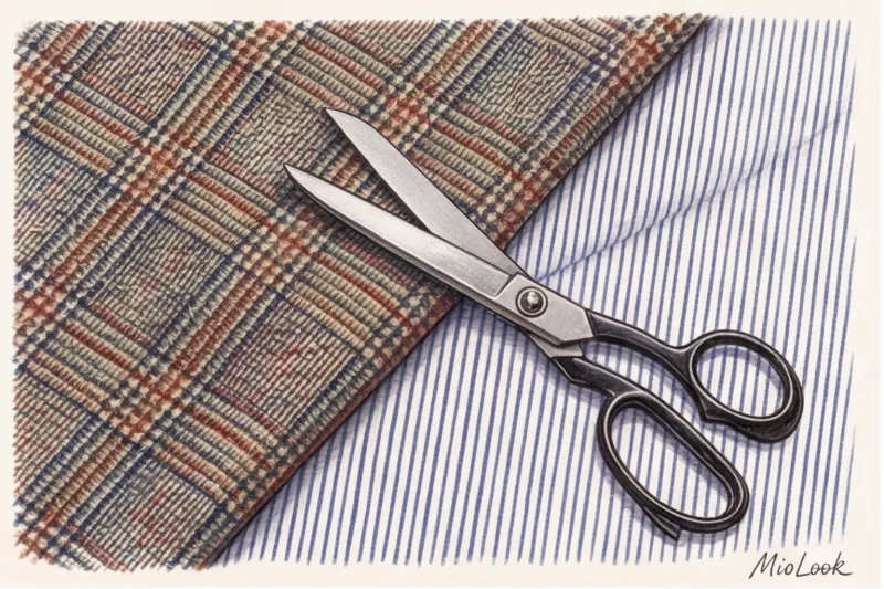
The secret to a luxurious multi-print look lies in the method of applying the pattern. There's a huge difference between a woven pattern (yarn-dyed, jacquard, tartan) and a cheap surface print. According to a 2024 study by the WGSN Textile Institute, garments with woven patterns last three times longer and withstand more washes without losing their geometric shape.
"Woven patterns have depth. The threads intertwine, creating micro-shadows and volume. Pigment printing on the surface of the fabric is flat, reflecting light differently and, when combined with complex cuts, often looking flat and cheap." Sophia Müller.
For prints to work well together, they must have comparable textile weights (GSM—grams per square meter). Heavy cotton (from 180 g/m²) works well with fine suit wool. However, trying to pair heavy tweed with a flowing polyester imitation silk will create a clash. Pigment-printed synthetics create a greenhouse effect not only on the body but also on the visual perception of the garment's status.
Your perfect look starts here
Join thousands of users who look flawless every day with a smart wardrobe.
Start for freeAerobatics Basics: How to Combine Plaid and Stripes
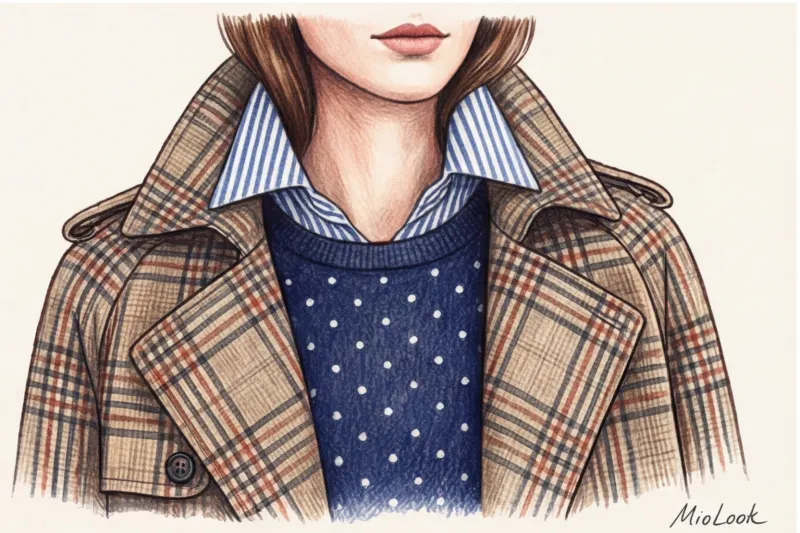
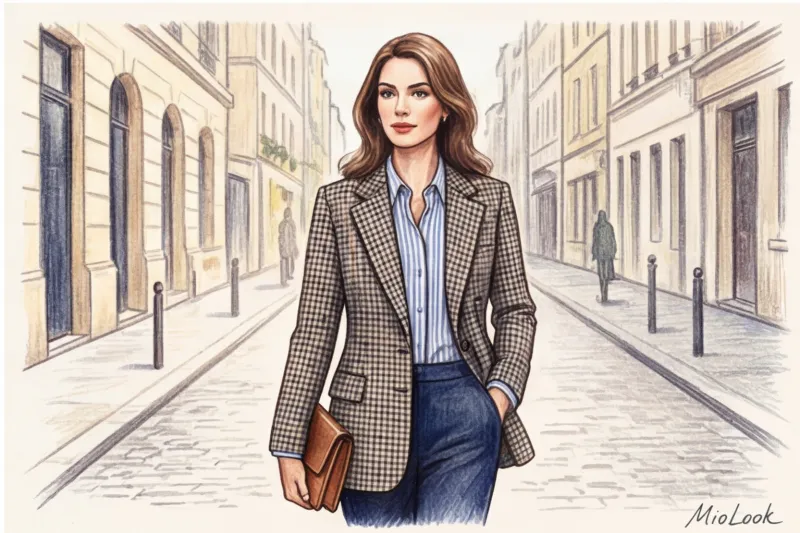
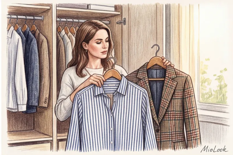
Once you've learned how to choose the right fabrics, you can move on to geometrics. If you ask the tailors on London's Savile Row, How to combine checkered and striped patterns , they will answer you with two words: scale and perpendicularity.
The checkered pattern is static. It grounds the image, creating a rigid architectural framework. The stripe is dynamic, a vector that directs the gaze. If you juxtapose them head-on at the same scale, the viewer's eye will begin to twitch nervously.
- Difference in scale: This is crucial. Macro checks (like large windowpanes) require micro stripes (like thin pinstripe suits). Conversely, massive, wide stripes (block stripes) are toned down by fine houndstooth.
- Rule of perpendicularity: If your shirt is dominated by strong vertical stripes, choose a check pattern that visually emphasizes the horizontal or diagonal lines (like tartan). This separates the vectors, eliminating conflict.
- Color Bridge: Find one, even the most subtle, unifying shade. If a complex jacket print features a subtle burgundy thread, a burgundy stripe on the shirt will tie the entire look together.
These principles work great not only in strict tailoring, but also when you are composing autumn casual look for walks around the city.
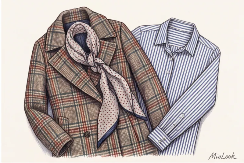
Adding Polka Dots: How Circles Soften Rigid Geometry
Checks and stripes are all about angles and straight lines. They embody the masculine, austere energy of tailoring. Left alone, they can create a look that's too dry and uniform. This is where polka dots come in—a brilliant visual shock absorber.
Polka dots act as a buffer between strict patterns. I once styled a client for an important presentation. She wore wide-leg pinstripe trousers and a Prince of Wales check jacket. The look was stylish, but a bit too formal. When we added a polka dot silk scarf around her neck, magic happened. The rounded shapes softened the geometric lines, adding a touch of French casualness.
The best way to integrate polka dots into a triad is to use color inversion. For example, if your main ensemble is navy blue and beige, add a navy blue scarf with white (negative) polka dots. This will maintain the austerity of the palette but add complexity to the rhythm.
Try MioLook for free
A smart AI stylist will create the perfect look from your items in seconds. Upload your wardrobe and experiment with prints.
Start for freeThe "base thinner" myth: why you shouldn't separate prints with solid colors
Now we're going to debunk the cardinal rule of glossy magazines from the 2000s. The myth goes: to calm down a complex mix of two or three prints, you must include a basic solid color (for example, a white T-shirt under an unbuttoned plaid jacket with a striped collar).
Is it true: The solid block cuts the silhouette and emphasizes the fragmented patterns.
From a Gestalt psychology perspective, our brain strives for continuity of perception. When you place a white patch between a striped shirt and a plaid skirt, you're literally shouting, "Look, here one complex element ends and another begins!" This creates the effect of visual fragmentation.
A much more effective technique is continuous flow—overlay patterns directly on top of each other. Let the collar of a striped shirt lie directly on the lapel of a plaid blazer. If the scale is calibrated correctly, the eye will perceive this not as chaos, but as a complex, rich gradient of textures.
The Mathematics of a Perfect Image: Scale, Rhythm, and Proportion
Print combinations aren't a chaotic creative impulse. They're based on strict mathematics and the proportional distribution of visual weight. To prevent the look from turning into a circus costume, we use algorithms.
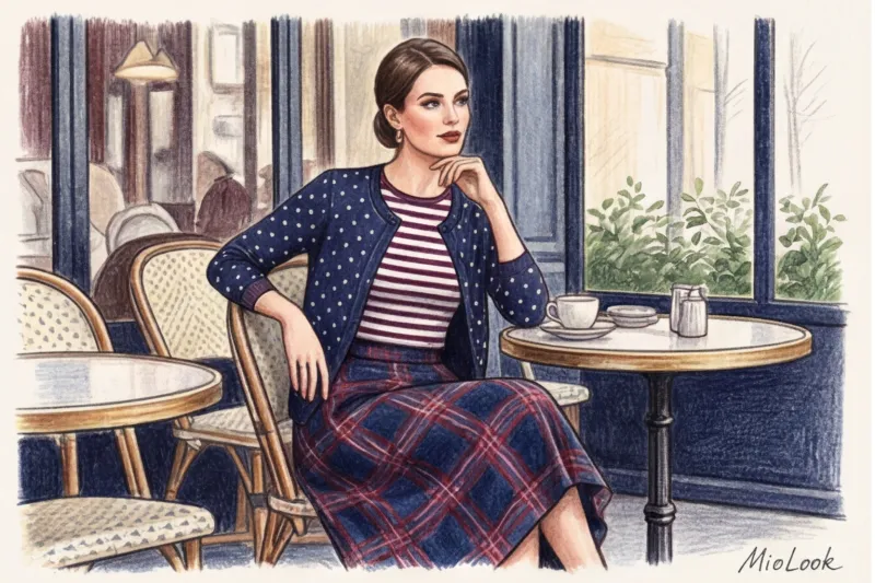
The 60/30/10 Rule for Three Prints
If you decide to use three patterns simultaneously, their areas should not be equal. The ideal proportion looks like this:
- 60% - dominant print. Typically, this is outerwear, a suit, or a long dress. Large-scale (macro-check) prints work best here.
- 30% - supporting print. A shirt, a first-layer blouse, or a midi skirt. Medium scale (classic vertical stripes).
- 10% - accent print. Shoes, bag, scarf, peeking cuffs. Micro-scale (small polka dots).
Contrast calibration
According to the PANTONE 2025 Analytical Report, the "quiet luxury" trend has evolved into "complex monochrome." The key rule here is: the more complex your pattern combination, the lower the color contrast between them. Combine prints within the same temperature range or even the same color (for example, gray check, gray-blue stripes, and dusty blue polka dots). High contrast (red, green, yellow) combined with three geometric shapes looks too theatrical.
A practical checklist: putting together a complex look step by step
Enough theory. Imagine you're standing in front of an open cabinet. Here's your step-by-step plan for today:
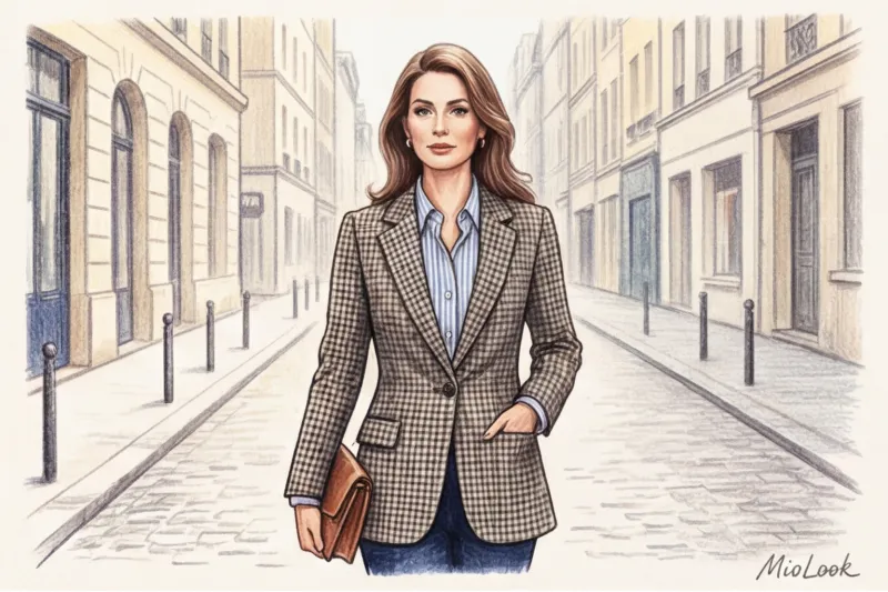
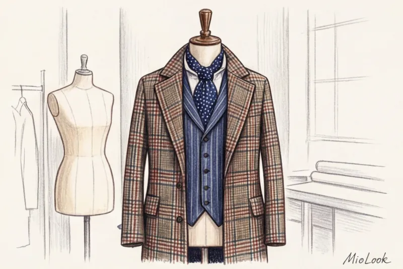
- Step 1: Selecting a "lead singer". Find the highest-quality woven patterned item in your wardrobe. For example, a heavy wool plaid jacket (price range €100 to €300 usually guarantees a good jacquard weave).
- Step 2: Finding a “color bridge”. Look closely at the jacket's threads. Find the least noticeable color in the weave (for example, a thin emerald line).
- Step 3: Selecting the second print. Take a cotton shirt (at least 180 g/m²) with stripes in this emerald shade. Check the scale: if the check pattern on the jacket is large, the stripes should be narrow.
- Step 4: Add micro-accent. Tie a silk scarf with small polka dots around your neck or bag handle to invert the main colors of your outfit.
- Step 5: Tactile test. Touch all three items. Are there any cheap, squeaky synthetics among them? If so, replace them.
Fair warning: When it doesn't work. This algorithm will break down if you're wearing extremely oversized pieces made from stiff fabrics. For example, a stiff, macro-checkered jacket paired with wide-leg striped trousers will make your figure look boxy. In such cases, you should choose one of the prints and choose a flowing, draping fabric (for example, viscose with 5% elastane).
Ready to get started?
Try MioLook's free plan—upload your prints, and the algorithm will suggest perfect combinations, no strings attached.
Start for freeSummary: From Theory to Your Status Wardrobe
Combining complex patterns isn't an innate gift reserved for Vogue editors. It's a practical skill, working with fabric architecture, geometry, and scale. Once you stop looking at just color and start appreciating the density of the weave, your wardrobe will reach a whole new level.
Invest in quality fabric: polyester prints will never produce the desired effect, no matter how skillfully you combine them. It's better to buy one high-quality mercerized cotton shirt for €80 than three "plastic" blouses for €25 each.
Practice your eye for detail every day. And to avoid spending hours trying on clothes in front of the mirror, delegate the routine to technology. Digitize your wardrobe with an app. MioLook — a smart AI stylist will help you create complex, layered looks with checks, stripes, and polka dots, based on the rules of proportion and color bridges. After all, true style is intelligence expressed through clothing.