Last week, a client named Anna came to my Paris studio. For the past ten years, she'd worn exclusively beige, black, and gray, terrified of looking like a "woman in florals." The result? A perfectly sterile, yet perfectly monochromatic, wardrobe that visually added five years to her age, mercilessly highlighting even the slightest traces of fatigue on her face. When I draped a structured jacket with a graphic emerald print over her shoulders, she froze in front of the mirror. Her face instantly brightened, and her silhouette tightened.
We talked about the basic rules of combinatorics in more detail in our A complete guide to combining prints in clothing But today I want to talk about something deeper. We'll explore the architecture of pattern: how fabric density, geometry, and contrast interact with age-related changes, and which prints specifically work as lifting makeup for women over 40.
The Hidden Danger of a Basic Wardrobe: Why Giving Up Prints After 40 Is a Mistake
There's a popular myth among newbie stylists: status equals monochrome minimalism. Women are told that after a certain age, they should embrace total "quiet casual" styles, featuring sleek textures. This is a fundamental mistake.
Dermatological research confirms that after age 40, natural skin contrast (the difference between skin tone, hair color, and iris) decreases by an average of 20% due to natural changes in melanin production. A smooth, solid beige sweater next to the face simply blends into this new, softer palette, making the look dull and tired.
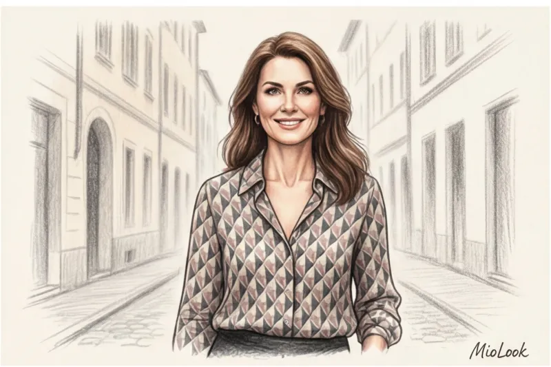
Properly chosen prints for women over 40 create the necessary focal point. They draw attention away from the skin's microrelief and direct the eye to the rhythm of the pattern.
Observing street style during Paris Fashion Week, I constantly notice one detail. Mature French women masterfully use patterns as a sculpting tool. They're not afraid of pattern because they know it's not the pattern itself that ages, but its quality.
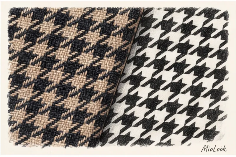
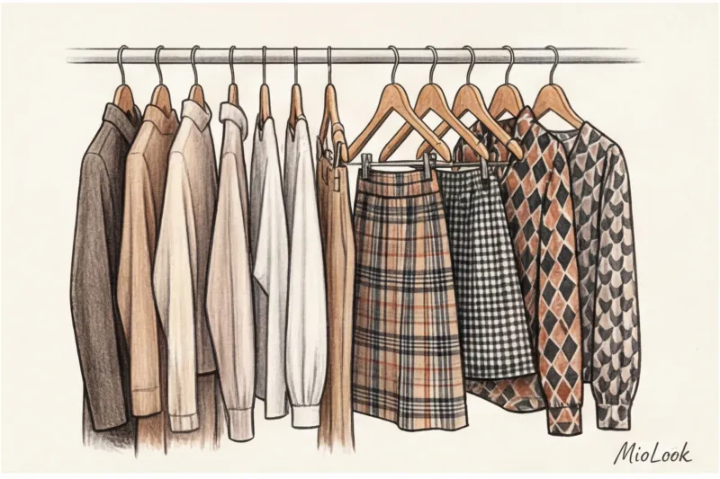
The Architecture of Expensive Patterns: Fabric Physics vs. Cheap Printing
Over 12 years of work, I've come up with some hard statistics: 8 out of 10 women over 40 are disappointed with prints simply because they buy them in the form of cheap pigment-printed polyester. This technology deposits dye on top of the fibers, gluing them together. The fabric loses its elasticity, drapes poorly, and creates an unpleasant greenhouse effect. And microcracks in the dye, which appear after the first wash, instantly cheapen the garment's appearance.
When you go shopping, use my signature "blind touch" rule. Close your eyes and rub the fabric between your fingers. If the print feels firmer than the background fabric (you can feel a layer of paint), return the item to the hanger. The ideal pattern is either deeply imprinted into the fibers of viscose and silk, or woven from multicolored threads.
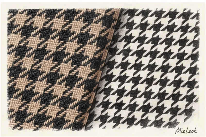
Woven ornaments as an investment in inheritance
The safest and most prestigious way to wear patterns is to choose structured, woven designs. Tweed, dense jacquard, or high-quality wool-blend tartan always look luxurious. In these designs, the pattern is created by the weave of the threads themselves, creating micro-shadows. This texture gives the pattern a depth that flat prints can never match.
Even a simple geometric jacquard pattern works differently. A mid-priced jacquard blazer will cost you €150–200 but will last for decades, becoming that one piece that instantly transforms ordinary jeans and a white T-shirt into a business lunch outfit.
Try MioLook for free
A smart AI stylist will select the perfect look for your body type and color type.
Start for freeGeometry and scale: how prints for women over 40 can shape their silhouettes
The law of optical illusions is actively used in styling. For example, the Müller-Lyer illusion demonstrates that the geometry of lines can visually narrow or widen objects. However, few people consider that the scale of a print must strictly correspond to the bone structure of your face and body.
If you have large, expressive features and are taller than 170 cm, a small chintz floral print will make you look like a mountain, visually widening your silhouette. Conversely, a petite woman will simply be crushed by large geometric block prints.
What about contrast? The stark black and white Breton top that looked so good on you at 25 may now clash with your skin tone, highlighting your nasolabial folds. Swap the contrasting black for a deep navy blue, chocolate, or graphite. Reducing the contrast by just a couple of shades has a tremendously refreshing effect.
The Trap of Infantilism: Polka Dots and Hearts
Classic, small, rhythmic polka dots often evoke the retro naiveté of the 1950s. On a mature woman, this print can make her look like she's stuck in the image of a diligent schoolgirl. This clashes with the confidence that age conveys.
Solution: Choose asymmetrical polka dots of varying diameters, abstract round spots, or an inverted palette in the style of Yves Saint Laurent—for example, caramel polka dots on a deep burgundy background.
Animalism in an Elegant Age: The Line Between Luxury and Vulgarity
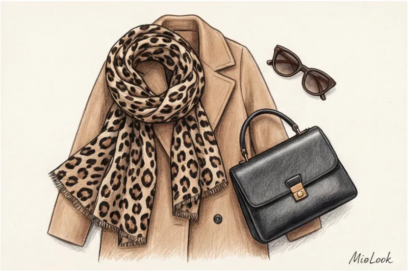
The most persistent myth in the fashion industry is that women over 40 should forget about leopard, zebra, and python forever. The truth is, it's not the animal print itself that adds age, but rather its flat printing on cheap, thin knitwear.
Animal print is a classic. Think of the Prada shows, where leopard coats are worn by models with graceful gray hair. The stylists' secret is simple: animal print becomes elegant when it departs from its natural, realistic colors. Emerald zebra, graphite-gray leopard, or deep wine-colored python look like complex abstractions, not like attempts to blend into the savannah.
To avoid vulgarity, follow the "one-piece rule" and combine the pattern with so-called heavy luxury. A cashmere sweater, a thick, shape-holding wool, matte leather. One of my clients struggled with leopard print for a long time. We started small: adding leopard pony skin loafers and a silk handbag scarf to her formal wardrobe. Today, these details are her signature, recognizable style, earning compliments at business meetings.
Your ideal image begins Here
Join thousands of users who look flawless every day with MioLook.
Start for freeFloral motifs: how to avoid looking like a "provincial aunt"
Floral prints are the most dangerous territory for women over 40. The main mistake I regularly see on the street is choosing dull, watercolor-like colors on a dark, subtle background. These colors are associated with dressing gowns and instantly erase one's status.
Explore the collections of Dries Van Noten, a renowned master of floral design who masterfully crafts mature beauty. He never uses small, fussy flowers. His preference is for large, architectural florals. Botanical prints (clearly defined leaves and buds, as if crafted from antique satin) on dense cotton (from 180 g/m²) or silk look like works of art.
If you prefer French chic and microfloral prints (millefleurs), offset the romanticism of the pattern with a strict cut. Avoid dresses with ruffles and flounces in favor of a simple shirt dress or A-line skirt. The structure tames the frivolity of the pattern.
Stylist's Checklist: 5 Steps to Take Before Buying a Printed Piece
To prevent your item from becoming dead weight in your closet, run it through this professional filter right in the fitting room:
- Distance test. Move 3 meters away from the mirror. Has the pattern turned into a dirty, mottled spot? It's missing negative (empty) space. A good print is legible from any distance.
- Portrait zone test. Place the fabric on your face (preferably without heavy makeup). Look into your reflection's eyes: if you see the pattern first and then yourself, the print has "eaten you."
- Evaluation of the inside. Turn the item inside out. High-quality items have a deeply dyed back (not white, but a slightly muted version of the front).
- Checking the joint fit. Look at the side seams. Mass-market brands (like Zara's basic line) rarely bother with geometric alignment, which immediately betrays their cheap production. But Massimo Dutti and COS, in 90% of cases, stitch their checks into a perfect herringbone pattern.
- The white space rule. The older we get, the more air (print-to-background ratio) a design should have. A solid, obtrusive pattern without pauses visually weighs it down.
A fair point: the seam matching rule does NOT apply to abstract deconstructive prints (such as tie-dye or watercolor washes)—they're designed with randomness in mind.
Smart Pattern Integration: How MioLook Technologies Help Find Balance
The biggest problem with printed items is the difficulty of combining them. You buy a stunning statement skirt, bring it home, and discover that none of your 20 solid-color sweaters complement it. To avoid the "closet full, but nothing to wear" syndrome, you need to digitize your wardrobe.
This is where modern technologies such as MioLook app The smart wardrobe feature allows you to upload photos of your basic items. Before buying a complex geometric blazer, you can virtually "try it on" with your pants and shirts. The AI stylist will instantly show you whether the pattern will tie your basics together or stand alone.
If you're unsure how to properly distribute proportions, remember the golden ratio rule for your closet: the ideal capsule wardrobe contains about 70% solid base colors and 30% prints that serve as a unifying element. (You can learn about body types and the scale solutions that suit them in our article about classic type according to Larson ).
Elegance after 40 doesn't mean sacrificing expressiveness. It's about making a conscious choice, where texture, scale, and geometry work for you. Don't hide behind a bland beige monochrome—let complex, rich patterns tell the story of your confidence.


