Over 12 years of wardrobe analysis, I've come up with a sad statistic. Eight out of ten of my clients' closets contain at least one floral dress that's been worn exactly once. It's usually bought in the spring, in a romantic mood, and then shuffled from shelf to shelf for years. Why? "Darina, I feel like a lady when I put it on," is the most common explanation.
Really, floral print in clothing — it's a minefield. One wrong decision in texture or scale, and instead of a light Parisian aesthetic, you get the effect of "upholstery from a Soviet sofa." We've already covered the basic rules of working with patterns in more detail in our a complete guide to combining prints in clothing , but today I want to discuss floral design specifically. We won't be talking about the cliché "large flowers for plus-size women, small flowers for thin women" (which, by the way, is a harmful myth). We'll look at floral design through the eyes of a designer and colorist.
Try MioLook for free
A smart AI stylist will select the perfect look based on your proportions.
Start for freeWhy floral prints in clothing often look like a blast from the past
Our perception of floral design is closely tied to cultural codes. As fashion historian Cassie Davis-Stoddart (2023) notes, before the Industrial Revolution, floral designs were a symbol of the highest status—the embroidery of a single waistcoat required months of hand labor. But as production became cheaper, flowers became too abundant. They migrated to cheap calico, dressing gowns, and curtains.
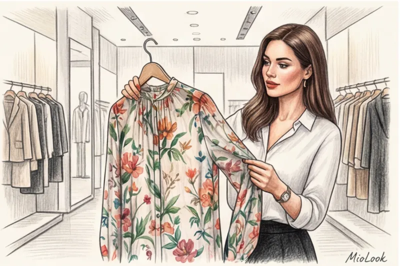
The biggest mistake I see when shopping is judging the design itself without considering the cut and fabric. You can find a stunning watercolor pattern, but if it's printed on flimsy knitwear that stretches across the chest, the magic is lost. Floral design is a ruthless indicator of taste: this pattern absolutely does not forgive skimping on the quality of the base.
Fabric architecture and the "blind touch" rule
In the textile industry, there are two fundamentally different approaches to pattern creation. The first is when the design is woven into the fabric's structure using threads of different colors (jacquard). The second is when dye is applied over the finished fabric. And herein lies the main pitfall of the mass market.
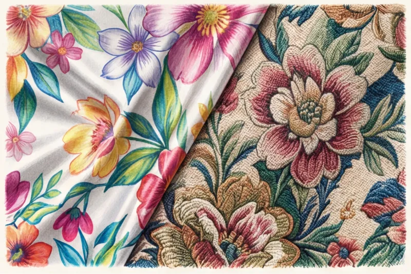
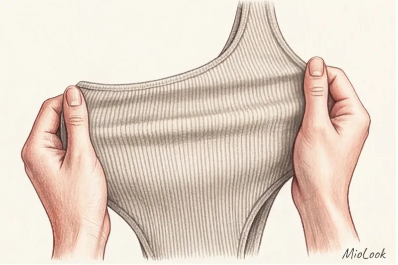
Most inexpensive floral prints (in the €20–€40 range) are created using pigment printing on polyester. The dye doesn't penetrate the fibers, but rather lays on top like a rubber film. To weed out such items, I teach my clients a signature "blind touch" test right in the fitting room.
- Step 1: Close your eyes (so as not to be distracted by the beautiful drawing).
- Step 2: Pinch the fabric between your thumb and index finger.
- Step 3: Rub the canvas lightly against itself.
If you notice a characteristic "creaking" or stickiness, or if the areas with the printed flower feel harder than the background, don't buy the item. After the first wash, microcracks will appear in this rubber film, and the print will look dirty.
The Impact of Cheap Printing on Your Comfort
According to a McKinsey study on textile industry development (2024), dense surface printing reduces the breathability of synthetic fabrics by another 40%. This creates a classic greenhouse effect. You buy a seemingly thin summer dress, but you sweat more in it than in a thick cotton hoodie. Multilayered, variegated patterns are often used by brands intentionally to visually disguise the loose, poorly woven nature of the fabric itself.
Your perfect look starts here
Join thousands of users who look flawless every day with MioLook.
Start for freeScale and Geometry: How to Choose a Floral Print to Suit Your Facial Features
Forget the outdated rule that's been passed down from one glossy magazine to another: "Large flowers for large women, small flowers for petite women." This is a gross oversimplification that often backfires. When choosing the scale of your floral arrangements, consider the scale of your outfit, not the size of your clothes. facial features.
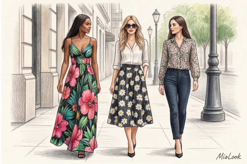
If you have large, expressive features (full lips, wide eyebrows, large eyes), a small, chintz-colored flower will simply disappear against your background, making your face appear bulky. Conversely, for a girl with delicate, graceful features, a large tropical lily will make her look like an accessory to her dress.
But it's not just size that matters. Consider the geometry of the buds:
- Rounded floristry (peonies, lush roses, hydrangeas) perfectly emphasizes the soft lines of the face, plump cheeks or curls.
- Pointed floristry (monstera leaves, irises, orchids with sharp petals) harmonizes sharp cheekbones, a straight nose and a graphic haircut.
And another insider secret: pay attention to the rhythm of the pattern. A thin "air" (empty background space) between the buds always looks more prestigious and expensive than a solid, motley mess where the flowers overlap each other.
The main myth of stylistics: the dangers of a small flower (millefleur)
A small floral pattern (also known as a millefleur, from the French mille fleurs, meaning "thousand flowers") is traditionally considered the safest, most girlish, and romantic print. But in my experience, I've seen the opposite: it's the millefleur that most often mercilessly adds age and "forgives" to a look.
Why does this happen? Historically, small, dense patterns were used for work and home wear—stains are less noticeable on them. Our subconscious interprets this pattern as either a child's dress or a kitchen apron. Wearing such a dress to the office or a meeting conveys immaturity or everyday fatigue.
But there is an exception. If you adore fine prints, look for the benchmark quality of Liberty London. Since the 19th century, the renowned British department store Liberty has been producing fabrics where every millimeter-sized flower is rendered with incredible detail, and the shades are deep and complex. Good millefleur can be found at brands like COS or in premium lines (from €100), where complex color palettes make all the difference.
Contrast and background: defining your floral palette
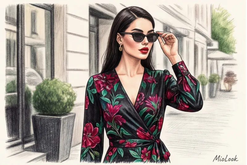
As a certified colorist, I always begin my printmaking work using Itten's theory of contrasts. Floral design comes in two main forms: watercolor (on a light background) and dark floral design (bright flowers on a black, navy, or emerald background).
Choose the print contrast based on your natural appearance:
- High contrast: (For example, dark hair, porcelain skin, bright eyes). Your story is dark florals. Ruby roses on black silk will make your face stand out.
- Low contrast: (Light brown hair, neutral skin tone, light eyes). Dark florals will "kill" you; your face will look tired. Your choice should be pastel or watercolor flowers on a beige or off-white background.
Fair Limit: This method (dark florals) is absolutely NOT suitable for business attire with a strict dress code. If you want a floral print for the office, the only compromise is blouses with an abstract, graphic flower in monochrome (for example, dark blue outlines on a light blue background), where the floral design is more reminiscent of geometry.
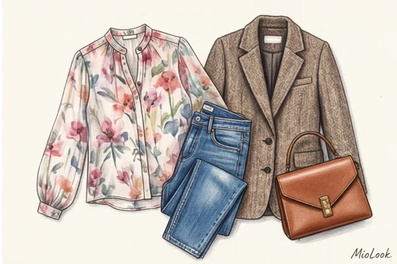
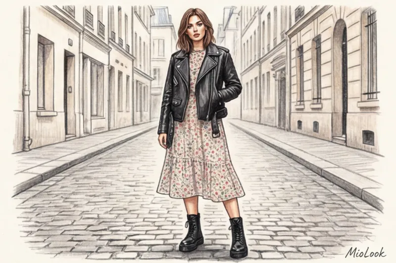
The Texture Clash Rule: What to Wear with Florals
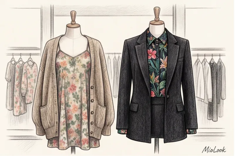
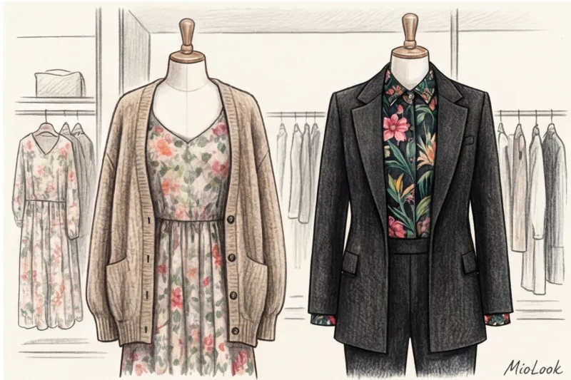
We were recently sorting through a wardrobe with a client who's an executive. She put on a beautiful rose-print chiffon dress and threw a thin, fluffy cardigan over it. The mirror instantly reflected a "retired teacher." This is a major styling mistake: never combine romance with romance.
The modern style formula is built on a clash of textures. A flowing, delicate floral print desperately needs a rigid, brutal, or architectural frame. If you're wearing a floral silk blouse (which can cost up to €200 on its own), don't pair it with a soft, flowing skirt. Add stiff, stiff raw denim.
Here are some surefire combinations:
- Floral chiffon dress + structured men's blazer with wide shoulders.
- Floral midi skirt + chunky knit sweater (not a thin knit!).
- Millefleur dress + heavy leather biker jacket.
Footwear anchors the look. Cleat-soled boots, Cossack boots, or chunky loafers instantly ground the naivety of the colors and bring a sense of collectedness to the look.
Ready to get started?
Try MioLook's free plan—no commitments required. Upload your florals and let the AI create stylish outfits.
Start for freeChecklist: 5 Signs of a Modern Floral Design
Save this checklist for your next shopping trip. A modern, high-end floral print should meet at least four of these five criteria:
- 1. Clarity: No pixelation. Lines should be sharp, without muddy color transitions, as if the pattern was drawn on a bad printer.
- 2. Quality of application: The fabric passes the "blind touch" test. The pattern is not felt by the rubber sticker.
- 3. Relevance of the cut: A flower always looks better on modern silhouettes (asymmetry, exaggerated sleeves, architectural cut) than on outdated fitted knee-length dresses.
- 4. Rhythm: There is “air” between the elements of the pattern, and the background is clearly visible.
- 5. No cheap glitter: The base fabric shouldn't be shiny (except for natural silk or high-quality satin). Cheap, glossy polyester with floral prints always cheapens the look.
Conclusion: Flowers in your wardrobe are an investment
Floral prints are timeless when they're structurally sound. Don't be afraid of florals or consider them "too complicated." Treat them like spices in cooking: you don't need to pepper the entire dish; a couple of pinches is enough.
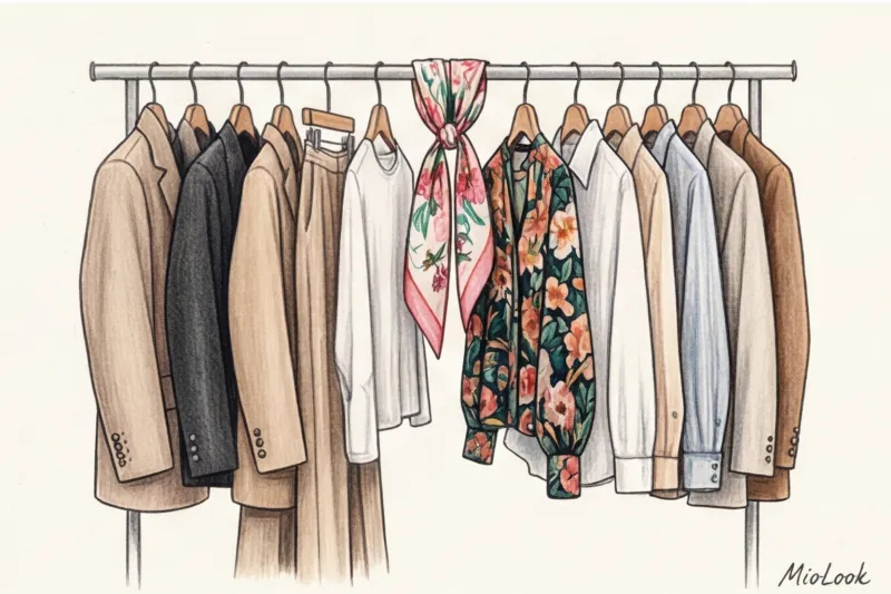
Take stock of your closet today. Ruthlessly get rid of that squeaky polyester with rubber roses. Keep one or two pieces with a refined, high-quality pattern that truly complements your contrast. And if you're unsure what to pair the remaining dress with, upload a photo of it to MioLook — Our smart AI wardrobe will instantly suggest modern outfits based on the rule of texture clashes.