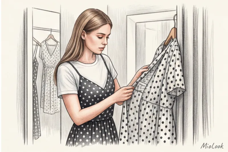
A client once approached me with a classic request: "I bought a polka-dot dress for an office party, but it makes me feel like a '60s flight attendant, or worse, Mickey Mouse's girlfriend. What am I doing wrong?" We opened her closet, and I immediately saw the problem. It was a fitted dress with a full skirt, made of stiff polyester with a contrasting black and white print. She tried styling it with red lipstick and classic pumps. The result? A perfect, yet hopelessly outdated, retro cosplay.
Polka dots (also known as polka dots) carry a tremendous amount of historical baggage. Since Christian Dior and his 1950s collections, this pattern has been inexorably associated with exaggerated, almost cloying femininity. But if you want to look relevant, expensive, and prestigious today, your romanticism needs to be ruthlessly undermined by rough textures and masculine cuts. We covered this in more detail in our the complete guide to print combinations , but today we are dissecting peas.
Print architecture: why does one polka-dot look expensive, while another cheapens the look?
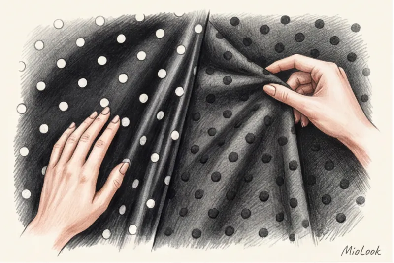
The first thing I teach my clients during shopping tours is the "blind touch" rule. Go to a high-street store, close your eyes, and run your hand over a printed fabric. Do you feel a slight roughness, like a rubber film, along the pattern? Hang the item back up immediately.
The problem is that budget brands (especially entry-level lines priced under €30–40) use cheap pigment printing over finished fabric. The dye literally lies like a layer on the fabric. This print creates a "greenhouse effect," preventing the leather from breathing, and begins to crack after the third wash. Expensive mid-range brands (such as COS, & Other Stories, or the premium Massimo Dutti lines) use either discharge printing, where the dye penetrates the fiber structure, or knit the pattern using a jacquard weave. In this case, the fabric remains flowing and soft.
The second status marker is the color base. The stark, garish contrast of pure white polka dots against a charcoal background often looks flat. If you're looking for a "quiet luxury" effect, choose softer contrasts: cream polka dots against a deep navy, chocolate, or dark chocolate background. This immediately adds depth to the look.
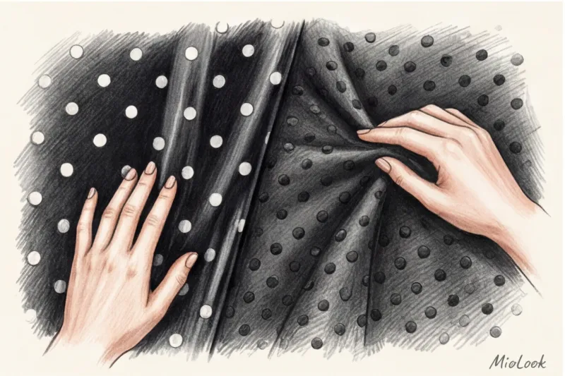
"The biggest mistake mass-market manufacturers make is skimping on fabric. Because of this, the polka dots on the side seams don't meet, creating visual chaos. If you see a circle cut in half on a seam that doesn't flow smoothly to the other side, it's a sure sign of a cheap item," says Katarzyna Nowak.
Geometry and scale: how to choose your pea size
Print scale is pure mathematics. According to WGSN research on visual perception of fashion, the size of a repeating geometric pattern directly influences body measurements. Our eyes perceive large light spots on a dark background as expanding objects (the Helmholtz illusion). Simply put, overly large polka dots add visual weight if they're located in an area you'd like to reduce.
The basic principle of style is that the scale of the print should be proportionate to your bone structure and facial features. Women with fine, delicate features (like Keira Knightley) shouldn't wear giant polka dots—they'll simply "eat" them. But for women with large, expressive features and a statuesque figure, micro polka dots can seem inappropriately small, creating a rippled effect.
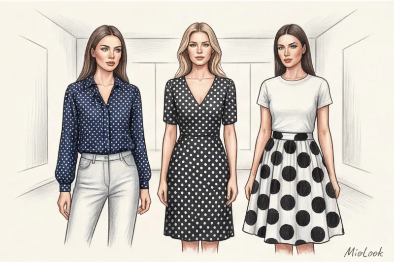
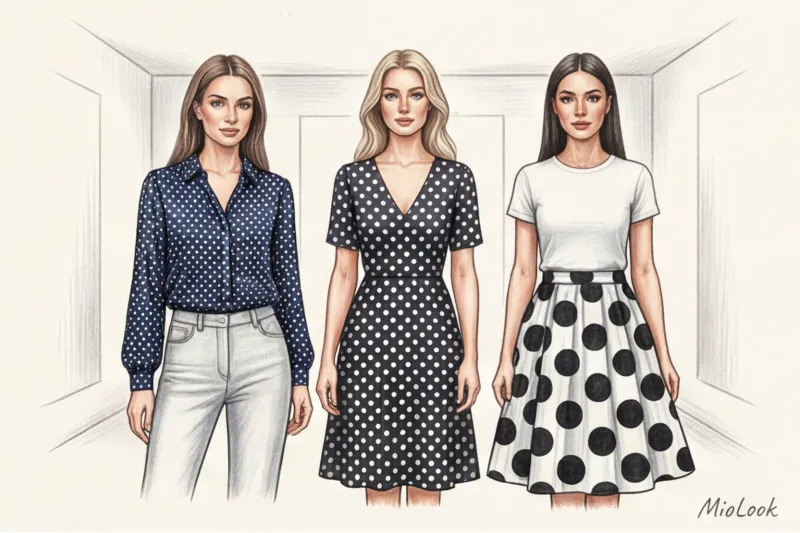
Micro-polka dots (up to 5 mm): a safe base and office chic
If you're wary of prints, start with micro polka dots, 3 to 5 millimeters in size. From a distance, such a piece (especially a navy silk shirt with white dots) looks like a solid, textured fabric, but only up close does its geometric pattern reveal itself. It's the perfect alternative to boring white and light blue office shirts. Micro polka dots easily fit into a strict dress code without violating corporate rules, yet they add a lively touch.
Large, Accent Polka Dots: How to Wear Them Without Looking Comical
A large print (3 cm or more in diameter) can be dangerous. It always teeters on the edge of theatrical costume. To avoid a clownish effect, fabrics with such a pattern should have a strictly architectural cut. No flounces, ruffles, bows, or puff sleeves! Only clean lines: a straight jacket with accented shoulders, a pencil skirt, or a sheath dress. The more childish the print, the more serious the cut should be.
Ready to update your wardrobe without mistakes?
Try MioLook for free: A smart AI stylist will select the perfect look based on your appearance and the clothes you have.
Start for freePolka Dot Print: What to Wear Today to Beat the Retro Pride
And so we come to the main insight of this article. The main myth is that polka dots are associated with femininity. In fact, for this print to look stylish today, it needs to be completely stripped of its romanticism. I call this the "texture conflict" rule.
Forget ballet flats, red lipstick, and a strand of pearls paired with a polka-dot dress. Take a look at the latest Saint Laurent shows under Anthony Vaccarello. He takes a sheer polka-dot blouse and styles it in a way that makes it look edgy, not cute.
Here are 3 surefire formulas that always work:
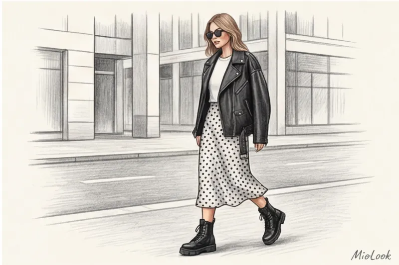
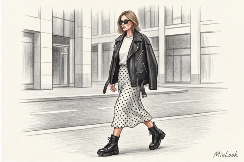
- Silk + rough leather. If you have a flowy dress or a polka-dot midi skirt, layer it with a voluminous vintage biker jacket. The contrast between the delicate, flowing material and the crisp leather creates that perfect modern Parisian chic. Pair it with chunky boots with tractor soles or Cossack boots.
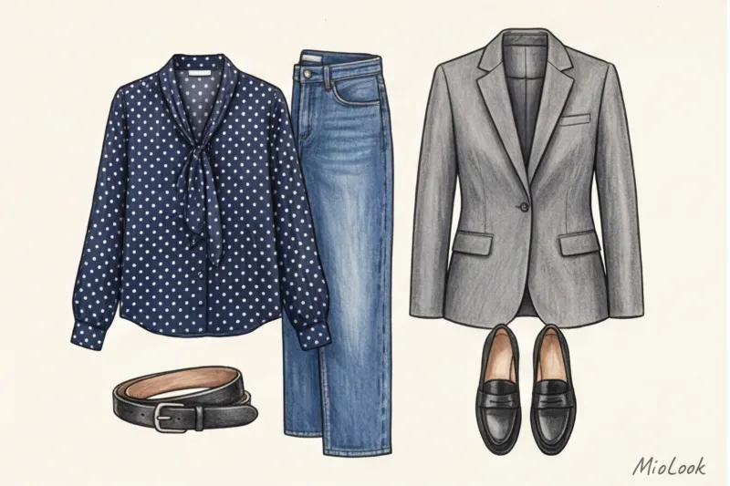
- Polka dots + vintage denim. The elegance of a silk polka-dot blouse needs to be grounded. The ideal partner is a pair of straight-leg blue jeans made of heavy cotton (in the spirit of classic Levi's 501s), without stretch or fraying. The denim will take away the blouse's excess pretentiousness.
- Feminine print + masculine shoulder. To MioLook app If you've created a status capsule, add a masculine oversized jacket. Wear it over a polka-dot slip dress to conceal your silhouette and add a touch of relaxed confidence.
Top-notch: How to Pair Polka Dots with Other Prints
Beginners are often wary of mixing patterns, preferring to wear polka dots only with solid-color pieces. But it's the mix of prints that reveals a person with a well-developed visual sense. The key here is a unifying base. Prints should have at least one common color.
Peas + Stripes. This is a classic. To make it work, follow the rule of scale. If the polka dots are large, the stripe on the jacket or trousers should be thin (for example, a classic chalk pinstripe). If you have a cream blouse with dark blue micro polka dots, it will pair perfectly with a Breton top with blue stripes of the same shade.
Peas + Cell. A stunning, intelligent mix. The smooth, rounded lines of polka dots perfectly soften the strict geometry of glen check or houndstooth. Feel free to wear a gray check jacket over a polka dot blouse.
But there is also a fair limitation. When does this NOT work? I highly recommend against mixing polka dots and bold floral motifs (floristry). It's a no-no for 95% of women. Both polka dots and florals carry a romantic air. Combining them in one look creates a critical overload of immaturity, making it very difficult to pull off a stylish look without the help of a professional stylist.
Confused about print combinations?
Your perfect look starts here: Join thousands of users who look flawless every day with MioLook. AI algorithms will suggest which items from your closet complement each other.
Start for freeInvesting Smart: 3 Things in Polka Dots That Will Make Every Penny Worth It
I'm not a fan of filling my closet with trendy items for one season. Every item in my clients' wardrobes must be worth its price. In fashion economics, there's a formula called Cost-per-Wear (CPW). If you buy a blouse for €20 and wear it twice before it starts pilling, your CPW is worth €10. If you buy a quality item for €150 and wear it for three years (about 100 times), your CPW is worth €1.50. That's smart shopping.
Which polka-dot print items are really worth investing in (budget €80–€200):
- Silk blouse with V-neck (without bow). A pussy bow often adds age and looks too conservative. Look for a simple cut made of 100% silk or high-quality viscose from brands like Massimo Dutti or Sézanne. It's a timeless classic.
- Midi length slip skirt with lingerie cut. Cut on the bias, it softly hugs the hips and flows as you walk. With its small polka dots on a dark background, it's the basis for dozens of looks—from office-ready with a blazer to relaxed styles with a chunky knit sweater and sneakers.
- Silk square scarf. The perfect entry point for minimalists. If you only wear black, white, and gray, tie a polka-dot scarf (like a vintage Hermès or a basic one from COS for €50) around your neck or bag. This will add a touch of French casualness to your look without the risk of going overboard.
Checklist: How to check a polka-dot item before buying
Before you take an item to the checkout, run a quick check using my checklist. In my experience, this algorithm has saved clients from hundreds of spontaneous and unnecessary purchases.
- Hardness test. Crumple the fabric in your fist. If it crunches, feels stiff, or you feel a layer of pigment under your fingers, discard it. The fabric should flow. For cotton, look for a density of at least 180 g/m², and for viscose, at least 5% elastane for durability.
- Joining seams. Turn the garment inside out or look at the side seams from the outside. Are the polka dots cut carelessly and not continued onto another piece? This will give away the cheapness of the garment a mile away. The same goes for chest patch pockets—the pattern on the pocket should match the pattern on the front of the shirt perfectly.
- Cut analysis. Consider the level of "noise." If the polka dot print is already there, you don't need any additional distracting details. Avoid frills, ruffles, asymmetrical hems, and accent buttons with rhinestones. Remember: a complex print requires simple shapes.
- Checking the contrast of the face. Try the item against your face in daylight. If the stark black and white contrast makes your face look tired and the dark circles under your eyes more noticeable, it's not your temperature. Switch to a dark blue or caramel base.
Don't let the print dictate your style. Polka dots aren't necessarily retro and romantic. They're a powerful graphic tool that, when styled correctly and paired with rough textures, can make your look truly sophisticated, modern, and classy.