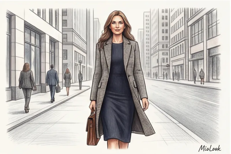
Last Friday, the CFO of a large IT company came to me for a wardrobe review. She complained that her ideas were often interrupted at board meetings, and that investors were looking over her head. When we opened her closet, I immediately understood the reason. It was filled with perfectly tailored jackets, but underneath them were blouses with loud, contrasting geometric patterns that literally blinded the eye. Her clothes screamed louder than her expertise. prints in business clothes — is an art on the border between neuroscience and classical protocol. If you want to delve deeper into the foundations of pattern creation, I recommend checking out our a complete guide to combining prints in clothing Here we'll examine the anatomy of a formal office pattern.
Psychology and Status: Why Prints in Business Attire Are Always a Risk and an Opportunity
As a certified colorist, I always tell my clients: the human brain is lazy. When we look at someone, our gaze scans the image, trying to determine their status in a split second. Solid colors are easy to read—the brain calms down and switches to the meaning of your words. But a complex, high-contrast pattern creates visual noise.
According to neuroaesthetics research (specifically, the 2024 WGSN consumer psychology reports), high-contrast patterns in the portrait zone are subconsciously perceived as aggression or frivolity. A client of mine, a corporate lawyer, once lost an important hearing simply because the judge kept being distracted by the black-and-white optical illusion of her blouse.
"A strict pattern should whisper about your status, not shout about your presence."
The main tool of the stylist here is "three-meter rule" Take three steps away from the mirror. If the pattern on your jacket merges into a single texture, creating a complex shade, it's ideal for a meeting room. If the pattern remains clearly visible and breaks up the silhouette, save it for smart casual on Friday.
The Architecture of Ornament: Woven Pattern vs. Cheap Printing
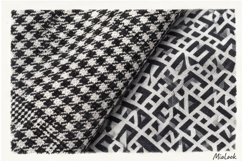
Do you know why a €50 mass-market jacket and a €400 premium blazer with the same houndstooth pattern look completely different? It's all about the fabric's architecture.
I always teach my clients to use the "blind touch" test. Close your eyes and run your hand over the fabric. A true, high-status business print (jacquard, tweed, wool flannel) always woven The pattern is created by interweaving multicolored threads. This gives the garment depth, a subtle melange, and that very "built-in luxury."
In contrast, pigment printing—where paint is simply applied over a smooth fabric (usually 100% polyester)—mercilessly cheapens the look. A printed check on a smooth fabric looks flat and artificial. For office wear, we always opt for structure: be it fine wool (120s and up) or heavy cotton, where the pattern is ingrained in the fabric's DNA.
Try MioLook for free
A smart AI stylist will select the perfect look based on your best colors and patterns.
Start for free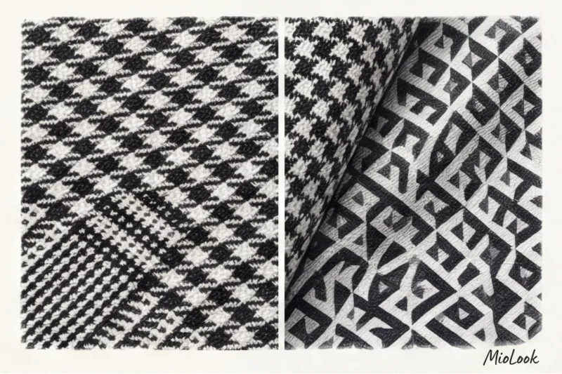
Classic Geometry: What Patterns Are Acceptable in Strict Business Formal?
In conservative spheres (banking, law, diplomacy), protocol rules have evolved over decades. There's no room for experimentation here, but there is room for impeccable taste. Only two types of ornamentation are permissible.
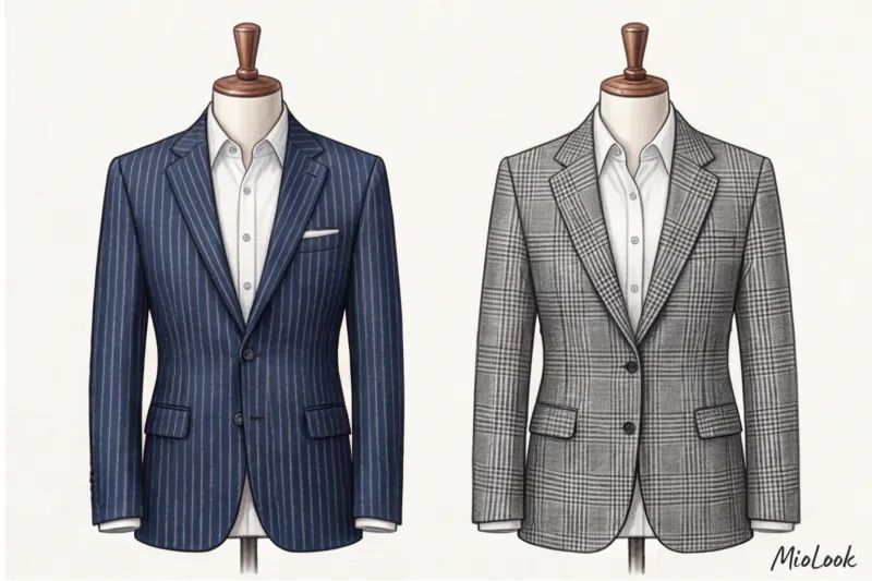
Pinstripe and Chalk stripe
Don't confuse them. Pinstripe — it's a very thin, thread-like strip, literally the width of a pinhead. It looks extremely austere. Chalk stripe (chalk stripe) is slightly wider and has slightly blurred edges, as if a line was drawn with tailor's chalk on flannel.
Have you noticed that not every stripe is slimming? It's a pure optical illusion: vertical lines only elongate the silhouette if the distance between them is narrow. If the stripes are spaced wider than 2-3 centimeters, the eye begins to move horizontally, visually widening the figure. The ideal base for this pattern is a navy or charcoal gray background.
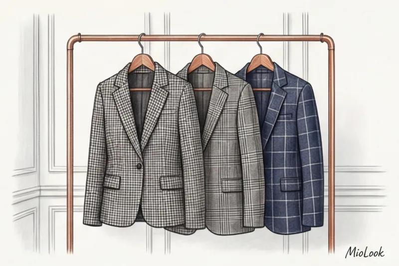
The Cage: From Prince of Wales to Glencheck
Glen check, or Prince of Wales check, is the absolute king of women's formal wear. It's a complex interplay of small and large stripes, creating a muted, sophisticated pattern. Another excellent option is micro pied-de-poule (houndstooth), which from a distance appears simply as an interesting gray texture.
When it does NOT work: Large, bright tartans or contrasting red and black lumberjack checks are a no-no in a formal office. Save them for relaxed weekends. Large-scale geometric patterns kill formality.
Dangerous Territory: Florals, Animals, and Polka Dots at Smart Casual
Here I want to dispel the main myth propagated by many outdated style guides. It's commonly believed that any flower in the office is a violation of corporate ethics. This is not true.
Floral patterns can and should be worn, but there are strict conditions. Avoid contrasting Hawaiian motifs and large buds. Your choice is low-contrast Microfloral prints (like classic archival Liberty of London patterns). Pairing a silk blouse (19mm or higher) with a small, muted blue-beige floral print under a crisp navy blue jacket will create a stunningly elegant yet professional look.
With polka dots, size is everything. A classic, small polka dot on a dark background is classic. But as soon as the diameter exceeds 1.5–2 centimeters, the "Minnie Mouse effect" kicks in. The larger the polka dot, the more comical and childish it becomes.
As for animal prints, we leave leopard-print dresses and zebra blouses outside the business center. However, a crocodile-print embossed item on a quality leather tote bag (in the €200–€400 range) or loafers is a sign of good taste and status that doesn't violate protocol.
Your perfect look starts here
Join thousands of users who look flawless every day with MioLook. Upload your items and let the AI create harmonious outfits.
Start for free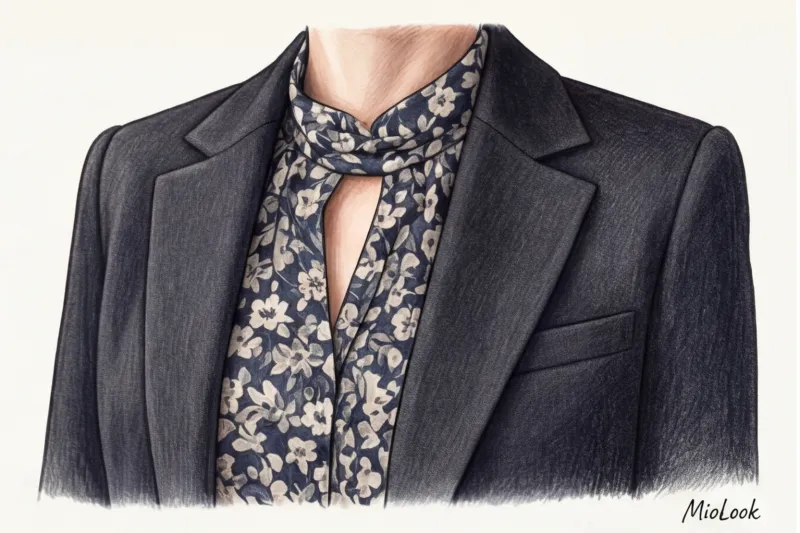
The Rule of Scale: How to Size a Print to Fit Your Proportions
How often have you seen a luxurious suit seemingly "eating" its owner? It's a conflict of scale. The size of the pattern should be proportionate to your natural features—your height and facial features.
For petite women (up to 160 cm tall), a giant windowpane check is not recommended. It will visually cut the figure into blocks and make the figure appear even shorter. Conversely, on a plus-size woman, a small, rippled flower print will create the illusion of an immense canvas, visually expanding the figure.
Don't forget about the contrast in your appearance. If you have a soft, muted coloring (for example, light brown hair and gray eyes), a contrasting black and white houndstooth will overwhelm your face, making it look washed out. Opt for medium-contrast combinations: dark gray with graphite, beige with chocolate.
Stylist Checklist: How to Incorporate Prints into Your Business Wardrobe Without Mistakes
To avoid stress when getting ready for work, use these four proven rules. These are the rules I use when creating capsules for top managers:
- Golden ratio 80/20: Your business wardrobe should consist of 80% perfect solid-color basics and only 20% printed pieces. This ensures maximum compatibility.
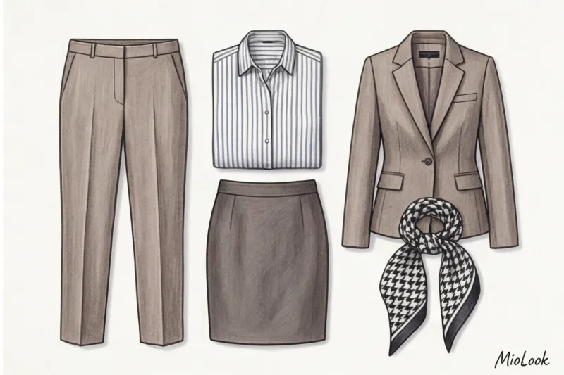
- One thing rule: A strict dress code allows only one bold pattern. A striped blouse and a plaid skirt are a great street style combination, but at a board meeting, it'll give your colleagues a migraine.
- Color hint: How to incorporate a complex printed blouse? Look closely at the pattern. Find the darkest or most neutral shade, and choose bottoms (pants or skirt) in exactly that color.
- The secret to layering: Print hidden under A solid-color jacket or cardigan always looks more formal and safer than a fully printed top layer.
Summary: Print as an impression management tool
Business attire is your first negotiator. Woven, structured, classic patterns are always a long-term investment in your personal brand. Printed, colorful polyester patterns risk looking cheap and unprofessional.
Treat patterns like spices: in the right doses, they add depth and impact to a look, but in excess, they ruin the whole dish. If you find it difficult to independently assess how harmoniously the items in your closet go together, digitize them using an app. MioLook This is a great way to visually see the ratio of base and prints in your personal 80/20 capsule.
Choose your patterns consciously and let them work for your authority.