It's a familiar situation: you're standing in front of the fitting room mirror, wearing an incredibly trendy dress from a new mass-market collection. On the hanger, the pattern seemed like a masterpiece, but on you, for some reason, it looks like you're wrapped in cheap sofa upholstery. Why does the same pattern convey luxury on the runway, but in real life, it's desperately forgiving?
After 12 years of working as a stylist and colorist, I've solved this mystery. It's not about your body shape or even the pattern itself. The problem lies in the fabric architecture and contrast. Today, we'll explore fashionable prints 2024 years not as a collection of glossy pictures, but as a complex tool that requires skill to manage. We've already discussed the basic principles of combination in more detail in our a complete guide to combining prints in clothing , and in this article we'll focus on the hottest catwalk trends and how they're being adapted for real life.
Fashionable prints 2024: why runway trends often look cheap in real life
According to Lyst analytics (2024), interest in bold patterns has grown by 42% compared to the minimalist era of previous years. But here's a stark statistic from my personal experience: 8 out of 10 clients show me items with pigment prints on thin polyester during their initial wardrobe review. And they complain that they're unwearable in the summer.
Why does this happen? Mass-market fabrics (in the €30–€50 segment) often cut corners on production. Instead of weaving a pattern into the fabric's structure (as is done in jacquard), factories simply "print" the design onto cheap synthetics.
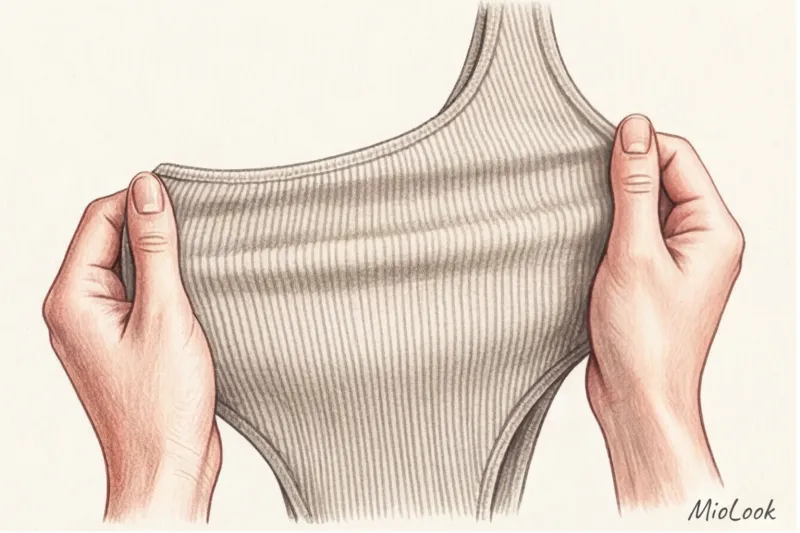
I always teach my clients the "blind touch" rule. Close your eyes and rub the printed fabric between your fingers. Then, stretch it slightly. If you feel a rubbery film under your fingers, and if the print develops micro-cracks when stretched, revealing a white base, return the item to the hanger. This is cheap pigment printing. It creates a "greenhouse effect," preventing the leather from breathing, and will lose its appearance after the third wash.
"The true luxury of a print lies in its birth with the fabric, not its application after the fact"—this is the rule that distinguishes luxury from fast fashion. Look for pieces where the pattern is woven into the threads (jacquard, tapestry, complex knits).
Try MioLook for free
A smart AI stylist will select the perfect look based on your prints and color type.
Start for freeAnimalism with Intelligence: A New Interpretation of the Leopard and the Snake
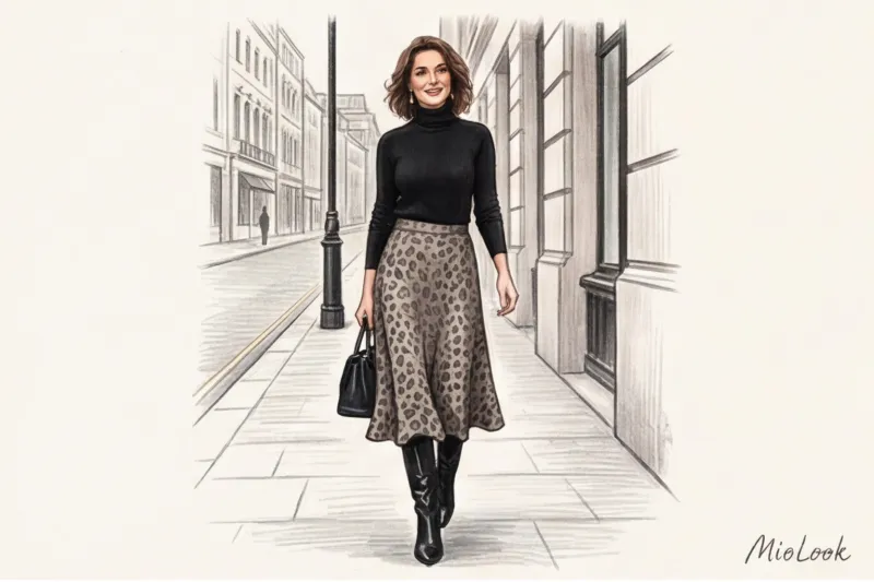
"Leopard is vulgar." Ever heard that? Forget it. The Fall/Winter 2024/2025 runway collections from Bottega Veneta and Saint Laurent proved otherwise: animal print has finally become a staple neutral. But there's a catch.
To make leopard print look smart rather than garish, tone down its color contrast. Flashy orange and black spots are a thing of the past. Muted, gray-beige, caramel, and monochrome versions of this pattern are in fashion today.
The main rules for working with animalistics today:
- One thing rule. A total leopard look only works on the runway or at a themed party. In real life, especially in an office with a relaxed dress code, it's inappropriate. Stick to one accent: a midi skirt, shoes, or a bag.
- Snake print is the new beige. The cool grey-green python pattern is a great substitute for boring black shoes in your basic wardrobe.
- Texture decides everything. A woven leopard print on thick cotton (180 g/m² and above) or tapestry fabric looks classy. The same pattern on a thin, shiny satin instantly cheapens the look.
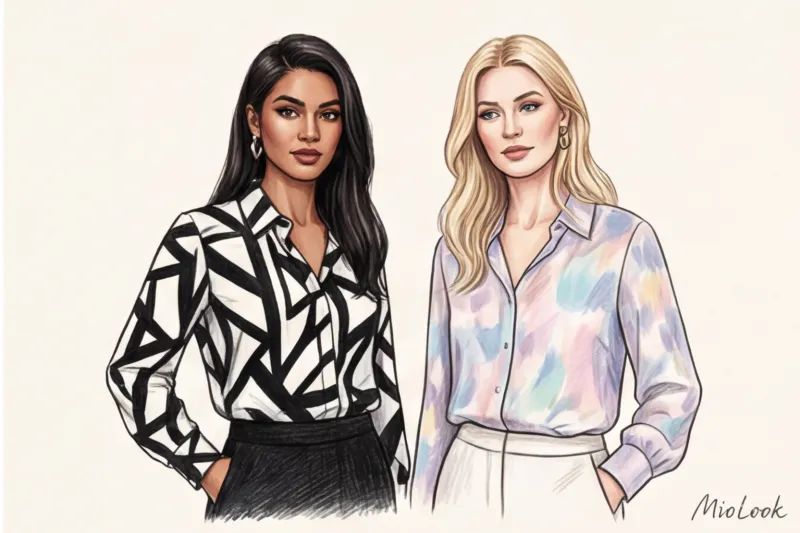
Geometry and Architecture: From Optical Illusions to Classicism
If you want to collect the perfect capsule wardrobe Geometry is your best investment. But geometry comes in different forms.
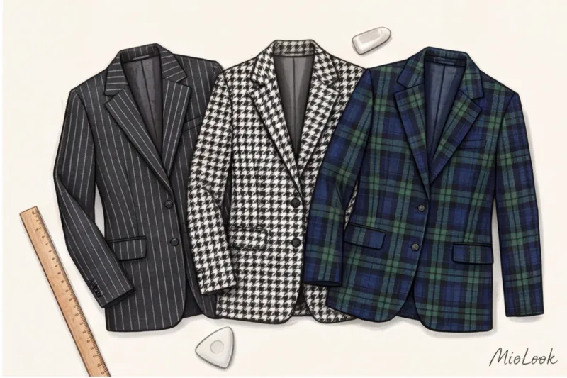
This year, two contrasting trends have emerged. On one hand, wide contrast stripes (awning stripes), perfect for heavy, oversized shirts. On the other, subtle, subtle pinstripe, ideal for business suits.
Now let's debunk the most persistent myth in styling: "Horizontal stripes make you look fat" In fact, science claims the opposite. Back in 1867, physicist Hermann von Helmholtz discovered an optical illusion that modern stylists still use today. A horizontal stripe up to 2 centimeters wide visually lengthens and slims the silhouette , since the eye perceives frequent lines as a single vertical line. Only a sparse, wide (over 5 cm) horizontal contrasting stripe can make you look fat.
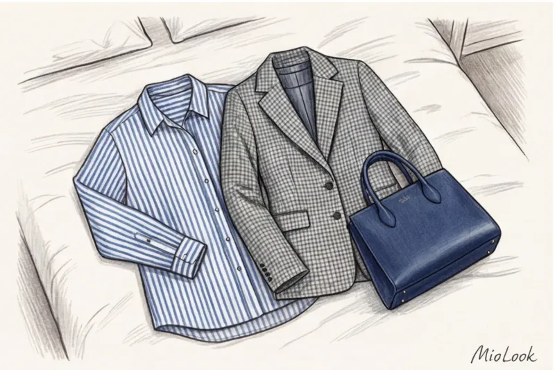
Plaid and tweed: an investment that never goes out of style
If you have a budget (say, €150 to €300) for a single quality jacket, choose a complex check pattern. Houndstooth (pied de poule) or classic tartan are examples of ideal woven patterns. An intricate weave of multicolored threads always looks more expensive than any printed pattern. This is the basis. old mani style , which is based on the quality of materials.
Botany at a New Level: Forgetting the "Grandma's" Flower
As a stylist, I often see the same mistake in the spring. Girls pull dresses with small, densely packed floral prints (called millefleurs) out of their closets, believing they'll add a touch of romance. The harsh truth is: 90% of the time, a small, chintz floral print on a mature woman looks childish, dulls the look, and, paradoxically, adds age.
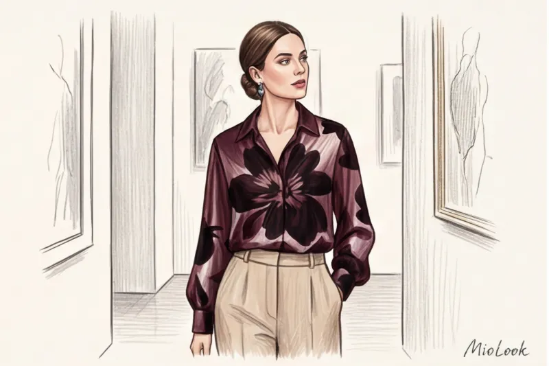
The real trend for 2024, set by Prada and Loewe, is large, abstract, almost blurred florals. Enormous single buds with a shadow effect. Dark romance – flowers on a deep burgundy, emerald, or black background. Or even better – 3D floral appliqués that extend beyond the plane of the fabric.
I once changed a client's outfit from her favorite daisy-print dress to a silk blouse with a single, gigantic, abstract, wine-colored flower. The effect was stunning: her face instantly gained sculptural definition, and her look became luxurious and cohesive.
Your perfect look starts here
Join thousands of users who look flawless every day with MioLook.
Start for freeWatercolor and ombre (gradient): the most prestigious trend of the year
For those afraid of harsh graphics, designers have prepared the perfect solution: an ombre effect (smooth gradient) and blurred watercolor transitions.
Why does it work? According to Johannes Itten's color theory, the human eye perceives smooth transitions of shades as the natural play of light and shadow in nature. This evokes a subconscious feeling of calm and luxury. Unlike a sharp color block, a gradient doesn't cut into the figure.
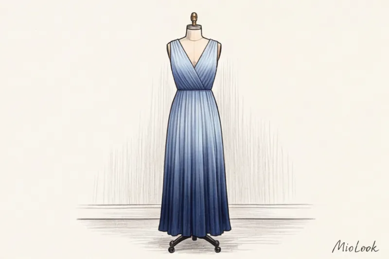
Watercolor prints look especially elegant on flowing fabrics like natural silk, chiffon, and viscose. Check out this "grown-up" version of tie-dye: without the psychedelic spirals of the '70s (although 70s style is now also being rethought), but in the form of soft, as if sun-faded spots in pastel colors.
Stylist's Guide: How to Choose Trendy 2024 Prints to Match Your Color Type
Even the most luxurious print will kill your look if it doesn't match your natural contrast. Knowing your color type - this is the foundation.
The main rule of harmony: The contrast of the pattern should match the contrast of your face.
- For the Winter and Spring color types (high contrast): You're shown clear graphics, contrasting polka dots, vibrant color blocking, and black-and-white geometric patterns. The design should have clear boundaries.
- For the "Summer" and "Autumn" color types (soft colors): High-contrast black and white stripes or zebra prints will "eat up" your face—people will see the dress, not you. Your options: watercolor, complex multi-layered checks with close-knit shades (for example, olive and mustard), and gradients. If you really want to wear trendy geometric patterns, choose combinations of off-white and graphite instead of crisp white and black.
Don't forget about scale. If you have large, expressive features and are tall, small polka dots will look like dust on you. Conversely, for a petite woman (up to 160 cm), large macro flowers will visually "pin" you down.
Checklist: 5 Golden Rules for Mixing Prints in One Look
Pattern mixing is the ultimate styling technique. But if you follow strict formulas, anyone can do it.
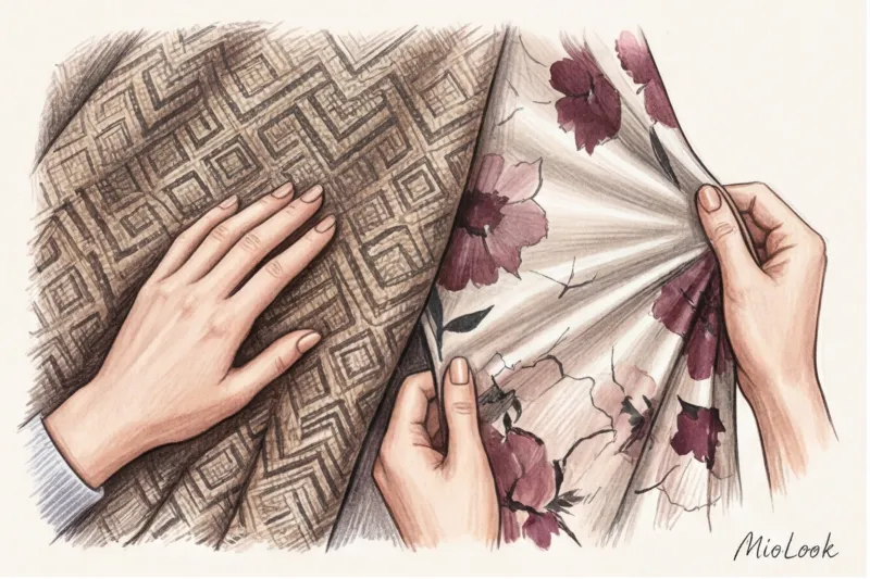
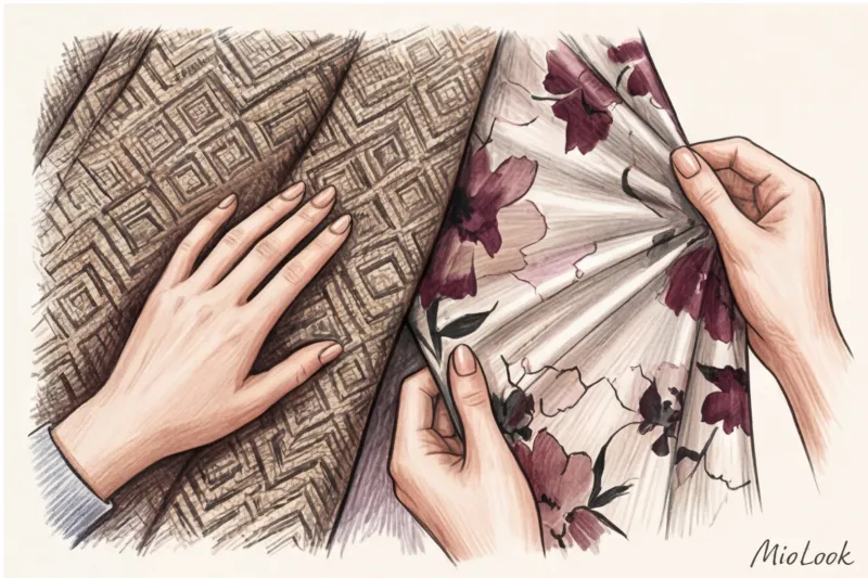
- Single color rule. This is the safest formula. Take two completely different patterns (for example, checkered and floral), but they must share at least one color. Red checkered + red florals = harmony.
- Rule of scale. Never combine two prints of the same size—they'll clash for attention. Always combine a large pattern with a small one (wide stripes and small polka dots).
- Geometry + Romance. A crisp stripe or check pattern is the perfect counterpoint to the frivolity of a floral pattern.
- Animalistic + Neutral base. Use leopard or zebra as an accent, framing it with solid, chunky pieces like black cashmere or heavy denim.
- Using "neutral prints". Thin stripes, subtle pied-de-poule checks, or micro polka dots blend into a single color from a distance. They can be used as a backdrop for a more vibrant, larger pattern.
Conclusion: How to Invest in Patterns Wisely
Fashionable prints change every season: today everyone's wearing leopard, tomorrow it's macro polka dots. But the laws of visual proportion and quality remain immutable. Invest in the architecture of the fabric, not in a flat image.
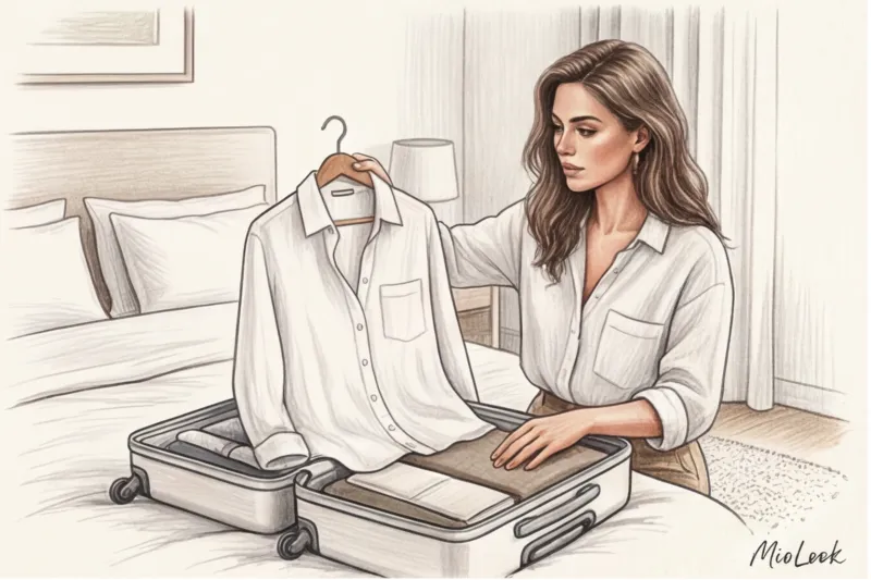
Take stock of your closet today. Remove all printed items and check them against the "blind touch" rule. Keep only those patterns that match your contrast level and are the right size. And to avoid racking your brain over combinations in the morning, digitize your best finds in a wardrobe app.
Ready to get started?
Try the MioLook free plan—no commitments. Save, combine, and create looks in one click.
Start for free