Why does a capsule collection without prints and textures look boring and flat?
Take a look in your closet right now. How many completely smooth, matte, monochromatic items are there? I bet they take up the lion's share of the hangers. In my 12 years as a stylist and colorist, I've noticed a disturbing trend: in pursuit of so-called "versatility," women are reducing their wardrobes to a set of bland basics. The question is, How to combine prints in clothing , consistently causes panic in most clients, and they, giving in, choose the path of least resistance.
But let's be honest. True minimalism—in the spirit of iconic brands like The Row or Jil Sander—is built on impeccable, complex, architectural cuts and premium materials. What we often find in mass-market clothing—smooth cotton, basic viscose, and polyester—isn't minimalism, it's simply a lack of imagination. Solid-color pieces with similar textures inevitably blur into a single, flat blob. Your look lacks rhythm; there's simply nothing to catch the eye.
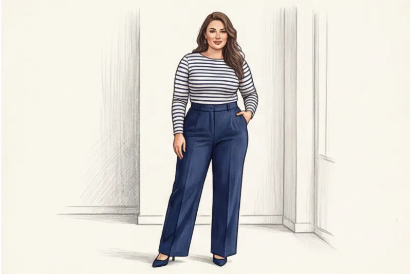
There's a pernicious stereotype that a basic capsule wardrobe must consist exclusively of beige, black, gray, and white. This is a major color myth that's time to get rid of! Basics are about simplicity of cut and compatibility, not color. Your personal basics could be deep burgundy, emerald, textured terracotta, or even navy blue with a fine chalk stripe.
I had a particularly revealing experience with my client, Anna, a top manager at an IT company. We put together a "basic capsule" outfit for her, perfectly crafted in terms of color and cut. Everything fit perfectly, but in the mirror, every look looked like a strict corporate uniform—correct, but painfully boring. The magic only happened when we swapped the sleek gray jacket for a voluminous, textured tweed, and the matte black skirt for a micro-houndstooth print. The silhouette remained the same, but the look suddenly took on a new vibe and character.
The secret lies in the physics of light. Texture is the absolute salvation of any, even the simplest, monochrome look. Consider how light reflects differently off surfaces: smooth silk shimmers, creating a wet, fluid effect, dense wool absorbs light, casting color into a soft depth, and matte leather creates a harsh, graphic shadow. Combine these three materials in a single black or beige color, and you'll create a look with incredible visual dynamism.
The Illusion of a "Safe" Wardrobe: Where We're Going Wrong
The main reason we avoid patterns is the fear of looking awkward. We choose the "safe" smooth beige simply because we don't understand the mechanics of visual weight and are afraid of overloading the look. However, this stylistic safety is extremely deceptive.
A lack of visual accents dramatically diminishes the status quo of your look. The fact is that smooth, basic fabrics in the budget and mid-price range (ranging from €50 to €150) often look cheaper than their textured counterparts. If you buy a blazer from a mass-market retailer, its smooth suiting fabric will immediately reveal the slightest creases, imperfect stitching, and the origin of the fiber. Meanwhile, dense bouclé, ribbed, corduroy, or jacquard fabrics for the same €100 will masterfully conceal manufacturing flaws. They appear visually more sophisticated and richer.
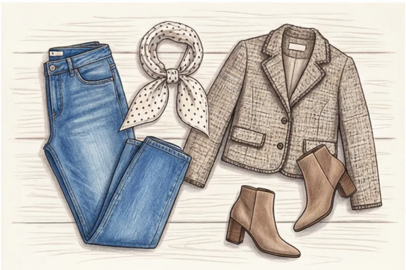
To start incorporating textures, you don't necessarily need to buy a complex cut right away. Often, the right accessories are enough. For example, we've already discussed How to wear a scarf with a down jacket: it is the voluminous, loose knit of the scarf that becomes that saving contrasting accent against the background of the smooth raincoat fabric, breaking up the boring surface of the outerwear.
If you're unsure whether a new printed or textured item will fit into your "quiet" capsule wardrobe, don't rely on your intuition in the fitting room. I always advise my clients to digitize their closets. After uploading your database to MioLook , you can virtually apply any complex texture to your everyday items right in the app and see how the combination works before you buy.
Basics: How to Combine Prints in Clothes Without Looking Like a Parrot
As someone with an academic background in art and design, I always encourage my clients to view the wardrobe styling process as if it were painting a picture. When you ask me, How to combine prints in clothing without mistakes, I ask you to mentally imagine a blank canvas in front of you.
Any pattern on fabric is made up of brushstrokes of varying thickness, shape, and intensity. They require vital contrast. If you paint the entire canvas with equally active, chaotic spots, the viewer's eye will instantly become tired. It is this overabundance of visual information and lack of focus that creates the undesirable "parrot" effect.
Here comes the stage theory of visual weight and rhythm Visual weight determines how strongly a pattern draws the eye. A large, high-contrast pattern (such as a black and white zebra or a geometric color block) "weighs" much more than a small pastel flower. Rhythm, on the other hand, is the trajectory along which the eye glides across your silhouette. For an outfit to look prestigious and well-thought-out, patterns should create a harmonious melody, smoothly directing the eye rather than competing for volume. Take a look at the shows of Dries Van Noten, a renowned Belgian pattern master. His collections are always built on a strict rhythm of alternating "heavy" and "light" elements.
Let's move from theory to foolproof practical formulas. There are basic pairings that always work, regardless of your budget—whether it's a statement skirt from Zara for €40 or a premium silk blouse:
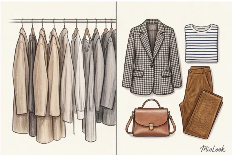
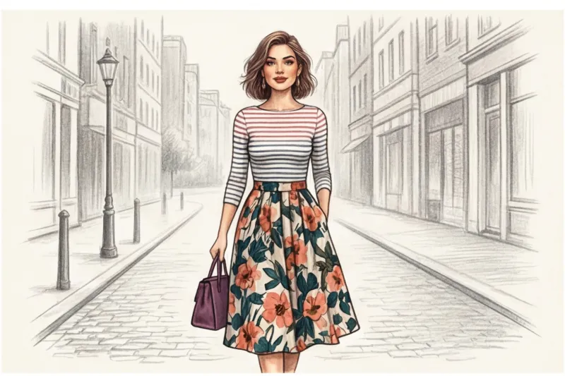
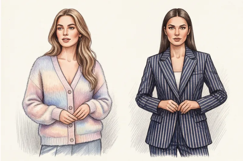
- Geometry + floristry. The strictness of straight lines perfectly calms the romanticism and excess of colors. My favorite technique for business casual: a structured jacket with a thin chalk stripe ( pinstripe ) and a flowing midi skirt with a delicate floral motif. Masculine and feminine, structure and fluidity—this contrast of meanings gives the look an intellectual quality.
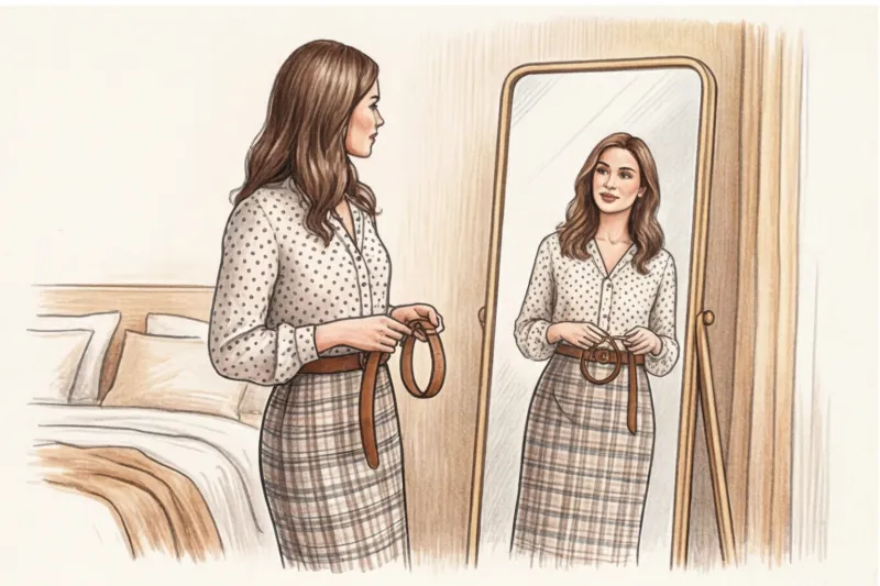
- Stripe + polka dot. A classic Parisian story built on a geometric paradox. A graphic Breton striped shirt provides a reliable anchor for the playful, round polka dots on palazzo trousers or a silk scarf.
Rule of scale: micro and macro
If you're willing to incorporate just one technique from this article into your personal style, let it be the law of scale. Never combine two prints of the same size in one outfit.
What happens if you wear a medium-sized floral blouse and a medium-sized checkered skirt? A brutal visual clash ensues. It's a true optical illusion that will literally make everyone's eyes water. The brain simply doesn't know what to focus on and begins to perceive the image as nothing but informational noise.
The secret lies in the proper distribution of roles. In any printed duet, one design must be dominant ( macro ), and the second one is background, supporting ( micro ).
"If your tweed jacket makes a loud statement with its large houndstooth pattern, the shirt underneath should whisper tactfully with the finest stripes or micro polka dots."
For example, a large architectural pattern on statement trousers requires air and support in the form of a top with a subtle, almost seamless, thin ribbed stripe. From a distance of two or three meters, a micro-print is generally perceived by the eye as an interesting, textured solid color. It is precisely this physical property of our vision that allows the macro-print to safely stand out without becoming messy or overloaded.
Not sure if your items go together?
Try MioLook for free: A smart AI stylist will analyze your wardrobe and select the perfect print combinations for every day.
Start for freeThe Unifying Color Rule: Color "Glue"
I'm often asked during consultations: how to combine seemingly polar opposite pieces from different styles? Say, a bold tartan and a relaxed boho floral pattern? Designers use the "color glue" rule to solve such ambitious problems.
Two different prints should share at least one common shade. This is the visual bridge that will make our brain perceive things as a well-thought-out, complete ensemble, rather than a random assortment of clothes thrown on in the dark.
Let's say you have a fall jacket with a complex check pattern, where dark blue, emerald, and deep burgundy intersect. A perfect pairing would be a blouse with an abstract pattern, the elements of which exactly echo the burgundy or dark blue hue. The temperature and saturation are important: if the burgundy check is muted and matte, avoid pairing it with a blouse featuring neon red or crimson flowers.
A neutral background ("negative space") plays an equally important role in printed pieces. If the pattern's base is off-white, cool beige, graphite, or navy blue, the chances of successfully incorporating it into a capsule collection increase exponentially. I often recommend that clients digitalize their basic pieces using Smart wardrobe features in the MioLook app When you see the actual palette of your capsule collection on your smartphone screen, finding that "common denominator" for new printed purchases becomes a matter of a couple of swipes. This protects you from impulsive spending and ensures that the new item fits perfectly into your current looks.
Texture as an Invisible Print: Adding Depth
Do you know why Chanel's all-black look never looks boring? The secret lies not in the complex cut, but in the simple physics of light. Color is just reflected light, and that, How the surface of the fabric reflects or absorbs it, completely changing the visual perception of the item.
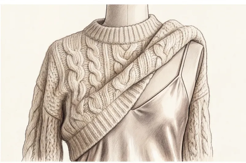
In the professional environment of image makers we use the term tactile print This is the textured surface of a fabric: the rhythmic ribbing of corduroy, the distinctive knots of bouclé, the complex multi-layered weave of jacquard, or the voluminous ornateness of lace. Based on the basic laws of chiaroscuro, any textured fabric creates thousands of micro-shadows. These tiny differences in light act as a pattern in themselves, complicating even the most basic cut. You can wear a simple sweater, but if it's knitted from fluffy alpaca, the play of light and shadow has already created a complex gradient.
An interesting paradox: texture is far more forgiving of stylistic mistakes than a classic color pattern. If you're just learning how to combine prints in clothing and are worried about misplacing florals or geometric patterns, start with textures. Tactile prints are completely safe: they don't have sharp, contrasting edges, don't clash with the natural contrast of the face, and don't distort the figure's proportions with optical illusions.
This tool is especially effective when mixing textures within a single color to create a monochrome look. According to the Pantone Color Institute, monochrome remains one of the most enduring commercial trends. But to prevent an outfit in a single graphite or caramel shade from becoming a dull, flat "uniform," textural dissonance is essential. Imagine an all-white look: a sleek basic T-shirt with white jeans—it's simple, but bland. Swap the T-shirt for a voluminous merino cardigan, add an embossed leather bag—and the outfit instantly moves into the premium category, visually increasing its value, even if the actual price is in the budget segment of €80–€120.
The main rule when working with monochrome: the smaller the difference in color, the more radical the difference in texture should be.
Smooth and textured: the law of contrasting textures
The secret to the perfect textured mix lies in finding absolute opposites. Our brains love contrasts; they instantly detect differences in surfaces, and it's this dissonance that makes the look "delicious." Remember two basic formulas that work flawlessly:
- Matte vs. Shiny. This is a favorite technique among stylists for creating multifaceted looks. Combine flowing, shiny silk with a matte, chunky knit. Another surefire option is a combination of smooth, polished leather with soft, light-absorbing suede. The shiny fabric will act as a reflective accent, while the matte fabric will act as a calming, refined backdrop.
- Hard vs. Flying. Play with the differences in weight and density of materials. Try pairing stiff, shapely denim with translucent, weightless chiffon. The roughness of one fabric brilliantly highlights the fragility and lightness of the other.
By the way, when digitizing a wardrobe in MioLook app I strongly recommend noting not only the season and color, but also the material. This will make it much easier for the smart wardrobe algorithm to generate stylish outfits for you based on the right balance of tactile contrasts.
Integrating prints into a basic capsule wardrobe
At the advanced training courses at Istituto Marangoni, lecturers often repeat one harsh but true thought: pattern doesn't exist separately from the person. Choosing your ideal basic print shouldn't start with trend reports, but with an objective look in the mirror.
There is a key concept in imageology - linearity of appearance. This is the geometric code of your face. Stand in front of a mirror in daylight and assess your features. If you have pronounced, sculpted cheekbones, a straight nose, a well-defined jawline, and defined eyebrows, your appearance is built on strong lines. Strong geometric prints are ideal for you: classic plaid, argyle, chopped stripes, and graphic houndstooth. They will seamlessly extend the architecture of your face.
Conversely, if your features are dominated by smooth curves (full lips, rounded cheeks, a soft jawline, and slightly curly hair), your linearity is soft. On this type of face, rigid geometry looks alien and harsh. Your basic patterns should be watercolor florals, soft paisley, polka dots, and soft abstracts.
The right print works like high-quality contouring—it accentuates the natural geometry of the face. If you put a chopped plaid on a girl with exceptionally soft, "romantic" features, it will create a visual dissonance: the print will "wear" her, not she.
60/30/10 formula for a printed capsule
Let's move from theory to pure mathematics. If you are faced with the task of understanding, How to combine prints in clothing To avoid turning your closet into a chaotic theater wardrobe, use the 60/30/10 architectural rule. This is the algorithm I implement in my clients' wardrobes to achieve the perfect balance.
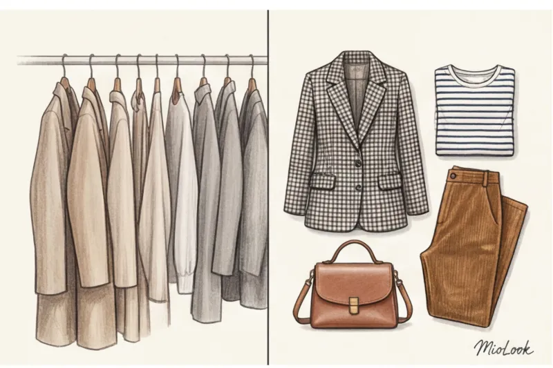
Let's create a specific layout for a standard work capsule of 20 items (excluding bags, shoes, and outerwear). Here's how the visual load should be distributed:
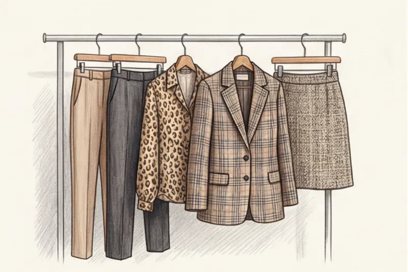
- 60% (12 items) - smooth, single-color base. This is your foundation. High-quality fine wool trousers, basic cashmere turtlenecks, and cotton poplin shirts. They give your eyes a rest and serve as a backdrop. It's worth investing in these items: a good basic in the European segment will cost between €100 and €300 per item, and it should be impeccable.
- 30% (6 items) - textures and micro-prints (background). These are pieces that appear monochromatic from a distance but reveal their complexity up close. These include tweed jackets, corduroy trousers, and blouses with micro-ribbed or micro-polka dots.
- 10% (2 items) — statement prints. Accentuated, large, bold macro prints. For example, a silk midi skirt with large buds or a cardigan with a massive geometric block. These are the very statement pieces that make the capsule collection unique.
This mathematical proportion completely eliminates the risk of overloading the look. With 12 calm background pieces, you can easily incorporate either of your two macro prints into the outfit.
Smart wardrobe analytics
Digitize your items in MioLook, and the app will automatically calculate the percentage ratio of base, textures, and prints using the 60/30/10 formula.
Try MioLook for freePrints that work as a "solid color"
There is a term in the slang of professional buyers false plains (false monochromatic). These patterns are so small, classical, and rhythmic that the human brain perceives them not as a design, but as a neutral textured surface.
If you're tired of your base consisting entirely of black, gray, or beige, swap out some of these pieces for a faux solid. Here's a fabulous quartet of patterns that pair with any other color or pattern:
- Small Vichy check (Gingham): Perfect for a summer capsule collection, the black and white vichy print on a cotton shirt replaces the usual white one, but makes the portrait section much more expressive.
- Pinstripe: Chalk stripes on suiting are an absolute must-have. Gray trousers with a thin white stripe (quality merino wool models start at €120) look more dynamic than plain gray ones, but retain all the versatility of those trousers.
- Micro houndstooth: This is a perfect example of when classics save your fall wardrobe. A jacket with this pattern will easily pair even with a floral skirt, as long as they have a unifying hue.
- Classic Leopard: Yes, you read that right. Leopard print, in its natural, muted sandy-brown tones, has long since become a staple. A silk leopard midi skirt paired with a chunky, chunky knit sweater works just as well as a beige one, but adds a touch of boldness and class to the look.
Myths and stereotypes about prints that are time to be forgotten
For decades, glossy magazines have instilled in us a set of strict stylistic restrictions that today seem downright archaic. Perhaps the most persistent of these is the rule "no more than three colors or prints in a single look." I still hear this postulate from women who come to my color analysis sessions.
Let's be honest: the rule of three was invented to simplify the work of department store merchandisers, not to create a profound personal style. If you look at the collections of Dries Van Noten or Etro, you'll see a delicate clash of four or even five patterns in a single ensemble. The secret to their success lies not in the mathematical calculation of patterns, but in a unified temperature tone and the correct balance of space. For example, a basic shirt with a thin blue stripe can easily be worn under a gray houndstooth jacket, adorned with a paisley scarf, and carried with a crocodile-patterned bag. This mix will not fall apart because the prints are of varying scale and do not compete for your attention.
Another common misconception is the belief that a strict business dress code abhors patterns. When I consult with clients in financial consulting or the legal field, their work wardrobe often resembles a uniform: all sleek blue, gray, and black. But formal styles embrace geometric patterns beautifully.
If you're faced with the challenge of combining prints in boardroom attire without losing the classy feel, consider using patterns borrowed from classic men's wardrobes. Foulard prints or micro-argyle patterns are ideal. By integrating such elements into a formal style, we tone down the rigidity while conveying a sense of sophistication. To see how a patterned blouse will fit into your work wardrobe, upload a photo of it to MioLook — the app's algorithms will help you instantly estimate how this item will look with your formal suits.
Fairy tale: "Horizontal stripes make you look fat"
This is perhaps the most pernicious fashion myth, one that has led millions of women to abandon their gorgeous foundation. In fact, science proved the opposite back in the 19th century. In 1867, German physiologist Hermann von Helmholtz published a fundamental study on optical illusions. He drew two identical squares: one filled with horizontal lines, the other with vertical ones. The scientist clearly demonstrated that the human eye perceives the square with horizontal shading as taller and narrower!
The Helmholtz illusion works flawlessly in styling. When I suggest that plus-size clients try on a classic Breton stripe (where the light stripe is wider than the dark, and the rhythm is quite frequent), they can't believe their reflection in the mirror. The dense horizontal stripes force the observer's gaze to continuously move upward, creating a visual "column" effect. Meanwhile, the popular method of "hiding weight" in an oversized black sweater has the opposite effect: the black color completely absorbs light, kills shadows, and transforms the figure into a monolithic, featureless mass. Of course, there is one true exception: if the horizontal stripe is palm-width wide and in bold, contrasting colors, it will actually widen the silhouette. But the classic "French" stripe always elongates the figure.
Fairy tale: "A leopard is vulgar"
It's surprising how one of the most aristocratic prints of the last century acquired a reputation as a "cheap" accent. Animal print became associated with vulgarity solely due to the low quality of synthetic fabrics in the mass-market segment of the 2000s. But let's turn to the archives of high fashion.
In 1947, Christian Dior presented his revolutionary New Look collection, and it was there that leopard print established itself as a symbol of absolute elegance. The couturier's primary inspiration was his muse, the refined Mitsa Bricard. Dior's leopard print adorned not extreme minis, but luxurious coats and flowing chiffon dresses.
To tone down a leopard print in a modern capsule wardrobe and de-emphasize its aggressiveness, focus exclusively on refined matte textures and loose fits. Leopard categorically dislikes shiny polyester and tight-fitting garments. Swap a tight printed turtleneck for a flowing midi skirt in matte, thick silk (decent basic options can be found at European brands for €120–€180) and pair it with a chunky, chunky knit sweater. The rough, cozy texture of the wool will instantly downplay the pretentiousness of the animal print, transforming the look into the epitome of relaxed Parisian chic.
Image aspect: how prints and textures control impressions
Have you ever wondered why we instinctively wear a sharp pinstripe suit for complex financial negotiations, but opt for a soft cashmere cardigan for an informal team meeting? It's not just a nod to tradition, but pure neurophysiology. Our brain reads lines, shapes, and the density of materials in milliseconds, forming an assessment of the person we're talking to. The psychology of perception is this: clothing speaks for us before we even open our mouths. Understanding that... How to combine prints in clothing and mixing textures is not only about aesthetics, but also about consciously managing other people's attention.
Let's explore the semantics of patterns. Any geometric pattern (checkered, striped, diamond-shaped) consists of straight, continuous lines. Such ideal forms are virtually nonexistent in nature; they are man-made, and therefore subconsciously convey structure, ironclad logic, and reliability. If my client is preparing to defend her budget or present before the board of directors, we always integrate a graphic print into the look. It literally conveys a nonverbal message to the audience: "Everything is under control, the system works, you can trust me with the numbers."
On the other hand, flowing lines—floral prints, paisley, abstract watercolor patterns, or even classic polka dots—are free of rigid boundaries. They are organic and natural. Such patterns convey empathy, creativity, and flexible thinking. They are an ideal tool for HR directors, psychologists, or managers who need to conduct complex, developmental conversations with employees without provoking an aggressive, defensive reaction.
Working with textures in a business environment deserves special attention. In my corporate styling practice, there's an unspoken rule for experts and top managers: fabric density is directly proportional to the level of authority conveyed. Rigid, shape-resistant materials (heavy wool suiting, starched cotton poplin, smooth leather) act as visual armor. They establish personal boundaries and emphasize status. If you're facing tough negotiations, choose fabrics that confidently "hold the frame." An investment in such a structured suit (basic, high-quality wool-blend models start at €250-€400) pays for itself with the first successful deal.
But soft, draping fabrics (silk, fine merino, viscose) have exactly the opposite effect. Our brain mirrors the tactile properties of the fabric onto a person's character. Supple materials flow over the body, visually soften the silhouette, and make you more approachable. Using such textures is the best way to inspire trust, win over your opponent, and demonstrate a willingness to compromise. By building a functional capsule in MioLook app I often advise my clients to use a tagging system: labeling items not only by season but also by "firmness level." This allows you to assemble an outfit in just a few seconds that will work toward a specific career goal today.
Your ideal image
it begins Here
Join thousands of users who look flawless every day with MioLook.
Start for freeChecklist: How to Pre-Wear Your Printed Look Before You Go Out
My final step in working on any complex outfit is a systematic audit in front of the mirror. You're standing there five minutes before you go out, and your inner voice is wondering: is it too colorful? To avoid panicking and changing into your usual safe sweater, let's go through the checklist. These four steps will help you understand... How to combine prints in clothing and accurately determine whether a stylistic experiment has been successful.
Step 1: Assess the scale (is there a difference in size?)
Look at the space occupied by the patterns. If you wear a blouse with giant polka dots (in macro mode) and trousers with equally wide, bold stripes, the viewer's mind will literally explode from the visual noise. Proper rhythm requires hierarchy. One print should always take a back seat: if the skirt makes a statement with large geometric prints, let the top complement the look with a delicate micro-floral.
Step 2: Find the "glue" (does any of the shades match?)
Answer the question: what do the top and bottom have in common? The patterns can be completely different—for example, a leopard-print skirt and an argyle sweater. But if the predatory pattern has a warm caramel undertone, and the same caramel color is present in the knit diamonds—bingo! This overall hue will act as color glue, bringing disparate elements together into a cohesive, well-thought-out ensemble.
Step 3: Check the contrast of textures (is there a play of light and shadow?)
Even perfectly coordinated prints can look flat if they're printed on identical fabrics. Run your hand over the garment. Is there a difference in temperature and texture? If you pair a silk paisley scarf (smooth and shiny) with a Vichy check jacket made of heavy cotton (matte and dry), you've created the desired optical depth.
"If your look feels overloaded, don't rush to remove the printed item. Try simply swapping out one of the textures for a more subdued, matte one." This technique often helps my clients during wardrobe reviews.
Step 4: My personal life hack – the “squint rule” and a black and white filter
As a colorist, I always use one foolproof trick for checking contrast. Take a few steps away from the mirror and squint hard. Does the image blur into a single mess, or do the pieces retain their structure? If squinting is difficult, pull out your smartphone: take a photo of your outfit and apply a regular black-and-white filter. If two prints in a monochrome photo merge into a solid dark or light spot, they are severely lacking tonal contrast. In this case, the look needs to be broken up with a solid color element.
Successful combinations that pass this rigorous test are not worth keeping in mind. I always recommend photographing them and uploading them to the "smart wardrobe" feature in MioLook This way, you'll create a personal library of ready-made solutions, where every complex print mix has already been verified, tested, and awaits its release.
Summary: Your New Stylish Handwriting
When I first started working with clients, I often came to them with the same idea: "The simpler and more monochromatic the items, the easier they are to combine." This is a huge stylistic misconception. In fact, a capsule collection of thirty perfectly plain basics will give you dozens of outfits... all of which will look depressingly similar. There's simply nothing to catch the eye.
Many people intuitively avoid patterns, considering them an uncontrollable factor of chaos. But once you understand, How to combine prints in clothing By relying on the rules of scale and color "glue," they transform from a problem into your most powerful weapon of expression. Prints and complex textures aren't a wardrobe complication, but a mathematically precise tool for expanding it. By replacing just one sleek black skirt with a dense jacquard or adding a delicate houndstooth blouse, you triple the number of unique looks.
"The secret to truly luxurious minimalism lies not in the absence of detail, but in its tactile complexity. The smooth base is a blank canvas, and the texture and print are your signature on the painting."
If you're feeling inspired after reading this article but still dreading putting together complex outfits, I urge you to start small. Don't rush out and buy a leopard-print coat or a giant polka-dot suit tomorrow. Focus on accessories and micro-accents. Pair your usual cashmere sweater and blue jeans with a textured silk scarf with a geometric pattern. You can find a great basic option even in premium mass-market lines like COS or Massimo Dutti for €40-€60—and this tiny detail will instantly add complexity to your outfit. Or invest in suede pumps with an animal print—they'll elegantly elevate any bland office outfit.
To avoid the process of introducing new patterns from turning into morning panic in front of the mirror and a mountain of clothes thrown onto the bed, convert your styling to a digital format. This is a proven life hack that saves my clients up to five hours a month.
Digitizing your wardrobe isn't just about creating a catalog; it's your own safe laboratory. Take photos of your items in good daylight (so the camera captures the ribbing of corduroy, the grain of leather, or the glossy sheen of satin) and upload them to MioLook app The smart wardrobe feature lets you create outfits with prints, check texture contrasts, and apply the aforementioned "squint rule" right on your smartphone screen. You can preview how your new striped blouse will pair with your favorite trousers and save your favorite combination in the outfit planner.
Building a personal style is a muscle that needs to be exercised regularly. Don't be afraid to try the wrong stripe width or check color when experimenting at home. It's far more dangerous to get stuck in a comfortable but completely bland "beige cocoon." Let your wardrobe speak loudly—add rhythm, texture, and character!
Guide Chapters
How to Wear Sheer Clothing: Stylish Everyday Looks
Sheer fabrics aren't just for evening wear. Learn how to incorporate lace, mesh, and organza into your basic wardrobe and create luxurious everyday looks.
Abstract Prints in Clothing: How to Wear with a Basic
Is your basic wardrobe feeling boring and outdated? Learn how to use abstract prints and tie-dye as stylish accents for your capsule wardrobe.
How to Wear Sequins Every Day: Stylish Looks
Tired of boring basics? Learn how to incorporate shimmery textures into your everyday wardrobe and wear dressy pieces stylishly during the day.
How to Wear Polka Dots: Styling Tips
Worried that polka dots will make you look fat or flatter your look? We'll tell you how to choose the right print and stylishly incorporate it into your wardrobe.
Textured Fabrics: What to Wear with Corduroy, Tweed, and Bouclé in Winter
Smooth knits and basic wool are just the foundation. Learn how to incorporate textured fabrics into your wardrobe to save your winter capsule wardrobe from becoming visually dull.
How to wear stripes: styling striped shirts and vests
Do horizontal stripes make you look fat? We'll dispel this popular myth and explain how to choose and combine striped items in your wardrobe.
How to choose the right print size for your body shape and height
Afraid to wear patterns for fear of throwing off proportions? Let's explore the "rule of scale"—a law of proportionality that will help you choose the perfect print for your figure.
Which prints are slimming: visual figure correction
We're busting the myth that only black can hide curves. Learn how to create the illusion of a slimmer figure with the right prints and textures.
How to Wear Plaid: A Print Guide
Plaid isn't just a pattern; it's an architectural element of your wardrobe. Learn how to wear geometric prints to elongate your silhouette and add a touch of class to your look.
Monochrome Clothing: Secrets of Playing with Textures
Why does a total look look luxurious on some and boring on others? We reveal the secrets of creating voluminous, monochromatic outfits using texture.
Basic Printed Wardrobe: How Many Accents Do You Need?
Minimalism doesn't mean boredom. Find out how many accent pieces you need for the perfect capsule wardrobe to look stylish and "expensive" every day.
How to wear leopard print without it being too vulgar
Animal print isn't synonymous with vulgarity, but rather a natural camouflage that requires the right approach. We discuss with a stylist how to skillfully incorporate leopard into your wardrobe.
How to Combine Fabric Textures in Clothing: A Style Guide
The secret to "quiet luxury" lies not in the price tag, but in the right mix of textures. We'll explore examples of how to create luxurious monochrome looks.
How to Combine Different Prints in Clothing: Geometric and Floral
Forget the abstract advice to "trust your taste." We'll explore a clear algorithm that will help you easily combine strict geometric patterns and florals into a stylish look.