Have you ever noticed that most women instinctively wince at the word "polka dots"? Images of '50s pin-ups, Minnie Mouse dresses, or, even worse, the outfits of entertainers at a children's party immediately pop into mind. In my 12 years of working as a colorist and image consultant, I've heard the phrase hundreds of times: "Darina, not polka dots, they'll forgive me and make me look fat."

In fact, polka dots are a strict geometric shape. And they work just as well as a classic suit stripe. The only question is... What to wear with polka dot print and how to choose the right "architecture": scale, density, and contrast. We've already discussed the mechanics of working with patterns in more detail in our a complete guide to combining prints in clothing , and today I want to explore the most underrated geometry that can become your perfect modern base.
Why We're Afraid of Polka Dots: Debunking the Main Style Myths
According to the analytical agency WGSN (2024), 68% of women over 30 consciously avoid round prints. The reason is simple: the fear of looking older or bulkier. Let's explore why it's time to put these fears behind us.
- The "retro-mothball" myth: Polka dots are associated with the '50s only when we embrace retro silhouettes (full circle skirts, fitted bodices). Transfer the pattern to an asymmetrical slip dress or an oversized straight-cut shirt, and the vintage feel disappears. Analysis of recent runway collections (from Saint Laurent to Jacquemus) proves that polka dots have transitioned from retro to modern deconstruction.
- The myth of "childishness": It's not the print that makes the look childish, but the abundance of frills, bows, and round collars.
- The myth of obesity: This is my favorite misconception. The established wisdom is that "large peas make you look fat, small ones make you look slim." This is fundamentally wrong.
This is where the Helmholtz optical illusion comes into play. German physicist Hermann von Helmholtz demonstrated back in 1867 that the visual perception of area depends on the occupancy of the space. not size peas, but the high density of its fit on the fabric and the sharp color contrast.
Smooth, solid-colored pieces (especially from high-street fashion) often reveal even the slightest nuances of the figure much more than fabrics with rhythmic prints. Polka dots create visual "white noise" that perfectly camouflages a tummy or uneven hips. Avoiding prints for fear of "looking bigger" makes a wardrobe look flat and inexpressive.
Try MioLook for free
A smart AI stylist will select the perfect look based on your proportions.
Start for freePrint Architecture: How to Choose the Right Polka Dot Print for Your Skin Type
As an image consultant, I always ask my clients to evaluate any printed item from a distance of at least two meters. This is the only way to truly understand it. visual weight and how this rhythm is read by others.
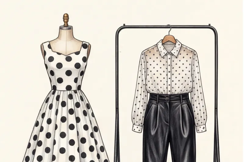
Does size matter: micro, midi or macro?
The size of an element is the focal point of your image. And there's a clear gradation here:
- Micro Peas (Pin dot): The pinhead-sized dots blend together from a distance of a couple of meters, creating the effect of a textured, slightly shimmering fabric. It's the perfect and completely safe alternative to plain basic shirts.
- Medium classic (Polka dot): That same standard size. It's dangerous for girls with large facial features, as it can emphasize volume by contrast.
- Macro Peas (Coin Dot): Large circles the size of a coin or larger. This is a powerful architectural element. It creates drama. In my practice, eight out of ten plus-size clients looked significantly slimmer in sparse macro polka dots because the large geometric shapes are proportionate to their figures.
Important limitation: This rule does NOT apply if you have an inverted triangle body type and are wearing macro polka dots on broad shoulders—in this case, the accentuated geometric pattern will only exacerbate the disproportion.
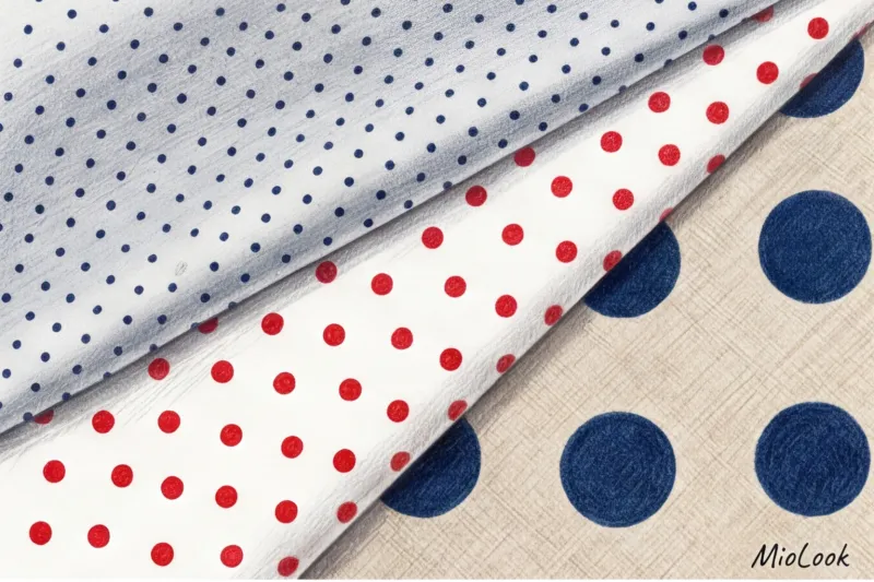
Planting Density: The Secret Brands Don't Tell You
Pay attention to the "negative space"—the background between the circles. There's a golden rule of thumb: if the distance between the dots is at least three times their diameter, the print visually elongates the silhouette by 10–15%. A sparse pattern gives the eye a rest.
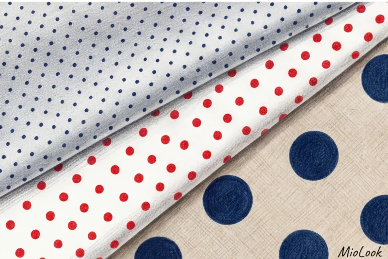
Dense polka dots (where the circles almost touch) create a dazzling effect. They're only appropriate on small accessories, like a scarf. Wear them with a maxi dress and you'll become one vibrant blur.
Contrast and color types of appearance
Why doesn't classic black and white suit everyone? Black polka dots on a crisp white background offer the ultimate in contrast. If you have a soft, muted complexion (light brown hair, light eyes, or low-contrast skin), this print will simply flatter your face. You'll look tired.
The solution is monochrome or closely spaced polka dots. Dark blue dots on a light blue background, burgundy on dusty pink, or chocolate on a camel shade look luxurious.
If you're unsure what contrast is right for you, upload your photos to MioLook app — algorithms will help determine your color type and suggest safe palettes for experimentation.
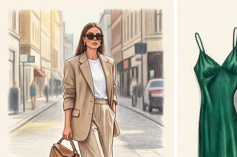
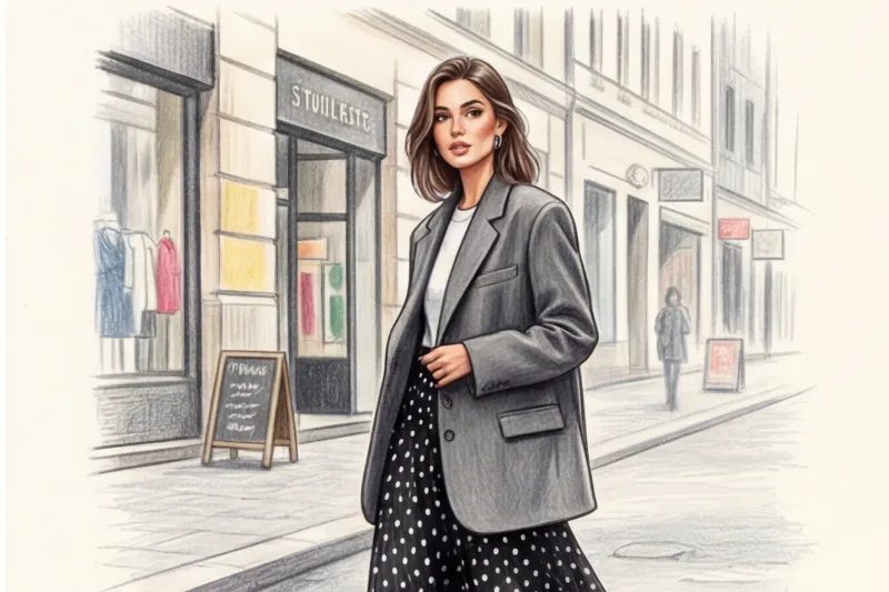
How to Wear Polka Dots in 2024: Formulas for a Fun Wardrobe
The secret to modern styling lies in blending stylistic "poles." If we choose a feminine, dynamic print, it needs to be "toned down" with a rugged texture or clean lines. Here are three effective formulas that steer polka dots away from romance and toward grunge and minimalism.
Formula 1: Peas + Masculinity
No fitted cardigans. We mix a flowing polka-dot silk dress with a voluminous, hand-me-down men's jacket. And we tuck a lightweight, semi-sheer blouse with this pattern into tailored, pleated, pleated trousers. This contrast of fragility and strength is hypnotic.
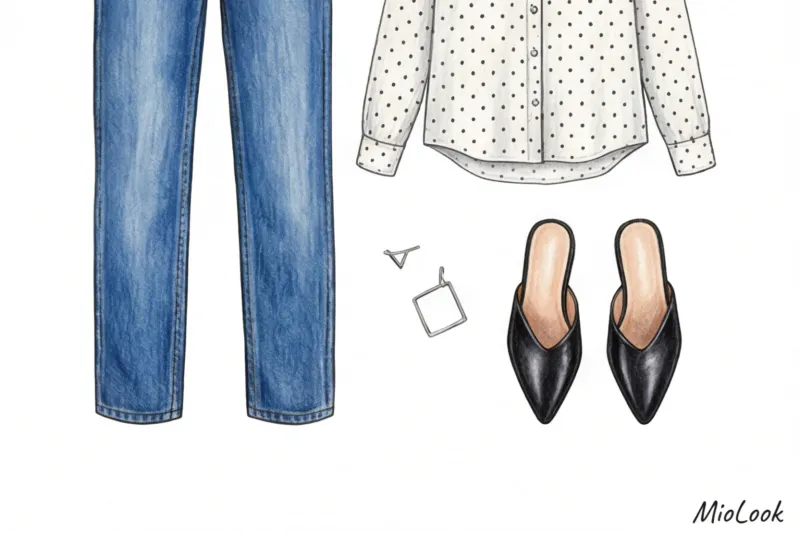
Formula 2: Peas + Rough Textures
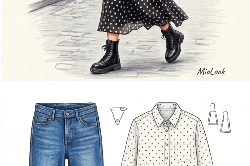
Smooth polka-dot silk demands a rugged pairing. Wear it with distressed, crisp denim or thick, matte leather. Footwear is key: swap out those dainty pumps for heavy, lace-up combat boots or chunky-soled loafers.
Formula 3: Print Clash (Polka Dots + Stripes or Checks)
Advanced level for those who aren't afraid of attention. How to combine two different geometric patterns? Follow the rule of common color denominators. For example, a navy blue shirt with white stripes looks great with a navy blue skirt with white polka dots. The key is to keep the scale of the prints proportional (medium stripes + medium polka dots).
Your perfect look starts here
Join thousands of users who look flawless every day with MioLook.
Start for freeIntegration into business style: can you wear polka dots to the office?
If your look isn't strictly Business Traditional, but Business Casual or Smart Casual, polka dots will be your best ally. Think about pin dots. The mind perceives them as texture, not a frivolous pattern, making them perfectly safe for business negotiations.
One of my clients, Elena (a lawyer at a large corporation), had long considered any print "frivolous." Her wardrobe consisted solely of white and light blue stiff shirts, which made her complexion appear gray in the office lighting. We swapped out the "banker" shirt for an ivory silk blouse with small chocolate polka dots and added a dark brown suit. Her style instantly soared. She began to look more prestigious, more expensive, without breaking protocol one bit.
Stylization Mistakes: How to Avoid Looking Like a Theatrical Set
On the street, I often see polka dots ruining even a potentially good look. Here are three things that immediately catch the eye of a professional stylist:
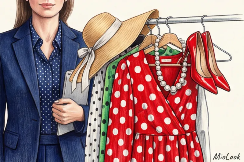
- Literal stylization. A black dress with white polka dots + red lipstick + large curls + a strand of pearls = a Halloween outfit. You'll look like an actress on stage. Replace the red lipstick with a nude gloss and the pearls with a cool, geometric metal.
- Cheap fabrics. Polka dots on thin, flimsy viscose knitwear cheapen the look. A quality print requires form. Choose structured cotton (at least 180 g/m²), heavy silk, or a viscose blend. By comparison, a basic blouse made from heavy fabric from COS (around €90–€120) will last you for years, while a €15 polyester top from a mass-market store will snag and distort the pattern after the first wash.
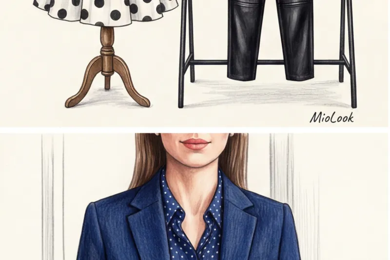
- Too many accents. A dress, shoes, and handbag with identical polka dots is a faux pas from the early 2000s. There should only be one pattern. Period.
Checklist: 5 Steps to the Perfect Polka Dot Look
To avoid getting lost in the fitting room or while sorting through your closet, take a screenshot of this short checklist. It will help you integrate geometric patterns without any stylistic faux pas:
- Evaluate the density and contrast. Is there air between the circles? Does the contrast suit your face?
- Choose a modern cut. Avoid circle skirts and puff sleeves. Opt for straight lines, oversized pieces, or asymmetrical styles.
- Add a "softening" piece. Tone down the dressiness with a tailored jacket, straight-leg jeans, or a leather jacket.
- Remove romantic accessories. No bows or headbands. Just minimalism.
- Choose shoes with character. Chunky loafers, Chelsea boots, or architectural mules will do the trick better than basic pumps.
Polka dots aren't a relic of the past, but a brilliant tool for visual enhancement and creating multi-layered, fun looks. Stop hiding behind flat, monochromatic pieces. Allow yourself a little geometric flair, but use it according to the rules of 2024: with the right scale, paired with rough textures, and with absolute confidence.