You open a closet full of impeccable basics: a sand-colored trench coat, perfect graphite trousers, a crisp white shirt... and you catch yourself looking like a bank clerk on the move. The basics are perfectly chosen, but your wardrobe has lost its charm. Sound familiar?
In my 12 years as a colorist and stylist, I've heard this complaint hundreds of times. We've become so obsessed with the idea of a universal capsule that we've stripped it of any individuality. And when I suggest my clients add an abstract print to their clothes to "glue" this base together, I often see panic in their eyes. We discussed this in more detail in our a complete guide to combining prints in your wardrobe , but today I want to talk about the most frightening and, paradoxically, the most functional type of drawing.
Forget the "wear complex prints only with a neutral background" rule. Today, I'll show you how abstraction and modern tie-dye work as an intelligent "glue" that unites disparate pieces into a cohesive system.
Why Abstract Prints Scare Us the Most (And How to Overcome It)
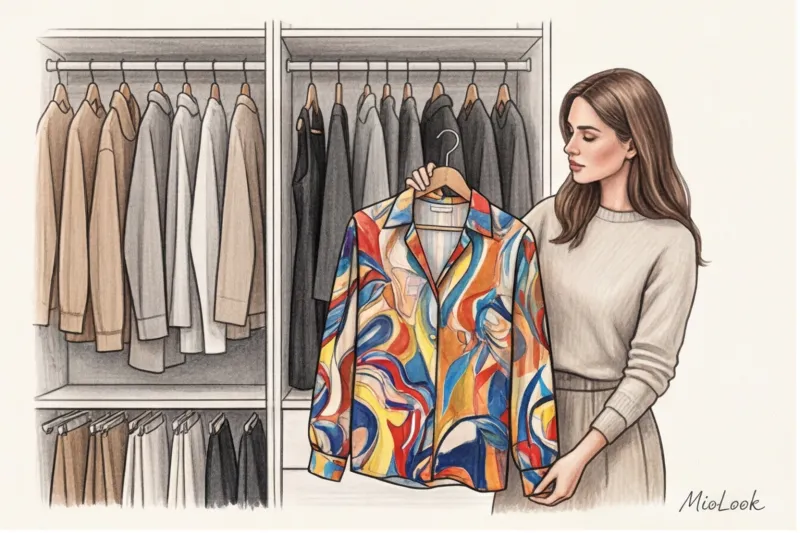
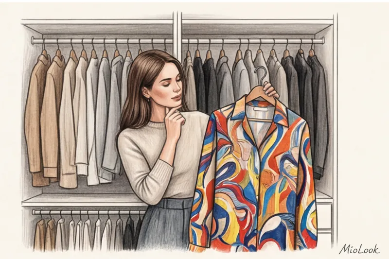
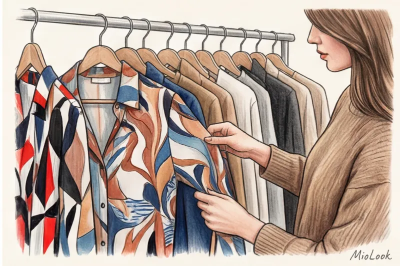
One of my clients, Anna, a lawyer with a very disciplined wardrobe, suffered from classic "wardrobe paralysis." She owned 15 expensive, solid-color pieces in blue and beige that looked like a flight attendant's uniform. When I brought a silk blouse with a washed-out watercolor pattern into the fitting room, she recoiled: "I'll look like the city's crazy woman."
Our brains thrive on logic. A floral print is romantic, a checkered pattern is rigorous, and a stripe is dynamic. Abstraction lacks a clear narrative, so the subconscious perceives it as chaos. The second problem is the collective trauma of the 2010s, when tie-dye was associated exclusively with cheap, acid-colored T-shirts from festival wardrobes.
An abstract art print isn't a statement piece, but a canvas that sets the mood and color temperature for your entire look.
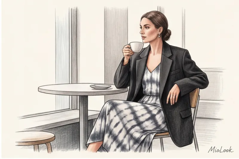
To overcome this barrier, you need to change your mindset. View such a piece not as a standalone, starring element, but as an artist's palette. As soon as Anna tried on that very blouse under her formal dark blue jacket, leaving only the collar and cuffs visible, her formal dress code instantly gained polish and depth without losing its status.
Stylists' Secret: The "Bridge" Theory for Integrating Complex Prints
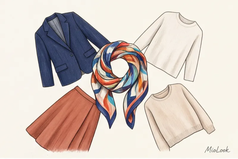
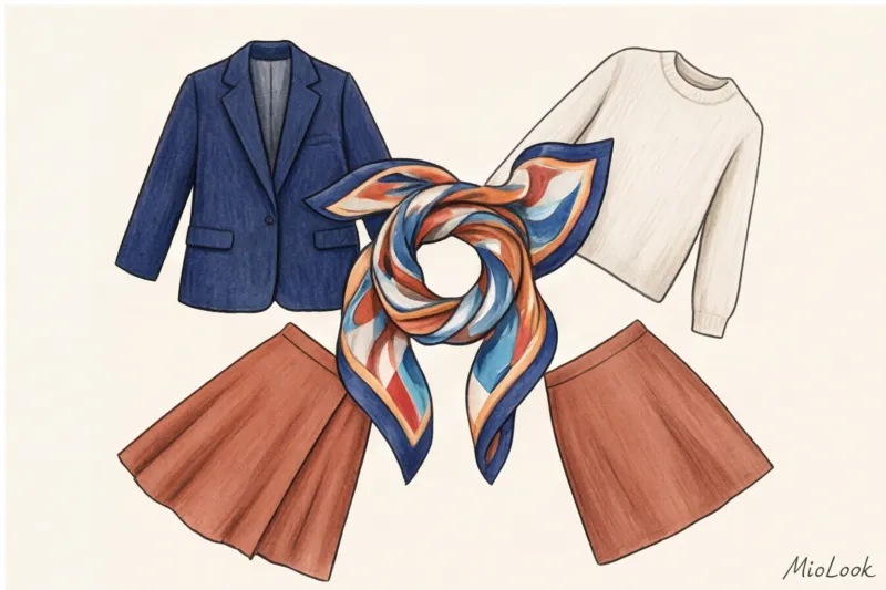
Have you ever noticed that sleek, solid-colored items of different colors (like olive and burgundy) are very difficult to coordinate without the help of neutral black or white? In professional settings, we use the term bridge piece (bridge thing).
According to the principles of Itten's color wheel, the best way to combine two dissimilar hues is to find an element where they already blend. Let's say you have burgundy trousers and an olive jacket. Individually, they're a color clash. But add a top with an abstract print, featuring touches of burgundy, olive, and a touch of creamy ecru, and the look instantly comes together into a sophisticated ensemble.
The mathematics of capsule collections is inexorable: according to consumer behavior research in fashion retail (2024), a print containing 3-4 shades increases the number of possible combinations in a capsule collection by 40% compared to buying another solid-color blouse. One item with an art print potentially gives you five new outfits from what's already in your closet.
The 60/30/10 Rule for Abstract Imagery
To avoid overload, use the golden rule of color distribution:
- 60% - base color. Typically, it's taken from the lightest or neutral background of the print. This could be your basic beige suit or long coat.
- 30% - additional color. This is the item itself with a complex abstract design (for example, a blouse or a midi skirt).
- 10% - accent. The brightest, yet microscopic, touch of color from your print. Match it with shoes, a watch strap, or a small bag.
Your perfect look starts here
Join thousands of users who look flawless every day. Upload your looks to the app and find your color "bridges."
Start for freeTie-dye for adults: from beach aesthetics to intellectual minimalism
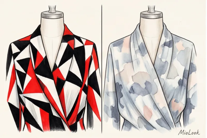
Let's debunk the biggest myth: modern tie-dye isn't about hippie rainbow spirals. Intelligent tie-dye has its roots in Japanese techniques. shibori (knotted dyeing), where smooth, gradient transitions and elegant color splashes are prized. Just look at The Row or Jil Sander's cruise collections (2024-2025) to understand that this pattern has entered the realm of "quiet luxury."
The main rule of adult tie-dye is texture decides everything When a design is printed on thin, flimsy mass-market knitwear, it always looks cheap. The same print on thick linen, natural silk (19 momme weight or higher), or fine merino wool looks classy. In the premium segment, prices for such items often start at €300, but at brands like COS or Massimo Dutti, you can find excellent silk tops for €80–120.
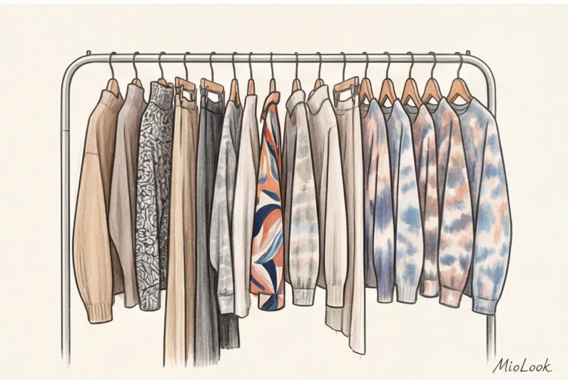
Opt for muted color combinations. Beige and gray, wet asphalt with milky white, dusty pink with muted burgundy—this tie-dye is a great alternative to the familiar and tired gray melange.
How to choose an abstract print for your color type
I regularly conduct wardrobe reviews and see the same mistake: a girl buys an incredibly beautiful printed shirt dress, puts it on, and... her face disappears. All that's left is the dress walking down the street.
When choosing an abstraction, scale and contrast are critical. But let's be honest: this rule doesn't work 100% for everyone, but the basic principles are as follows:
- Scale and facial features. Large, sweeping watercolor abstraction literally "eats" petite girls up to 160 cm tall. If you're Thumbelina, look for a medium or small pattern (strokes no larger than the palm of your hand).
- Level of contrast in appearance. Women with a winter complexion (dark hair, fair skin) look great with sharp, geometric strokes with clear edges (for example, black and white zigzags or contrasting color blocking). Women with a summer complexion (light brown hair, soft features) prefer soft, watercolor-like transitions, where the colors flow seamlessly into each other.
- Temperature of face shade. When you place the fabric in the store, look at the color of the print that is in daylight. right at the neck If it's a warm mustard color and you have a cool undertone, you'll get a "sick face" effect, even if the print has cool blue spots at the bottom that suit you.
For those afraid of color: monochrome abstraction
If introducing a burgundy and olive pattern is too nerve-wracking, start with monochrome. Graphic black and white, gray-graphite, or all-beige art prints are your safe entry into the world of complex textures. Look for fabrics that imitate the texture of natural stone, marble veining, or tree ring patterns. They create visual volume without overwhelming the nervous system with an abundance of color.
Try MioLook for free
Not sure if a print suits you? Our smart AI stylist will analyze your appearance and select the perfect color palette.
Start for free4 foolproof formulas for stylizing art prints
Theory is great, but how do you wear it in real life? Here are four formulas I use for my clients, adapting them to a smart-casual dress code (for example, for an office where jeans are the norm on Fridays, but you want to look a little more put-together).
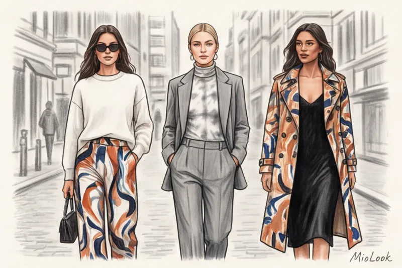
- Formula 1: "The Taming of the Shrew". Take a bright, abstract midi skirt (silk or viscose) and tone it down with a voluminous men's jacket in a completely basic color (gray, camel, black). Add chunky loafers with a thick sole. The jacket acts as a frame for the painting.
- Formula 2: "Peeking Out Accent". A thin mesh turtleneck with a tie-dye print is worn under a formal white men's shirt (with the top three buttons unbuttoned) or a classic pantsuit. Only the turtleneck and cuffs are visible. Ideal for a more conservative environment.
- Formula 3: "Complex bottom, simple top." Pair wide, flowing palazzo pants with an abstract pattern with a smooth silk top or a thick T-shirt. The secret: the color of the top should match the tone-on-tone of the pants. the brightest a stain on the trousers. This visually lengthens the height.
- Formula 4: "Art Block". A dress with a large architectural print is worn as a statement piece on its own. Shoes and bags should be minimalist, with crisp, geometric shapes and no accessories. No additional embellishments.
Checklist: Checking Items with Complex Prints Before Buying
When I'm shopping with someone, I often reject abstract pieces that look luxurious on the hanger. To avoid wasting your budget (a high-quality printed blouse costs between €60 and €150 on something that will cheapen your look, try this 30-second check:
- Joining seams. Cheap production reveals itself at side seams and darts. If a beautiful abstract pattern breaks off abruptly and turns into a contrasting spot, leave the item in the store. High-quality brands always ensure the pattern fits correctly (although this is more difficult for abstract patterns than for checks).
- Location of light spots. Take a close look in the mirror: is the largest, lightest spot of the print right on the protruding part of your belly or hips? Light colors visually add volume. This is an optical illusion that can't be corrected with diet.
- Tensile test. If the print is only on the surface (cheap printing on knitwear), the white base will show through on the chest or elbows when the fabric is slightly stretched. This instantly ruins the "expensive" aesthetic.
- Test for 3 things. Right in the fitting room, name three items from your wardrobe whose colors perfectly match the colors in this print. Don't remember? Then the item will remain hanging with the tag.
Summary: Your First Step to a Wardrobe with Character
Abstract prints and elegant tie-dye aren't the enemies of a basic capsule collection. On the contrary, they're the missing pieces that transform a collection of solid but boring pieces into a well-thought-out personal style.
If you're hesitant to invest in a printed coat or palazzo pants, start small. Buy a quality silk twill scarf to hang on the handle of a basic bag or a bandeau top that's just barely visible in the neckline of your cardigan.
Review your current capsule wardrobe, find those items that just don't seem to go together, and find the right "color bridge" for them. And if you need help visualizing, upload your wardrobe to MioLook app A smart algorithm will suggest which art print will tie your clothes together, saving you money and time in the morning.