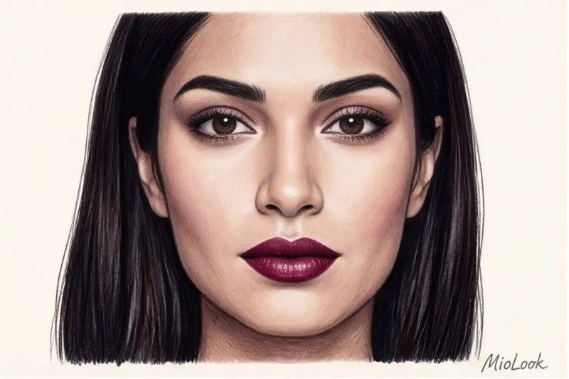
The Psychology of Color in Clothing: Science or Fashion Myth?
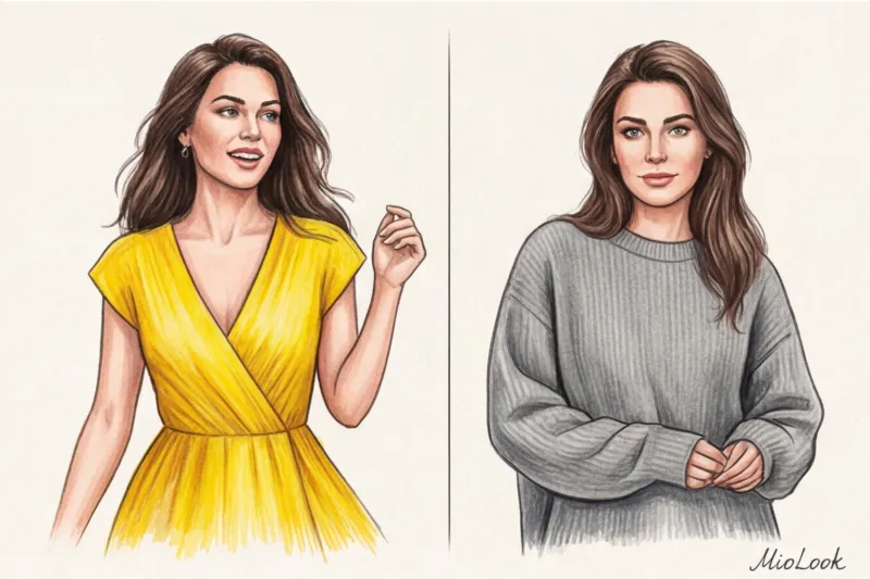
Have you ever wondered why on certain days your hand automatically reaches for a bright red jacket, while on others you unconsciously slip into a voluminous gray cashmere? Over 12 years as a fashion journalist, I've observed the same scene backstage at fashion shows hundreds of times. Models given neon-hued pieces by stylists instinctively straightened their backs, and their gait became sharper and more predatory. Meanwhile, those in pastel, flowing tones moved noticeably more fluidly. The psychology of color in clothing isn't esoteric discussions of "energy" or "chakras," but rather rigorous physics, coupled with neurobiology and clever marketing.
Research Institute for Color Research This hypothesis is supported by impressive figures: a subconscious opinion of a person is formed within the first 90 seconds of communication, and 62% to 90% of this initial impression is based solely on color. How exactly does this work at the physiological level? Our eyes read light as an electromagnetic wave. Long wavelengths (such as red or orange) require the lens to work harder to focus. This signal is instantly transmitted to the hypothalamus, the part of the brain that controls the autonomic nervous system. As a result, our heart rate literally quickens, blood pressure rises, and a micro-release of adrenaline occurs. Short wavelengths (blue and light blue), on the contrary, act as a visual tranquilizer, slowing down metabolism. We don't just we see shade, we have it we live physiologically.
It is on this physical response that the fashion phenomenon is built. dopamine dressing ("dopamine wardrobe"). The concept goes: bright clothes can stimulate the production of joy hormones and pull us out of apathy. However, as an industry insider, I must make an important remark: fashion houses are well aware of how the human brain works, and they artificially create trends for "antidepressant colors" during periods of global economic or social crises. Remember the crazy fuchsia shade Pink PP from Valentino or the total boom in Bottega Green after 2020. When the world is in turmoil, brands sell us more than just an €800 sweater; they sell us an injection of optimism and the illusion of control over our mood.
If you want to check how this mechanism works for you personally, try tracking your images. In my stylistic practice, I often recommend using Smart wardrobe in the MioLook app Take a photo of your outfits every day for a month and record your energy levels in the notes. You'll be amazed at how clearly the color scheme you choose in the morning correlates with your productivity in the evening.
However, our reaction to color isn't determined solely by biology. Historical context and social status have programmed our perception of shades for centuries. Why do we still subconsciously associate deep purple with power and elitism? Because in ancient Rome and Byzantium, the imperial purple was extracted from the rarest sea shells. Tens of thousands of shells were used to dye one kilogram of wool, making fabric of this color more valuable than gold. I wrote more about other shades that carry the historical code of aristocracy in the article " Top 10: Colors that look expensive and prestigious ".
Even more revealing is the evolution of black. In the 19th century, it was harshly stigmatized by society: black was associated exclusively with grief and religious asceticism, and was the obligatory, unforgiving uniform of Victorian widows. It took the brilliant audacity of Coco Chanel in 1926 with her Little Black Dress (The Ford Dress, as Vogue dubbed it) to forever "crack" this mourning code. Chanel reimagined black, turning it into a synonym for independence, graphic style, and impeccable taste.
Today, the color in our closets is a complex hybrid of ancient instincts, cultural heritage, and commercial calculation. By understanding these mechanisms, we stop being hostage to spontaneous choices and begin to use palette as a powerful tool of influence—both on others and on ourselves.
The Anatomy of a Basic Palette: The Hidden Messages in Your Wardrobe
"Buy the perfect black jacket, and half your style problems will be solved"—this hackneyed advice is repeated from one glossy magazine to another. However, after observing thousands of street style looks during Paris and Milan Fashion Weeks and working with real wardrobes, I came to a completely different conclusion. A basic palette isn't just a neutral canvas on which you build your look. It's your psychological armor and the first social filter that others read in a split second.
The choice of basic shades is directly dictated by your dominant style archetypes. What works flawlessly for the "Ruler" archetype will be a communication disaster for the "Gentleman" or "Caregiver" archetypes. Let's dissect the anatomy of key wardrobe colors and remove the labels of marketing stereotypes from them.
Black and White: Between Absolute Power, Distance, and Zeroing Out
Let's start by debunking the biggest fashion myth: black is absolutely not a universal color. In style psychology, all-black is the color of ultimate power, strict control, and maximum distance. When the great Yohji Yamamoto uttered his famous phrase: "The color black says: I don't bother you, so don't bother me either." , he described the mechanism of its operation with great precision.
In my experience, women often buy black items (from mass-market items for €50 to premium knitwear for €500) simply out of inertia, considering them a "safe base." But black creates a solid, invisible barrier. This is why I categorically do not recommend building a base on the color black for helping practitioners. If you're a psychotherapist, HR director, coach, or children's teacher, your professional goal is to be relatable. One of my clients, a highly qualified family psychologist, couldn't understand for a long time why teenagers in her sessions were so reluctant to connect with her. Once we replaced her graphic black turtlenecks with warm shades of caramel and soft navy, the level of trust increased visually and psychologically—the distance between them decreased.
White acts as a powerful psychological "reset." It's the color of new beginnings, clinical purity, and status-conscious inaccessibility. Think of the white pantsuits worn by iconic historical figures—they're not about practicality. They convey the status of someone who hasn't come into contact with the everyday grime of the streets and has the right to absolute perfection.
Blue and Gray: The International "Uniform of Trust" and How to Avoid Boredom
If black conveys power, then navy and graphite gray convey intelligence, consistency, and reliability. It's no coincidence that top politicians and CEOs of global corporations invariably choose navy suits for formal portraits. According to color psychometric research, deep blue physiologically lowers the heart rate of those viewing it. It's literally the color of stability.
However, this "uniform of trust" has a tricky side effect: it's incredibly easy to become boring and invisible. To prevent a classic €200 gray suit from turning you into a tired bank clerk from the 2000s, you need to masterfully play with textures and cuts. The ironclad rule of stylists is: The more banal and calm the color, the more complex the silhouette should be.
Use asymmetry, architectural oversize, and exaggerated shoulder lines. Pair a sleek gray wool suit with a fluffy angora sweater or flowing cool silk. Only through this contrast of textures do strict corporate colors acquire modern dynamism and depth.
Red: Energy, Aggression, or Status (and How to Tame It)
Red is the adrenaline rush of your closet. Neurobiologically, the reaction to the color red is immediate and uncontrolled: the viewer may experience a slight increase in blood pressure and a quickened heart rate. It's the color of vitality, energy, and, frankly, aggression. This is why many women are intuitively wary of introducing it into their wardrobe, limiting themselves to classic red lipstick.
But red can and should be tamed, transforming it from garish to classy. If a total scarlet look (as in Valentino's famous couture collections) is too much of a statement for you, use three strategies to reduce contrast:
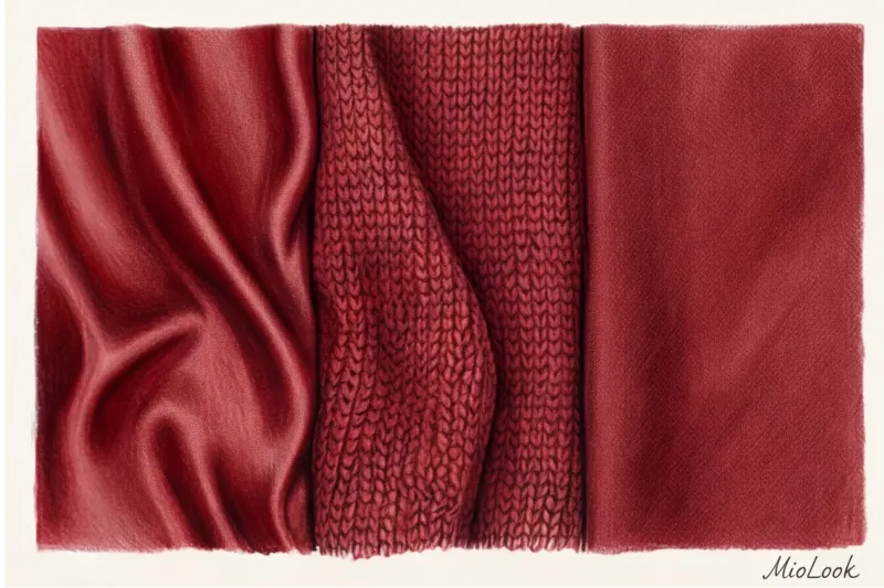
- Going deep: Replace open scarlet with rich, saturated shades of burgundy, carmine, or oxblood. They retain the inherent strength of red but strip it of its overt aggression, translating it into a noble register of "quiet luxury."
- Focus Shift: Use red at the bottom of your silhouette—for example, in wide-leg pants or statement shoes. This grounds the color, shifting its powerful vibe away from the portrait area.
- Matte textures: Red glossy silk or vinyl is always an overt provocation. But red matte wool, cashmere, or thick cotton are simply a beautiful, confident color accent without any hidden meaning.
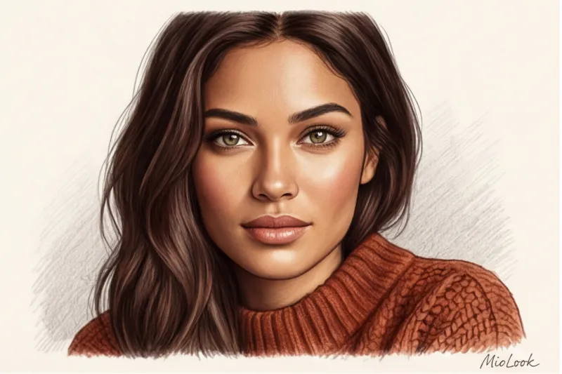
Green and Brown: Grounding, Sustainability, and Salvation in an Age of Anxiety
Over the past few years, we've witnessed a phenomenal tectonic shift in the fashion paradigm. Brown has officially become "the new black." Why did this happen? The answer lies not in the runways, but in sociology. In an era of constant stress, information overload, and post-pandemic anxiety, the human psyche is desperately searching for visual support.
Warm browns (from caramel and chocolate to terracotta) and natural greens (khaki, olive, deep pine) are strongly associated with the soil, trees, and forests. These are the colors of the "Explorer" and "Sage" style archetypes. Wearing a voluminous dark chocolate cashmere jumper is like saying to yourself and the world, "I stand firmly on my feet, I am safe."
Moreover, these shades look phenomenal in the luxury segment: a structured camel-colored coat for €400 will always visually appear more expensive than a black equivalent for the same price, since the luxurious texture of the material is much more visible against the light, shaggy wool.
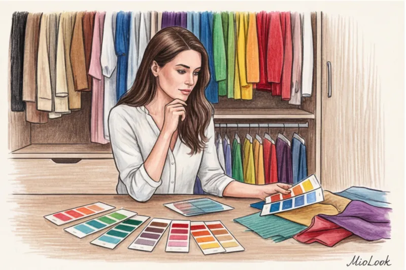
Digitize your palette with MioLook
Not sure which color dominates your closet? Upload your items to the app, and an AI stylist will analyze your wardrobe's color scheme. Find out which shades are missing for your psychological balance, and create capsule wardrobes with a single click.
Sort out your wardrobe for freePastel and complex shades: a strategy of soft influence
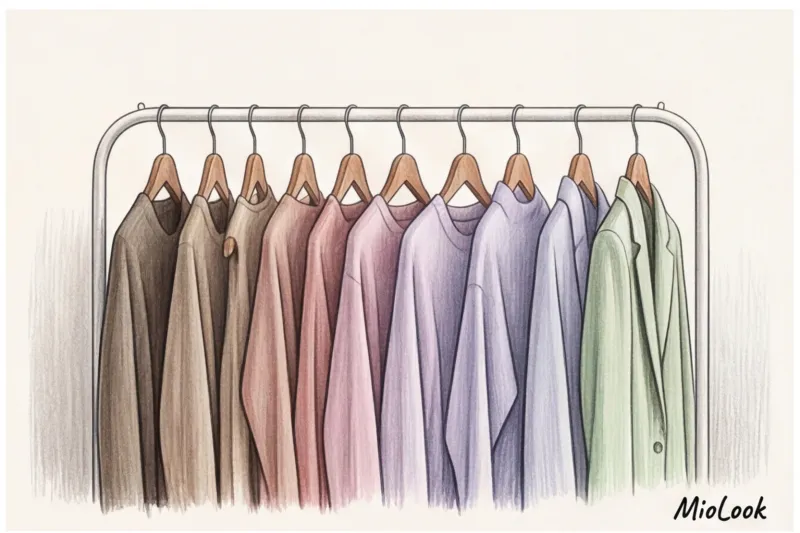
A special place in the wardrobe hierarchy is occupied by “dusty”, complex shades: mauve (muted mauve) sage (color of dried sage), taupe (an ambiguous taupe). In the professional industry, we often refer to these as the colors of intellectual luxury, closely associated with the Old Money aesthetic.
Have you ever wondered why the human eye automatically perceives these shades as more expensive and prestigious? The secret lies in cognitive load. The more complex the pigment (for example, when the color taupe The more complex a color is (there are gray, beige, and a subtle lilac undertone), the longer it takes the brain to "decode" it. This visual complexity is deeply subconsciously associated with a multifaceted character, intelligence, and high social status. Moreover, historically, achieving such complex, muted undertones in fabric dyeing was significantly more difficult than achieving open, vibrant colors.
In the tough business world, pastel and dusty tones are your secret weapon for masterful conflict management. I often assemble capsule wardrobes for top managers before challenging negotiations. If a tense discussion is imminent, I strongly advise avoiding contrasting black and white combinations or red elements—they act as triggers and only fuel confrontation.
Instead, we use a “soft influence strategy”: a silk blouse in a shade sage or a thin jumper of color taupe , worn under an impeccably tailored jacket. This palette acts as an effective visual shock absorber. It subtly reduces the opponent's aggression, conveying calm, prudence, and a willingness to engage in constructive dialogue, without diminishing your professional authority for a second.
A Stylist's Secret: How Fabric Texture Changes the Meaning of Color
I often encounter the same optical illusion during wardrobe reviews. A client will categorically declare, "Blue absolutely doesn't suit me," pointing to a smooth satin blouse that truly does make her face look unhealthy and highlights even the slightest traces of fatigue. But try on a tweed jacket in the exact same navy shade—and suddenly her features become more expressive, and her appearance takes on a noble air.
Why does this happen? Because color doesn't exist in a vacuum. It's inextricably linked to the surface it inhabits. Research in visual psychophysics proves that the human brain doesn't read the pigment itself so much as how it interacts with lighting.
Take the color red, for example. By its very nature, it is always a statement. But red silk is an open provocation , sensuality bordering on foul. The glossy surface reflects maximum light, making the hue vibrate. You wouldn't wear such a piece (say, a silk midi skirt in the €150–€200 range) to a casual meeting—it would steal all the attention. On the other hand, red matte cotton or heavy linen is simply an active, cheerful color. The matte surface absorbs light, grounding the aggressiveness of the hue to a dynamic, everyday level.
The second most important factor is the density and structure of the weave. We already know that black often creates a blank wall around a person and conveys a rigid distance. However, this effect can be masterfully overcome with texture. A thick black gabardine suit is like armor. But if you wear chunky, loose-knit sweater Made from fluffy mohair in the same jet-black shade, the perception changes dramatically. The air between the loops and the fuzzy texture "eats" the harshness of the color. The stark black suddenly becomes cozy, tactile, and inviting.
The most complex and intriguing level of working with color is the effect interference We're talking about fabrics that change hue with every movement: velvet, corduroy, taffeta, or chameleon-like organza. Pile fabrics create an optical illusion of depth through the endless play of light and shadow. An emerald velvet jacket fades almost to black in the folds, while in the raised areas it flashes with bright neon.
The intricate iridescent textures of taffeta and velvet look incredibly expensive (remember the iconic Giorgio Armani collections), but they conceal a physiological trap: the sharp changes in light and shadow automatically add visual volume. If you're looking to contour your silhouette and elongate your height, smooth matte textures are much more effective.
To master the art of juggling textures, I highly recommend digitizing your closet. When you load your items into MioLook Be sure to consider not only color but also material. The smart wardrobe feature will help you create complex monochrome outfits, where the same gray will be revealed through the intelligent contrast of smooth silk and rough, textured wool.
Micro-conclusion: If a shade seems too loud, cheap, or unsuitable, don't rush to banish it from your palette forever. Try simply changing the texture of the fabric. Make smooth fabrics rougher, shiny fabrics matte, and thick fabrics translucent.
Color and Personal Branding: Impression Management in Business
According to a large-scale study by the Institute for Color Research, people form unconscious judgments about a person within the first 90 seconds of interaction, and up to 90% of this assessment is based solely on color palette. In corporate environments and public settings, your wardrobe is more than just a protective fabric shell; it's a subtle tool for nonverbal communication.
When preparing top managers for TEDx talks and large-scale professional webinars, I always apply one strict rule: color shouldn't compete with your face; it should serve as a frame for your portrait. Cameras and stage lighting often "eat away" charisma, leading experts to try to compensate by wearing their favorite neon-coral jacket to guarantee "being remembered." It's a trap. As a result, the audience remembers the aggressive splash of color, not the brilliant message of your speech.
Furthermore, pure white often glares in the camera, ruining the frame's exposure, while pitch black turns a silhouette into a flat, black hole. Our tried-and-true strategy for stage is deep, rich, jewel-toned hues: sapphire, emerald, deep amethyst, or wine. They look refined under the spotlights, highlight a fresh complexion, and keep the audience's attention on your eyes and articulation.
Adapting a palette to a specific business task requires no less strategic precision:
- For an interview for a top position: Avoid stark black—it creates too much distance and is often perceived as a lack of flexibility. Instead, choose navy or deep gray with a subtle melange. These colors convey systemic thinking, logic, and competence, while leaving psychological space for dialogue with your HR partner.
- For complex and crisis negotiations: Use the "psychological armor" technique. A suit in a thick, dark chocolate or dark graphite color grounds you, visually making you appear more substantial and unshakable. This subconsciously dampens your opponent's unwarranted aggression.
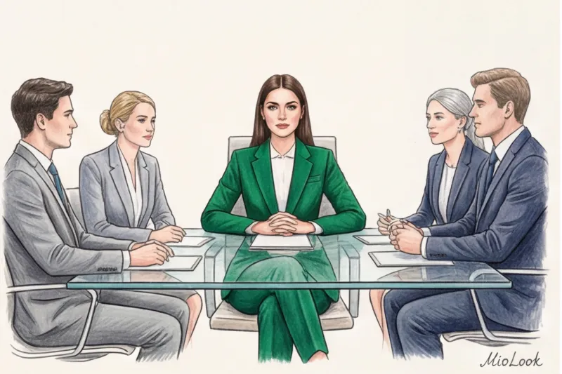
Contrast Ratio: The Formula for Visual Authority
In business style, there is an immutable law of non-verbal communication: high contrast = high authority (high contrast equals highest authority).
The difference in lightness between elements of your clothing is directly interpreted by your interlocutor's brain as a measure of your assertiveness, clear boundaries, and authority. Think of the classic CEO archetype at a board meeting: a navy blue suit and a pristine white shirt. This extreme contrast creates extremely clear visual boundaries. It conveys uncompromising attitude, clarity of thought, and a willingness to make tough, unpopular decisions.
However, if you're approaching a design thinking session with a team or a meeting where you need to demonstrate maximum empathy and collaboration, the "armored man" look will only be detrimental. Low contrast—monochromatic combinations of beige and sand, or soft gray gradients—is ideal for such tasks. They visually blur the boundaries of your silhouette, making you appear more approachable and open to ideas.
By the way, it can be difficult to objectively assess the true contrast level of your look in the mirror due to the peculiarities of room lighting. To avoid making mistakes, I recommend taking a photo of your finished look and uploading it to the "smart wardrobe" feature in MioLook When you browse images in a gallery format on your smartphone screen, you instantly become distracted and see where the focus falls: on your face or on the overly contrasting collar of your blouse.
The Color Blocking Trap: Why Too Much Color Is Killing Professionalism
A particular danger awaits those who decide to demonstrate originality and integrate several bold colors into a strict business dress code. Color blocking (the combination of large blocks of contrasting, pure shades in a single look) is perfect for Fashion Week street style or for those in the creative industries. But in traditional business attire, it makes a fatal mistake—it overloads your partner's visual system.
Imagine: you're wearing a fuchsia jacket, rich emerald trousers, and an architectural yellow bag. Even if these items are custom-made and cost over €2,500, in a conservative environment, such an excess of color mercilessly undermines professionalism. The other person's brain is forced to expend colossal energy processing this visual noise. Subconsciously, this causes irritation, and the wearer of such an outfit is perceived as chaotic, overly emotional, or unable to prioritize.
If you want to incorporate a bold color into a formal dress code, stick to the "one-single-color" rule. Consider a luxurious pantsuit in a sophisticated terracotta hue, paired with a completely neutral base and minimalist shoes. In business, color should elegantly highlight your expertise, not overpower your professional arguments.
Try MioLook for free
Start creating perfect business images with precise contrast levels using artificial intelligence.
Start for freeColor Anchoring: A Practice for a Capsule Wardrobe
In cognitive behavioral psychology, there's the concept of an "anchor"—a stimulus that immediately evokes a specific emotional response. In styling, we utilize this same biological mechanism, but instead of sounds or smells, we use a visual trigger. A well-designed capsule wardrobe isn't just a collection of coordinating pieces; it's a control panel for your state of mind.
How do you anchor confidence, focus, or relaxation to a specific color? It requires a little systematic brain training. Here's a step-by-step guide:
- Define the deficit: What state of mind do you lack during your workdays? If it's extreme concentration, deep cobalt might be your trigger. If you need grounding and calm, try sage or terracotta.
- Isolate the anchor: Choose one or two items of this color and wear them exclusively at those moments when you want to experience or consolidate the desired state.
- Form a reflex: After three to four weeks, your brain will associate that hue with the desired neural activity.
One of my clients, the COO of an IT company, used a rich emerald green as a "confidence anchor" before challenging meetings. We added a tailored silk top (a great investment in the €150-€200 range from brands like TOTEME) to her minimalist capsule wardrobe and wore it only to boardroom meetings. After a while, just a glance at the emerald cuff peeking out from under her jacket was enough to instantly mobilize her spirit.
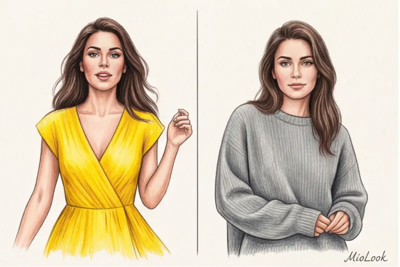
The 60/30/10 Formula: The Architecture of a Harmonious Outfit
To incorporate these psychological anchors into my everyday wardrobe and avoid turning my look into chaos, I always borrow the golden rule of three colors from interior designers: the 60/30/10 formula. This mathematically precise proportion will save you from the mistake of "wearing all your best at once."
- 60% - main canvas: This is the base color of your outfit. Typically, it's a suit, outerwear, or a monochrome base (pants and a turtleneck). It sets the overall tone and is responsible for your visual silhouette.
- 30% - complementary shade: A secondary color that supports the base. A shirt, a cardigan draped over the shoulders, or a contrasting jacket. It creates depth and complexity.
- 10% - color anchor: That very psychological emphasis that you want to convey to yourself and others.
Micro-dosing of color: the power of bright accents
The secret to a 10% accent is the clever use of details. It's a safe "micro-dosing" of color that allows you to incorporate even the boldest shade into a formal wardrobe.
You don't need a neon pink coat to feel a rush of dopamine. Use shoes, bags, and scarves. A classic silk bob tied to the handle of a formal bag, fuchsia pumps peeking out from under wide gray palazzos, or even a chunky bracelet with colorful enamel. You'll notice this color in your peripheral vision all day long, and it will act as a continuous injection of the desired emotion without violating the professional dress code.
When you're drawing up these proportions in front of the mirror in the morning, it's easy to get the volumes wrong. Therefore, I recommend digitizing your basic pieces and accent accessories by uploading them to MioLook smart wardrobe By putting together your outfit on your smartphone screen the night before, you'll visually and clearly see whether the 60/30/10 balance is being maintained and whether your "color anchor" is overpowering the overall look.
Color Psychology vs. Color Type: How to Wear Shades That Aren't Yours
The twelve color type system is a wonderful analytical tool, but sometimes the rigid boundaries of coloristics become a veritable stylistic prison. During London Fashion Week 2023, I discussed this with a leading analyst at the Pantone Color Institute, and we agreed: the strict physiological harmony of shades often directly conflicts with our deep psychological needs.
Imagine a typical scenario: you're facing a tough business negotiation. Your instinct is to wear all-black to create a thick, impenetrable armor and project absolute distance. But the paradox is that, by natural coloring, you're a classic Light Spring. Biologically, your appearance is low-contrast, with light eyes and a warm, honey-toned skin tone. Deep, light-absorbing black will inevitably cast heavy gray shadows on your face, highlighting even the slightest fatigue and visually adding years to your age. Ultimately, you'll lose the very energy and authority you were originally hoping to find in this dark shade.
The secret of professional stylists is that we never prohibit clients from using "inappropriate" colors. If you need a color as a psychological anchor, we simply change its location using the "portrait zone" rule.
Any fabric acts as a photo-reflector: light hits the material of a blouse or jacket and bounces directly onto your chin, neck, and cheeks. The portrait zone is the space from the bust to the face, and this is where the real optical magic happens. To resolve the conflict between the psychology of color in clothing and your physiology, you need to ruthlessly push the psychologically important but physically disharmonious shade downward.
Need the uncompromising confidence of black? Choose impeccably tailored black palazzo pants in thick wool, a strict maxi skirt, or pointed-toe shoes. And in the portrait area, leave cream, warm beige, or a shade of baked milk that complements your "Bright Spring." The psychological anchor (black) will remain with you, creating the necessary inner core, but the face will be illuminated by the right light. To check how well such "broken" color blocks combine, I advise not to waste your nerves in front of the mirror. Take photos of the items and upload them to MioLook app and use the virtual fitting room: the algorithm will clearly show how a complex color at the bottom is balanced by the right top.
But what if the item is already hanging in your closet, and it's a solid piece? For example, you bought a stunning dress in a cool, vibrant fuchsia shade for €250, which makes you feel incredibly bold, even though your natural complexion desperately cries out for soft, warm tones. There's no need to give up on the dress—that's where makeup comes in, serving as the key tool for adapting complex colors.
Using makeup, we can artificially "pull" the contrast level and skin temperature to match the brightness of our clothing. If the color of your dress is too cool and vibrant, you'll need to even out your skin tone with a slightly thicker foundation to completely eliminate any natural redness (a cool, vibrant color will immediately highlight it). Add a bold touch to your brows so your face doesn't get lost in the background of your active outfit, and be sure to complement the look with blush and lipstick that match the cool undertone of your clothing. It's like donning a temporary "mask" of a different color type, allowing you to confidently and safely wear any shade that feels comfortable to you.
Your ideal image
it begins Here:
Join thousands of users who look flawless every day with MioLook. Our algorithm will help you create a capsule makeup look where every color works for you.
Start for freeChecklist: Auditing Your Wardrobe Through the Lens of Emotions
Stand up right now, open your closet doors, and take two steps back. Blur your vision. What single color do you see on the rails? The psychology of color in clothing isn't an abstract theory for fashion magazines, but a literal cardiogram of your current emotional state. Your wardrobe never lies.
Just last month, I was auditing a financial analyst's wardrobe. The client complained that she had "absolutely nothing to wear," despite her closet being overflowing with clothes. Upon analysis, we discovered that 85% of her hangers were filled with endless variations of graphite, mouse gray, and dull black. What does this total bias toward dark achromats mean? According to research by Karen Haller, a leading world expert in applied color psychology, the unconscious desire to hide in gray is a classic human response to sensory overload and stress. Your brain, overwhelmed by the onslaught of tasks, simply refuses to process additional visual information. If your closet looks like an old black-and-white movie, ask yourself: what am I protecting myself from right now? Perhaps what you need isn't another bright blouse, but a proper vacation and a nervous system reset.
But let's say you've rested, realized your energy levels are low, and are determined to add color to your life. It's at this point that 90% of style mistakes are made. People impulsively buy "resourceful" shades that then hang with their labels on for years. Before shelling out €150-200 for a trendy lemon jacket or fuchsia trousers, ask yourself three tough questions:
- What specific emotion am I trying to buy now? Are you lacking aggressive drive (then red), intellectual focus (deep blue), or mental ease (pastel mint)? If you're buying a color simply out of boredom, it's guaranteed to fail to fit into your wardrobe.
- Do I have at least three "silent" companion items in my database? Any bright color needs visual grounding. If your closet doesn't have neutral trousers, a basic skirt, and subdued shoes to balance this vibrant hue, one purchase will lead to an endless and costly chain of unplanned expenses.
- Am I ready for increased attention from others? A bright color always attracts the human eye. If you're looking to stay in the background and avoid the gazes of your colleagues in the coming months, this jacket will remain on the hanger like a museum piece.
If you answered yes to these questions, we need a plan for gradually introducing natural colors into your everyday style. I'm categorically against drastic carnival-style transformations—your psyche will perceive sudden head-to-toe color blocking as severe stress. In my practice, I use a proven three-step algorithm for color micro-dosing.
Step One: Periphery. Start with details you can see yourself, but that don't dominate the look. It could be a juicy orange phone case, an emerald watch strap, or a silk scarf tied loosely to the handle of a bag. Give your brain time to adjust to the new color vibe.
Step two: Lower hemisphere. After a couple of weeks, incorporate the color away from your face—into pants, skirts, or shoes. This is much easier on the eyes: the color doesn't reflect on your skin, doesn't highlight signs of fatigue, and doesn't dictate the tone of your makeup.
Step three: Total integration. Now we move on to tops, blouses, and dresses in the portrait area. To ensure this final transition is painless and budget-friendly, I always recommend using palette analysis feature in the MioLook smart wardrobe By uploading your basics, you can virtually try on a new, bold color accent before you even go to the store, mathematically assessing the overall harmony of your capsule wardrobe.
Color is the fastest, most legal, and most accessible way to change your brain chemistry. You're not just putting on a yellow cashmere sweater; you're literally injecting yourself with a dose of serotonin.
Stop treating clothes simply as utilitarian body coverings or uniforms. Your wardrobe is a powerful control panel for your mood and how the world reacts to you. Take advantage of it today: choose one, even the smallest, resourceful color for tomorrow morning, and let it transform the course of your day.
Guide Chapters
Yellow in clothing: the psychology and energy of the image
Bright colors aren't just for beach sundresses. Discover a premium approach to incorporating high-energy hues into your everyday wardrobe.
Pastel colors in clothing: psychology and status
Why are many women over 35 afraid of light shades? We debunk the stereotypes and prove that pastels are a powerful tool for subtle influence.
Clothing color and a person's character: wardrobe and personality type
It's commonly believed that introverts hide behind gray, while leaders wear red. Find out how choosing a wardrobe color is actually linked to neurobiology.
Green clothing: its meaning in the psychology of style
Discover the neuroscience of color. Learn how to use green shades to create a harmonious look that radiates calm and security.
Color Combinations in Clothing: The Psychology of Color Blocking
Think a calm monochrome inspires more trust? Our experiment showed that contrasting color blocking not only attracts attention but also creates a feeling of security.
The Perfect Color for a Presentation: A Guide for Speakers
Choosing a color palette for a scene or Zoom isn't just about aesthetics; it's about the physics of light and lens optics. Learn how to avoid common mistakes and look flawless on camera.
White in clothing: psychology, influence, status
Why do many people avoid light-colored clothing? We explore how white influences status, break down stereotypes, and learn how to choose your perfect shade.
Dopamine Wardrobe: How Color Helps Relieve Stress
A dopamine-boosting wardrobe isn't just neon clothes, it's a subtle neurophysiological tool. Learn how to intelligently use color to support your nervous system.
Blue in Clothing: Meaning and Psychology for the Office
A navy blue jacket is worn 3.8 times more often than a black one, and it's no coincidence. We explore the neurobiology of the shade and prove why blue is ideal for the office.
Black in the Wardrobe: The Psychology of Style
Why do we dress in dark colors when we're vulnerable? We reveal the secrets of black: how it protects us and controls the impressions we make on others.
Business Attire Colors: How to Dress for Negotiations
A well-chosen wardrobe is an invisible partner in negotiations. Find out which shades will help relieve tension and successfully close the deal.
Red in Clothing: Psychology and Styling Advice
Why are we afraid of the color red, and how does it affect our mood? We explore the physiology of color and learn how to manage our attention through clothing.
The Perfect Date Color: Stylist Tips
Find out how wardrobe colors influence first impressions. A stylist reveals which colors will help you stay true to yourself and attract the right people.
The Perfect Color to Wear for an Interview: How to Choose
Choosing a color for your outfit isn't just a dress code; it sends subconscious signals to recruiters. We'll explore how the right palette can help you land a job.