One day, a client of mine, the CFO of a large holding company, came to me with an unusual request. She needed to chair a complex board meeting, where heated debates were expected. Women usually opt for a more formal look in such situations—a dark blue suit or a muted gray jacket. I suggested a different approach: we kept the tailored cut but swapped the white shirt for a crisp, saffron-colored silk blouse. The result? She not only held the audience's attention, but her opponents subconsciously perceived her as someone with an absolute, unstoppable energy level. This is the secret behind warm accent colors.
If you think bright colors are only for beach sundresses, this article will change your ideas about a basic wardrobe. We've already discussed the fundamental mechanisms by which shades influence our mood in our complete guide to the psychology of color in clothing and its influence on mood Today, I want to show you a premium approach: how to integrate complex, high-energy colors into everyday life without looking childish.
Yellow in clothing: psychology and physiological response
"Dopamine Wardrobe" isn't just a catchy social media hashtag. It's an organic connection to our neurobiology. A 2022 study by the Institute for Color Research found that long wavelengths of light, including orange and yellow, physiologically stimulate the autonomic nervous system. Visual contact with these hues triggers micro-releases of adrenaline and slightly increases heart rate.
When you integrate yellow color in clothing, psychology It works for you: you literally wake up your brain and the brain of your conversation partner. However, there's a hidden danger here. Too much loud, acid-neon color can trigger anxiety. The trick is to find the right balance—use color as a subtle spice, not as the main course.
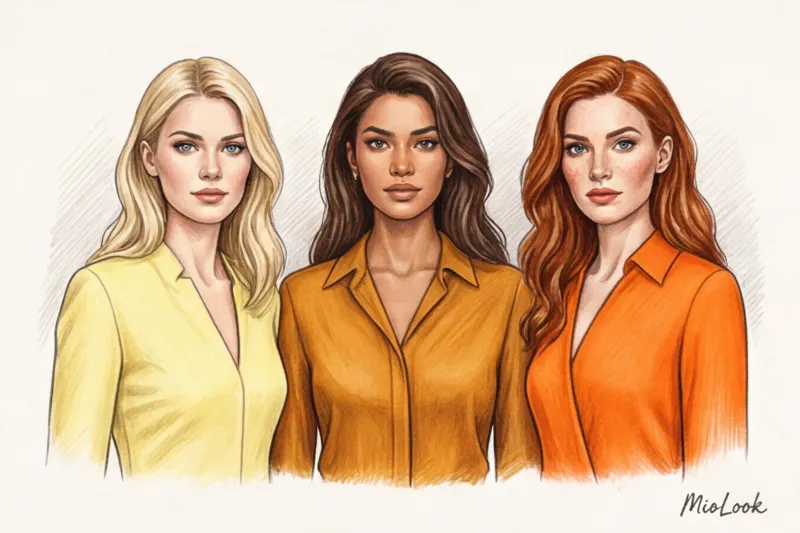
Intelligent shades of the sun: from lemon to ocher
There's no such thing as "yellow." The palette is vast, and every nuance conveys its own code:
- Pastel Lemon: Openness, ease, and a willingness to engage in dialogue. Ideal for first meetings or informal brunches.
- Mustard: Creative energy, down-to-earth. An excellent choice for creative industries.
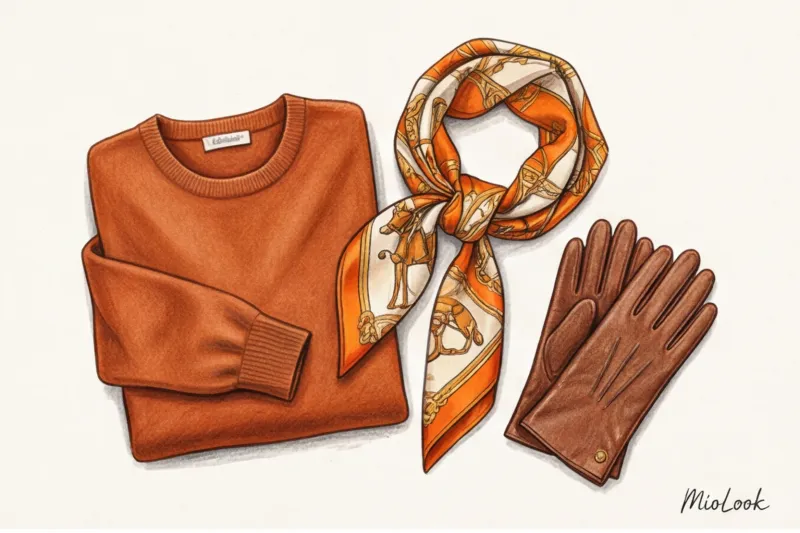
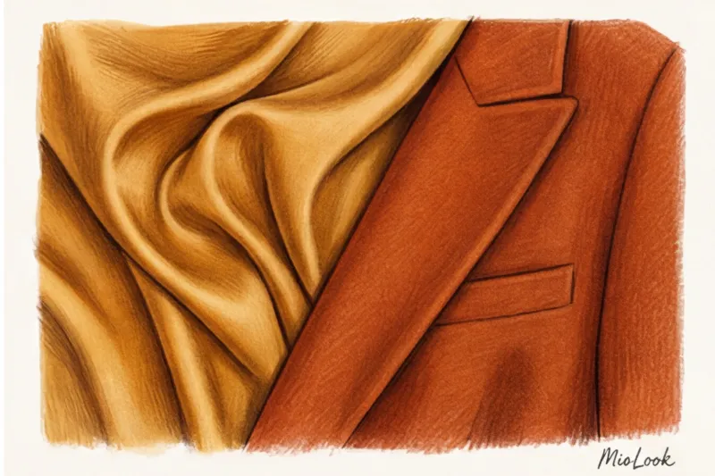
- Deep ochre: Intellect, status, "old money." Paired with suede or cashmere, it looks incredibly expensive.
Over 12 years of working as a stylist, I have come up with a golden rule: the denser and more expensive the texture of the fabric, the darker and more complex the shade of yellow it can “pull out.”
Your perfect look starts here
Join thousands of users who look flawless every day with MioLook.
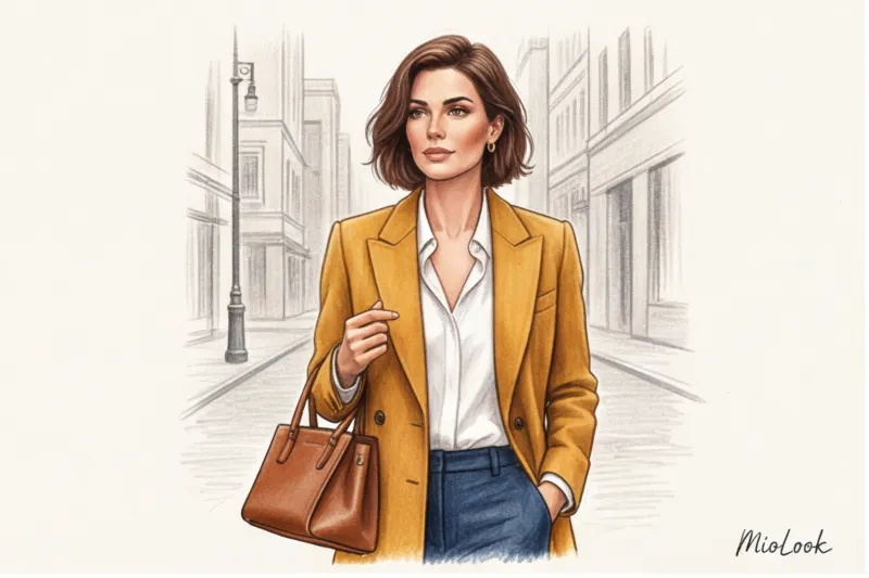
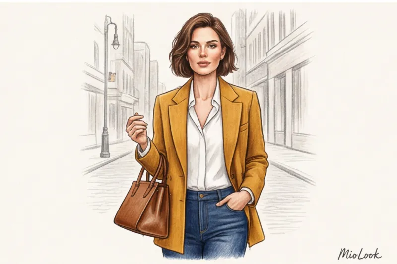
Start for freeStatus Orange: From Hermès Box to Everyday Luxury
No discussion of orange in the luxury context would be possible without mentioning the House of Hermès. Their iconic hue Orange Boîte (Orange Box) emerged during World War II due to a shortage of dyes, but today it is the absolute standard of status color. In European culture, deep orange is firmly associated with exclusivity and impeccable taste.
But here a strict law comes into force: bright color does not forgive cheap materials.
"My experience assessing the cost of a look proves that cheap tangerine polyester is a stylistic disaster. The same tangerine hue, but on a thick, matte silk or cashmere, is the epitome of quiet luxury."
If you want to wear orange, be prepared to invest. An acrylic sweater for €25 will pill and make your look look plasticky. But a terracotta wool-silk blend jumper (in the €150-€300 range) will last for years and garner compliments. If you're unsure whether a particular texture will suit your wardrobe, you can upload a photo of the item to MioLook — a smart AI stylist will analyze your database and advise you on the success of your investment.
The "Summer" Palette Myth: How to Wear Bright Colors Year-Round
It's commonly believed that yellow and orange are exclusively summer, beach, or casual colors. This is a colossal misconception. I maintain that these colors are far more effective in winter.
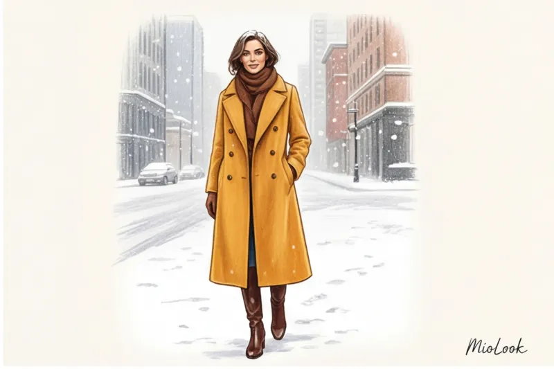
When 90% of people on the streets are wrapped in black, gray and dull brown down jackets, a thick saffron double wool coat or a terracotta cashmere suit is a powerful tool power-dressing It's a statement: "I don't need to hide, I'm in control." One of my clients bought a mustard-colored Loro Piana coat and made it her signature look on gray winter days. She reported that the number of casual small talk and smiles directed at her increased exponentially.
The art of layering allows you to brilliantly incorporate vibrant color into your autumn-winter landscape. Remember the three most elegant combinations for cold weather:
- Ochre + Deep Blue (Navy). A classic built on the contrast of warm and cold.
- Mandarin + Dark chocolate. A delicious, enveloping combination.
- Mustard + Burgundy. A complex, deep aesthetic in the style of an English country club.
Energy Investments: When to Buy the Basics and When to Buy the Accents?
Let's talk numbers. A successful wardrobe is built on an understanding of cost-per-wear. Sales statistics from leading luxury retailers reveal an interesting trend: accent accessories in yellow and orange sell 30% faster in the fall/winter season. Why?
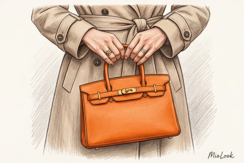
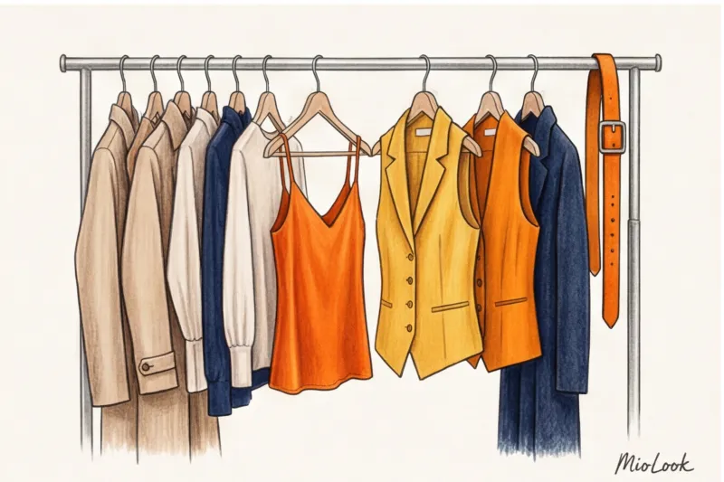
Because smart women invest in accents and skimp on consumables. A €30 white T-shirt from a mass-market store looks great under a tailored jacket when you're carrying a structured burnt orange bag. Bright items steal the show, so they need to be of impeccable quality.
Accessories as a safe start: bags, scarves, and shoes
If introducing color into a portrait area is daunting, start from a safe distance. An orange grained leather tote bag is the perfect investment for a conservative dress code. It won't violate office etiquette, but it will communicate your creativity.
French women have long since figured this out. They wear a simple beige trench coat, jeans, and a white shirt, but tie a silk scarf with vibrant lemon or gold flecks around their neck or bag handle. The price tag ranges from €50 to €400, but the effect is worth a million.
Ready to get started?
Try the MioLook free plan—no commitments required. Start creating perfect looks with AI.
Start for freeA stylist's tip: how to adapt bright colors to your color type
On set, we often encounter a problem: a color is gorgeous, but the model's face looks sallow next to it, and dark circles appear under the eyes. This doesn't mean the color doesn't suit you. It means you chose the wrong "temperature" or placed the color too close to the face.
How to tame a complex palette:
- Cool skin undertones (Winter and Summer color types): Choose shades with added blue pigment. Your ideal yellow is lemon or lime. Your orange is more of a cool coral.
- Warm skin undertone (Spring and Autumn color types): The entire classic warm palette is open to you. Honey, pumpkin, amber, and terracotta will highlight your natural glow.
- Stylist trick: If you bought a stunning mustard sweater but it makes you look washed out, simply wear a white shirt underneath, allowing the collar to separate your face from the colored knitwear. The white will act as a reflector.
Find your perfect color combinations without the risk of wasting money with the smart selection feature in MioLook app , which takes into account your personal contrast.
Mistakes that irrevocably cheapen the image
As an expert, I have to be honest: these colors can be tricky. Here are three styling mistakes I see on the streets every day.
Mistake number one: incorrect proportions in the total look. If you wear a plain, monochrome orange outfit with no waist accents or exposed skin (wrists, ankles), you risk looking like a traffic cone. Be sure to break up the silhouette with a belt or choose pieces with an asymmetrical, complex cut.
Mistake number two: neon in a mature wardrobe. Acid yellow might look playful on a teenager, but on a woman with an elegant style it looks like she's lost on her way to a '90s rave. Swap neon for a refined saffron.
Mistake number three: the combination "bees". Yellow and jet black in equal proportions almost always evoke the Beeline uniform or the coloring of a dangerous insect. This contrast is too aggressive. Try replacing the black with anthracite (dark gray), marengo, or dark chocolate. The look will instantly become softer, more expensive, and more intellectual.
Conclusion: Your Personal Color Strategy
Yellow and orange aren't just paint on fabric. They're your personal tools for managing your attention and inner energy. They require courage, good taste, and impeccable textures. But once you learn how to work with them, you'll never want to go back to gray.
Don't try to dress head-to-toe in color right away. Your plan for tomorrow: analyze your basics. Find the most conservative, boring outfit (like a beige trench coat or a blue jacket) and add just one element of a warm, vibrant color—an ochre leather belt or terracotta suede loafers. You'll immediately notice a change not only in your reflection in the mirror but also in your posture.