Have you ever wondered why, after a long, stressful day staring at a computer screen, ophthalmologists recommend simply looking at the trees outside the window? It's not about romance or a love of nature. It's pure physiology. The eye gets a rest. And herein lies the answer to the question of why. green color of clothing and its meaning go far beyond the banal "color of hope and ecology." As a stylist and textile specialist, I often see women trying to add softness to their looks with color, but making critical mistakes in their choice of shade and texture.
We've covered more about how different spectra affect our nervous system in our complete guide. The Psychology of Color in Clothing: Its Impact on Mood Today we'll talk about green: how to ensure your image conveys absolute safety, empathy, and a willingness to engage in dialogue.
Green Clothing: Its Significance for Neuroscience and Our Brains
Let's forget the esotericism of color for a moment and turn to science. Green is located exactly in the middle of the human visible spectrum (wavelength is approximately 500–550 nanometers). What does this mean in practice? It's the only color for which the lens of the eye practically doesn't need to refract the light. The ciliary muscles relax, and the focus falls directly on the retina.
We subconsciously perceive people in green as "safe." According to a large-scale study on the impact of biophilic design (University of Essex, 2020), visual contact with natural shades of green can reduce cortisol (the stress hormone) levels in the blood by 15% in a matter of minutes. Fashion quickly adopted this principle from architecture. By wearing the right green, you literally become a visual antidepressant for your conversation partner.
"Physiological relaxation of the eye muscles immediately sends a signal to the brain: there is no threat here, you can relax and trust."
Empathy or distance? How color changes the psychological message
There's a dangerous myth: any green is calming. This is absolutely not true. Color doesn't exist in a vacuum; its "temperature" and saturation are game-changing.
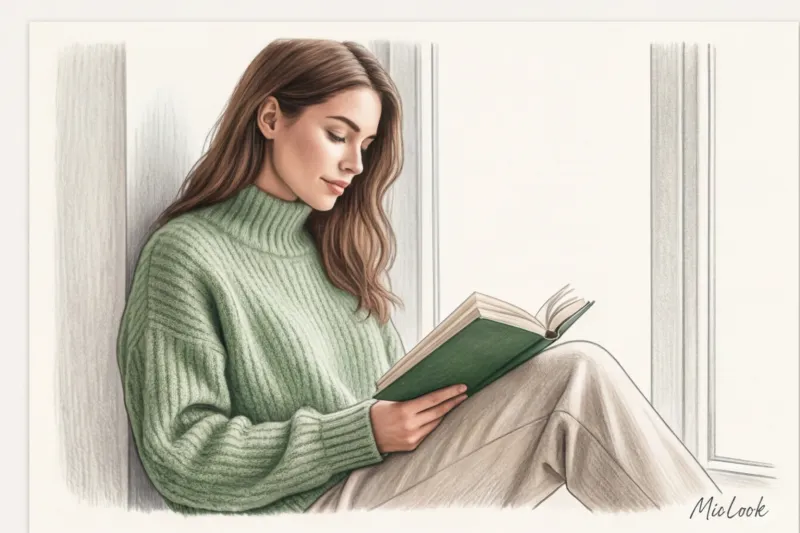
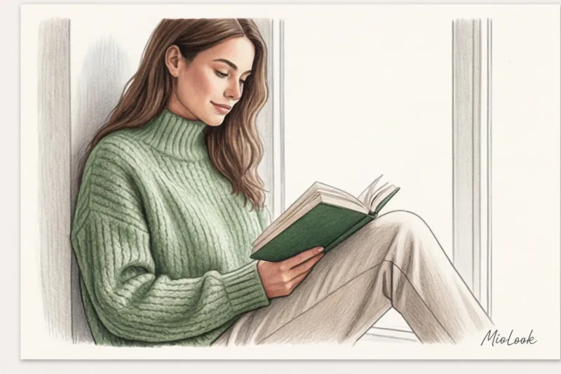
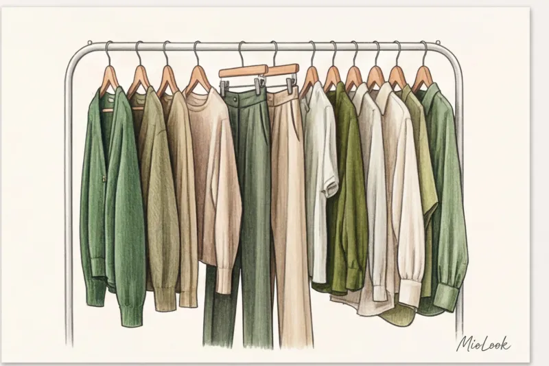
Warm and natural (sage, olive, khaki) are trust magnets
If your goal is to be liked, choose complex, muted shades with gray and warm yellow pigments. It's no wonder the Pantone Color Institute regularly includes shades such as Loden Frost or Olive Branch , into basic palettes. These are grounding colors.
Over 12 years of work, I've noticed a clear pattern: these are the shades that successful helping practitioners—psychologists, coaches, pediatricians—intuitively choose (or I help them choose). One of my clients, the HR director of a large IT company, complained that candidates were too reserved during interviews. We conducted an experiment: she swapped her stiff, dark blue armor-like blazers for soft, sage-colored cardigans and jackets. The result? People began to open up, anxiety levels in the meeting room decreased, and conversations became more honest.
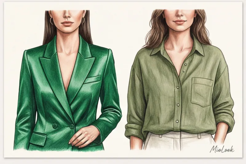
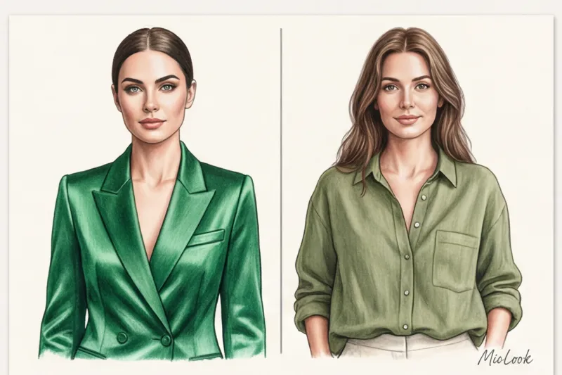
Cold and precious (emerald, malachite) are markers of power
But herein lies the main counterintuitive insight. Rich, pure shades of precious stones (emerald, jade, malachite) are not conducive to intimate conversations. They convey a cold sense of status, high intelligence, and rigid distance.
Emerald is the color of power. It's perfect for speaking at a conference in front of thousands, signing a complex contract, or dining with stakeholders. However, wearing an emerald silk blouse to a meeting that requires empathy (for example, firing an employee or resolving a family conflict) will make you appear arrogant and cold.
Try MioLook for free
A smart AI stylist will help you choose the perfect shade of green to suit your color type and needs.
Start for freeThe Magic of Tactility: Why Plastic Neon Kills Empathy
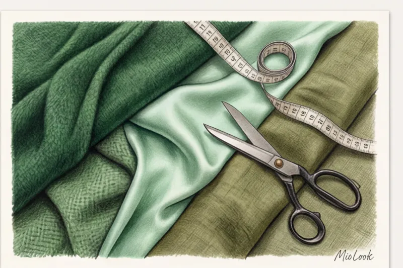
As a textile expert, I never tire of repeating: color is only half the message. The other half is the texture of the fabric. The visual weight of the material can either enhance the magic of green or destroy it completely.
Why does an acid-green top made of cheap polyester evoke anxiety rather than calm? Glossy neon doesn't exist in nature; it's the color of poisonous insects and chemical warning signs. Synthetic shine (especially in the budget segment) disrupts the natural color code. The brain interprets this as "toxicity," and instead of empathy, we experience irritation.
Ideal textures for conveying trust:
- Cashmere and merino wool (matte light absorption);
- Organic cotton with a density of 180 g/m² (keeps its shape but remains soft);
- Linen softened by washing (its slight wrinkles say: “I’m relaxed and not chasing the perfect picture”);
- Boucle and tweed in muted forest tones.
Business Dress Code: How to Incorporate Green into Your Office Capsule
For many women, a business wardrobe is limited to black, gray, and navy blue. But deep forest green is a luxurious and less cliché alternative. If you're looking to rethink yours, business capsule , start small.

How to integrate it correctly:
- Proportions. An all-green look might be too theatrical for a conservative office. Use it as a base: khaki pants and a cream-colored blouse, or a sage-colored jacket over a sand-colored turtleneck.
- Confidence combinations. Want maximum empathy? Combine green with warm, natural companions. Green + dark chocolate, green + beige, green + baked milk.
- Wardrobe digitization. Before buying new items, I always recommend that clients take a look at their closet. The easiest way to do this is through smart wardrobe feature in MioLook — Upload a photo of your beige or brown trousers, and AI will show you how they will look with a new olive cardigan.
Color Ecology: Toxic Dyes vs. Natural Green
We can't talk about green without touching on sustainable fashion. It's an irony of history: the color symbolizing nature was long considered the most dangerous to health. In the Victorian era, the famous "Paris green" was made with arsenic. Dresses literally killed their wearers.
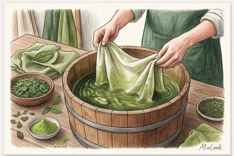
Today's reality is different, but achieving a beautiful, long-lasting green from natural ingredients (chlorophyll, matcha, nettle) remains difficult and expensive. High-quality natural dyeing with a GOTS certificate generally increases the price of an item. While a budget mass-market store offers a synthetic jumper for €20-€30, an ethically sourced cotton jumper with plant-based dyes will cost between €100-€250. But the difference is colossal.
In my experience, items made from organic fabrics with natural dyes age incredibly beautifully. I personally tested a shirt dyed with nettle extract. While fading in the sun, it didn't become washed-out and dull (as happens with polyester), but acquired a complex, vibrant patina and a vintage character. This is an investment in quality that's visible to the naked eye.
Your perfect look starts here
Join thousands of users who look flawless every day by combining eco-friendliness and style with MioLook.
Start for freeChecklist: Building a Look for Difficult Negotiations
Knowledge of neurobiology and textures is useless without practical application. Let's imagine a situation: you're about to have a conversation where you need to de-escalate tension and reach an agreement. Here's your cheat sheet.
- Step 1: Define the vector. Need empathy? Consider sage linen or olive wool. Need unquestionable authority? Consider smooth, dark emerald.
- Step 2: Remove shine. No silk, satin, or glossy leather in the portrait area. Only matte, light-absorbing textures.
- Step 3: Choose a companion. Calm down the look with milky, beige or dark brown.
- What NOT to do (limitation): Never combine muted green with a bright, contrasting red or burgundy unless you want to evoke associations with a Christmas tree or Santa's elf uniform. Complementary colors alone create maximum visual tension—exactly what we're trying to avoid.
- Step 4: Matte accessories. Maintain the softness of the fabric with suede shoes and brushed (matte) gold jewelry, avoiding the jingle of shiny metal.
Managing impressions through color isn't magic, but applied physiology and a knowledge of textiles. By choosing the right shade and matte texture, you literally recalibrate your interlocutor's perception, signaling, "I'm safe." Treat color as a tool, and your wardrobe will begin to work for you.