I was recently analyzing anonymized statistics from our styling app and came across some astonishing figures: 68% of women over 35 completely remove light, washed-out shades from their virtual wardrobes. The reason they cite in surveys is always the same: fear of looking "inappropriate" or "too frivolous." We voluntarily abandon this most powerful visual tool, replacing it with safe beige or a strict but subdued black.
We have already discussed physiological reactions to different palettes in more detail in our A complete guide to the psychology of color in clothing and its impact on mood However, it is precisely pastel colors in clothing, psychology The perception of which is overgrown with numerous stereotypes deserves a separate analysis. Forget the glossy clichés about powder pink being only suitable for dates. In this article, I'll prove to you that architecturally tailored pastel is a marker of high status, hidden influence, and confidence that disarms any opponent.
The Psychology of Pastel Colors in Clothing: Why Are We Afraid of Looking Childish?
Our cultural code is strict: from birth, pink and light blue are firmly associated with the nursery, while navy and graphite are associated with the boardroom. Because of this, we instinctively confuse color and shape. We believe that wearing a mint shade automatically transforms us into an immature girl whose opinion can be disregarded.
I admit, I was a prisoner of this myth for a long time. Early in my career as a stylist, I hid behind black turtlenecks and stiff dark jackets until I was 28. I thought that was the only way clients would believe in my expertise. I artificially added age and rigidity to myself. My epiphany came when I began studying archetype theory and realized that authority is built not on gloom, but on contrasts and a well-fitted silhouette.
When discussing the psychology of pastel colors in clothing, it's important to understand the biggest mistake most people make: we dismiss the color itself, while in reality, we're intimidated by the poor cuts that this color typically comes with in mass-market clothing. But separating these concepts opens up a whole new level of impression management.
The Neurobiology of Tenderness: How Light Colors Affect the Brain (and Your Conversation Partners)
Let's look at color from the perspective of physics and neurobiology. Any pastel shade is a base color with a lot of white added. White reflects light as much as possible, meaning the observer's optic nerve requires much less effort to process it. No overload, no stress.
Research by the Institute for Color Research (2023) confirms that light, off-white clothing acts as a visual tranquilizer. When you enter a meeting room wearing a dusty blue or sage green suit, the heart rate of those you're talking to reflexively decreases by 3-5 beats per minute. You literally calm them down on a physiological level by reducing the production of cortisol (the stress hormone).
This is especially relevant now. In its latest report, the Pantone Color Institute attributes the growing trend toward "soft tones" to the demand for empathetic leadership in the post-COVID era. Authoritarian management styles are on the decline. Today, top managers are choosing pastels to convey the message: "I'm strong, but I'm open to dialogue."
Try MioLook for free
A smart AI stylist will select the perfect look based on your appearance and psychological needs.
Start for freeThe Myth of Weakness: How to Wear Pastels and Convey Authority
There's an unspoken rule among stylists working in the premium segment: pastels are a marker of status and "quiet luxury" (stealth wealth). Why? It's simple.
Dark colors are utilitarian. A navy blue coat screams, "I ride the subway during rush hour, get stuck in traffic, and worry about getting a coffee stain." A light, pastel shade conveys a completely different message: "I take a taxi, my schedule is predictable, and I have the resources to afford impracticality."
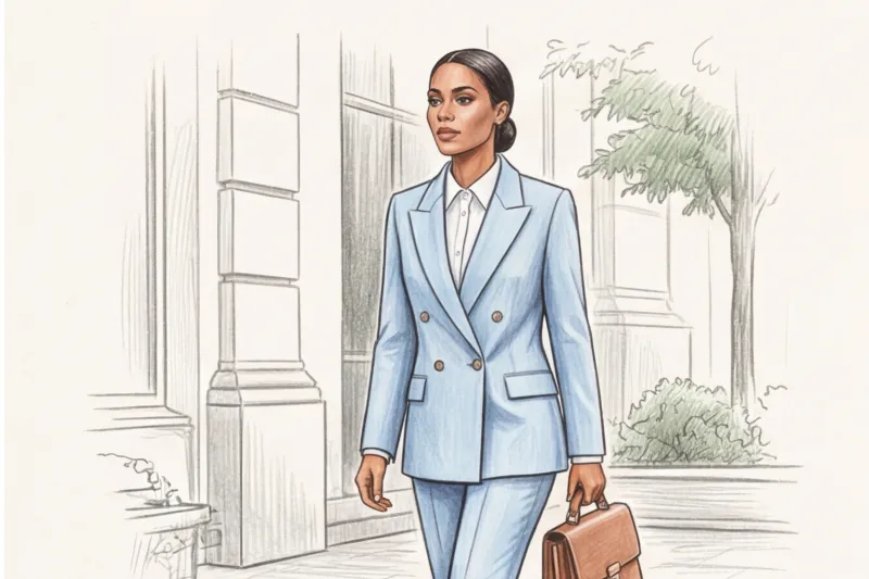
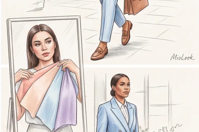
I had a revealing case in my practice. A client, the founder of a fintech startup, was preparing for a challenging pitch to a pool of investors (mostly conservative men). Typically, in such situations, the advice is to wear a formal dark blue suit. We did just the opposite—we chose a crisp, double-breasted pantsuit in a powder blue shade.
The result? Among ten other founders in black and blue uniforms, she was instantly memorable. But most importantly, her image lowered the investors' critical level. They subconsciously perceived her less aggressively, and the crisp cut of her suit eliminated any doubts about her professionalism. The investment round was successfully closed.
The Secret Formula of Stylists: 'Soft Color + Rigid Shape'
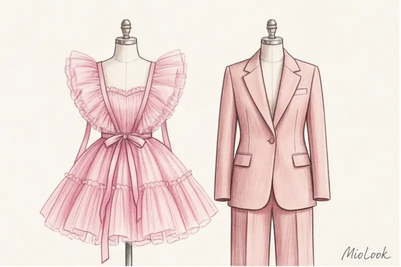
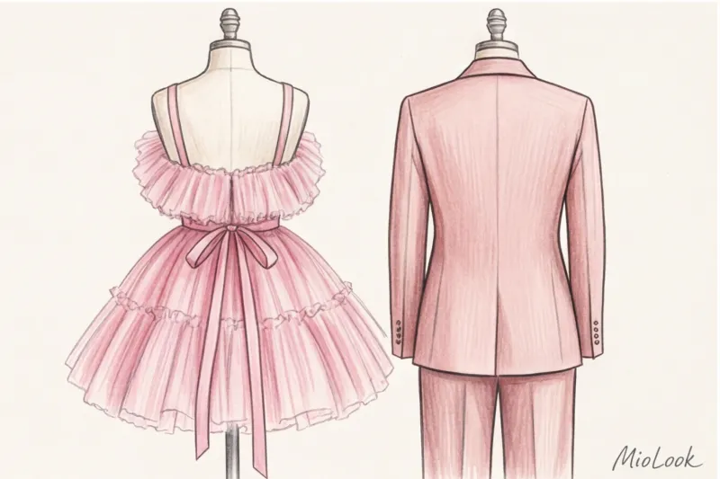
This case brings us to the main rule of working with a light palette: the more delicate the color, the harsher, more masculine, and more architectural the cut of the garment should be.
Compare these two options. The first: a slim-fitting pink blouse in fine knitwear—a classic "teen girl" look. The second: a voluminous pink jacket with a crisp collar, styled like a man's. The color is the same, but the perception is radically different. The rigid shape offsets the softness of the color, creating the perfect balance that looks both expensive and stylish.
Typical mistakes that turn femininity into infantilism
Despite the power of pastel shades, they're easy to get wrong. When people come to me for wardrobe reviews, I often see items that have to be ruthlessly discarded. Here are two of the most common mistakes.
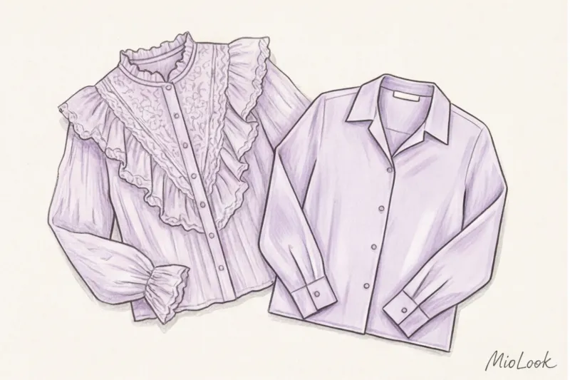
Mistake 1: Flimsy fabrics. In my experience, 80% of the impression of a pastel outfit's "expensiveness" comes from the fabric's density, not the color itself. Thin, flimsy knitwear, cheap, shiny viscose, or see-through cotton in delicate shades instantly cheapen the look. If you're buying a basic shirt (even a high-street one like Zara or H&M for €30-40), choose a heavyweight cotton (180 g/m² and above) that holds its shape rather than looking flimsy.
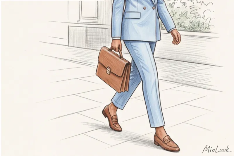
Mistake 2: Total "match". Matching your bag, shoes, and dress in the same pastel shade without using contrasting textures is a throwback to the 2010s. This look looks flat and too "try-hard." If you're wearing a mint-colored suit, jazz it up with a dark chocolate-colored suede bag or graphite loafers.
Your perfect look starts here
Join thousands of users who look flawless every day with the MioLook virtual wardrobe.
Start for freeMarshmallow Syndrome: Decor That Has No Place in a Serious Wardrobe
I always warn my clients: pastel color is a powerful decorative element in its own right. Therefore, it doesn't tolerate competition from excessive details.
Ruffles, flounces, bows, lace inserts, and small floral prints paired with pastels are a guaranteed way to achieve a "little girl" look. In a modern business or smart-casual wardrobe, pastels should be kept as minimal as possible. Clean lines, hidden buttons, and a lack of unnecessary seams—this is what mature elegance looks like.
Smart Integration: Adding Pastels to a Basic Capsule Wardrobe
You don't have to buy butter-colored three-piece suits right away. Start small. I recommend using the 20/80 rule: make up 80% of your outfit with your usual neutrals (gray, beige, camel), and 20% with a pastel accent.
For example, if your office has a jeans-only Friday dress code, but you want to look a little more put-together, try a pair of straight-leg dark blue jeans, a tailored graphite jacket, and a soft lavender men's shirt. It looks fresh yet completely appropriate.
To avoid guessing what goes with what, I recommend digitizing your items. Upload photos of your basic clothes to MioLook — the algorithm will automatically show you how your new dusty pink sweater (say, a basic cashmere from COS for €150) will look with the olive pants or gray coat you already own. You'll be surprised how versatile pastels are when paired with a neutral base.
Checklist: How to choose 'grown-up' pastels based on contrast level
The only time pastels can actually be harmful is if the color temperature isn't chosen correctly. Light colors near the skin can make you look pale and tired if you ignore your natural coloring.
Here's a quick rule for choosing: focus on your natural contrast (the difference between your skin, eye, and hair color).
- High contrast (dark hair, fair skin, bright eyes): You need icy , bleached shades. Icy blue, frosty mint, cool lemon. They will highlight your brightness.
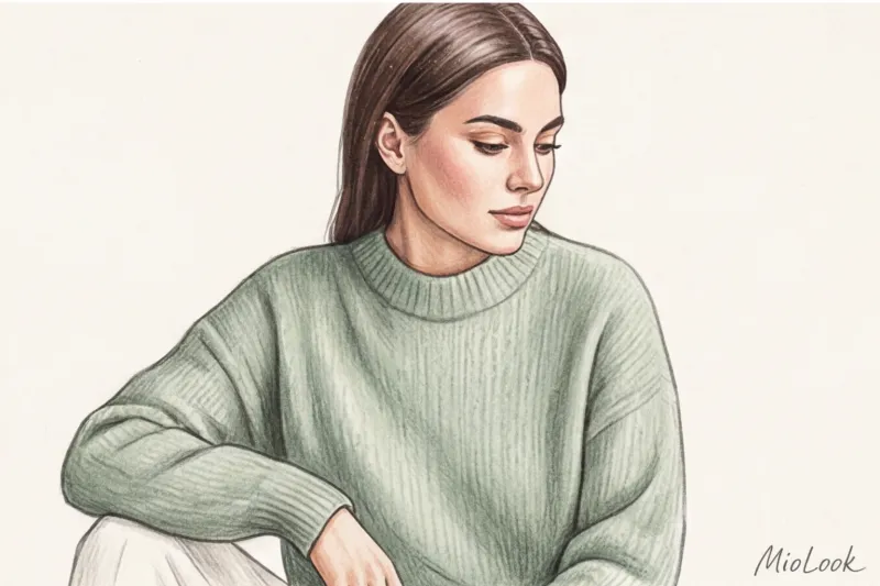
- Low contrast (light brown hair, soft eye color, low-contrast skin): Take your pick powdery , complex and dusty shades. Dusty rose, complex pistachio, gray-blue.
According to WGSN's analytical reports, the top 3 most trendy and "expensive" pastel shades of this season, which are easy to incorporate into your wardrobe, are:
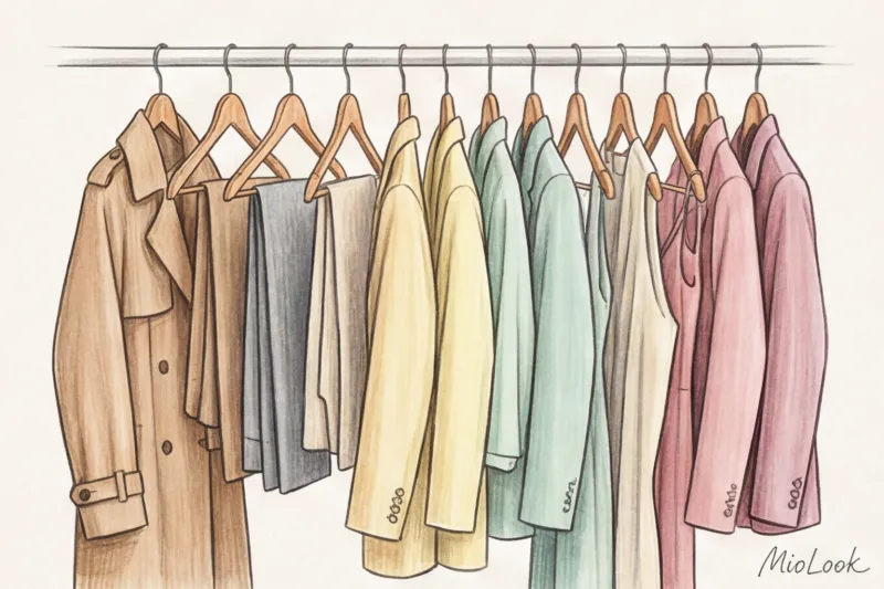
- Sage green - an ideal replacement for boring gray color.
- Butter (Butter yellow) - looks luxurious in silk and thick linen.
- Dusty blue — new black for shirts and jackets.
To summarize: pastel colors aren't a sign of weakness or immaturity. They're a way to fine-tune your look, conveying confidence, empathy, and a high status. Don't hide in the safety of dark blue. Tomorrow morning, simply try wearing an icy blue shirt instead of your usual white one. You'll immediately notice a change not only in your reflection but also in the way others speak to you.