
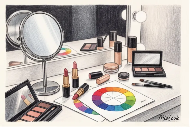
Why makeup based on your color type isn't a framework, but your beauty compass.
In 12 years of working as a personal stylist, I've learned one ironclad rule: even the most impeccable €1,500 silk three-piece suit will lose its luster if the key "accessory" on your face is chosen incorrectly. You can invest hours in creating the perfect wardrobe, but if the makeup shades clash with your natural coloring, the look instantly falls apart. That's why a well-designed makeup according to color type — this is not an outdated theory from the glossy magazines of the 2000s, but an absolutely basic tool for impression management.
I always tell my clients that makeup is a complete extension of your style and wardrobe. Just as it's impossible to wear a warm gold necklace over a cool silver dress without losing the harmony, it's equally impossible to use terracotta blush on skin with a porcelain-pink undertone. The connection between your skin tone, the shade of your irises, and the pigments in your makeup is based on pure physics and the laws of color theory established by Johannes Itten. When light hits your face, it reflects off the pigments in your makeup and the melanin in your skin. When these colors resonate, your skin literally glows from within.
It's this harmony of shades that creates that coveted effect of an "expensive" and well-rested face. It's not about the price of the foundation—the right mass-market shade for $15 will always look more refined than a discordant luxury shade for $150. When the temperature and saturation of your makeup matches your natural features, you look like you just returned from a vacation in the Amalfi Coast. This rule is especially critical in professional settings, as I discussed in detail in the article about business makeup for executives , where status is conveyed precisely through impeccable tone.
"Makeup shouldn't overpower your appearance. A perfectly chosen palette works like good lighting in a photo studio—it highlights your best features and gently counteracts fatigue."
The Biggest Mistake: How the Wrong Undertone Ages You by 5 Years
The most dramatic consequence of ignoring your color type is visual aging. I had a case in Madrid where a 30-year-old client looked 40 simply because of the contents of her makeup bag. The first and most common problem is a gray, sallow complexion that results from applying a too-warm, peachy tone to skin with cool, pinkish, or olive undertones Instead of a light tan, the face takes on a sallow appearance because the warm yellow pigment clashes with the cool skin base, creating an optical smudge.
The second pitfall is the trendy red pigment on the eyelids. Yes, burgundy and brick-red eyeshadows look great on models with a warm complexion. But if you have a cool skin tone and light eyes, using the wrong red pigment will instantly guarantee a "tear-stained" look or a severe allergy. A puffy look is not a trend you should strive for, especially if you're doing stylish makeup for work in the office.
Finally, the insidiousness of lipstick. Have you ever noticed how your perfect, snow-white smile suddenly fades? Yellow teeth are most often caused by the wrong lipstick undertone. Warm coral, orange, and brick shades visually draw out the yellow pigment from your teeth. Meanwhile, lipsticks with a cool blue base (classic ruby, plum, cool pink), on the contrary, act as optical brighteners.
To avoid buying dozens of unsuitable products at Sephora through trial and error, I strongly recommend first digitizing your appearance. You can use MioLook — The app's algorithms help visualize how different color combinations will look on your facial features, turning cosmetic selection from a roulette wheel into a precise science.
Color Basics: How to Determine Temperature and Contrast
In 1961, Swiss art theorist Johannes Itten published The Art of Color. He hardly imagined that his work, written for artists at the Bauhaus school of architecture, would become a veritable bible for 21st-century makeup artists. But Itten's theory of the interaction of shades proves why the same peach tint can make one woman look fresh and rested, while giving another a sickly, jaundiced appearance.
Today, professionals don't rely on the rigid boundaries of "winters" and "springs" in the classical sense. We rely on directional method — a flexible system that analyzes appearance not as a static image, but as a set of vectors. This approach breaks down your natural gifts into three fundamental characteristics—the three pillars of color type:
- Temperature (hot/cold): physiological basis. It is determined by the ratio of melanin, carotene, and hemoglobin in your skin. A warm undertone has a golden, peach, or yellowish glow, while a cool undertone has a pinkish, olive, or slightly bluish tint.
- Saturation (brightness/softness) Imagine the "saturation" slider in a photo editor. Bright faces have pure, crystalline colors. Soft faces have complex, muted colors, as if mixed with a drop of gray pigment.
- Depth (light/dark): the level of pigment saturation in the hair, eyes, and skin. From transparent Scandinavian blonde to deep ebony.
The intersection of these three vectors forms the modern 12-season system. In makeup, this works like a precise mathematical formula. If your primary characteristic is "softness," then graphic black eyeliner and neon lipstick will look like theatrical makeup, separate from you. Conversely, contrasting types are contraindicated by dusty, "dirty" shading, which makes the face look dull. I've already provided a detailed analysis of each category and the mechanics of how they work in our article. 12 color types of appearance — I strongly recommend studying it to understand your base.
Forget about the color of your veins: stylists' methods that work
At almost every first consultation, I hear the same phrase: "I looked at my wrist, and the veins look green, so I'm warm!" And every time, I have to gently debunk this myth. Determining skin tone by vein color or the popular gold and silver test are hopelessly outdated methods from the glossy magazines of the 2000s.
Why doesn't this work? The color of your veins depends solely on the thickness of your epidermis and the transparency of your skin. Moreover, many people confuse Overton (a superficial shade that may be pinkish due to rosacea or fine vessels) with real depth undertone As a result, a woman with a cool olive undertone and a reddish overtone buys pink foundation, which ends up looking like a foreign mask.
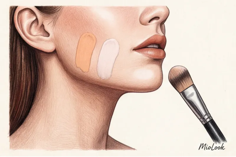
What does a professional stylist use? The reliable drape test. You can easily do it at home. Remove all makeup, pull your hair back from your face, and put on a basic white T-shirt so the color of your clothes doesn't bleed onto your chin. Take two large pieces of fabric (or sheets of thick colored paper): one in a cool pink shade (pure fuchsia), the other in a warm peach or salmon. Stand directly in front of a window in filtered daylight and alternately apply the colors to your chest.
Pay close attention to the shadows on your face. "Your" shade instantly smooths out the contours: under-eye circles lighten, facial contours appear firmer, and skin tone becomes even. A foreign color acts as a merciless magnifying glass for imperfections: nasolabial folds deepen, the slightest pigmentation comes to the fore, and the skin takes on a sallow or sickly yellowish tint.
Access to MioLook for €0.99 — one-time payment
A smart AI stylist will select the perfect makeup and look based on your complexion.
Get access — €0.99 onceThe second crucial step, often overlooked when buying cosmetics, is determining the contrast level of your appearance to determine the intensity of your makeup. This is the difference in lightness between your skin, hair, and eyes. The most accurate way to determine this is to take a makeup-free selfie in good lighting and convert the photo to a black-and-white filter.
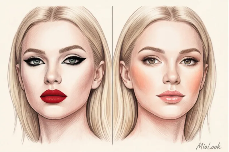
If your hair looks almost black in photos and your skin is radiantly white, you have high contrast. Saturated makeup is essential: a rich ruby lipstick or dark, deep smoky eyes won't overwhelm your face, but rather balance its natural contours. If, in a black-and-white filter, your face, eyes, and hair merge into a single light gray canvas, you have low contrast. In this case, dark, harsh contours will kill your individuality; your key to an expensive, polished look is watercolor undertones, brown mascara instead of jet black, and soft, seamless gradients.
Makeup for the spring color type: freshness and warmth
In the era of the global popularity of heavy, matte contouring, a la social media, spring-type women suffered the most. Trying to create bold cheekbones with thick, gray contouring, they literally erased their most natural asset, turning their vibrant faces into a frozen mask.
Let's dot the i's and cross the t's. The main characteristics of "Vesna" are: warm, clean, light skin , which seems to glow from within. It's completely free of the olive gray of Summer or the dense swarthiness of Autumn. The main goal of your makeup is not to cover up this phenomenal natural transparency with foundation, but to skillfully highlight it.
What's on the list of absolute beauty taboos? The forbidden techniques begin with graphics. Heavy black kohl and wide, jet-black eyeliner on a fair, warm complexion look foreign and aggressive. They visually make the eyes look smaller, creating the effect of fatigue and painful lack of sleep. The second enemy is dense matte textures. Fixative foundations with a velvety effect instantly "kill" the face's vibrant glow. And finally, shades with a hint of cool gray, such as the ever-popular "dusty rose." What makes the summer color type look noble and aristocratic gives the spring type a dull, tired look.
There's an immutable rule in makeup color: purity demands purity. If your natural palette lacks any gray, any muted, "dirty" makeup shade will visually add at least five years to your age.
Your ideal foundation is built on completely different principles: luminous, dewy textures, peach, coral, and golden shades. The famous gold shimmer blush (many professional brands have excellent options in the $30-$35 range) seems to be made just for you. It perfectly combines the right temperature with a translucent texture.
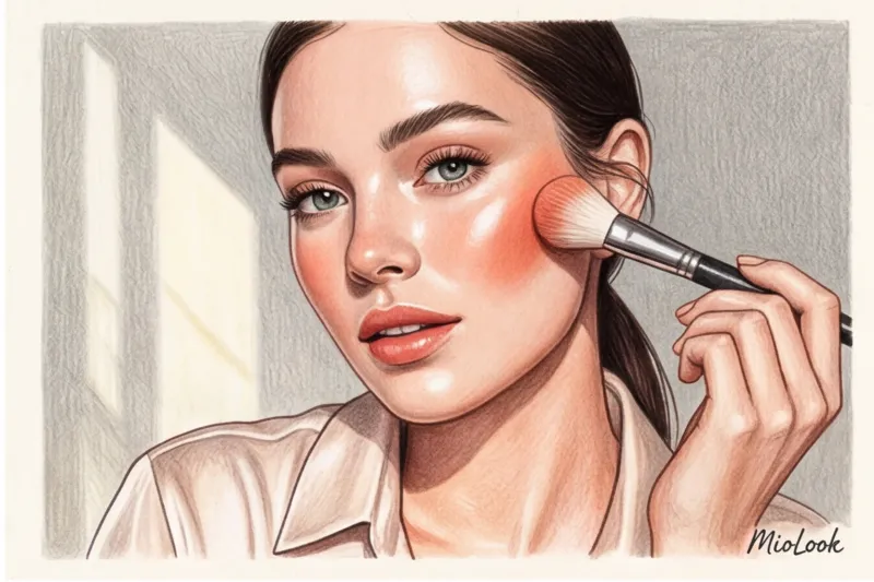
In my master classes, I often share a professional trick I jokingly call the "Sicilian Morning Effect." My absolute favorite formula: Peach blush + warm brown pencil + clear gloss = instant lift for Spring In just two minutes, this combination dramatically refreshes your complexion. The warm chocolate pencil softly defines the lash line without the harshness of black, while the peach blends with your skin tone, creating the effect of a natural flush after a long walk by the sea.
Light, Warm, and Bright Spring: Differences in Your Cosmetic Bag
While the general rules apply, there are three subtypes within a season, each requiring a different approach to pigment saturation. It's crucial to understand your own contrast level to avoid overloading your face with color.
- Light Spring: Your beauty story demands the utmost delicacy. Choose watercolor, sheer shades, and soft pastels. Translucent cream blush in the color of ripe melon, light golden champagne eyeshadow, and moisturizing lip balms. Harsh lines are a no-no here—use only soft shading. Instead of thick black mascara, try brown—it will add incredible depth to your eyes.
- Warm Spring (True Spring): This subtype can handle richer, more "delicious" colors. Rich copper on the eyelids, warm terracotta on the lips, and vibrant gold highlighter on the cheekbones boldly come into play. Imagine the palette of a Mediterranean market: ochre, turmeric, paprika. A bronzer with a soft shimmer will become your best friend, helping to maintain skin's warmth even in winter.
- Clear/Bright Spring: The most contrasting subtype, it's incredibly flattering in vibrant, clear colors. You have the unique ability to wear contrasting colors that might look theatrical or vulgar on others. Try a bright coral lipstick or a turquoise liner on your lower eye – it'll make your iris literally sparkle. The main rule: keep your skin dewy when using bright accents.
To avoid getting lost in the cosmetics aisles and buying the wrong cool shades due to current trends, I highly recommend digitizing your palette. You can save references of your ideal shades in MioLook app By creating a separate beauty mood board, you'll save yourself a ton of time and prevent impulse purchases that end up sitting dead in your makeup bag for years.
Makeup for the summer color type: noble coolness
The beauty industry's paradox is that approximately 80% of commercial bronzers on the market have a decidedly warm, orange undertone. And this very fact daily ruins the makeup of women with a summer complexion. In the color system, "Summer" doesn't mean scorching heat and a tropical tan. It's the aesthetic of August twilight, morning fog, and muted colors. The main markers of this type are: cool skin undertone And low or medium contrast between the color of the hair, eyes, and face. Harsh, graphic lines don't work here, but soft shading reveals itself flawlessly.
One of my clients, a top manager at an IT company, couldn't figure out for a long time why her face looked tired and downright sickly by the middle of the workday. While sorting through her makeup bag, I discovered the root of the problem: a popular foundation with a warm peach undertone. The salesperson at the store recommended it to artificially "brighten her pallor." But on cool summer skin, this warm pigment inevitably oxidized, creating a yellowish effect. Once we switched to a neutral-cool fluid foundation with a slightly pinkish finish (we chose the perfect shade from the Armani line for $69), her face literally glowed from within, and the tired look disappeared without a trace.
What other mistakes instantly cheapen a summer look? First and foremost, any attempts to artificially "warm up" the face:
- Red bronzers On cool skin they look like dirty, foreign spots.
- Brick lipsticks visually yellow the tooth enamel and highlight the slightest redness.
- Highlighters shade yellow gold lie on top of the skin texture like a rough foil, without merging with it.
The secret to the perfect basic makeup kit lies in intricate, slightly dusty nuances. With the right shades, even a budget $15 lipstick will look more luxurious on you than an ill-suited warm $60 luxe shade. Your arsenal should definitely include:
- Dusty Rose — the best choice for everyday blush. This shade perfectly mimics a natural flush after a frosty walk.
- Taupe — your essential tool for sculpting your face and applying eye makeup. Shades like MAC's iconic Omega shadows create the perfect, anatomically-contoured shadow with absolutely no red undertones.
- Cool pink and berry shades — the perfect lip solution. From a translucent tint for daytime to a full-bodied matte lipstick in a cool cherry hue for evening.
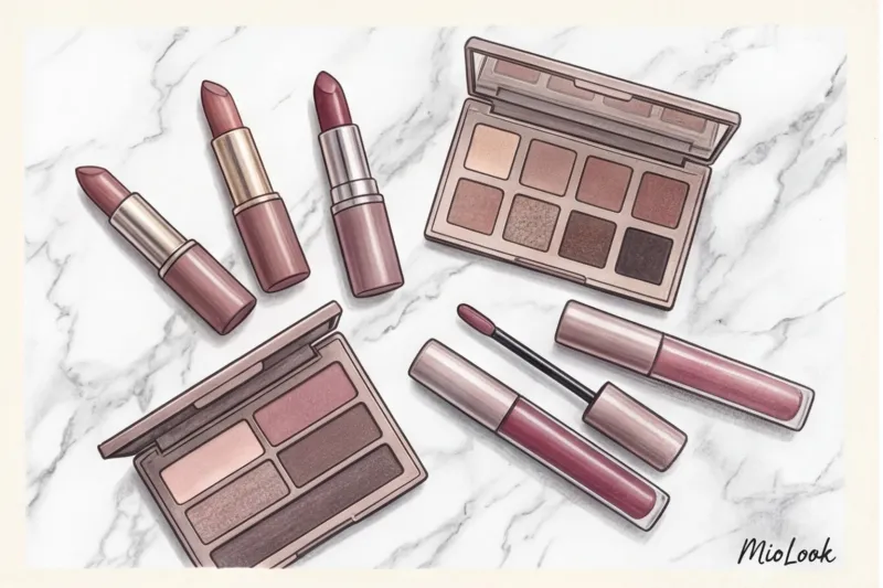
Light, Cool, and Soft Summer: The Perfect Palette
Like any season, summer color types are varied. When choosing makeup, be sure to consider your dominant color type.
Light Summer This eye has the most delicate appearance. Dense, dark smoky eyes are strictly prohibited here; they will make the look heavy and add years. Opt for watercolor transparency: pearl textures on the lid, icy pink lip gloss, and definitely a graphite pencil instead of charcoal. A dark gray kajal will highlight the lash line softly and elegantly.
True/Cool Summer — is an absolute celebration of cool. Pure berry tones look incredibly flattering on you. Try applying a cool plum lipstick with your fingertips (the currently popular "kissed lips" effect), and add a silver highlighter to the high points of your cheekbones. This combo creates an aristocratic, truly classy look.
Soft Summer It's bordering on fall, but maintains a cool base. Complex, muted shades are your forte, as they can look muddy or dull on other color types. Monochromatic makeup in taupe shades, gray-blue smudged eyeliner, or a matte lipstick in a fading rose color will fully reveal your natural beauty.
"For Soft Summer, the immutable 'haze' rule applies: no color in makeup should be too obvious. The more complex the shade blend in the refill, the more harmoniously it will blend with your skin." This makeup artist mantra has saved hundreds of red carpet looks.
Access to MioLook for €0.99 — one-time payment
Start creating perfect images with the help of artificial intelligence
Get access — €0.99 onceMakeup for the Autumn Color Type: The Luxury of Spicy Shades
In 1994, legendary makeup artist Kevin Ecoin created an iconic look for Cindy Crawford that forever cemented the "spicy" aesthetic in the history of high fashion. The autumn type is the only one who can wear heavy, monochrome makeup in brown tones and still look fresh, expensive, and completely natural.
When we select makeup according to color type for autumn appearance, we rely on three basic characteristics: pronounced warm undertone , mainly low contrast (the shades of skin, hair and eyes flow smoothly into each other, without creating sharp boundaries) and rich, thick colors This is the palette of an oriental bazaar – cinnamon, turmeric, cardamom and nutmeg.
Unlike spring girls who crave watercolor transparency, autumn demands depth. That's why textures play a crucial role here. The best shades for autumn are suede matte lipsticks And cream bronzers During the Barcelona campaign shoot, I used Fenty Beauty Cheeks Out Creamy Bronzer (around $36) on fall-toned models—it literally melts into warm skin, creating a natural-looking shadow without a dry, powdery finish. Your ideal base should include complex shades like copper, bronze, khaki, mustard and terracotta And for an expressive look, replace the aggressive black eyeliner with a soft one. brown kajal.
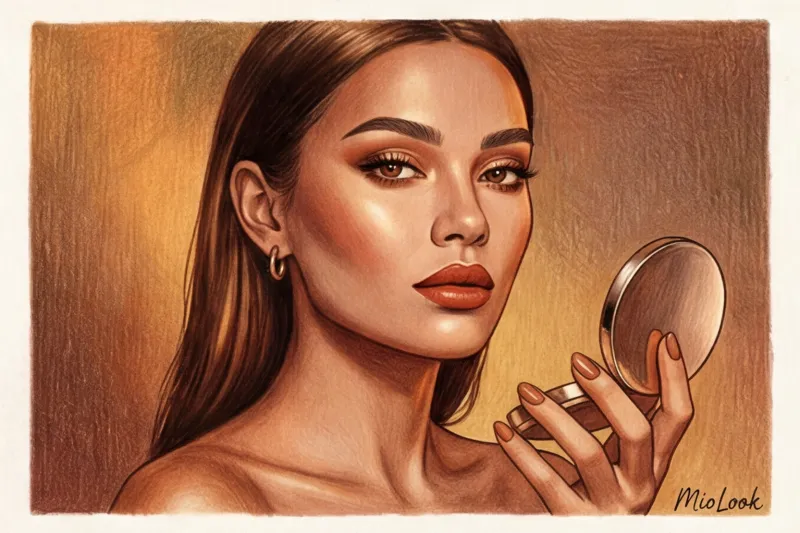
What instantly destroys this natural harmony? Three main mistakes: fuchsia, icy pink and black liner I once had a client come to me, a classic Autumn, who had been wearing neon pink lipstick for years, trying to "refresh" her face. The problem with garish, cool colors on warm, low-contrast skin is that they take on a completely separate life. Her lips "entered" the room before she did, and her skin took on a sickly, sallow, greenish tint against them. To avoid wasting your budget on makeup that ages you, I always recommend uploading your selfies to MioLook — a smart algorithm will immediately show how a specific lipstick shade will interact with your skin temperature.
Soft, Warm, and Dark Autumn: Textures and Pigments
Although the overall "spicy" direction remains, within the autumn palette there is a gradation of saturation that requires fine-tuning in the makeup bag.
Soft Autumn borders on the summer season, so its colors seem dusted with morning mist. Imagine the color of dried sage or sun-bleached clay. Your main technique is soft shading No sharp graphic lines, just haze. Complex images work flawlessly for you. olive eyeshadow and translucent nude-brown lipstick (For example, the iconic Velvet Teddy shade from MAC). Avoid overly dense textures, opting for velvety finishes.
Warm Autumn — this is the absolute highlight of the season, the color of maple leaves and ripe pumpkin. You can confidently wear pigments that would create the effect of inflamed eyes on other girls. Deep copper smokes , saturated brick red lipstick And warm blush A peachy-brown shade is your uniform for creating classy looks. Here, textures can be slightly more satiny to highlight the natural glow of warm skin.
Dark Autumn It has the highest visual weight in this group and transitions smoothly into Winter. These shades are dark chocolate, aged cognac, and ripe pomegranate. Drama is called for here, but it must be interpreted warmly. Choose burgundy, chocolate and deep eggplant on the lips and eyes Rich, warm-toned wine lips with a matte finish paired with a bronze sculptor will create a truly hypnotic look.
Makeup for the Winter Color Type: Contrast and Drama
Have you ever wondered why the classic Hollywood look—snow-white porcelain skin, jet-black eyeliner, and full red lips—looks like regal luxury on some women, while on others it turns into a ridiculous mask? The secret lies in the level of natural contrast. Winter is the only color palette that perfectly suits such uncompromising, graphic lines. What's difficult for summer or autumn types stage makeup , on representatives of the winter type it looks like an absolutely natural, harmonious everyday look.
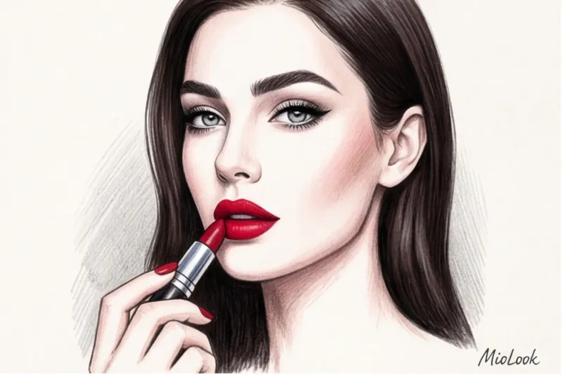
The key characteristics of this luxurious type are a dominant cool undertone, extremely high contrast between skin, hair, and irises, and a physiological need for crystal-clear colors. If you're a Winter, your ideal base should be built on shades of precious stones and precious metals. A graphic black liner, a pure red pigment (like the legendary MAC Ruby Woo matte lipstick for $25), pulsating fuchsia, deep emerald, and cool, shimmering silver are your essential tools for creating an "expensive" complexion.
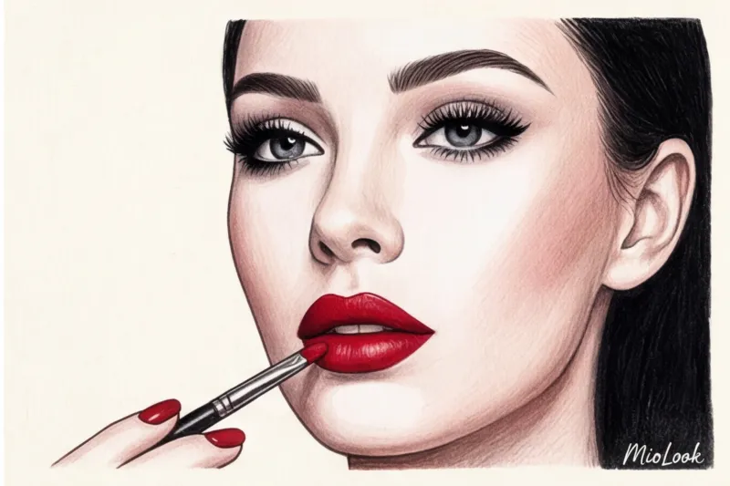
But this vibrant, natural palette has its strict no-nos. The biggest mistake I regularly correct in new clients is trying to artificially "soften" their appearance with trendy beige makeup. Pale nudes, especially with a warm peach undertone, literally erase the Winter complexion. Since your beauty is built on a stark contrast of light and shadow, a concealer-colored lipstick blends into your skin, turning a gorgeous woman into a tired shadow. Another deadly enemy is red-brown eyeshadow and brick-red bronzers. They clash harshly with the natural ash or blue-black pigment of your hair, instantly giving your eyes a bloodshot, tear-stained look. Remember: when choosing makeup based on your color type, Winter absolutely must not blur her natural boundaries.
Your ideal image begins Here
Join thousands of users who look flawless every day with MioLook. Digitize your makeup bag and find the perfect shades.
Get access — €0.99 onceDark, Cold, and Bright Winter: Accents That Work
As with other seasons, winter color palettes are uneven. They are delicately divided into three subtypes, each with its own rules for playing with textures and pigments.
Dark Winter (Deep) is distinguished by incredible color saturation and a mix of subtle warmth against a deep, dark background. When I was preparing a client with this type for an evening reception in Geneva, we deliberately eschewed classic scarlet in favor of a dark-chic aesthetic. The ideal combo for Dark Winter is full, wine-colored lips the color of ripe cherries (for example, Tom Ford lipstick in Black Orchid, $60), deep graphite smoky eyes instead of flat black, and distinctly expressive, architectural brows. Here, the depth of color reigns supreme, not its garish brightness.
Cold Winter (True) is the epitome of an elegant "snow queen." The absolute, total absence of warm pigments in your appearance demands the same surgical uncompromising approach in your makeup bag. Your main arsenal is an icy pink blush (the famous Dior Rosy Glow 001, €42), which, on cool skin, creates not a doll-like effect, but the illusion of healthy, frosty freshness. Add to this a sapphire liquid liner and a cool ruby lip color with a blue undertone—this trick, incidentally, visually makes the whites of your eyes brighter and your teeth a shade whiter.
Bright Winter — the rarest, boldest, and most extravagant subtype, teetering on the edge of Spring but firmly maintaining an icy base. This type is allowed to embrace everything that others fear: bold neon accents, vinyl-like glossy textures, and crystal-clear, almost acidic colors. Want to draw a double-winged winged eyeliner in electric blue or apply a glossy fuchsia varnish to your lips? Go for it. My only fair warning as a practicing stylist: such bold pops of color require an absolutely flawless, porcelain complexion, free of the slightest trace of fatigue or redness.
Stylist Secrets: How to Wear "Alien" Shades in Makeup
I often hear disappointed clients say, "This luxurious terracotta lipstick isn't my type; I'll have to give it to a friend." Stop it. As a practicing stylist, I officially declare: you CAN wear colors outside your natural palette. Strictly adhering to your color type is a great foundation, but the ultimate in style lies in breaking the rules. The secret lies not in blindly following charts, but in the mathematics of balance.
Let's tackle the most common problem: mixing temperatures. For example, you have cool skin with a pink undertone, but you're dying to try a warm coral lip shade. Applying this lipstick alone will instantly make your face look sallow and your teeth appear yellowish. The solution lies in creating a visual "bridge." Warm lipstick and a cool base are a modern eclectic combination that looks incredibly stylish when combined with the right connecting element. In our case, that's blush. Blend a complex neutral-peach shade onto the apples of your cheeks (a great example is the iconic NARS Orgasm ($32), which blends warm peach with cool golden-pink shimmer). This gradient will seamlessly connect your cool skin with the warm accent on your lips, creating the effect of a deliberate fashion statement rather than a makeup artist's mistake.
What should you do if your lipstick shade clashes with your appearance and blush just won't do the trick? This is where the "rule of distance" comes into play. It's simple: to compensate for an unflattering color on your face, you need to create a powerful, well-matched contrast with your clothing. Perfectly even out your skin tone with a rich foundation (a different color will always highlight even the slightest redness and bruises) and wear a top or jacket in your perfect, 100% matching shade. If you're a "Winter" with brick-red lipstick, wear an icy sapphire or snow-white sweater. The garment will create the perfect under-illumination for your portrait area, neutralizing the negative impact of your makeup. To plan such complex combinations in advance, I recommend putting together looks in MioLook — a smart wardrobe will clearly show how the color of a blouse will elevate a questionable makeup look.
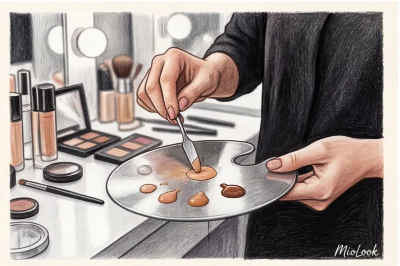
And finally, my favorite insider trick, which I spied backstage at Milan Fashion Week. Often, the problem isn't the accents, but the base products—the foundation you bought turns out too yellow, gray, or downright pink. Don't rush to throw the bottle away. Every makeup artist's professional makeup kit includes adjusters—highly pigmented drops for color change. This is true beauty alchemy in your makeup bag. Just add a micro-drop of blue adjuster (try the base pigment from LA Girl for $9) to an overly warm, "reddish" tone, and it instantly becomes a refined neutral olive, blending perfectly with your neck. A drop of yellow adjuster will save an overly pink foundation. This tool allows you to adapt literally any texture to the unique undertones of your skin, turning a standard product into a custom couture creation.
Putting together a basic beauty capsule: a step-by-step checklist
According to Mintel's 2023 Consumer Habits Study, we only regularly use 20% of the contents of our makeup bags. The remaining 80% are impulse purchases that sit idle or, worse, distort our natural features. It's time to bring the principles of mindful minimalism from your closet to your vanity.
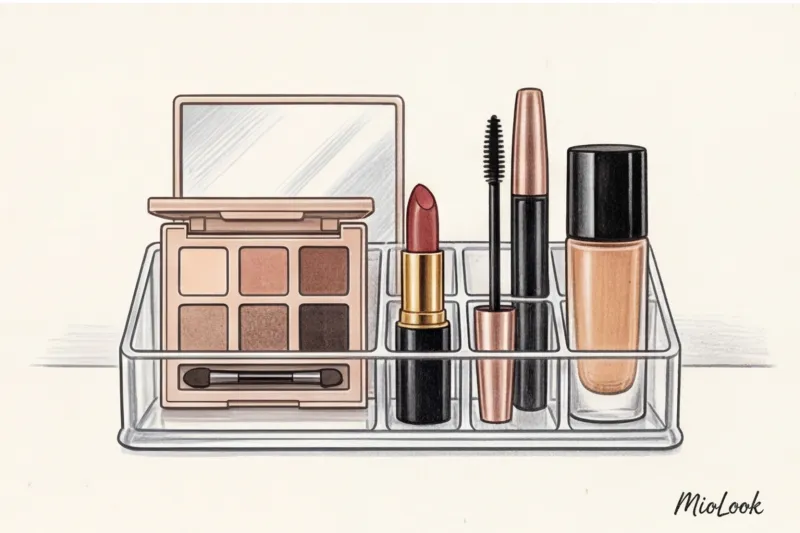
Let's start with a thorough audit. Your first priority is to ruthlessly get rid of anything that ruins your complexion. My favorite pro trick: take dense swatches of all your foundations, bronzers, and concealers on a sheet of crisp A4 office paper (it works as a perfect color target). If your concealer looks decidedly red against the crisp white paper, and you have a cool complexion, toss it without hesitation. The same goes for lipsticks, the pigment of which makes your teeth look yellower.
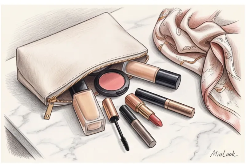
To avoid beauty failures in the future, I developed a strict beauty capsule formula: 1 foundation + 1 concealer + 1 universal palette (for color type) + 2 lipsticks (nude and accent) With this arsenal, you'll accomplish 95% of your daily and evening tasks.
Before you head to the stands, save this step-by-step checklist for your cosmetics shopping trip:
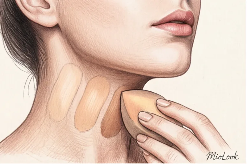
- Tone (base): Look for textures that blend into the skin. Test the shade only on the jawline in daylight. A good guide is lightweight fluids like Make Up For Ever HD Skin (about $47).
- Concealer: It should be a maximum of half a tone lighter than the base, but strictly at the same temperature. NARS Radiant Creamy Concealer ($32) remains the industry benchmark.
- Universal palette (sculptor + blush + highlighter): Ideal for warm skin types Charlotte Tilbury Filmstar Bronze & Glow ($68), for cold tones - multifunctional palettes Dior Backstage ($49).
- Two lipsticks: A flawless nude (that matches your lip color exactly) and one dramatic accent (the right red, wine, or berry, depending on the season).
The key to elegance is aligning your makeup bag with your capsule wardrobe. Your makeup should be a logical extension of your outfit. Imagine wearing a luxurious cashmere coat in a warm camel shade. If your lipstick is a garishly cool, icy fuchsia, the look will instantly disintegrate into clashing fragments. For a business environment, this rule is absolutely critical—we discussed the mechanics of creating a prestigious look in detail in our article about business makeup.
To make the planning process quick and clear, I recommend digitizing your images in MioLook app When you have a clear color palette of your wardrobe for the week in front of you, choosing the right accent lipstick to match your jacket tomorrow takes exactly 10 seconds.
Conclusion: Your Personal Beauty Formula
There's a persistent myth among my new clients: they're convinced that color analysis will lock them into rigid boundaries. "Isabella, does this mean I can never wear red lipstick again?" a top manager from Milan, whose wardrobe consisted primarily of formal black suits, once asked me in horror. My answer is always the same: knowing your color type isn't a cage; it's your most powerful tool for liberation.
Applying makeup based on your color type gives you the most important thing: absolute freedom and confidence in your choice. You stop buying random $60 palettes on impulse, only to have them gather dust in your drawer for years because "something's not quite right." You know exactly which red will make your teeth look whiter and your eyes more piercing. You're no longer a victim of marketing because you have a clear, personalized navigation system.
To put this theory to work for you today, I encourage you to take action. Right now, put down what you're reading and pull out your favorite, most frequently used lipstick from your purse or makeup bag. Got it? Now let's analyze it like a pro, using my favorite three-step method:
- White Sheet Test: Apply a thick, dense layer of lipstick onto plain white printer paper. Against the cool white background, the true undertone will instantly reveal itself. You'll clearly see whether the pigment leans toward brick-orange (warm), raspberry-blue (cool), or has a hint of gray dust (muted).
- Metal test: Place a gold and silver ring next to the resulting swatch. Which metal makes the lipstick look expensive and organic, and which makes it look cheap and foreign?
- Focus Check: Apply this lipstick, stand in natural light, and take a selfie without filters. Look closely: do you see your bright eyes and even skin tone first, or is it the distinct pop of color on your lips that steals the show?
If the results of this quick test showed that your favorite shade is living separately from your appearance, it's a great reason to update your beauty routine. And to ensure your new perfect makeup colors seamlessly integrate into your style, I highly recommend uploading your looks to MioLook This smart assistant will help you sync your makeup with your wardrobe, ensuring the temperature of your new lipstick won't clash with the undertone of your favorite silk blouse.
"Color possesses colossal psychological power. It can either wipe you off the face of the earth or make the entire world listen only to you. Your task is to make this magic work for your goals."
Consider the effect of a woman who has meticulously considered every detail. A perfectly chosen palette creates that very "quiet luxury" and status. This happens precisely when a warm peach blush is complemented by gold hardware on a bag and the caramel hue of a trench coat, and a cool berry lipstick perfectly matches the platinum shine of jewelry.
My main advice to you as a stylist: stop hiding behind "universal" colors that don't actually exist. Don't be afraid of bright colors if your contrasting appearance calls for them, and don't shy away from elegant mutedness if that's where your elegance lies. The right shades work like an invisible corset—they straighten your back, change your gait, and sparkle your eyes.
When your makeup and clothes are in sync, you don't just look good—you project success.
Guide Chapters
Dark Winter Makeup: The Best Cosmetics for Your Skin Tone
Warm shades can blur your beauty, while the right cool tone restores your energy. We'll explore the key makeup rules for deep coloring.
Soft Summer Makeup: Palette and Color Type Features
The "Soft Summer" color type is ideal for a quietly luxurious aesthetic. Learn how to accentuate your aristocratic appearance with the right shades.
Blush by color type: how to choose a shade to match your wardrobe
Forget the old makeup rules! Learn how to choose the perfect blush shade that will perfectly complement your face and your favorite outfit.
Age-appropriate makeup based on your skin tone: how to refresh your face after 40
Is your usual makeup no longer working? Learn how to use shades that match your skin tone to visually rejuvenate and refresh your face after 40.
Eyeshadow by color type: how to make your eyes brighter
80% of women choose makeup shades that make them look older. Learn how to choose the perfect eyeshadow palette based on your skin tone and undertone.
A Basic Cosmetic Bag by Color Type: 5 Essential Products
How to transform a chaotic purse into the perfect beauty wardrobe? Discover the 5 products that will highlight your natural beauty better than any expensive outfit.
Red Lipstick by Color Type: How to Find Your Shade
There's no such thing as a universal red lipstick—it's a popular beauty myth. Learn how to choose the perfect shade using the principles of color theory.
Nude Lipstick by Skin Tone: How to Find Your Color
The perfect nude isn't just a light beige that blends into your skin. We'll show you how to find your perfect shade and refresh your complexion.
Makeup for the Spring Color Type: Secrets to a Radiant Look
Spring girls often make mistakes when using cool makeup shades. We'll explore how to choose makeup that will make your skin glow with youth and beauty.
Ideal Makeup for the Autumn Color Type: Stylist Tips
70% of women with warm undertones choose the wrong foundation. We're debunking stereotypes and discovering modern beauty solutions for your autumn complexion.
Makeup for the Winter Color Type: How to Highlight Contrast
Why does trendy warm nude make your face look tired? Find out how to choose the right shades and highlight the vibrant appearance of your winter complexion.
How to determine your skin undertone for the perfect complexion
Around 70% of women use the wrong shade of foundation every day. Discover the secrets of a personal stylist to help you find your perfect shade.
Makeup for the Summer Skin Type: A Step-by-Step Guide and Shades
Summer skin tones often make the mistake of choosing makeup shades that are too warm. We'll show you how to create the perfect beauty capsule that will accentuate your aristocratic appearance.