
Over 12 years as a stylist, I've sifted through hundreds of my clients' makeup bags. And you know what I see most often? A perfectly coordinated wardrobe, perfectly balanced silhouettes, and... completely dissonant makeup. Women spend hours trying to find "that" shade of emerald silk for a blouse, but continue to apply foundation that makes them look like porcelain dolls with a neck that doesn't belong.
Ideal makeup according to color type — it's not just a mechanical transfer of your clothing palette onto your face. It's real chemistry. We've already covered the basic concept of coloristics in more detail in our a complete guide to the 12 color types of appearance , but when it comes to cosmetics, the rules of the game change dramatically.
Let's figure out why your favorite shades from your closet can become your worst makeup enemies, and how to learn to read your appearance like professional makeup artists.
Why makeup based on your color type isn't just about transferring a palette from your wardrobe
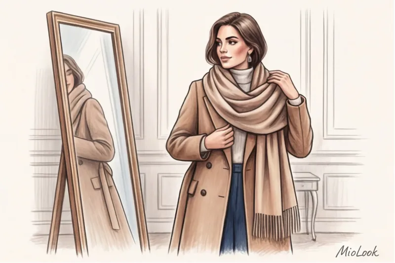
The biggest mistake I regularly see is trying to match blush to a favorite dress. It seems logical: if this salmon sweater suits me, then salmon blush will make me look like a goddess. Unfortunately, it doesn't work that way.
The difference lies in the physics and chemistry of the materials. Textile dyes are applied to dead, dry fabrics (cotton, silk, viscose), which simply reflect light. Cosmetic pigments are applied to a living organ—your skin. Your face secretes sebum (oil), has its own pH level, and a temperature of about 98.6 degrees Fahrenheit (36.6 degrees Celsius). When in contact with your skin, cosmetics literally take on a life of their own.
One time, a client and I were testing a premium brand's famous "universal" red lipstick. On me (with a warm olive undertone), it revealed a refined ruby hue. On a client with porcelain skin and a cool undertone, the same lipstick transformed into a garish neon fuchsia within 10 minutes due to the individual pH of her lips. Cosmetics are always a reaction.
The Biggest Myth of Coloristics: Why It's Time to Ditch the Wrist Vein Test
"Look at your wrist veins: if they're blue, you're a cool type; if they're green, you're a warm type." This is perhaps the most harmful and persistent beauty myth on the internet.
The color of your veins is an optical illusion, the result of light refraction through layers of skin (called Rayleigh scattering). Veins may appear green simply because you have thick epidermis or a light tan on your arms, while your facial skin may have a distinctly cool, pink undertone.
The wrist and face have different skin thicknesses, different numbers of blood vessels, and different levels of sun exposure. The only effective way to determine your makeup undertone is to evaluate your jawline and neck in clear daylight.
Access to MioLook for €0.99 — one-time payment
A smart AI stylist will select the perfect look based on your unique personality.
Get access — €0.99 onceTemperature, Depth, and Contrast: The 12 Color Type System in Your Makeup Bag
The classic four-season system ("Winter," "Spring," "Summer," and "Fall") is hopelessly outdated. Modern makeup artists use a directional method based on Albert Munsell's color system. It evaluates color based on three parameters: value (depth), temperature (warmth/coolness), and saturation (purity/softness).
Your leading characteristic dictates not only the shade, but also texture cosmetics:
- Pure colors (Clear Winter, Clear Spring) have high natural contrast. They look great with clean lines: graphic liquid eyeliner, glossy lip glosses, and rich, pure colors.
- Soft colors (Soft Summer, Soft Autumn) have a complex, slightly dusty appearance. A graphic black liner will make their look appear rough and tired. Their ideal choices are smudged pencil lines, satin finishes, and watercolor-like translucence.
Undertone vs. Overtone: The Hidden Pitfall of Choosing Shades
Why do you buy foundation that blends perfectly with your cheeks in the store but looks like a mask at home? You've fallen into the trap of overtones. Overtones are the surface: tan, rosacea, redness, freckles. Undertones are the base, the true temperature that shines through.
I had a stunning experience with a client named Anna. She had rosacea (a pronounced red tint on her cheeks and nose). For decades, store associates had been selling her pink foundations (labeled C for Cool) based on the color of her cheeks. As a result, Anna's face looked inflamed, and the contrast with her sallow neck was disastrous.
Anna's true undertone was warm olive. Once we switched to a foundation with olive undertones and added a touch of green corrector (to neutralize the red overtones), her skin acquired an aristocratic glow, and the redness faded without the effect of a thick mask.
The Perfect Foundation: The Anatomy of Blending with Skin
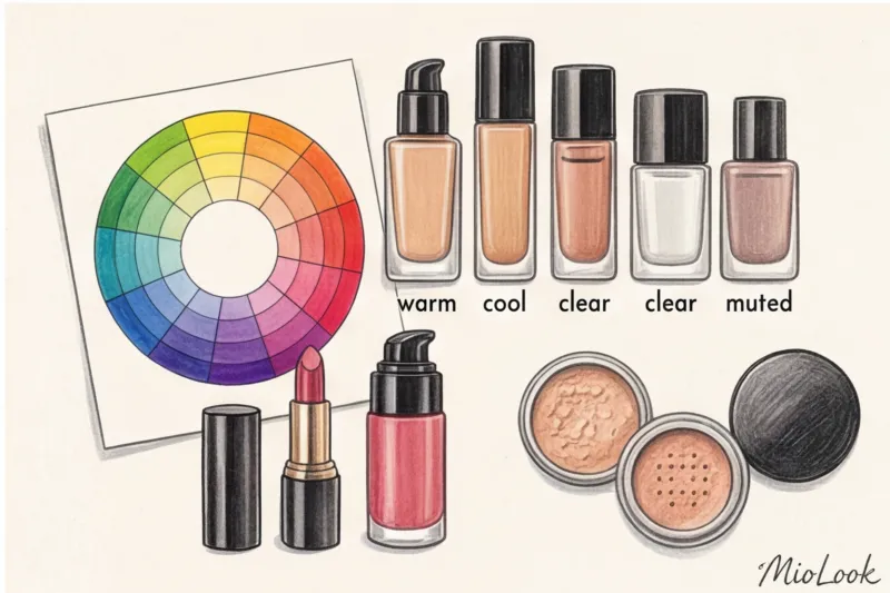
According to the WGSN research platform (2024), up to 80% of women use a foundation daily that doesn't match their true neck undertone. To avoid being among these statistics, it's important to understand the labels. Brands most often use letters: C (Cool – cool, pink/reddish), W (Warm – warm, yellow/peach), and N (Neutral).
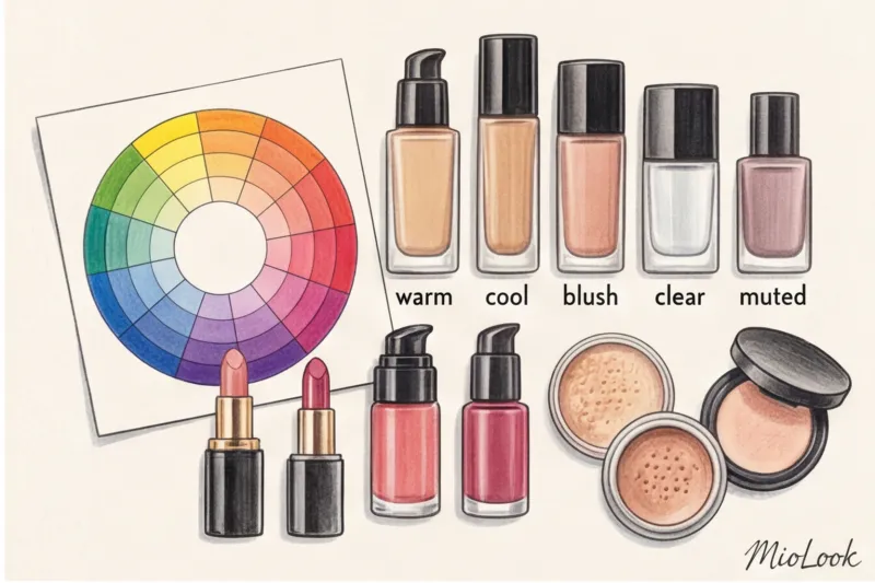
But the most insidious thing about foundation creams is the oxidation process. Journal of Cosmetic Science, 2023 confirms that when in contact with skin sebum and under the influence of oxygen, cosmetic pigments may darken and turn yellow by 1-2 tones.
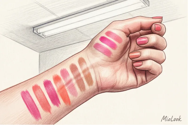
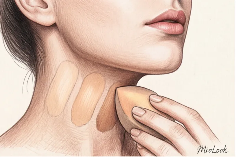
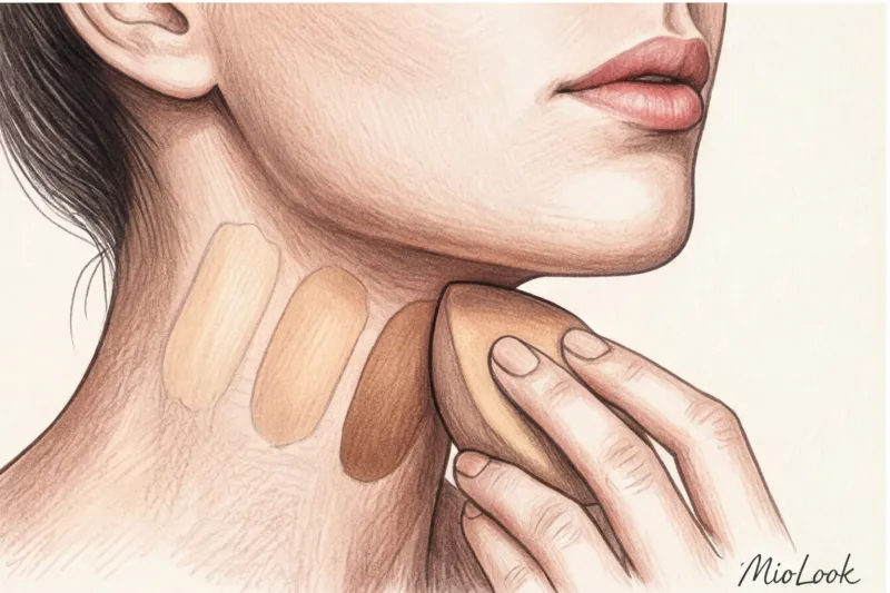
Therefore, you need to test the tone according to the “Three Stripes” rule:
- Apply three similar shades in vertical stripes along the jawline, letting them flow down to the neck.
- Step out of the store into daylight (artificial lighting in boutiques always distorts colors).
- Wait 20-30 minutes. Let the cream oxidize. The shade that disappears completely from your neck within half an hour is your ideal color.
Let me be honest: this rule doesn't work if you have active breakouts or severe pigmentation along your jawline. In this case, we move the testing area lower—to the exposed area of your neck or collarbone—to ensure your skin tone is clear.
Your perfect look starts here
Join thousands of users who look flawless every day with MioLook. Upload your clothes and get ready-made looks.
Get access — €0.99 onceHow to Choose the Perfect Lipstick: From the Right Nude to Red
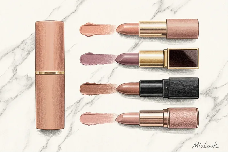
How many nude lipsticks have you bought and tossed in the back of your drawer because they made you look like a zombie? The formula for the perfect nude is simple, yet few people use it: your ideal base shade should be an exact match to the lining of your lips (or half a shade darker).
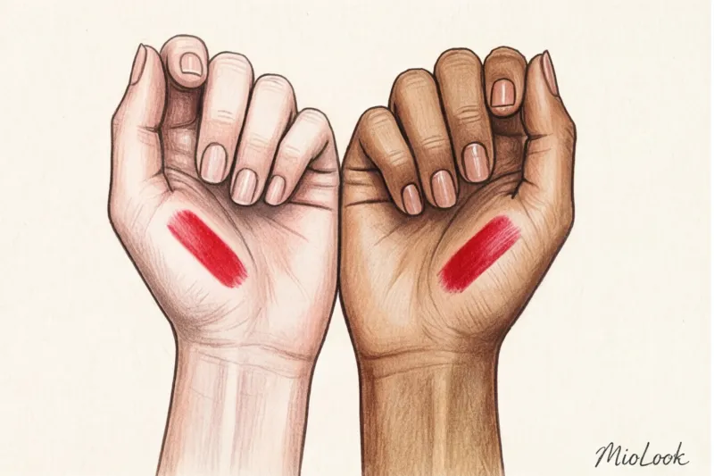
Another industry secret that's not mentioned on the packaging is titanium dioxide (CI 77891). This white pigment is added to light, pastel, and nude lipsticks for color density. If you have a "Dark Autumn" or "Dark Winter" complexion, too much titanium dioxide on your lips will create a chalky effect. Your lips will appear plastered on. You need lipsticks with a transparent, gel, or balm texture, where the pigment works by providing depth of color rather than a white base.
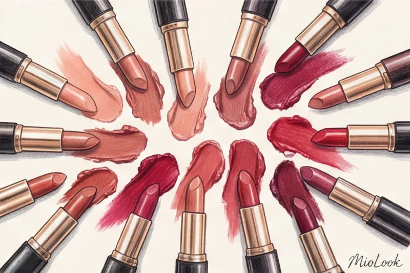
With red lipstick, everything is subject to temperature:
- Cool color tones (Winter, Summer) require reds with a blue base (raspberry, cherry, ruby). Bonus: the blue pigment visually whitens teeth.
- Warm colors (Autumn, Spring) need reds on a yellow or orange base (tomato, terracotta, coral).
Eyeshadow: Complementary contrast for a vibrant look
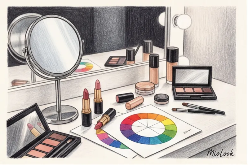
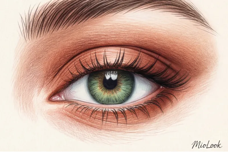
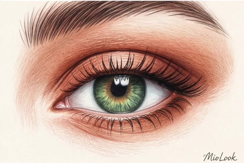
When choosing eyeshadow, we focus not so much on our skin undertone as on the color of our irises. This is where Itten's color wheel and the rule of complementary contrast come in handy—colors on opposite sides of the wheel enhance each other most effectively.
If you want your eyes to literally “burn,” use contrasting eyeshadow:
- For green eyes: copper, burgundy, purple, plum shades (red pigment brings out the green).
- For blue eyes: warm bronze, peach, gold and terracotta tones.
- For brown eyes: deep blue, emerald, cool violet.
But what if the complementary color clashes with your skin? For example, say you have blue eyes and a very cool, rosy complexion. Bronze eyeshadow will enhance the blueness of your eyes but make your face look tear-stained. A professional makeup artist's solution: use bronze only on the lid or the lining of your eyelid, and be sure to blend the crease with a neutral taupe shade, which will blend the bright accent with your cool undertone.
Stylist checklist: cosmetic bag revision by color type
It's time to take stock of what's already in your bathroom. Remove all your makeup. Check expiration dates immediately—cream products older than 12-18 months are thrown in the trash without a second thought.
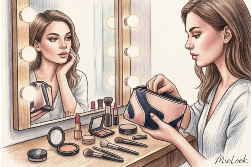
Many women throw away expensive foundations in horror when they realize they've messed up their undertone. Don't rush! The industry has long since invented adjusters (pigment mixers):
- Is the tone too yellow or orange? A drop of blue adjuster will neutralize it.
- Is the tone too pink? A yellow adjuster will restore its warm, human tone.
Your basic makeup capsule should only include 5 products. correct shade: a perfectly matching foundation, a concealer half a shade lighter, blush (to match your natural blush after frost), an eyeshadow palette of three basic shades (light matte, transitional for the crease, dark for the lash line) and lipstick in the shade of the inner lip lining.
By the way, you can digitize your updated makeup bag and create palettes in the app. MioLook so you can immediately see in the store whether a new palette fits into your color system.
Remember the most important thing: color in makeup is not a rigid dogma, but a flexible tool. You don't have to become a slave to your palette, but knowing your basic appearance settings gives you the freedom to break the rules beautifully and consciously.