
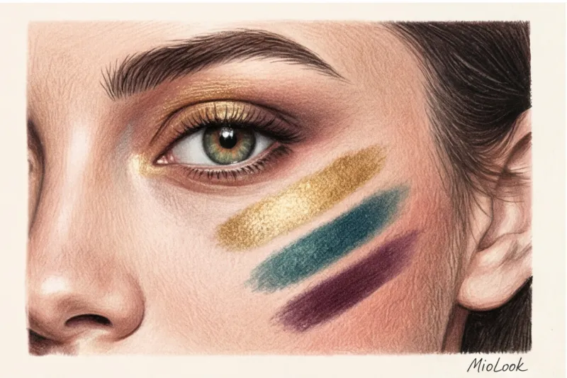
Have you ever noticed how the same peach shade looks fresh on your friend, but makes your eyes look tired and visibly inflamed? The statistics are brutal: about 80% of women use makeup shades every day that make them look older or sleep-deprived. The reason isn't the price of the palette, but rather the blind adherence to formulaic rules. We're used to Googling. Eyeshadow by color type , find primitive signs from women's magazines of the 2000s and buy cosmetics based solely on the color of the iris.
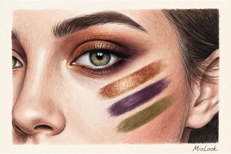
But masterful makeup isn't a paint-by-numbers game. It's a true physics of light, the chemistry of pigments, and a direct extension of your wardrobe. We've covered the basic principles of facial coloring in more detail in our a complete guide to perfect makeup based on your color type Today, I invite you to explore eyeshadow selection through the eyes of a stylist and textile expert: we'll explore how texture, skin undertone, and formula quality make your eyes glow from within.
Eyeshadow by Color Type: Why Pure Color Theory Doesn't Work Without Taking Skin Into Account
The biggest mistake I regularly see when sorting through makeup bags is trying to match eyeshadows solely to your eye color, completely ignoring the "canvas"—the temperature and contrast of your skin. When choosing eyeshadow, you're actually working with three variables: the color of your iris, the color of your whites, and the undertone of your eyelid.
I had a particularly revealing case in my practice. A client, a top manager at an IT company, came to me with a classic "Summer" complexion (cool, slightly olive skin) and gray-blue eyes. For years, she'd been using warm terracotta and copper eyeshadow because online articles insisted that "copper makes blue eyes brighter." And her irises really did appear blue. However, against her cool skin, the warm copper created a harsh temperature dissonance—her eyes looked as if she'd been crying all night or suffered from a terrible allergy. Her colleagues constantly asked if she was sick.
As soon as we swapped out the warm terracotta for a cool taupe (brown-gray) and a hint of rose gold, my complexion instantly came together and the questions about my well-being disappeared. That's it. temperature resonance rule: The pigment of the eyeshadow should always be complementary not only to the eye, but also to the temperature of your skin.
Access to MioLook for €0.99 — one-time payment
A smart AI stylist will select the perfect look based on your natural coloring.
Get access — €0.99 onceThe Physics of Color: How to Make the Iris Glow
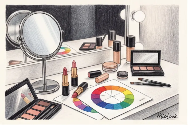
To understand how to make your eye color work 100%, we need to remember our physics lessons. As color theorist Johannes Itten described in his seminal work, "The Art of Color" (1961), our vision is designed to always seek color balance. If we see one color, the brain automatically generates a need for its complementary (opposite on the color wheel) shade.
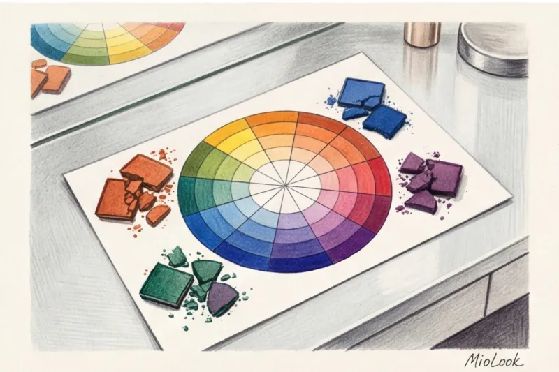
This phenomenon is called simultaneous contrast If you place a gray square on a blue background, it will appear yellowish. Applied to the face, if you apply the correct opposite shade near the iris, it will visually flare, attempting to balance the optical field.
"We can't change the color of our eyes without lenses, but we can trick the brain of the person looking at us by creating the right optical frame with makeup."
Contrast in lightness is equally important. The darker the shadow you apply along the lash line, the whiter and cleaner the white of the eye (sclera) will appear. Conversely, too-light, whitening shadows can accentuate yellowness or red blood vessels in tired eyes.
Blue and Gray Eyes: Taming Warm Tones
Blue lies opposite the orange sector on the Itten circle. The basic complementary shades here are peach, bronze, copper, and caramel. But, as we've already learned from my client's example, they need to be adapted to your temperature.
- If you are a Summer or Winter (cool undertone): Look for "cooled" bronzes. These include shades of dusty rose, cool taupe, taupe, platinum, and rose gold.
- If you are a Spring or Autumn (warm undertone): Classic copper, apricot, warm golden brown and milk chocolate are available.
Green eyes: from emerald to olive
True green eyes are rare. More common are gray-green or hazel. The opposite of green is red. But pure red eyeshadow is a surefire way to look sickly.
Your main highlights are purple, plum, eggplant, and dusty burgundy. The secret lies in the base: choose purple tones that are based on black or gray, not bright pink. Ideally, apply a taupe shadow all over the lid and then use a deep plum pencil to line the lash line.
Brown and black eyes: depth and contrast
Brown eyes are universal—they contain all the primary colors of the spectrum (red, yellow, and blue), so almost any palette complements them. It's just a matter of the desired effect.
Light brown (hazel) eyes with golden flecks call for delicate golden olive, marsh, or deep emerald tones that will enhance their greenery. Deep dark brown eyes, however, handle extreme contrast beautifully—rich cobalt blue, indigo, or cool metallic gray will create a magnetic look.
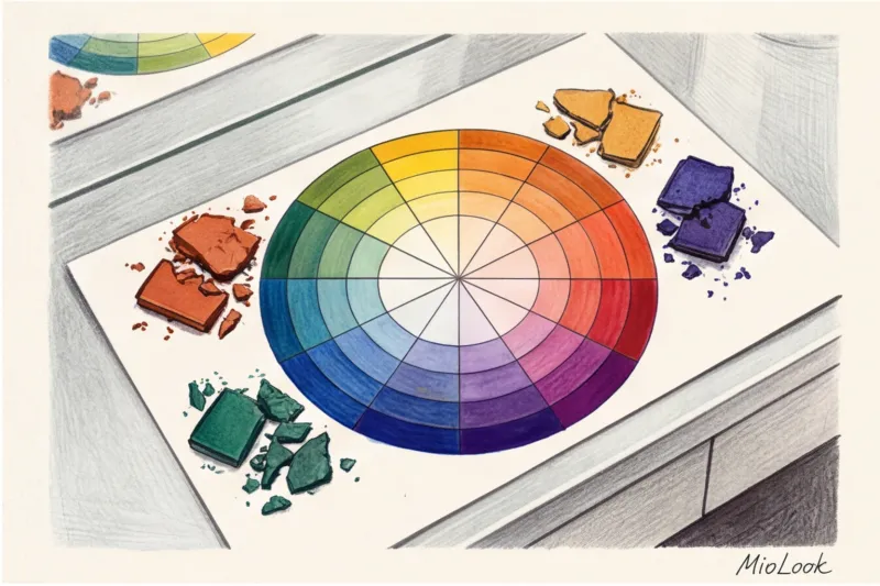
Eyeshadow Texture: Why Finish Is More Important Than Color
As a fabric expert, I always explain the work of cosmetics through textile metaphors. Just as the wrong fabric texture can ruin a perfectly colored suit, the wrong finish on eyeshadow can ruin the entire look.
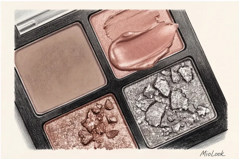
- Matte shadows work like wool, crepe or suede. They absorb light. In makeup, matte textures create the illusion of shadow and depth. They are used to sculpt the shape of the eye and conceal drooping eyelids. They are the absolute foundation of formal makeup.
- Satin eyeshadows behave like high-quality silk. They reflect light softly, without any sparkles. They're the perfect, simply phenomenal choice for mature makeup (35+). Unlike matte shadows, which can highlight dry skin, satin creates the effect of a smooth, slightly dewy lid, visually blurring fine lines.
- Shimmer and glitter are sequins. They reflect light in flashes, drawing maximum attention to the surface texture. Large shimmer in a daytime or business attire looks as out of place as a sequined dress at a morning meeting. Moreover, glitter mercilessly highlights any unevenness of the skin.
Your perfect look starts here
Join thousands of users who look flawless every day with MioLook, choosing their wardrobe and makeup in one click.
Get access — €0.99 onceThe Myth of Coincidence: Why You Shouldn't Wear Eye Makeup That Matches Your Eye Color
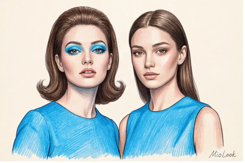
It's time to dispel one of the most persistent myths of the 2000s: monochromatic, tone-on-tone makeup (blue eyeshadow for blue eyes, green for green). It's the worst thing you can do to your appearance.
Why doesn't this work? Physics again. The natural pigment in our irises is translucent and inhomogeneous. Cosmetic pigment is always denser, richer, and brighter. When you apply dense blue eyeshadow around translucent blue eyes, the makeup simply "shouts out" your biology. As a result, the irises appear dull, washed-out, and watery gray.
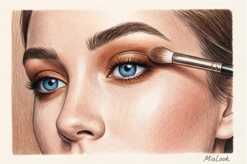
Of course, there are exceptions to this rule, for example, if your goal is a creative editorial makeup look for a photo shoot where the face is merely a canvas for an art object. But for real life, another solution works: if you really want to use a related color, do it sparingly. For example, apply a neutral brown eyeshadow to the lid, and then apply a colored blue or emerald kohl only to the lower lid. This will add a pop of color without creating an overwhelming background.
Environmental friendliness and pigment quality: what to look for in the composition
We pay increasingly close attention to the composition of our clothing (180 g/m² cotton, silk, cashmere), but for some reason we often skimp on what we apply to the thinnest skin on our body—our eyelids. And in vain.
Typical budget-friendly mass-market eyeshadows are 70-80% cheap technical talc. This is why they look chalky on the face, dusty when applied, and crumble under the eyes after a couple of hours. Furthermore, to create a shimmery finish, cheap cosmetics often contain microplastics (PET), which not only harms the environment when washed off but can also damage the cornea.
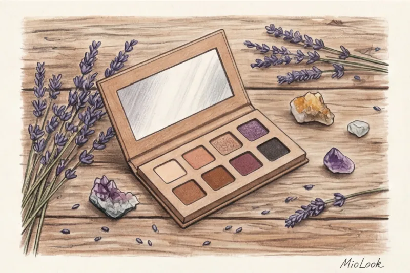
I'm a proponent of mindful consumption: it's better to have one high-quality refill palette than ten cheap plastic boxes. Look for mineral brands. They're based on pure, finely ground mica and iron oxides. Cosmetic chemistry studies show that mineral eyeshadows with a high pigment concentration (without fillers) last 40% longer without creasing in the crease. They literally blend into the skin, providing that "expensive" gradient without smudging.
Checklist: Putting together a basic palette to suit your color type
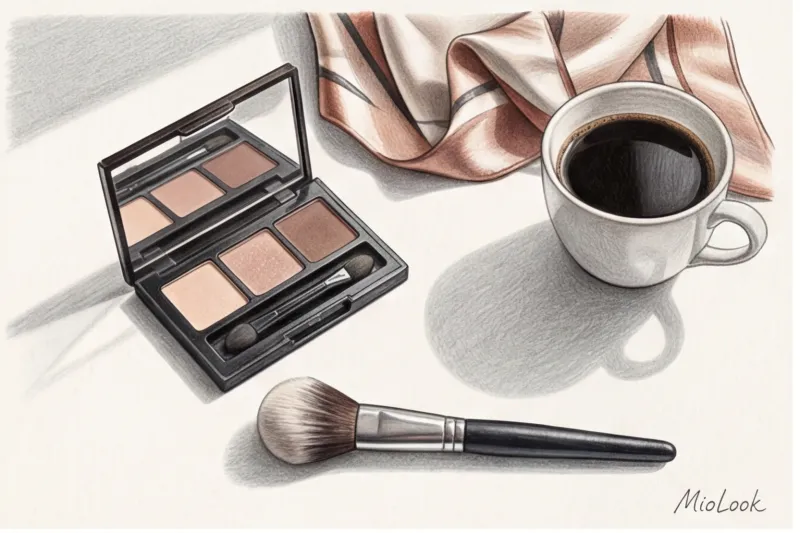
Don't buy huge professional palettes with 40 colors—you'll only use three at most. The ideal basic palette follows the "4-shade rule":
- Light matte (base): Match your skin tone or a half-tone lighter. We use it to even out the color of your eyelids.
- Transit matte (sculptor): 2-3 shades darker than skin tone. Used to darken folds and create volume.
- Dark matte (contour): The darkest color in the palette (dark brown, graphite, eggplant). For defining the lash line instead of eyeliner.
- Satin (accent): Apply with your finger to the center of the moving eyelid to add highlight.
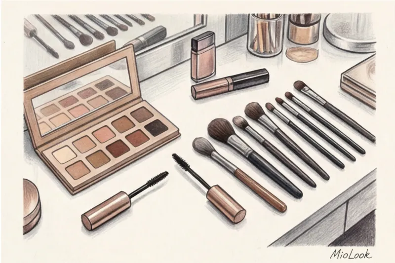
Stylist life hack: When testing eyeshadows in a store, never swatch on the back of your hand—the skin there is too smooth. Instead, pick up the color on your fingertips and gently rub it between your thumb and index finger. Your fingertips have a papillary pattern (texture) similar to the creases on your eyelids. If the eyeshadow glides on smoothly, doesn't crumble, or settle into the microrelief of your skin, buy it.
And don't forget about expiration dates. Dry powder textures last on average 1.5-2 years, after which the binding components oxidize, making the eyeshadow blend less easily. Cream products should be discarded after 6-8 months due to the risk of bacterial growth.
Ready to get started?
Try the MioLook plan for free—no commitments required. Organize your beauty arsenal and wardrobe in one place.
Get access — €0.99 onceEye Makeup as Part of Your Overall Image: Linking It to Your Wardrobe
The face is the focal point of any communication. People look you in the eyes when you speak. That's why your makeup shouldn't exist in isolation from what you're wearing.
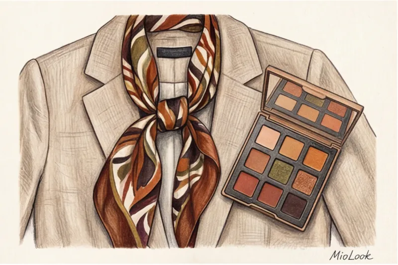
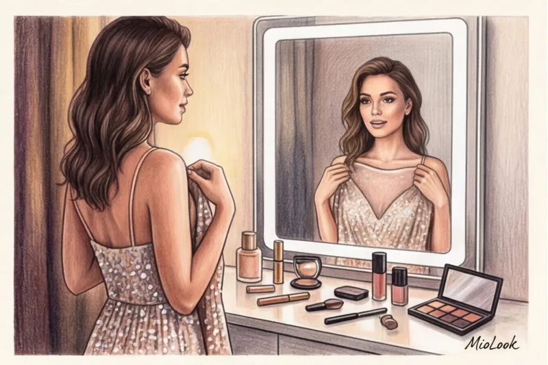
Always match the tone of your eye makeup to the color of your clothing (blouse, jacket, scarf) in the portrait area. If you're wearing a cool gray, heavy wool suit, warm bronze eyeshadow will create a visual clash. In the appendix MioLook The smart wardrobe feature helps you see this balance: you can plan your looks, immediately understanding what makeup you need to achieve harmony.
It's also important to maintain a balance of accents. If your wardrobe is dominated by complex, architectural cuts and deep textures (such as tweed, leather, or layering), your makeup should be structured—clean matte shades and flawless skin. The right eyeshadow for your skin tone isn't just a dusting of color in pretty packaging. It's your daily investment in a bold, expressive look, a classy look, and self-confidence.