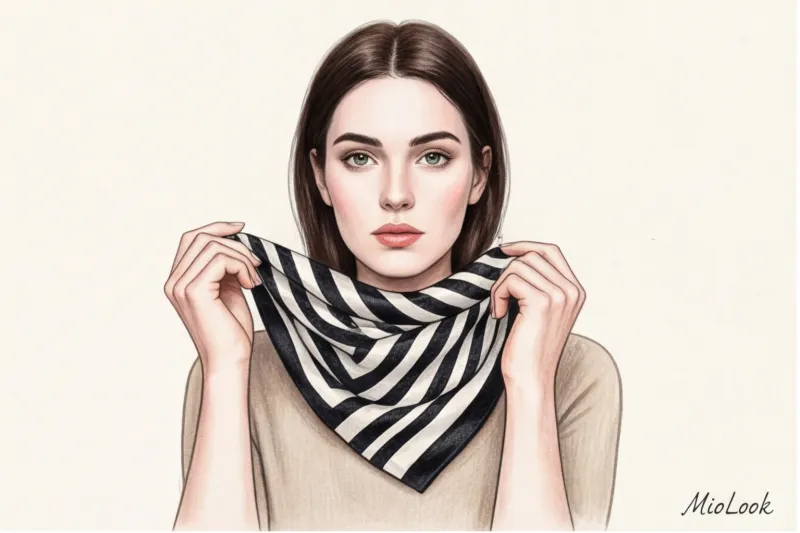

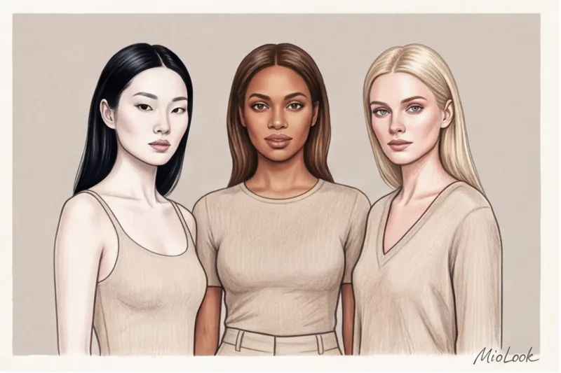
Have you noticed a paradox? You grab a stunning dress with a crisp geometric pattern from the hanger, take it to the fitting room, put it on... and suddenly your face disappears. You look tired, a couple of years older, and the dress seems to "live" independently of you. You take it off, put on your usual beige sweater, and your face regains its freshness. It's not that the dress is bad or you didn't get enough sleep. It's that contrast in appearance things turned out to be higher than your natural one.
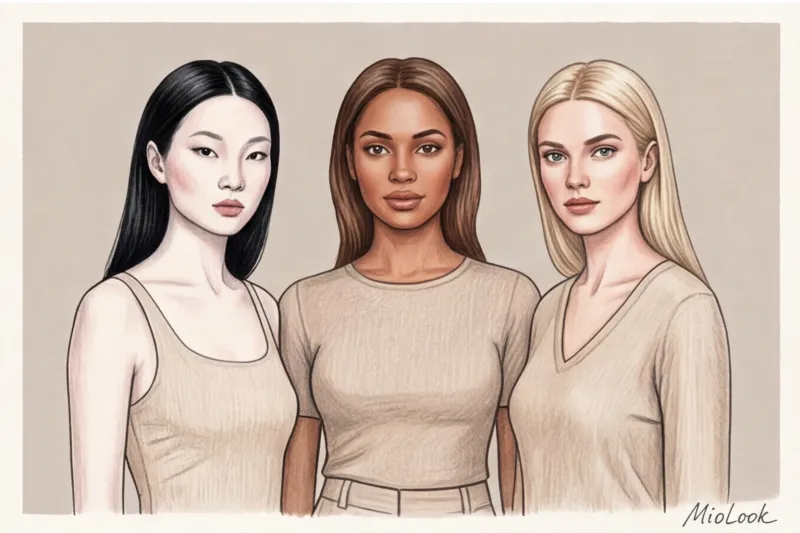
We have already talked in more detail about basic coloristics and palette selection in our a complete guide to the 12 color types of appearance But knowing whether you're a "Soft Summer" or a "Deep Autumn" doesn't always protect you from fashion disasters. Within the same season, people can have completely different levels of contrast. Today, I'll show you how the mechanics of light and dark work, why mass-market lookbooks often mislead us, and how to make any piece work for you, not against you.
What is contrast in appearance and why is it more important than your color type?
In the professional stylist community, we often rely on Albert Munsell's Munsell Value Scale. Back in the early 20th century, he classified colors not only by hue but also by value. In human terms, contrast in appearance is the difference in value between your skin tone, hair color, and eye color.
Imagine a painting in a frame. If the frame is gaudy and gold, and inside hangs a delicate pastel watercolor, you'll only notice the frame. The painting itself will be lost. Your clothes are your frame. If your natural contrast is low (for example, light brown hair, light eyes, fair skin), and you wear a stark black jacket with a crisp white shirt, people will notice the "frame" (the suit) first, and only then your face.
"The cardinal rule of portraiture is that clothing should never be more active, brighter, or more contrasting than your face, unless you are doing so intentionally for a theatrical effect."
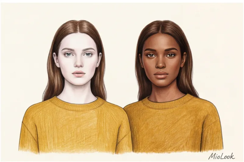
This is why dividing people into just 12 seasons often fails. Two "Winter" girls might have different levels of contrast: one is Snow White with porcelain skin and jet-black hair (maximum contrast), the other has swarthy olive skin and dark brown hair (medium contrast). The same black and white combinations will work completely differently on them.
How to determine your appearance contrast in 2 minutes
Forget subjective assessments like "I'm kind of dark" or "I have a bland face." Style is geometry and mathematics. We need precise numbers. Prepare yourself: remove your makeup (especially foundation and mascara), pull your hair away from your face if it's a different color than your roots, and stand by a window in natural daylight.
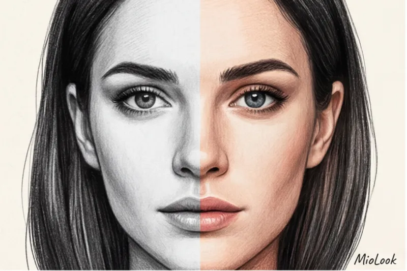
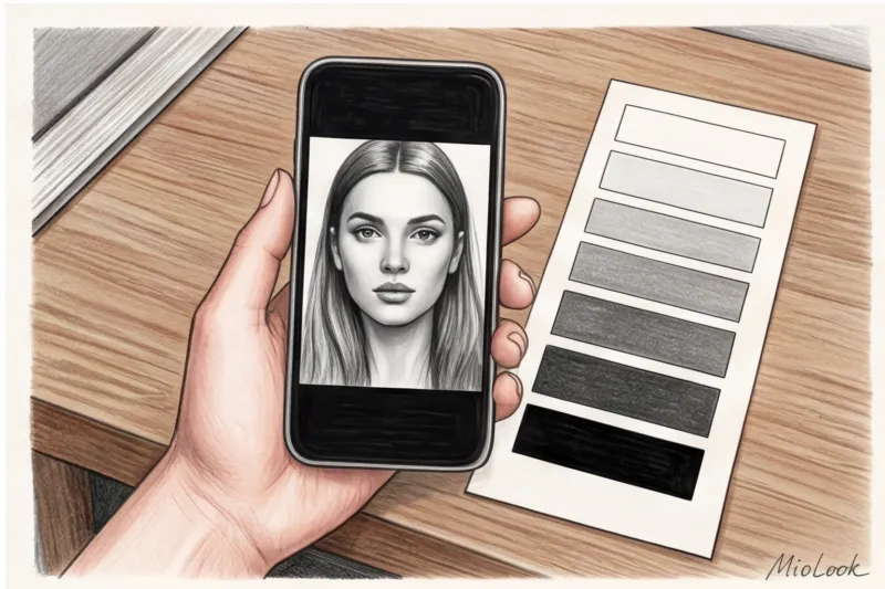
Black and white filter: the most accurate method
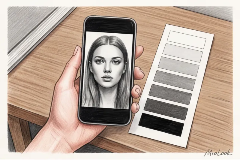
Over 12 years of working as a personal shopper, I've tested dozens of color typing methods, but the most reliable tool is always in our pockets. It's a smartphone camera with a monochrome filter enabled. When I go to the store with a client, we take a black-and-white selfie right in the fitting room. Color is distracting. In black-and-white, you instantly see only shadows, highlights, and true tonal depth.
Take a portrait photo in black and white. Now, mentally (or directly on the screen), place a scale of 1 to 10 on your face, where 1 is the color of a white sheet of paper and 10 is pitch black, a light-absorbing color. Evaluate which number your skin falls on, and which number represents the darkest areas (usually your hair or eyebrows).
The Mathematics of Style: Calculating the Difference
The formula is simple: subtract your skin value from your hair value. If your skin is a 2 (very light) and your hair is a 9 (almost black), your difference is 7 units. high contrast in appearance.
- Difference from 0 to 3 (Low): Hair, skin, and eye color blend into a single, soft palette. For example, a blonde with fair skin or a mulatto with light brown hair.
- Difference from 4 to 6 (Average): The most common European type. Dark blond hair, beige skin, hazel or gray eyes.
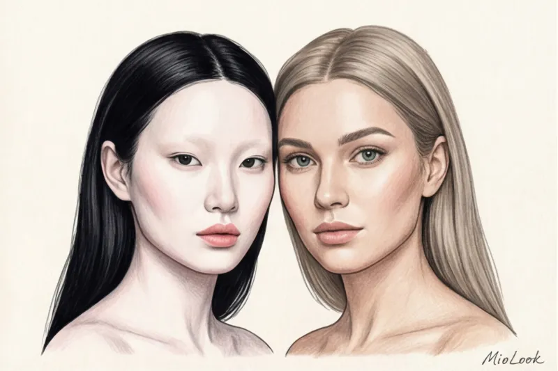
- Difference from 7 to 10 (High): A striking juxtaposition of light and dark. Very pale skin and dark hair, or vice versa—dark skin and platinum blonde.
Your perfect look starts here
Join thousands of users who look flawless every day with MioLook. The smart algorithm will take your contrast into account when creating your makeup look.
Get access — €0.99 onceThree Levels of Contrast: How to Combine Colors in Clothing
Once you've determined your number, you'll have the key to perfect combinations. In interior design, there's a golden rule of proportions: 60-30-10. In personal styling, we adapt this to the level of contrast: your clothes should replicate the natural range of lightness in your face.
High contrast appearance: the 50/50 rule
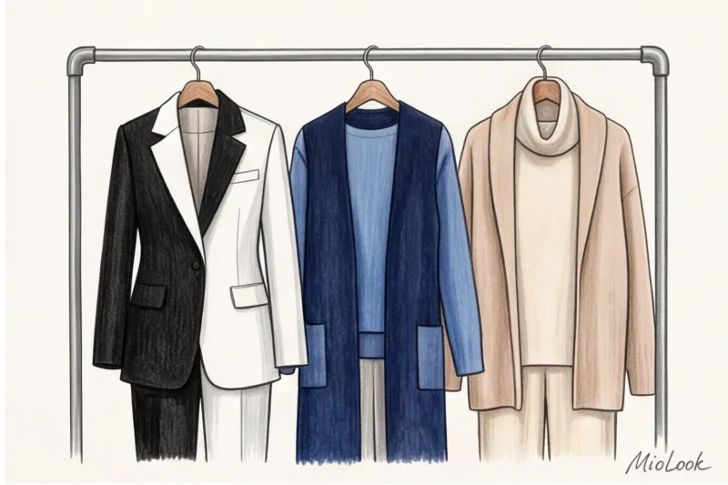
If your height difference is between 7 and 10, you're made for bold, graphic combinations. Classic color blocking is your best friend. You can confidently wear a crisp white shirt with jet-black trousers without making you look like a waitress. On the contrary, your appearance will withstand the pressure and shine.
Danger: Pastel, all-over looks (all beige, dusty pink, or light gray) without a single dark accent will make your face look tired and unwell. If you're wearing a light dress, be sure to add dark shoes, a belt, or a contrasting jacket to bring out your natural vibrancy.
Medium contrast: soft color block
A difference of 4-6 shades requires a more delicate approach. You don't need polarized black and white shades; you need "neighbors" on the color wheel or combinations with a difference of 3-4 tones. Ideal pairings: burgundy and dusty rose, navy blue and caramel beige, emerald and ecru.
Danger: Too abrupt a transition (that same black bottom and white top) will visually "cut" your figure in half and draw all the attention away from your face. If the dress code calls for formal colors, replace black with anthracite gray, and white with eggshell or pearl.
Low Contrast: The Magic of Monochrome
A difference of 0-3 units is aristocratic softness. Monochromatic looks and gradient transitions are your superpower. Only you can look luxurious in a total camel look or head-to-toe powder tones.
To prevent a look without color contrast from looking flat, play with textures. Combine different surfaces in one outfit: the smooth silk of a midi skirt, the fluffy cashmere of an oversized sweater, and the matte suede of ankle boots. The eye will glide over the look, taking in the nuances of texture, while your face remains the main focus.
The Mass-Market Mistake: Why Do Zara Clothes Often "Falsely Fit"?
Now let's talk about the harsh reality of fast fashion. One of my clients, a typical "Soft Summer" (light brown hair, gray-blue eyes, translucent skin—low contrast), bought a fantastically beautiful dress with a massive black-and-white architectural print at COS. It was the hit of the season. But when she tried it on at home, she nearly burst into tears: in the mirror, she saw a "severed head" floating above the aggressive dress. The garment literally devoured her appearance.
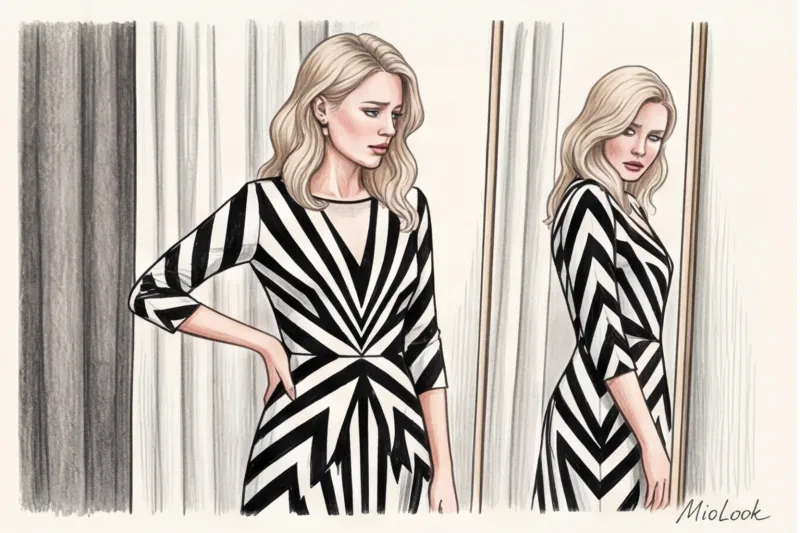
According to WGSN's fashion trend analysis (2024), approximately 80% of items with aggressive geometric prints from mass-market stores end up on the back shelves of the wardrobes of women with a Slavic (soft) appearance. Why do we buy them?
Take a look at the lookbooks of Zara, H&M, or Massimo Dutti. These brands often cast models with exotic, high-contrast looks (dark skin and bright whites of the eyes, or very pale skin and jet-black hair). Their natural beauty can pull off any crazy print. They sell the image. But when the same piece is worn by a woman with medium or low contrast, without heavy studio makeup and proper lighting, the magic is shattered.
Access to MioLook for €0.99 — one-time payment
A smart AI stylist will select the perfect look based on your individual appearance.
Get access — €0.99 onceSelecting prints: size, rhythm, and background contrast
Contrasting appearances dictate not only the choice of color but also the choice of prints. Do you know why a classic Breton striped shirt looks like a style icon on one French woman, but like a prison uniform on another? The answer lies in the rhythm of the stripes and the contrast between them.
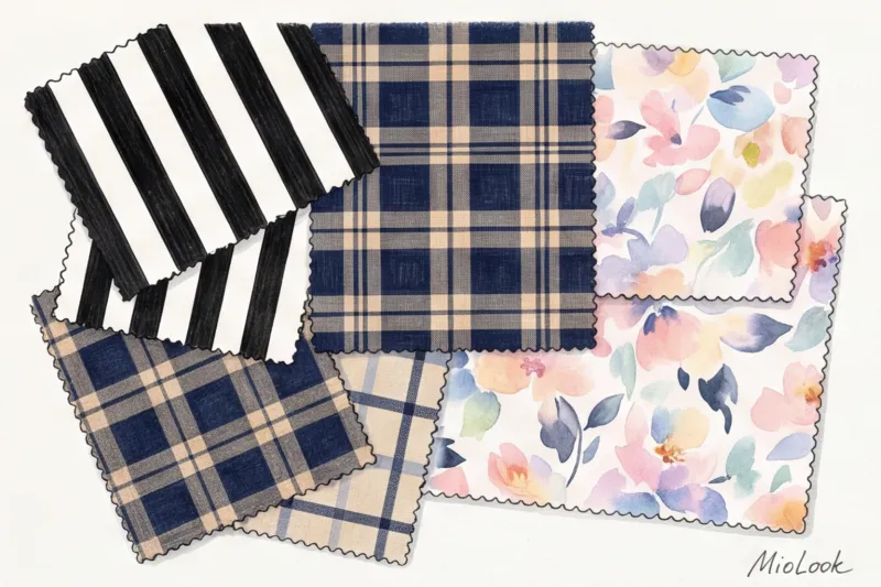
- High contrast: Your appearance demands clarity. Choose geometric, large prints with sharp edges. Classic houndstooth, zebra, wide stripes, and large, contrasting checks. If you visit COS, half of their patterns are designed just for you.
- Medium and low contrast: You want flowing, blurred edges. Opt for watercolor washes, tie-dye prints, polka dots, subtle French stripes, or salt-and-pepper tweed. Excellent examples of such soft patterns can always be found in the &Other Stories collections or from French brands like Rouje.
Is it okay to wear someone else's contrast? (Spoiler: yes)
Old-school style rigidly confined women to a box: "You can't wear black, it makes you look older." But I'm a practical person. I understand that there are strict corporate dress codes, spontaneous loves for a piece, or the simple desire to wear your favorite black tuxedo. The good news: the system can be hacked.
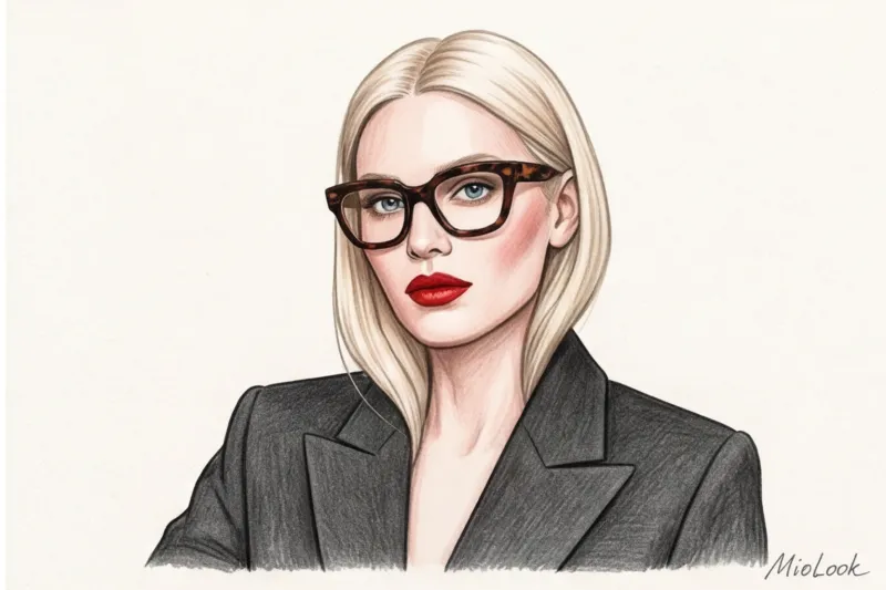
If the thing has higher contrast If your face is brighter than your face, you need to artificially boost your natural brightness to match your clothes. This is called focus control. How do you do it?
- Distance from face: The simplest trick: Create a deep V-neckline. The further the bold color or print is from your face, the less it will impact your complexion.
- Buffer zone: Wear a turtleneck, top, or tie a scarf in your natural, correct shade between your face and a contrasting jacket.
- Additional contrast on the face: Wearing a black dress with light brown hair? Create bold eyebrows and apply a bold, bright or deep dark lipstick. Another ingenious tool is glasses with thick, dark frames. They instantly increase the contrast of your face by 2-3 points. You can plan such complex looks in advance by uploading your items to the app. MioLook — the algorithm will suggest which accessories will balance the look.
Fair Limit: This technique won't work if you have pronounced redness, rosacea, or couperose. Pure white or deep black will act like a spotlight on your face, mercilessly highlighting any blemishes. In this case, it's best to stick to your natural contrast and use buffer zones.
Checklist: How to check if an item is compatible with your contrast ratio
Theory is great, but style is applied in the fitting room. Save this checklist and use it before every purchase to ensure your wardrobe works for you.
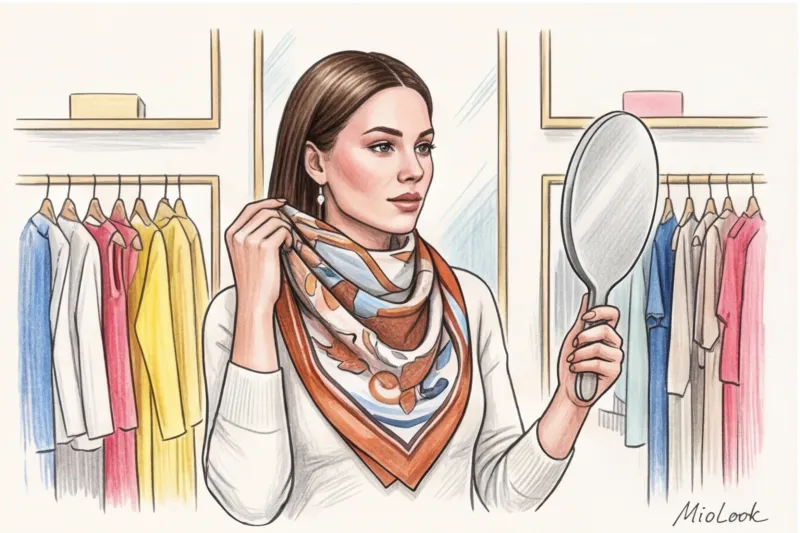
- First look test: Place the item of clothing against your face in front of a large mirror in the store (preferably from the fitting room into a brighter room). Close your eyes for three seconds, then open them. What do you see first? Your face or the piece of fabric? If the fabric takes your focus away, the contrast is too high for you.
- Black and white check: Take a selfie with an item near your face, and switch the photo to black and white. Does your face blend into the background because the item is too dim, or does the item look like a black spot under your light face?
- Makeup Factor: Ask yourself: "Can I wear this item on a Saturday morning without a drop of makeup and still look fresh?" If you need foundation, eyeliner, and lipstick to pull it off, the item has a contrast that's foreign to you. It will require a lot of effort every time you decide to wear it.
Don't let your clothes drown you out. Even the most expensive, high-quality 200 g/m² fabric won't save your look if it doesn't align with your natural rhythm. Your clothes should be just an elegant frame in which your face is always the main diamond.