Why Season 4 No Longer Works: Evolution of 12 Color Types
Remember that moment when you first tried to determine your color type using the classic "Winter-Spring-Summer-Fall" scheme and... hit a dead end? Your hair seems dark (so, Winter?), but your skin has a warm peachy undertone (Spring?), and your eyes are a total gray-green (Summer?). If you've ever felt "wrong" and didn't fit into these neat frameworks, I hasten to reassure you: there's nothing wrong with you. The problem lies in a hopelessly outdated theory. Today, professional stylists use a system that includes 12 color types of appearance , and now I'll explain why we've permanently abandoned the basic four seasons.
Let's take a brief historical tour. The classical theory of the four seasons was born in the early 20th century thanks to the Swiss artist Johannes Itten. While teaching at the Bauhaus, he noticed that students intuitively responded to palettes that resonated with their natural colors. This was a breakthrough for painting, but it's woefully inadequate for modern fashion.
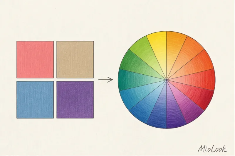
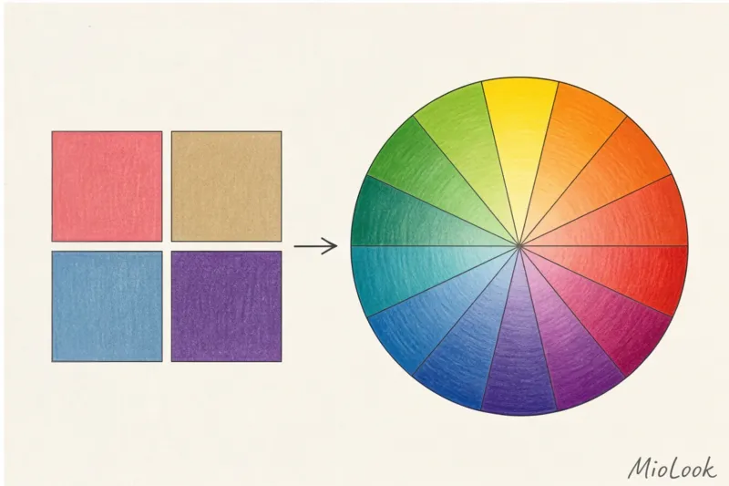
The true scientific basis for modern coloristics was the far more precise system of American professor Albert Munsell. As early as 1905, he demonstrated that any color has three dimensions: hue (temperature), lightness (depth), and saturation (purity). It was this three-dimensional approach that formed the basis of the modern directional method.
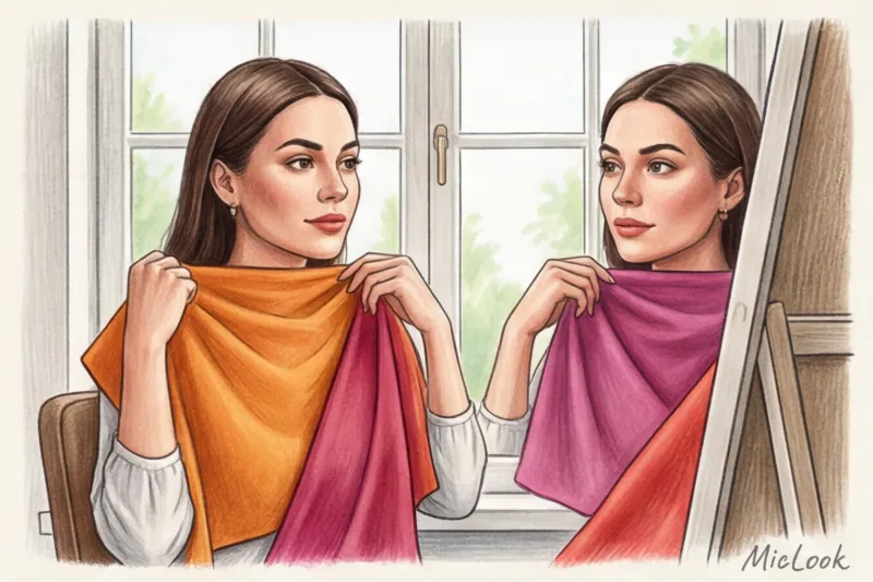
Over my 12 years of colorist practice, I've seen hundreds of women literally "break" themselves into conforming to outdated standards. One of my clients, Anna, had a typical "borderline" appearance: dark chestnut hair but very fair, translucently warm skin. The classic system would have categorically classified her as a "Winter" because of the contrast or an "Autumn" because of the warmth. The result? In a wintery, charcoal-black color, she looked tired, and in a heavy, autumnal terracotta, she looked sickly.
The transition to the directional method, which identifies 12 color types of appearance, has become a real salvation for such complex types. This system doesn't try to squeeze you into a rigid box. It reveals dominant And secondary Characteristics. In Anna's case, her dominant trait was "Brightness," and her secondary trait was "Warmth." She is a Bright Spring, and the pure, vibrant shades of coral and turquoise suited her perfectly.
The 12-category system takes into account the most subtle nuances: what comes first on your face—coolness or softness? Darkness or mutedness? Once you find your formula, building your wardrobe will become much easier. By the way, to avoid having to remember all the suitable shades while shopping, I always recommend downloading your personal palette to MioLook — the app's smart algorithm will automatically tell you whether a new item fits your unique style.
The Three Pillars of Coloristics: How the 12 Color Type System Is Built
We often conduct a revealing test with our clients during consultations. I use a classic red lipstick—for example, the iconic MAC Ruby Woo shade. On one woman, this rich red looks natural, like a natural, slightly refreshing blush. But on another, it creates a heavy, vamp-like drama, visually adding five to seven years and highlighting every shadow on the face. Why does the same pigment behave so differently? The answer lies in the physics of color.
In 1905, artist and professor Albert Munsell realized that describing colors subjectively was pointless. He created a rigorous system, breaking down each hue into three independent coordinates. Today, these three pillars of coloristics form the mathematically precise foundation upon which 12 color types of appearance.
Temperature (Hue): A battle between ice and fire
Temperature determines the basic undertone of your appearance. Cool tones (with a blue base) are at one extreme, while warm tones (with a yellow base) are at the other. In our skin, very specific biological markers are responsible for this balance. Besides the well-known melanin, two pigments play a crucial role: hemoglobin And carotene.
If blood vessels are located close to the skin's surface and hemoglobin predominates, the complexion takes on a cool, pinkish-blue undertone. If carotene predominates, we see a warm, golden, or peachy glow. This is why trying to change your color type simply by dyeing your hair is pointless: your skin's temperature (hue) is determined by the physiology of your skin.
Depth (Value): the play of light and shadow
This characteristic (called lightness in some schools) indicates how light or dark a color is. In the context of your appearance, we evaluate your natural level of contrast and pigment density.
A sultry brunette with dark eyes will have a Value value that leans toward the dark pole, while a natural blonde with clear eyes and light eyebrows will lean toward the light pole. A miscalculation in this coordinate is fatal. If a woman with low contrast wears a dark burgundy sweater, the effect will be "one thing, one person": we first see the heavy sweater, and then, somewhere in the background, the woman's lost face.
Chroma: Neon vs. Velvet
My favorite and perhaps most underrated characteristic, clarity determines how open and vibrant a color is (bright) or whether it's muted by the addition of gray pigment (soft).
Imagine a fuchsia highlighter—it's the ultimate in purity (Chroma). Now mentally add a drop of gray watercolor to it—you'll get a complex, dusty pink shade. For girls with a "soft" complexion (whose natural coloring contains that same grayish undertone), pure colors mercilessly drown out their complexion, making it appear sallow. Conversely, if your look calls for vibrancy, muted, "dusty" shades will make you look like you haven't slept in a week.
The secret of the 12 color type system is that it doesn’t just mix these characteristics, but reveals them dominant For some, absolute cold comes to the fore (Dark Winter), while for others, uncompromising softness (Soft Summer).
Try MioLook for free
A smart AI stylist will select the perfect look based on your individual color and contrast characteristics.
Start for freeThe Main Myths About Determining Your Color Type (And Why the Vein Test Doesn't Work)
You know what gives me my biggest professional twitch? Short videos on social media with titles like "Find out your color type in 5 seconds." According to statistics we collected from new clients, 70% of self-diagnosis attempts Such "internet advice" leads to completely incorrect results. Let's once and for all dispel the harmful myths that prevent you from finding your true color palette within the 12 color types.
Myth #1: "Look at the veins on your wrist."
Blue veins are cool, green veins are warm. It sounds simple, but from a physiological perspective, it's completely absurd. The color of the veins we see is an optical illusion, depending on how light refracts through the epidermis. This so-called test is influenced by the thickness of your skin, the presence of even a light tan, and the depth of the vessels. One of my clients with a pronounced warm undertone (Warm Autumn) had veins on her thin wrist that appeared completely blue simply because they were located superficially.
Myth #2: "The Gold and Silver Test"
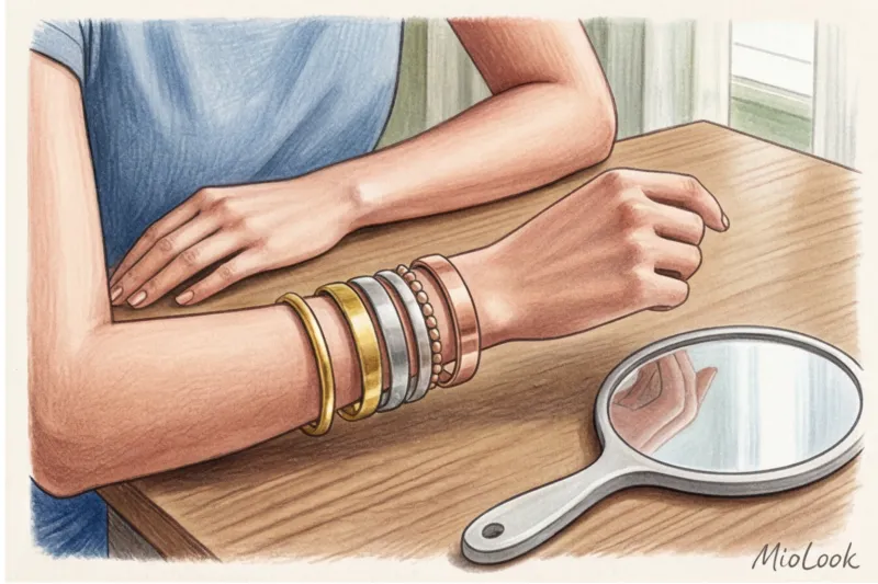
"Put foil or jewelry against your face..." is another hopelessly outdated piece of advice. Firstly, personal preference plays a huge role here: if you've been wearing white gold your whole life, yellow will seem "foreign" to you, purely psychologically. Secondly, modern rhodium-plated silver has a bright white sheen that produces a completely different reaction on the skin than classic sterling silver or nickel silver. These metals reflect too much light for the untrained eye to objectively assess the skin's reaction.
Myth #3: "Black suits everyone; it's a base color."
Coco Chanel was a genius, but a little black dress isn't a universal solution. Black is a deep achromat that absorbs light. Unless you belong to the contrasting Winter group, black near your face will act as a poor photo filter. It will cast harsh shadows on your chin and neck, highlight nasolabial folds and under-eye circles, and make your complexion appear sallow. For most skin tones, the ideal base dark color should be graphite, complex navy, or dark chocolate.
Myth #4: "Eye and hair color are the most important factors when determining personality type."
"I have blue eyes and light brown hair, so I'm Summer." No, no, and no again! Hair fades or is dyed (sometimes we even forget our natural shade), and the iris of the eye occupies too small an area to produce a significant reflection. In professional coloristics and the system of 12 color types of appearance skin tone is always primary We look exclusively at how the largest area on the face reacts to the applied fabric color.
That is why I recommend using it for my clients. MioLook — When digitizing your wardrobe, the app helps you create looks based on your actual appearance, not dubious tests with foil and veins.
A detailed guide to 12 color types: find your dominant color.
Light is an electromagnetic wave, and how it reflects off the pigments in our skin, hair, and eyes dictates absolutely all the rules of personal coloristics. No magic, just pure physics. When Professor Albert Munsell created his famous color sphere in 1905, he forever changed the approach to color by identifying three strict coordinates: hue (temperature), value (depth), and saturation (purity). It is this scientific foundation that underlies the system. 12 color types of appearance.
In the directional method used by modern image makers, the season (Spring, Summer, and so on) is only a secondary marker. Yours is primary. dominant — the most striking, eye-catching physical characteristic. You're not just an "Autumn." You're primarily a "Dark," "Soft," or "Warm." If softness is your dominant trait (meaning your natural colors contain a lot of gray pigment), then pure, spectral colors will literally "erase" your face, leaving the effect of clothing floating in the air. Let's explore the physics behind each of the 12 color directions.
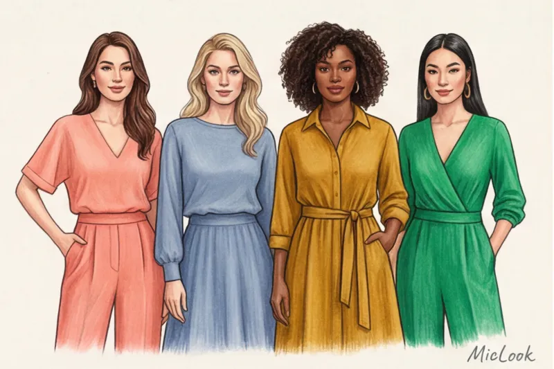
Spring group: Bright, Warm, Light
In terms of coloristics, Spring colors are characterized by a high degree of light reflection. This group contains virtually no gray or black pigment. The colors are pure, vibrant, with a clear yellow (warm) undertone. The skin of Spring shades often has a fine, translucent texture that resonates beautifully with smooth, reflective fabrics.
- Clear Spring: Purity and contrast are dominant. There's not a hint of dullness in your appearance. The whites of your eyes are usually dazzling white, creating a high natural contrast with the iris. This type's physical makeup requires similarly pure, unbleached shades. If Bright Spring wears dusty pink, her face instantly takes on an earthy hue due to the lack of color energy in the fabric. Best colors: coral, turquoise, icy yellow, neon peach.
- Warm Spring (True Spring): The dominant tone is absolute warmth. Your coloring is completely devoid of blue undertones. Your skin often has a golden glow due to the high concentration of carotene. Cool metallics and icy shades are strictly contraindicated for this type—they clash with the warm undertone of your skin, highlighting even the slightest redness. Best colors: peach, golden yellow, green apple, warm tomato.
- Light Spring: Lightness is dominant (high Munsell Value). Your natural colors are watercolor-like and delicate. Hair and eye pigmentation is very subtle. Heavy, dark colors (especially burgundy or indigo) create harsh shadows on the Light Spring's face, visually deepening nasolabial folds and wrinkles. You need shades diluted with white light. Best colors: light green, aquamarine, cream, light salmon.
"The mistake many spring-type girls make is trying to 'calm' their vibrant appearance with basic gray and black pieces. But the physics of color is inexorable: light-absorbing black drains all the natural freshness from spring skin, leaving only shadows."
Summer group: Light, Cold, Soft
The summer palette in the 12 color types system is built on a cool (blue) base with the obligatory addition of white or gray pigment. These are colors with low to medium saturation (Chroma). They don't scream, but rather envelop. Interestingly, according to the PANTONE Color Institute, it's the complex summer shades that most often become commercial hits in brands' core collections, as they have a calming psychological effect.
- Light Summer: The dominant is lightness, but, unlike Light Spring, the base here is cold. Your skin often has a pinkish or porcelain undertone due to closely spaced capillaries (influenced by hemoglobin). Dark, contrasting colors feel oppressive. The secret to a Light Summer wardrobe is cool pastels. Best colors: dusty pink, lavender, mint, light blue-gray.
- Cool/True Summer: Your dominant color is absolute cold. There's not a hint of gold or red in your colors. Ash-blond hair, cool skin tone. Wearing mustard or orange will create an optical dissonance: your face will appear sickly yellow. Your palette is colors that seem to have a hint of ice shining through them. Best colors: berry, gray-blue, cool emerald, muted fuchsia.
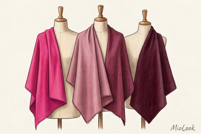
- Soft Summer: The dominant trait is mutedness. This is the most common and most complex color type in the CIS countries. Gray pigment (a mixture of warm and cool in low contrasts) predominates in your colors. Your superpower is the ability to wear the most complex, "dirty" shades that would look washed-out on others. On you, they reveal a noble, velvety quality. Best colors: dusty blue, grey-green (wormwood), cocoa color with milk, complex purple.
By the way, if you are unsure which summer subgroup your favorite item belongs to, I highly recommend digitizing it. MioLook There's a great algorithm that helps you organize your virtual wardrobe into color categories and immediately shows you what that dusty pink sweater will pair perfectly with and what it will clash with.
Autumn group: Soft, Warm, Dark
If Spring reflects light, Autumn absorbs it. In color physics, the autumn palette is characterized by a warm undertone (yellow-red base) and low luminosity (added black pigment) or low purity (added taupe). This is why matte, textured fabrics such as suede, corduroy, thick cashmere, and chunky knits are phenomenal for autumnal complexions. A glossy sheen often cheapens this noble palette.
- Soft Autumn: The dominant tone is mutedness, veering toward warmth. You're on the border with Soft Summer, but your skin has a slightly more golden glow. Contrast in your appearance is low. Pure, spectral colors (like neon pink) will take center stage—people will see your dress first, then your face. Your palette is a complex mix. Best colors: olive, terracotta, moss, muted salmon.
- Warm Autumn (True Autumn): The dominant tone is absolute warmth and richness. These are thick, dense colors with pronounced red or copper undertones. Unlike Warm Spring, your colors are heavier and earthier. Cool tones (especially royal blue or fuchsia) make Warm Autumn skin appear gray and lifeless. Best colors: mustard, copper, rust, deep tomato.
- Dark Autumn: Dominant: Depth (low Value). You have high levels of melanin in your hair and eyes, creating a strong contrast with fair or dark skin. You can handle the darkest, most luxurious colors in the palette, which would turn others into pale moths. However, it's important that these dark colors retain a hint of warmth. Best colors: Burgundy, dark chocolate, pine green, eggplant color.
Try MioLook for free
Start creating perfect looks with AI and find your own unique palette.
Start for freeWinter Group: Dark, Cold, Bright
Winter is the king of contrasts. In coloristic terms, it combines a cool (blue) undertone with extremes of lightness: either very light (icy) or very dark colors. The Winter group is the only one of the 12 color types with enough natural contrast to withstand optical extremes.
- Dark Winter: The dominant trait is depth and coolness. You border on Dark Autumn, but your base is blue, not yellow. Your appearance is rich in dark pigment (thick dark hair, deep eyes), which requires a similar visual heaviness from your clothing. Light, washed-out pastel tones make your face appear expressionless. Best colors: emerald, plum, deep indigo, dark wine (without red undertone).
- Cold Winter (Cool/True Winter): The dominant tone is absolute frosty cold. This is the classic Snow White type: fair, often porcelain skin with a bluish undertone and dark hair. Any yellow pigment (beige, mustard, peach) will leave a painful mark on your face. You need piercing, pure, cool shades. Best colors: fuchsia, royal blue (for example, the famous Pantone 19-4052 Classic Blue), cool ruby, icy pink.
- Clear Winter: The dominant feature is a ringing purity and maximum contrast. There is not a drop of gray pigment in your appearance, and your eyes often have a piercing, sparkling hue (bright blue, icy brown). The most important fact: this the only one A type of all 12 color types that physiologically looks best in pure white (reflecting all light) and jet black (absorbing all light) directly on the face. On everyone else, these two colors cast harsh shadows. Best colors: Optical White, Pure Black, Neon Lemon, Bright Sapphire.
An important clarification from my experience: with age, as we lose some of our natural pigment (hair turns gray, the contrast of the iris decreases), our dominant color can shift. A Bright Winter can smoothly transition into a Cool Summer, and a Dark Autumn into a Soft Autumn. Therefore, it's worth revisiting your palette every 7-10 years, based on your current physical characteristics, not on memories of your hair color in youth.
A stylist's tutorial: how to determine your color type at home
The average cost of a professional color test in Europe is currently around 250 euros. However, a basic diagnosis using the 12 color types of appearance system can be performed independently, provided you understand the physics of the process and abandon subjective "like/dislike" judgments.
Preparation is 80% of success. We need ideal lighting: diffused daylight. No direct sunlight (it produces a harsh yellow reflection that will instantly turn you into a "Warm Spring") and no incandescent bulbs, which distort color rendering. The optimal time is first half of the day by a north- or east-facing window. A must: a clean face without a trace of makeup (yes, even without clear concealer or traces of mascara) and a basic white T-shirt. White acts as a neutral canvas, isolating the face from the influence of your everyday clothes.
In our studios, we use special test cloths called drapes. At home, you can use the draping method using your own clothes, towels, or even scraps of fabric from a sewing store. Important: choose matte textures for testing. Shiny silk or satin will reflect light and distort the results, while matte cotton provides a pure color reflection. Our goal is to stress-test your appearance using polarizing characteristics.
- Testing the temperature (warm vs. cold): Take two very pure shades—a classic orange-orange and a cool, vibrant fuchsia. Apply them alternately to your chest, right under your chin. Change the fabrics quickly—the human eye adapts to color in 3-5 seconds, so the initial, instinctive reaction is crucial.
- Testing clarity (bright vs. soft): Compare an acidic neon (like highlighter yellow or electric blue) with a muted, dusty shade (like a sophisticated sage green or faded rose).
Here I'll share my biggest professional secret. Do you know what the biggest mistake newbies make when self-diagnosing their color is? They look at the fabric and think, "What a beautiful color!" Colorists, however, don't even look at the fabric. We evaluate exclusively the facial geometry and skin microrelief. Our focus is on the chin area, nasolabial folds, and the under-eye area.
The right color works like a good Photoshop tool: it visually blurs nasolabial folds, illuminates the under-eye area (neutralizing dark circles), and evens out overall skin tone. The eyes literally "light up," and the facial contours become more defined and toned.
But a foreign shade acts like a merciless magnifying glass, casting its own reflections on the face. The wrong color instantly highlights even the slightest pigmentation, accentuates rosacea and redness, and creates deep shadows where they shouldn't be (especially in the nasolabial triangle). The face takes on a tired, sallow, or sickly yellow hue. This creates the famous "face, dress" effect—when the person you're talking to first sees a loud blouse and only then, with great effort, notices the person wearing it. For example, if you're wearing an orange sweater and your natural undertone is cool, your skin will inevitably take on a grayish-green, unhealthy appearance due to the pigment clash.
Once you've figured out your winning features, don't try to remember every successful shade. Take photos of the fabrics that created the lifting effect and add them to your MioLook The app's smart wardrobe feature allows you to compare new purchases with your ideal palette right in the fitting room, so you never again waste money on items that make you look older.
How to Wear Colors That Are Not Yours: Secret Tricks from Colorists
Do you know the most important rule of modern applied coloristics? Giving up your favorite sweater just because it doesn't fit your palette of 12 appearance color types is a crime against personal style. Color should serve you, not dictate rigid restrictions. Any shade, even the most "contraindicated," can be tamed if you understand the laws of optics.
Let's start with basic physics. Hue affects our face only when light reflects off the pigment in the fabric directly onto the skin. This is called portrait zone — the area approximately 15-20 centimeters from the chin. Anything below the collarbone doesn't highlight the face in any way. Pants, skirts, shoes, bags—you're free to wear neon orange here, even if you're a delicate Soft Summer. Your skin won't suffer.
But what if the "forbidden" color ends up right next to your face? This trick comes into play. "buffer zone" Our goal is to physically push away the foreign pigment, placing your ideal shade between it and your skin. This could be a shirt collar of the right temperature, worn over a sweater, a silk scarf around your neck, or a chunky necklace.
Let's break down the specific algorithm I give to clients confined to the office. If you're a Summer type, but the strict corporate dress code categorically demands a black suit (and black will mercilessly highlight the dark circles under the eyes of a Summer type), wear a pearl gray or dusty blue blouse under the jacket. It will create that saving buffer.
The next level of adaptation is makeup A foundation with slightly heavier coverage acts as a shield, preventing reflections from clothing from revealing skin pigmentation. Returning to our example of Leto in a black suit, add a matte lipstick in a cool berry shade to the look. A bright, yet unique, accent on the lips will draw attention to itself and offset the heaviness of the black color on the face. Elevating a poorly executed outfit with well-chosen makeup is a favorite trick of Hollywood stylists on the red carpet.
Finally, a secret that is rarely mentioned in glossy magazines: the texture of the fabric controls the aggressiveness of the color According to research by the PANTONE Color Institute, reflective materials enhance the visual vibrancy of pigments. What does this mean in practice? A shiny silk or satin blouse in the wrong color is a disaster. It will act like a mirror, harshly reflecting light onto your chin and casting colored shadows. However, loose matte cashmere, bouclé, or thick linen in the same shade will absorb the light. A matte texture always reduces the clash between clothing and your appearance.
To masterfully juggle such techniques, you need to always have your "buffer" items on hand. I recommend digitizing your best scarves, tops, and jewelry in MioLook — this way, you can quickly put together a harmonious look using the designer, where even the most controversial trendy item will work for you.
Your ideal image begins Here
Join thousands of users who look flawless every day with MioLook.
Start for freePalette Integration: Creating a Capsule Wardrobe Based on Color Type
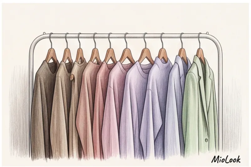
According to statistics from the global analytics agency WGSN (2023), most women regularly wear only 15-20% of their closet contents. When reviewing my wardrobe, I constantly encounter the same picture: many beautiful, high-quality items have been purchased, but they don't physically "match" each other due to clashing temperatures and undertones. Knowing your place within the 12 color types is the cheat code that transforms a chaotic wardrobe into a flawlessly functional capsule wardrobe.
Building a smart wardrobe starts with a foundation—basic neutrals. Forget the outdated rule that "black and white are for everyone." Pure white and charcoal black against the face only work flawlessly for those with a Bright and Cold Winter. For other types, this contrast is too aggressive and will highlight fatigue. If you're a Soft Summer, your ideal alternative to black is graphite or a sophisticated navy, and for white, a delicate ecru shade. For Warm Autumn, the best base would be dark chocolate and the classic camel shade.
Once the base is assembled, we introduce accent colors. Here, I always apply the classic architectural rule of 60-30-10 proportions, which works perfectly in styling. A harmonious look should consist of 60% of the space taken up by your base neutral color (for example, a taupe pantsuit), 30% by a complementary color from your palette (a dusty pink silk blouse), and just 10% by a bright accent (a burgundy bag or shoes). Always choose accent colors based on your dominant personality: if you're a Light Spring, choose a cheerful coral or aquamarine, but never a heavy eggplant.
An important detail that's often overlooked: your palette doesn't dictate your personal style. Whether a piece is grunge, minimalist, or boho-chic is up to you. You can be a Cool Summer and wear bold leather jackets, but they won't be black, but deep graphite or pine. Color is simply a tool for expressing your style DNA.
To avoid getting lost in stores and keep your capsule wardrobe under strict control, I strongly recommend digitizing your wardrobe. Upload your items to MioLook app — a smart algorithm will help you filter clothes by color and clearly show you which basic or accent pieces you're missing to complete the perfect seasonal capsule.
Conclusion: Color as a tool, not a limitation
The most common fear I see in women's eyes after receiving a personalized color lookbook is: "Darina, do I really have to wear only these thirty shades for the rest of my life and forget about the rest forever?" If you're experiencing similar feelings right now, take a deep breath.
Let's clarify a fundamental rule of modern styling. A deep understanding of how the 12 color types work gives you absolute freedom, not locks you in a fashion cage. It's not a strict diet where any misstep is punished by the "fashion police." It's your personal filter that filters out visual noise and protects you from bad purchases.
Remember the approach of legendary colorist Susan Caygill, who demonstrated back in the mid-20th century that the right color should be an extension of your natural architecture, not a mask. When you know your dominant trait (for example, that you're a Cold Winter), you can consciously break the rules. You understand that a mustard sweater will make your face look sallow, but if you really want to, you simply wear a crisp white shirt with a stiff collar underneath, creating that protective buffer we discussed earlier.
Checklist: Your First 3 Steps After Reading This Article
To ensure that this theory doesn't just remain an interesting read, I offer you a concrete plan of action for the coming weekend:
- Conduct an audit of the portrait zone. There's no need to throw out half your closet. Just take out all your tops, shirts, turtlenecks, and scarves. Put aside any items that clearly contradict your dominant personality trait (for example, too pale and dusty if you're a Bright Spring). Move them out of sight and onto lower shelves.
- Invest in one 100% “your” color. Buy an inexpensive but high-quality basic T-shirt or scarf in your strongest, signature shade. Wear it for three days in a row and track how many compliments you get on your complexion's freshness. It works better than any persuasion.
- Digitize your database. To avoid having to think about every nuance of the palette while standing in the fitting room, I strongly recommend transferring your closet to your smartphone. Upload your existing items to MioLook The app will not only show you how your current wardrobe matches your personality but also help you create ready-made capsule wardrobes from what's already on the hangers.
Evolution of style and conscious shopping
According to a 2024 Ellen MacArthur Foundation research report, implementing a personalized palette system reduces returns in online shopping by a staggering 60%. Why? Because you stop falling for marketing gimmicks and discounts. You see a gorgeous terracotta dress on sale, but your internal sensor (Light Summer) instantly says, "It's beautiful, but it's not for me."
I encourage you to experiment. Think of your palette as an artist's. Test unusual combinations, play with textures—from matte cashmere to glossy silk—within your best shades. Personal style isn't a fixed constant; it's a living, breathing evolution. And now you have the most accurate compass for this beautiful journey. Trust your mirror, listen to yourself, and wear the colors that make you feel invincible.
Guide Chapters
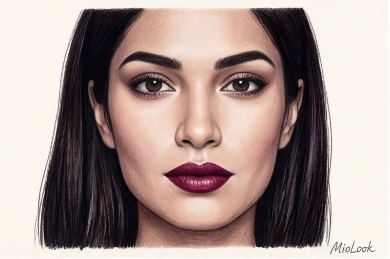
Dark Autumn Color Type: Ideal Colors and Looks
Many brunettes mistakenly consider themselves "Winter" and choose the wrong colors. Learn how to reveal your beauty if your true coloring is dark autumn.
How to determine your color type from a photo online: the whole truth
Neural networks promise to find your perfect shade in a couple of clicks, but they often produce inconsistent results. We'll explore why this happens and how to avoid mistakes.
The Ideal Hair Color Based on Your Color Type: Stylist Tips
Forget the clichéd shade-picking rules of the 2000s. We'll explore the mechanics of color with a professional stylist: how to find your perfect shade without looking older.