I've been tracking the cost per wear of my clients' brightly colored mass-market items for the past year and a half. Guess what the numbers show? Cheap, flashy synthetic tops are thrown out or end up in the bottom of the closet three times faster than basic pieces in deep, complex shades. And it's not just the quality of the seams that's at play here.
According to behavioral psychology research, 70% of first impressions are formed based on nonverbal cues, and color is the very first visual data point our brain processes in milliseconds. Choosing the right colors for women in their 30s isn't just a matter of aesthetics; it's a tool for managing how the world perceives your status and professionalism.
In our complete guide to A basic wardrobe for a 30-year-old woman: style and status We've covered the architecture of perfect silhouettes in detail, but today I want to dig deeper. We'll explore the physics and psychology of color, learn to distinguish "expensive" pigments from cheap ones, and put to rest the myth that a high-status woman must wear only dull beige.
The Psychology of Color: Why Colors in Women's Clothing Change Their Meanings in Their 30s
The transition from your twenties to your thirties is accompanied by a powerful psychological shift. At 22, we use clothing to declare: "Look at me!" At 32, our visual message transforms into: "I know my worth, and I don't need to shout to be heard.".
That's why those acid-neon dresses or dopamine-inspired wardrobe staples you enjoyed as a student are now starting to feel physically uncomfortable. They no longer resonate with your inner maturity. As the PANTONE Color Institute notes in its 2024 report, global fashion is shifting away from aggressive, statement colors toward "quiet confidence"—shades that convey stability and competence.
Research in color science confirms that the higher the saturation and brightness of a pure color (such as signal red or highlighter yellow), the less seriously and competently the medium is perceived in professional settings. Reducing brightness and adding depth, on the other hand, increases your visual weight.
The "Expensive Beige" Myth: Why Status Isn't Just Neutrals
The "Old Money" aesthetic that has taken over social media has convinced millions of women that the only way to achieve elegance is to wrap themselves in a head-to-toe beige and gray cocoon. As a practicing stylist, I see the consequences of this trend every day: wardrobes full of bland pieces that blend into the skin and make the face look tired.
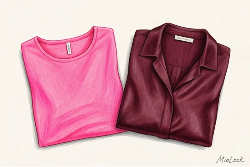
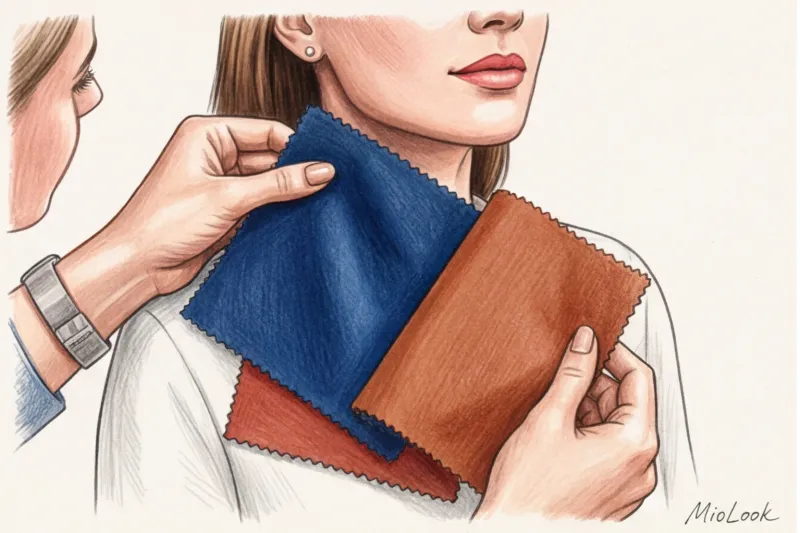
"Status isn't the absence of color. It's the depth of the dye and the quality of the texture. A cheap beige polyester jacket for €40 looks significantly worse and cheaper than a high-quality silk blouse in a rich fuchsia shade for €150."
In the textile industry, there's the concept of "dyeing baths." Premium brands (such as COS, Massimo Dutti, and luxury brands) run fabric through 3-4 dyeing cycles using various pigments. This creates that exquisite depth of color that plays differently in the sun and shade. Mass-market brands, in an effort to save money, use 1-2 basic dyeing baths. The result is a flat, aggressive color that's jarring.
Complex and flat shades: how to distinguish
- Flat shades (fast fashion): One-dimensional, synthetic, and often associated with markers or plastic. For example: pure primary red, lemon yellow, and pure electric blue.
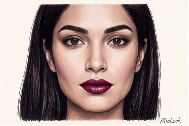
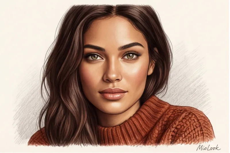
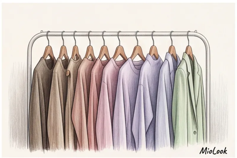
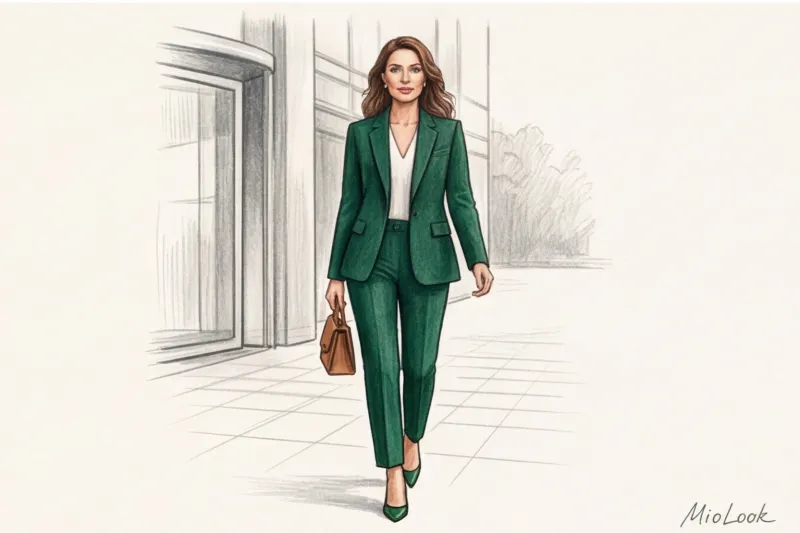
- Complex shades (premium): Always have a gray, brown, or olive undertone. These include burgundy, mustard, sage, terracotta, dusty rose, and deep sapphire.
The Architecture of Status Combinations: 3 Formulas for a 30+ Wardrobe
You don't have to be a professional colorist to create stunning looks. Over 12 years of practice, I've developed three foolproof formulas.
Formula 1: Monochrome with high contrast textures
Monochrome only looks expensive when the eye is drawn to the difference in materials. Pair matte wool with shimmering silk in a completely identical tone. For example: matte ivory wool trousers and a flowing silk blouse in the same shade.
When it does NOT work: Fair warning: this formula looks terrible if both pieces are made of thin, cheap cotton jersey or polyester. You'll look like you're wearing pajamas.
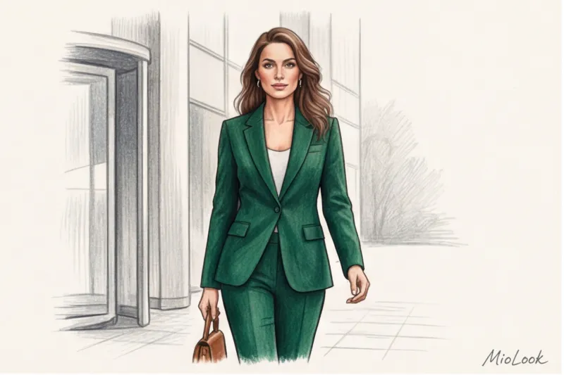
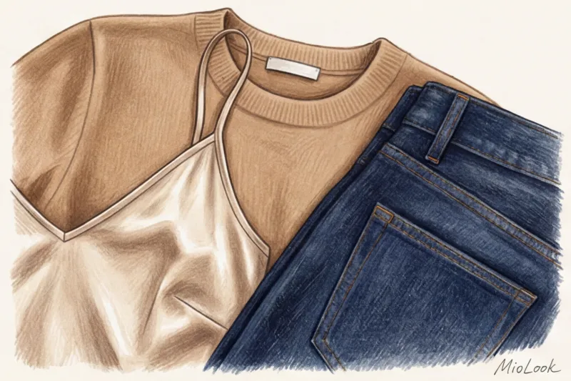
Formula 2: Deep base + one “expensive bright” accent
A year ago, 32-year-old Anna, a marketing director, approached me. She complained that she felt like a "gray mouse" because she wore only formal navy blue and gray to appear more serious at boardroom meetings. We kept her favorite base color of dark chocolate but added one accent—a deep emerald bag and an olive-print silk scarf.
The result? Coworkers started complimenting her on how fresh she looked, and her perceived authority only increased because the sophisticated color projected a sense of self-confidence.
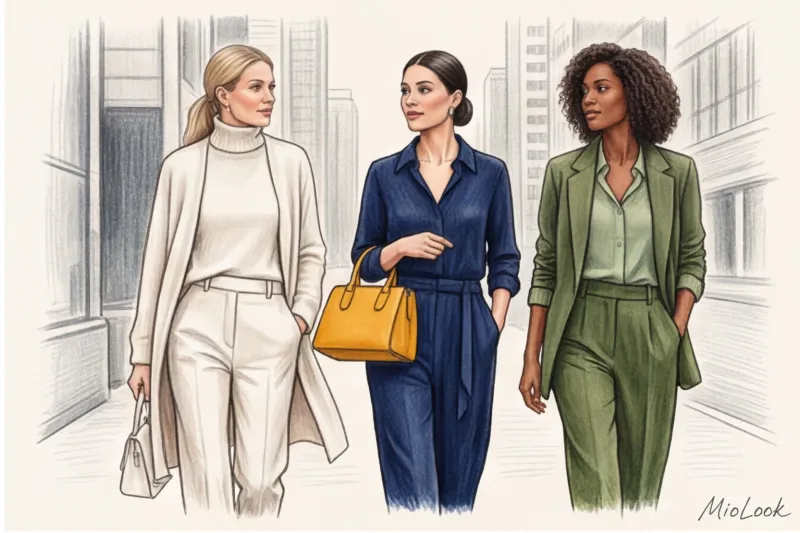
Formula 3: Analogue Combinations for Soft Elegance
Take colors that are adjacent on the color wheel, but tone down their vibrancy. A luxurious triad for the cold season: navy blue + teal + taupe. It looks incredibly sophisticated and sophisticated.
Tired of racking your brains over combinations?
Upload photos of your items to MioLook. Our AI stylist will instantly analyze shades and suggest dozens of stylish combinations based on monochrome and color wheel formulas.
Choose images for freeHow to adapt your color type to a high-status wardrobe
The traditional color classification system (Winter, Spring, Summer, Fall) is hopelessly outdated. As a stylist, I believe that rigid frameworks only limit women. You can wear absolutely any color; it's just a matter of its temperature, saturation, and placement relative to the face.
If you want to delve deeper into the theory, I recommend our materials about how to determine skin undertone and an article about ideal hair color according to your color type But the main rule of a status wardrobe is this: Move "foreign" colors away from the portrait area.
If you adore warm peach but have a cool, contrasting complexion, don't give up your favorite color. Simply buy peach pants or pumps, and keep your face in a strong color (like deep sapphire). This way, you'll keep your complexion looking fresh and add your favorite shade to your look without compromising your overall appearance.
Fabric Matters: How Material Changes Color Perception
Color doesn't exist in a vacuum—it lives on the surface of the fabric. And this is a critical insight: the texture of the material can either save a mediocre shade or ruin a premium dye.
Analyzing my clients' huge wardrobe database through the app MioLook I discovered a surprising pattern: women over 30 wear colorful clothes made from natural fabrics (wool, silk, linen, thick cotton) 40% more often than items of similar shades made from 100% synthetic materials. Why?
- Matte fabrics absorb light: Wool, suede, cashmere, and heavy cotton (180 g/m² and above) make colors appear deeper, richer, and darker. That same burgundy on suede will look like fine wine.
- Glossy fabrics reflect light: Natural silk, satin or high-quality viscose illuminate the color from within, making it vibrant.
- Cheap synthetics glare: Polyester reflects light unevenly, creating a cheap, plasticky sheen that instantly cheapens any shade, even the most complex one.
If you're on a budget (for example, looking for a piece in the €30-€50 range), always choose matte, dense textures. Cheap silk or satin will instantly reveal their value, while a dense matte cotton in a sophisticated olive shade can look like it was bought at The Row.
Conduct a tissue audit
Take photos of your clothes in MioLook. The app will help you visualize which textures and colors you wear most often and calculate the actual cost per wear for each blouse.
Digitize your wardrobe for freeChecklist: Auditing Your Color Palette and Smart Integration into MioLook
To put theory into practice, I suggest you conduct a mini closet audit today. Here's a step-by-step guide to creating a status palette:
- Find the 3 "power colors": Think about the clothes that most often get you complimented on, like "you look so fresh" (as opposed to "what a beautiful blouse"). These are your anchor shades.
- Get rid of "flat" dyes ruthlessly: Find items in marker colors (pure orange, neon pink)—they drag your look down. Put them away.
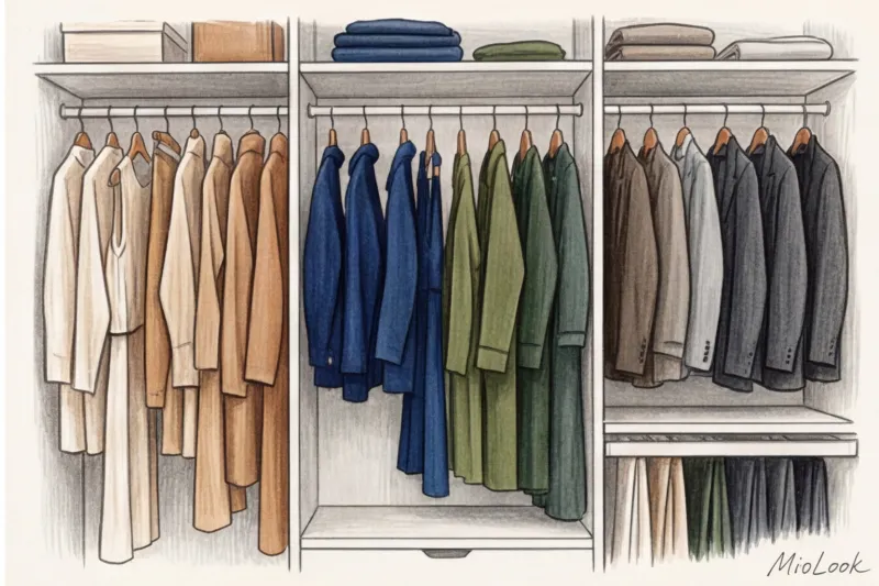
- Assemble a three-level palette: Your base should consist of 2 neutral colors (for example, camel and graphite), 2 deep complex colors (burgundy and emerald) and 1-2 accent colors for accessories.
I always recommend my clients use the rule of three combinations. Before buying a new item in deep terracotta or mustard, upload a photo of it to the MioLook app. If the algorithm, or you yourself, can't create at least three outfits with it from your existing items, it's a waste of money.
Conclusion: Your color is your visual calling card
Reaching 30 is a great opportunity to upgrade not only your career and personal goals, but also how you visually interact with the world. You don't have to give up color and hide in gray robes. You need to enhance quality this color.
It's better to invest in one perfectly tailored viscose or silk blouse in a complex sapphire shade for €120 than to buy five cheap tops in garish colors. Take the first step today: open your closet, find one item in the flattest, cheapest shade, and replace it with a deep, elegant alternative. You'll be surprised at how much it changes the way you feel.